Notes
Article history
The research reported in this issue of the journal was funded by the HSDR programme or one of its preceding programmes as project number 17/99/89. The contractual start date was in February 2019. The final report began editorial review in August 2021 and was accepted for publication in February 2022. The authors have been wholly responsible for all data collection, analysis and interpretation, and for writing up their work. The HSDR editors and production house have tried to ensure the accuracy of the authors’ report and would like to thank the reviewers for their constructive comments on the final report document. However, they do not accept liability for damages or losses arising from material published in this report.
Permissions
Copyright statement
Copyright © 2022 Allen et al. This work was produced by Allen et al. under the terms of a commissioning contract issued by the Secretary of State for Health and Social Care. This is an Open Access publication distributed under the terms of the Creative Commons Attribution CC BY 4.0 licence, which permits unrestricted use, distribution, reproduction and adaption in any medium and for any purpose provided that it is properly attributed. See: https://creativecommons.org/licenses/by/4.0/. For attribution the title, original author(s), the publication source – NIHR Journals Library, and the DOI of the publication must be cited.
2022 Allen et al.
Chapter 1 General introduction
Stroke
Stroke is a medical condition in which blood flow to an area of the brain has been interrupted, causing cell death. 1 Stroke may be broadly categorised into two types: (1) ischaemic (due to an arterial blockage) and (2) haemorrhagic (due to bleeding).
Stroke is a major cause of adult long-term disability and presents a significant load on health-care services. In 2010, it was reported that, across the world, there were 5.9 million stroke deaths and 33 million stroke survivors. 2 Approximately 85,000 people are hospitalised with stroke each year in England, Wales and Northern Ireland. 3 Over the last 25 years, stroke was the leading cause of lost disability-adjusted life-years, which combine mortality and disability burdens. 4
Intravenous thrombolysis
Intravenous thrombolysis is a form of ‘clot-busting’ therapy developed to treat ischaemic stroke by removing or reducing the blood clot impairing blood flow in the brain.
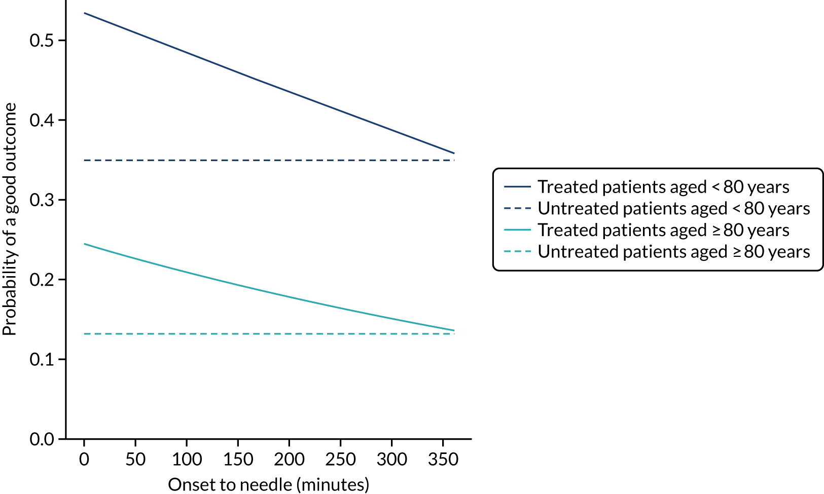
For ischaemic strokes, thrombolysis is an effective treatment for the management of acute stroke if given soon after stroke onset,5 and is recommended for use in many parts of the world, including Europe. 6 The mechanism of action is activation of the body’s own clot breakdown pathway, fibrinolysis. Although the benefit of alteplase (recombinant tissue plasminogen activator) is now well established, individual trials have suffered from uncertainty in the relationship between time to treatment with alteplase and the benefit achieved. Emberson et al. 5 accessed individual patient results from nine clinical trials involving 6756 patients (treated, n = 3391; untreated control, n = 3365). By combining the trials in this meta-analysis, Emberson et al. 5 established a statistically significant benefit of alteplase up to 5 hours after onset of stroke symptoms, using a modified Rankin Scale (mRS) score of 0–1 at 3–6 months as the outcome measure. The decline in odds ratio of an additional good outcome was consistent across age groups, but the differences in baseline (untreated) probability of a good outcome between those aged < 80 years and those aged ≥ 80 years means that the absolute probability of a good outcome after treatment with alteplase is dependent on age group. Figure 1 shows the probability of a good outcome if receiving alteplase, depending on time to treatment, derived from the analysis by Emberson et al. 5
FIGURE 1.
Effect of time to treatment (onset-to-needle time) on the clinical benefit (probability of an outcome with mRS score of 0–1) from thrombolysis, as derived by Emberson et al. 5
Targets for thrombolysis use and speed
The European Stroke Organisation (Basel, Switzerland) has prepared a European stroke action plan7 and has suggested a European target of at least 15% thrombolysis, with median onset-to-needle (also known as onset-to-treatment) times of < 120 minutes, noting that evidence suggests that achieving these targets may be aided by centralisation of stroke services. 8,9 An analysis of the third international stroke trial for thrombolysis concluded that 60% of ischaemic stroke patients arriving within 4 hours of known stroke onset were suitable for thrombolysis. 10 Assuming that 40% of patients arrive within 4 hours of known stroke onset, and assuming that 85% of stroke is ischaemic, then this gives a potential target of 20% thrombolysis. (In 2016–18, in England and Wales, 37% of emergency stroke patients arrived within 4 hours of known stroke onset; see Table 1.) The 2019/20 Sentinel Stroke National Audit Programme (SSNAP) report3 provides an NHS England long-term ambition of 20% of emergency stroke patients receiving thrombolysis. This target of treating up to 20% of patients with thrombolysis is also stated in The NHS Long Term Plan11 and the specification of the Integrated Stroke Delivery Networks. 12
The NHS plan for improving stroke care through the use of Integrated Stroke Delivery Networks sets a target that patients should receive thrombolysis within 60 minutes of arrival, but ideally within 20 minutes. 12 Although this speed of thrombolysis, also called door-to-needle time, provides an ambitious target, it has also been shown to be achievable, as the Helsinki University Central Hospital (Helsinki, Finland) has reported a median of 20 minutes door-to-needle time, with 94% of patients treated within 60 minutes. 13 This speed was achieved using innovative solutions, such as bypassing the emergency department (ED) and taking patients straight to the scanner (with thrombolysis delivered close to the scanner to avoid any transfer-related delay in treatment).
Barriers to thrombolysis use
There have been many studies of barriers to the uptake of thrombolysis. 14–16 Eissa et al. 14 divided barriers into pre- and post-admission phases. Pre-admission barriers included poor patient response (e.g. not recognising symptoms of a stroke and not calling for help soon enough) and paramedic-related barriers (e.g. adding delays in getting the patient to an appropriate hospital in the fastest possible time). Hospital-based barriers include organisational problems (e.g. delay in recognising stroke patients, delays in pathway and poor infrastructure) and physician uncertainty or lack of experience leading to low use of thrombolysis. There has been significant discussion on how services may best be organised to optimise the effectiveness of thrombolysis. 17
Clinical audit
NHS England describes clinical audit in the following way:18
Clinical audit is a way to find out if healthcare is being provided in line with standards and lets care providers and patients know where their service is doing well, and where there could be improvements. The aim is to allow quality improvement to take place where it will be most helpful and will improve outcomes for patients. Clinical audits can look at care nationwide (national clinical audits) and local clinical audits can also be performed locally in trusts, hospitals or GP [general practitioner] practices anywhere healthcare is provided.
In England, the Healthcare Quality Improvement Partnership (HQIP) is responsible for overseeing and commissioning clinical audits. Over 30 clinical audits together form the National Clinical Audit Programme. These audits collect and analyse data supplied by local clinicians.
SSNAP collects data on about 85,000 stroke admission patients per year (i.e. more than 90% of stroke admissions to acute hospitals in England, Wales and Northern Ireland). The data collected include process information and outcomes for stroke care up to 6 months post stroke. SSNAP publishes analysis of results on its website. 19
Clinical pathway simulation
Clinical pathway simulation aims to mimic the passage of individual patients through a clinical pathway. Each patient may take a different route through the pathway, and may take different amounts of time in process steps, depending on the model logic and distributions of timings used.
Computer simulation of stroke pathways has previously allowed investigation and improvement of thrombolysis use in individual hospitals, including both increasing the number of patients treated and reducing door-to-needle times. 20,21 These models have usually focused solely on the speed of the acute stroke pathway from arrival at hospital to treatment with thrombolysis. 20 Interest in the use of simulation for improving the performance of the acute stroke pathway has reached such a level that a common framework has been proposed. 22
Modelling clinical decision-making
A component of clinical pathway simulation that has not usually been included in modelling is patient-level clinical decision-making. For example, in previous modelling studies, when there was time to administer patient thrombolysis, the model component ‘Does a patient receive thrombolysis?’ was modelled as a stochastic event independent of clinical characteristics of the patient. 20,21
In this project, we seek to use machine learning to predict the probability of a patient receiving thrombolysis, based on a range of features about the patient and also based on which stroke team (hospital) they attend, with the aim of being able to answer the counterfactual question ‘What treatment would this patient probably receive at other hospitals?’. This is a classical supervised learning problem in machine learning, and we explore three machine learning methods: (1) logistic regression, (2) random forest and (3) neural network.
Combining clinical pathway simulation and clinical decision-making
Traditional clinical pathway simulation mimics a process, using times and decisions sampled from appropriate distributions. In this project, we combine simulation with machine learning, by using probabilities of receiving thrombolysis derived from machine learning models (e.g. by ‘replacing’ the decision-making in one hospital with a majority vote of a standard set of benchmark hospital decision models).
Pilot work
Pilot work for this project, based on seven regional stroke teams, has been published. 23
Chapter 2 Open science
In conducting this research we have tried to follow, where possible, the recommendations for open and reproducible data science from The Alan Turing Institute. 24 Detailed methods (including all code used) and results are available online. 25
At this stage, it is not possible to share original data.
Chapter 3 Data
Data were obtained from the Sentinel Stroke National Audit,19 managed through HQIP. 26 SSNAP collects patient-level data on acute stroke admissions, with pre-hospital data recently added. SSNAP has near-complete coverage of all acute stroke admissions in the UK (outside Scotland) and is building up coverage of outcomes at 6 months. All hospitals admitting acute stroke participate in the audit, and year-on-year comparison with Hospital Episode Statistics27 confirms estimated case ascertainment of 95% of coded cases of acute stroke.
The NHS Health Research Authority (HRA) decision tool28 was used to confirm that ethics approval was not required to access the data. Data access was authorised by HQIP (reference HQIP303).
Data were retrieved for 246,676 emergency stroke admissions to acute stroke teams in England and Wales between 2016 and 2018 (i.e. 3 full years).
Data fields are given in Appendix 1.
Chapter 4 General descriptive statistics
What is in this section?
This section provides an analysis of descriptive statistics of the SSNAP data.
This section contains the following analyses:
-
descriptive analysis of stroke pathway data, describing mean patient and pathway characteristics, and describing variation across stroke teams and between age groups (i.e. age < 80 years vs. ≥ 80 years)
-
association between patient features on use of thrombolysis, examining the relationship between patient features and use of thrombolysis, including analysis by disability (mRS) before stroke, stroke severity [using the National Institutes of Health Stroke Scale (NIHSS)], gender, ethnicity, age group, onset known, arrival by ambulance and comorbidities
-
comparison of average values for patients who receive thrombolysis and those who do not, comparing feature means for patients who receive thrombolysis and those who do not
-
pathway patterns throughout the day, analysing key pathway statistics broken down by time of day (3-hour epochs)
-
pathway patterns throughout the week, analysing key pathway statistics broken down by day of week
-
pathway patterns throughout the day in an example single stroke team, analysing key pathway statistics broken down by time of day (3-hour epochs) in a single stroke team
-
pathway patterns throughout the week in an example single stroke team, analysing key pathway statistics broken down by day of week in a single stroke team
-
stroke pathway timing distribution, visualising distributions for onset to arrival, arrival to scan and scan to needle
-
covariance between all feature pairs.
Detailed code and results are available online. 29
Key findings in this section
Some key general statistics include the following:
-
Between 2016 and 2018, there were 239,505 admissions to 132 stroke teams that had received at least 300 admissions and provided thrombolysis to at least 10 patients over the course of 3 years (2016–18).
-
A total of 5.3% of patients had an in-hospital onset of stroke, 12.3% of whom received thrombolysis.
-
A total of 94.7% of patients had an out-of-hospital onset of stroke, 11.8% of whom received thrombolysis.
-
There was generally little covariance between features, with 96% of feature pairs having a R2 of < 0.1.
The following statistics apply to patients with an out-of-hospital onset of stroke only:
-
A total of 43% of patient arrivals were aged ≥ 80 years.
-
A total of 67% of all patients had a determined stroke time of onset, 60% of whom arrived within 4 hours of known stroke onset. This equates to 40% of all arrivals arriving within 4 hours of known stroke onset.
The following statistics apply to patients with an out-of-hospital onset of stroke who also arrived within 4 hours of known stroke onset:
-
The mean onset-to-arrival time was 111 minutes.
-
Most (95%) patients underwent scanning within 4 hours of arrival, with a mean arrival-to-scan time of 43 minutes.
-
Among patients who underwent scanning within 4 hours of known stroke onset, 30% received thrombolysis.
-
Overall, 11.8% of patients received thrombolysis.
-
The mean scan-to-needle time was 40 minutes, the mean arrival-to-needle time was 63 minutes and the mean onset-to-needle time was 158 minutes.
Statistics on inter-hospital variation include the following:
-
Thrombolysis use varied from 1.5% to 24.3% of all patients and from 7.3% to 49.7% of patients arriving within 4 hours of known stroke onset.
-
The proportion of patients with a determined stroke onset time ranged from 34% to 99%.
-
The proportion of patients arriving within 4 hours of known stroke onset ranged from 22% to 56%.
-
The proportion of patients scanned within 4 hours of arrival ranged from 85% to 100%.
-
Mean arrival-to-scan time (for those arriving within 4 hours of known stroke onset and scanned within 4 hours of arrival) ranged from 19 to 93 minutes.
-
Mean arrival-to-needle time varied from 26 to 111 minutes.
-
The proportion of patients aged ≥ 80 years varied from 29% to 58%.
-
The mean NIHSS score (i.e. stroke severity) ranged from 6.1 to 11.7.
Statistics on differences by age group (i.e. patients aged < 80 years vs. ≥ 80 years) and gender include the following:
-
A total of 10.1% of arrivals aged ≥ 80 years received thrombolysis (compared with 13.0% of arrivals aged < 80 years). There was a steady decline in use of thrombolysis over the age of 55 years.
-
A total of 39% of arrivals aged ≥ 80 years arrived within 4 hours of known stroke onset (compared with 40% of arrivals aged < 80 years).
-
The mean disability (mRS) score before stroke was 1.7 among patients aged ≥ 80 years (compared with 0.6 among patients aged < 80 years).
-
The mean stroke severity (NIHSS) score on arrival was 10.7 for patients aged ≥ 80 years (compared with 8.2 for patients aged < 80 years).
-
Of the patients scanned within 4 hours, 26.3% of those aged ≥ 80 years received thrombolysis (compared with 34.7% of those aged < 80 years).
-
Of the patients arriving within 4 hours of known stroke onset, 30.8% of all male arrivals received thrombolysis (compared with 28.2% of all female arrivals).
Statistics on ethnicity include the following:
-
There was a weak relationship between ethnicity and thrombolysis use, with 10.2% of black people receiving thrombolysis, compared with 11.7% of white people. This difference was mostly explained by a lower proportion of black people arriving within 4 hours of known stroke onset.
Statistics on the relationship between clinical features and use of thrombolysis include the following:
-
Use of thrombolysis fell as disability (mRS) score before stroke increased.
-
Use of thrombolysis was low for low stroke severity on arrival and then increased and reached a plateau (NIHSS score 6–25) before falling at higher stroke severity on arrival.
-
The presence or absence of comorbidities could be a strong indicator of the use of thrombolysis. For example, patients on anticoagulant therapies were less likely to receive thrombolysis than those who were not on anticoagulant therapies, but patients on antiplatelet therapies were more likely to receive thrombolysis than those who were not on antiplatelet therapies.
The three most common reasons stated for not giving thrombolysis were:
-
stroke was too mild/severe
-
haemorrhagic stroke
-
patient improving.
Statistics on the relationship of time of day and day of week to use of thrombolysis include the following:
-
Nationally, there was a significant fall in the use of thrombolysis among patients arriving between 3 a.m. and 6 a.m. (with about 6% of those arriving between 3 a.m. and 6 a.m. receiving thrombolysis, compared with 11–13% of patients arriving at other times of the day); however, patients arriving during this period accounted for only about 3% of all arrivals (compared with the 12.5% that would be expected if the arrival rate were uniform).
-
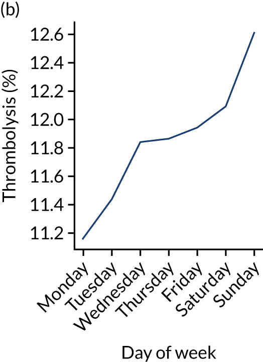
Nationally, there was a weak relationship between day of week and use of thrombolysis, with thrombolysis use ranging from 11.2% to 12.6% by day of week (increasing Monday through to Sunday).
General descriptive statistics stratified by age group
Table 1 shows general statistics for those patients with an out-of-hospital onset of stroke (i.e. 94.7% of all patients), stratified by age group (patients aged ≤ 80 years vs. aged ≥ 80 years).
| Pathway parameter | All | Age group (years) | |
|---|---|---|---|
| < 80 | ≥ 80 | ||
| Thrombolysis use (%) | 11.8 | 13.0 | 10.1 |
| Admissions/year, n | 75,607 | 44,134 | 31,473 |
| Aged ≥ 80 years (%) | 42.3 | 0.0 | 100.0 |
| mRS score before stroke | 1.0 | 0.7 | 1.6 |
| NIHSS score on arrival | 7.5 | 6.4 | 9.1 |
| Onset determined (%) | 66.9 | 68.2 | 65.0 |
| Known stroke onset arriving within 4 hours (%) | 58.6 | 56.8 | 61.3 |
| All arriving within 4 hours (%) | 39.2 | 38.7 | 39.9 |
| mRS score before stroke (4-hour arrivals)a | 1.1 | 0.6 | 1.7 |
| NIHSS score on arrival (4-hour arrivals)a | 9.2 | 8.2 | 10.7 |
| Mean onset-to-arrival time (minutes)a | 111.4 | 109.3 | 114.3 |
| SD onset-to-arrival time (minutes)a | 52.7 | 52.8 | 52.4 |
| Receiving scan within 4 hours of onset (%)a | 94.8 | 95.0 | 94.5 |
| Mean arrival-to-scan time (minutes)b | 42.1 | 41.6 | 42.8 |
| SD arrival-to-scan time (minutes)b | 44.8 | 44.6 | 45.1 |
| Receiving thrombolysis (%)b | 31.1 | 34.7 | 26.3 |
| Mean scan-to-needle time (minutes) | 36.0 | 36.5 | 35.0 |
| SD scan-to-needle time (minutes) | 28.4 | 29.3 | 26.6 |
| Mean arrival-to-needle time (minutes) | 58.8 | 60.0 | 56.7 |
| SD arrival-to-needle time (minutes) | 35.2 | 36.7 | 32.2 |
| Mean onset-to-needle time (minutes) | 155.8 | 156.5 | 154.5 |
| SD onset-to-needle time (minutes) | 54.0 | 55.2 | 51.8 |
| Thrombolysis given at > 180 minutes (%) | 29.5 | 30.3 | 28.0 |
| Thrombolysis given at > 240 minutes (%) | 1.7 | 1.8 | 1.4 |
Relationship between patient features and use of thrombolysis
In this section, we examine the relationship between particular features and the use of thrombolysis.
Note that the association of particular features with use of thrombolysis does not imply that these relationships are necessarily causal.
Disability before stroke
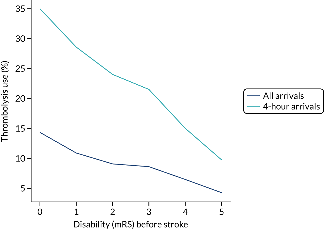
The higher the level of disability before stroke (as described by the mRS) then the lower the use of thrombolysis (Figure 2). As a percentage of arrivals with an out-of-hospital onset of stroke, thrombolysis use dropped from 14.2% in those with no disability before stroke to 4.3% in those with a mRS score of 5. As a percentage of arrivals with an out-of-hospital onset of stroke who arrive within 4 hours of known stroke onset, thrombolysis use dropped from 34.9% in those with no disability before stroke to 9.8% in those with a mRS score of 5.
FIGURE 2.
Thrombolysis use by disability before stroke: mRS. The dark blue line shows thrombolysis use in all arrivals, and the light blue line shows thrombolysis use in those arriving within 4 hours of known stroke onset.
Stroke severity on arrival
The use of thrombolysis varied very significantly with stroke severity (i.e. NIHSS score) on arrival (Figure 3). Thrombolysis use was very low at extreme NIHSS scores, with a plateau of use at NIHSS scores of approximately 6–25.
FIGURE 3.
Thrombolysis use by stroke severity on arrival: NIHSS. The dark blue line shows thrombolysis use in all arrivals, and the light blue line shows thrombolysis use in those arriving within 4 hours of known stroke onset.

Gender
There was a weak relationship between gender and use of thrombolysis. A total of 12.3% of all male arrivals received thrombolysis, compared with 11.3% of all female arrivals. Among patients arriving within 4 hours of known stroke onset, 30.8% of all males received thrombolysis, compared with 28.2% of all females.
Ethnicity
There was a weak relationship between ethnicity and thrombolysis use in all arrivals (Table 2), with use of thrombolysis being lowest in black people, but use of thrombolysis showed little variation with ethnicity among those arriving within 4 hours of known stroke onset, suggesting that the cause of lower use of thrombolysis was likely to be the lower proportion of black people arriving at hospital within 4 hours of known stroke onset.
| Ethnicity | Thrombolysis use (%) | |
|---|---|---|
| All arrivals | Arrivals within 4 hours of known stroke onset | |
| Asian | 12.1 | 30.0 |
| Black | 10.2 | 29.2 |
| Mixed | 11.7 | 32.3 |
| White | 11.6 | 29.1 |
Age
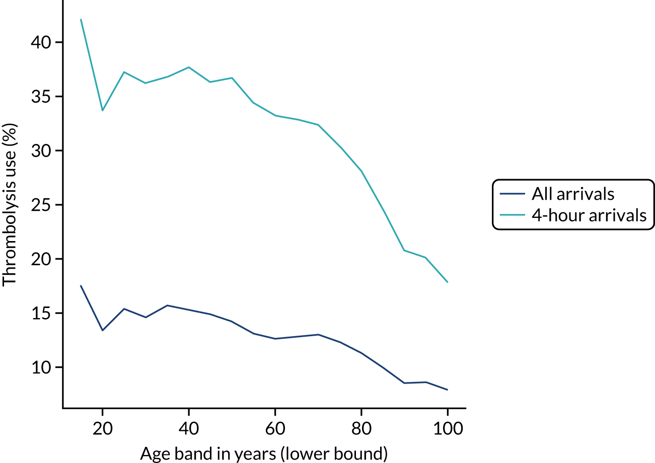
Thrombolysis use declined with age (Figure 4). Among patients aged 25–55 years, thrombolysis was used in about 15% of all patients and in about 35% of those arriving within 4 hours of known stroke onset. Above this age band, there was a decline in use; for example, in the age band 85–89 years, thrombolysis was used in about 10% of all patients and in 25% of patients arriving within 4 hours of known stroke onset.
FIGURE 4.
Thrombolysis use by age band (5-year bands). The dark blue line shows thrombolysis use in all arrivals, and the light blue line shows thrombolysis use in those arriving within 4 hours of known stroke onset.
Knowledge of time of stroke onset
Knowledge of time of onset was split almost evenly (33–34% each) among ‘not known’, ‘best estimate’ and ‘precise’. Type of knowledge of stroke onset showed a significant association with use of thrombolysis (Table 3). Of patients arriving within 4 hours of known onset, 39.0% received thrombolysis if the time was recorded as being known precisely, compared with 14.0% receiving thrombolysis if the time was a best estimate.
| Knowledge of time of onset | Thrombolysis use (%) | |
|---|---|---|
| All arrivals | Arrivals within 4 hours of known stroke onset | |
| Not known | 0.4 | NA |
| Best estimate | 6.3 | 14.0 |
| Precise | 28.8 | 39.0 |
Arrival mode
A total of 8.4% of patients arrived by ambulance. There was a significant association between mode of arrival and use of thrombolysis. Use of thrombolysis was 13.7% among patients arriving by ambulance and 3.8% among those arriving by other means.
Comorbidities
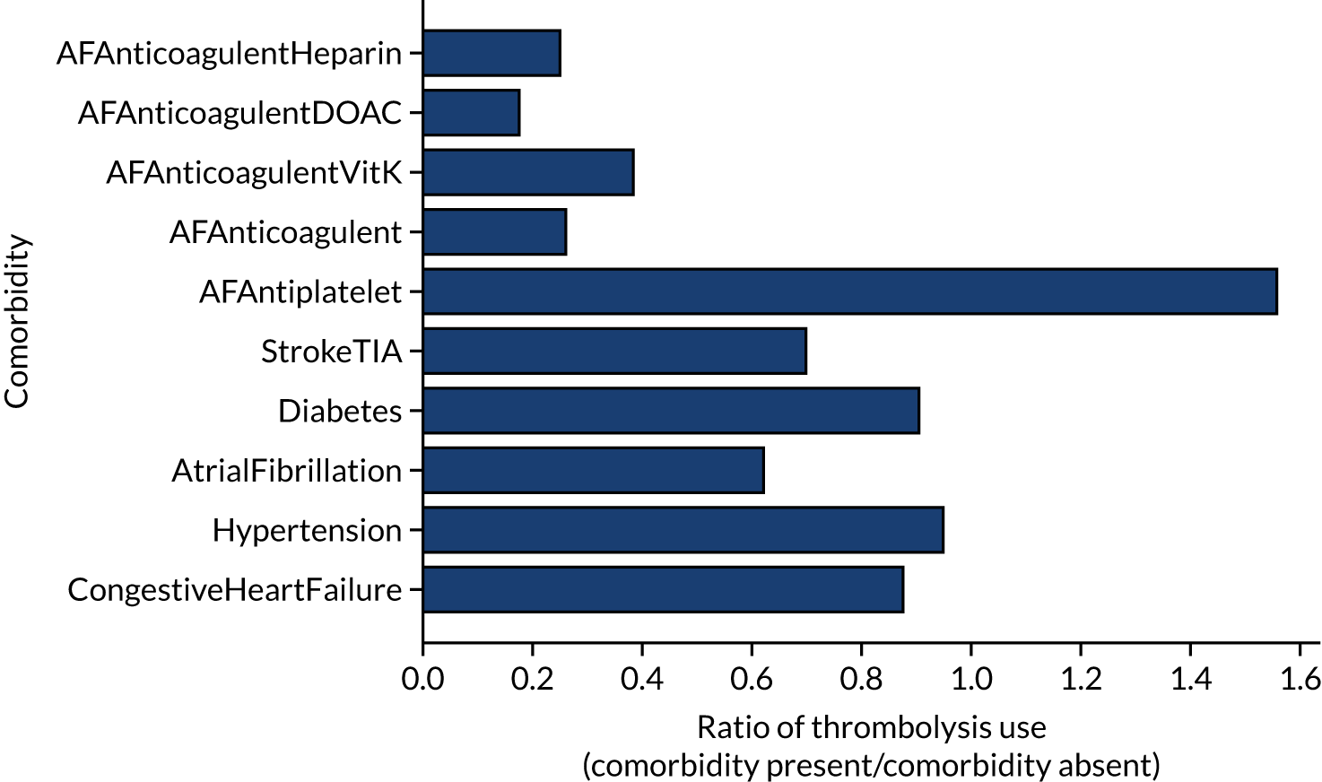
The presence or absence of comorbidities could be a strong indicator of the use of thrombolysis (Figure 5). For example, patients on anticoagulant therapies were less likely than patients who were not on anticoagulant therapies to receive thrombolysis (by ratios of 0.18–0.39, depending on the type of anticoagulant), whereas those on antiplatelet therapies were more likely than those not on antiplatelet therapies to receive thrombolysis (by a ratio of 1.56).
FIGURE 5.
The relationship between the presence of comorbidities and the use of thrombolysis. The results show the ratio of patients treated with the comorbidity present to the use when the comorbidity is absent. AF, atrial fibrillation; DOAC, direct oral anticoagulant; TIA, transient ischaemic attack.
Stated reasons for not giving thrombolysis
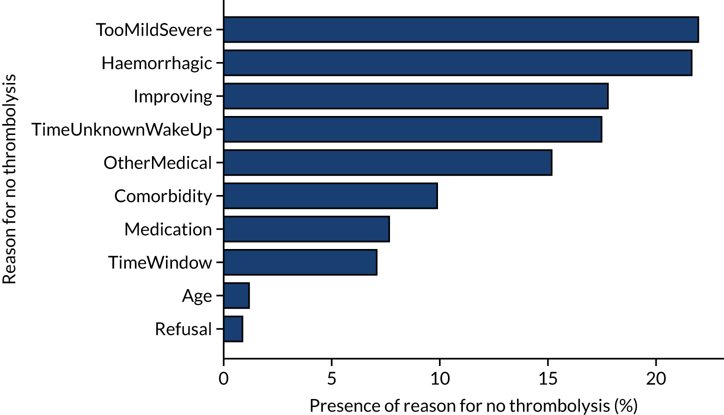
Figure 6 shows the reasons given for not giving thrombolysis (note that more than one reason may be given). Haemorrhagic stroke or a stroke that is too mild/severe were the most common causes (each present for 22% of patients not treated). An improving condition was given as the reason for no treatment in 17% of non-treated patients. It is noteworthy that patient refusal was given as a reason for non-treatment in only 0.9% of untreated patients.
FIGURE 6.
Indicated reasons for not giving thrombolysis among patients who did not receive thrombolysis. Note that more than one reason may be given.
Inter-hospital variation in general descriptive statistics
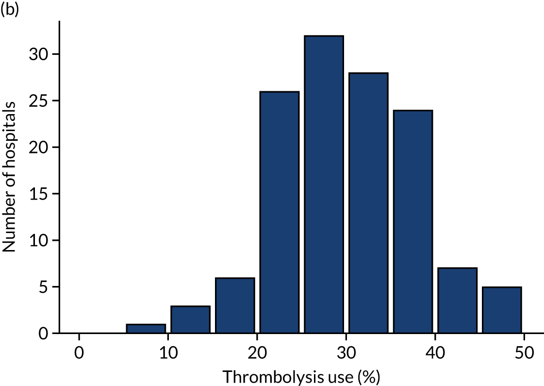
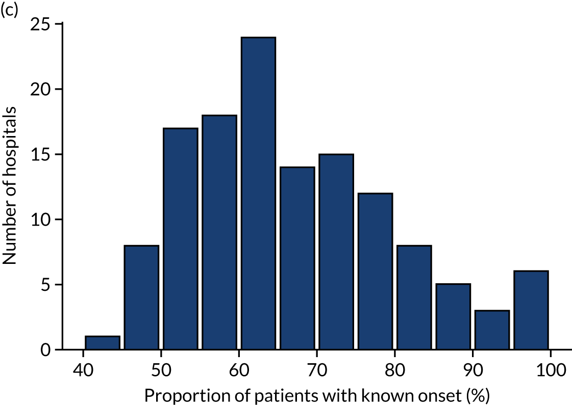
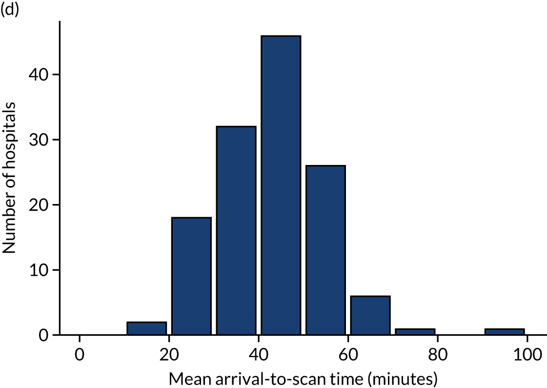
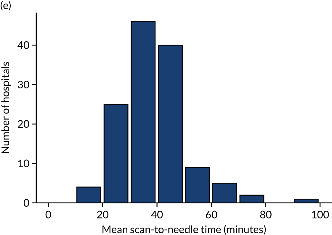
Table 4 shows inter-hospital variation in general descriptive statistics for patients with an out-of-hospital onset of stroke. Distributions of key parameters are also shown as histograms in Figure 7.
| Pathway parameter | Mean | SD | Minimum | First quartile | Median | Third quartile | Maximum |
|---|---|---|---|---|---|---|---|
| Thrombolysis use (%) | 11.5 | 3.5 | 1.5 | 9.3 | 11.0 | 13.3 | 24.3 |
| Admissions/year, n | 573 | 277 | 101 | 378 | 544 | 755 | 2039 |
| Aged ≥ 80 years (%) | 42.6 | 5.6 | 29.2 | 38.7 | 42.8 | 45.8 | 57.6 |
| mRS score before stroke | 1.0 | 0.3 | 0.5 | 0.8 | 1.0 | 1.2 | 1.9 |
| NIHSS score on arrival | 7.4 | 0.9 | 4.5 | 6.7 | 7.4 | 8.1 | 10.3 |
| Onset determined (%) | 66.6 | 13.4 | 34.5 | 57.4 | 64.2 | 75.3 | 98.8 |
| Known onset arriving within 4 hours (%) | 60.1 | 9.0 | 25.7 | 55.8 | 60.9 | 66.2 | 81.4 |
| All arriving within 4 hours (%) | 39.2 | 6.2 | 22.3 | 35.3 | 39.2 | 43.1 | 55.8 |
| mRS score before stroke (4-hour arrivals)a | 1.1 | 0.3 | 0.5 | 0.9 | 1.1 | 1.2 | 1.8 |
| NIHSS score on arrival (4-hour arrivals)a | 9.1 | 1.1 | 6.1 | 8.4 | 9.2 | 9.9 | 11.7 |
| Mean onset-to-arrival time (minutes)a | 110.6 | 6.7 | 90.3 | 106.9 | 110.8 | 115.1 | 132.6 |
| SD onset-to-arrival time (minutes)a | 52.4 | 2.3 | 46.5 | 50.8 | 52.1 | 53.7 | 63.9 |
| Receiving scan within 4 hours of onset (%)a | 94.8 | 3.0 | 84.7 | 93.3 | 95.4 | 96.9 | 100.0 |
| Mean arrival-to-scan time (minutes)b | 43.0 | 11.5 | 18.6 | 35.6 | 42.9 | 50.6 | 92.9 |
| SD arrival-to-scan time (minutes)b | 43.2 | 6.9 | 24.0 | 38.9 | 42.7 | 47.5 | 64.4 |
| Receiving thrombolysis (%)b | 30.1 | 7.8 | 7.3 | 24.9 | 29.3 | 36.0 | 49.7 |
| Mean scan-to-needle time (minutes) | 39.7 | 12.0 | 19.1 | 30.7 | 37.4 | 45.9 | 92.1 |
| SD scan-to-needle time (minutes) | 26.5 | 8.5 | 7.9 | 21.3 | 25.1 | 29.9 | 65.9 |
| Mean arrival-to-needle time (minutes) | 63.5 | 15.1 | 26.5 | 54.5 | 60.0 | 71.7 | 111.4 |
| SD arrival-to-needle time (minutes) | 32.8 | 8.4 | 8.2 | 27.9 | 32.2 | 36.5 | 69.8 |
| Mean onset-to-needle time (minutes) | 158.4 | 13.1 | 127.0 | 149.7 | 156.5 | 166.7 | 189.7 |
| SD onset-to-needle time (minutes) | 52.3 | 5.9 | 39.1 | 48.6 | 51.3 | 54.9 | 83.3 |
| Thrombolysis given at > 180 minutes (%) | 31.0 | 9.3 | 8.0 | 25.0 | 29.0 | 35.6 | 58.8 |
| Thrombolysis given at > 240 minutes (%) | 1.8 | 1.5 | 0.0 | 0.8 | 1.5 | 2.6 | 7.0 |
FIGURE 7.
Histograms of inter-hospital variation in key descriptive statistics for those patients with an out-of-hospital onset of stroke. (a) Thrombolysis use: all admissions; (b) thrombolysis use: arrivals within 4 hours of known onset; (c) proportion of patients with known onset; (d) mean arrival-to-scan time for patients arriving within 4 hours of known onset and receiving scan within 4 hours of arrival; (e) mean scan-to-needle time; and (f) mean arrival-to-needle time.


Relationship between time of day and day of week on use of thrombolysis
At a national scale
Figure 8 shows changes in key pathway statistics throughout the day, as averaged across all patients. Arrivals peaked between 9 a.m. and 3 p.m., and then dropped steadily to a low between 3 a.m. and 6 a.m. Thrombolysis use was significantly lower in the 3 a.m. to 6 a.m. epoch. At this point, the proportion of patients who arrived within 4 hours of known stroke onset was lower than during the day. Processes appeared a little slower; for example, the arrival-to-scan time was 47 minutes on average, compared with about 42 minutes during the day. The largest coincidental association at this time (i.e. the 3 a.m. to 6 a.m. epoch) was that fewer patients who were scanned within 4 hours of known stroke onset were deemed suitable for thrombolysis (22%, compared with about 35% of patients who arrived later in the day). When considering the performance of the pathway at this time, it may be worth noting that only about 3% of all patients arrived between 3 a.m. and 6 a.m. (and we would expect this to be 12.5% of all arrivals in this time period if there were a uniform arrival rate).
FIGURE 8.
Changes in key pathway statistics by time of day. Results are mean results across all stroke units. Time is given as the start of a 3-hour epoch (e.g. ‘3’ is 3 a.m. to 6 a.m.). (a) Arrivals: normalised to average; (b) thrombolysis use: all arrivals; (c) proportion of patients with known onset; (d) proportion of patients aged ≥ 80 years; (e) mean pre-stroke mRS: all arrivals; (f) mean NIHSS score: all arrivals; (g) proportion of patients arriving within 4 hours of known onset; (h) mean pre-stroke mRS: arrivals 4 hours from onset; (i) mean NIHSS score: arrivals 4 hours from onset; (j) mean onset-to-arrival time (minutes): arrivals 4 hours from onset; (k) proportion of patients scanned within 4 hours of arrival: arrivals 4 hours from onset; (l) mean arrival-to-scan time (minutes): scanned 4 hours from onset; (m) thrombolysis use: scanned 4 hours from onset; (n) mean scan-to-needle time (minutes); (o) mean arrival-to-needle time (minutes); and (p) mean onset-to-needle time.
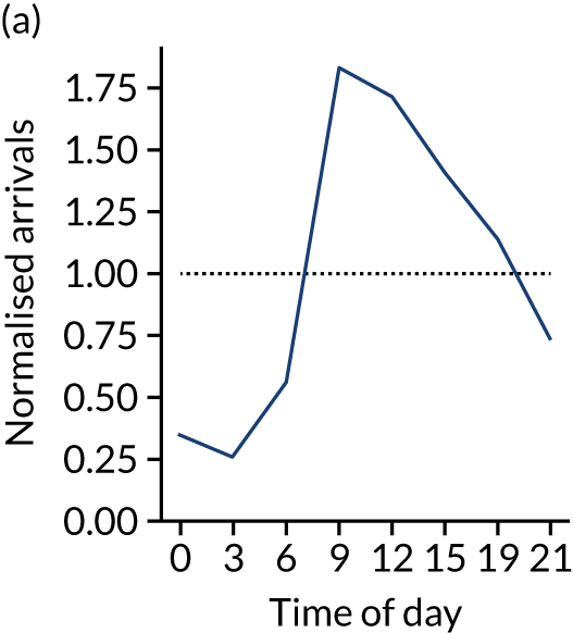
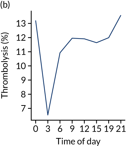

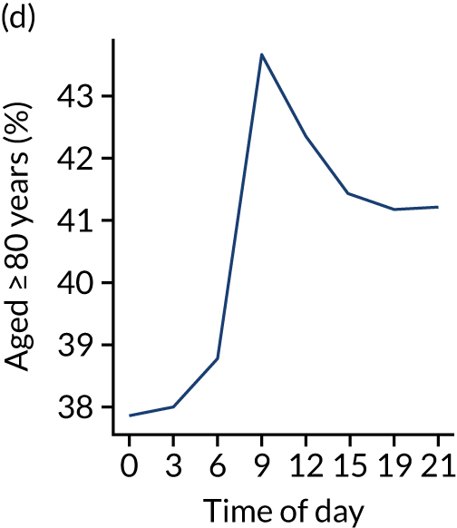
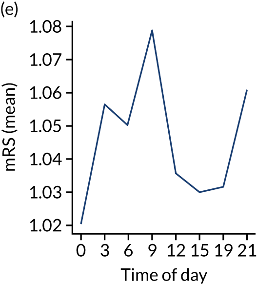
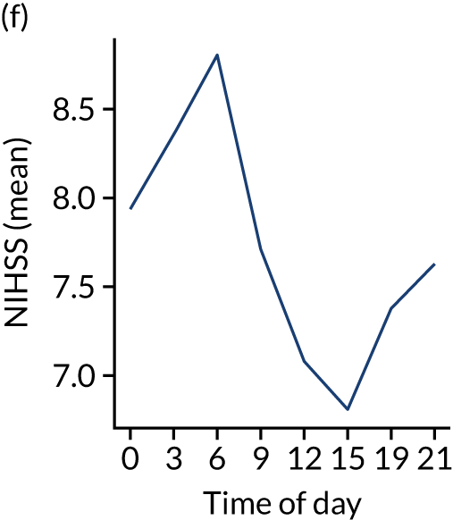
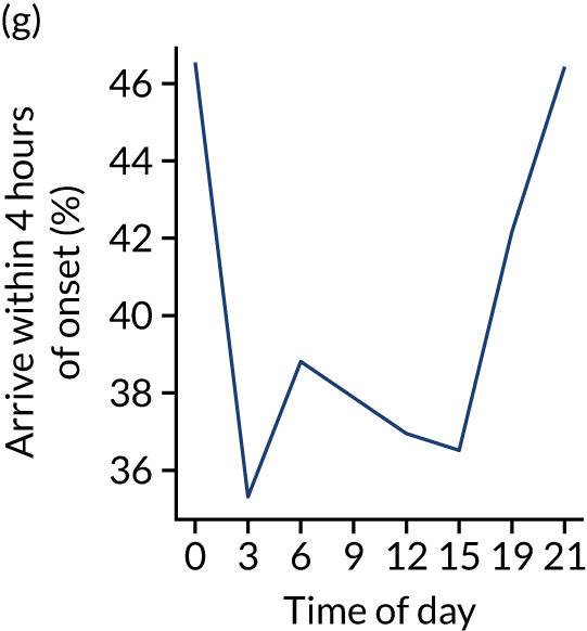
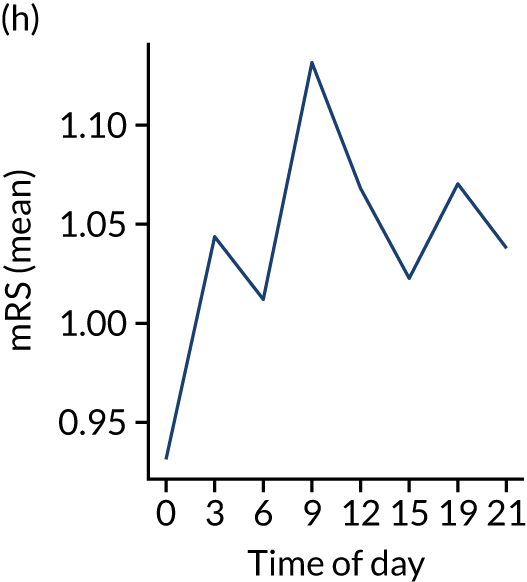
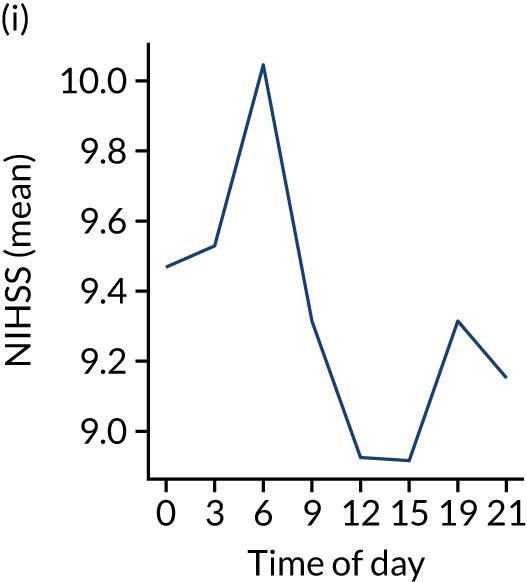
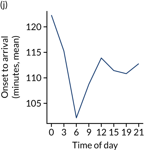
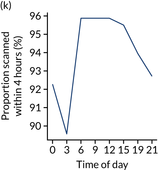
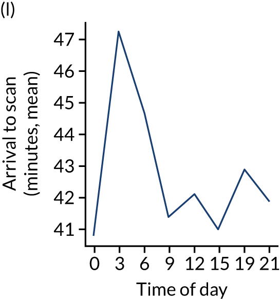
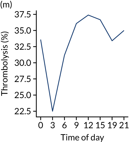
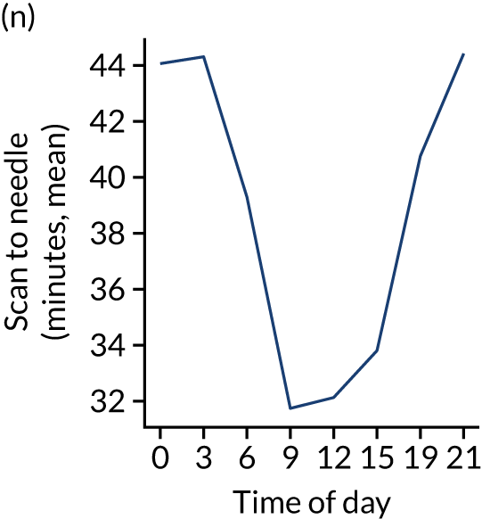
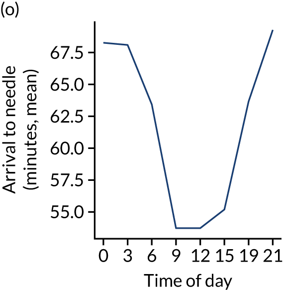
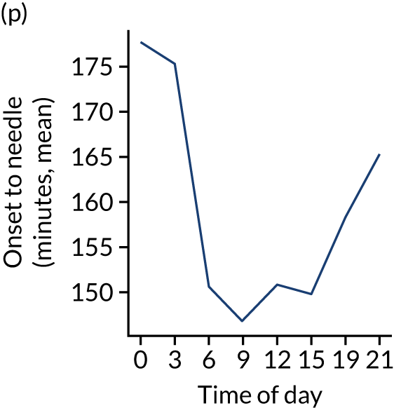
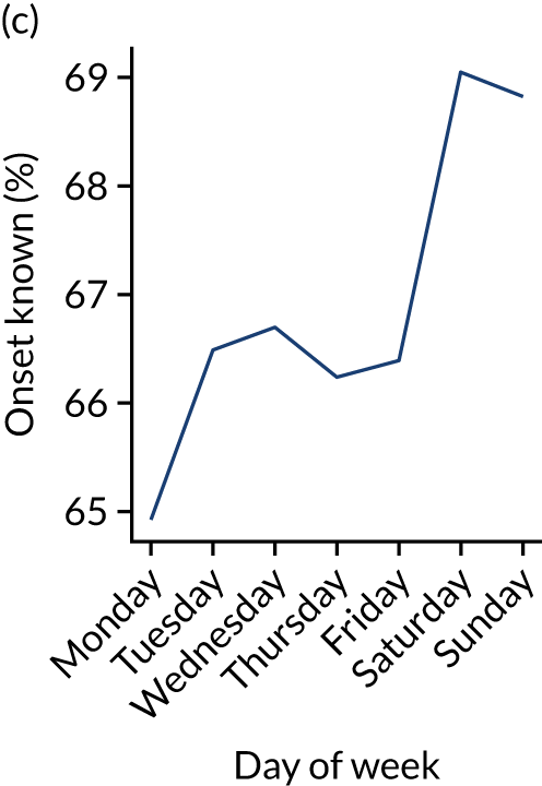
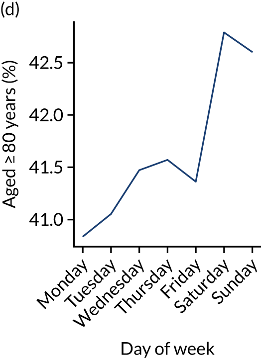
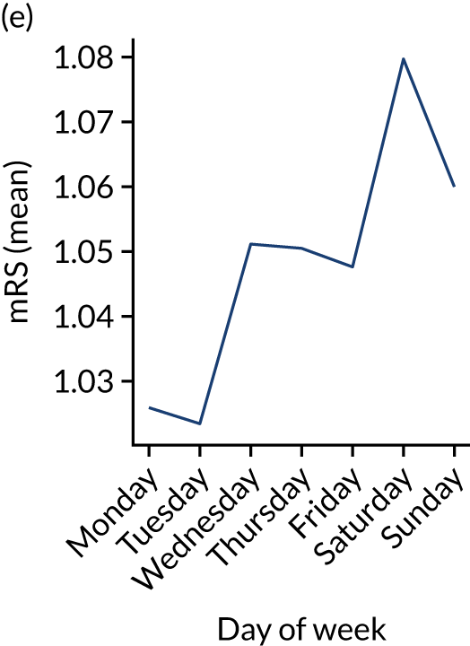
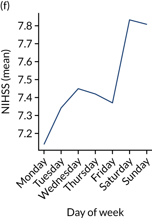
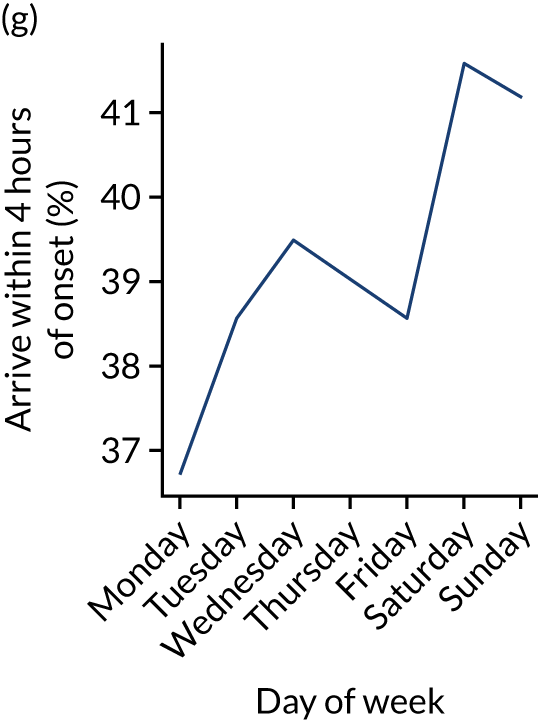
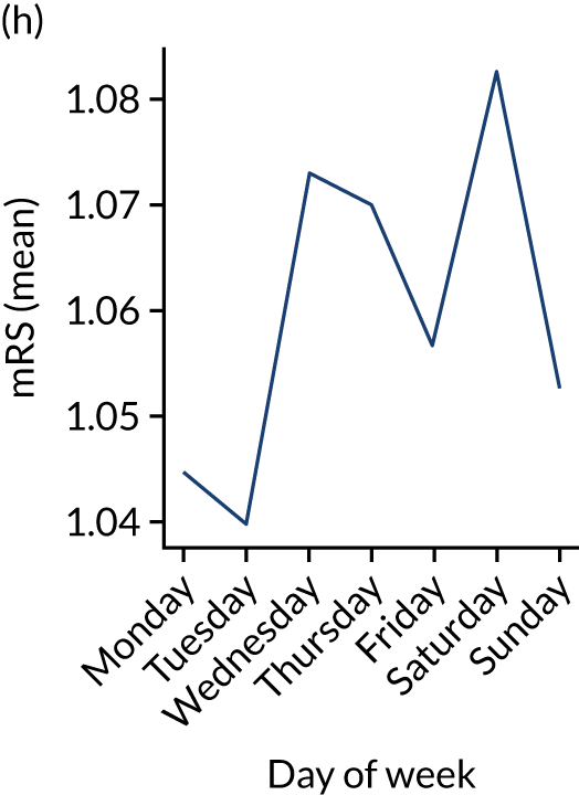
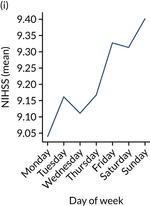
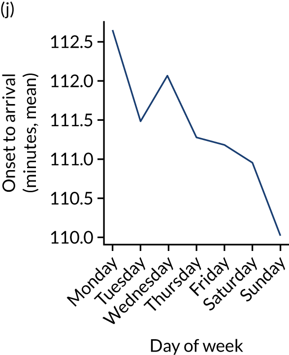
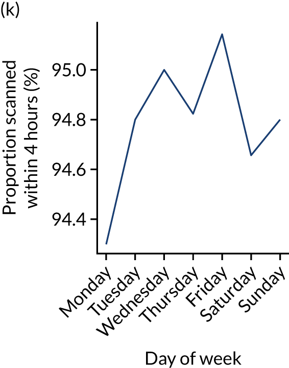
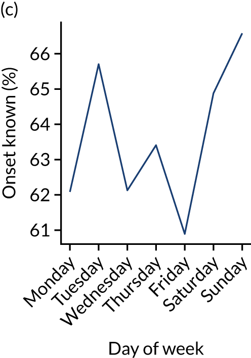
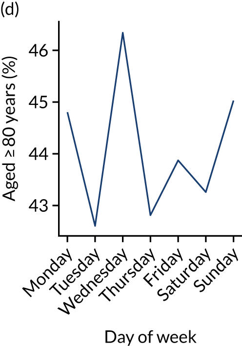
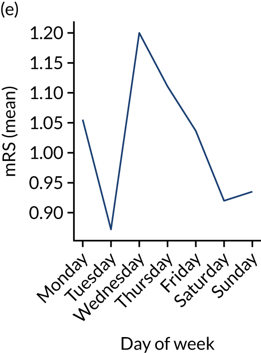
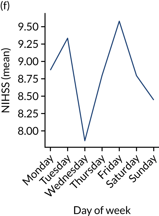
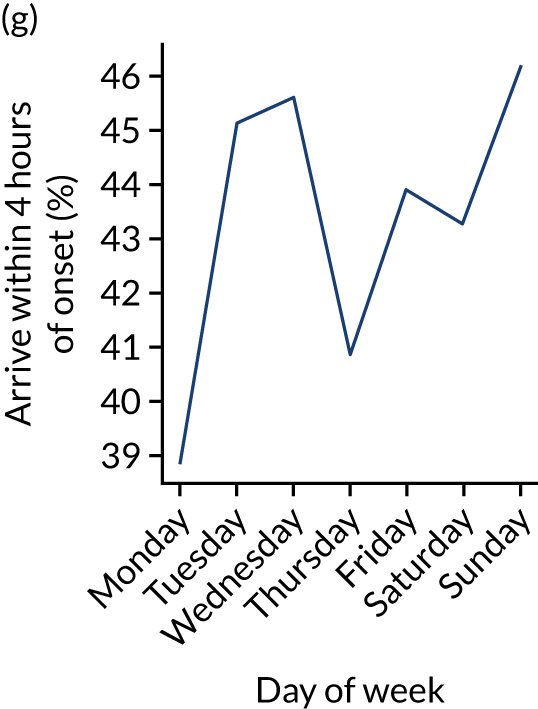
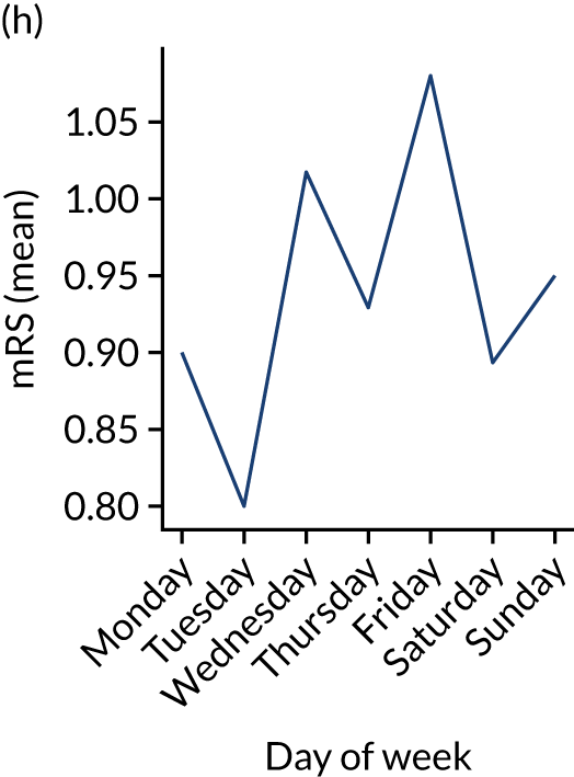
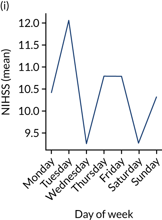
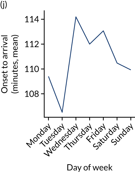
Figure 9 shows changes in key pathway statistics throughout the week, as averaged across all patients. Compared with the time-of-day associations (see Figure 8), the association between day of week and thrombolysis use was more modest. There were slightly fewer admissions at weekends than during the week (i.e. weekend arrivals were about 12% lower than during the week). The proportion of patients arriving within about 4 hours of known stroke onset was a little higher at weekends, and this was associated with a slightly higher thrombolysis use in all arrivals, without any change in thrombolysis use in patients who received a scan within 4 hours of known onset. Arrival-to-scan time was similar at the weekend to on weekdays, but scan-to-needle time tended to be a little (about 5 minutes) longer at weekends.
FIGURE 9.
Changes in key pathway statistics by day of week. Results are mean results across all stroke units. (a) Arrivals: normalised to average; (b) thrombolysis use: all arrivals; (c) proportion of patients with known onset; (d) proportion of patients aged ≥ 80 years; (e) mean pre-stroke mRS: all arrivals; (f) mean NIHSS score: all arrivals; (g) proportion of patients arriving within 4 hours of known onset; (h) mean pre-stroke mRS: arrivals 4 hours from onset; (i) mean NIHSS score: arrivals 4 hours from onset; (j) mean onset-to-arrival time (minutes): arrivals 4 hours from onset; (k) proportion of patients scanned within 4 hours of arrival: arrivals 4 hours from onset; (l) mean arrival-to-scan time (minutes): scanned 4 hours from onset; (m) thrombolysis use: scanned 4 hours from onset; (n) mean scan-to-needle time (minutes); (o) mean arrival-to-needle time (minutes); and (p) mean onset-to-needle time.



At the level of an individual stroke team
Individual hospitals may show similarities and differences in diurnal patterns compared with the national average, and results may be produced at the individual hospital/team level, as shown in Figures 10 and 11.
FIGURE 10.
Changes in key pathway statistics by time of day. Results show a single team (with 672 admissions/year). Time is given as the start of a 3-hour epoch (e.g. ‘3’ is 3 a.m. to 6 a.m.). (a) Arrivals: normalised to average; (b) thrombolysis use: all arrivals; (c) proportion of patients with known onset; (d) proportion of patients aged ≥ 80 years; (e) mean pre-stroke mRS: all arrivals; (f) mean NIHSS score: all arrivals; (g) proportion of patients arriving within 4 hours of known onset; (h) mean pre-stroke mRS: arrivals 4 hours from onset; (i) mean NIHSS score: arrivals 4 hours from onset; (j) mean onset-to-arrival time (minutes): arrivals 4 hours from onset; (k) proportion of patients scanned within 4 hours of arrival: arrivals 4 hours from onset; (l) mean arrival-to-scan time (minutes): scanned 4 hours from onset; (m) thrombolysis use: scanned 4 hours from onset; (n) mean scan-to-needle time (minutes); (o) mean arrival-to-needle time (minutes); and (p) mean onset-to-needle time.

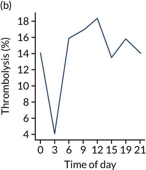
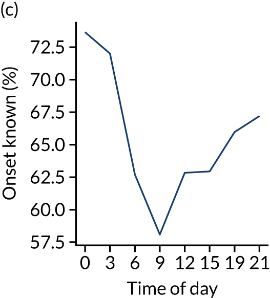
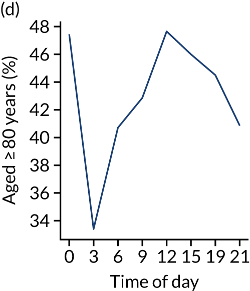
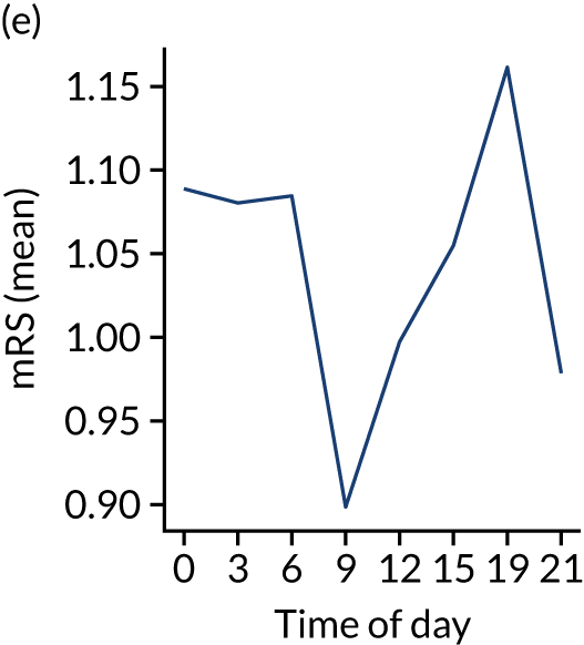
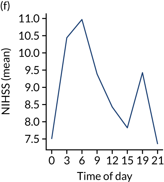
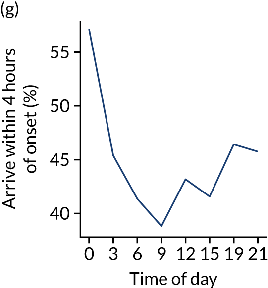
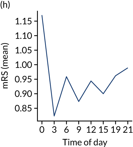
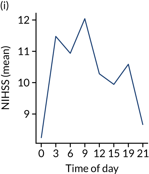
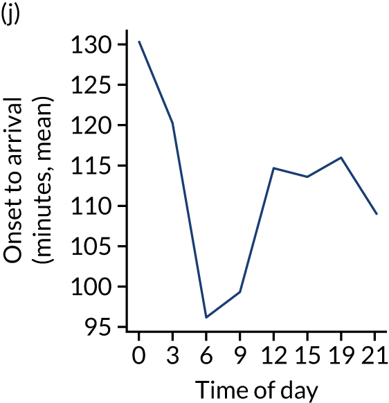
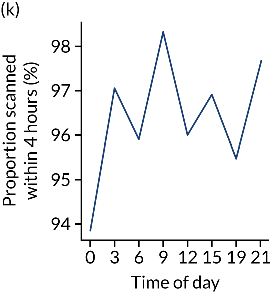
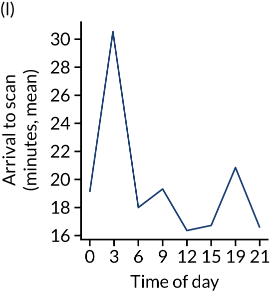
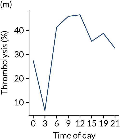
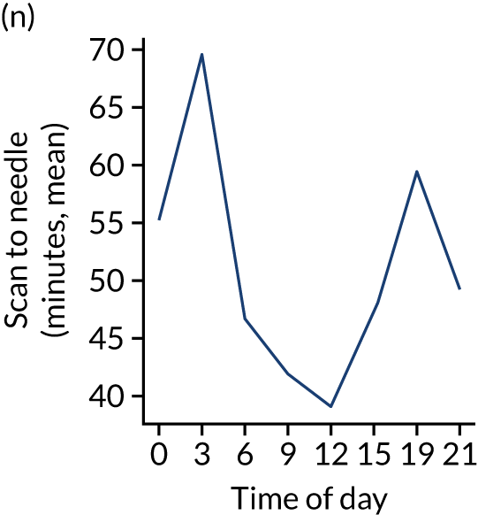
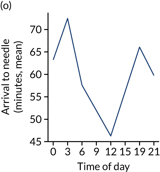
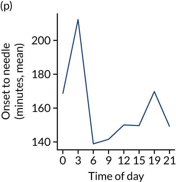
FIGURE 11.
Changes in key pathway statistics by day of week. Results show a single team (with 672 admissions/year). (a) Arrivals: normalised to average; (b) thrombolysis use: all arrivals; (c) proportion of patients with known onset; (d) proportion of patients aged ≥ 80 years; (e) mean pre-stroke mRS: all arrivals; (f) mean NIHSS score: all arrivals; (g) proportion of patients arriving within 4 hours of known onset; (h) mean pre-stroke mRS: arrivals 4 hours from onset; (i) mean NIHSS score: arrivals 4 hours from onset; (j) mean onset-to-arrival time (minutes): arrivals 4 hours from onset; (k) proportion of patients scanned within 4 hours of arrival: arrivals 4 hours from onset; (l) mean arrival-to-scan time (minutes): scanned 4 hours from onset; (m) thrombolysis use: scanned 4 hours from onset; (n) mean scan-to-needle time (minutes); (o) mean arrival-to-needle time (minutes); and (p) mean onset-to-needle time.
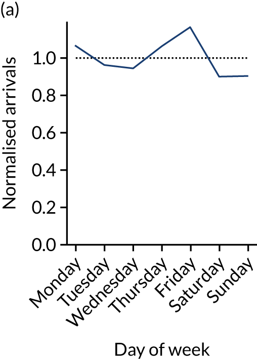
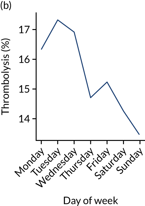


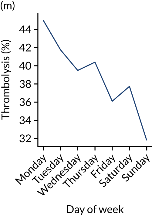
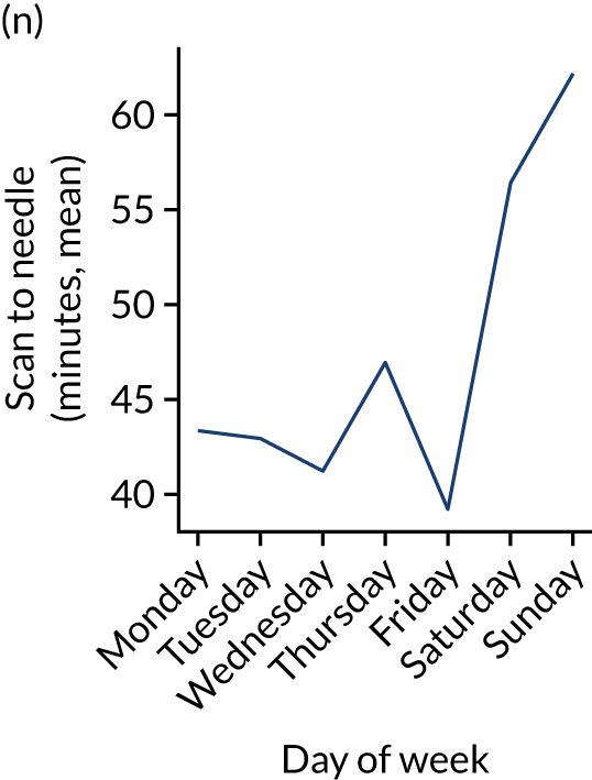
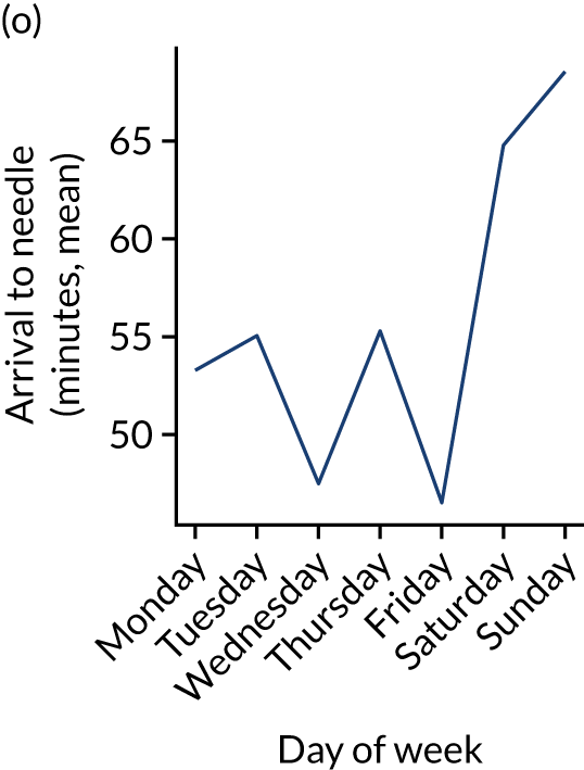

One hospital showed a more marked reduction in night-time (i.e. midnight to 3 a.m.) use of thrombolysis than the national average, and showed a marked reduction in use of thrombolysis at weekends. This reduced use of thrombolysis was associated with a lower use of thrombolysis in patients scanned within 4 hours and significantly slower scan-to-needle times. These observations may suggest that this unit struggled to maintain the post-scan thrombolysis pathway at weekends.
Comparison of average values for patients who receive thrombolysis and patients who do not
Among patients arriving within 4 hours of known stroke onset, those who received thrombolysis had the following characteristics (vs. patients who did not receive thrombolysis):
-
Patients were younger (mean age 73 years vs. 76 years).
-
Patients arrived sooner (mean onset-to-arrival time 97 minutes vs. 117 minutes).
-
Patients had higher stroke severity (mean NIHSS score 11.6 vs. 8.4).
-
Patients were scanned within 4 hours of arrival (100% vs. 93%) and within 4 hours of onset (99% vs. 77%).
-
Patients were more likely to have a precisely determined stroke onset time (97% vs. 87%).
-
Patients arrived by ambulance (94% vs. 91%).
-
Patients did not have atrial fibrillation (AF) (14% vs. 24% having AF).
-
Patients did not have a history of transient ischaemic attack (TIA) (21% vs. 30% having had a TIA).
-
Patients were not on anticoagulant therapy (e.g. of those receiving thrombolysis, 3.7% were on an anticoagulant, whereas of those not receiving thrombolysis, 15.7% were on an anticoagulant).
Distribution of process times
The code and all results for distribution fitting may be found online. 30
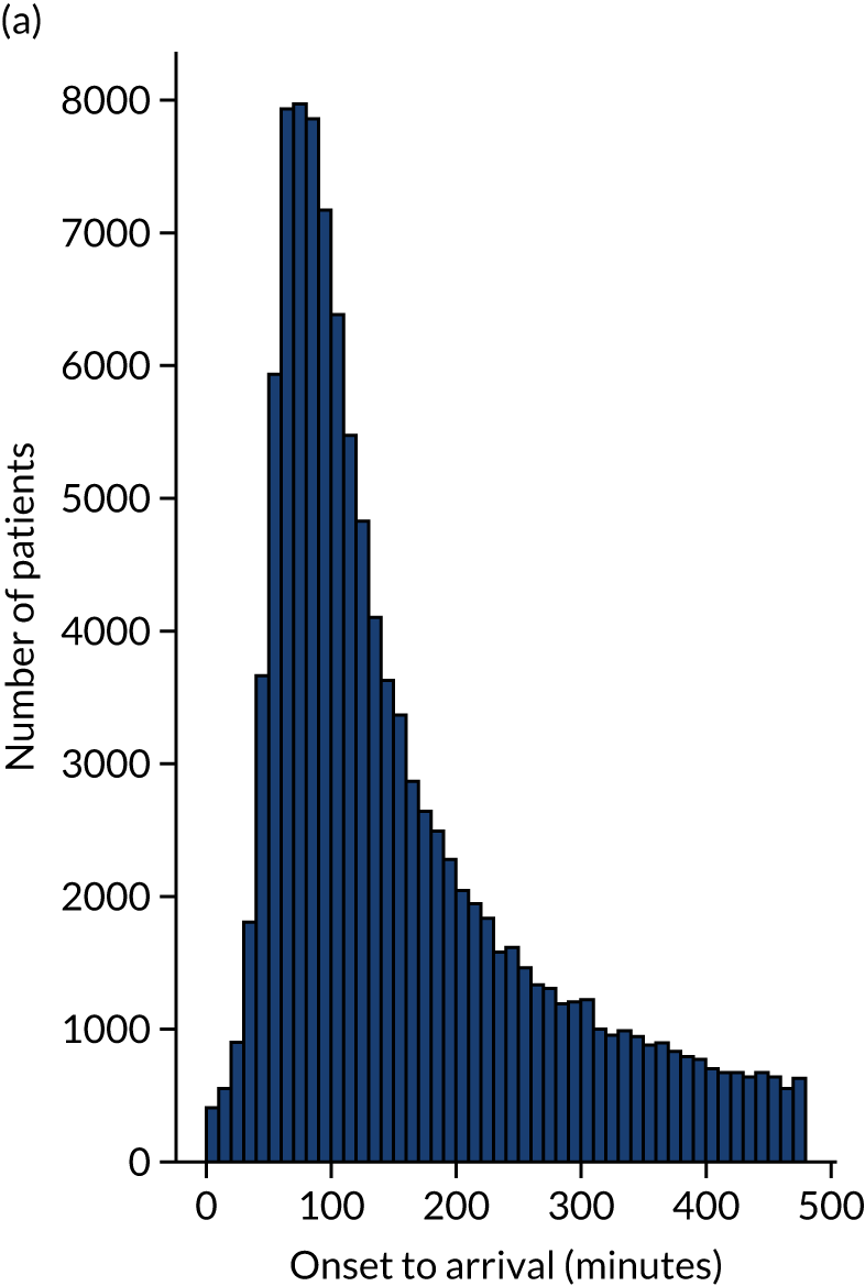
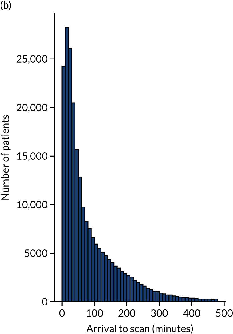
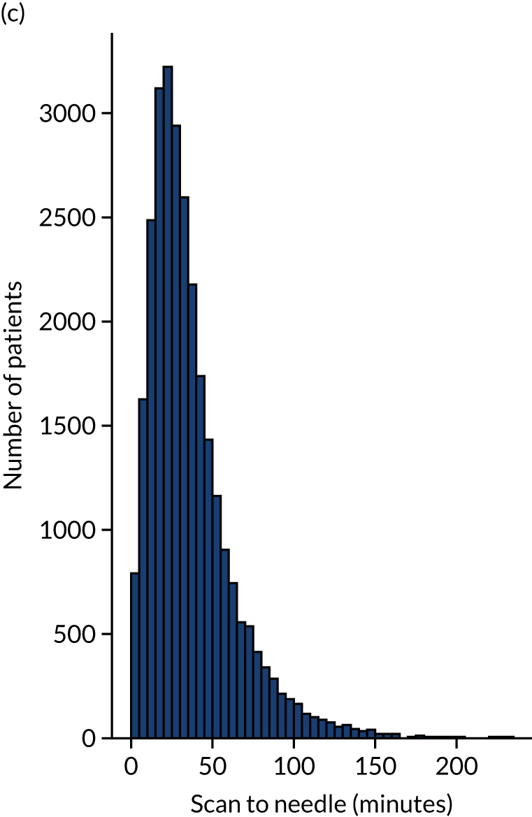
Figure 12 shows the distribution of process times across all hospitals. All timings show a right skew.
FIGURE 12.
Histograms of distribution of timings for (a) onset to arrival; (b) arrival to scan; and (c) scan to needle.
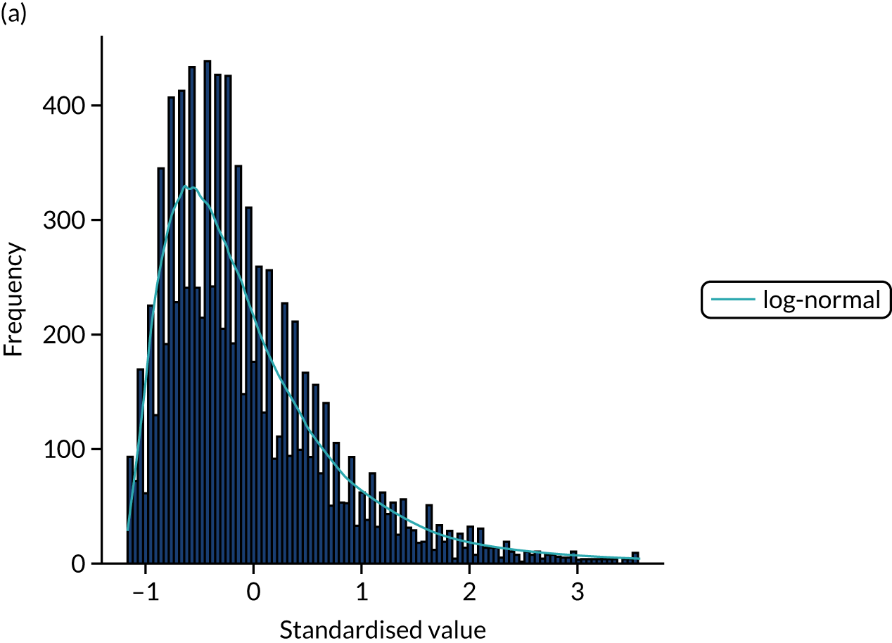
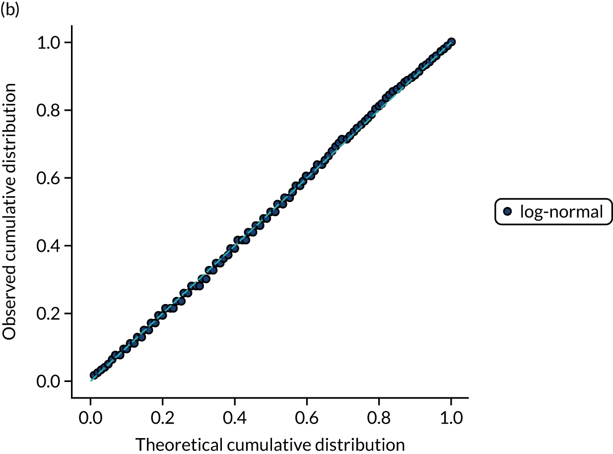
Ten candidate distribution types were fitted to the data. All three process times were best fitted by a log-normal distribution (chosen by lowest chi-squared; distributions were fitted to 10,000 bootstrapped samples for each process time). Figures 13–15 show log-normal distribution fits for the three process times.
FIGURE 13.
Distribution fitting to onset-to-arrival times. (a) Histogram of standardised values and fitted distribution (log-normal); and (b) P–P plot of actual vs. theoretical (fitted) probabilities.
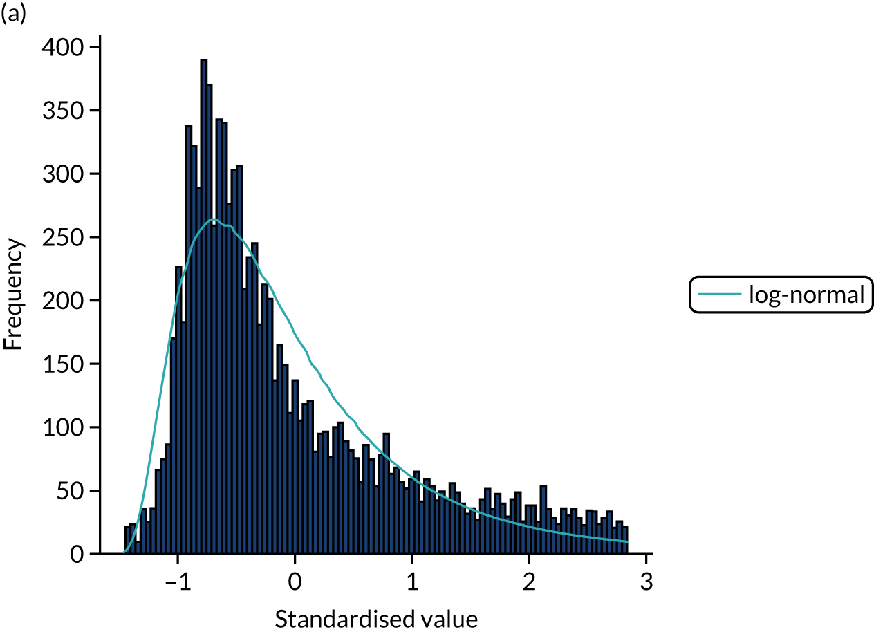
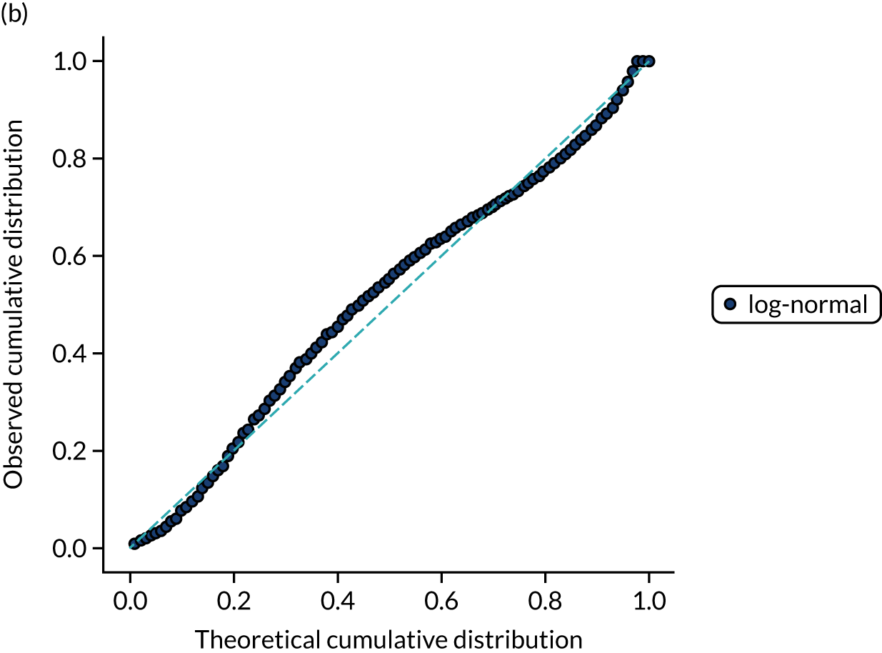
FIGURE 14.
Distribution fitting to arrival-to-scan times. (a) Histogram of standardised values and fitted distribution (log-normal); and (b) P–P plot of actual vs. theoretical (fitted) probabilities.
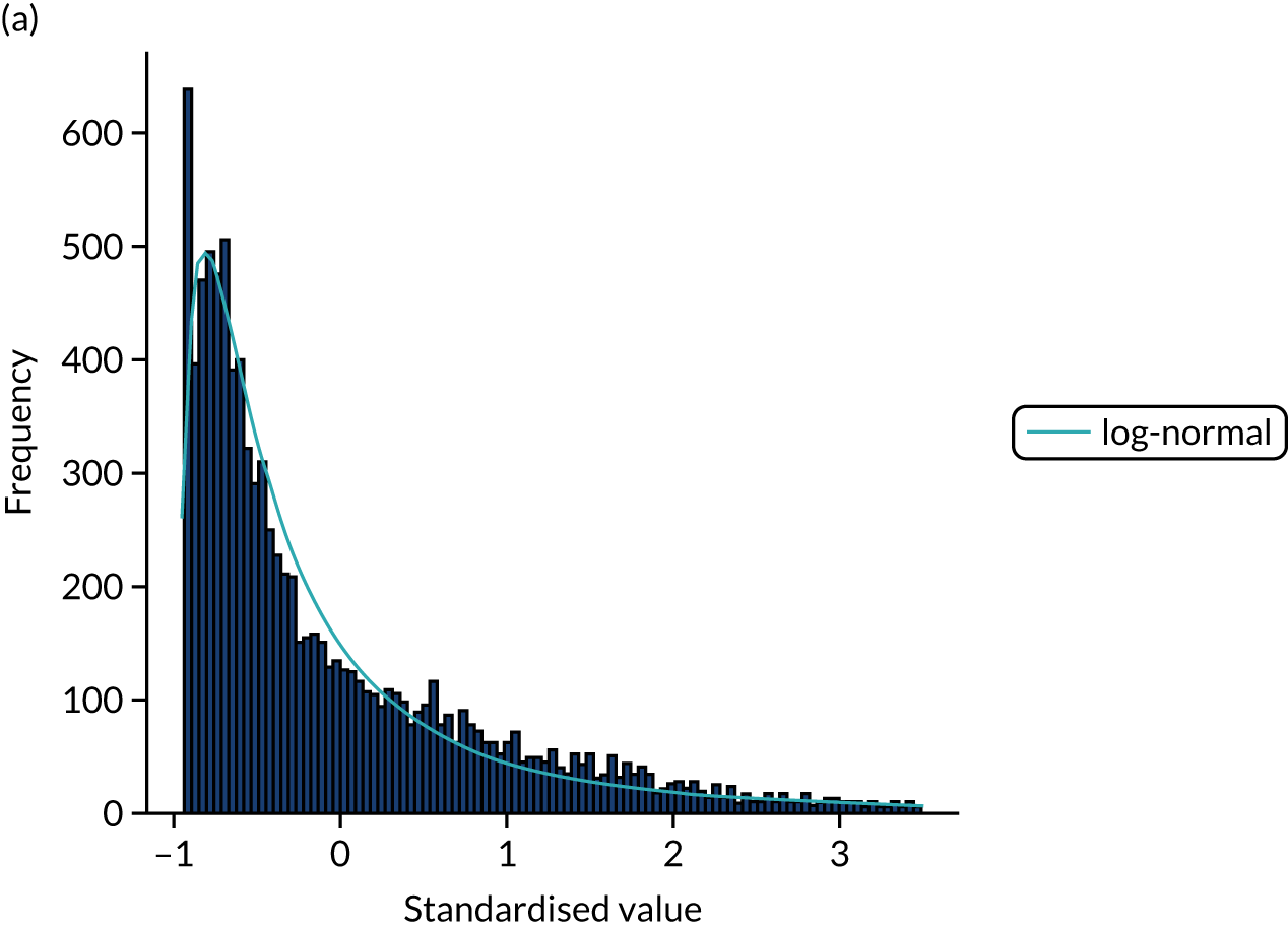
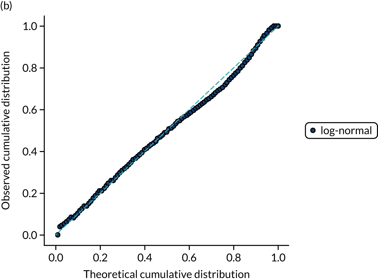
FIGURE 15.
Distribution fitting to scan-to-needle times. (a) Histogram of standardised values and fitted distribution (log-normal); and (b) P–P plot of actual vs. theoretical (fitted) probabilities.
Covariance between features
The code and full results for analysis of covariance are available online. 31
Figure 16 shows the distribution of R2 between feature pairs. Fewer than 4% of the feature pairs had a R2 ≥ 0.1.
FIGURE 16.
Coefficient of determination (R2) between feature pairs.
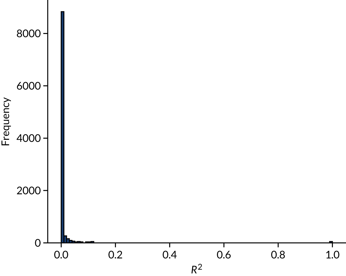
Table 5 shows those feature pairs with a R2 ≥ 0.25. Many of these feature pairs are pairs of data from within the same subset of data, such as stroke type, anticoagulant use or NIHSS score.
| Feature pair | R 2 | |
|---|---|---|
| Feature 1 | Feature 2 | |
| S2StrokeType_Infarction | S2StrokeType_Primary Intracerebral Haemorrhage | 0.988 |
| AFAnticoagulentHeparin_No | AFAnticoagulentVitK_No | 0.917 |
| AFAnticoagulentDOAC_No | AFAnticoagulentHeparin_No | 0.869 |
| AFAnticoagulentDOAC_No | AFAnticoagulentVitK_No | 0.790 |
| MotorLegRight | MotorArmRight | 0.712 |
| MotorArmLeft | MotorLegLeft | 0.693 |
| S2NewAFDiagnosis_No | AFAnticoagulentDOAC_No | 0.618 |
| S2NewAFDiagnosis_No | AFAnticoagulentVitK_No | 0.600 |
| AtrialFibrillation_No | AFAntiplatelet_No | 0.598 |
| AFAntiplatelet_No | AtrialFibrillation_Yes | 0.598 |
| S1Ethnicity_White | S1Ethnicity_Other | 0.579 |
| S2NewAFDiagnosis_No | AFAnticoagulentHeparin_No | 0.573 |
| MoreEqual80y_Yes | S1AgeOnArrival | 0.571 |
| MoreEqual80y_No | S1AgeOnArrival | 0.571 |
| S1OnsetDateType_Precise | S1OnsetDateType_Best estimate | 0.528 |
| AFAnticoagulent_No | AFAnticoagulentDOAC_No | 0.520 |
| S2NewAFDiagnosis_No | AFAnticoagulent_No | 0.503 |
| AFAnticoagulent_No | AFAnticoagulentVitK_No | 0.487 |
| BestLanguage | LocQuestions | 0.487 |
| S2NihssArrival | ExtinctionInattention | 0.462 |
| BestGaze | S2NihssArrival | 0.456 |
| BestLanguage | S2NihssArrival | 0.455 |
| AFAnticoagulentHeparin_No | AFAnticoagulent_No | 0.440 |
| LocCommands | LocQuestions | 0.433 |
| S2NihssArrival | LocCommands | 0.430 |
| AtrialFibrillation_Yes | AFAnticoagulent_Yes | 0.425 |
| AFAnticoagulent_Yes | AtrialFibrillation_No | 0.425 |
| S2NihssArrival | MotorLegRight | 0.422 |
| S1OnsetDateType_Stroke during sleep | S1OnsetDateType_Precise | 0.419 |
| LocQuestions | S2NihssArrival | 0.404 |
| LocCommands | BestLanguage | 0.403 |
| S2NihssArrival | MotorArmRight | 0.386 |
| AFAnticoagulent_Yes | AFAntiplatelet_No | 0.362 |
| Visual | S2NihssArrival | 0.358 |
| Dysarthria | S2NihssArrival | 0.341 |
| BestGaze | ExtinctionInattention | 0.329 |
| Visual | ExtinctionInattention | 0.317 |
| S2NihssArrival | Loc | 0.310 |
| S2NihssArrival | FacialPalsy | 0.308 |
| S2NihssArrival | MotorLegLeft | 0.303 |
| S2NihssArrival | Sensory | 0.303 |
| Visual | BestGaze | 0.296 |
| MotorArmRight | BestLanguage | 0.275 |
| ExtinctionInattention | Sensory | 0.257 |
| MotorLegRight | BestLanguage | 0.255 |
Chapter 5 Machine learning (modelling clinical decision-making)
General machine learning methodology
Machine learning models were used to predict whether or not a patient would receive thrombolysis, based on a range of patient-related features in SSNAP, including which hospital the patient attended. Machine learning models were restricted to patients arriving at hospital within 4 hours of known stroke onset and to 132 stroke teams that had received at least 300 admissions and provided thrombolysis to at least 10 patients over the course of 3 years (2016–18).
As we restrict machine learning to those patients who arrive within 4 hours of known stroke onset, the mean use of thrombolysis is 29.5% (compared with 11.8% of all arrivals receiving thrombolysis).
This is a supervised learning problem where we train a model using a training set of data that has all the features (i.e. variables) for the patient with a corresponding label of whether or not a patient received thrombolysis. The model is then tested on data that have not been used in training (see Stratified k-fold validation). We test three different types of machine learning: (1) logistic regression, (2) random forest and (3) neural networks (with alternative architectures).
Handling hospital identification
We use three different ways of handling hospital identification (ID) in our models.
One-hot encoding
A single model is built, which predicts use of thrombolysis in all hospitals. Hospital ID is encoded in a vector whose length is equal to the number of hospitals. All values are set to zero, except one value is set to 1 (i.e. one-hot) using the hospital ID as the index. For example, if there were five hospitals, then the one-hot encoding of hospital 2 would be (0, 1, 0, 0, 0). This one-hot vector is then joined to the rest of the input data. In our models, the one-hot vector has 132 values, one of which has the value 1, with all others having the value 0.
Hospital-specific model
A model is built for each hospital. No encoding of hospital is needed.
Embedding layer (neural networks only)
The hospital ID is first one-hot vector encoded. The one-hot vector is used as the input into an embedding layer, which reduces the one-hot vector to a reduced size [in this project, we reduce the one-hot vector to either a one-dimensional (1D) or a two-dimensional (2D) vector]. The embedding value is optimised during neural network training so that similar hospitals (from the perspective of decision-making) have embedding values that are similar.
Stratified k-fold validation
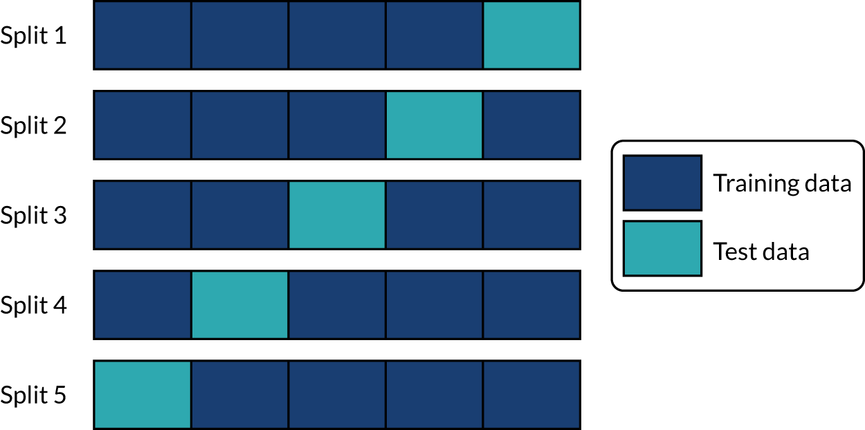
When assessing accuracy of the machine learning models, stratified k-fold splits were used. We used fivefold splits where each data point is in one, and only one, of five test sets (the same point is in the training set for the four other splits). This is represented schematically in Figure 17. Data are stratified such that the test set is representative of hospital mix in the whole data population, and within the hospital-level data the use of thrombolysis is representative of the whole data for that hospital.
FIGURE 17.
Schematic representation of k-fold splits with five splits.
Logistic regression
What is in this section?
This section describes experiments predicting, using logistic regression, whether or not a patient will receive thrombolysis in a given hospital.
This section contains the following analyses:
-
Fitting to all stroke teams together, that is, a logistic regression classifier that is fitted to all data together, with each stroke team being a one-hot encoded feature. The models were analysed for (1) various accuracy scores, (2) a receiver operating characteristic (ROC) area under curve (AUC), (3) a sensitivity–specificity curve, (4) feature weights, (5) learning rate and (6) model calibration.
-
Fitting hospital-specific models, that is, a logistic regression classifier that has a fitted model for each hospital. The models were analysed for (1) various accuracy scores, (2) a ROC AUC, (3) a sensitivity–specificity curve and (4) model calibration.
Detailed code and results can be found online. 32
Key findings in this section
Using a single model fitted to all hospitals, we found the following:
-
The overall accuracy was 83.2%.
-
The model can achieve 82.0% sensitivity and specificity simultaneously.
-
The mean ROC AUC was 0.904.
Using models fitted to each hospital, we found the following:
-
The overall accuracy was 82.6%.
-
The model can achieve 78.9% sensitivity and specificity simultaneously.
-
The ROC AUC was 0.870.
Introduction to logistic regression methodology
Logistic regression is a probabilistic model, meaning that it assigns a class probability to each data point. Probabilities are calculated using a logistic function:
Here, x is a linear combination of the variables of each data point, that is, a + bx1 + cx2 + ., where x1 is the value of one variable, x2 the value of another, etc. The function f maps x to a value between 0 and 1, which may be viewed as a class probability. If the class probability is greater than the decision threshold, then the data point is classified as belonging to class 1 (i.e. receives thrombolysis). For probabilities less than the threshold, it is placed in class 0 (i.e. does not receive thrombolysis).
During training, the logistic regression uses the examples in the training data to find the values of the coefficients in x (a, b, c, . . .) that lead to the highest possible accuracy in the training data. The values of these parameters determine the importance of each variable for the classification and, therefore, the decision-making process. A variable with a larger coefficient (positive or negative) is more important when predicting whether or not a patient will receive thrombolysis.
The logistic regression classifier used was from scikit-learn [URL: https://samuel-book.github.io/samuel-1/introduction/software.html (accessed 23 May 2022)]. Default settings were used.
Logistic regression model fitted as a single model
Logistic regression models were fitted to standardised data. These results are for a model that is fitted to all hospitals simultaneously, with hospital encoded as a ‘one-hot’ feature (i.e. all hospitals are present as separate features in the model and the hospital attended has a feature value of 1, whereas all other hospitals have a feature value of 0).
Accuracy
The logistic regression model had an overall accuracy of 83.2%. With a default classification threshold, sensitivity (71.7%) is lower than specificity (88.1%), which is likely due to the imbalance of class weights in the data set. Full accuracy measures are given in Table 6.
| Accuracy measure | Mean (95% CI)a |
|---|---|
| Actual positive rate | 0.295 (0.000) |
| Predicted positive rate | 0.295 (0.000) |
| Accuracy | 0.833 (0.001) |
| Precision | 0.717 (0.002) |
| Recall/sensitivity | 0.717 (0.002) |
| F1 score | 0.717 (0.002) |
| Specificity | 0.881 (0.001) |
Receiver operating characteristic and sensitivity–specificity curves
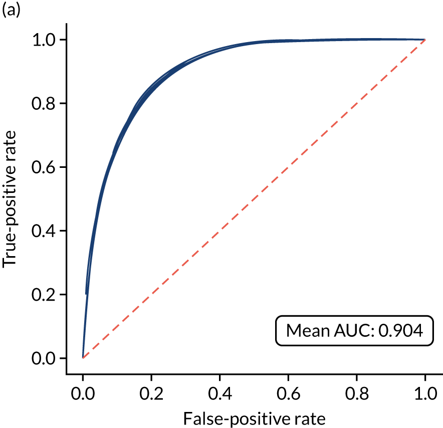
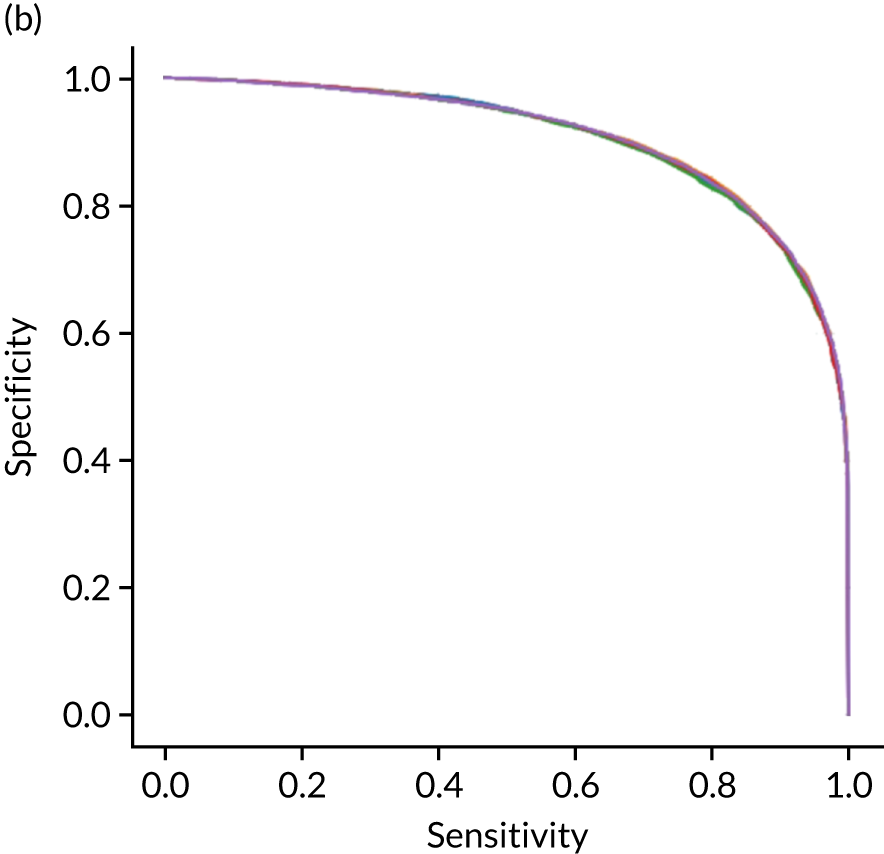
Figure 18 shows ROC and sensitivity–specificity curves for the single-fit logistic regression model. Analyses were performed using fivefold validation. The mean ROC AUC was 0.904. By using a different classification threshold to the default, the model can achieve 82.0% sensitivity and specificity simultaneously.
FIGURE 18.
(a) ROC curve; and (b) sensitivity–specificity curve for a logistic regression model with hospital as a feature (one-hot encoded). Curves show separate fivefold validation results; however, multiple lines are not easily visible as they overlap each other.
Feature weights
Figure 19 shows the top 25 feature weights (i.e. model coefficients using standardised feature values). The probability of receiving thrombolysis is dominated by arrival-to-scan time (a shorter duration increases the probability of receiving thrombolysis) and stroke type (an infarction increases the probability of receiving thrombolysis), and this is followed by disability before stroke (with higher disability scores meaning that a patient is less likely to receive thrombolysis), receiving anticoagulants (reduces probability of receiving thrombolysis), level of consciousness (lower consciousness leads to lower probability of receiving thrombolysis) and best language (poorer language leads to lower probability of receiving thrombolysis). It should be noted that this logistic regression model does not allow for complex interactions (e.g. bell-shaped or U-shaped curves) between feature values and probability of receiving thrombolysis (see Figure 3 as an example, which shows that thrombolysis use is low when stroke severity is either low or high, with thrombolysis use having a high plateau with intermediate stroke severity scores).
FIGURE 19.
Feature weights (coefficients) for a logistic regression model with hospital as a feature (one-hot encoded). Results show mean values from fivefold validation.

Learning curve
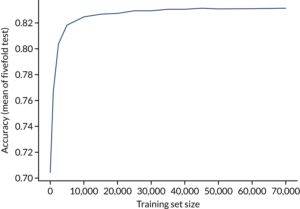
A learning curve shows the relationship between size of training data and accuracy of model. Learning curves that show a clear plateau are indicative of models where accessing more data would not improve model accuracy. For the single-fit logistic regression model, accuracy appears to have reached a plateau with a training set size of 50,000 individuals (Figure 20), suggesting that the accuracy of this model is not limited by the number of training data available.
FIGURE 20.
Learning curve (relationship between training set size and model accuracy) for a logistic regression model with hospital as a feature (one-hot encoded). Results show mean values from 5-fold validation.
Calibration and assessment of accuracy when model has high confidence
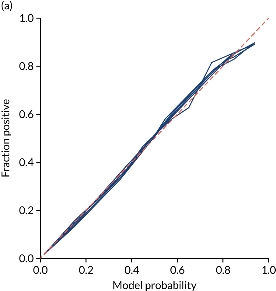
Ideally, machine learning model probability output should be well calibrated with actual incidence of receiving thrombolysis. For example, 9 out of 10 patients with a model prediction of 90% probability of receiving thrombolysis should receive thrombolysis. Calibration may be tested by separating output into probability bins and comparing mean probability and the proportion of patients receiving thrombolysis.
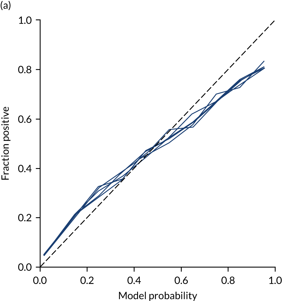
This is shown for the single-fit logistic regression model in Figure 21a. A well-calibrated model has a good match between the mean probability (x-axis) and the fraction of those patients with a positive output category (y-axis). We can see that the single-fit logistic regression model is well calibrated (see Figure 21b).
FIGURE 21.
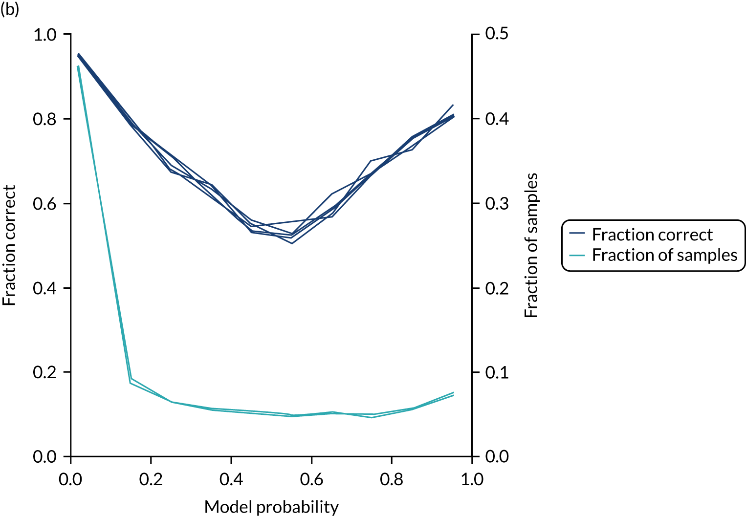
(a) Model probability calibration; and (b) model accuracy vs. confidence for a logistic regression model with hospital as a feature (one-hot encoded). Results show separate fivefold validation results.
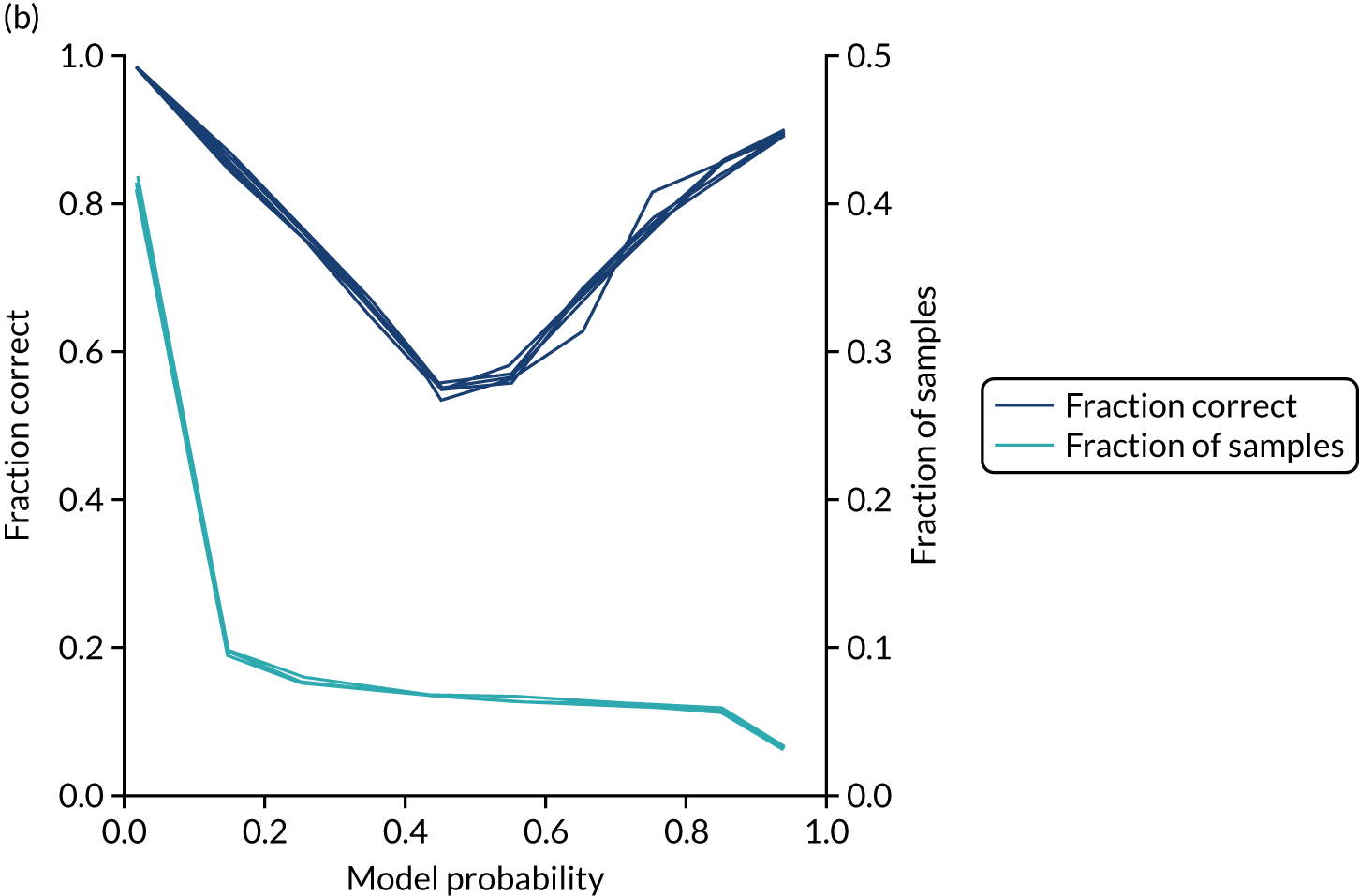
In addition, the proportion that is correct may be tested against predicted probability, that is, if a model is well calibrated, then the proportion that is correct should align with the probability of classification of the ‘most likely’ predicted class (e.g. for those individuals given a 10% probability of receiving thrombolysis, 90% should be correct in a well-calibrated model). This is shown for the single-fit logistic regression model in Figure 21b. The light blue line is a distribution function that shows the spread of instances that have a model probability output. The dark blue line shows the fraction of instances that are correctly predicted across the different model probability values. This is shown as a V-shaped relationship, which means, as we would expect, getting correct classifications at the two extremes of the probabilities (< 0.2 and > 0.8) and fewer correct classifications when the model is less certain (0.4–0.6).
Although the overall accuracy of the model is 83.2%, the accuracy of those 60% samples with at least 80% confidence in prediction is 89.6% (calculated separately).
Logistic regression models fitted to individual hospital stroke teams
As an alternative to using hospital stroke team as a feature in the model, models may be fitted to each hospital separately. When we fitted models, we standardised data for each hospital individually and calibrated each model so that a threshold was used that gave the same thrombolysis use rate as observed for that hospital.
Fitting models to individual hospitals has the advantage that each model may learn the hospital-specific relationship between features and probability of thrombolysis, but the disadvantage that each model has a much smaller number of data to fit to than a single-fit model.
Accuracy
Accuracy of the model (Table 7) was lower than in the single-fit model (overall accuracy 82.6% vs. 83.3%, and ROC-AUC 0.870 vs. 0.904 compared with a single-fit model).
| Accuracy measure | Mean (95% CI)a |
|---|---|
| Actual positive rate | 0.295 (0.000) |
| Predicted positive rate | 0.296 (0.000) |
| Accuracy | 0.801 (0.002) |
| Precision | 0.671 (0.003) |
| Recall/sensitivity | 0.672 (0.003) |
| F1 score | 0.672 (0.003) |
| Specificity | 0.862 (0.003) |
Receiver operating characteristic and sensitivity–specificity curves
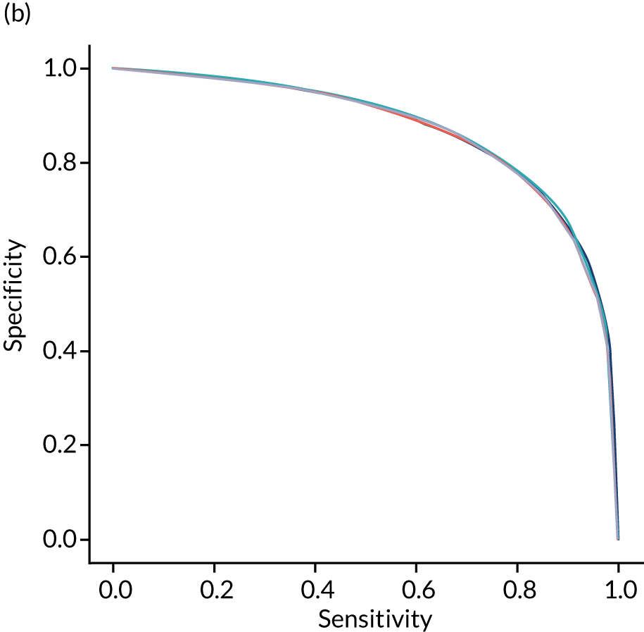
Figure 22 shows ROC and sensitivity–specificity curves for logistic regression models fitted to individual hospitals. The mean ROC AUC was significantly lower than a single-fit model (0.870 vs. 0.904) and sensitivity–specificity trade-off was poorer, with the model achieving 78.9% sensitivity and specificity simultaneously (compared with 82.0% for the single-fit model).
FIGURE 22.
(a) ROC curve; and (b) sensitivity–specificity curve for logistic regression models fitted to individual hospitals. Curves show separate fivefold validation results; however, multiple lines are not easily visible as they overlap each other.

Feature weights
As models are fitted to each hospital individually, we do not report overall feature weights.
Learning curve
As different hospitals had different numbers of data available for fitting, a learning curve was not constructed.
Calibration and assessment of accuracy when model has high confidence
Logistic regression models fitted to individual hospitals were not as well calibrated as the single-fit mode (Figure 23). For example, among individuals with a predicted probability of receiving thrombolysis of 80–90%, the mean probability of receiving thrombolysis was 85.1%, but only 74.6% actually received thrombolysis.
FIGURE 23.
(a) Model probability calibration; and (b) model accuracy vs. confidence for logistic regression models fitted to individual hospitals. Results show separate fivefold validation results.
Machine learning: random forest
What is in this section?
This section describes experiments predicting, using random forest, whether or not a patient will receive thrombolysis in a given hospital.
This section contains the following analyses: a random forest classifier fitting to all stroke teams together; a random forest classifier fitting to hospital-specific models; a comparison of the level of agreement in clinical decision-making between hospitals; a comparison of thrombolysis rates of benchmark hospitals with actual thrombolysis rates; a comparison of similarity in decision-making between hospitals; a comparison of hospital decision-making with the benchmark hospital set, identifying individual patients of interest; and an analysis to find similar patients who are treated differently within the same hospital. Details of these analyses are provided below.
A random forest classifier fitting to all stroke teams together
This analysis involved a random forest classifier that is fitted to all data together, with each stroke team being a one-hot encoded feature. The models were analysed for (1) various accuracy scores, (2) a ROC AUC, (3) a sensitivity–specificity curve, (4) feature importance, (5) learning rate and (6) model calibration.
A random forest classifier fitting hospital-specific models
This analysis involved a random forest classifier that has a fitted model for each hospital. The models were analysed for (1) various accuracy scores, (2) a ROC AUC, (3) a sensitivity–specificity curve and (4) model calibration.
A comparison of the level of agreement in clinical decision-making between hospitals using random forest models
This analysis passed all patients through all hospital decision models and investigated if there was a level of agreement between hospitals.
Benchmark hospitals
In this analysis, we identified the 30 hospitals with highest thrombolysis use, using the same 10,000 reference set of patients at all hospitals (note the 10,000 reference set of patients is a random sample of patients arriving within 4 hours of known stroke onset). For all hospitals and all patients, we predicted the decisions made by those 30 benchmark hospitals and took a majority decision to determine whether or not each hospital’s patients would be given thrombolysis. We then compared these benchmark thrombolysis rates with actual thrombolysis rates.
Grouping hospitals by similarities in decision-making
In this analysis, we compared the extent of similarity in decision-making between hospitals, and identified groups of hospitals making similar decisions.
Thrombolysis hospitals versus benchmark diagrams and patient vignettes
In this analysis, we Iooked at the differences in decision-making between hospitals and the benchmark set and asked how much overlap there is and how much difference. We created synthetic patient vignettes (based on SSNAP data) to illustrate examples of differences in decision-making (e.g. hospitals with lower-than-usual use of thrombolysis in either patients with milder strokes or patients with prior disability).
Similar patients who are treated differently within the same hospital
In this analysis, within a hospital, we identified patients who did not receive thrombolysis, when the model had high confidence that they would have, and then looked for the most similar patients who did actually receive thrombolysis.
Detailed code and results are available online. 33
Key findings in this section
Using a single model fitted to all hospitals, we found the following:
-
The overall accuracy was 84.6%.
-
The model can achieve 83.7% sensitivity and specificity simultaneously.
-
The ROC AUC was 0.914.
Using models fitted to each hospital, we found the following:
-
The overall accuracy was 84.3%.
-
The model can achieve 83.2% sensitivity and specificity simultaneously.
-
The ROC AUC was 0.906.
When comparing predicted decisions between hospitals, we found the following:
-
It is easier to find majority agreement on who not to thrombolyse than who to thrombolyse. A total of 77.5% of all patients had a treatment decision that was agreed by 80% of hospitals. Of patients who were not given thrombolysis, 84.6% had agreement from 80% of hospitals. Of patients who were given thrombolysis, 60.4% had agreement from 80% of hospitals.
-
A benchmark set of hospitals was created by passing the same 10,000 patient cohort set through all hospitals and selecting the 30 hospitals with the highest thrombolysis use. If all thrombolysis decisions were made by a majority vote of these 30 hospitals, then thrombolysis use (in those arriving within 4 hours of known stroke onset) would be expected to increase from 29.5% to 36.9%.
-
Decisions at each hospital may be compared to the benchmark majority vote decision.
-
These models may be used to identify the following types of patients:
-
Patients for whom the hospital model has high confidence in prediction but who, in reality, were treated the other way (e.g. a patient who appears to have high suitability for thrombolysis, but did not receive it or, conversely, a patient who appears to not be suitable for thrombolysis, but received it).
-
Patients who were treated in accordance with the prediction of the hospital model but whom the majority of the benchmark hospitals would have treated differently.
-
-
Patient vignettes may be constructed to illustrate particular types of patients, for example a patient in a hospital that has low treatment rates of patients with previous disability. These vignettes are potentially useful for clinical discussions.
-
When hospitals are making decisions for a set of common patients, hospitals may be grouped according to the proportion of patients who would be expected to have the same thrombolysis decision. This grouping is made clearer by using a subset of patients with higher divergence of decisions (i.e. those patients who 30–70% of hospitals would thrombolyse).
-
For patients not treated as expected in real life, we can use the structure of the random forest model to find similar patients who were treated as expected.
Introduction to random forest methodology
A random forest is an example of an ensemble algorithm, and the outcome (i.e. whether or not a patient receives thrombolysis) is decided by a majority vote of other algorithms. In the case of a random forest, these ‘other algorithms’ are decision trees (each of which is trained on a random subset of examples and a random subset of features). A random forest is an ensemble of decision trees. Each tree is considered a weak learner, but the collection of trees together forms a robust classifier that is less prone to overfitting than a single full decision tree.
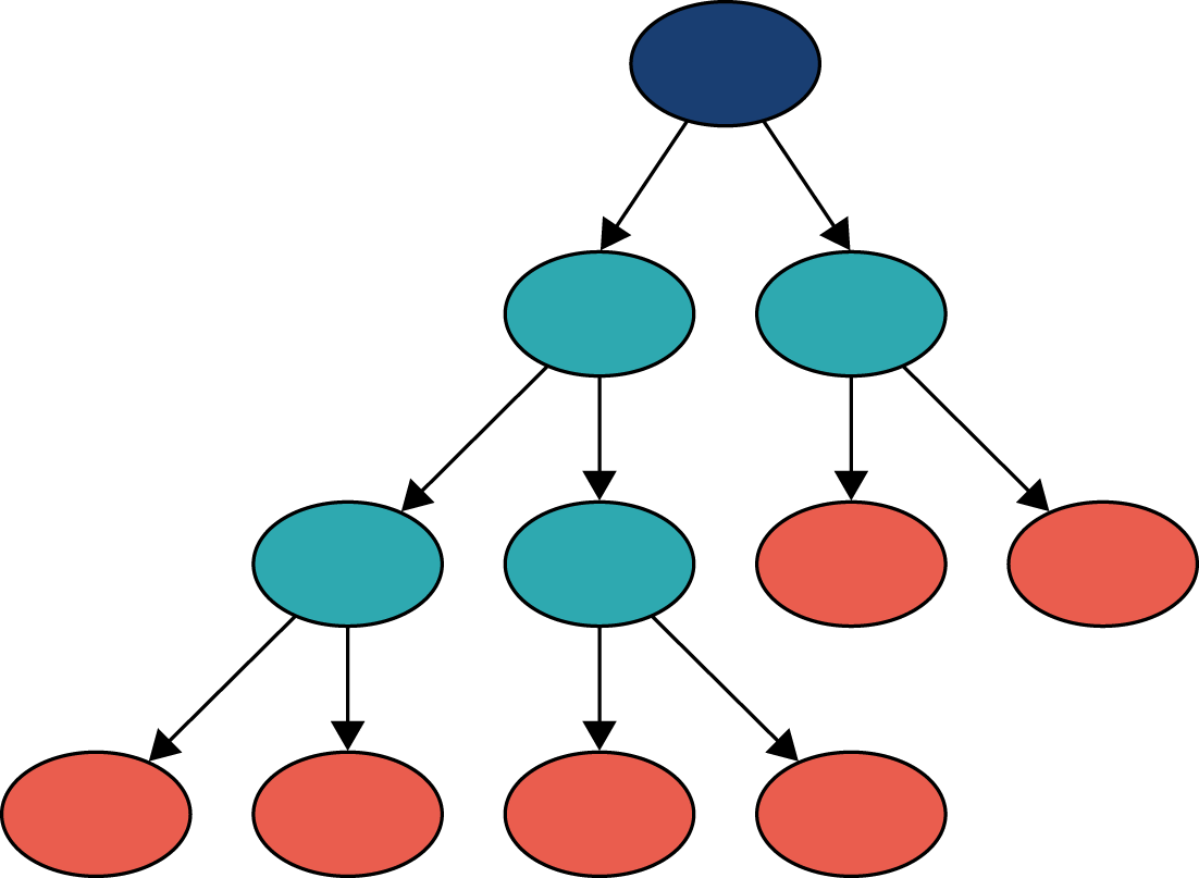
We can think of a decision tree as similar to a flow chart. In Figure 24, we can see that a decision tree comprises a set of nodes and branches. The node at the top of the tree is called the root node, and the nodes at the bottom are leaf nodes. Every node in the tree, except for the leaf nodes, splits into two branches leading to two nodes that are further down the tree. A path through the decision tree always starts at the root node. Each step in the path involves moving along a branch to a node lower down the tree. The path ends at a leaf node where there are no further branches to move along. Leaf nodes will each have a particular classification (e.g. patient receives thrombolysis or does not receive thrombolysis).
FIGURE 24.
Schematic of a decision tree showing root node (dark blue), splitting nodes (light blue) and terminal leaf nodes (orange). A random forest takes the majority vote from a multitude of decision trees.
The path taken through a tree is determined by the rules associated with each node. The decision tree learns these rules during the training process. The goal of the training process is to find rules for each node, such that a leaf node contains samples from one class only. The leaf node a patient ends up in determines the predicted outcome of the decision tree.
Specifically, given some training data (i.e. variables and outcomes), the decision tree algorithm will find the variable that is most discriminative (i.e. provides the best separation of data based on the outcome). This variable will be used for the root node. The rule for the root node consists of this variable and a threshold value. For any data point, if the value of the variable is less than or equal to the threshold value at the root node, then the data point will take the left branch, and if it is greater than the threshold value, then it will take the right branch. The process of finding the most discriminative feature and a threshold value is repeated to determine the rules of the internal nodes lower down the tree. Once all data points in a node have the same outcome, then that node is a leaf node, representing the end of a path through a tree. The training process is complete once all paths through the tree end in a leaf node.
A random forest is an ensemble of decision trees. During training, the algorithm will select, with replacement, a random sample of the training data and, using a subset of the features, will train a decision tree. This process is repeated many times, with the exact number being a parameter of the algorithm corresponding to the number of decision trees in the random forest.
The resulting random forest is a classifier that can be used to determine whether a data point belongs to class 0 (i.e. patient does not receive thrombolysis) or to class 1 (i.e. patient receives thrombolysis). The path of the data point through every decision tree ends in a leaf node. If there are 100 decision trees in the random forest, and the data point’s path ends in a leaf node with class 0 in 30 of the decision trees and a leaf node of class 1 in 70, then the random forest takes the majority outcome and classifies the data point as belonging to class 1 (i.e. patient receives thrombolysis) with a probability of 0.7 [number of trees voting class 1/total number of trees (70/100)].
The random forest classifier used was from scikit-learn. Default settings were used, apart from balanced class weighting, where weights for samples are inversely proportional to the frequency of the class label.
Random forest model fitted as a single model
These results are for a model that is fitted to all hospitals simultaneously, with hospital encoded as a ‘one-hot’ feature. The random forest model is fitted to raw (non-standardised) data.
Accuracy
The random forest model had an overall accuracy of 84.6%. With a default classification threshold, sensitivity (74.2%) is lower than specificity (88.9%), which is likely to be due to the imbalance of class weights in the data set. Full accuracy measures are given in Table 8.
| Accuracy measure | Mean (95% CI)a |
|---|---|
| Observed positive rate | 0.295 (0.000) |
| Predicted positive rate | 0.297 (0.001) |
| Accuracy | 0.846 (0.002) |
| Precision | 0.738 (0.003) |
| Recall/sensitivity | 0.742 (0.002) |
| F1 score | 0.740 (0.002) |
| Specificity | 0.889 (0.002) |
Receiver operating characteristic and sensitivity–specificity curves
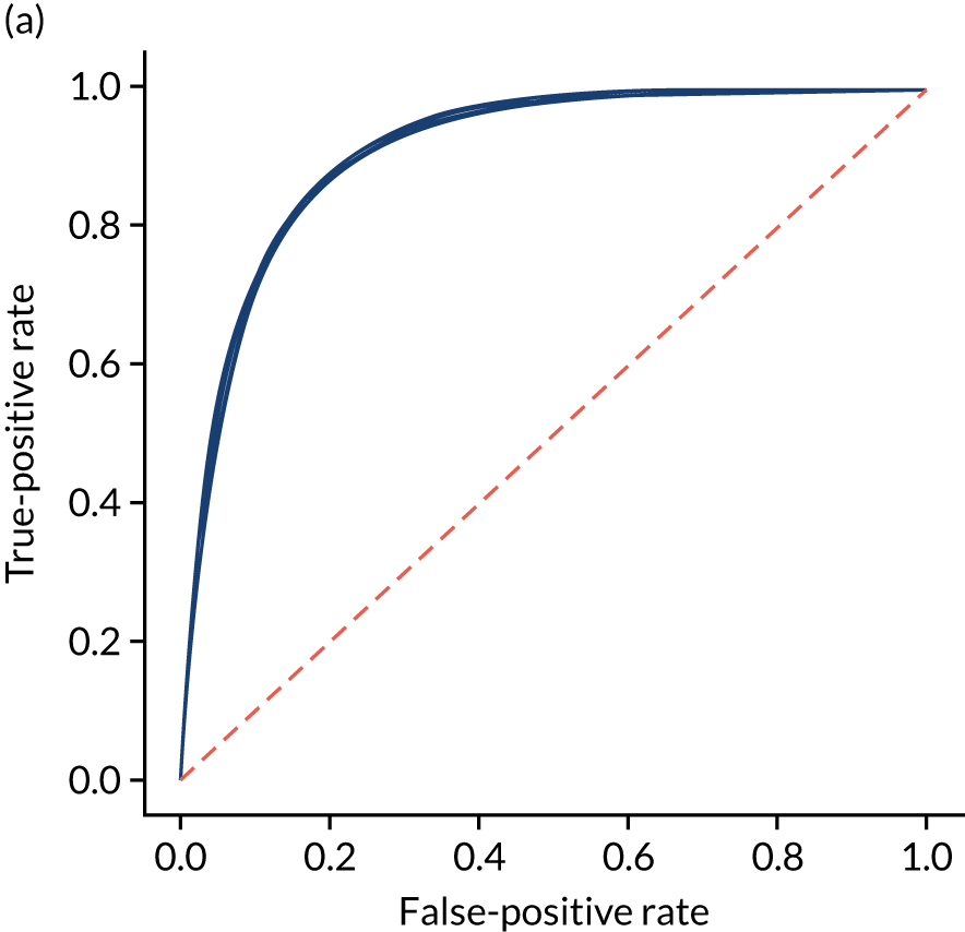
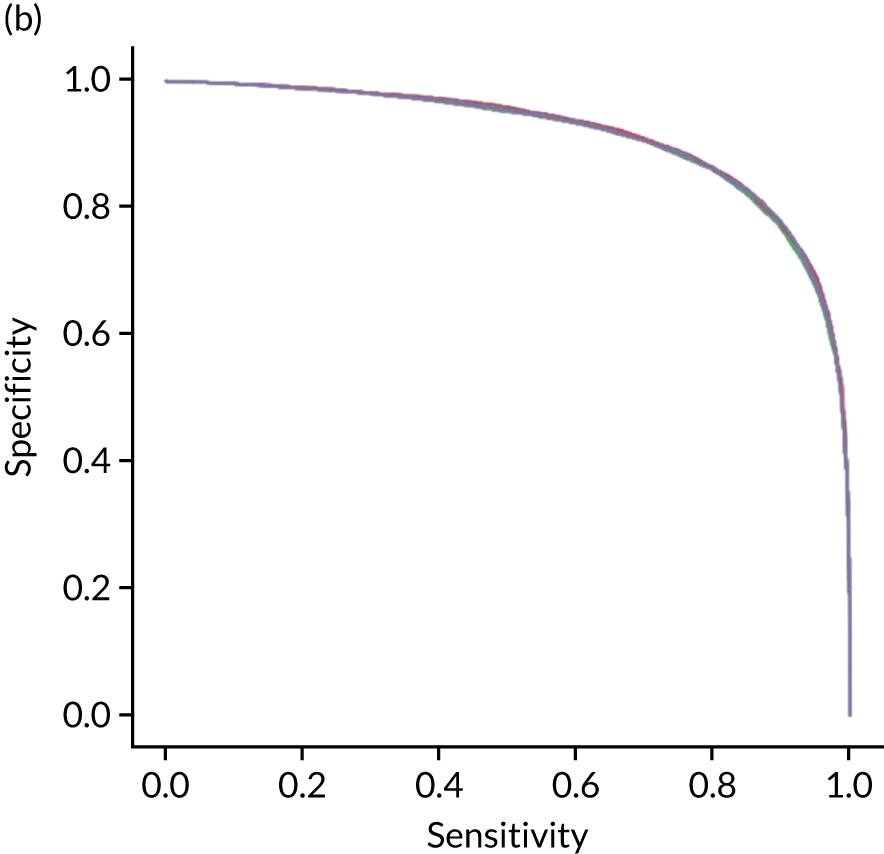
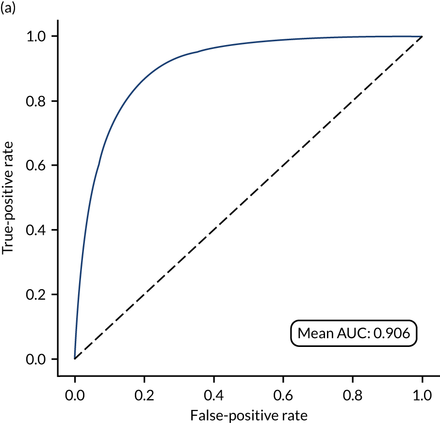
Figure 25 shows ROC and sensitivity–specificity curves for the single-fit random forest model. Analyses were performed using fivefold validation. The mean ROC AUC was 0.914 (compared with 0.904 for the single-fit logistic regression model). By using a different classification threshold to the default, the model can achieve 83.7% sensitivity and specificity simultaneously (compared with 82.0% for the single-fit logistic regression model).
FIGURE 25.
(a) ROC curve; and (b) sensitivity–specificity curve for a random forest model with hospital as a feature (one-hot encoded). Curves show separate fivefold validation results; however, multiple lines are not easily visible as they overlap each other.
Feature importance
The influence of features in a random forest model may be calculated in various ways. Here we report the standard scikit-learn feature importance, which is based on how much each feature, on average, reduces the impurity of the split data. The feature importance of the 25 most influential features is shown in Figure 26. The five most influential features are arrival-to-scan time, stroke severity on arrival, stroke type, onset-to-arrival time and whether onset has been determined precisely or has been estimated.
FIGURE 26.
Feature importance for a random forest model with hospital as a feature (one-hot encoded). Results show mean values from fivefold validation.
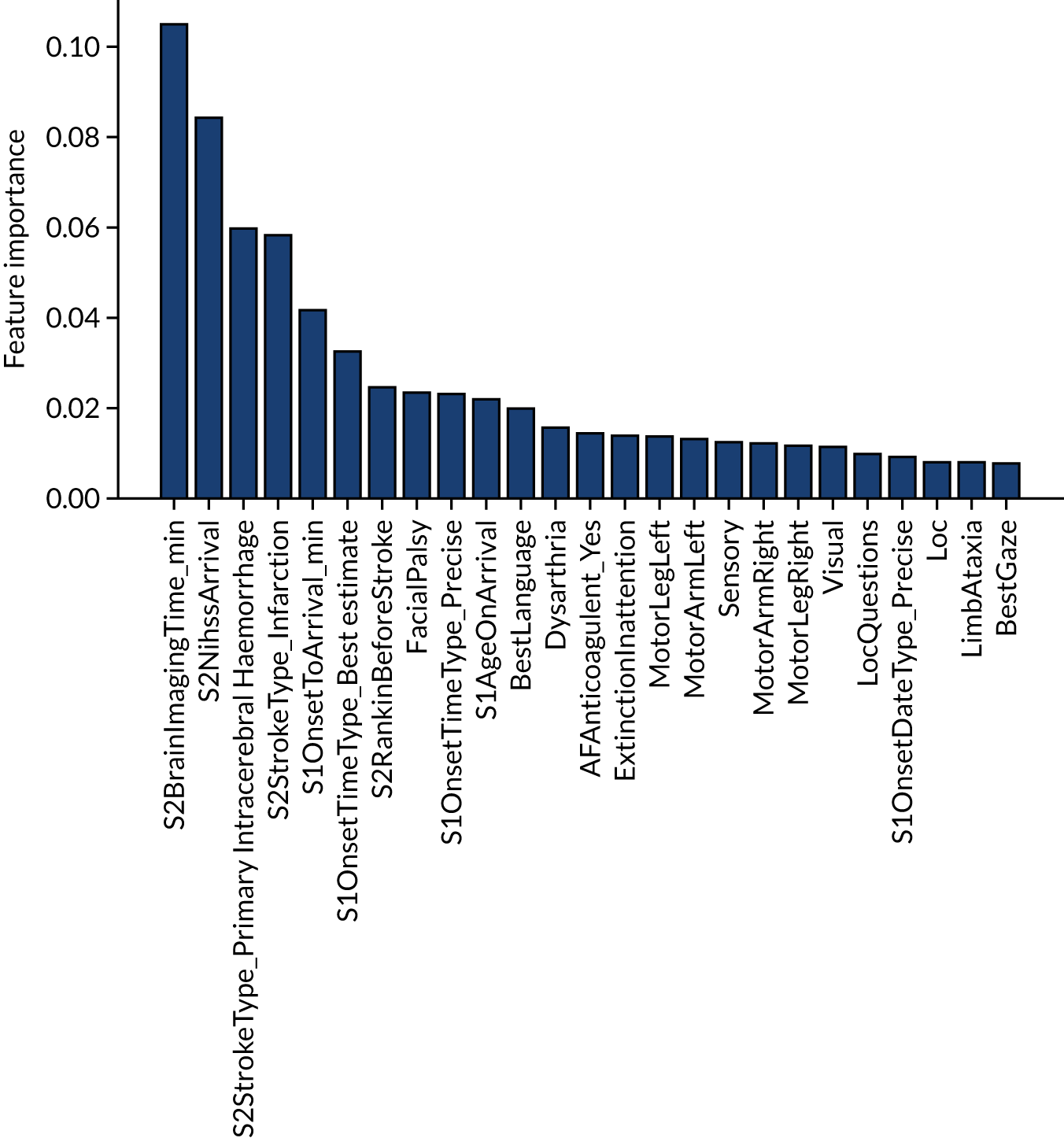
The single-fit random forest and single-fit logistic regression models have the same two features in their top three: (1) arrival-to-scan time and (2) stroke type. Stroke severity on arrival is present in the random forest model top three but not the logistic regression, and this is likely to be because of the logistic regression not being able to model the non-linear relationship between stroke severity on arrival and use of thrombolysis.
Learning curve
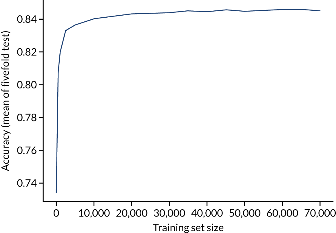
The accuracy of the random forest model reaches a plateau by about 40,000 training points (Figure 27), suggesting that the accuracy of this model is not limited by the number of training data available.
FIGURE 27.
Learning curve (relationship between training set size and model accuracy) for a random forest model with hospital as a feature (one-hot encoded). Results show mean values from fivefold validation.
Calibration and assessment of accuracy when model has high confidence
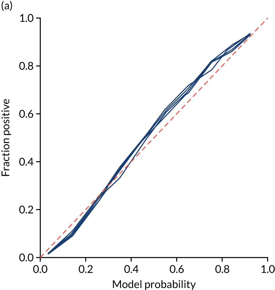
The single-fit random forest model is well calibrated (Figure 28). Although the overall accuracy of the model is 84.6%, the accuracy of those 59% of samples with at least 80% confidence in prediction is 92.4% (calculated separately).
FIGURE 28.
(a) Model probability calibration; and (b) model accuracy vs. confidence for a random forest model with hospital as a feature (one-hot encoded). Results show separate fivefold validation results.

Random forest model fitted to individual hospital stroke teams
As with logistic regression, random forest models were also fitted for individual hospitals, rather than using hospital as a feature. Again, data were left raw (i.e. non-standardised). We calibrated each model so that a classification threshold was used that gave the same thrombolysis use rate as observed for that hospital.
Accuracy
The model accuracy was slightly lower than the single-fit model (overall accuracy 84.3% vs. 84.6% for a single-fit model), although the loss of accuracy was less than that observed with logistic regression. Full accuracy results are shown in Table 9.
| Accuracy measure | Mean (95% CI)a |
|---|---|
| Actual positive rate | 0.295 (0.001) |
| Predicted positive rate | 0.300 (0.001) |
| Accuracy | 0.843 (0.001) |
| Precision | 0.730 (0.001) |
| Recall/sensitivity | 0.743 (0.001) |
| F1 score | 0.737 (0.001) |
| Specificity | 0.885 (0.001) |
Receiver operating characteristic and sensitivity–specificity curves
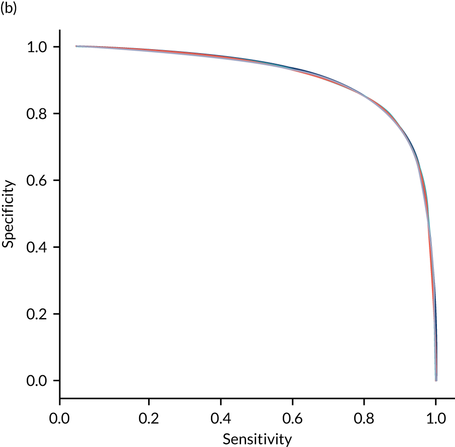
Figure 29 shows ROC and sensitivity–specificity curves for random forest models fitted to individual hospitals. The mean ROC AUC was slightly lower than a single-fit random forest model (0.906 vs. 0.914). Sensitivity–specificity trade-off was also slightly poorer, with the model achieving approximately 83.2% sensitivity and specificity simultaneously (compared with 83.7% for the single-fit random forest model).
FIGURE 29.
(a) ROC curve; and (b) sensitivity–specificity curve for random forest models fitted to individual hospitals. Curves show separate fivefold validation results; however, multiple lines are not easily visible as they overlap each other.
Feature importance
As models are fitted to each hospital individually, we do not report overall feature importance.
Learning curve
As different hospitals had different numbers of data available for fitting, a learning curve was not constructed.
Calibration and assessment of accuracy when model has high confidence
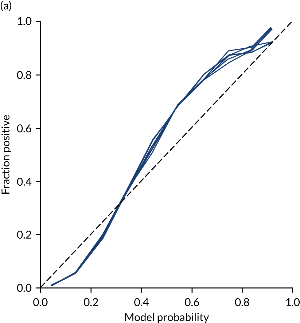
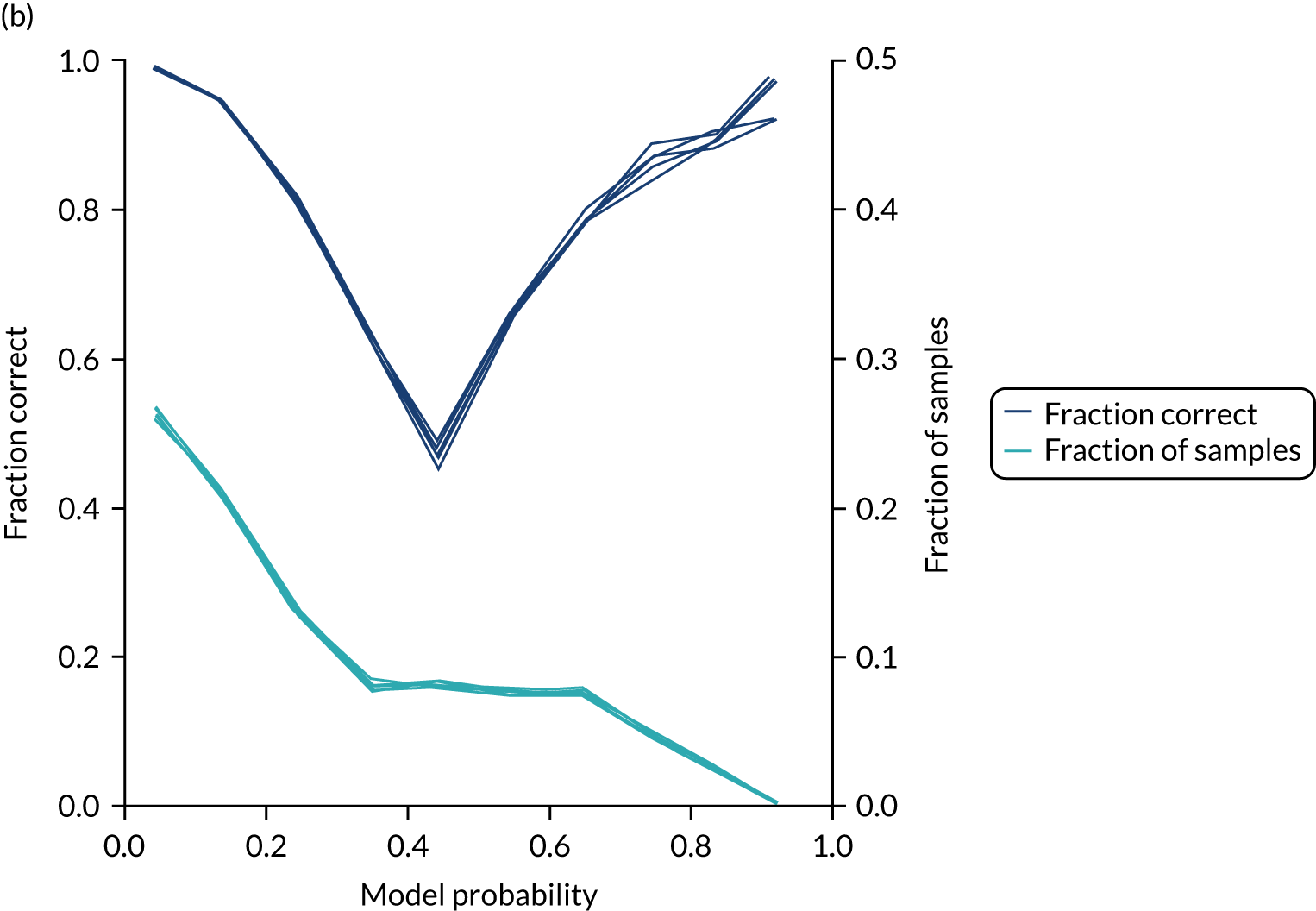
Unlike logistic regression, individual models fitted to hospitals maintain reasonable calibration (Figure 30). Although the overall accuracy of the model is 84.3%, the accuracy of those 50% of samples with at least 80% confidence in prediction is 94.4% (calculated separately).
FIGURE 30.
(a) Model probability calibration; and (b) model accuracy vs. confidence for random forest models fitted to individual hospitals. Results show separate fivefold validation results.
Agreement of decision-making between hospitals
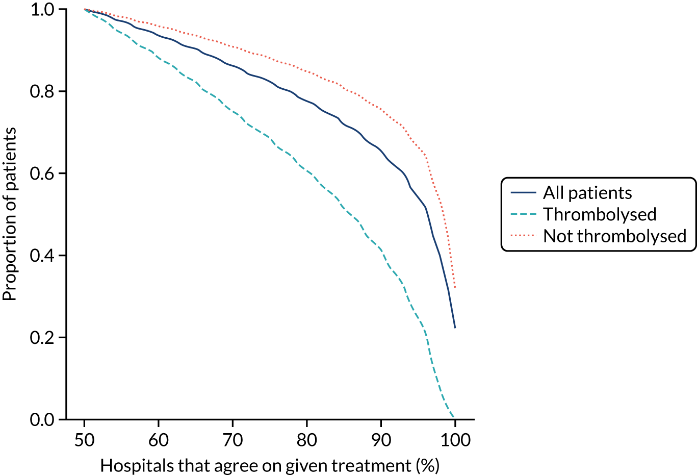
Using the random forest models fitted for individual hospitals to determine the treatment for each patient at each hospital, Figure 31 shows the level of agreement between hospitals on decision-making. Hospitals agree more on patients who will not receive thrombolysis than those who do. For example, 76% of patients have decisions that are agreed by 80% of hospitals, but 85% of patients who did not receive thrombolysis have agreement from 80% of hospitals and 60% of patients who did receive thrombolysis have agreement from 80% of hospitals.
FIGURE 31.
Agreement on decision-making between hospitals (using the random forest models fitted on individual hospitals). The x-axis shows the proportion of hospitals that must agree on a decision and the y-axis shows the proportion of patients who have that level of agreement. Analysis is for all decisions (dark blue solid), for those patients who did receive thrombolysis (light blue dashed) and for those patients who did not receive thrombolysis (orange dotted).
Benchmarking hospitals
Comparison of thrombolysis use between hospitals, using raw thrombolysis use, is confounded by different patient populations (see Table 4). If a hospital has a lower-than-average thrombolysis rate in patients who arrive and are scanned in time for thrombolysis, then is that because decision-making is different or because the patient population is different? Our aim is to compare decisions each hospital would make on a standard set of patients so that we can compare decision-making independently of local patient populations.
To compare decision-making between hospitals, we compare decisions predicted (using the random forest models fitted for individual hospitals) for a cohort of 10,000 patients (i.e. a random selection of patients who arrive within 4 hours of known stroke onset) and this gives us what we call a predicted cohort thrombolysis rate (i.e. the predicted thrombolysis use in a standard cohort of patients).
Figure 32 shows a comparison of true thrombolysis rate (i.e. the hospital’s actual thrombolysis rate on the patients who attended their hospital) and predicted cohort thrombolysis rate. There is a trend for predicted cohort thrombolysis to be higher in those hospitals that have a higher true thrombolysis rate, but there is also significant variation (R2 = 0.393), suggesting that patient populations play a significant role in determining a hospital’s level of use of thrombolysis, even after removing those patients who did not arrive within 4 hours of known stroke onset.
FIGURE 32.
A comparison of true (actual) thrombolysis rate and the predicted cohort thrombolysis rate when a decision model for each hospital makes predictions for thrombolysis use on a standard cohort of 10,000 patients (each arriving within 4 hours of known stroke onset). Each point represents a single hospital. The orange points are those hospitals that are in the top 30 of hospitals when cohort thrombolysis rate is predicted, with other hospitals coloured light purple. The dashed mid-blue line shows the threshold for selection of the top 30 hospitals. The dotted dark blue line shows a 1 : 1 relationship between true thrombolysis rate and predicted cohort thrombolysis rate.

After analysing the predicted thrombolysis use in a standard cohort of patients, we take the 30 hospitals with the highest predicted cohort thrombolysis rate as a set of benchmark hospitals. We can use the hospital models of these 30 benchmark hospitals and predict what thrombolysis use would be at each hospital if the decision made was the same as the majority vote of the benchmark hospitals. For example, we take all the patients from hospital X and pass them through the decision models for the 30 benchmark hospitals. Each benchmark hospital model predicts a yes/no output on whether or not each patient would be predicted to receive thrombolysis at that hospital. If 15 or more of the 30 benchmark hospitals predict thrombolysis would be given for any patient, then we assign ‘receive thrombolysis’ to that patient.
Figure 33 shows the predicted thrombolysis use at each hospital in accordance with the majority vote of the benchmark hospital models. When results are weighted by the number of patients attending each hospital, using the 30 benchmark hospital models to decide if a patient would receive thrombolysis, then this would increase national thrombolysis use from 29.5% to 36.9% of patients arriving within 4 hours of known stroke onset. If decisions were, instead, made by the majority vote of the top 30 hospitals with the highest true (actual) thrombolysis rate, rather than choosing benchmark hospitals using a standard patient cohort, then overall thrombolysis rate would increase from 29.5% to 32.7% of patients arriving within 4 hours of known stroke onset.
FIGURE 33.
A comparison of actual thrombolysis rate at each hospital and the predicted thrombolysis rate if decisions were made in accordance with the majority vote of the 30 benchmark hospitals. Thrombolysis rate is predicted for patients arriving within 4 hours of known stroke onset. The solid circle shows the current thrombolysis use, and the bar shows the thrombolysis use predicted by a majority vote of the benchmark hospitals. The light blue points are those hospitals that are in the top 30 thrombolysing hospitals (i.e. the benchmark set) when cohort thrombolysis use is predicted, with all other hospitals coloured dark blue.
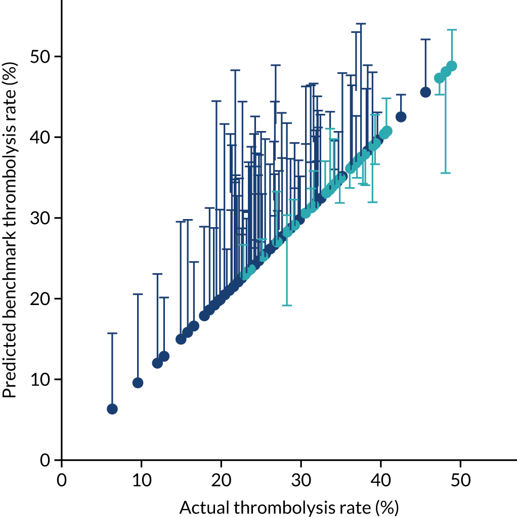
Grouping hospitals by similarities in decision-making
To compare hospitals, we use the predicted decision of the cohort of 10,000 patients (all arriving within 4 hours of known stroke onset) passed through all hospital models. We identify those patients with most variation between hospitals, that is, patients who would be predicted to be given thrombolysis by 30–70% of the hospitals (taking 50% to represent patients with most variation, and applying a ± 20% range). Using those patients, we calculate a Hamming distance between all pairs of hospitals, based on the proportion of patients with an agreed decision between the two hospitals. Hamming distances are in the range 0–1. A Hamming distance of zero is obtained if hospitals agree on all patients, and a Hamming distance of 1 is obtained if hospitals disagree on all patients.
For visualisation, hospitals are grouped by seriation using the Python Seriate library (Python Software Foundation, Wilmington, DE, USA) [URL: https://pypi.org/project/seriate/ (accessed 6 May 2022)].
Figure 34 shows sorted (seriated) Hamming distances between hospitals. Two clusters stand out: (1) a group of hospitals with ordered (seriated) ID of 35–60 and (2) a group with ordered ID 95–125. Each cluster has high similarity within itself, but high dissimilarity with the other group. When we examine the use of thrombolysis in these hospitals for this subgroup of patients (i.e. those predicted to receive thrombolysis in 30–70% of hospitals), then we find that those in the group ID 35–60 have a mean thrombolysis use of 90%, and those in group ID 95–125 have a mean thrombolysis use of 13%. We find, therefore, that similarity/dissimilarity in decision-making is correlated with use of thrombolysis in a subset of patients with most inter-hospital variation in predicted thrombolysis use.
FIGURE 34.
Ordered (seriated) Hamming distances between hospitals. The colour indicates the Hamming distance (i.e. the proportion of patients where decisions differ between any two hospitals). Blue shading represents hospitals making similar decisions and red shading represents hospitals making significantly different decisions. The number on each axis represents the seriated order. Predictions were made for a standard cohort of 10,000 patients. Patients for whom 30–70% of hospitals are predicted to give thrombolysis are used in this analysis.
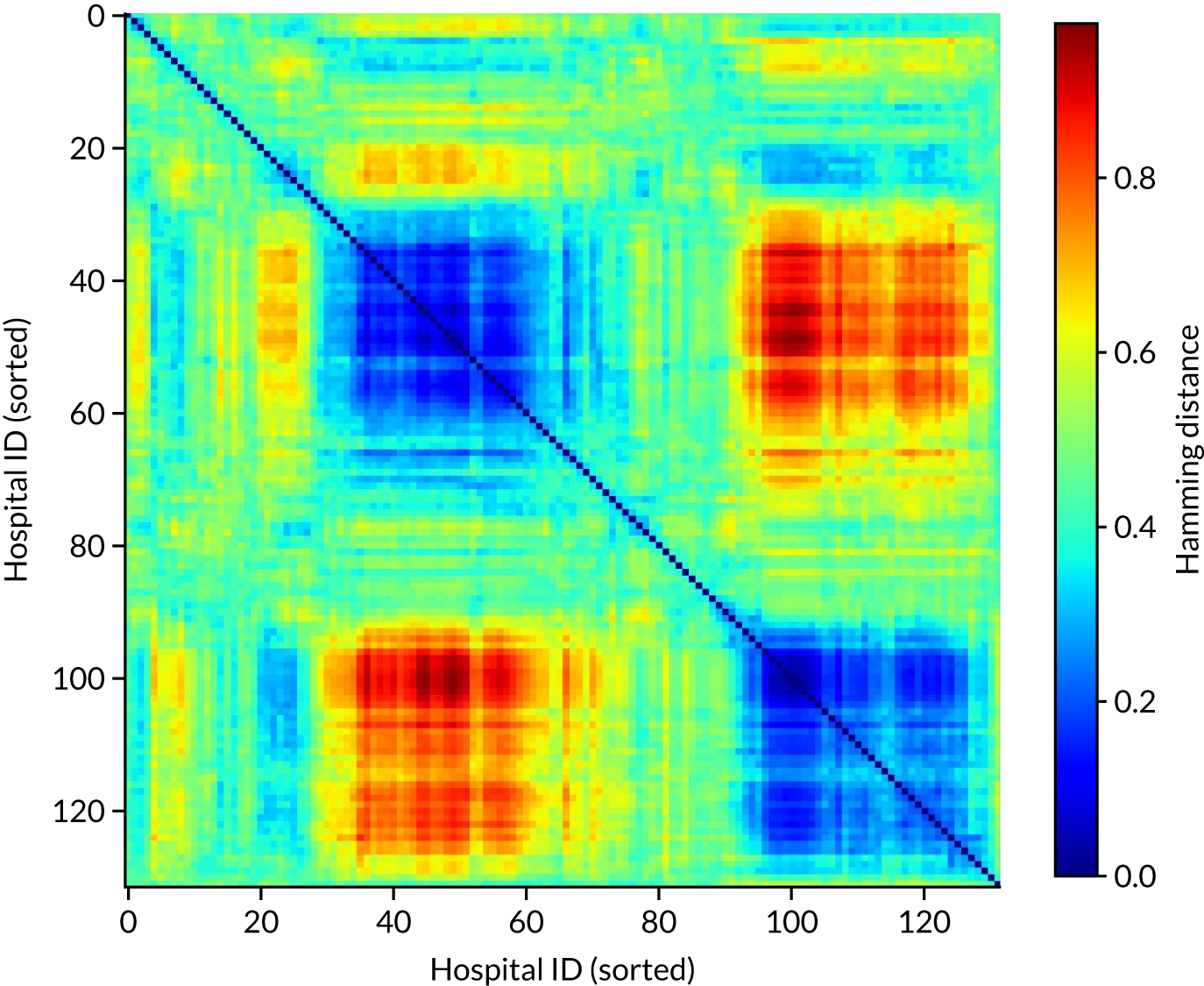
Comparing hospital decision-making with the benchmark hospital set and identifying individual patients of interest
To provide more information on how similar/dissimilar one hospital’s decision-making is to our benchmark set of 30 hospitals, we can compare the number of thrombolysis/no-thrombolysis decisions in which the actual decision made at a hospital is the same as the predicted majority vote of our benchmark hospital set. We can also identify some key patients of interest that may help provide discussion points:
-
Patients for whom the hospital model was confident in a decision, but the model prediction was contrary to what actually occurred. This may point to patients for whom information in SSNAP was lacking important detail or may help identify examples where the pathway failed.
-
Patients for whom a hospital is predicted to make different decisions from the benchmark hospitals and where this appears to follow a specific pattern of difference.
Example 1: a hospital with low thrombolysis use in patients with mild stroke
The mean use of thrombolysis in mild stroke (i.e. a NIHSS score of 0–4) across hospitals is 12.9% of patients arriving within 4 hours of known stroke onset. This rate is, on average, 33% that of moderate to severe stroke (i.e. a NIHSS score of 16–20). LFPMM4706C is a stroke team that uses thrombolysis in 0.6% of mild stroke, which is 4% of the use rate in moderate to severe stroke in the same hospital.
There were 338 admissions to this hospital (LFPMM4706C). The hospital gave thrombolysis to 21 patients. The benchmark majority vote would have given thrombolysis to 17 of those 21 patients. The hospital would not have given thrombolysis to 317 patients. The benchmark majority vote would have given thrombolysis to 31 of these. Figures 35 and 36 show two methods of visualising the results: (1) a Venn diagram (see Figure 35) and (2) a tree graph diagram (see Figure 36).
FIGURE 35.
Venn diagram showing overlap of thrombolysis decisions between stroke team LFPMM4706C and the majority vote of the benchmark hospitals. Light blue shows the decisions specific to the hospital under study (i.e. decisions that the hospital made, but the benchmark majority did not), light orange shows common decisions and light purple shows decisions specific to the benchmark majority vote (i.e. decisions that the benchmark majority made, but the hospital did not).

FIGURE 36.
Tree graph diagram showing overlap of thrombolysis decisions between stroke team LFPMM4706C and the majority vote of the benchmark hospitals. Light blue shows the decisions made in the hospital under study, light orange shows common decisions and light purple shows decisions different from the hospital under study. The lowest level shows the decisions made by the benchmark majority vote.

An example patient with mild stroke was taken. The patient did not receive thrombolysis at the hospital they attended, and the hospital model had high confidence that the patient would not be expected to receive thrombolysis at that hospital; however, the majority vote of the benchmark hospitals would have given thrombolysis to this patient. Key SSNAP data for this patient are shown in Box 1.
-
Age: 77.5 years.
-
Onset-to-arrival time: 88 minutes.
-
mRS before: 1.
-
Facial palsy: 1.
-
Motor arm right: 1.
-
Motor leg right: 1.
-
Limb ataxia: 1.
-
Sensory: 1.
-
NIHSS score: 5.
-
Brain imaging time: 31 minutes.
-
White.
-
Female.
-
Precise onset time.
-
Admitted between 6 p.m. and 9 p.m. on Thursday, quarter 1, 2018.
-
No diabetes, congestive heart failure or AF.
-
Yes to stroke TIA and hypertension.
-
No record of antiplatelet or anticoagulant.
-
No TIA in last month.
-
Probability of thrombolysis in this hospital was 0.00.
As an example of how these data may be used for a workshop on discussion of treatment, we built a patient vignette around these data. This aids anonymisation of data and provides an output that clinicians are used to discussing. This vignette may be provided with the background of what decision was actually made, what decision is expected to be made at a given hospital and what decision is expected to be made at the majority of our benchmark hospitals (Box 2).
Sally is a 76-year-old woman with hypertension who had a TIA 3 years ago, who was taking clopidogrel, bendroflumethiazide and a statin. She found her knee arthritis a bit of a nuisance when shopping. She started to feel a slight weakness in her left arm and leg as she was making dinner for herself and her husband, Roy, one Thursday evening. She thought her knee was playing up and put the 6 o’clock news on the radio to take her mind off it. However, when Sally and Roy sat down to eat at 7 p.m. he noticed that she was clumsy with her fork, and he thought her face looked twisted on the right. As she had previously had a TIA, Roy was alarmed and quickly dialled 999. An ambulance arrived within 10 minutes, and by 7.28 p.m. she was being assessed in the emergency department of her local hospital.
The first doctor to see Sally quickly sent her for a CT [computerised tomography] brain scan, which happened at 7.59 p.m. Once back in the emergency department, the doctor assessing Sally noted her history of hypertension and TIA but that she was otherwise generally well. The doctor noted a minor drooping of her face, and a drift of her left arm and leg which were also slightly numb, and it seemed to make her left arm rather clumsy. Her NIHSS was 5. The scan showed no signs of haemorrhage, but there was an old lacunar infarct in the left hemisphere. The doctor decided that the risks of thrombolysis outweighed her potential to benefit as she thought the natural prognosis from her mild stroke was good even without thrombolysis. She subsequently admitted her to the stroke unit for observation.
Example 2: a hospital with low thrombolysis use in patients with previous disability
The mean use of thrombolysis in patients with prior disability (i.e. a mRS score of ≥ 2) is 18.9% of patients arriving within 4 hours of known stroke onset. This rate is, on average, 58% that of patients with no prior disability (i.e. a mRS score of 0–1). OUXUZ1084Q is a stroke team that uses thrombolysis in 2.3% of patients with prior disability (i.e. 10% of the use rate in patients with no prior disability).
There were 346 admissions to the hospital (OUXUZ1084Q). The hospital gave thrombolysis to 73 patients. The benchmark majority vote would have given thrombolysis to 66 of these 73 patients. The hospital did not give thrombolysis to 273 patients, of whom the benchmark majority vote would have given thrombolysis to 64. Figures 37 and 38 show two methods of visualising the results: (1) a Venn diagram (see Figure 37) and (2) a tree graph diagram (see Figure 38).
FIGURE 37.
Venn diagram showing overlap of thrombolysis decisions between stroke team OUXUZ1084Q and the majority vote of the benchmark hospitals. Light blue shows the decisions specific to the hospital under study (i.e. decisions that the hospital made, but the benchmark majority did not), light orange shows common decisions and light purple shows decisions specific to the benchmark majority vote (i.e. decisions that the benchmark majority made, but the hospital did not).

FIGURE 38.
Tree graph diagram showing overlap of thrombolysis decisions between stroke team OUXUZ1084Q and the majority vote of the benchmark hospitals. Light blue shows the decisions made in the hospital under study, light orange shows common decisions and light purple shows decisions different from the hospital under study. The lowest level shows the decisions made by the benchmark majority vote.
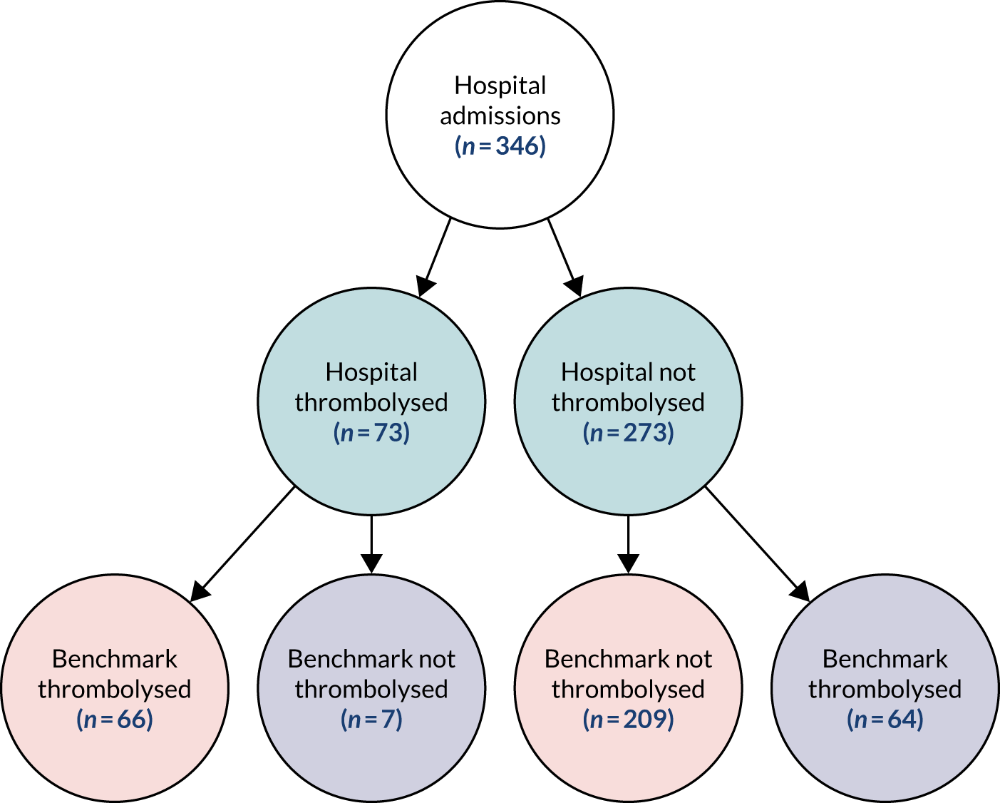
An example patient was taken who did not receive thrombolysis at the hospital they attended, and where the hospital model also had a moderate to high confidence that the patient would not be expected to receive thrombolysis at that hospital; however, the majority vote of the benchmark hospitals would have given thrombolysis to this patient. Key SSNAP data for this patient are shown in Box 3.
-
Age: 82.5 years.
-
Onset-to-arrival time: 151 minutes.
-
mRS score before: 3.
-
LOC questions: 1.
-
LOC commands: 1.
-
Visual: 2.
-
Facial palsy: 2.
-
Motor arm right: 1.
-
Motor leg right: 1.
-
Sensory: 1.
-
Best language: 2.
-
Dysarthia: 2.
-
NIHSS score: 13.
-
Brain imaging time: 9 minutes.
-
White.
-
Female.
-
Precise onset time.
-
Admitted between 3 p.m. and 6 p.m. on Tuesday, quarter 1, 2017.
-
No diabetes, congestive heart failure, stroke TIA or AF.
-
Yes to hypertension.
-
No record of antiplatelet, anticoagulant or new AF diagnosis.
-
No recorded TIA in last month.
-
Probability of thrombolysis in this hospital was 0.22.
LOC, Level of Consciousness.
As before, this was turned into a patient vignette for discussion (Box 4).
Mabel is 84 years old and, since her husband passed away, has lived in a residential home; although she is still mobile, Mabel requires some help with her day to day living due to memory decline. After finishing her lunch at 1 p.m. on Tuesday, Katy, one of the staff, came over to take her plate to the kitchen. Katy always enjoyed a chat with Mabel; however, as they were talking, Mabel started to slur her words and very quickly it became hard for Katy to understand what she was saying. Knowing the signs of stroke, Katy quickly called for an ambulance.
Unfortunately, due to a serious incident nearby, the ambulance almost 2 hours to arrive. Once it did arrive, Mabel was quickly taken to the nearest stroke unit. She arrived at 3.30 p.m. and had a brain scan within 10 minutes. The clinician assessing her found her stroke was moderate, scoring 13 on the NIH [National Institutes of Health] Stroke Scale. Mabel had previously been diagnosed with hypertension but was otherwise healthy for her age. Mabel was admitted to the stroke unit but was not offered thrombolysis.
Finding similar patients who are treated differently within the same hospital
Here, we identify patients whose predicted decision at the hospital they attended was different from the actual decision made, and identify similar patients who were treated differently (i.e. the same as the predicted decision). This method may, again, be used in audit to not only provide ID of a patient who was not treated as we would expect that hospital to treat them, but also to provide examples to help illustrate that similar patients were treated as the model would expect this patient to be treated.
Calculation of similarity metric
When a decision tree is fitted to the training data, each internal node in the tree will be split into two further nodes based on the feature that maximises the information gain (or minimises the entropy). Once a split results in two nodes that are pure (i.e. containing samples from a single class only), then no further information gain is possible (i.e. the two nodes are leaves, representing the ends of two paths through the tree). As each patient can take only one path through the decision tree, and all patients start in the same node (the root node), we can use these paths to find the similarity between any pair of patients:
Here, S(i,j) represents the similarity between patient i and patient j as a function of each patient’s shared path, P, through the decision tree, where P(i,i) corresponds to the shared path length of patient i with itself, P(j,j) the shared path length of j with itself and P(i,j) the length of the shared path of i and j.
Shared path length is measured using the information gain (i.e. change in entropy) at each split. Consider patient i, who takes a path through the decision tree, which comprises a set of N nodes, each passed sequentially and with index n ∈ [1, N], where n = 1 represents the root node and n = N the leaf node. If each node with index n has density ρn patients passing through it, then the length of the shared path of patient i, P(i,i), is given by:
where Hn is the entropy at node n and the information gain at each split has been weighted by ρn + 1, the total density of patients who move from node n to node n + 1.
From Equation 3, it is clear that if patients i and j take exactly the same path through the decision tree, then their path lengths are equal: P(i,i) = P(j,j) = P(i,j). When substituting this into Equation 2, it is clear that if two patients take identical paths, then the similarity between them is 1. Conversely, if patients i and j diverge at the root node n = 1, then their shared path contains only node P(i,j) = 0 and, therefore, the similarity between them is equal to zero.
As a random forest is composed of many decision trees, for each pair of patients we take the similarity between them as the average over all trees in the forest. Using this measure of similarity, for each patient in each hospital we found the most similar patients who were treated differently.
Example 1: thrombolysis was not given when expected
Figures 39 and 40 are for a patient who was not given thrombolysis when the model predicted thrombolysis would be given, and the five nearest patients who were given thrombolysis are shown. Bar and line-area charts are provided (see Figures 39 and 40, respectively), and these show the same data in different forms. The features shown in Figures 39 and 40 are those that have most importance in the random forest model. The results demonstrate that we can identify patients for comparison with a patient who was not treated as the model would predict.
FIGURE 39.
Bar chart of a patient not treated as expected (i.e. not given thrombolysis when predicted to be given thrombolysis) and the five most similar patients treated differently from the patient (i.e. given thrombolysis). The features shown are those features with highest importance in the random forest model.
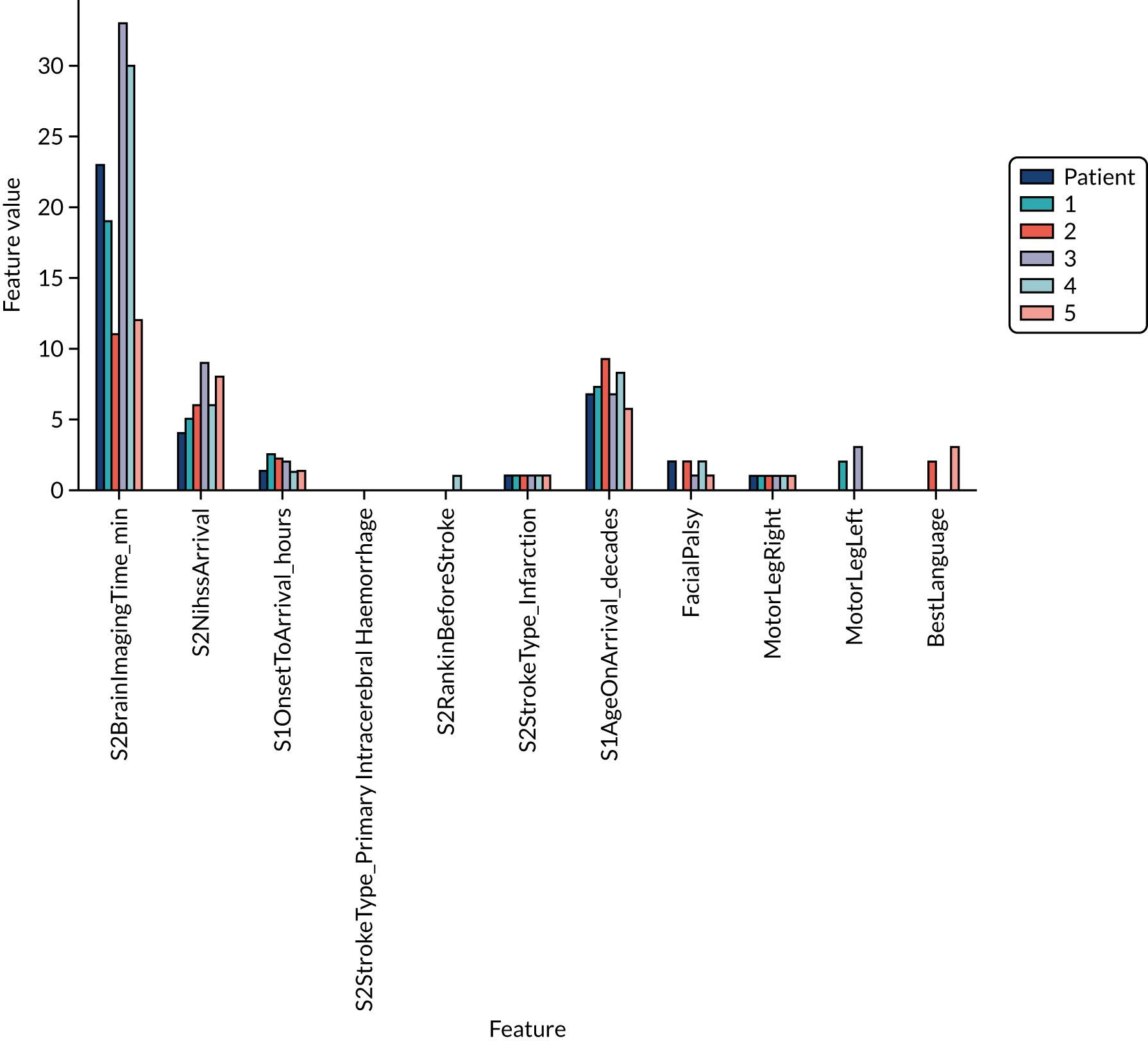
FIGURE 40.
Line-area chart of a patient not treated as expected (i.e. not given thrombolysis when predicted to be given thrombolysis) compared with the five most similar patients treated differently from the patient (i.e. given thrombolysis). The features shown are those features with highest importance in the random forest model. The value for the patient not treated as expected is shown by a light purple star. Feature values for the five most similar patients treated differently are shown as a range (light blue area and mid-blue/orange stars for the minimum/maximum) and as a mean (dark blue star).
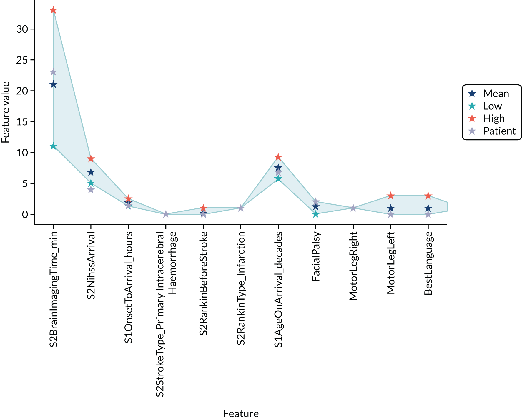
Example 2: thrombolysis was given when not expected
The following is a patient who was given thrombolysis when the model predicted thrombolysis would not be given. Output is as previously described (Figures 41 and 42).
FIGURE 41.
Bar chart of a patient not treated as expected (i.e. given thrombolysis when not predicted to be given thrombolysis) and the five most similar patients treated differently from the patient (i.e. not given thrombolysis). The features shown are those features with highest importance in random forest model.
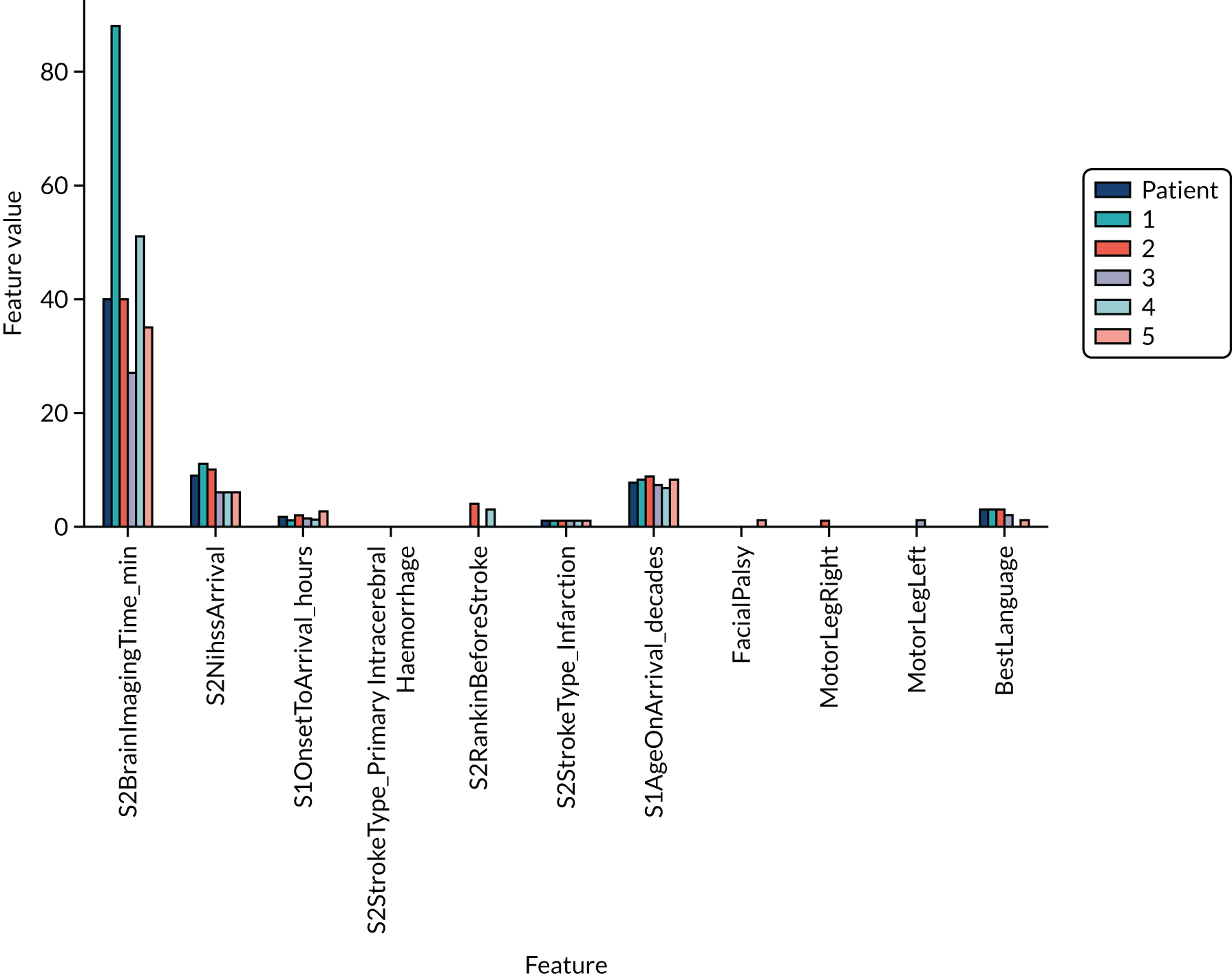
FIGURE 42.
Line-area chart of a patient not treated as expected (i.e. given thrombolysis when not predicted to be given thrombolysis) compared with the five most similar patients treated differently from the patient (i.e. not given thrombolysis). The features shown are those features with highest importance in a random forest model. The value for the patient not treated as expected is shown by a light purple star. Feature values for 5 most similar patients treated differently are shown as range (light blue area, and mid-blue/orange stars for the minimum/maximum) and mean (dark blue star).
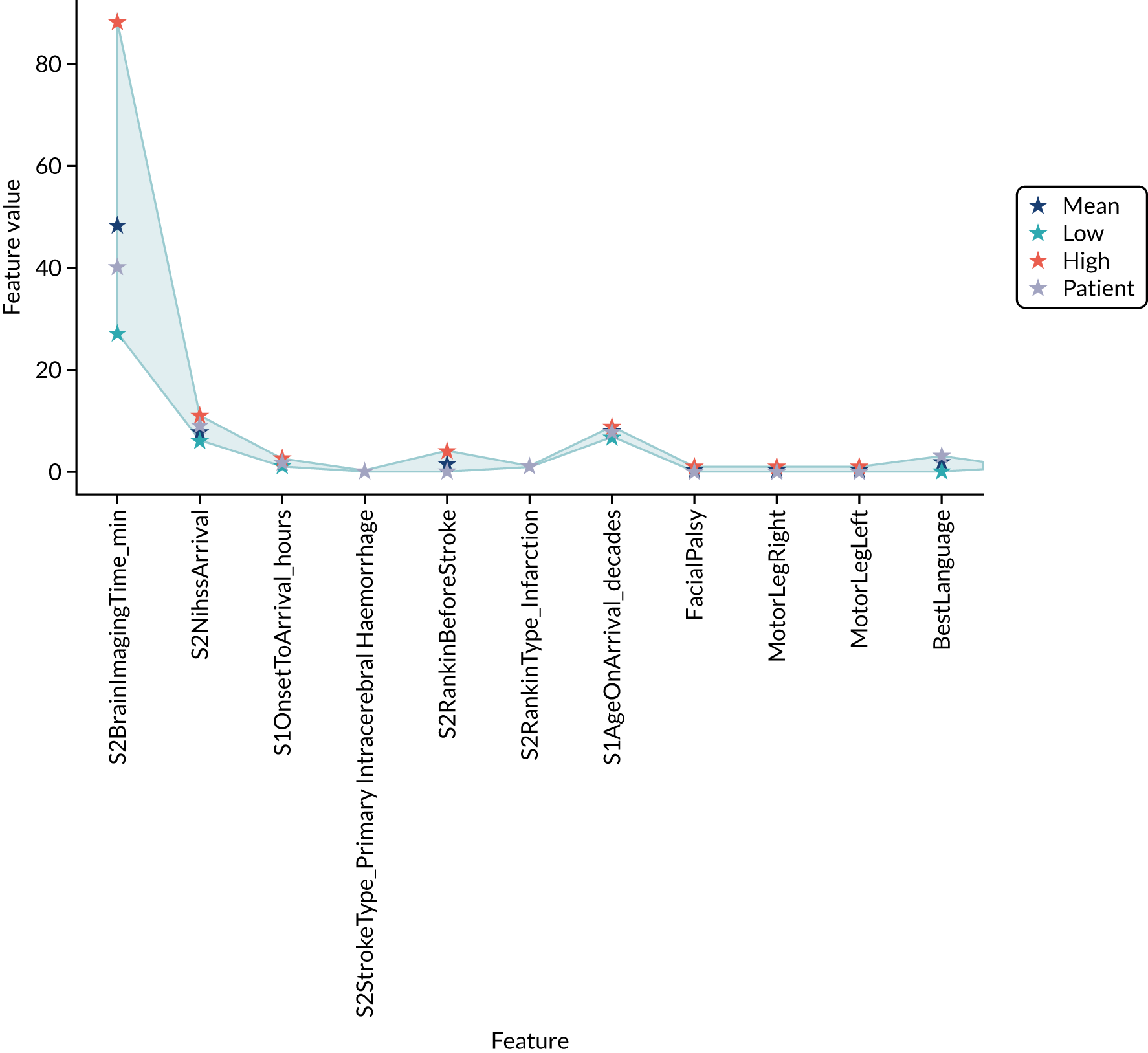
Machine learning: neural networks
What is in this section?
This section describes experiments predicting, using neural networks, whether or not a patient will receive thrombolysis in a given hospital.
This section contains the following three analyses:
A fully connected neural network fitting to all stroke teams together
In this analysis, a fully connected neural network is fitted to all data together, with each stroke team being a one-hot encoded feature. The models were analysed for (1) various accuracy scores, (2) a ROC AUC, (3) a sensitivity–specificity curve, (4) learning rate and (5) model calibration.
Modular neural networks with one-dimensional embedding fitting to all stroke teams together
In this analysis, modular neural networks with 1D embedding are fitted to all data together, with each stroke team being a one-hot encoded feature. The models were analysed for (1) various accuracy scores, (2) a ROC AUC, (3) a sensitivity–specificity curve and (4) model calibration. We investigated the 1D hospital subnet embedding output and the 1D clinical subnet embedding output.
Modular neural networks with two-dimensional embedding fitting to all stroke teams together
In this analysis, modular neural networks with 2D embedding are fitted to all data together, with each stroke team being a one-hot encoded feature. The models were analysed for (1) various accuracy scores, (2) a ROC AUC, (3) a sensitivity–specificity curve and (4) model calibration. We investigated the 2D hospital subnet embedding output and the 2D clinical subnet embedding output.
The experiments compare accuracy of different neural net architectures and investigate the embedding outputs.
The detailed code and results are available online. 34
Key findings in this section
Using a fully connected network, we found the following:
-
The overall accuracy was 84.4%.
-
The model can achieve 83.3% sensitivity and specificity simultaneously.
-
The ROC AUC was 0.913.
A 1D embedding network encodes hospitals, patients and pathway information as a single value for each. Using modular (1D embedding) networks, we found the following:
-
The overall accuracy was 85.5%.
-
The model can achieve 84.5% sensitivity and specificity simultaneously.
-
The ROC AUC was 0.921.
-
Each hospital always has the same hospital embedding value. This value correlates very highly with the predicted thrombolysis use on a standard test set of patients. The network, therefore, appears to be encoding a hospital’s willingness/enthusiasm to use thrombolysis.
-
Each patient has a separate clinical subnet embedding value, based just on their clinical features, and this correlates closely with the probability of receiving thrombolysis. The network, therefore, appears to be encoding a patient’s clinical suitability for thrombolysis. Clinical embedding mimics patterns seen in thrombolysis use, such as low perceived suitability for thrombolysis at very low or high stroke severity scores, and declining perceived suitability for thrombolysis with level of disability before stroke.
A 2D embedding network encodes hospitals, patients and pathway information as two values for each. Using modular (2D embedding) networks, we found the following:
-
The overall accuracy was 85.2%.
-
The model can achieve 84.2% sensitivity and specificity simultaneously.
-
The ROC AUC was 0.919.
-
2D hospital embedding does not appear to show any more detail than 1D embedding.
-
2D patient embedding clusters patients by clear groups, for example four groups (located at each corner of a chart when plotting the patient embeddings 2D vector) are (1) patients with high clinical suitability for thrombolysis, (2) non-given thrombolysis haemorrhagic stroke patients, (3) non-given thrombolysis severe stroke patients and (4) non-given thrombolysis mild stroke patients.
Introduction to neural net methodology
The basic building block of neural networks is the perceptron (Figure 43). Each feature (including a constant/bias feature, which usually has the value of 1) has an associated weight. The product of each feature multiplied by its weight is summed. The sum is then passed to an activation function. The activation function may leave the input unchanged (often used for a regression output), may use a step function (whereby if the sum of weighted features is less than zero then the output is zero, and if the sum of weighted features is equal to or more than zero then the output is 1), may use a logistic function (converting the input into a number between zero and 1) or may use another function. The weights are optimised during the learning process to minimise the inaccuracy (loss) of the model. Commonly, optimising is performed according to a variant of stochastic gradient descent, where an example is chosen at random (stochastic), the inaccuracy (loss) is calculated and the weights are moved a little in the direction that reduced the loss (gradient descent). This learning process is repeated until the model converges on minimum loss.
FIGURE 43.
Schematic of a perceptron. Each feature (including a constant) is multiplied by an individual weight for that feature. These feature weights are summed, and the output passed to an activation function (a simple activation function is a step function whereby if the sum of weighted features is less than zero then the output is zero, and if the sum of weighted features is equal to or more than zero then the output is 1).

A neural network is composed of a network of perceptrons and is sometimes called a multilayer perceptron (Figure 44). Input features are connected to multiple perceptrons (or neurones), each of which performs a weighted sum of feature weights and passes the output through an activation function. The most common activation function used within a neural network is the rectified linear unit (ReLU). Using the ReLU, if the weighted sum of inputs is less than zero, then the output is zero, and if the weighted sum of inputs is greater than zero, then the output is equal to the weighted sum of inputs. This simple function is computationally efficient and is enough for the neural network to mimic non-linear functions. The outputs from a layer in the network are passed as inputs to the next layer. The layers may be of any number of neurones and may vary between layers (although it is common now to have the same number of neurones in all layers apart from the final layer). The final layer has an activation function, depending on the purpose of the network. For example, a regressor network will often leave the weighted sum in the final layer unchanged. A binomial classification network will commonly use logistic/sigmoid activation in the final layer (usually with a single neurone in the output layer) and a multiclass network will often use softmax activation where there are as many output neurones as there are classes, and each will have an output equivalent to a probability of 0–1. A standard approach is to have a ‘fully connected’ neural network, where each perceptron in the current layer is connected to all perceptrons in the following layer. It is possible to define a custom design with only specific connections chosen.
FIGURE 44.
An example neural network. In this ‘fully connected’ neural network there are as many perceptrons in each layer as there are features (in practice this number may be changed). Each feature is connected to all perceptrons in the first hidden layer, each with its own associated weight.
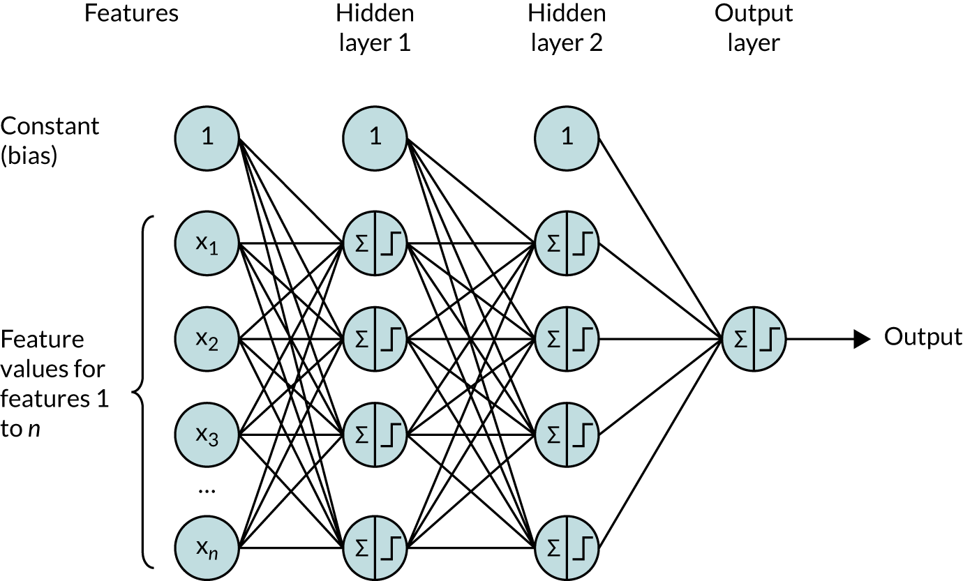
Figure 44 shows a fully connected neural network where all neurones in a layer are connected to all neurones in the next layer. Each neurone sums all inputs multiplied by the weight for each input. This is then commonly passed through an activation function. We use ReLU activation for the hidden layers, whereby all outputs of less than zero are set to zero and all outputs greater than zero are unchanged. The final layer is a sigmoid activation layer with an output of 0–1. If the network is well calibrated, then this output will be the probability of classification of a patient receiving thrombolysis. To prevent overfitting of the network, we use dropout (where 50% of the neurones are randomly excluded in each training run) and early stopping (where training of the network is stopped when accuracy of an evaluation data set is no longer improving, and the network weights are rolled back to when the accuracy of the evaluation set was at its highest).
Training a neural network is similar to a perceptron, using methods based on stochastic gradient descent. The additional component in neural network is back-propagation of loss, which distributes loss through the network according to how much individual neurones contribute to the overall loss.
We used the Keras neural network library for Python/TensorFlow (Python Software Foundation, Wilmington, DE, USA). General methodology for training and optimising neural networks using Keras is described by Chollet. 35
Modular network with one-dimensional hospital identification embedding
Embedding uses a subnet (i.e. a distinct part of a larger neural network) to convert a categorical variable into a projection onto n-dimensional space. 36 Subnet embedding has been shown to be an effective way to train neural networks when using categorical data and allows a measure of similarity/distance between different values of the categorical data. Here, we use subnet embedding for three groups of the data available for each patient: (1) hospital ID, (2) patient/clinical characteristics (age, gender, stroke symptoms, etc.) (Box 5) and (3) pathway times/timings (time from onset to arrival, time to scan, etc.). These data are either based on a single categorical value (hospital ID) or a group of related data (clinical features or pathway information). When we convert a set of related data to a smaller dimension space, then it may also be known as encoding the data.
-
S1AgeOnArrival.
-
S2RankinBeforeStroke.
-
Loc.
-
LocQuestions.
-
LocCommands.
-
BestGaze.
-
Visual.
-
FacialPalsy.
-
MotorArmLeft.
-
MotorArmRight.
-
MotorLegLeft.
-
MotorLegRight.
-
LimbAtaxia.
-
Sensory.
-
BestLanguage.
-
Dysarthria.
-
ExtinctionInattention.
-
S2NihssArrival.
-
MoreEqual80y_No.
-
MoreEqual80y_Yes.
-
S1Gender_Female.
-
S1Gender_Male.
-
S1Ethnicity_Asian.
-
S1Ethnicity_Black.
-
S1Ethnicity_Mixed.
-
S1Ethnicity_Other.
-
S1Ethnicity_White.
-
CongestiveHeartFailure_No.
-
CongestiveHeartFailure_Yes.
-
Hypertension_No.
-
Hypertension_Yes.
-
AtrialFibrillation_No.
-
AtrialFibrillation_Yes.
-
Diabetes_No.
-
Diabetes_Yes.
-
StrokeTIA_No.
-
StrokeTIA_Yes.
-
AFAntiplatelet_No.
-
AFAntiplatelet_No but.
-
AFAntiplatelet_Yes.
-
AFAntiplatelet_missing.
-
AFAnticoagulent_No.
-
AFAnticoagulent_No but.
-
AFAnticoagulent_Yes.
-
AFAnticoagulent_missing.
-
AFAnticoagulentVitK_No.
-
AFAnticoagulentVitK_Yes.
-
AFAnticoagulentVitK_missing.
-
AFAnticoagulentDOAC_No.
-
AFAnticoagulentDOAC_Yes.
-
AFAnticoagulentDOAC_missing.
-
AFAnticoagulentHeparin_No.
-
AFAnticoagulentHeparin_Yes.
-
AFAnticoagulentHeparin_missing.
-
S2NewAFDiagnosis_No.
-
S2NewAFDiagnosis_Yes.
-
S2NewAFDiagnosis_missing.
-
S2StrokeType_Infarction.
-
S2StrokeType_Primary Intracerebral Haemorrhage.
-
S2StrokeType_missing.
-
S2TIAInLastMonth_No.
-
S2TIAInLastMonth_No but.
-
S2TIAInLastMonth_Yes.
-
S2TIAInLastMonth_missing.
Hospitals that make similar decisions should end up close to each other in the embedded vector space. As with hospitals, patients who are similar (from the perspective of thrombolysis decision-making) should end up close to each other in the embedded vector space.
Our modular neural networks split data into three subgroups of (1) hospital ID, (2) patient/clinical characteristics and (3) pathway times/timings. Each subgroup of data is processed by a neural subnet to produce a vector. The architecture may be set to produce a vector of any number of dimensions, and here we use one and two values per subnet output vector. The output from the subnets is combined in an additional layer in the neural network, that is, the concatenation layer, which outputs a sigmoid probability of receiving thrombolysis.
When the subnets output a single value, then this will condense each of the subgroups down to a single value that is in the final layer to determine probability of thrombolysis. This allows, for example, ranking of patients’ suitability for thrombolysis determined by a consensus view from all hospitals and, similarly, allows ranking of hospitals by propensity to give thrombolysis, independent of their own patient population. When two or more output values are used for each subnet, then this allows for more complex interactions between patients and hospitals to be represented, and offers the potential to cluster similar hospitals or patients by location of their output vectors.
Figure 45 shows a schematic representation of the modular neural network with 1D embedding (i.e. hospital, pathway and clinical features each get converted to a 1D vector – a single value) before being combined in a final concatenation layer with sigmoid activation. Pathway data and clinical data each have one hidden layer before being embedded by sigmoid activation.
FIGURE 45.
Schematic representation of the modular neural network with 1D embedding.

Modular network with two-dimensional hospital ID embedding
The modular network may be modified to have more than 1D output of the subnets. Here, we modify the modular network to have each subnet converting the input features to a 2D embedding (Figure 46).
FIGURE 46.
Schematic representation of the modular neural network with 2D embedding.

Building neural networks
Neural networks were built using TensorFlow/Keras. Shared technical details for all neural networks described include the following:
-
MinMax scaling (0–1) of input variables
-
ReLU activation in hidden layers; sigmoid activation of output layer
-
batch normalisation of hidden layers
-
50% dropout in hidden layers during training
-
early stopping when validation accuracy no longer increasing, with roll-back to minimum loss
-
binary cross-entropy loss function
-
Adam optimisation (learning rate initialised at 0.003)
-
batch size in training of 32.
Fully connected neural network
For the fully connected neural network model, a single model is fitted to the data, with hospital ID being one-hot encoded.
Accuracy
The fully connected neural network had an overall accuracy of 84.4%. With a default classification threshold, sensitivity (72.7%) is lower than specificity (89.4%), which is likely due to the imbalance of class weights in the data set. Full accuracy measures are given in Table 10.
| Accuracy measure | Mean (95% CI)a |
|---|---|
| Actual positive rate | 0.295 (0.000) |
| Predicted positive rate | 0.290 (0.016) |
| Accuracy | 0.844 (0.002) |
| Precision | 0.742 (0.013) |
| Recall/sensitivity | 0.727 (0.027) |
| F1 score | 0.739 (0.008) |
| Specificity | 0.894 (0.011) |
Receiver operating characteristic and sensitivity–specificity curves
Figure 47 shows ROC and sensitivity–specificity curves for the fully connected neural network. Analyses were performed using fivefold validation. The mean ROC AUC was 0.913. By adjusting the classification threshold, the model can achieve 83.3% sensitivity and specificity simultaneously.
FIGURE 47.
(a) ROC curve; and (b) sensitivity–specificity curve for a fully connected neural network. Curves show separate fivefold validation results; however, multiple lines are not easily visible as they overlap each other.
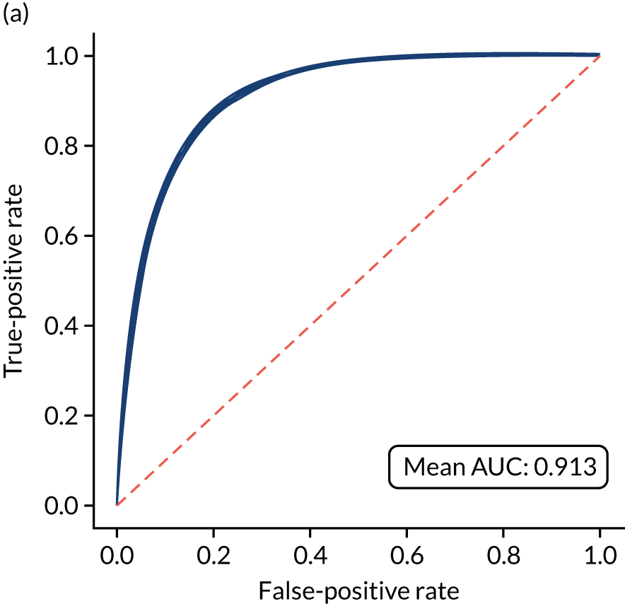
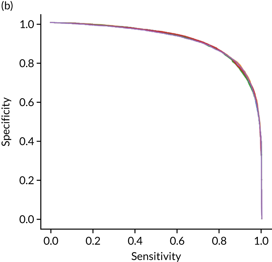
Learning curve
Figure 48 shows the relationship between training set size and accuracy for the fully connected neural network. Accuracy increases up to about a training set size of 30,000 samples, but then increases only marginally up to the maximum training set size of 72,000 samples. This implies that it is likely that only marginal performance gains may be achieved with more data.
FIGURE 48.
Learning curve (relationship between training set size and model accuracy) for a fully connected neural network. (a) The relationship between accuracy and training set size for the full training set; and (b) the view on training with up to 5000 samples. Results show mean values from fivefold validation.
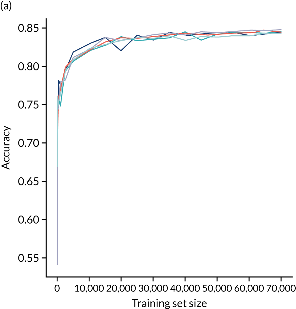
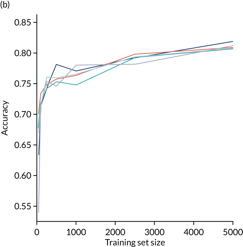
Calibration and assessment of accuracy when model has high confidence
The fully connected neural network model is well calibrated (Figure 49). Although the overall accuracy of the model is 84.4%, the accuracy of those 65% samples with at least 80% confidence in prediction is 90.3% (calculated separately).
FIGURE 49.
(a) Model probability calibration; and (b) model accuracy vs. confidence for a fully connected neural network. Results show separate fivefold validation results.
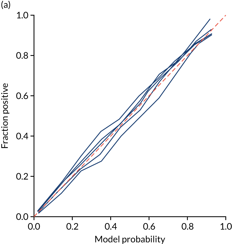
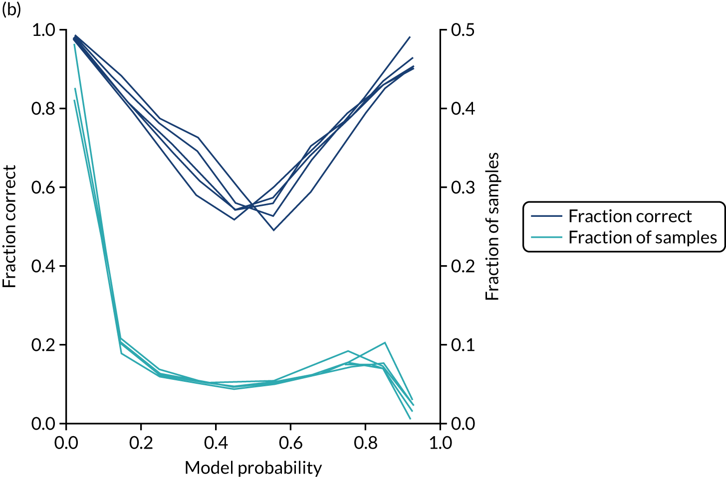
Modular neural network with one-dimensional embedding
These results are for a modular neural network with 1D embedding that is fitted to all hospitals simultaneously, with each hospital being a one-hot encoded feature. The neural network was fitted to normalised data.
Accuracy
The modular neural network with 1D embedding had an overall accuracy of 85.5% (vs. 84.4% for a fully connected neural network). With a default classification threshold, sensitivity (76.3%) is lower than specificity (89.3%), which is likely due to the imbalance of class weights in the data set. Full accuracy measures are given in Table 11.
| Accuracy measure | Mean (95% CI)a |
|---|---|
| Actual positive rate | 0.295 (0.000) |
| Predicted positive rate | 0.301 (0.008) |
| Accuracy | 0.855 (0.000) |
| Precision | 0.749 (0.007) |
| Recall/sensitivity | 0.763 (0.013) |
| F1 score | 0.756 (0.003) |
| Specificity | 0.893 (0.006) |
Receiver operating characteristic and sensitivity–specificity curves
Figure 50 shows ROC and sensitivity–specificity curves for the modular neural network with 1D embedding. Analyses were performed using fivefold validation. The mean ROC AUC was 0.921 (vs. 0.913 for the fully connected neural network). By using a different classification threshold to the default, the model can achieve 84.5% sensitivity and specificity simultaneously (vs. 83.3% for the fully connected neural network model).
FIGURE 50.
(a) ROC curve; and (b) sensitivity–specificity curve for a modular neural network with 1D embedding. Curves show separate fivefold validation results; however, multiple lines are not easily visible as they overlap each other.
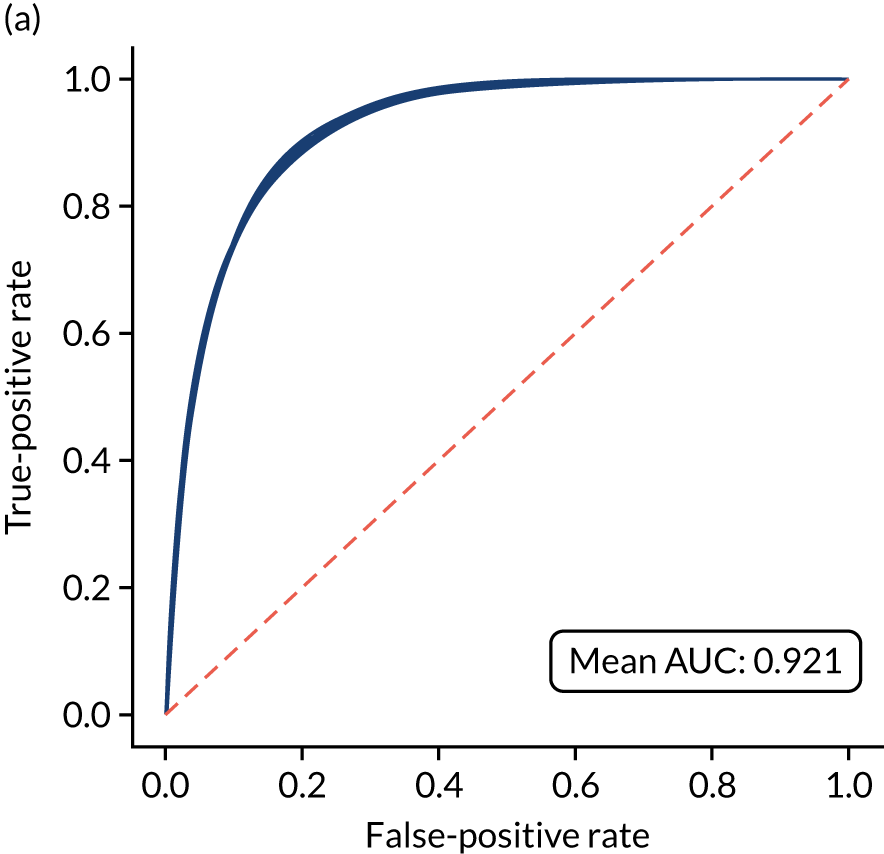

Calibration and assessment of accuracy when model has high confidence
The modular neural network model with 1D embedding is well calibrated (Figure 51). Although the overall accuracy of the model is 85.5%, the accuracy of those 65% samples with at least 80% confidence in prediction is 90.5% (calculated separately).
FIGURE 51.
(a) Model probability calibration; and (b) model accuracy vs. confidence for a modular neural network with 1D embedding. Results show separate fivefold validation results.
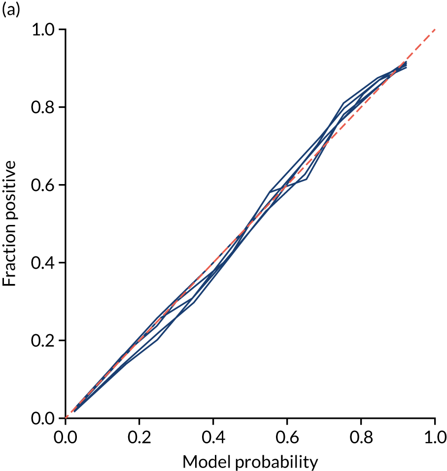
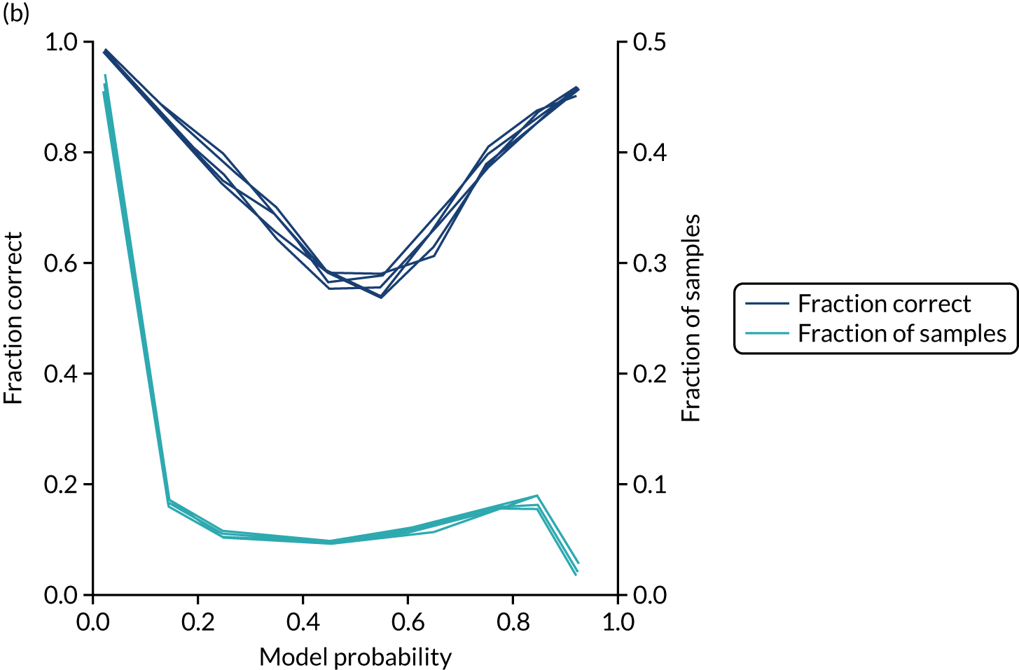
Investigating the one-dimensional hospital embeddings
We investigate the neural network hospital subnet embedding output by using a single training/test split, with 78,900 training samples and with 10,000 samples held back for testing. Train and test splits are balanced to have the same use of thrombolysis at each hospital in the training and test sets. The hospital subnet will always return the same embedding output value for each hospital ID. We will compare the hospital subnet embedding output with (1) the actual thrombolysis use at each hospital and (2) the predicted thrombolysis of an identical 10,000 set of patients at each hospital.
The actual thrombolysis use at each hospital is obtained from the SSNAP data set. The predicted thrombolysis of an identical 10,000 set of patients at each hospital are made by altering the hospital one-hot input vector so that the neural network may mimic any patient going to any hospital. By passing the 10,000 test cohort of patients through each of the hospital models in turn (i.e. by changing the hospital one-hot encoding input), we may obtain a thrombolysis rate expected for each hospital if those same 10,000 patients went to each hospital.
Figure 52 shows the relationship between the hospital subnet embedding output and the actual thrombolysis use at each hospital (see Figure 52a) and the predicted thrombolysis of an identical 10,000 set of patients at each hospital (see Figure 52b). The hospital subnet embedding output correlates well with actual thrombolysis use (R2 = 0.669), suggesting that a large degree of the inter-hospital variation in thrombolysis use may be attributed to the hospital. When compared with the predicted thrombolysis use of a standard 10,000 set of patients, the hospital subnet embedding output has a very high correlation with predicted thrombolysis use (R2 = 0.996). This analysis removes differences in patient populations being tested at each hospital. It is worth noting that the hospital subnet embedding output is fixed after training the neural network, and these 10,000 patients were not used during training. The hospital subnet embedding output, therefore, appears to rank the hospital’s tendency to use thrombolysis, without the need of assessing an independent group of patients. The very high correlation observed suggests that a hospital’s tendency to use thrombolysis can be almost completely explained by a single number (i.e. there is not a need to use more than one dimension of embedding output if we want to just analyse propensity to use thrombolysis). Note that in this output, there is an inverse relationship between hospital subnet embedding output and thrombolysis use. Neural networks do not necessarily have the expected intuitive direction of correlation within the middle layer, as a later layer may reverse that direction.
FIGURE 52.
Relationship of hospital subnet embedding output to (a) actual thrombolysis use at each hospital; and (b) predicted thrombolysis of an identical set of 10,000 patients at each hospital.

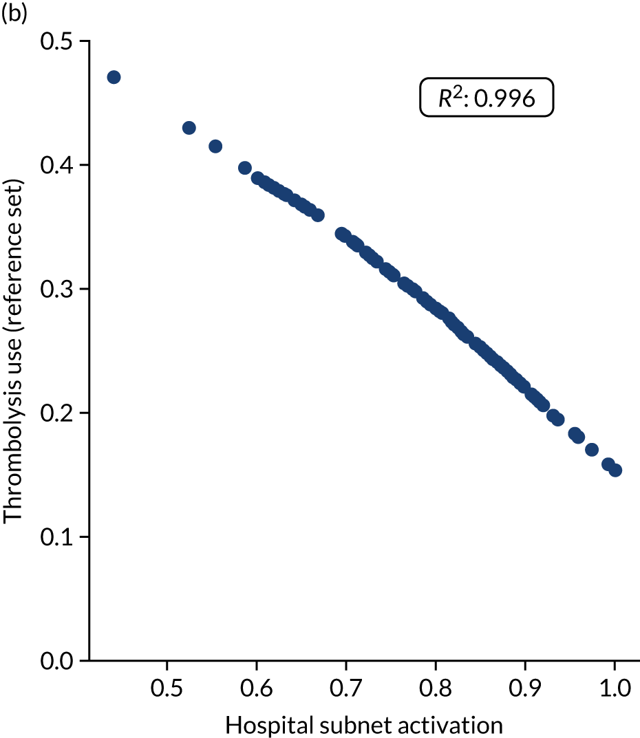
Investigating the one-dimensional clinical subnet embedding output
Each patient has a clinical subnet embedding output that is independent of hospital and process through the clinical pathway. We investigated the clinical subnet embedding output in the following three ways:
-
binning the clinical subnet embedding output and comparing the average embedding output with the actual use of thrombolysis in that group
-
for each patient, getting the predicted use of thrombolysis at each hospital and then comparing the clinical subnet embedding output with the number of hospitals expected to give that patient thrombolysis
-
investigating the relationship between clinical subnet embedding output and patient characteristics (e.g. age, stroke severity on arrival and disability prior to stroke).
Figure 53 shows the relationship between clinical subnet embedding output and the proportion of patients who received thrombolysis. There is a clear relationship between clinical subnet embedding output and the proportion of patients receiving thrombolysis. In the highest clinical subnet embedding output bin, a little over 70% of patients receive thrombolysis. This will not reach 100% because (1) some patients will have pathway data (e.g. late scan) that will lead to the patient not receiving thrombolysis and (2) some patients will attend hospitals with very low propensity to give thrombolysis (see Investigating the one-dimensional hospital embeddings).
FIGURE 53.
Relationship between patient clinical subnet embedding output (binned with divisions of 0.1) and the proportion of patients who receive thrombolysis.
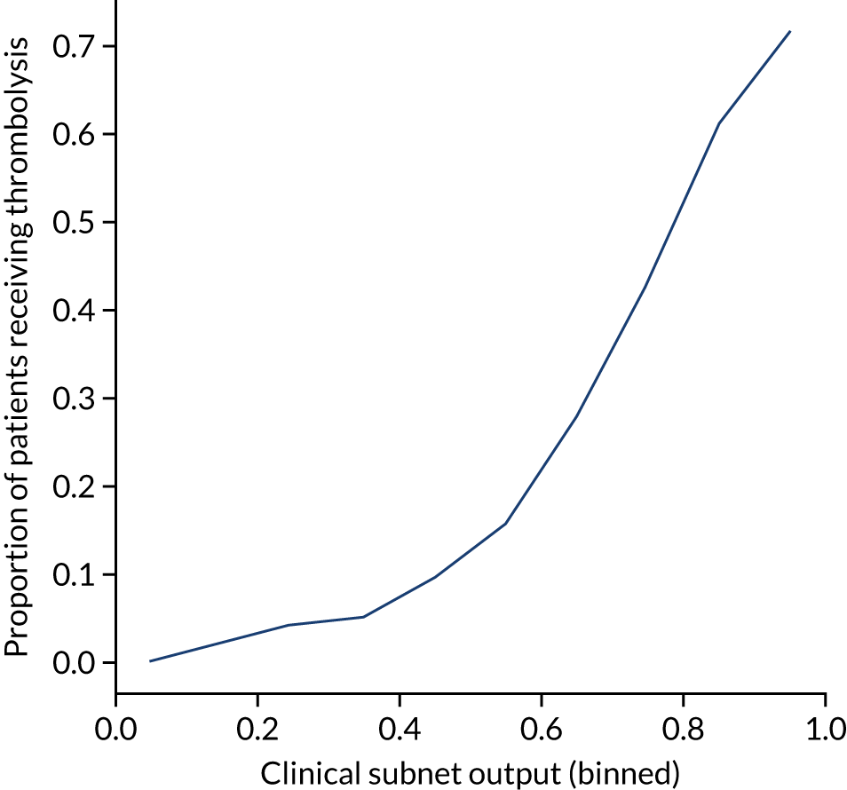
Figure 54 shows the relationship between patient clinical subnet embedding output and the number of hospitals that would be expected to give that patient thrombolysis. The clinical subnet embedding output provides a clear upper-bound to how many units are expected to give thrombolysis to a patient, but other factors, such as pathway speed, may mean that fewer units give thrombolysis.
FIGURE 54.
Relationship between patient clinical subnet embedding output and the number of hospitals that would be expected to give that patient thrombolysis (out of 132 hospitals). Each point is a single patient, with the colour and position on the y-axis indicating the number of units that would be expected to give that patient thrombolysis.
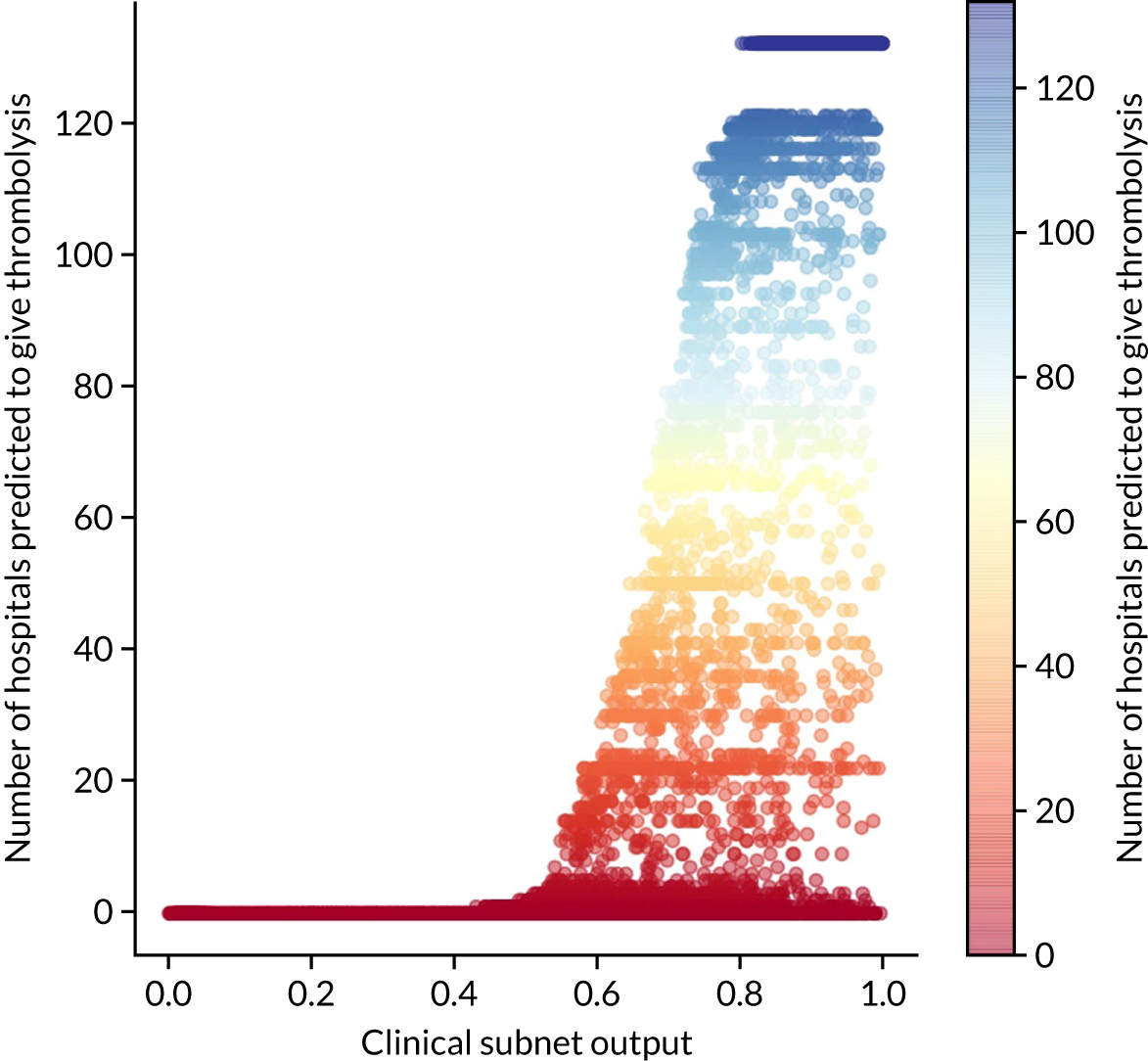
We investigated the relationship between various features and the clinical subnet output values.
Relationship between clinical subnet embedding output and patient age
Patient age had a modest relationship on clinical subnet embedding output. The mean output for patients aged < 80 years was 0.56, whereas for those aged ≥ 80 years it was 0.51.
Relationship between clinical subnet embedding output and stroke severity on arrival
Stroke severity on arrival showed a non-linear relationship with clinical subnet embedding output (Figure 55), with clinical subnet embedding output being lowest at both low and high NIHSS scores, consistent with the pattern of use of thrombolysis.
FIGURE 55.
Relationship between stroke severity (NIHSS) on arrival and clinical subnet output.
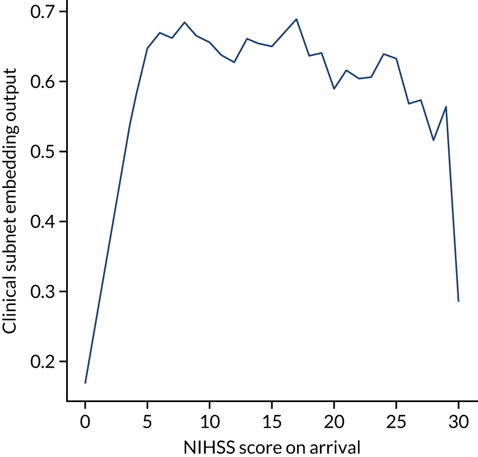
Relationship between clinical subnet embedding output and disability prior to stroke
As disability (i.e. mRS score) before stroke increases, then the clinical subnet output reduces, showing a clear reduction in perceived suitability for thrombolysis with higher previous disability (Figure 56).
FIGURE 56.
Relationship between disability (mRS) before stroke and clinical subnet embedding output.
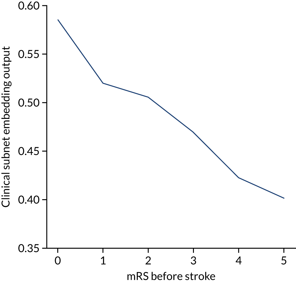
Modular neural network with two-dimensional embedding
These results are for a modular neural network with 2D embedding that is fitted to all hospitals simultaneously, with each hospital being a one-hot encoded feature. The neural network was fitted to normalised data.
Accuracy
The modular neural network with 2D embedding had an overall accuracy of 85.1% (vs. 85.5% for the 1D embedding model). With a default classification threshold, sensitivity (75.0%) is lower than specificity (89.4%), which is likely due to the imbalance of class weights in the data set. Full accuracy measures are given in Table 12.
| Accuracy measure | Mean (95% CI)a |
|---|---|
| Actual positive rate | 0.295 (0.000) |
| Predicted positive rate | 0.296 (0.006) |
| Accuracy | 0.851 (0.002) |
| Precision | 0.748 (0.006) |
| Recall/sensitivity | 0.750 (0.010) |
| F1 score | 0.749 (0.004) |
| Specificity | 0.894 (0.004) |
Receiver operating characteristic and sensitivity–specificity curves
Figure 57 shows ROC and sensitivity–specificity curves for the modular neural network with 2D embedding. Analyses were performed using fivefold validation. The mean ROC AUC was 0.919 (vs. 0.921 for the 1D embedding model). By using a different classification threshold to the default, the model can achieve 84.2% sensitivity and specificity simultaneously (compared with 84.5% for the 1D embedding model).
FIGURE 57.
(a) ROC curve; and (b) sensitivity–specificity curve for modular neural network with 2D embedding. Curves show separate fivefold validation results; however, multiple lines are not easily visible as they overlap each other.
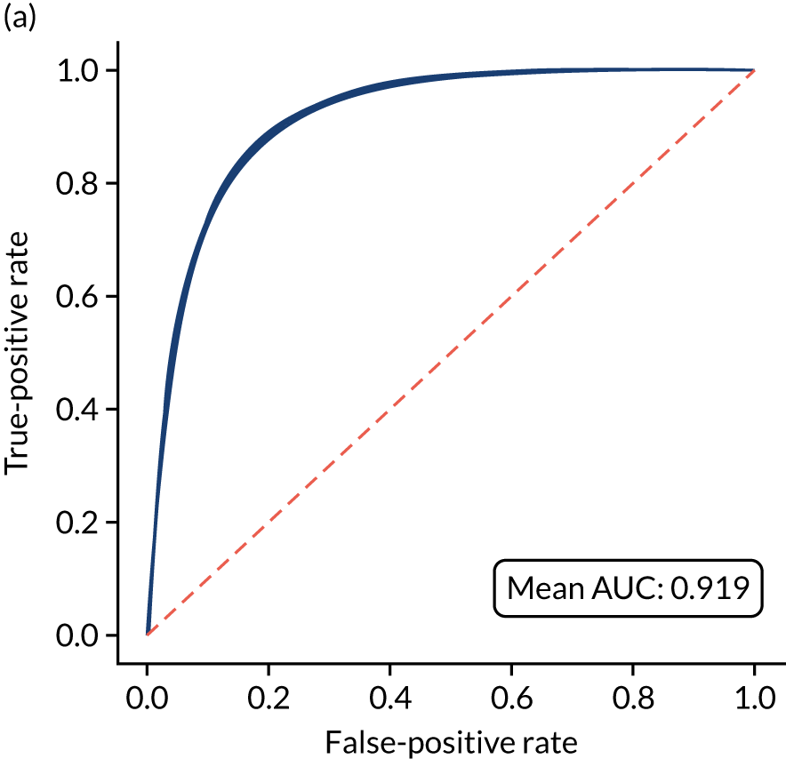
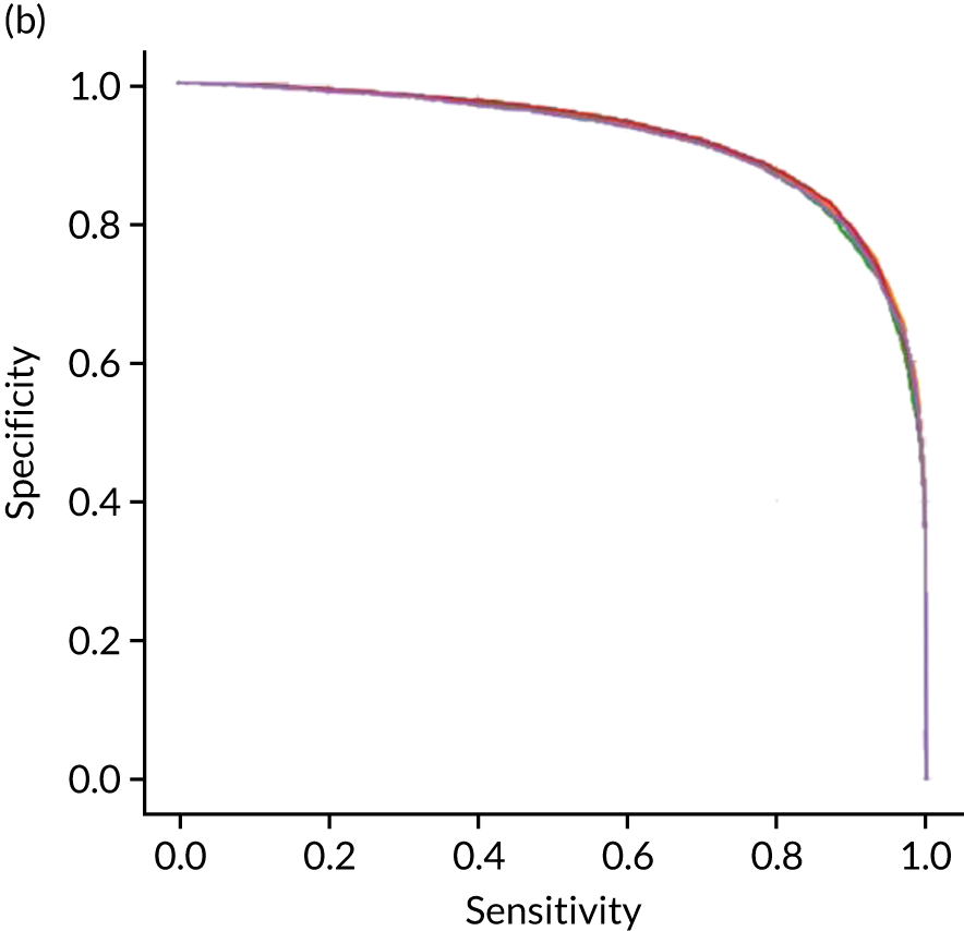
Calibration and assessment of accuracy when model has high confidence
The modular neural network model with 2D embedding is well calibrated (Figure 58). Although the overall accuracy of the model is 85.1%, the accuracy of those 66% samples with at least 80% confidence in prediction is 90.1% (calculated separately).
FIGURE 58.
(a) Model probability calibration; and (b) model accuracy vs. confidence for a modular neural network with 2D embedding. Results show separate fivefold validation results.
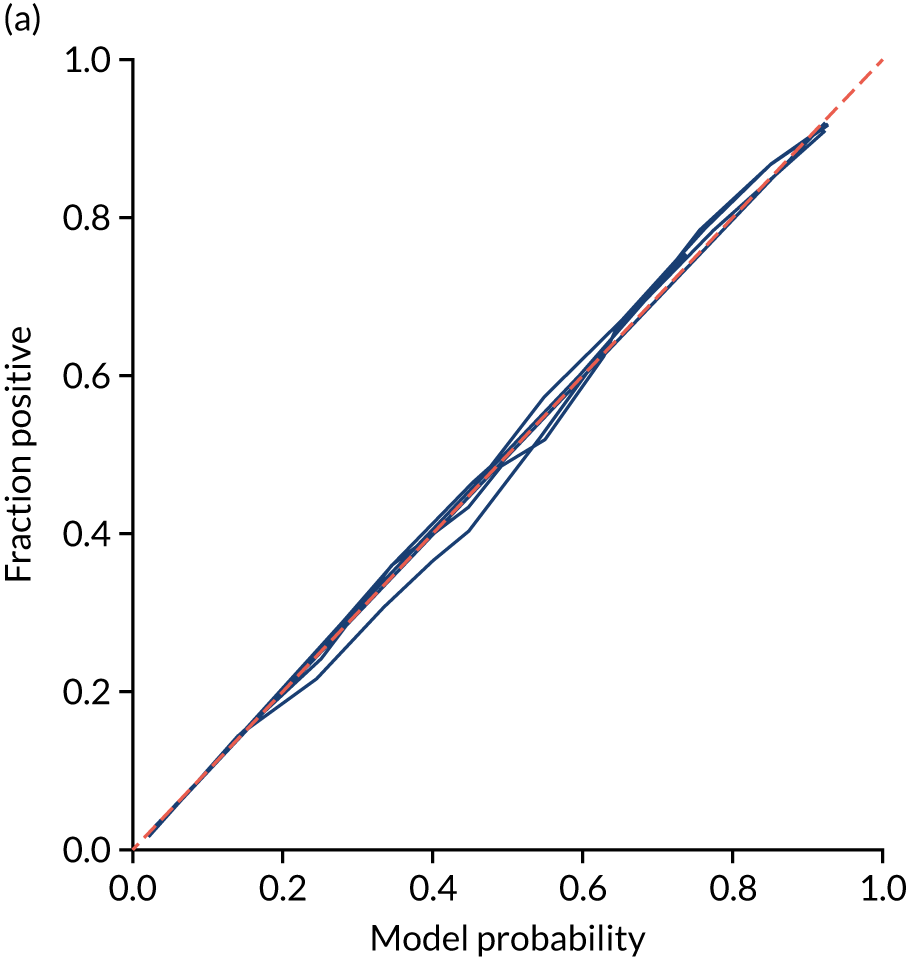
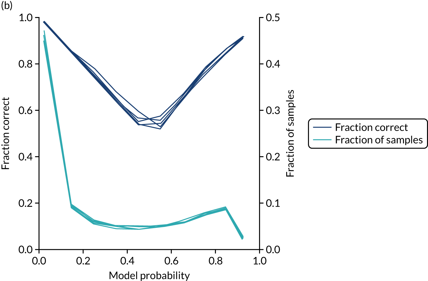
Investigating the two-dimensional hospital subnet embedding outputs
Although 1D embeddings allow us to rank hospitals by willingness to use thrombolysis, it is possible that 2D embeddings may reveal more sophisticated relationships. This, however, appears not to be the case. There appears to be a relatively simple relationship between the 2D hospital subnet embedding output and thrombolysis use (Figure 59).
FIGURE 59.
The relationship between the 2D hospital subnet embedding outputs (each axis showing one of the dimensions) and the thrombolysis use in each hospital, shown by colour.
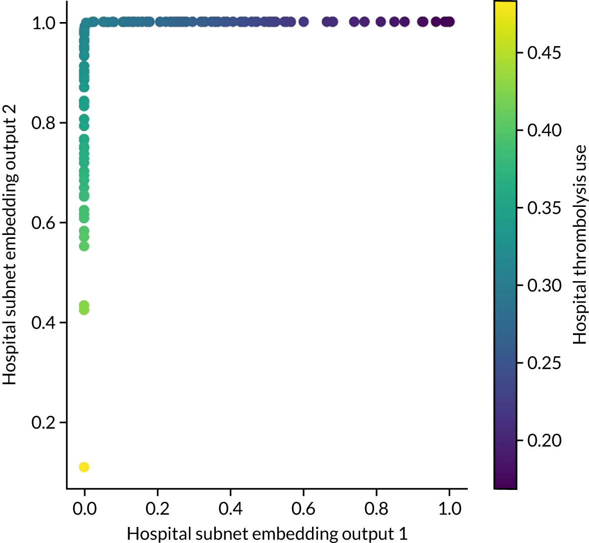
Investigating the two-dimensional clinical subnet embedding outputs
Although 1D embeddings allow us to rank patients by suitability for thrombolysis (by clinical characteristics alone), it is possible that 2D embeddings may reveal more sophisticated relationships, as we show in Figure 60.
To study the relationship between the clinical subnet embedding outputs and use of thrombolysis, we obtained the number of hospitals predicted to give thrombolysis to each patient, along with the patients’ clinical subnet embedding outputs.
Figure 60 shows the relationship between the clinical subnet embedding output and the number of hospitals at which a patient is predicted to receive thrombolysis. The patients most likely to be given thrombolysis are those in the top left of the scatterplot (i.e. x-axis close to 0 and y-axis close to 1). Predicted use of thrombolysis falls as a function of distance from that corner. Patients may be in that corner of the scatterplot and still not be predicted to receive thrombolysis at many hospitals, as the pathway data are not taken into account here (e.g. a patient may be clinically suitable for thrombolysis but be scanned too late).
FIGURE 60.
The relationship between the 2D clinical subnet embedding outputs (each axis showing one of the dimensions) for each patient and the number of hospitals predicted to give thrombolysis to that patient (shown by the colour of the data point).
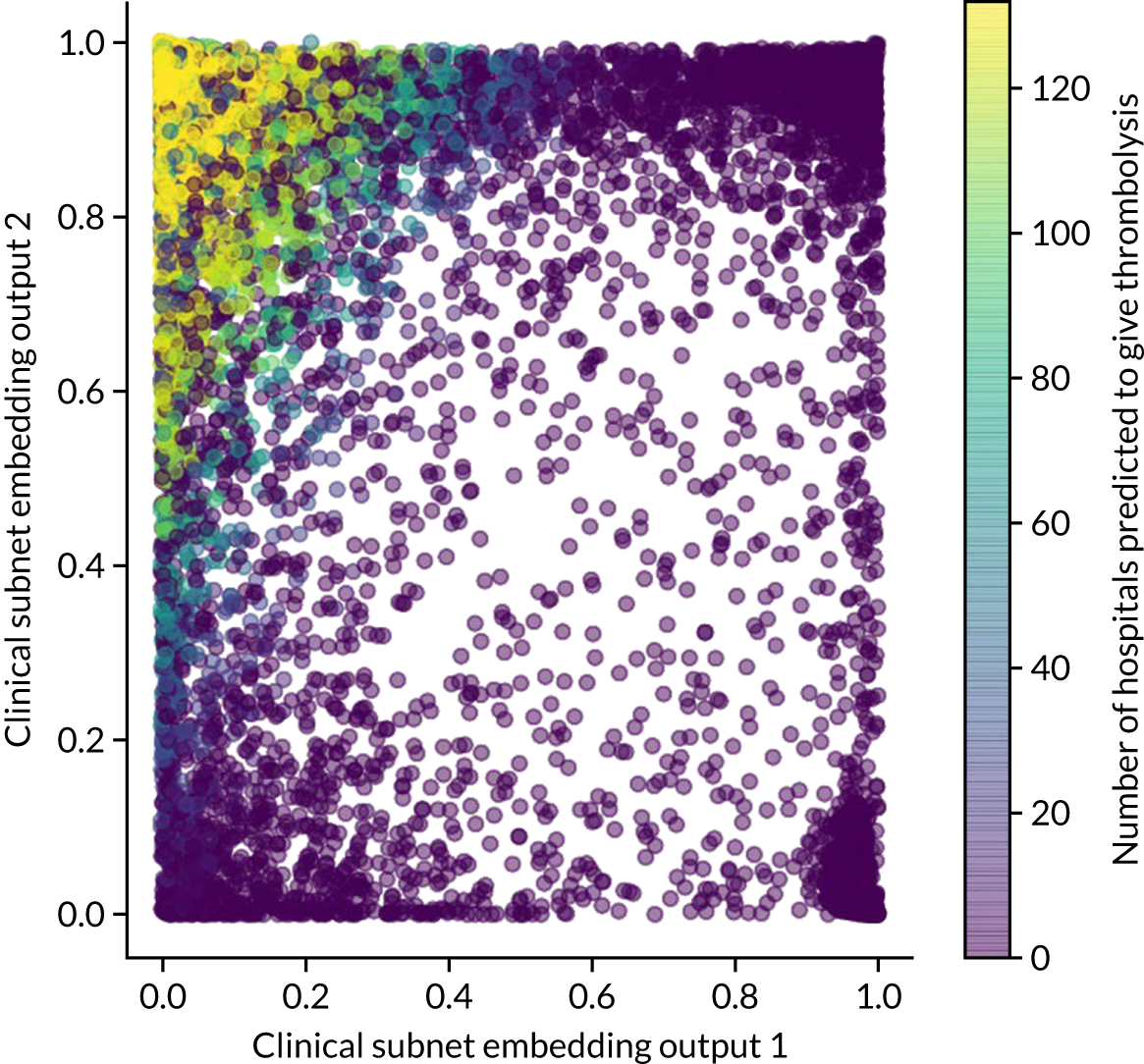
In theory, patients should cluster by similarity in decision-making. To explore this, we highlight on the scatterplot those patients with a haemorrhagic stroke (Figure 61). We see a clear clustering of haemorrhagic stroke patients at the opposite corner to those who receive thrombolysis, suggesting maximum ‘decision distance’ from those who receive thrombolysis.
FIGURE 61.
Clinical subnet embedding output marking of those patients with a haemorrhagic stroke (red) as opposed to a non-haemorrhagic stroke (blue).
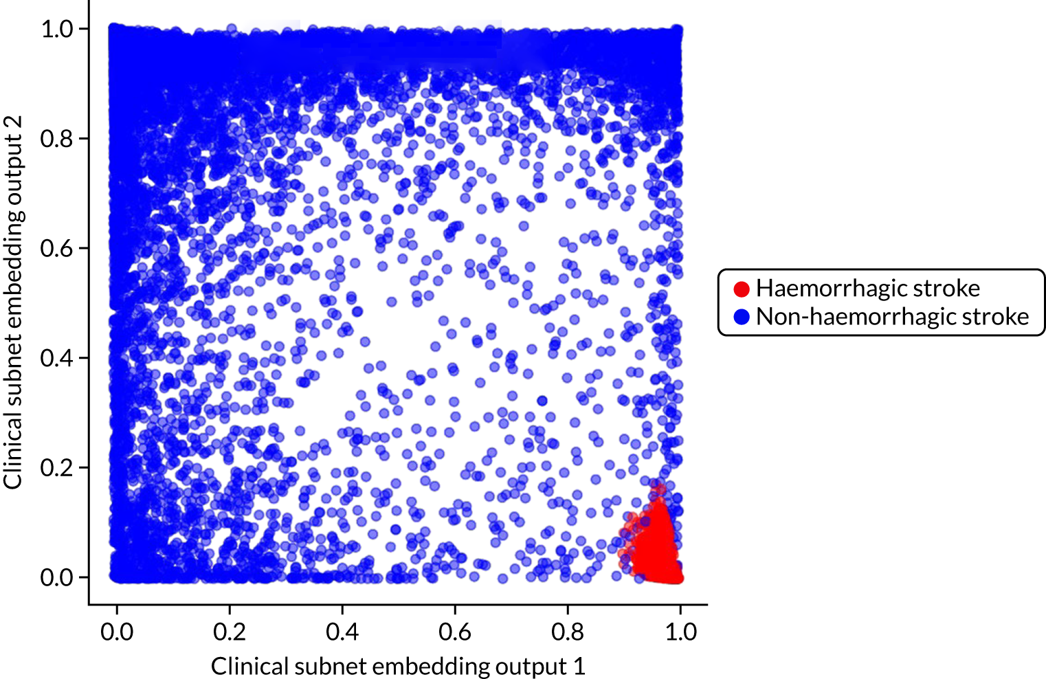
Patients in the top-right and bottom-left corners are also unlikely to receive thrombolysis (see Figure 61). We analysed patients in all of the corners of the chart (see Figure 61) to see whether or not they are different types of patients. We used cut-off values for each axis of 0.2 and 0.8. Results are shown in Table 13.
| Characteristic | Clinical subnet values | |||
|---|---|---|---|---|
| x-axis < 0.2, y-axis < 0.2 | x-axis < 0.2, y-axis > 0.8 | x-axis > 0.8, y-axis < 0.2 | x-axis > 0.8, y-axis > 0.8 | |
| mRS before stroke | 2.87 | 0.24 | 1.14 | 0.49 |
| NIHSS score on arrival | 18.3 | 11.81 | 12.55 | 0.94 |
| Haemorrhagic stroke | 0.00 | 0.00 | 0.95 | 0.00 |
| Number of hospitals giving patient thrombolysis (out of 132) | 3.9 | 102.0 | 0.0 | 0.0 |
Machine learning: comparison of models and ensemble modelling
What is in this section?
-
A summary of accuracy previously measured in k-fold validation.
-
A comparison of probability outputs from logistic regression (single-fit), random forest (single-fit) and neural networks (1D embedding), all using a single 10,000 test set.
-
An assessment of ensemble models. These ensemble models combine the outputs of the three different model types into a single output. The ensemble models may use only the output of the three models (i.e. logistic regression, random forest and neural network) or may combine those outputs with all the original patient data as well. The ensemble models may themselves be based on logistic regression, random forest or a fully connected neural network.
Detailed code and results are available online. 37
Key findings in this section
-
There is high agreement between model types. Logistic regression (single-fit), random forest (single-fit) and neural networks (1D embedding) agree classification on 87% of patients. Neural networks and random forest agree on 93% of patients.
-
There is generally higher agreement between different model types (87–93% for any pairwise comparison) than between models and reality (83–86% accuracy for the same model types).
-
Ensemble methods did not improve prediction accuracy.
Introduction to ensemble models
Ensemble modelling, also known as ‘model stacking’, is a process where multiple diverse models are created to predict an outcome. We train logistic regression, random forest and neural network models independently. Each model predicts the probability of whether or not a patient receives thrombolysis. These predictions become the inputs to an ensemble model. The ensemble model may be of any model type (i.e. logistic regression, random forest or neural network), and we test all three types of ensemble model.
Summary of k-fold validation
Table 14 shows a summary of model accuracies. The highest-performing model, by a modest margin, was the modular neural network with 1D embedding. With logistic regression and random forest, a single-fit model outperformed models fitted individually to hospitals. Although accuracy is important, small differences in accuracies must be balanced with explainability and interpretability of models. Although methods for understanding neural networks are improving (e.g. by use of Shapley values), they are still more ‘black box’ than traditional models, such as logistic regression and random forest. Currently, therefore, our preferred model for use in SSNAP is the hospital-level random forest model (with independent models for each hospital). This type of model reduces the barriers to acceptance that can occur with more opaque models, such as the embedding neural network.
| Modela | Accuracy (%) | ROC AUC | Max sensitivity = specificity (%)b |
|---|---|---|---|
| Logistic regression single model | 83.2 | 0.904 | 82.0 |
| Logistic regression hospital-level models | 80.6 | 0.870 | 78.9 |
| Random forest single model | 84.6 | 0.914 | 83.7 |
| Random forest hospital-level models | 84.3 | 0.906 | 83.2 |
| Fully-connected neural net single model | 84.4 | 0.913 | 83.3 |
| Embedding (1D) neural net single model | 85.5 | 0.921 | 84.5 |
| Embedding (2D) neural net single model | 85.1 | 0.919 | 84.2 |
Although the accuracy is better when all data are used to train a single model (using one-hot encoding of hospitals), there is an advantage in terms of simplicity of understanding/communication to having separate models for different hospitals.
Comparison of models
Logistic regression (single-fit), random forest (single-fit) and neural network (1D embedding) models were fitted to data, holding back the same set of 10,000 test patients.
For each pairwise comparison of the models, Figure 62 shows the comparison of the predicted probabilities of a patient receiving thrombolysis. The neural network and random forest models showed highest correlation (R2 = 0.895), followed by neural network and logistic regression (R2 = 0.862), with logistic regression and random forest having the lowest correlation (R2 = 0.795). The high correlation between all models suggests that models are finding similar patterns to predict use of thrombolysis.
FIGURE 62.
A comparison of predicted probabilities of receiving thrombolysis. (a) Random forest vs. logistic regression; (b) neural network vs. logistic regression; and (c) neural network vs. random forest. Data shown are for 10,000 test set patients. Points in dark blue show agreement in classification and points in light blue show disagreement (using the default classification threshold of 0.5).

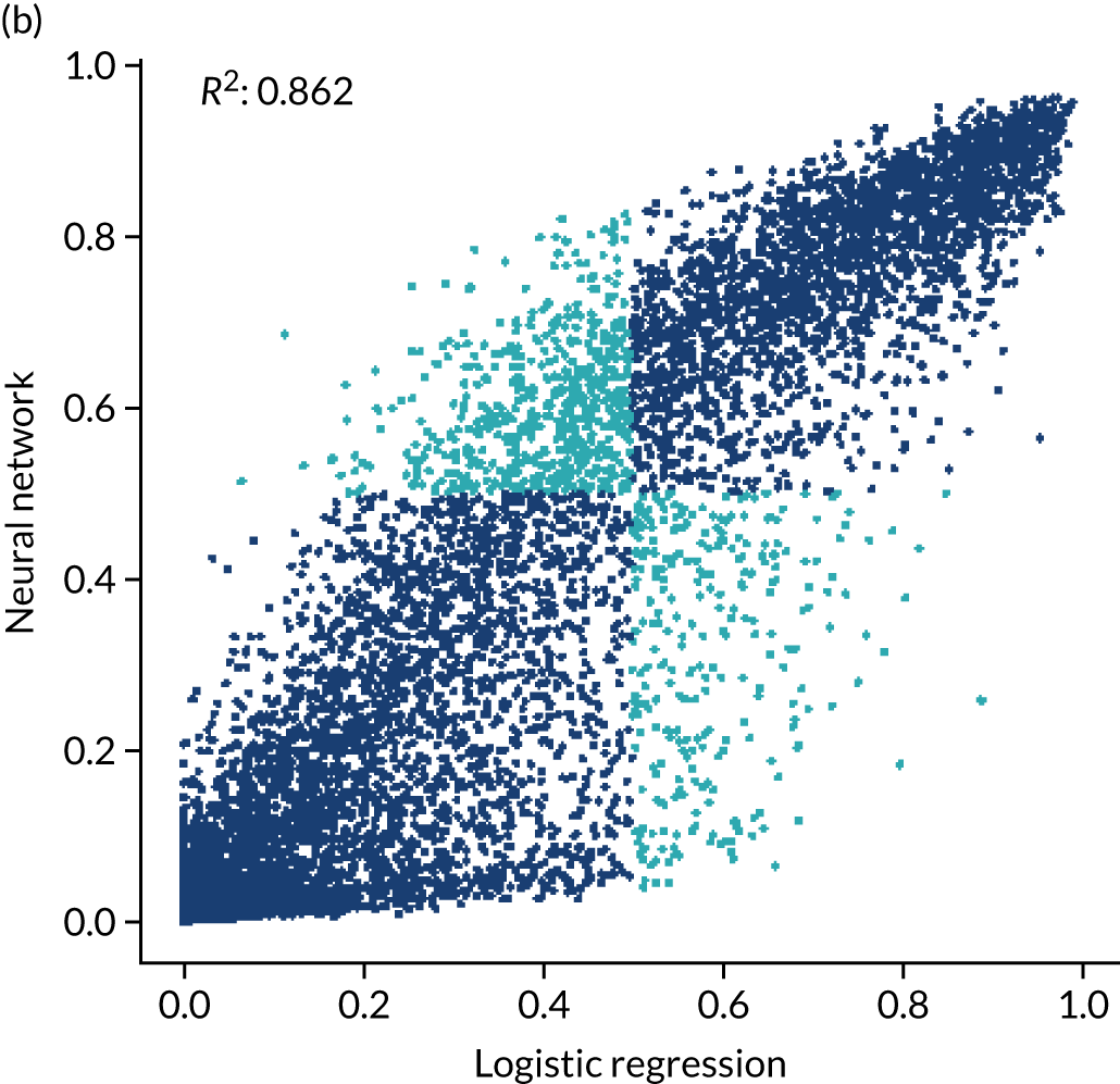
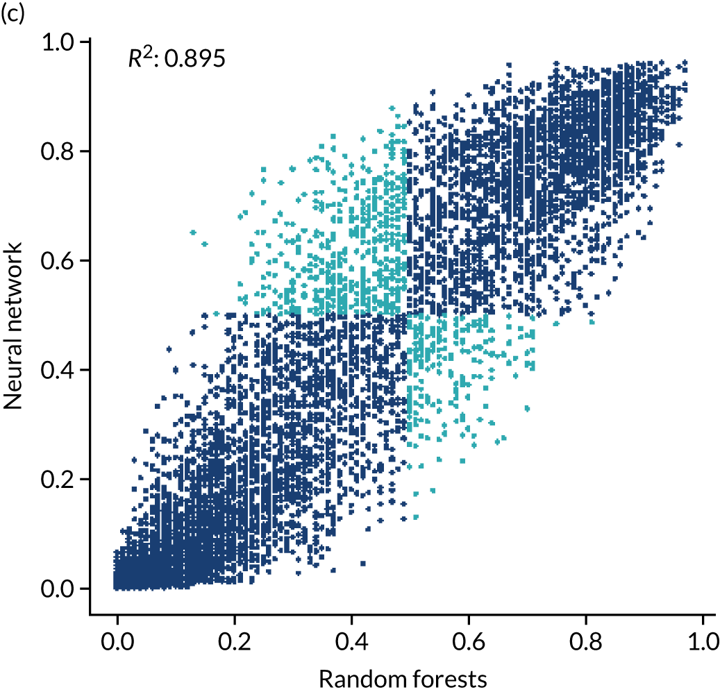
Figure 63 shows the confusion matrices for predicted use of thrombolysis. The highest agreement is between neural networks and random forest (92.7%), followed by neural networks and logistic regression (91.4%) and then logistic regression and random forest (89.3%). All three models are in agreement for 86.7% of patients.
FIGURE 63.
Confusion matrices for predicted use of thrombolysis. (a) Random forest vs. logistic regression; (b) neural network vs. logistic regression; and (c) neural network vs. random forest. Data shown are for 10,000 test set patients using the default classification threshold of 0.5.


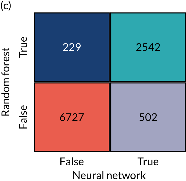
For comparison, confusion matrices for predicted compared with actual thrombolysis use (the same as the reported accuracy of the model) are shown for each model type in Figure 64. It is noteworthy that there is a little higher agreement between model types than between models and reality.
FIGURE 64.
Confusion matrices for predicted vs. actual use of thrombolysis. (a) Logistic regression; (b) random forest; and (c) neural network. Data shown are for 10,000 test set patients using the default classification threshold of 0.5.


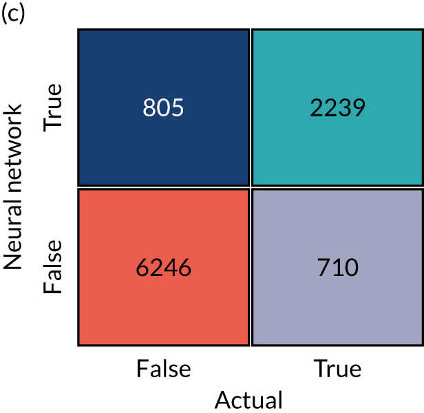
Ensemble models
Ensemble models may be used to combine the outputs of diverse types of models and may lead to improvement in model accuracy over any model type alone. The ensembling may be performed using each of the different model types (i.e. logistic regression, random forest or neural networks). Here, we train models (using the train/test split with 10,000 patients in the test set) using logistic regression, random forest or a fully connected neural network. All models are fitted as a single model with one-hot encoding of hospital ID if the original patient data are used. We compare accuracy when fitting to the original patient data alone, fitting only to the probability outputs of the previously described models (see Comparison of models) or fitting to a combination of raw patient data and outputs from previously trained models. Results are summarised in Table 15. Using ensemble models did not lead to improvement in model accuracy.
| Data used | Model type | ||
|---|---|---|---|
| Logistic regression (%) | Random forest (%) | Neural network (fully connected) (%) | |
| Original patient data only | 83.2 | 84.2 | 83.4 |
| Model probability output only | 83.6 | 83.8 | 83.5 |
| Original patient data + model probability output | 83.9 | 84.2 | 83.0 |
Chapter 6 Clinical pathway simulation
Clinical pathway simulation models were used to examine the effect, at each hospital and nationally, of making three key changes (alone or in combination) to the stroke pathway, that is, (1) speed, (2) proportion of patients with determined stroke onset time and (3) clinical decision-making.
What is in this section?
This section describes the stroke pathway model and validates that pathway model against current thrombolysis use at each of the 132 hospitals.
The pathway model is then used to examine the effect, at each hospital and nationally, of making the following three key changes (alone or in combination) to the stroke pathway:
-
Speed sets 95% of patients as having a scan within 4 hours of arrival and all patients as having a 15-minute arrival-to-scan time and a 15-minute scan-to-needle time.
-
Onset known sets the proportion of patients with a known stroke onset time to the national upper quartile if currently less than the national upper quartile (leaving any patients greater than the upper national quartile at their current level).
-
The benchmark thrombolysis rate takes the likelihood to give thrombolysis for patients scanned within 4 hours of onset from the majority vote of the 30 hospitals with the highest predicted thrombolysis use in a standard cohort set of 10,000 patients. The models used to predict thrombolysis are individual hospital random forest models.
The code for building the pathway model, and model validation, may be found online,38 as can the code for scenario testing and results. 39
Key findings in this section
-
The pathway model predicts current thrombolysis use with high accuracy (R2 of 0.980 and mean absolute difference in thrombolysis use of 0.5 percentage points).
-
Combining the three changes suggests that thrombolysis use could potentially be increased from 11.6% to 18.3% of all emergency admissions, and the clinical benefit increased from 9.4 to 17.6 additional good outcomes per 1000 admissions. The main drivers in improvement in thrombolysis use were benchmark decisions, followed by determining stroke onset and then speed, whereas the main drivers in improvement in outcomes were speed, followed by benchmark decisions and then determining stroke onset.
-
The pathway model identifies the changes that make the most difference at each hospital. For improvement in thrombolysis use, the changes that make the greatest single difference are benchmark decisions (at 83 hospitals), determining stroke onset time (at 39 hospitals) and speed (at 10 hospitals). For improvement in predicted clinical benefit, the changes that make the greatest single difference are benchmark decisions (at 56 hospitals), speed (at 49 hospitals) and determining stroke onset time (at 27 hospitals).
-
If all changes were made at all hospitals, then there would still be significant variation in use of, and benefit from, thrombolysis. This variation is due to differences in local patient populations (in terms of both differing clinical presentations and differences in onset-to-arrival time); nevertheless, the total national benefit would be significantly improved.
-
The pathway model may be used to provide a target use of thrombolysis that is tailored to each hospital.
Benefit from thrombolysis
The clinical benefit from thrombolysis depends on the onset-to-needle time. To estimate the benefit from thrombolysis, depending on simulated onset-to-needle time, we use a meta-analysis of clinical trials. 5
Data processing for pathway simulation
Data processing for the pathway simulation is described in Appendix 2.
Each hospital has a base scenario based on its current performance. A statistical summary of these parameters across 132 hospitals is shown in Table 16. Table 16 shows a description of the ranges used for model parameters. Full parameters for each hospital may be found online. 40
| Parameter | Count | Mean | SD | Minimum | 25% | 50% | 75% | Maximum |
|---|---|---|---|---|---|---|---|---|
| Thrombolysis_rate | 132 | 0.115 | 0.035 | 0.015 | 0.093 | 0.110 | 0.133 | 0.243 |
| Admissions | 132 | 573 | 277 | 101 | 378 | 544 | 755 | 2039 |
| 80_plus | 132 | 0.426 | 0.056 | 0.292 | 0.387 | 0.428 | 0.458 | 0.576 |
| Onset_known | 132 | 0.666 | 0.134 | 0.345 | 0.574 | 0.642 | 0.753 | 0.988 |
| Known_arrival_within_4hrs | 132 | 0.601 | 0.090 | 0.257 | 0.558 | 0.609 | 0.662 | 0.814 |
| Onset_arrival_mins_mu | 132 | 4.572 | 0.098 | 3.768 | 4.530 | 4.580 | 4.629 | 4.763 |
| Onset_arrival_mins_sigma | 132 | 0.560 | 0.121 | 0.435 | 0.517 | 0.547 | 0.586 | 1.801 |
| Scan_within_4_hrs | 132 | 0.948 | 0.030 | 0.847 | 0.933 | 0.954 | 0.969 | 1.000 |
| Arrival_scan_arrival_mins_mu | 132 | 3.280 | 0.409 | 1.666 | 3.030 | 3.310 | 3.572 | 4.236 |
| Arrival_scan_arrival_mins_sigma | 132 | 0.941 | 0.221 | 0.549 | 0.788 | 0.891 | 1.034 | 1.751 |
| Onset_scan_4_hrs | 132 | 0.875 | 0.043 | 0.627 | 0.853 | 0.877 | 0.904 | 0.962 |
| Eligable | 132 | 0.338 | 0.083 | 0.111 | 0.276 | 0.332 | 0.399 | 0.532 |
| Scan_needle_mins_mu | 132 | 3.426 | 0.342 | 2.573 | 3.204 | 3.426 | 3.677 | 4.409 |
| Scan_needle_mins_sigma | 132 | 0.690 | 0.156 | 0.366 | 0.579 | 0.662 | 0.793 | 1.283 |
Clinical pathway simulation methodology
The pathway simulation is constructed in Python, using NumPy. 41 The code for the model may be found online. 42 The stroke pathway simulation models the passage of a cohort of patients through a hospital’s stroke pathway. Timings in the simulation are sampled from distributions using NumPy’s ‘random’ library, which uses the Permuted Congruential Generator (64-bit) pseudo-random number generator. These distributions may be based on observed timings or may be ‘What if?’ scenarios, such as ‘What if arrival-to-scan time was consistently 15 minutes?’. All process times are sampled from log-normal distributions (see Chapter 4, Distribution of process times, for more detailed analysis).
The key process steps in the pathway are shown in Figure 65. Patients can leave the pathway at each step if their pathway durations exceed the permitted time limits or if they become ineligible for treatment. Only patients who satisfy all restrictions continue along the full length of the pathway and receive thrombolysis. The outcome is then calculated as a probability of having a good outcome (i.e. mRS score of 0–1). If the patient does not receive thrombolysis, then the probability of a good outcome is the baseline probability of a good outcome in the population age group (aged < 80 years vs. ≥ 80 years). If the patient received thrombolysis, then the probability of a good outcome is based on age group and time to treatment (see Chapter 1, Intravenous thrombolysis).
FIGURE 65.
Schematic representation of the stroke pathway as simplified for the simulation. Patients can leave the pathway at each step if their pathway durations exceed the permitted time limits or if they become ineligible for treatment. Only patients who satisfy all restrictions continue along the full length of the pathway.

Individual patient pathways are modelled within a NumPy array for each hospital. The following fields are populated based on sampling from distributions:
-
Patients aged ≥ 80 years (Boolean, based on Bernoulli distribution).
-
Allowable onset-to-needle time (minutes, specified: may depend on age).
-
Stroke onset time known (Boolean, based on Bernoulli distribution).
-
Onset-to-arrival time is < 4 hours (Boolean, based on Bernoulli distribution).
-
Stroke onset time known and onset-to-arrival time is < 4 hours (Boolean, calculated based on values above).
-
Onset-to-arrival time (minutes, based on log-normal distribution).
-
Arrival-to-scan time is < 4 hours (Boolean, based on Bernoulli distribution).
-
Arrival-to-scan time (minutes, based on log-normal distribution).
-
Time left to thrombolyse (minutes, calculated based on values above).
-
Stroke onset time known and time left to thrombolyse (Boolean, calculated based on values above).
-
Ischaemic stroke (if they are filtered at this stage, Boolean, based on Bernoulli distribution).
-
Assign eligible for thrombolysis (Boolean, based on Bernoulli distribution). (Will receive thrombolysis if scanned within permitted treatment time.)
-
Thrombolysis planned (Boolean, calculated: scanned within time and eligible).
-
Scan-to-needle time (minutes, based on log-normal distribution).
Using these populated fields, the following steps are carried out to calculate the probability of a good outcome:
-
Clip onset to thrombolysis time to maximum allowable onset-to-needle time (minutes).
-
Set baseline probability of good outcome based on age group (scalar probability).
-
Convert baseline probability good outcome to odds (scalar odds).
-
Calculate odds ratio of good outcome based on onset-to-needle time (scalar odds ratio).
-
Calculate patient odds of good outcome if given thrombolysis (scalar-adjusted odds).
-
Calculate patient probability of good outcome if given thrombolysis (scalar-adjusted probability).
-
Clip patient probability of good outcome to minimum of zero (scalar-adjusted probability).
-
Calculate individual patient good outcome if given thrombolysis (Boolean). (Net population outcome is calculated here by summing probabilities of good outcome for all patients, rather than using individual outcomes. These columns are added for potential future use.)
-
Calculate individual patient good outcome if not given thrombolysis (Boolean). (Net population outcome is calculated here by summing probabilities of good outcome for all patients, rather than using individual outcomes. These columns are added for potential future use.)
Replication was set to 100 × 1-year runs, and this gave a precision (95% confidence limit) of < 5% of mean values for thrombolysis use and predicted number of additional good outcomes.
Validation of the pathway simulation
To validate the pathway model, the model was parameterised from the pathway statistics extracted from SSNAP, and the predicted thrombolysis rate for each hospital was compared with the actual thrombolysis rate. The pathway model reliably replicated the thrombolysis use in hospitals (Figure 66). Predicted thrombolysis use correlated with actual thrombolysis use with a R2 of 0.980. The mean thrombolysis use (averaged at hospital level, weighting all hospitals equally) was 11.45% in the observed data and 11.23% in the pathway model output. The mean difference in thrombolysis use between predicted use and actual use was 0.22 percentage points. The mean absolute difference in thrombolysis use between predicted use and actual use was 0.52 percentage points.
FIGURE 66.
Validation of the stroke thrombolysis pathway. The x-axis shows actual thrombolysis use in each hospital (for patients with out-of-hospital stroke onset) and the y-axis shows thrombolysis use predicted from the pathway model. Model parameters were based on pathway statistics for each hospital. The dotted line shows a perfect correlation between actual and predicted values.
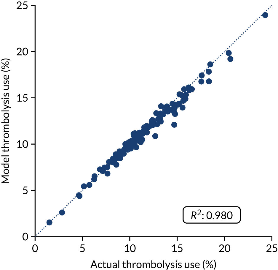
Precision of key pathway model outputs
Based on replication of 100 years per simulation run, the mean 95% confidence interval for thrombolysis use (%) prediction at each hospital in the base case was ± 0.28. The mean 95% confidence interval for additional good outcomes per 1000 admissions prediction at each hospital in the base case was ± 0.24. These values represent 2.5% and 2.8% of the mean values for thrombolysis use and additional good outcomes.
Testing of alternative scenarios
Using the pathway model, we can make key changes to the pathway for all hospitals, examining the overall effect on use of thrombolysis and the resulting benefit (which will change based on both use and speed of thrombolysis). We can examine the contribution of the following changes to the possible improvement in use of, and benefit from, thrombolysis:
-
Base uses the hospitals’ recorded pathway statistics in SSNAP (same as validation notebook).
-
Speed sets 95% of patients as having a scan within 4 hours of arrival, and all patients as having a 15-minute arrival-to-scan time and a 15-minute scan-to-needle time.
-
Onset known sets the proportion of patients with a known stroke onset time to the national upper quartile if currently less than the national upper quartile (patients with a known stroke onset time greater than the upper national quartile are left at their current level).
-
The benchmark thrombolysis rate takes the likelihood to give thrombolysis for patients scanned within 4 hours of onset from the majority vote of the 30 hospitals with the highest predicted thrombolysis use in a standard cohort set of 10,000 patients. The models used to predict thrombolysis are individual hospital random forest models.
-
Combine speed and onset known.
-
Combine speed and benchmark thrombolysis rate.
-
Combine onset known and benchmark thrombolysis rate
-
Combine speed, onset known and benchmark thrombolysis rate.
Overall results
Figure 67 shows the overall net effect of separate and combined changes to the stroke pathway. The pathway simulation suggests that thrombolysis use could potentially be increased from 11.6% to 18.3% of all emergency admissions, and the clinical benefit increased from 9.4 to 17.6 additional good outcomes per 1000 admissions. The main drivers in improvement in thrombolysis use were benchmark decisions, followed by determining stroke onset and then speed, whereas the main drivers in improvement in outcomes were speed, followed by benchmark decisions and then determining stroke onset.
FIGURE 67.
(a) Net national changes in thrombolysis use; and (b) clinical benefit by changing aspects of the stroke pathway (i.e. speed of stroke pathway, determining stroke onset time and using benchmark decisions). Results show effects across all 132 English stroke units, with averages weighted by admission numbers.
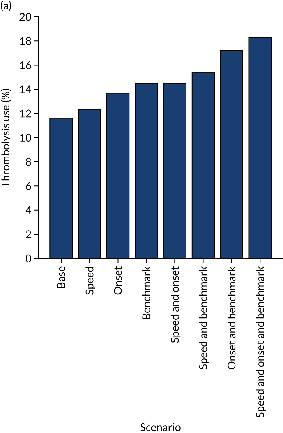
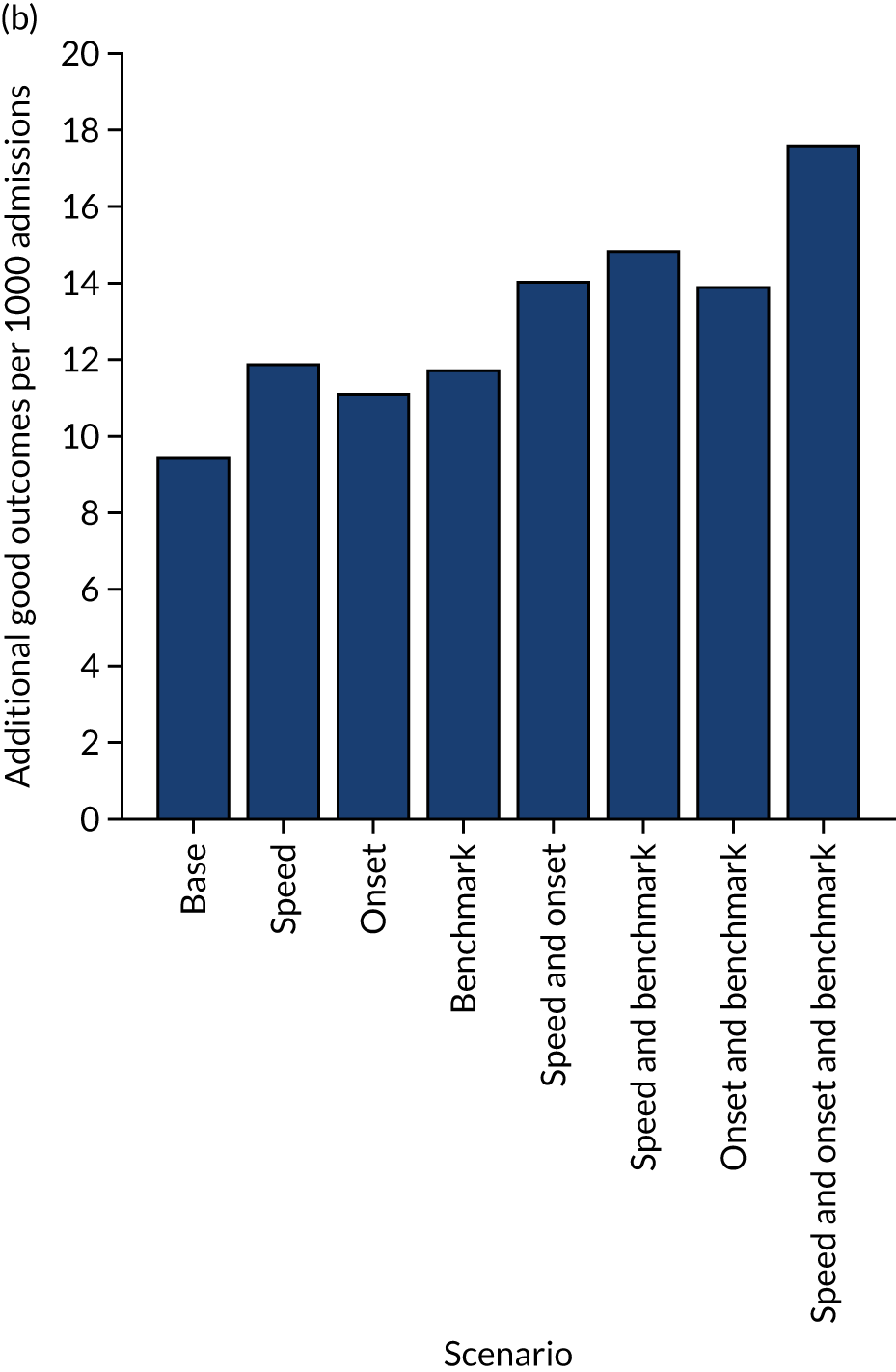
Figure 68 shows the distribution of use of, and benefit from, thrombolysis before and after all the modelled changes. It is noteworthy that there is still significant variation between hospitals, but the distributions have been shifted.
FIGURE 68.
Histograms for changes in distribution in (a) thrombolysis use; and (b) clinical benefit by combining changes to speed (i.e. 95% of patients have a 15-minute arrival-to-scan time and a 15-minute scan-to-treatment time, with other patients not being scanned within 4 hours of arrival), determining stroke onset time (i.e. changing to the national upper quartile if currently lower) and using benchmark decisions. The unshaded histogram shows the current base-case use of, and benefit from, thrombolysis, and the shaded histogram shows the predictions with all changes.
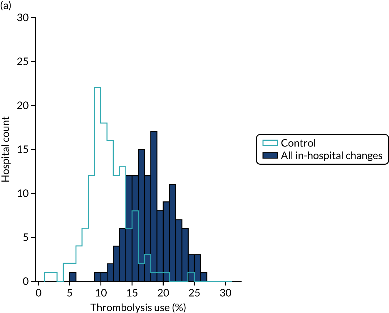

Effects at hospital level
Figures 69–72 show effects of combined changes and individual changes at a hospital level.
FIGURE 69.
(a) Changes in thrombolysis use; and (b) clinical benefit by combining changes to speed of stroke pathway (i.e. 95% of patients have a 15-minute arrival-to-scan time and a 15-minute scan-to-treatment time, with other patients not being scanned within 4 hours of arrival), determining stroke onset time (i.e. changing to the national upper quartile if currently lower) and using benchmark decisions. Points show before/after results for each hospital. Dark blue points/lines show an increase in use/benefit and light blue points/lines show a reduction.
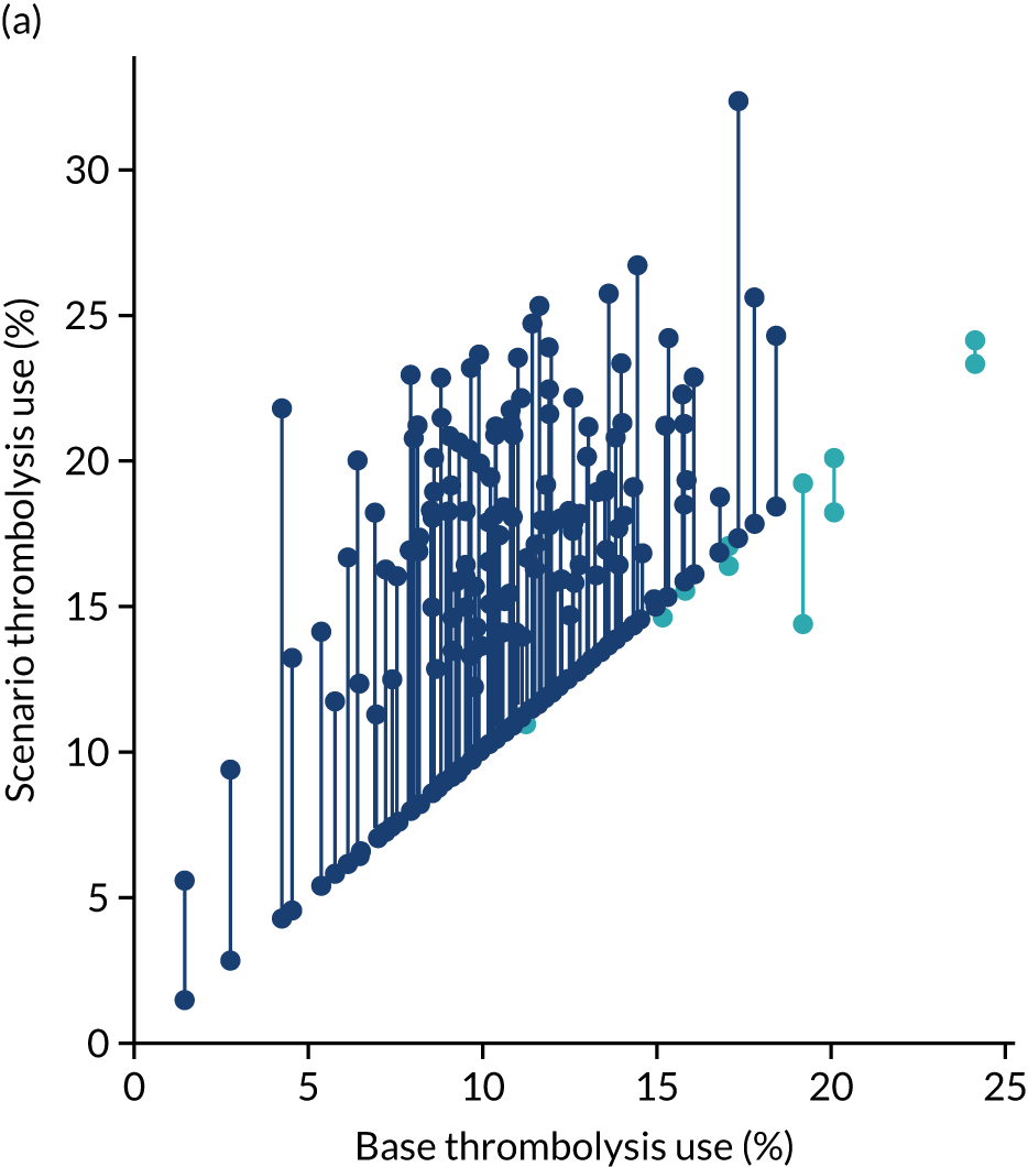
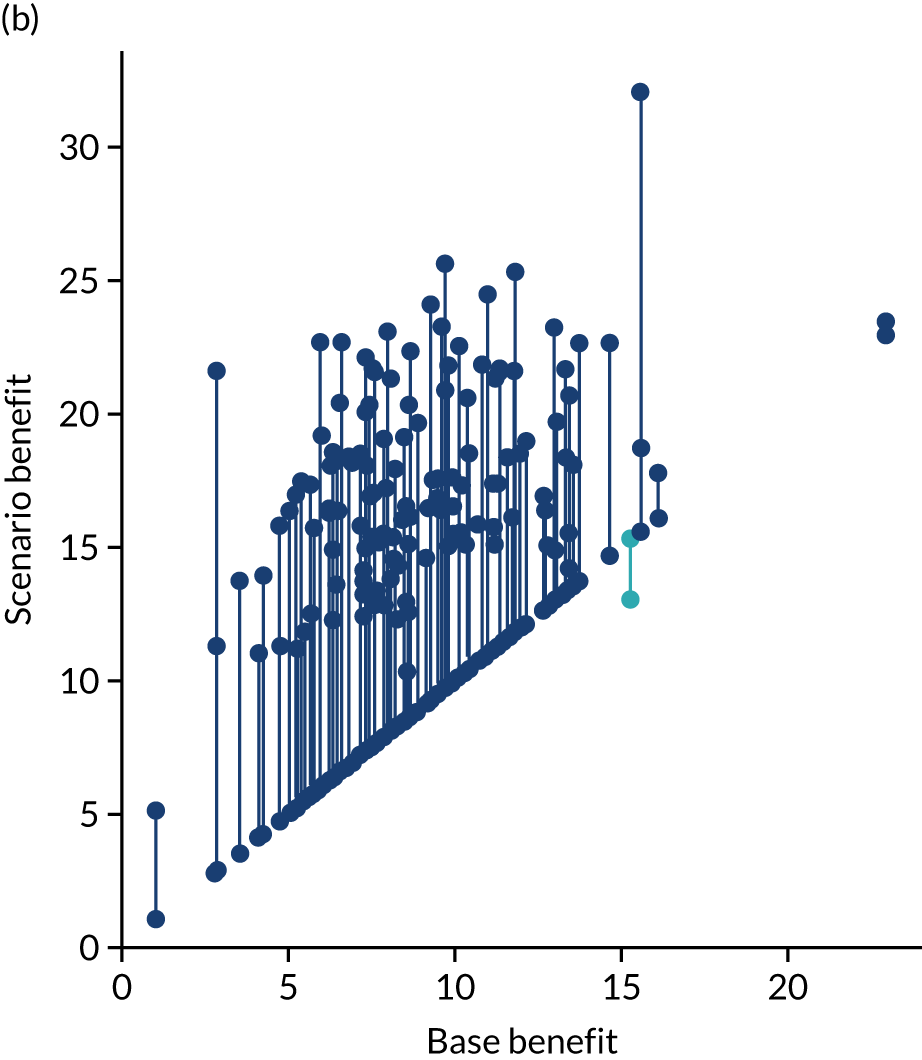
FIGURE 70.
(a) Changes in thrombolysis use; and (b) clinical benefit by changing the speed of stroke pathway only (i.e. 95% of patients have a 15-minute arrival-to-scan time and a 15-minute scan-to-treatment time, with other patients not being scanned within 4 hours of arrival). Points show before/after results for each hospital. Dark blue points/lines show an increase in use/benefit and light blue points/lines show a reduction.
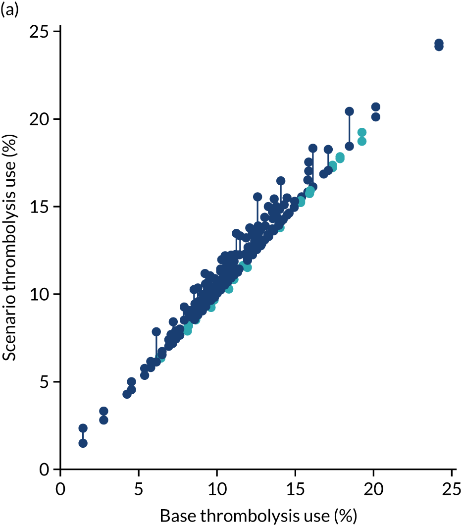
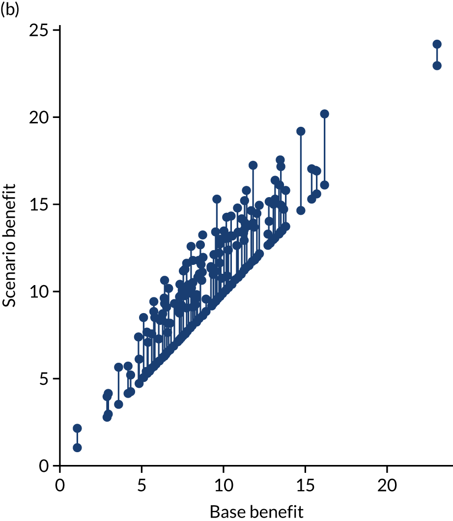
FIGURE 71.
(a) Changes in thrombolysis use; and (b) clinical benefit by changing the determination of stroke onset only (i.e. to the national upper quartile if currently lower). Points show before/after results for each hospital. Dark blue points/lines show increase in use/benefit and light blue points/lines show a reduction.
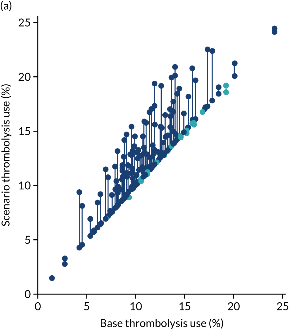
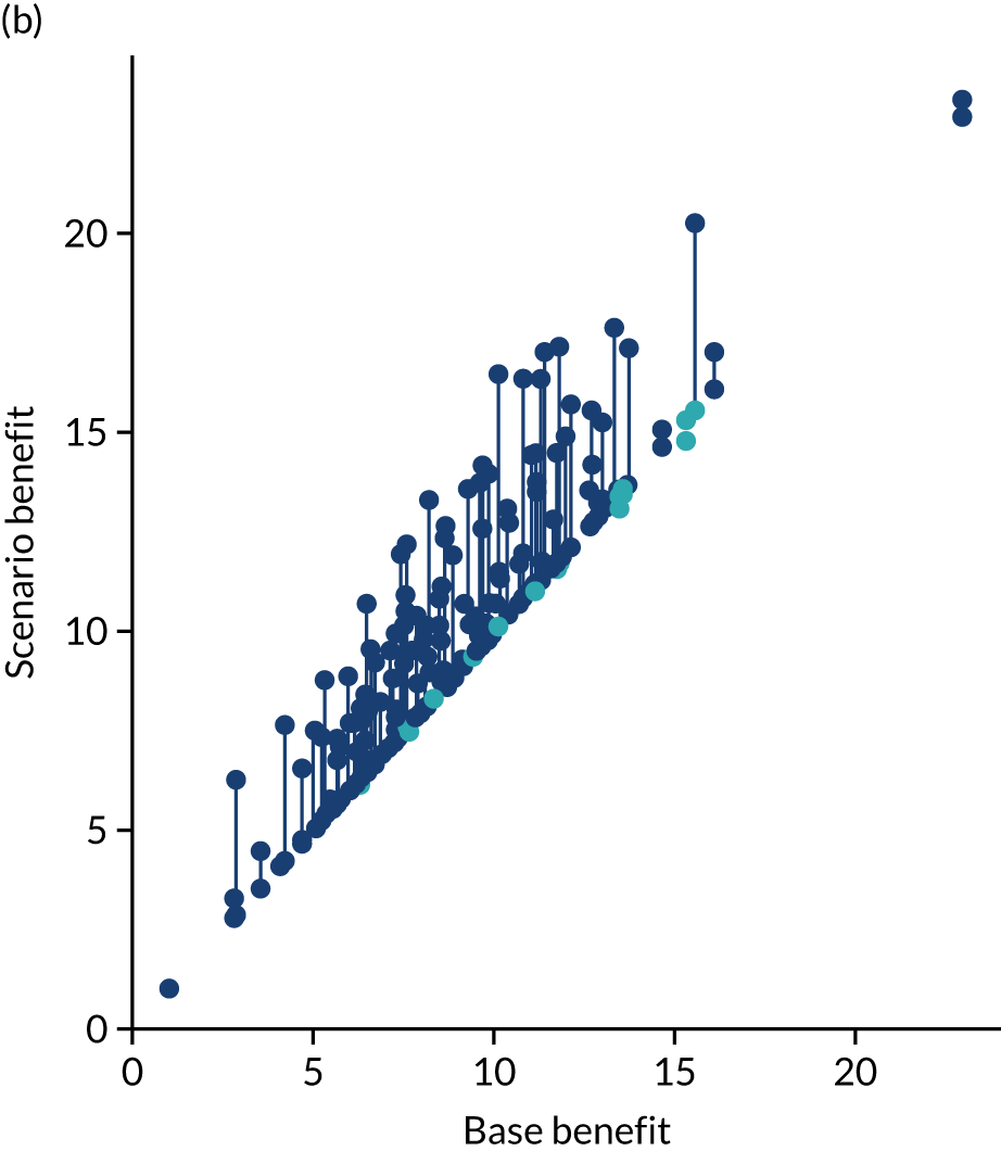
FIGURE 72.
(a) Changes in thrombolysis use; and (b) clinical benefit by changing the clinical decision only (using benchmark decisions). Points show before/after results for each hospital. Dark blue points/lines show increase in use/benefit and light blue points/lines show a reduction.
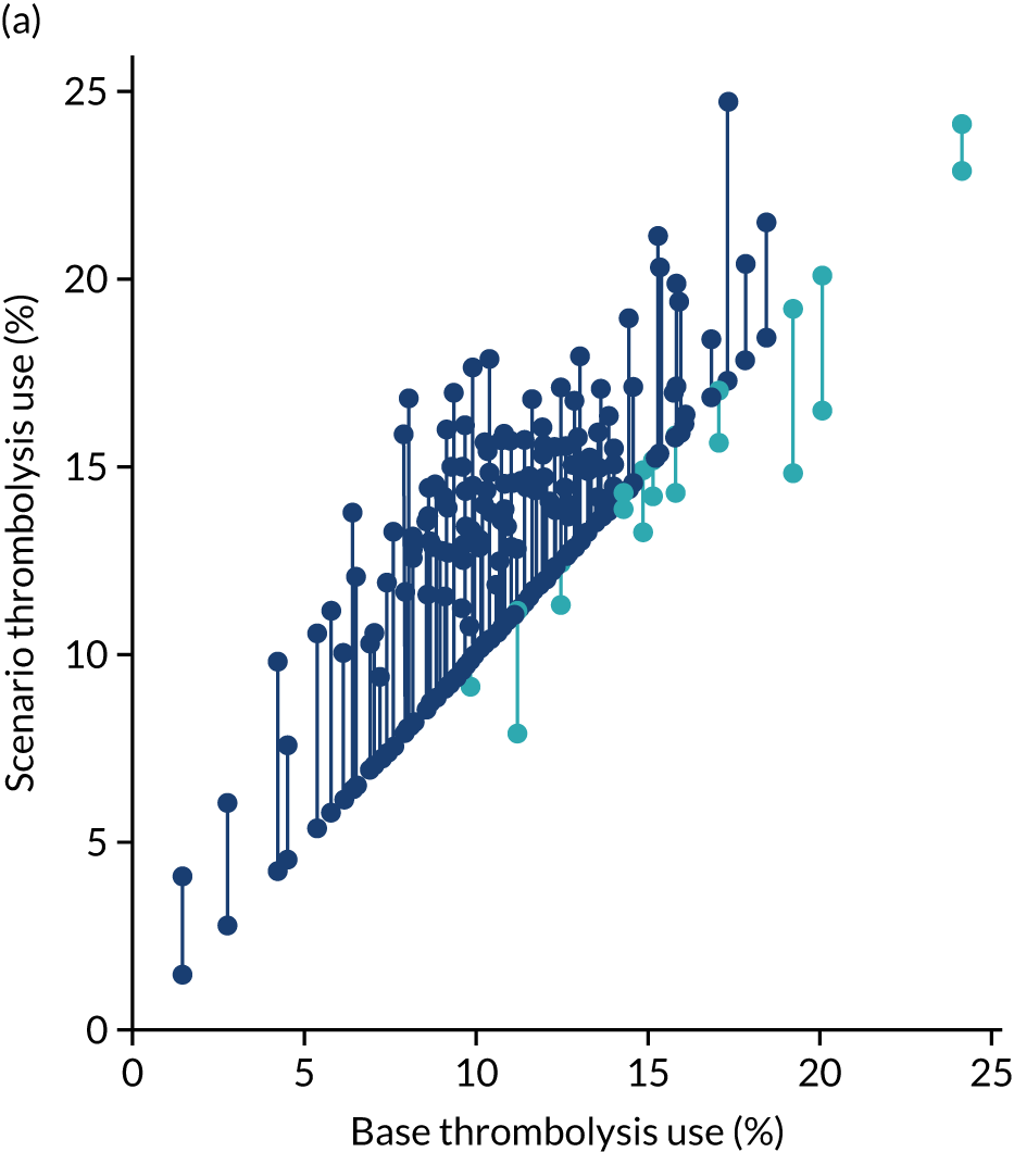
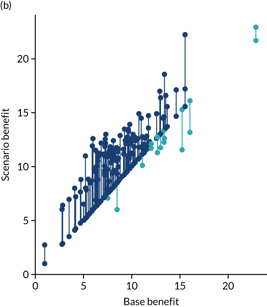
Figures 73 and 74 show, in bar chart form, improvement in thrombolysis use or clinical outcome at each hospital with each individual change. In Figures 73 and 74, it is clear that different hospitals benefit most from different changes. For improvement in thrombolysis use, the changes that make the greatest single difference are benchmark decisions (at 83 hospitals), determining stroke onset time (at 39 hospitals) and speed (at 10 hospitals). For improvement in predicted clinical benefit, the changes that make the greatest single difference are benchmark decisions (at 56 hospitals), speed (at 49 hospitals) and determining stroke onset time (at 27 hospitals).
FIGURE 73.
Bar chart of improvements in thrombolysis use in each hospital by changes to speed of stroke pathway (i.e. 95% of patients have a 15-minute arrival-to-scan time and a 15-minute scan-to-treatment time, with other patients not being scanned within 4 hours of arrival), determining stroke onset time (i.e. changing to the national upper quartile if currently lower) and using benchmark decisions. (a) Hospitals 0–65; and (b) hospitals 66–131.
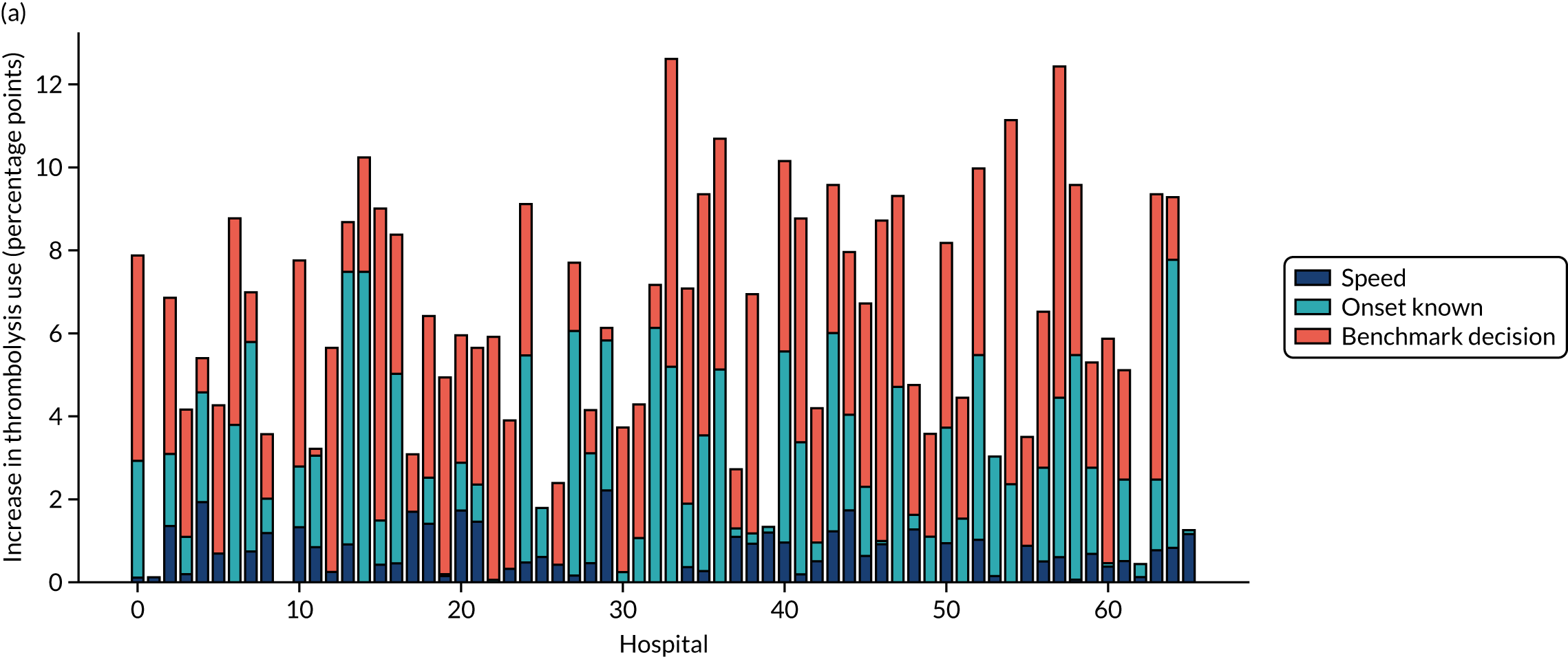
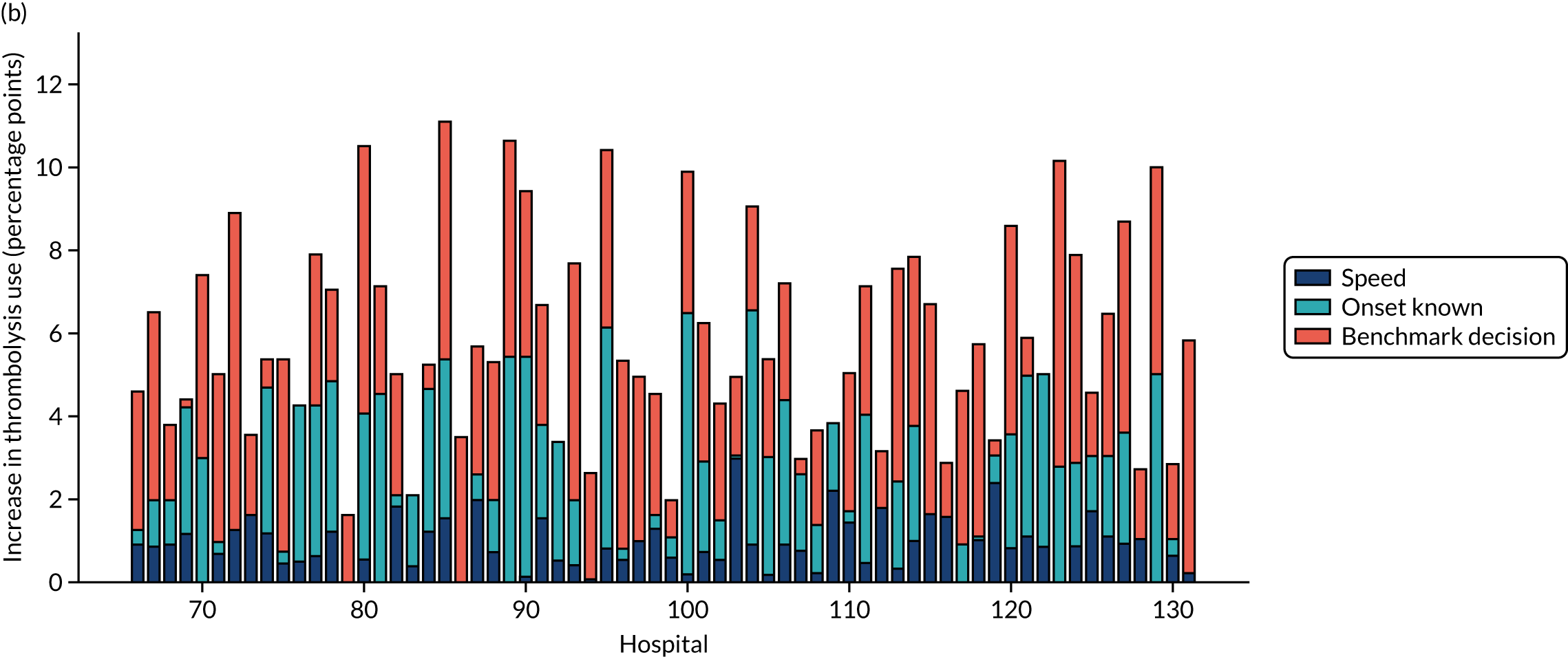
FIGURE 74.
Bar chart of improvements in outcome in each hospital by changes to speed of stroke pathway (i.e. 95% of patients have a 15-minute arrival-to-scan time and a 15-minute scan-to-treatment time, with other patients not being scanned within 4 hours of arrival), determining stroke onset time (i.e. changing to the national upper quartile if currently lower) and using benchmark decisions. Note that the combined outcome in this chart is indicative, and actual total improvement may be larger because of synergy of combining changes. (a) Hospitals 0–65; and (b) hospitals 66–131.
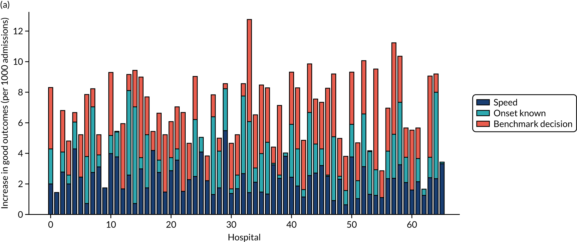
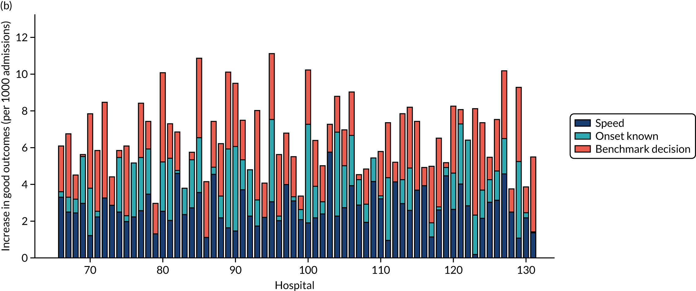
Demonstrating the effects of changes at individual hospitals
More detailed results showing the effect of individual changes and all combinations of changes may be shown at an individual hospital level. The first example is of a hospital where improving the speed of the pathway is the single change to make the most difference (Figure 75), the second example is of a hospital where improving determination of stroke onset time is the single change to make the most difference (Figure 76) and the third is a hospital where using benchmark decisions is the single change to make the most difference (Figure 77).
FIGURE 75.
Pathway model results for the effect of scenario changes at an individual hospital, showing effects of changes on (a) thrombolysis use; and (b) clinical benefit of thrombolysis. This is an example of a hospital where the single change to make the most difference is based on improving speed of pathway (i.e. 95% of patients have a 15-minute arrival-to-scan time and a 15-minute scan-to-treatment time, with other patients not being scanned within 4 hours of arrival).


FIGURE 76.
Pathway model results for the effect of scenario changes at an individual hospital, showing effects of changes on (a) thrombolysis use; and (b) clinical benefit of thrombolysis. This is an example of a hospital where the single change to make the most difference is based on improving determination of stroke onset time (i.e. changing to the national upper quartile if currently lower).
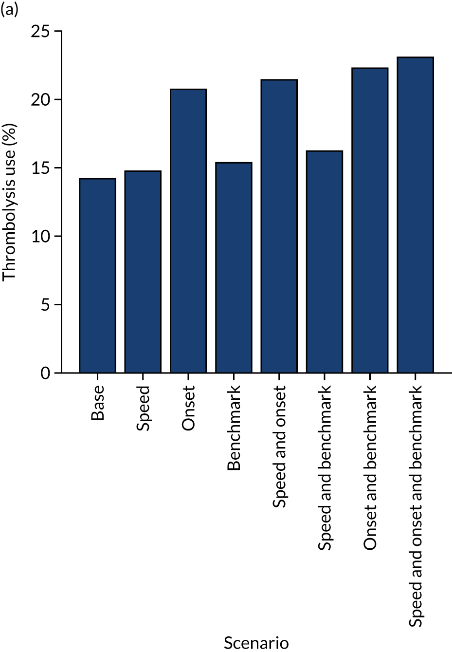

FIGURE 77.
Pathway model results for the effect of scenario changes at an individual hospital, showing effects of changes on (a) thrombolysis use; and (b) clinical benefit of thrombolysis. This is an example of a hospital where the single change to make the most difference is based on using benchmark decisions.
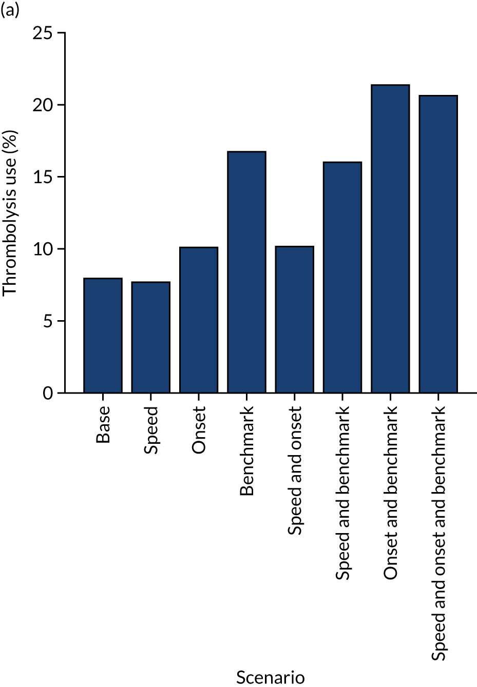
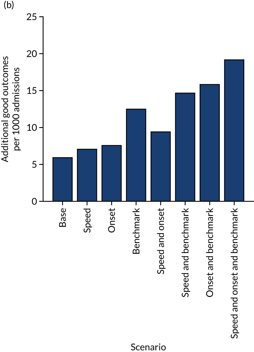
Investigation into the causes of current variation in thrombolysis use
Rather than ask the question of ‘What will improve thrombolysis most?’, we specifically address the question of ‘What causes the current variation?’. These two questions, although related, are somewhat different.
Summary of key findings
-
About half of the variance in current thrombolysis use is due to differences in local patient populations, and about half is due to differences within hospitals (e.g. pathway speed, determination of stroke onset time and decisions on whether or not to give thrombolysis).
-
Within the hospitals, the largest contributor to inter-hospital differences in thrombolysis use is differences in decision-making around thrombolysis, then speed and then determination of stroke onset time.
-
If all hospitals treated a standard set of patients, reflecting national averages in patient population characteristics, hospitals that currently have a lower thrombolysis rate would tend to give more thrombolysis and those with a higher thrombolysis rate would tend to give less thrombolysis. However, this explains only about half of the differences between units with low and high thrombolysis rates.
Passing a standard cohort of patients through all hospital models
Each hospital stroke pathway model uses its own in-hospital process parameters (e.g. arrival-to-scan time and scan-to-needle time); however, each pathway model is run using a common set of patient population characteristics for all hospitals, with distributions drawn from the national distributions for:
-
arrival within 4 hours of stroke onset
-
proportion of patients aged ≥ 80 years
-
onset-to-arrival time [mean and standard deviation (SD)].
The proportion of arrivals eligible for thrombolysis is set to the predicted 10,000 cohort rate (see Chapter 5, Benchmarking hospitals) for each hospital (adjusted to give thrombolysis use in those patients scanned within 4 hours of stroke onset). The pathway model passes 100 × 1000 patient cohorts through each hospital stroke pathway model, and each patient has patient characteristics drawn from the appropriate distributions.
Results are shown in Figure 78. When a standard (national average) patient population is passed through all hospitals, the cohort thrombolysis rate at each hospital correlates with the actual thrombolysis use, with a R2 of 0.41, suggesting that in-hospital processes and decision-making account for about 40% of observed variance. Similarly, the regression fit between the actual thrombolysis rate and the cohort thrombolysis rate has a slope of 0.55, suggesting that 55% of the inter-hospital variance is due to hospital processes (i.e. when the patient population is unchanged there is, on average, a 0.55 percentage point difference in predicted cohort population thrombolysis rate for each 1 percentage point change in actual thrombolysis rate). The mean thrombolysis use across all hospitals using the national patient cohort was 11.1% compared with an actual mean of thrombolysis use of 11.2%. We would not expect the mean thrombolysis use to vary between these two sets of models.
FIGURE 78.
The predicted thrombolysis use at each hospital if all hospitals received patients drawn from a national average population. (a) Regression fits between actual thrombolysis use and predicted thrombolysis use in a standard cohort of patients (chart shows expected fits if all variance was due solely to differences in local patient populations and if all variance was due solely to differences in hospital stroke pathways); (b) scatterplot showing whether each hospital would have a higher (dark blue) or lower (light blue) use of thrombolysis if it received patients drawn from a national average population instead of their own patient populations; (c) histogram of current thrombolysis use and predicted thrombolysis use if each hospital received patients drawn from a national average population.
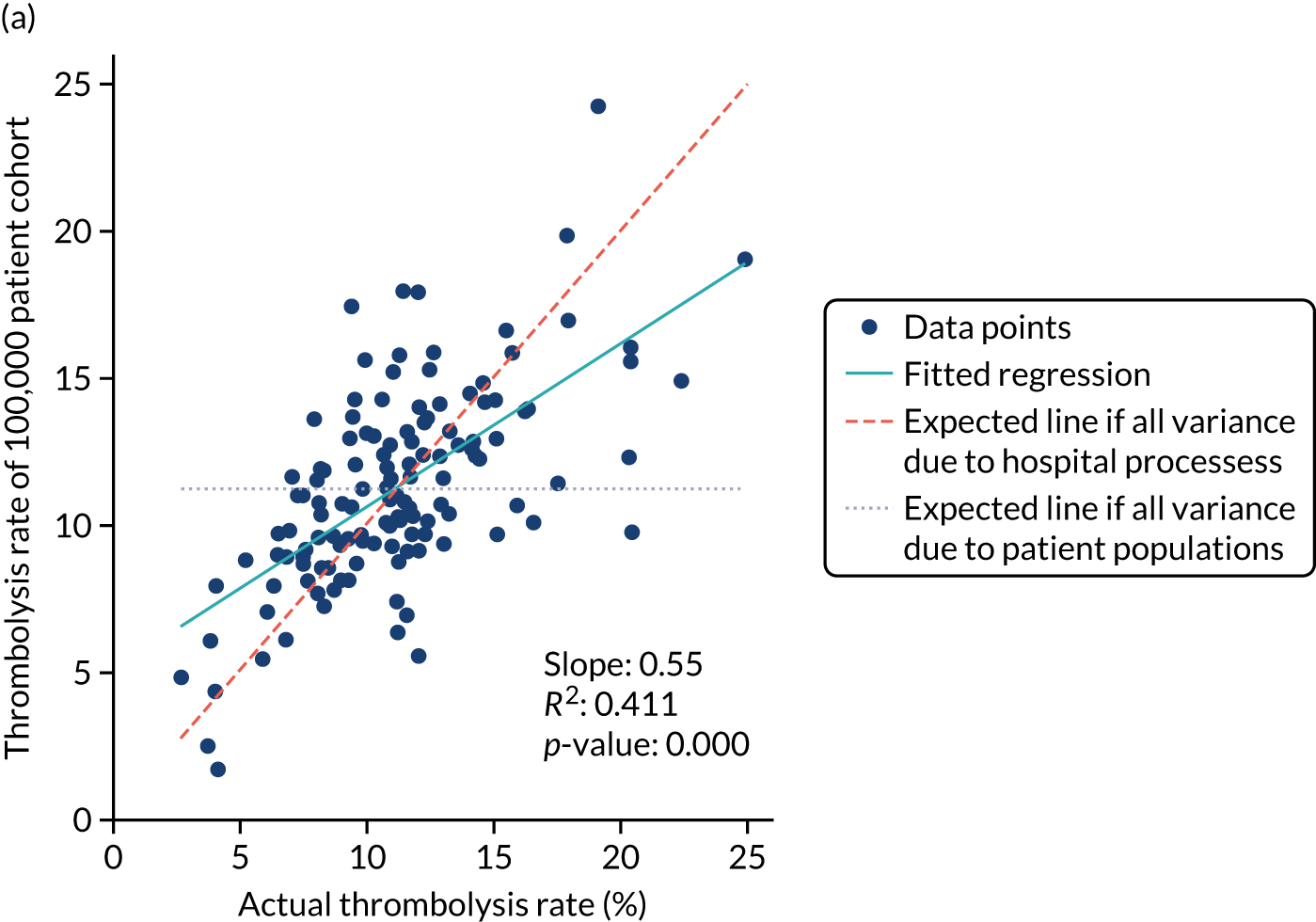
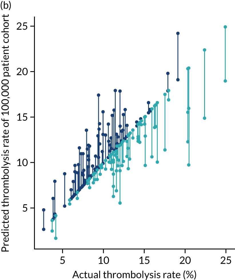
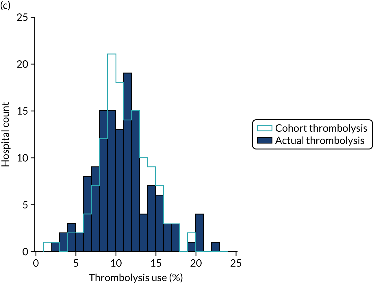
There is a tendency for units with lower rates of thrombolysis to do better with a standard cohort, and for units with higher rates of thrombolysis to do worse. Therefore, there is a general observation that hospitals with high thrombolysis use are such partly because they have a more ‘thrombolysable’ population, and vice versa.
How much of the inter-hospital variation in thrombolysis use do in-hospital processes explain?
Here, we investigate the correlation (explained variance) between hospital model process parameters and the variation in use of thrombolysis between hospitals. It should be stressed that these relationships are not necessarily causal, but may be considered alongside other work in this project.
In-hospital process parameters partly explain the inter-hospital variation in thrombolysis use (Figure 79). The strongest relationship is between decision-making, as described by the predicted thrombolysis use of a standard cohort of 10,000 patients (R2 = 0.30). Pathway speed is the next strongest predictor of thrombolysis use, with a R2 of 0.25. Determination of stroke onset time is the weakest predictor of thrombolysis use (R2 = 0.05), but is still statistically significant (p = 0.012).
FIGURE 79.
Regression analysis of in-hospital factors that may explain the difference in thrombolysis use at each hospital from the average thrombolysis use. (a) Relationship between thrombolysis use and decision-making; (b) relationship between thrombolysis use and pathway speed; and (c) relationship between thrombolysis use and determination of stroke onset.
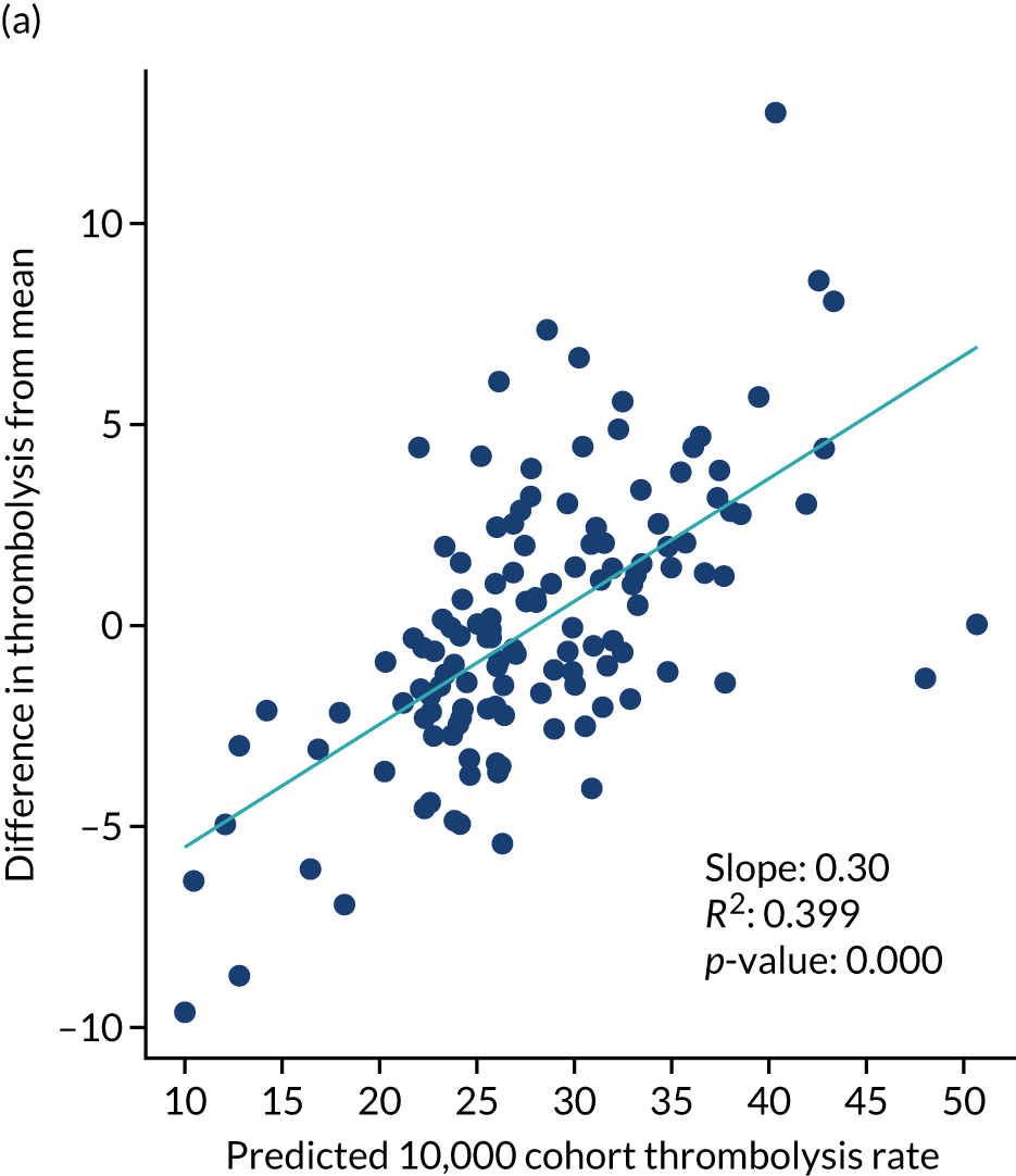
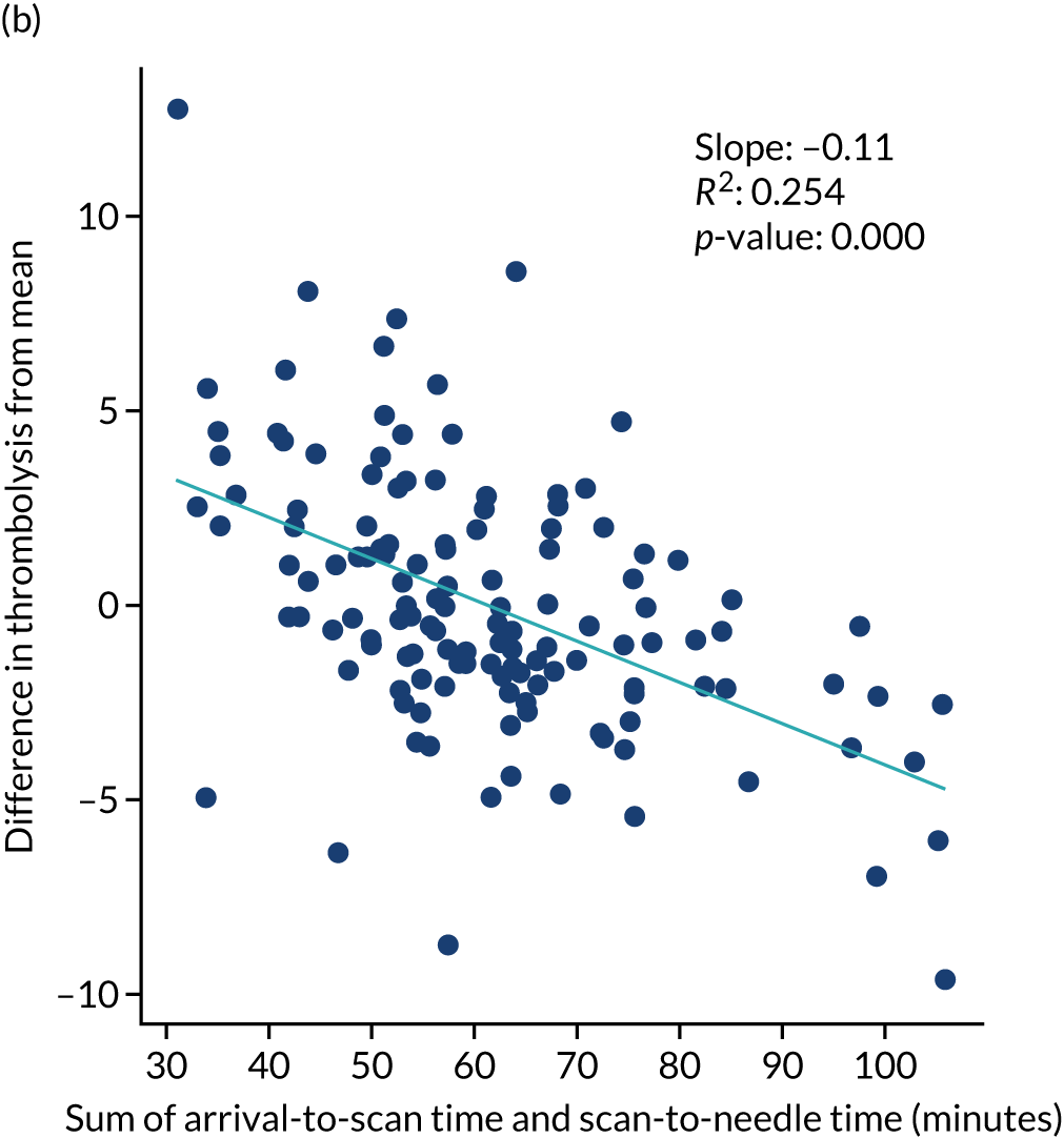
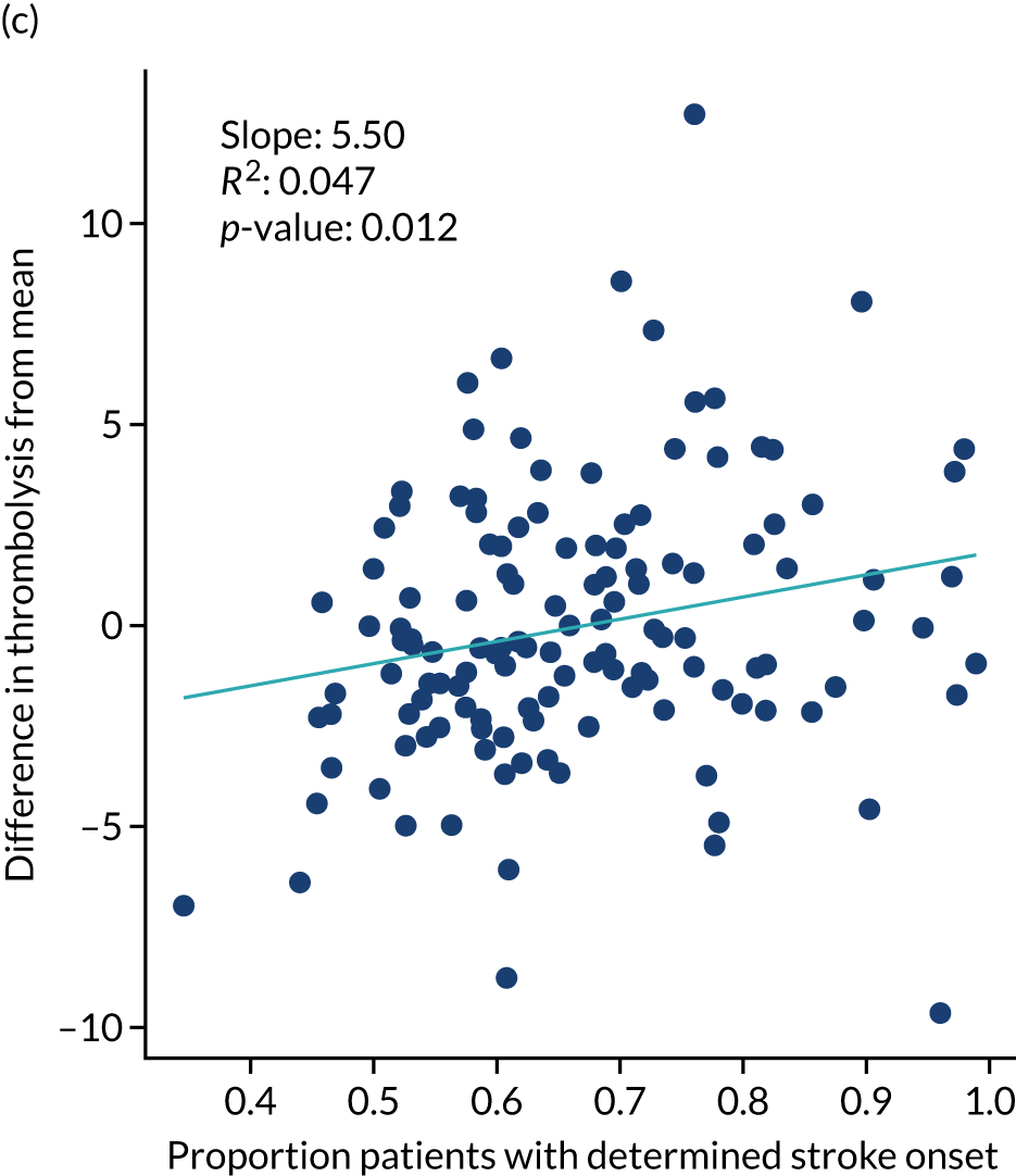
Production code
Our original plan was to run code on SSNAP machines; however, owing to travel and work restrictions due to the COVID-19 pandemic, a transfer of SSNAP infrastructure from a Stata®-based system (StataCorp LP, College Station, TX, USA) to a Microsoft Azure Database system (Microsoft Corporation, Redmond, WA, USA) and staff shortages in the SSNAP analytic team, it was not possible in the time frame of the project. In discussion with SSNAP, we developed a way to test the code on University of Exeter (Exeter, UK) machines. This involved back-converting the supplied data into the structure (i.e. data types and column headings) that a raw SSNAP Structured Query Language (SQL) query would produce, writing some bridge code to translate the original SSNAP data into a form our models use (starting with data parsing and imputation) and putting our models into an automated pipeline of steps (data parsing/imputation, followed by machine learning models, then pathway simulation and, finally, outputs). We confirm that the models may work on original SSNAP SQL query outputs and that the models may be automated to generate key results (for individual hospitals and for net effects across all hospitals).
The production code will be trialled by SSNAP in due course.
Chapter 7 Qualitative research
Objectives
The overall objective of the qualitative research was to understand the influence of modelling, including the use of machine learning techniques, in the context of the national audit to support efforts to maximise the appropriate use of thrombolysis and reduce unnecessary variation.
Specifically, the aims were to:
-
explore current understanding and rationale for the use of thrombolysis for ischaemic stroke to establish reasons for the variance in the use and speed of thrombolysis
-
understand physician perspectives on clinical pathway simulation and machine learning feedback to influence how simulation can be incorporated into SSNAP to have a positive impact on practice
-
identify potential routes for the implementation of machine learning feedback to inform and improve future stroke management
-
explore how physicians interpret the potential consequences of following changes in pathway suggested by simulation.
Qualitative research was conducted in accordance with guidance offered by Blaxter. 43
Intended data collection
Two experienced qualitative researchers (JF and KL) developed qualitative data collection and analysis protocols (see appendix). We planned to collect data through individual and group interviews with physicians involved in stroke care. We intended to conduct seven individual and three group face-to-face pilot interviews locally to determine variance in clinician approaches and attitudes to the management of ischaemic stroke and thrombolysis practice. We wanted to identify and pilot our topic guide and a range of visual displays and other methods of feedback from both clinical pathway simulation and machine learning for use in subsequent interviews. We then planned to undertake individual and group interviews, in person, with 20–30 career and training physicians.
To maximise participation in this research, we aimed to recruit physicians via the National Institute for Health and Care Research (NIHR) Clinical Research Network’s Stroke Network. To be eligible for inclusion, physicians needed to be employed at an NHS hospital and be involved in delivering stroke treatment at the time of the interview. Our sampling frame was premised on thrombolysis rates at the participating NHS hospital, which we divided into tertiles [i.e. low (8.9% and below), medium (9–13.9%) and high (14% and above)], as well as physician specialism, physician grade and door-to-needle time.
We planned to conduct interviews with 30–40 physicians and to conduct a follow-up stakeholder workshop with approximately 30 people. From the SSNAP data, as of 2018, we identified 20 potential sites for recruiting physicians, with six to eight sites in each of the tertiles for thrombolysis. Ethics approval was provided by the HRA and Health and Care Research Wales (reference 19/HRA/5796).
We worked with NIHR clinical research nurses and/or research and development (R&D) leads local to each site to identify a physician, nurse or R&D lead to act as a principal investigator, through whom the clinical research nurse would facilitate recruitment of physicians. This procedure was more complex than we could have anticipated, with each site operating with a different configuration of R&D personnel and requiring different variants of paperwork – despite our adherence to all requirements required by HRA ethics approval (e.g. the Organisation Information Document for Non-Commercially Sponsored Studies). This was a lengthy process, which led to us commencing recruitment at the same time as the first and second lockdowns for COVID-19. This significantly diminished the pool of physicians from which we were able to recruit, as physicians were redeployed to front-line duties and we were not a priority study for recruitment. In addition, we required a further amendment, for HRA approval, for us to conduct all interviews remotely. Preparation for a third HRA amendment, which would have identified 10 further sites for recruitment, coincided with the third lockdown for COVID-19, and most Clinical Research Networks and NHS trusts that we approached told us that they did not have the capacity or capability to support the study.
Actual data collection
To pilot our interview approach, we undertook a face-to-face group interview with a small group of medical registrars on a regional rotation that included stroke in their clinical setting. Having given written consent to interview, a senior modeller (MA) provided the registrars with a demonstration of the modelling process and outcomes, prior to the qualitative researchers piloting the topic guide. Feedback from the stroke physicians suggested that this approach was appropriate and produced data that were fit for purpose.
Our approach was subsequently modified for remote delivery, with all interviews conducted via Teams (Microsoft Corporation, Redmond, WA, USA), Skype™ (Microsoft Corporation, Redmond, WA, USA) or Zoom (Zoom Video Communications, San Jose, CA, USA), depending on the medium that was allowed in each NHS trust. At the beginning of each interview, participants watched a 10-minute video made by the senior modeller that contained examples of the process and outcomes of the machine modelling and pathway analysis, as a stimulus for discussion. 44 The topic guide was then used to elicit participants’ own experiences of thrombolysis and perspectives on machine learning, alongside observations of group interactions and clinical settings. 45
During the interviews, we collected data about physicians’ backgrounds, their attitudes to thrombolysis and their understanding of variance, their perspectives on machine learning and potential loci for the implementation of machine learning feedback (within and beyond SSNAP), and established the physicians’ views on possible unintended consequences that may result from changing the acute stroke pathway and potential means of mitigation. Our fieldnotes reflected the challenges of conducting interviews via video, with physicians often in clinical settings and sometimes wearing personal protective equipment, as well as capturing the dynamics between physicians who were working remotely from each other. 46,47
Towards the end of the project, and during the third lockdown for COVID-19, we undertook an online discussion of our results with a small group of physicians (n = 3) who were identified via an annual meeting for trainees, organised by the British Association for Stroke Physicians (London, UK). The modellers (MA and CJ) presented a further set of outputs from their analyses, and the discussion focused on how additional modelling outputs might be used to facilitate quality improvement and inform service delivery.
The number of participants recruited was smaller than originally planned because of the NHS focus on coping with the COVID-19 pandemic and because of the challenge in accessing staff from units with lower thrombolysis use. The interview participants were also skewed heavily towards medical practitioners. In any future study we recommend having more qualitative resources to help recruit more staff, especially from units with lower thrombolysis use, and to broaden the interview base to include more non-medical practitioner staff (e.g. specialist stroke nurses).
Data analysis
Interview data were transcribed by an independent General Data Protection Regulation-compliant transcriber, and fieldnotes were written up by the two researchers. All data were anonymised and managed in NVivo for Teams (QSR International, Warrington, UK). Both researchers read all the transcripts to develop preliminary ideas and understanding. We developed these ideas alongside further re-reading of the transcripts, using a framework analysis aligned with the four broad exploratory objectives of the study, but, crucially, with an openness to any new insights from the physicians. 48,49 Analytical summaries across multiple cases were created independently by both researchers and were used to explore the data. We held repeat discussions to develop the analysis, looking for negative cases and resolving differences of opinion about interpretation. 50 In this way, we were able to examine these physicians’ accounts of their use of thrombolysis and orientation to machine learning and simulation. As our analyses developed, we also discussed our findings with members of the wider research team.
Results
Summary of key findings
Qualitative research demonstrated a varying openness to machine learning and modelling techniques:
-
Broadly, those units with higher thrombolysis use engaged more positively with the research and units with lower thrombolysis use were more cautious.
-
Clinicians from units with lower thrombolysis use tended to emphasise differences in their patients as the reason for lower thrombolysis use. Clinicians in units with a middling use of thrombolysis tended to emphasise access to specialist resources as being key in being able to deliver thrombolysis well. Clinicians in units with higher thrombolysis use tended to emphasise the work and investment that had gone into establishing a good thrombolysis pathway.
-
Clinicians wanted to see the machine learning models expanded to predict probability of good outcome and adverse effects of thrombolysis.
-
Despite this being a small study, physicians engaged with the machine learning process and outcomes, suggesting ways in which the outputs could be modified for feedback to stroke centres and utilised to inform thrombolytic decision-making.
Interview participants
We recruited 19 participants who took part in three individual and five group interviews (Table 17). Fourteen participants were consultants (specialising in stroke, neurology or elderly care), four were stroke registrars and one was a specialist stroke nurse. Ten participants were female and nine were male.
| Thrombosis use | Interview details |
|---|---|
| Low (site A) | Group: two stroke consultants (both male) and one specialist stroke nurse (female) |
| Low (site B) | Single: stroke and elderly medicine consultant (male) |
| Low (site C) | Group: three stroke consultants (one male and two females) |
| Middle (site D/pilot) | Group: four registrars (all females) (pilot interview) |
| Middle (site E) | Single: consultant geriatrician (male) |
| Middle (site F) | Single: stroke consultant (male) |
| High (site G) | Group: three consultants – stroke and geriatrician (one male and two females) |
| High (site H) | Group: three consultants – stroke, neurologist and geriatrician (two males and one female) |
Current attitudes to thrombolysis use
Differences due to patient characteristics
Physicians working in hospitals with lower thrombolysis rates were more likely to suggest that a significant barrier to thrombolysis was the delayed presentation of patients, which could be magnified by suboptimal ambulance services:
A lot of patients present outside the window of thrombolysis at the hospital.
Site B
I think we rarely hit the 11% per cent national numbers, probably because patients come just outside the thrombolysis window.
Site A
Those physicians working in hospitals with lower thrombolysis rates were more likely to report that their patients were ‘different’ from those presenting at other centres, in terms of rurality, ethnicity, frailty and socio-demographic factors:
We’ve a slightly older population . . . we’ve slightly more bleeds than infarcts . . . we’re a slightly larger geographical area, so sometimes people are a bit delayed getting to hospital and we operate across two sites as well.
Site C
The above physician also highlighted that, because of these complexities, decision-making about thrombolysis was the most difficult part of their job.
Although population differences were also acknowledged by physicians at higher-thrombolysing centres, they were more likely to articulate the centrality of patient heterogeneity in their decision-making:
I wouldn’t be giving thrombolysis for various reasons . . . They’re often late, or got a very mild deficit, or they’ve got something that makes you feel extra wary about treating them . . . we’ve got a population that’s increasingly frail, they’ve got multiple comorbidities . . . [but] every patient is unique.
We all have different approaches, I say to myself the first question is, if I don’t thrombolyse this patient, what is the worst neurological outcome they could have? What is the disability going to be? And then the next question is how far are we down the time pathway, what’s the risk of bleeding here? And then, what are the little things that feed into pros and cons, how does that alter the equation from a standard patient? Is it that the benefits are going to outweigh the risks, how finely balanced is that decision?
The days of people being textbook strokes are long gone . . . we don’t see them . . . we don’t have a blanket policy. We eyeball them. And if they look dodgy, we park them and work out what’s going on, if they don’t look dodgy, we go straight to the scanner.
Differences due to differences in specialist resources available
Interviewees in units with a middling use of thrombolysis suggested that some of the delays in patient presentation could be mitigated through treatment by stroke physicians, rather than generalists, or by the involvement of a specialist stroke nurse:
We typically have a more deprived population, so accessing health care and time to hospital [and] our ambulance service is not as good . . ., a burden of disease due to deprivation . . . we do see a lot of young strokes . . . smoking, drinking, drug abuse . . . expertise is important there, so if you looked at our patients . . . the ones that had been given thrombolysis under 30 minutes . . . nearly all of them had been managed by a stroke registrar or a geriatrics registrar or a geriatrics consultant.
Site E
Stroke nurses being there increases the speed . . .
Site D
Those physicians currently working in centres with low or medium thrombolysis rates seemed more likely to emphasise the equipment that they lacked and that they perceived would improve the accuracy and speed of their decision-making.
Similarly, physicians working in hospitals with higher thrombolysis rates suggested that their higher rates were because of access to scans and other specialist facilities, as well as 24-hour stroke services:
We’re a big teaching hospital . . . that’s also got a trauma centre.
Site H
Thrombolysis is done by registrars with consultation on the phone with some access to the imaging for the consultant . . . there is no dedicated stroke team at night . . . we have a big variation between out-of-hours and in-hours door-to-needle time . . . it’s 38 minutes, out of hours it’s 89 minutes . . . don’t thrombolyse wake up stroke . . . MRI [magnetic resonance imaging] . . . perfusion scan . . . we don’t have the facilities.
Site F
On SSNAP data, we are one of the top-performing units in the country and that has happened through years of planning and hard work, where we take direct admissions, 24/7, we don’t do remote assessments . . . it’s always face-to-face assessments by consultant . . . with a specialist nurse, to see a patient, etc. And we have access to scans directly, including vascular imaging . . .
Site G
Therefore, the provision of more diagnostic tools was perceived as enabling a more nuanced approach to risk management, one that went beyond tallying risk factors and individualised patient care for more ‘marginal’ cases:
If I might manage a level of uncertainty about the onset time and some other characteristics, medications, for example, a slightly imperfect history that I have, if it’s a very severe stroke, it’s going to be a disabling stroke and I feel that the risks are outweighed by the benefits . . . I think that stroke severity and my perception of the ability to benefit from thrombolysis will then weigh into how much uncertainty I’m able to cope with, with the other things.
Site G
Although the sample interviewed was small, they were diverse in their attitudes to thrombolysis use.
Perspectives on simulation and machine learning
Acceptance of machine learning
Physicians who identified as confident thrombolysers had an initial scepticism of both the premise and methods employed in the simulations they were shown, although this scepticism was later dispelled:
The first thought that came to mind [with the modelling] was an innate assumption that doing more thrombolysis is a good thing . . . So, your machine learning may tell us how to do a lot of people who possibly don’t need it, possibly. I’m not saying that’s necessarily what you’re going to do, but it’s where it might go if we just say ‘more is better’.
Site H
Physicians who both worked alone and were interviewed in isolation were more anxious about how the simulation might be used to hold them to account for their decision-making and identified perceived risks:
I’d be suspicious if such a tool was available and a patient wasn’t given thrombolysis, then that might involve the lawyers and the legal teams.
Site C
I think safety would be the top thing, isn’t it, it’s got to be a hundred per cent safe and I think if you are close to a hundred per cent safe, if you can show that, if you can show that it’s safe and it doesn’t cause any negative outcomes for patients, then – and it also enhances patient care by speeding the process up, then I think you’ve won. If there’s doubts about its safety, even if it does speed things up, people aren’t going to trust it . . . clinicians are always wary about litigation, as well . . . some of this software could be used retrospectively . . . it could lead to decision-making being criticised retrospectively.
Site E
Those interviewees who had the benefit of working in a team with both a culture of collaboration and professional challenge were more inclined to see machine learning as a resource to draw on for their own decision-making. For example, interviewees in low-thrombolysing centres suggested that it might augment their decision-making, whereas interviewees in high-thrombolysing centres viewed it as a positive challenge to inherent assumptions that they might have developed:
I think it would be a help if there was a patient where, you know, maybe somebody else would have given thrombolysis them and we might see something that we weren’t doing that we would then, you know, implement as an action, if there was something clearly that we could be doing, you know, that would improve the rates.
Site B
. . . if you have a computer model you might get out these things out of, well, at least you think about it if the computer says something, then you have to have a strong kind of argument to refuse, to say no [laughs]. To say, well, the computer says, well the modelling comments that they should be given thrombolysis, why do you say it’s not given thrombolysis, you can’t just say oh, because he’s old or whatever.
Site F
It would be useful to know what would somebody else do. Now, whether that’s presented as a number or as a likelihood for thrombolysis . . . the hospitals . . .
Site F
In addition, those in the highest-thrombolysing centre also thought that the modelling outputs could extend their quality improvement initiatives:
It’s just a tool, isn’t it, it’s just another tool. We would never – you’d never base your decision on what the machine said! I mean, not until it’s like, you know, the Star Trek computer! . . . You’re generating data for improving a process and for understanding of process, so it’s very helpful for that . . . And it might be useful to beat the managers and say we need help with this, that and the other, but then any audit does that.
Site H
Suggestions for additional data to collect
Some participants suggested additional variables that they would like to see included in the modelling:
There are factors there which we would use in our decision-making process which are not listed as inputs . . . active bleeding, head injuries, blood pressure, whether the patient assents or consents [inputs]are insufficient and superficial . . .
Site G
The other thing that feeds in is that not everyone’s comfortable looking at CT [computerised tomography] heads and some people are waiting for that to be reported and I think that can add considerable time . . . especially down here, the radiology registrar is not always based in this hospital. So, they cover the whole of the [area] and they might be based in [other centre], whereas in the daytime you can just walk round the corner and speak to the radiologist reporting the scan, and say ‘What do you think, is it OK?’, or call the consultant on call. But I think if you’re, for example, a med reg in another speciality thrombolysing at night, you wouldn’t have that confidence to say that and then having to call up a radiology reg[istrar] on call in another hospital all takes time, doesn’t it . . . Say, at worst, half an hour.
Site D
Centres with middle tertile thrombolysis rates were keen to see the outcomes of employing machine learning included in the outputs:
How have you extrapolated your outcome data? . . . what I think would be useful to know is within that people of decision makers, who is making the decisions? . . . [I would want to see] median times with clear confidence intervals would be most useful . . . diagnosis at discharge comparative to decision-making at the time.
Site D
So, I think that is, kind of, disabilities should be part of that pathway, some type of assessment for that, for instance, the things which I do is I have to try and identify a link between the disability they get and patient kind of function – that would be helpful.
Site F
Perspectives on simulation and machine learning varied by the size and type of unit that the physicians worked in, with some participants welcoming the addition of modelling to their decision-making tool kit and others worried about the loss of their agency.
Potential routes for the implementation of machine learning feedback
Across centres, there was an understanding that modelling had the potential to identify which changes a particular centre could invest in to improve their stroke pathway:
Tell us we should do our scans quicker or hurry up with our CTAs [computerised tomography angiography] . . . Placing them on the scanner table rather than wheeling them round . . . simple things.
Site H
The SSNAP data we have is great, but it’s difficult to apply that to solutions locally. Whereas if you could apply the modelling to a local set-up and find out where the delays are consistently across a number of cases, rather than just looking at one case . . . if you do that across hundreds of cases in the same centre, then you find local solutions to increase speed.
Site H
When asked to identify the potential routes by which machine learning might inform or improve future stroke management, physicians replied with suggestions that matched particular issues with which they were grappling.
Interviewees in low-thrombolysing centres wanted a tool that could help them to improve care with a particular patient or type of patient, via a prototypical patient:
[I] would value a prototype patient . . . where it showed you which hospital would or wouldn’t thrombolyse . . . I would trust the data . . . we could get some advice on where to improve . . . there might be some big gains from that, if we did it.
Site B
If we had the information that over the country [about older frail people from care homes], it would probably give those hospitals that are more cautious, more confidence to give that thrombolysis.
Site D
People are quite afraid of the risk of bleeding and things like that. If they produce a type of individualised risk and benefit for the patient, on the information that’s provided on algorithm, that would be very helpful . . . and also the ability to be updated quickly, that would be very helpful, because the texts change every year and then sometimes you can’t keep up with all those protocols and pathways.
Site H
Physicians working in the highest-thrombolysing unit who expressed greater familiarity with SSNAP, as well as other performance indicators, wanted a more sophisticated instrument that could compare treatment across consultants or centres:
. . . internally we tend to look at consultant level data, just by looking at the thrombolysis data and picking that apart. But obviously the numbers are small, so the data can be quite varied . . . but I don’t mind seeing it at consultant level information as well as, then, hospital.
You take a prototypical patient and apply them to the algorithms that you’ve constructed for our hospital and see what pops out the other end . . . These things rarely provide an answer; they just point you to something you can reflect on . . .
Perspectives on the potential routes for the implementation of machine learning feedback were informed by physicians’ beliefs about their current needs, with the idea of a prototype patient proving popular. However, there was variance in beliefs about what variables should be included and whether its objective should be to direct patient care or to act as a quality improvement tool.
Anticipated consequences of stroke pathway feedback
Two physicians, both of whom worked on their own, in lower-thrombolysing centres, were sceptical about the consequences of changes to the stroke pathway. Having identified that they found decision-making about thrombolysis difficult, both then questioned the evidence base for increasing the rate of thrombolysis:
I do think it’s about, kind of, the personality of the person deciding it, it is very subjective, is thrombolysis, I mean, I know we have all the guidelines as to who we should and shouldn’t thrombolyse, but, you know, some consultants will aggressively continue to reduce the blood pressure with as much i.v. [intravenous] medication as they can until they can thrombolyse, others will say, well, you know, a few doses and if it doesn’t come down, OK, it’s probably not meant to be, so yeah. And you know, I think I personally just sort of very much stay within the exact rules for whether you should or shouldn’t thrombolyse.
Site B
. . . more thrombolysis doesn’t mean better care . . . when I hear of hospitals that are thrombolysing, . . . 20-odd per cent, I do sometimes question them. Are they really thrombolysing strokes? Is the clinical diagnosis of stroke really robust enough or are they thrombolysing mimics and then putting that into their SSNAP data anyway, just to make them look good? And then their mortality rates are lower because they’ve given thrombolysis non-strokes anyway. So, some of me is – I’m a bit cynical with, of the SSNAP data sometimes, from some of the sites that appear to be doing really well.
Site E
In contrast, interviewees those in higher-thrombolysing centres had a more balanced perspective on the perceived benefits of implementation of machine learning in the stroke pathway, but identified the likely enduring challenges of thrombolysis decision-making:
There’s been a gazillion studies looking at how to give tPA [tissue plasminogen activator] quicker, so the question, I think, for you guys, is what’s going to be different about this, compared to everybody else’s that tells us to get ready, get the ambulance there quicker, be more streamlined, have a checklist, der, der, der, you know, what’s going to be different?
Outcomes data with a comparator is a disaster, what does it mean? . . . I think you’re going to end up with a league table, but basically we already have one with SSNAP.
The implementation of artificial intelligence and automated reporting of scans would change the picture, would change the landscape, let’s say, of the speed of thrombolysis.
To be fair, the only aspect of machine learning I can see in this is the thrombolysis decision-making process. The rest is all straightforward factors . . . The only two parts machine learning is going to help is if the machine can actually interpret the head scan for us, which is really part of the decision to treat or not treat, and that’s the only real machine learning aspect of this, the rest is not . . . your decision to treat or not treat . . . That’s the difficult part. That’s the grey area where everyone does a different thing.
Participants were clearly curious about machine learning, and they welcomed the opportunity to discuss its potential benefits for stroke pathway feedback. Findings suggest that stroke physicians have doubts and concerns about the ability of machine learning to improve the pathway, suggesting that further dialogue is required.
Chapter 8 Patient and public involvement
Aims
We planned to invite two people with personal experience of having a stroke, or personal experience of caring for a family member at home after they had a stroke, to sit on the Study Steering Group. In addition, we planned to establish a Patient and Carer Advisory Group, with six to eight members, that would meet with the lead researchers separately to the Study Steering Group.
The aim of the patient and public involvement was to help keep the study patient centred, for patients and carers to inform the work of the modellers in terms of what aspects of the data to focus on and inform discussions about study dissemination and next steps at the end of the study.
How patients and carers were involved in this study
Two patient and carer members of the Study Steering Group were invited to join the team because of their relevant experiences and membership of the Peninsula Public Engagement Group. Leon Farmer (stroke survivor) and Penny Thompson (carer) both knew co-applicant Kristin Liabo from other studies they had been involved in. Penny Thompson was also involved in the funding application and a named collaborator on the bid.
To establish the Patient and Carer Advisory Group, we contacted rehabilitation groups for stroke survivors and distributed a call to patients who had signed up as interested in stroke research with the local hospital R&D department. Initially, we established a group of six people (two people were carers and four were stroke survivors, and two were women and four were men), including Leon Farmer and Penny Thompson.
Five members of the Patient and Carer Advisory Group attended a training workshop in spring 2019. This workshop focused primarily on how patient and carer experience can contribute to research. The workshop was led by Kristina Staley (visiting research fellow) with the NIHR Applied Research Collaboration South West Peninsula (PenARC) Patient and Public Involvement and Engagement Team. In addition, Michael Allen presented plans for the modelling work and Julia Frost presented plans for the qualitative interviews with stroke physicians.
After the workshop, one member of the Patient and Carer Advisory Group decided not to continue their involvement because of old age and frailty, as he felt his cognitive abilities were not up to following group discussions. This member was offered the opportunity of being involved on a one-to-one basis; however, this did not turn out to be an alternative because of his deteriorating health.
The remaining five members met again in September and November 2019. At both of these meetings, Michael Allen presented on the progress and outputs from the modelling work and invited discussion about which angles of the work were more important from a patient perspective. One of the meetings was held at the Royal Devon & Exeter Hospital and was also attended by Mr Martin James, lead clinician for stroke at the Royal Devon & Exeter Hospital. Kristin Liabo organised and facilitated both meetings and informed the Patient and Carer Advisory Group about the qualitative research.
Leon Farmer and Penny Thompson have been integral members of the Project Steering Group throughout the study period and their involvement continued after lockdown, with meetings being transferred to Microsoft Teams. The other three Project Steering Group members did not continue their involvement with the SAMueL (Stroke Audit Machine Learning) study during the COVID-19 pandemic: one member did not respond to meeting invitations, another member experienced a bereavement and the third member was not able to attend online meetings. Kristin Liabo kept in telephone contact with the two latter members who were kept up to date about the study via one-to-one e-mails and telephone conversations. It was not meaningful to involve people in this type of research by one-to-one telephone conversations, but the occasional contact meant that they were aware of the direction that the research was taking, and the challenges presented due to COVID-19. One of these members has since joined the Study Reference Group for another NIHR-funded study on acute stroke and has officially withdrawn from the SAMueL study to avoid conflict of interest.
Patient and carer contributions to this study
We have seen impact from patient and carer involvement in three main areas. First, having patients and carers in the room reminds the researchers of the patient perspective and the ultimate purpose of the research. Patient and carer representatives have asked questions about the benefit to patients, anchored in their personal experience of stroke care. This has been particularly valuable in a study that does not collect data directly from patients.
Second, communicating the methods of the SAMueL study, and its findings, to patients and carers has been valuable for the researchers in terms of learning to speak more clearly about their work, and about the public value of their research. Having a responsive audience has been useful for making the presentation of the research methods and results more accessible.
Finally, and perhaps most importantly, the dialectic process that is public involvement has given the researchers a deeper understanding of their own work. As argued by the late Nobel Prize winner for physics Richard Feynman, explaining things in simpler terms is hugely beneficial for the person doing the explanation, and this has been borne out in the SAMueL study time and again.
Involvement in this study has also been of some interest and benefit to the patients and carers themselves. Testimony to this can be found on the PenARC website, on which Leon Farmer speaks about how he has been involved and what it means to him. 51
Chapter 9 Discussion
Descriptive statistics
Descriptive statistics showed very significant variation in use of thrombolysis by hospitals (2–24%). There was significant variation in mean arrival-to-scan time (ranging from 19 to 93 minutes for patients arriving within 4 hours of known stroke onset who are also scanned within 4 hours of arrival) and in mean door-to-needle time (ranging from 26 to 111 minutes). We also see significant variation in the proportion of patients with a determined stroke onset time (34–99%). We, therefore, see significant variation in hospital stroke pathway performance. We also see variation in patient populations between hospitals; for example, the proportion of patients aged ≥ 80 years ranges from 29% to 58% and the mean stroke severity (NIHSS) on arrival ranges from 6.1 to 11.7. Therefore, we should expect stroke thrombolysis rates to vary because of both hospital processes and local patient populations. From these numbers alone, it is probably unrealistic to set the same thrombolysis use target at all hospitals.
Machine learning and clinical pathway simulation
The quantitative side of the SAMueL study focused on combining machine learning and simulation to identify levers for improving speed and use of thrombolysis, and to identify a realistic ‘target’ thrombolysis use at each hospital.
Machine learning
Machine learning algorithms were used to investigate the counterfactual question of ‘Would a patient have been treated differently if they had gone to a different hospital?’.
Machine learning models were trained to accommodate differences in decision-making between hospitals either by having independent models for each hospital or by training a single model for all hospitals by including the hospital ID as a feature in the model.
Four primary metrics were used to evaluate model performance: (1) accuracy, (2) sensitivity, (3) specificity and (4) ROC AUC. Although accuracy, sensitivity and specificity depend on the decision threshold of the algorithm, AUC does not and, therefore, it is a measure of how well the models perform across all thresholds.
In general, models that used hospital ID as a feature had higher accuracy than models fitted to each hospital independently. Within those models, accuracy ranged from 83.2% to 85.5% (with logistic regression being lowest and 1D embedding neural networks being highest). Accuracy of individual hospital fit models were 80.6% (logistic regression) and 84.3% (random forest). We did not try to fit neural networks to individual hospitals, as the data requirements of neural networks are generally higher than logistic regression or random forest. The weaker performance of logistic regression may be attributed to non-linear dependencies in the data (e.g. the relationship between stroke severity and use of thrombolysis, where thrombolysis may not be given if the stroke is either very moderate or very severe). Logistic regression is a linear classifier and assumes a linear relationship between independent and dependent variables,52 which is not the case for random forest or neural networks. 53
When comparing the performance of random forest with neural network and logistic regression, we found that there was high agreement between the algorithms, and the agreement between algorithm types was generally higher than agreement between algorithmically predicted use of thrombolysis and observed use of thrombolysis. This suggests that algorithms are converging on a similar abstraction of the relationship between hospital ID, patient and pathway features, and use of thrombolysis. The remaining 15% inaccuracy is likely to be due to either data that a clinician is using that are not present in our data set or variation in clinical decision-making between patients within a hospital (or likely a combination of both). However, achieving accuracies of 85% and a ROC AUC of greater than 0.9 gives us confidence that the models are finding patterns of treatment that may be used to analyse decision-making.
There can be a trade-off in machine learning models between accuracy and explainability. Logistic regression and decision tree methods are simpler to explain to people than neural networks. Currently, we have used a random forest algorithm in the full pathway simulation because of its robustness, ease of interpretability and ability to handle different types of variables. 54 As techniques for interpretation of neural networks improve, such as the use of Shapley values,55 we may switch to neural networks for their slight accuracy advantage. Neural networks may also offer other advantages, such as use of embedding layers, which is discussed below.
We used the decision threshold to finely calibrate each random forest model. For each hospital model, the threshold value was set so that the predicted positive rate (i.e. the proportion of patients given thrombolysis) was equal to the true-positive rate. Other methods of calibration, such as random undersampling of the majority class (i.e. patients not given thrombolysis)56 and using the Synthetic Minority Over-sampling TEchnique (SMOTE)57 to synthetically increasing the number of samples in the minority class (patients given thrombolysis), were also assessed. These methods were not used because adjusting the decision threshold was easier to both implement and interpret and did not require artificial manipulation of the number of samples in the data set.
We utilised the random forest algorithms (hospital models) to investigate whether or not patients would have been treated differently had they gone elsewhere. This allowed us to determine our ‘benchmark’ set of hospitals, the hospitals with the highest thrombolysis rate in a standardised cohort of patients and to develop unique metrics of hospital performance, both at the patient level (i.e. X per cent of other hospitals would have treated this patient differently) and at the hospital level (i.e. X per cent of patients who hospital A did not thrombolyse would have been given thrombolysis by a majority vote of benchmark hospitals). Using decision-making on a standard set of patients allows us to compare decision-making between hospitals independent of the hospitals’ usual patient populations, isolating clinical decision-making from other factors that influence thrombolysis use (e.g. local patient population characteristics and stroke pathway performance).
We use the benchmark set of hospitals to create a benchmark decision for each patient, which is the decision made by the majority of the top 30 hospitals. A concern has been raised that we may be using hospitals with too high thrombolysis use, risking too many thrombolysis-related adverse events. We try to mitigate this by using 30 hospitals, rather than just a few very high-thrombolysing hospitals, and the resulting use of thrombolysis is still a little lower than the 20% target from expert clinical opinion, even after modelling improvements to pathway speed and determination of stroke onset time. By itself, applying these benchmark decisions would increase thrombolysis use from 11.6% to 14.5%. Our model, therefore, appears to be conservative, compared with clinical expert expectations. Nonetheless, we believe that we would build more trust if we also predicted outcomes (including risk of adverse reactions), as well as decision-making. This was not included in this stage of work, as we wished to focus on the question of whether or not we could predict clinical decision-making in stroke at a hospital level.
By examining the overlap of decision-making in the cohort of 10,000 patients, we can cluster hospitals with similar decision-making. This method produced two clear groups, which reflected the highest- and lowest-thrombolysing hospitals.
The machine learning models may be used to identify two potentially useful groups of patients at each hospital. The first group are those patients who the model has high confidence should be given thrombolysis at that hospital. These patients may be useful to highlight for individual audit. It may be that there is a significant piece of information missing for these patients or some of these patients may be patients where the system failed, and review may be useful to tighten up processes. Similarly, we can identify similar patients where the decision was as expected and, therefore, the question of ‘What was it that made the treatment decision different?’ may be useful. Identifying these types of patients, where the treatment decision was not as expected would likely be constructive only if the information was confidential to a single hospital. The second group of patients are those who were not given thrombolysis, and would not be expected to be at that hospital, but would be given thrombolysis at the benchmark set of hospitals. These are patients who may be used in a discussion between clinicians (and especially between clinicians of different hospitals) on use of thrombolysis. In this report, we highlighted some examples based on hospitals that were more hesitant to use thrombolysis in either milder strokes or in patients with prior disability. To raise patients for discussion, we created ‘imagined’ patient vignettes that were based on actual SSNAP data. The aim of the patient vignettes was to anonymise patients and, in addition, we wanted to make any discussion less likely to be interpreted as a suggestion a hospital did the ‘wrong thing’ for an individual patient. Therefore, the patient vignettes were intended to provoke a discussion of ‘What would you do with this type of patient?’, but with the vignette constructed to reflect a typical patient where decisions between hospitals appears to vary. In addition, we have provided a visualisation of the overlap/difference in clinical decision-making between a hospital and the benchmark set to help show how close or different one hospital’s decision-making is to this benchmark set.
Although for most of our work we have used random forest models, we have also investigated neural networks. A standard fully connected neural network had performance a little worse than a random forest model. However, a neural network using embedding layers had performance a little better than a random forest model. Embedding converts one or more features to a low dimension vector. Embeddings have three primary purposes: (1) to create a new feature set that may be used to efficiently train models, (2) to find the nearest neighbours in an embedding space to find similar examples and (3) to provide a means of visualising relationships in data. Embeddings have found most use in locating words so that similar words (e.g. ‘large’ and ‘big’) are closely located in the embedded space. 58,59 Here, we have applied that technique to encode three components of data: (1) patient characteristics, (2) pathway timings and (3) hospital ID. When we reduce each of these components to a 1D vector (i.e. a single value for each example), we have the highest accuracy model in our tests. In this case, the hospital ID is converted to a value that very closely predicts the proportion of the set of 10,000 patients who would be expected to be given thrombolysis at a given hospital. The embedding layer is, therefore, learning the propensity/willingness of a hospital to give thrombolysis. The patient feature embedding predicts how many hospitals would give that patient thrombolysis. Thrombolysis will also depend on pathway speeds, and so this embedding has a very strong link with the number of hospitals giving thrombolysis, but reflects how ‘thrombolysable’ a patient is if pathway speeds are good. We also examined embedding in two dimensions. In this case, the most interesting aspect was the patient clinical feature embedding, as we could identify clear clusters of similar patients, for example haemorrhagic stroke patients all clustered tightly together and at maximum distance in embedding space from the patients who did receive thrombolysis. Embedding, therefore, appears to have potential for measuring similarity between hospitals and patients, and for clustering of patients. We hope that this will be of use in our context for identifying ‘typical’ patients of different types.
Finally, we tested combining models of different types to see if such an ensemble model gave higher accuracy than a single model type alone. For this particular work, combining models of different types did not improve prediction over the best model of a single type alone, suggesting that our best models do not ‘miss’ any patterns of prediction that the other types see.
To our knowledge, using machine learning algorithms to compare decision-making processes in different hospitals is a novel approach that could be applied beyond stroke to answer counterfactual questions surrounding other conditions and treatment pathways.
Comparison with discrete choice experiment on use of thrombolysis
Our machine learning models, which learn attitudes to thrombolysis from real-world data, have a parallel in a discrete choice experiment where clinicians were asked whether or not they would give thrombolysis based on a series of clinical vignettes. 60 These vignettes were designed to explore themes identified by expert physicians on likely points of contention on use of thrombolysis. There were a large number of similarities between the features observed to reduce the likelihood that physicians would give thrombolysis, and these include:
-
older age (95 years vs. 85 years)
-
longer time from stroke onset (4 hours 15 minutes vs. 2 hours 30 minutes)
-
mild stroke (NIHSS score of 2 vs. ≥ 5)
-
high pre-stroke disability (pre-stroke mRS score of 4 vs. 5).
The discrete choice experiment also highlighted how differences in degree of hypertension could affect decision-making, which our data are not detailed enough to detect. Our results detected a significant effect of stroke onset time type (estimated vs. precise) that was not explored in the discrete choice experiments. However, our work and the discrete choice experiment work highlighted differences in attitudes to giving thrombolysis, with no consistent decision-making. Our work, therefore, supports the general conclusions of the discrete choice experiment work, and the two pieces of work together, exploring decision-making in thrombolysis from two different angles, support the view that attitudes to thrombolysis differ and may be investigated with regard to specific clinical characteristics.
Clinical pathway simulation
Using SSNAP data allowed us to build a model of the stroke pathway from onset to needle, parameterised for each hospital and allowing incorporation of output from the machine learning models. Validation showed very high agreement between modelled and actual thrombolysis, with a mean absolute error of < 0.4 percentage points in thrombolysis use.
We chose three key changes to make, each of which we considered achievable: (1) determining the stroke onset times to a performance that matches the upper quartile of national results, (2) adjusting pathway speed to a 30-minute arrival-to-needle time and (3) making decisions that would be made by the majority of the top 30 thrombolysing hospitals (determined by predicting thrombolysis use of the same 10,000 patients at all hospitals). Overall, speeding up the pathway would have least effect on thrombolysis use. Making decisions in accordance with the benchmark hospitals would have greatest effect, with determining the stroke onset time to at least the upper national quartile being intermediate. However, when considering likely clinical outcomes, speed had the greatest effect, as speeding up the pathway advantages all patients who would already have received thrombolysis. Different hospitals have different patterns of what would make the most difference, and so the pathway model can help identify what part of the stroke pathway to focus most work on (and, as importantly, avoid using valuable quality improvement time on parts that will not necessarily make a large difference by themselves). Overall, most hospitals would benefit, for both thrombolysis use and outcomes, from the type of decision-making seen in the benchmark hospitals. Not surprisingly, the best gains in both thrombolysis use and predicted outcomes come with combining changes. With all three changes made at all hospitals, thrombolysis use is predicted to be a little over 18% across England and Wales, and clinical benefit from thrombolysis is doubled.
An important observation is that even with all these changes there remains considerable inter-hospital variation in predicted thrombolysis use. The changes shift the distribution of thrombolysis use and benefit to higher values, but differences will remain because of local patient populations, such as the average time it takes patients to get to hospital and the mix of patient age and stroke severity, etc. This suggests that a standard target of 20% thrombolysis is perhaps suboptimal, as some hospitals will very unlikely reach it, whereas other hospitals might achieve more and may be concerned that their thrombolysis use is too high when actually the high rate reflects a more ‘thrombolysable’ patient population.
An advantage of basing our models on SSNAP data is that we can get the same data for all hospitals and can build models for all hospitals simultaneously. The models will also be easy to update with an updated data set. A disadvantage of this ‘at scale’ modelling is that it is not possible to model the stroke pathway at the ‘micro level’ at each hospital to test individual ideas for how the pathway might be improved. Detailed models are likely to always need to be performed in a bespoke fashion for each hospital, depending on the individual hospital’s processes and the additional data that are available, or may be collected, for more detailed modelling.
Introducing clinical decision-making models in clinical pathway modelling is, we believe, a novel addition to an established method. Being able to build these models at scale using national data sets allows for rich comparison between hospitals.
Causes of current variation
We found that in-hospital processes and decision-making accounted for about half of inter-hospital variance, and differences in local patient populations accounted for the other half. If all hospitals saw patients who were drawn from national average distributions, then thrombolysis use at all hospitals would be generally dragged towards the national mean thrombolysis use, but significant variation would still occur. Within the hospital pathway models, decision-making was the strongest predictor of thrombolysis use, followed by pathway speed and then determination of stroke onset time. There is likely to be significant covariance between these variables; for example a team enthusiastic in use of thrombolysis is perhaps more likely to have faster processes, have better determination of stroke onset time and be less conservative over which patients receive thrombolysis.
We should note, however, that the question ‘What causes current variation between hospitals?’ is subtly different from the question ‘What will most improve thrombolysis use in hospitals?’. Although it is useful to understand the causes of current hospital variation, especially to manage expectations of what may be achieved locally at each hospital, the question ‘What will most improve thrombolysis use in hospitals?’ is the more practical question to ask.
General conclusions from machine learning and clinical pathway simulation
Figure 80 shows an isotype summary of the key findings of the machine learning and clinical pathway simulation.
FIGURE 80.
A summary of key findings from the machine learning and clinical pathway simulation.
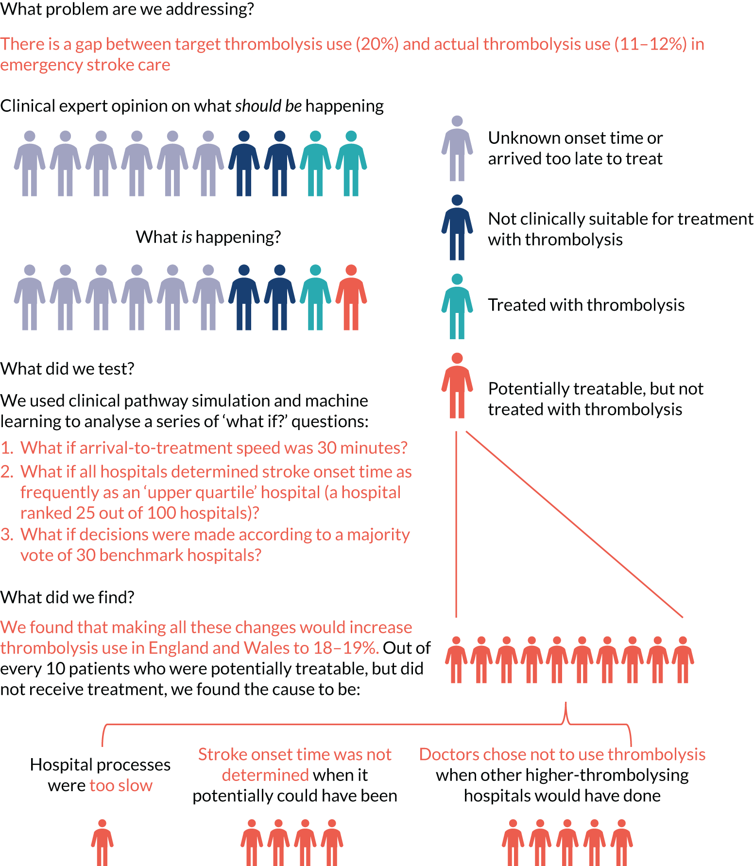
Qualitative research
We identified that physicians working in hospitals with lower thrombolysis rates identified patient factors (e.g. age and ethnicity) and patients’ time taken to travel to hospital as significant barriers to optimal thrombolysis decision-making. 61,62 These perspectives are associated with working in smaller and more rural hospitals where physicians tended to work alone, rather than in teams, and where decision-making about thrombolysis is taken less frequently, potentially invoking fear of poor decision-making and fear of complications. 63,64
In contrast, physicians working in hospitals with higher thrombolysis rates identified facilitators that they employed to mitigate previously identified ‘grey areas’ of decision-making (e.g. the individual-level interpretation of available evidence for the efficacy of thrombolysis). 65 Timely access to, and adequate reporting of, computerised tomography and access to specialists (or in some cases peers) were seen as crucial,66,67 as was the provision of specialist nurses who could prepare thrombolytic drugs for administration while physicians focused on gathering diagnostic information. 68 These physicians were more likely to work in larger centres, in collaborative teams that were actively advocating for the development of stroke services,69 and be able to envisage that machine learning could be used to improve operations and logistics in their specialism. 70
A significant finding of this research is that confident thrombolysers were more likely to be attuned to the potential benefits of instigating machine learning in the acute stroke pathway than less confident thrombolysers, and where improvement in thrombolysis use and speed is most warranted. Previous studies in applied clinical informatics have identified that health professionals have deep-rooted concerns that machine learning may lead to deskilling and distortion of the physician–patient relationship;71 in part, this is rooted in the lack of demonstrable potential of machine learning in clinical practice, with physicians yet to see how synthetic data are actionable at the point of care. 72 Unfamiliarity with machine learning and lack of familiarity with how models are created is associated with lack of trust in the methodology. 70 However, previous research has identified that trust can be established through researchers and clinicians working collaboratively throughout the research process,73,74 and with the methods and outputs reported in a transparent way. 60 As with existing research on the implementation of guidelines in stroke care, the identification of key individuals to lead the implementation or ‘advocates on the ground’ was seen as fundamental to the adoption of machine learning for optimising thrombolytic decision-making. 64,69
Various perspectives were provided by physicians on which machine learning outputs could best positively influence thrombolysis decision-making. Discussions included both the form and content of any data displays, and preference between a range of presentations. To ensure clinical face validity, outputs were requested to be accessible and engaging, as well as being presented in a way that limited the cognitive burden of the physician engaging with them. 72,73,75 The suggestion of a prototypical patient or vignette was popular, as were suggestions that downstream patient outcomes (e.g. on discharge) be included. 76 There was recognition that, currently, patient outcomes are fed back at unit or centre level, and some physicians were open to receiving this feedback at an individual (or consultant) level. 64 However, we also acknowledge that some physicians did not perceive that machine learning would diminish the uncertainty about the utilisation of thrombolysis because of their enduring concern about the potential risks and benefits associated with the therapy. 64,67
A limitation of this work is the small pool of physicians that we were able to interview. Although we were able to capture a range of perspectives from differing models of service delivery and with varying rates of thrombolysis, we are hindered in the conclusions that we can draw. Prior to the COVID-19 pandemic, we had difficulty gaining access to physicians at the interface of NHS trust R&D and human resources departments. Despite being a low-risk study, and having provided all necessary paperwork required for approval by the HRA Research Ethics Committee, we were regularly required to provide additional documents for local settings. This requirement, and the frequent change of personnel with whom we were asked to engage, delayed the recruitment process considerably. This qualitative work was then suspended during the COVID-19 pandemic while physicians were reallocated to front-line duties. However, on resumption of this study, bureaucratic processes (e.g. temporary local NHS trust policies) prevented us from interviewing physicians, even when they had provided us with written consent to be interviewed.
As well as benefiting from more qualitative interviews with physicians, we would have benefited from a broader model of provider engagement. Borrowing from complexity science, Braithwaite et al. 77 suggest that implementation in complex health-care scenarios requires an iterative and an adaptive social science approach to identifying which levers work best in which contexts. Although we had extensive patient and public involvement throughout the design and conduct of this research, our future planned work must also include a wider group of clinical stakeholders (including physicians who work in the ED, specialist stroke nurses, etc.) to ensure that we work with, rather than on, health professionals throughout the research and dissemination process to identify the most appropriate routes for machine learning feedback to stroke services. 78 Possible models for future engagement include embedding a wider range of clinical stakeholders in all aspects of the work (e.g. by our adoption of integrated knowledge translation approach) to ensure co-production of knowledge for policy and practice. 79–81
General conclusions from qualitative research
We identified a range of factors that physicians perceive of as barriers to or facilitators of the use of thrombolysis for ischaemic stroke. However, our key finding is that confident thrombolysers were more likely to be open to the potential benefits of instigating machine learning in the acute stroke pathway, in contrast to less confident thrombolysers, among whom improvement in thrombolysis use and speed is most needed. Despite this being a small study, physicians engaged with the machine learning process and outcomes, suggesting ways in which the outputs could be modified for feedback to stroke centres and utilised to inform thrombolytic decision-making. Future research needs to engage a wider group of clinical stakeholders throughout the research process.
General discussion
This project represents a novel approach to understanding the persisting variation that still exists in thrombolysis practice in the UK (outside Scotland, which has a separate national audit) and to developing new ways of supporting efforts to reduce that variation, and, in so doing, increase the clinical benefit to people with acute ischaemic stroke from thrombolysis.
In 2008, in the UK, alteplase was recommended for acute ischaemic stroke within 4.5 hours of known onset and, initially, usage increased rapidly to, on average, over 10% nationally. 82 However, since 2013, that is, the year that the prospective and comprehensive national stroke audit SSNAP was initiated, capturing approximately 95% of confirmed cases of acute stroke admitted to hospitals in England, Wales, Northern Ireland and the Islands, thrombolysis use has remained static at 11–12%. 83 This level of use remains well below that reported in continental Europe,84,85 and speculation continues as to why that might be. Furthermore, the national average conceals substantial variation in alteplase use between UK hospitals. As reported here, there is a persistent fivefold variation in the overall thrombolysis rate, increasing to nearly sevenfold among patients arriving at hospital within 4 hours of known onset (effectively the target population for thrombolysis).
Why does such enormous variation in the use of thrombolysis still persist, and what can be done to reduce it to increase the numbers of patients with reduced disability after stroke? Using new analytical techniques, the SAMueL project addresses these issues, with the objective of deriving tangible outputs that might realistically gain traction in the clinical community and result in an increase in the speed and proportion of patients given this life-changing treatment. In so doing, we have found that in-hospital processes and decision-making accounted for about half of inter-hospital variance and differences in local patient populations accounted for the other half. We identified several clear and readily implementable changes to processes and decision-making in hyperacute stroke that together could achieve a 58% increase in the number of patients treated with alteplase in the UK and result in a near-doubling of the clinical benefit from thrombolysis. Full implementation of the pathway changes identified in this study would go a long way towards achieving the stated ambition of The NHS Long Term Plan11 of bringing the UK up to among the best in Europe for reperfusion treatment for acute stroke.
The findings we summarise here are important, and they reveal persistent variation in clinical practice, more than 10 years on from the licensing of alteplase, which results in less clinical benefit (i.e. more stroke-related disability) than should be expected through the consistent application of the evidence from randomised controlled trials (RCTs).
The national average thrombolysis rate of 11.6% conceals the fact that one-quarter of all hospitals are treating just 9% of patients, and the lowest-thrombolysing hospital treats just 1.5% of patients. Considering the ‘target population’ of patients arriving within 4 hours of known stroke onset, the proportion of patients treated ranges between 7.3% and 49.7%, with an average of 29.5% of patients. Average door-to-needle times for a time-critical treatment also vary enormously, from < 30 minutes up to nearly 2 hours. If such variation were reported in the delivery of other evidence-based NICE-approved treatments, such as trastuzumab (Herceptin®, F. Hoffman-La Roche Ltd, Basel, Switzerland) treatment for breast cancer or pre-exposure human immunodeficiency virus antiviral prophylaxis, one might reasonably expect a public outcry. 86 Therefore, efforts to understand the sources of such variation, and to reduce or eliminate it, are more than amply justified, even if they attract comparatively less attention.
When challenged on the basis for such a significant degree of practice variation, clinicians regularly offer a number of explanations, most often suggesting that the demographics of their local patients are uniquely different from those seen in the rest of the country, with greater age, comorbidities and/or pre-stroke disability that disqualify a substantial proportion of their local population from treatment. These responses were replicated in the linked qualitative research undertaken in this study. The machine learning techniques described here, which go well beyond simple statistical adjustments for a few baseline characteristics, represent a sophisticated approach to revealing the factual basis for these ‘explanations’. The results of the machine learning exercise, using a standardised cohort of 10,000 identical patients presenting to every hospital in the UK, illustrate the unsupported and anecdotal nature of such explanations, revealing that half of the between-hospital variation in thrombolysis rates is accounted for by hospital-level factors rather than patient-level factors. Our work confirms, and adds to, previous work from discrete choice experiments that showed that clinicians vary in their attitudes with regard to thrombolysis for individual clinical features of patients. 60
Despite this, these machine learning techniques could not purport to replace clinical judgement in the decision about treating any individual patient and could not be used to provide a definitive predictive model. The highest-performing model, that is, embedding neural networks, achieved 84% sensitivity and specificity simultaneously. The hospital-specific random forest model, which had 81% accuracy for the decision to thrombolyse (and could attain 78% sensitivity and specificity simultaneously), identifies agreement among 80% of hospitals in the decision to treat a patient in 60% of cases, and identifies agreement among a similar proportion of hospitals in the decision not to treat in 85% of cases. Apart from anything else, these observations confirm that unanimity in the decision to treat across all 132 hospitals contributing data is highly unusual, although it is easier to find agreement on who not to treat than who to treat. These figures highlight that even high-performing predictive models cannot accommodate all the factors inherent in a decision to treat or not to treat, not least because SSNAP has not recorded all those factors. Therefore, the outputs from the machine learning can only ever be used probabilistically and could not be expected to derive treatment recommendations for use as a bedside decision aid. Indeed, our qualitative work indicated that thrombolysing physicians were much less open to its use in this way. It is far more preferable for the aggregated outputs to be used as a stimulus to scrutinise decision-making in audit at a local level, and as a means of identifying the principal sources of variation in a particular hospital. In this respect, it is more useful for the benchmarking process (i.e. the willingness to thrombolyse in an individual hospital is compared with the decisions taken in identical patients by the majority of the ‘top 30’ thrombolysing hospitals in the UK) to be incorporated as part of the other pathway improvements described in this study. Indeed, as we have learnt in the SAMueL study, it is not always the benchmarking process that has the greatest impact on either the thrombolysis rate or the resultant clinical benefit. For 26 hospitals, greater clinical benefit would accrue from efforts to improve the determination of the known stroke onset time to the top quartile, and for 51 hospitals, it would accrue from improvements in door-to-needle time.
These pathway changes have been previously shown to have a significant effect on thrombolysis rates and door-to-needle time in a number of different settings. 87,88 These projects would indicate that the 30-minute door-to-needle time proposed in the SAMueL study is not an unrealistic or unachievable target. Over the first 5 years of SSNAP from 2013, the median door-to-needle time in the UK reduced gradually by about 2 minutes per year to a low of 50 minutes. However, in the last 2 years, it has increased again to a similar degree. 89 Reasons offered for this increase are the increasing use of advanced brain imaging prior to thrombolysis as a selection method for mechanical thrombectomy, resulting in longer imaging sessions, and the steadily increasing pressure on EDs, causing delays in the prioritisation of stroke cases. What is more, these secular trends are not confined just to EDs. Recent SSNAP data show that as door-to-needle times have, at least until recently, gradually reduced year-on-year, pre-hospital onset-to-arrival times have increased and effectively cancelled out all the progress made in expediting in-hospital processes. 90 This is considered to be an effect of the increasing pressures on pre-hospital care and ambulance services in the UK from a wide range of other issues; however, it serves to illustrate the complexities of shortening onset-to-needle times in an emergency environment exposed to a whole range of other pressures and priorities. In the recent PASTA (Paramedic Acute Stroke Treatment Assessment) cluster RCT,91 which studied an enhanced role for paramedics in the first 15 minutes of hospital care for patients with suspected stroke, there was an unexpected, if non-significant, reduction in the thrombolysis rate for patients presenting within 4 hours of suspected stroke. The explanation offered for this observation was that a small amount of additional time spent acquiring and considering a wider range of information about the patient’s suitability for thrombolysis actually resulted in more decisions not to treat, independent of stroke severity or time since stroke onset. Once again, this observation serves to emphasise that there are factors other than those recorded either in SSNAP or in a RCT, such as PASTA, that are influencing the decision to treat or not to treat that cannot be disregarded. These less tangible or ‘soft’ influences on decision-making featured in our qualitative work with clinicians as justifications for between-clinician variances in decision-making.
One of our principal objectives with the SAMueL study was to develop, through the combination of pathway modelling and machine learning, bespoke outputs for individual hyperacute stroke centres that could be incorporated into routine reporting through national audit and, in so doing, ‘shift the dial’ of thrombolysis provision in a way that has not been done in the last 8 years, despite much other quality improvement effort. Illustrating to individual sites, using their own data from their own patients, what their specific thrombolysis rate could be and, more importantly, the impact that would have on outcomes addresses several of the traditional obstacles to the effective implementation of clinical change in response to audit findings. 92 A familiar pitfall when addressing clinical variation is that the phrase ‘if only all sites were as good as the best’ is, by definition, an oxymoron and lacks credibility with clinical teams that are far short of the best and/or struggling to improve. We have, therefore, sought to neutralise this pitfall through the use of a much more conservative approach, that is, modelling based either on the typical clinical behaviour of just the ‘top 30’ hospitals or the top-quartile performance for the acquisition of a known onset time. This presents poorly performing hospitals with a much more credible and achievable objective (i.e. you do not need to be as good as the best, often regarded as unachievable, but merely match the performance of a better-than-average site, of which there are many). To use a footballing analogy, this is equivalent to being in the top half of the league table in the second of the four tiers of professional football in England, the Championship. We cannot all be a Manchester City, but, surely, we can all aspire to being at least a Barnsley or a Millwall.
Our method also addresses another familiar objection regarding high-performing centres, that is, that such sites are needlessly thrombolysing mild strokes or even stroke mimics, although the latter are excluded from the SSNAP data used in this study. This issue arose in our linked qualitative work with low-thrombolysing sites. In our cohort of 10,000 standardised stroke patients presenting within 4 hours, 10 of the ‘top 30’ thrombolysing sites would have a lower thrombolysis rate after benchmarking. The moderating effect of a broad-based machine learning method removes extremes at both ends of the scale, but still contributes to a substantial increase in the overall thrombolysis rate for nearly all sites and a correspondingly greater population benefit. It would seem not unreasonable, therefore, to anticipate an achievable national thrombolysis rate for patients presenting within 4 hours to be 36.9%, compared with the current figure of 29.5%.
Limitations
The limitations of our study need to be acknowledged. Principal among them is the issue of unmeasured confounding through variables that influence the decision to treat that are not measured in SSNAP. Many of the main exclusions from treatment are recorded in SSNAP (e.g. concurrent anticoagulant treatment and pre-stroke severe disability), but by no means all. The extent to which these unmeasured confounders are responsible for residual variation between sites remains a matter of speculation, but it seems improbable that they are a major contributor. Our method of assessing the overall population benefit from thrombolysis is, by design, highly conservative in limiting ‘good outcomes’ to those with a mRS score of 0 or 1 at 90 days (i.e. survival with no symptoms or normal activities despite symptoms) – the same primary outcome used in the principal RCTs of alteplase. 5 However, it is clear that for many patients who fall short of such an ‘excellent’ outcome of being entirely free of disability, their outcomes are still improved (vs. no treatment), with alteplase treatment shifting the overall distribution of disability across all categories of mRS in a favourable direction. 93 In its conservatism, therefore, our method understates much of the additional population clinical benefit that is not captured by a simple dichotomous disabled/not disabled outcome.
Our predictions about differences in clinical decision-making are necessarily at site level. We pick up on general differences in attitude to thrombolysis between sites, but we cannot detect differences that exist between individual clinicians (i.e. as decision-making is the end result of a process, and, therefore, may be collective, it may be that decisions can never be fully assigned to an individual).
Owing to disruption caused by the COVID-19 pandemic, our qualitative research was more limited in input than originally planned, with fewer participants and only one specialist nurse participant (with the rest being medical practitioners).
There are limitations to the extent of the methodology developed. For example, we did not develop logistic regression methodology as much as it could have been. As some features have complex relationships with the choice to give thrombolysis (e.g. stroke severity, with thrombolysis not being given to those with very mild or severe stroke), we chose to focus more on methods that handle these complexities with less feature engineering; however, it could have been possible to use more complex feature engineering and/or more complex logistic regression model fits (e.g. spline fits) to deal with that complexity within a logistic regression model.
The remaining limitations relate to the potential for implementation. Our qualitative substudy identified the paradox that it was the confident thrombolysing physicians who were most open to the influence of machine learning and other methods of quality improvement; however, these were the physicians who also needed it the least. Successfully engaging with a large and disparate group of middling- to low-thrombolysing sites and with clinicians less open to these methods for improvement presents significant challenges and could blunt the impact and resultant benefits. This would contribute to the variation that would persist even after the fullest practicable implementation of the pathway changes that we describe here. We describe what we believe to be achievable standards, that is, a 30-minute median door-to-needle time, upper quartile performance for known stroke onset time and clinical behaviour typical of the majority of the top 30 hospitals in the UK in terms of performance. However, even within these standards, there will remain the potential for variation, much of it justifiable or at least understandable, which could diminish our headline ‘national average thrombolysis rate’ of 18.3% and the corresponding doubling of the population benefit. Taking an approach to quality improvement that is too simplistic, and that does not recognise that for all the standardisation that may be delivered there will remain pragmatic reasons behind residual differences in clinical practice, risks undermining the overall message of our study. Nonetheless, it is presently unacceptable to continue tolerating such a wide variation in practice in a complex clinical pathway for a disabling and time-critical condition, and there is clearly a great deal to be gained from further, relatively modest, efforts at reducing that variation, supported by the novel techniques described in the SAMueL study.
Implications for health care
Overall, our results suggest that England and Wales can get close to the target of 20% of emergency stroke admission patients receiving thrombolysis, but this should not be seen as a single target for all hospitals. Realistically achievable thrombolysis use depends on local patient populations and, therefore, a universal target of 20% across all hospitals may overestimate what is achievable at some hospitals, as well as underestimate what is achievable at other hospitals. Therefore, local agreed targets may be more appropriate.
The tools developed here have the potential to add further depth of analysis to the national stroke audit outputs, providing each stroke team with more in-depth analysis of what an achievable use of thrombolysis may be in their hospital, and what changes to pathway or decision-making would help drive most improvement. The approach adopted in this project may be transferable to other national clinical audits.
Chapter 10 Conclusions
Machine learning and clinical pathway simulation may be applied at scale to national audit data, allowing extended use and analysis of audit data. These models may help hospitals to identify what would most improve benefit from thrombolysis use (if improvement is needed) and to identify realistic targets for individual hospitals, given their own patient populations. We can identify patterns of differences in clinical decision-making between hospitals.
Our models have good accuracy. Decision-making can be predicted with 85% accuracy for those patients with a chance of receiving thrombolysis (arriving within 4 hours of stroke onset). This accuracy enables us to look for patterns in clinical decision-making in and between hospitals. Clinical pathway simulation predicts hospital thrombolysis use with an average absolute error of 0.5 percentage points.
Overall, we found that in-hospital processes and decision-making accounted for about half of inter-hospital variance, and differences in local patient populations accounted for the other half. The strongest predictor of thrombolysis within the in-hospital processes was clinical decision-making of who should or should not receive thrombolysis.
Stroke thrombolysis rates of at least 18% look achievable in England and Wales, but each hospital should have its own target.
Further qualitative research and prediction of thrombolysis outcome/risk are needed to maximise trust in, and engagement with, the model, especially by physicians in units with low thrombolysis use. We suggest a co-production model to achieve this.
These techniques may very possibly be of use in other national clinical audits.
Chapter 11 Recommendations for further research
The following recommendations for further work are based on feedback received while presenting the work to clinicians and to the patient and public involvement group.
Expand machine learning to predict probability of good outcome and probability of adverse effects of thrombolysis
Outcome is what ultimately matters. Clinicians worried that they may be pressured into giving thrombolysis to too many people, risking worsening overall outcomes due to adverse effects. The patient and public involvement group worried that clinicians were too cautious and that outcomes might be better with the higher thrombolysis use suggested by clinical opinion leaders, setting the 20% target. If we are able to predict likely outcome (e.g. NIHSS score at 24 hours, mRS score at discharge, mRS score at 6 months) and the probability of adverse effect to thrombolysis (e.g. worsening NIHSS score over 24 hours), then we hope to allay these concerns.
Further qualitative research with a focus on co-production of outputs
We recommend including clinicians from a range of different hospitals to help shape what output is shared with clinicians, and how that output is shared. Qualitative research could also be extended to a study of implementation of these methods, incorporating clinical and non-clinical (e.g. commissioning) perspectives.
Expand outputs of models to incorporate health economic evaluation of changes to demonstrate benefits in health economic terms (e.g. quality-adjusted life-years)
Expanding outputs of models to incorporate health economic evaluation of changes to demonstrate benefits in health economic terms allows exploration of the cost-effectiveness of making organisational changes to the care pathway. This recommendation addresses a concern that commissioners may need to be persuaded to invest in the stroke pathway (e.g. by funding specialist nurses).
Include organisational features (from the SSNAP Acute Organisational Audit) in machine learning models
This recommendation addresses an issue where hospitals said that they had insufficient infrastructure for an effective stroke pathway. By incorporating organisation factors into the model, as available through the routine SSNAP Acute Organisational Audit, we would examine the link between organisational factors and stroke pathway performance. This output, alongside the health economics analysis, could, again, strengthen the argument for more investment in the stroke pathway.
Develop more methods to explain machine learning models (and the biases that have been learned) so that people can see what is driving the model’s overall and individual predictions
Further research should look to develop more methods to explain machine learning models (and the biases that have been learned) so that people can see what is driving the model’s overall and individual predictions, for example incorporating Shapley values in model outputs. This could include design of a web portal for drilling down into hospital models in more detail. We would hope that this research would build trust in the models, especially in those sceptical of the model, by allowing people a clearer view ‘under the bonnet’ of the model.
Acknowledgements
We wish to particularly thank our patient and public involvement members Leon Farmer and Penny Thompson.
Thanks to our External Steering Team members Professor Tom Monks, Dr Ajay Bhalla, Professor Tony Rudd and Professor Gary Ford.
Thanks also to our research manager Sarah Carter, and to Cath Hopkins for general administration support.
Contributions of authors
Michael Allen (https://orcid.org/0000-0002-8746-9957) (Senior Research Fellow, Modelling and Machine Learning) proposed the original research theme, was responsible for the modelling and machine learning aspects of the projects, conducted the clinical pathway simulation modelling and the machine learning (other than random forests), and was the primary author of the report.
Charlotte James (https://orcid.org/0000-0003-4850-5318) (Research Fellow, Modelling and Machine Learning) conducted the random forests machine learning and was primary author of Chapter 5.
Julia Frost (https://orcid.org/0000-0002-3503-5911) (Senior Lecturer, Qualitative Research) devised, conducted and wrote up the qualitative research for the project.
Kristin Liabo (https://orcid.org/0000-0002-7052-1261) (Senior Research Fellow, patient and public involvement) was responsible for patient and public involvement for the project and was the primary author of Chapter 8.
Kerry Pearn (https://orcid.org/0000-0003-2786-4426) (Research Fellow, Modelling and Machine Learning) assisted in coding the simulation modelling and the machine learning (other than random forests), assisted in reviewing the descriptive statistics, machine learning and clinical pathway simulation results and write-up, and contributed to report editing.
Thomas Monks (https://orcid.org/0000-0003-2631-4481) (Associate Professor Modelling and Machine Learning) assisted in reviewing the descriptive statistics, machine learning and clinical pathway simulation results and write-up, and contributed to report editing.
Zhivko Zhelev (https://orcid.org/0000-0002-0106-2401) (Senior Research Fellow, Diagnostics) assisted in reviewing the descriptive statistics and machine learning methods and results, and contributed to report editing.
Stuart Logan (https://orcid.org/0000-0002-9279-261X) (Professor, Applied Healthcare Research) oversaw the project during Ken Stein’s absence from the project, and advised on preparing the work for implementation.
Richard Everson (https://orcid.org/0000-0002-3964-1150) (Professor, Machine Learning) supervised the random forest machine learning, and advised on all aspects of machine learning and clinical pathway simulation.
Martin James (https://orcid.org/0000-0001-6065-6018) (Professor, Stroke Consultant) advised on clinical aspects of the project, helped refine the project objectives, reviewed descriptive statistics, machine learning and clinical pathway simulation results, wrote the general discussion, contributed to report editing and was the primary link with SSNAP.
Ken Stein (https://orcid.org/0000-0002-5842-9972) (Professor, Applied Healthcare Research) oversaw the project, advised on project objectives, reviewed project results and contributed to report editing.
Publication
Allen M, James C, Frost J, Liabo K, Pearn K, Monks T, et al. Use of clinical pathway simulation and machine learning to identify key levers for maximizing the benefit of intravenous thrombolysis in acute stroke [published online ahead of print July 15 2022]. Stroke 2022.
Data-sharing statement
Although original patient-level data cannot be shared, all code for the project and detailed statistical summaries of the data (e.g. the parameters determined for each hospital for the clinical pathway simulation model) may be found at URL: https://samuel-book.github.io/samuel-1/introduction/intro.html (accessed 11 May 2022).
Patient data
This work uses data provided by patients and collected by the NHS as part of their care and support. Using patient data is vital to improve health and care for everyone. There is huge potential to make better use of information from people’s patient records, to understand more about disease, develop new treatments, monitor safety, and plan NHS services. Patient data should be kept safe and secure, to protect everyone’s privacy, and it’s important that there are safeguards to make sure that it is stored and used responsibly. Everyone should be able to find out about how patient data are used. #datasaveslives You can find out more about the background to this citation here: https://understandingpatientdata.org.uk/data-citation.
Disclaimers
This report presents independent research funded by the National Institute for Health and Care Research (NIHR). The views and opinions expressed by authors in this publication are those of the authors and do not necessarily reflect those of the NHS, the NIHR, the HSDR programme or the Department of Health and Social Care. If there are verbatim quotations included in this publication the views and opinions expressed by the interviewees are those of the interviewees and do not necessarily reflect those of the authors, those of the NHS, the NIHR, the HSDR programme or the Department of Health and Social Care.
References
- NIH National Heart Blood and Lung Institute . What Is a Stroke n.d. www.nhlbi.nih.gov/health-topics/stroke (accessed 1 July 2021).
- Feigin VL, Forouzanfar MH, Krishnamurthi R, Mensah GA, Connor M, Bennett DA, et al. Global and regional burden of stroke during 1990–2010: findings from the Global Burden of Disease Study 2010. Lancet 2014;383:245-54. https://doi.org/10.1016/S0140-6736(13)61953-4.
- Healthcare Quality Improvement Partnership . Sentinel Stroke National Audit Programme – Annual Report 2019–20 2021.
- Newton JN, Briggs AD, Murray CJ, Dicker D, Foreman KJ, Wang H, et al. Changes in health in England, with analysis by English regions and areas of deprivation, 1990–2013: a systematic analysis for the Global Burden of Disease Study 2013. Lancet 2015;386:2257-74. https://doi.org/10.1016/S0140-6736(15)00195-6.
- Emberson J, Lees KR, Lyden P, Blackwell L, Albers G, Bluhmki E, et al. Effect of treatment delay, age, and stroke severity on the effects of intravenous thrombolysis with alteplase for acute ischaemic stroke: a meta-analysis of individual patient data from randomised trials. Lancet 2014;384:1929-35. https://doi.org/10.1016/S0140-6736(14)60584-5.
- Berge E, Whiteley W, Audebert H, De Marchis GM, Fonseca AC, Padiglioni C, et al. European Stroke Organisation (ESO) guidelines on intravenous thrombolysis for acute ischaemic stroke. Eur Stroke J 2021;6:I-LXII. https://doi.org/10.1177/2396987321989865.
- Norrving B, Barrick J, Davalos A, Dichgans M, Cordonnier C, Guekht A, et al. Action plan for stroke in Europe 2018–2030. Eur Stroke J 2018;3:309-36. https://doi.org/10.1177/2396987318808719.
- Bray BD, Campbell J, Cloud GC, Hoffman A, Tyrrell PJ, Wolfe CDA, et al. Bigger, faster?: Associations between hospital thrombolysis volume and speed of thrombolysis administration in acute ischaemic stroke. Stroke 2013;44:3129-35. https://doi.org/10.1161/STROKEAHA.113.001981.
- Lahr MMH, Luijckx GJ, Vroomen PCAJ, Van Der Zee DJ, Buskens E. Proportion of patients treated with thrombolysis in a centralised versus a decentralised acute stroke care setting. Stroke 2012;43:1336-40. https://doi.org/10.1161/STROKEAHA.111.641795.
- Bembenek J, Kobayashi A, Sandercock P, Czlonkowska A. How many patients might receive thrombolytic therapy in the light of the ECASS-3 and IST-3 data?. Int J Stroke 2010;5:430-1. https://doi.org/10.1111/j.1747-4949.2010.00479.x.
- NHS . The NHS Long Term Plan n.d. www.longtermplan.nhs.uk/wp-content/uploads/2019/08/nhs-long-term-plan-version-1.2.pdf (accessed 1 July 2021).
- NHS England and NHS Improvement . National Stroke Service Model: Integrated Stroke Delivery Networks n.d. www.england.nhs.uk/wp-content/uploads/2021/05/national-stroke-service-model-integrated-stroke-delivery-networks-may-2021.pdf (accessed 1 July 2021).
- Meretoja A, Strbian D, Mustanoja S, Tatlisumak T, Lindsberg PJ, Kaste M. Reducing in-hospital delay to 20 minutes in stroke thrombolysis. Neurology 2012;79:306-13. https://doi.org/10.1212/WNL.0b013e31825d6011.
- Eissa A, Krass I, Bajorek BV. Barriers to the utilisation of thrombolysis for acute ischaemic stroke. J Clin Pharm Ther 2012;37:399-40. https://doi.org/10.1111/j.1365-2710.2011.01329.x.
- Carter-Jones CR. Stroke thrombolysis: barriers to implementation. Int Emerg Nurs 2011;19:53-7. https://doi.org/10.1016/j.ienj.2010.02.005.
- Engelter ST, Gostynski M, Papa S, Ajdacic-Gross V, Lyrer PA. Barriers to stroke thrombolysis in a geographically defined population. Cerebrovasc Dis 2007;23:211-15. https://doi.org/10.1159/000097643.
- Lahr MMH, Luijckx GJ, Vroomen PCAJ, Van Der Zee DJ, Buskens E. The chain of care enabling tPA treatment in acute ischaemic stroke: a comprehensive review of organisational models. J Neurol 2013;260:960-8. https://doi.org/10.1007/s00415-012-6647-7.
- NHS . Clinical Audit n.d. www.england.nhs.uk/clinaudit/ (accessed 1 July 2021).
- SSNAP . Sentinel Stroke National Audit Programme n.d. www.strokeaudit.org/ (accessed 1 July 2021).
- Monks T, Pitt M, Stein K, James M. Maximising the population benefit from thrombolysis in acute ischaemic stroke: a modelling study of in-hospital delays. Stroke 2012;43:2706-11. https://doi.org/10.1161/STROKEAHA.112.663187.
- Lahr M, van der Zee D-J, Luijckx G, Vroomen P, Buskens E. A simulation-based approach for improving utilisation of thrombolysis in acute brain infarction. Med Care 2013;51:1101-5. https://doi.org/10.1097/MLR.0b013e3182a3e505.
- Monks T, van der Zee D-J, Lahr MMH, Allen M, Pearn K, James MA, et al. A framework to accelerate simulation studies of hyperacute stroke systems. Oper Res Heal Care 2017;15:57-6. https://doi.org/10.1016/j.orhc.2017.09.002.
- Allen M, Pearn K, Monks T, Bray BD, Everson R, Salmon A, et al. Can clinical audits be enhanced by pathway simulation and machine learning? An example from the acute stroke pathway. BMJ Open 2019;9. https://doi.org/10.1136/bmjopen-2018-028296.
- The Turing Way Community . The Turing Way: A Handbook for Reproducible Data Science 2019.
- Jupyter Book . Introduction to SAMueL-1 (Stroke Audit Machine Learning) n.d. https://samuel-book.github.io/samuel-1/ (accessed 4 May 2022).
- Healthcare Quality Improvement Partnership . HQIP – Healthcare Quality Improvement Partnership n.d. www.hqip.org.uk/ (accessed 1 July 2021).
- NHS Digital . Hospital Episode Statistics n.d. https://digital.nhs.uk/data-and-information/data-tools-and-services/data-services/hospital-episode-statistics (accessed 1 July 2021).
- NHS Health Research Authority . Is My Study Research? n.d. www.hra-decisiontools.org.uk/research/ (accessed 1 July 2021).
- SAMueL project team . Outline – What Is in This Section? n.d. https://samuel-book.github.io/samuel-1/descriptive_stats/outline.html (accessed 4 May 2022).
- SAMueL project team . Stroke Pathway Timing Distribution n.d. https://samuel-book.github.io/samuel-1/descriptive_stats/06_distributions.html (accessed 5 May 2022).
- SAMueL project team . Measuring the Covariance Correlation Between Features n.d. https://samuel-book.github.io/samuel-1/descriptive_stats/07_covariance.html (accessed 5 May 2022).
- SAMueL project team . Logistic Regression n.d. https://samuel-book.github.io/samuel-1/logistic_regression/outline.html (accessed 5 May 2022).
- SAMueL project team . Random Forests n.d. https://samuel-book.github.io/samuel-1/random_forest/outline.html (accessed 6 May 2022).
- SAMueL project team . Neural Networks n.d. https://samuel-book.github.io/samuel-1/neural_net/outline.html (accessed 6 May 2022).
- Chollet F. Deep Learning with Python. Shelter Island, NY: Manning Publications; 2018.
- Guo C, Berkhahn F. Entity embeddings of categorical variables. ArXiv 2016.
- SAMueL project team . Ensemble Models n.d. https://samuel-book.github.io/samuel-1/ensemble/outline.html (accessed 9 May 2022).
- SAMueL project team . Model Building and Validation n.d. https://samuel-book.github.io/samuel-1/pathway_sim/outline_model.html (accessed 9 May 2022).
- SAMueL project team . Testing of Alternative What-If? Scenarios n.d. https://samuel-book.github.io/samuel-1/pathway_sim/outline_scenarios.html (accessed 9 May 2022).
- SAMueL project team . Base Model Parameters n.d. https://samuel-book.github.io/samuel-1/pathway_sim/base_parameters.html (accessed 9 May 2022).
- Harris CR, Millman KJ, van der Walt SJ, Gommers R, Virtanen P, Cournapeau D, et al. Array programming with NumPy. Nature 2020;585:357-62. https://doi.org/10.1038/s41586-020-2649-2.
- SAMueL project team . Pathway Code n.d. https://samuel-book.github.io/samuel-1/pathway_sim/pathway_code.html (accessed 9 May 2022).
- Blaxter M. Criteria for evaluation of qualitative research. Med Sociol News 1996;22:68-71.
- Crilly N, Blackwell AF, Clarkson PJ. Graphic elicitation: using research diagrams as interview stimuli. Qual Res 2006;6:341-66. https://doi.org/10.1177/1468794106065007.
- Eakin JM, Gladstone B. ‘Value-adding’ analysis: doing more with qualitative data. Int J Qual Methods 2020;19. https://doi.org/10.1177/1609406920949333.
- Archibald MM, Ambagtsheer RC, Casey MG, Lawless M. Using Zoom videoconferencing for qualitative data collection: perceptions and experiences of researchers and participants. Int J Qual Methods 2019;18. https://doi.org/10.1177/1609406919874596.
- Salmon J. Qualitative Online Interviews: Strategies, Design, and Skills. Thousand Oaks, CA: SAGE Publications Ltd; 2014.
- Ritchie J, Spencer L, Bryman A, Burgess B. Analysing Qualitative Data. Abingdon-on-Thames: Routledge; 1994.
- Miles M, Huberman A, Saldana J. Qualitative Data Analysis: A Sourcebook. Thousand Oaks, CA: SAGE Publications Ltd; 2014.
- Mays N, Pope C. Qualitative research: rigour and qualitative research. BMJ 1995;311:109-12. https://doi.org/10.1136/bmj.311.6997.109.
- NIHR Applied Research Collaboration South West Peninsula . Patient & Public Involvement &Amp; Engagement n.d. https://arc-swp.nihr.ac.uk/patient-and-public-involvement/ (accessed 10 May 2022).
- Hosmer DW, Lemeshow S, Sturdivant RX. Applied Logistic Regression. Volume 398. Oxford: John Wiley & Sons; 2013.
- Hastie T, Tibshirani R, Friedman J. The Elements of Statistical Learning: Data Mining, Inference, and Prediction. Berlin: Springer Science & Business Media; 2009.
- Breiman L. Random forests. Mach Learn 2001;45:5-32. https://doi.org/10.1023/A:1010933404324.
- Štrumbelj E, Kononenko I. Explaining prediction models and individual predictions with feature contributions. Knowl Inf Syst 2014;41:647-65. https://doi.org/10.1007/s10115-013-0679-x.
- Lemaître G, Nogueira F, Aridas CK. Imbalanced-learn: a python toolbox to tackle the curse of imbalanced data sets in machine learning. J Mach Learn Res 2017;18:1-5.
- Chawla NV, Bowyer KW, Hall LO, Kegelmeyer WP. SMOTE: synthetic minority over-sampling technique. J Artif Intell Res 2002;16:321-57. https://doi.org/10.1613/jair.953.
- Mikolov T, Chen K, Corrado G, Dean J. Distributed representations of words and phrases and their compositionality. ArXiv 2013.
- Mikolov T, Chen K, Corrado G, Dean J. Efficient estimation of word representations in vector space. ArXiv 2013.
- De Brún A, Flynn D, Ternent L, Price CI, Rodgers H, Ford GA, et al. Factors that influence clinicians’ decisions to offer intravenous alteplase in acute ischaemic stroke patients with uncertain treatment indication: results of a discrete choice experiment. Int J Stroke 2018;13:74-82. https://doi.org/10.1177/1747493017690755.
- Sheppard JP, Mellor RM, Greenfield S, Mant J, Quinn T, Sandler D, et al. The association between prehospital care and in-hospital treatment decisions in acute stroke: a cohort study. Emerg Med J 2015;32:93-9. https://doi.org/10.1136/emermed-2013-203026.
- Thomson RG, De Brun A, Flynn D, Ternent L, Price CI, Rodgers H, et al. Factors that influence variation in clinical decision-making about thrombolysis in the treatment of acute ischaemic stroke: results of a discrete choice experiment. Health Serv Deliv Res 2017;5. https://doi.org/10.3310/hsdr05040.
- Stecksén A, Lundman B, Eriksson M, Glader EL, Asplund K. Implementing thrombolytic guidelines in stroke care: perceived facilitators and barriers. Qual Health Res 2014;24:412-19. https://doi.org/10.1177/1049732313514137.
- Skolarus LE, Neshewat GM, Evans L, Green M, Rehman N, Landis-Lewis Z, et al. Understanding determinants of acute stroke thrombolysis using the tailored implementation for chronic diseases framework: a qualitative study. BMC Health Serv Res 2019;19. https://doi.org/10.1186/s12913-019-4012-6.
- De Brún A, Flynn D, Joyce K, Ternent L, Price C, Rodgers H, et al. Understanding clinicians’ decisions to offer intravenous thrombolytic treatment to patients with acute ischaemic stroke: a protocol for a discrete choice experiment. BMJ Open 2014;4. https://doi.org/10.1136/bmjopen-2014-005612.
- Meurer WJ, Majersik JJ, Frederiksen SM, Kade AM, Sandretto AM, Scott PA. Provider perceptions of barriers to the emergency use of tPA for acute ischaemic stroke: a qualitative study. BMC Emerg Med 2011;11. https://doi.org/10.1186/1471-227X-11-5.
- Moloczij N, Mosley I, Moss KM, Bagot KL, Bladin CF, Cadilhac DA. Is telemedicine helping or hindering the delivery of stroke thrombolysis in rural areas? A qualitative analysis. Intern Med J 2015;45:957-64. https://doi.org/10.1111/imj.12793.
- Xiao Y. Artefacts and collaborative work in healthcare: Methodological, theoretical, and technological implications of the tangible. J Biomed Inform 2005;38:26-33. https://doi.org/10.1016/j.jbi.2004.11.004.
- Donnellan C, Sweetman S, Shelley E. Implementing clinical guidelines in stroke: a qualitative study of perceived facilitators and barriers. Health Policy 2013;111:234-44. https://doi.org/10.1016/j.healthpol.2013.04.002.
- Sandhu S, Lin AL, Brajer N, Sperling J, Ratliff W, Bedoya AD, et al. Integrating a machine learning system into clinical workflows: qualitative study. J Med Internet Res 2020;22. https://doi.org/10.2196/22421.
- Castagno S, Khalifa M. Perceptions of artificial intelligence among healthcare staff: a qualitative survey study. Front Artif Intell 2020;3. https://doi.org/10.3389/frai.2020.578983.
- Roosan D, Del Fiol G, Butler J, Livnat Y, Mayer J, Samore M, et al. Feasibility of population health analytics and data visualisation for decision support in the infectious diseases domain. Appl Clin Inform 2016;7:604-23. https://doi.org/10.4338/ACI-2015-12-RA-0182.
- Ross J, Stevenson F, Lau R, Murray E. Factors that influence the implementation of e-health: a systematic review of systematic reviews (an update). Implement Sci 2016;11. https://doi.org/10.1186/s13012-016-0510-7.
- Crowe S, Turner S, Utley M, Fulop NJ. Improving the production of applied health research findings: insights from a qualitative study of operational research. Implement Sci 2017;12. https://doi.org/10.1186/s13012-017-0643-3.
- Crowe S, Brown K, Tregay J, Wray J, Knowles R, Ridout DA, et al. Combining qualitative and quantitative operational research methods to inform quality improvement in pathways that span multiple settings. BMJ Qual Saf 2017;26:641-52. https://doi.org/10.1136/bmjqs-2016-005636.
- Kareemi H, Vaillancourt C, Rosenberg H, Fournier K, Yadav K. Machine learning versus usual care for diagnostic and prognostic prediction in the emergency department: a systematic review. Acad Emerg Med 2021;28:184-96. https://doi.org/10.1111/acem.14190.
- Braithwaite J, Churruca K, Long JC, Ellis LA, Herkes J. When complexity science meets implementation science: a theoretical and empirical analysis of systems change. BMC Med 2018;16. https://doi.org/10.1186/s12916-018-1057-z.
- Fulop NJ, Ramsay AI, Perry C, Boaden RJ, McKevitt C, Rudd AG, et al. Explaining outcomes in major system change: a qualitative study of implementing centralised acute stroke services in two large metropolitan regions in England. Implement Sci 2016;11. https://doi.org/10.1186/s13012-016-0445-z.
- Johnson CM, Johnson TR, Zhang J. A user-centred framework for redesigning health care interfaces. J Biomed Inform 2005;38:75-87. https://doi.org/10.1016/j.jbi.2004.11.005.
- Boland L, Kothari A, McCutcheon C, Graham ID. Integrated Knowledge Translation Research Network . Building an integrated knowledge translation (IKT) evidence base: colloquium proceedings and research direction. Health Res Policy Syst 2020;18. https://doi.org/10.1186/s12961-019-0521-3.
- Nguyen T, Graham ID, Mrklas KJ, Bowen S, Cargo M, Estabrooks CA, et al. How does integrated knowledge translation (IKT) compare to other collaborative research approaches to generating and translating knowledge? Learning from experts in the field. Health Res Policy Syst 2020;18. https://doi.org/10.1186/s12961-020-0539-6.
- Royal College of Physicians . How Good Is Stroke Care? The First SSNAP Annual Report n.d. www.strokeaudit.org/Documents/National/Clinical/Apr2013Mar2014/Apr2013Mar2014-AnnualReport.aspx (accessed 1 July 2021).
- Sentinel Stroke National Audit Programme . Moving the Dial of Stroke Care: The 6th SSNAP National Report n.d. www.strokeaudit.org/Documents/National/Clinical/Apr2018Mar2019/Apr2018Mar2019-AnnualReport.aspx (accessed 1 July 2021).
- Kuhrij LS, Wouters MW, van den Berg-Vos RM, de Leeuw FE, Nederkoorn PJ. The Dutch Acute Stroke Audit: benchmarking acute stroke care in the Netherlands. Eur Stroke J 2018;3:361-8. https://doi.org/10.1177/2396987318787695.
- Meza HT, Gil Al, Saldana AS, Martinez-Zabaleta M, de la Riva Juez P, Lopez-Cancio Martinez E, et al. Impact of COVID-19 outbreak on ischaemic stroke admissions and in-hospital mortality in North-West Spain. Int J Stroke 2020;15:755-62. https://doi.org/10.1177/1747493020938301.
- Wood M. Depoliticisation, resilience and the herceptin post-code lottery crisis: holding back the tide. Br J Polit Int Relat 2015;17:644-64. https://doi.org/10.1111/1467-856X.12060.
- Meretoja A, Weir L, Ugalde M, Yassi N, Yan B, Hand P, et al. Helsinki model cut stroke thrombolysis delays to 25 minutes in Melbourne in only 4 months. Neurology 2013;81:1071-6. https://doi.org/10.1212/WNL.0b013e3182a4a4d2.
- Wu TY, Coleman E, Wright SL, Mason DF, Reimers J, Duncan R, et al. Helsinki stroke model is transferable with ‘real-world’ resources and reduced stroke thrombolysis delay to 34 min in Christchurch. Front Neurol 2018;9. https://doi.org/10.3389/fneur.2018.00290.
- Sentinel Stroke National Audit Programme . Springboard for Progress: The Seventh Annual SSNAP Report n.d. www.strokeaudit.org/Documents/National/Clinical/Apr2019Mar2020/Apr2019Mar2020-AnnualReport.aspx (accessed 1 July 2021).
- McMullen E, Stanley K, Muruet W, Douiri, Bhalla A, Wolfe C, . Are Patients With Acute Stroke Taking Longer to Get to Hospital in the UK? Data from the National Stroke Registry n.d.
- Price CI, Shaw L, Islam S, Javanbakht M, Watkins A, McMeekin P, et al. Effect of an enhanced paramedic acute stroke treatment assessment on thrombolysis delivery during emergency stroke care: a cluster randomised clinical trial. JAMA Neurol 2020;77:840-8. https://doi.org/10.1001/jamaneurol.2020.0611.
- Foy R, Skrypak M, Alderson S, Ivers NM, McInerney B, Stoddart J, et al. Revitalising audit and feedback to improve patient care. BMJ 2020;368. https://doi.org/10.1136/bmj.m213.
- Meretoja A, Keshtkaran M, Saver JL, Tatlisumak T, Parsons MW, Kaste M, et al. Stroke thrombolysis: save a minute, save a day. Stroke 2014;45:1053-8. https://doi.org/10.1161/STROKEAHA.113.002910.
- SAMueL project team . Extract Hospital Performance for Pathway Model n.d. https://samuel-book.github.io/samuel-1/pathway_sim/extract_hospital_performance.html (accessed 11 May 2022).
Appendix 1 Sentinel Stroke National Audit Programme data fields
The SSNAP data fields provided are listed below.
Hospital ID
-
StrokeTeam: pseudonymised SSNAP ‘routinely admitting team’ unique identifier. For emergency care, it is expected that each hospital has one stroke team (although post 72-hour care may be reported under a different team at that hospital).
Patient: general
-
PatientUID: pseudonymised patient unique identifier.
-
Pathway: total number of team transfers, excluding community teams.
-
S1AgeOnArrival: age on arrival aggregated to 5-year bands.
-
MoreEqual80y: whether the patient is ≥ 80 years old at the moment of the stroke.
-
S1Gender: gender.
-
S1Ethnicity: patient ethnicity. Aggregated to white, black, mixed, Asian and other.
Patient: pathway information
-
S1OnsetInHospital: whether or not the patient was already an inpatient at the time of stroke.
-
S1OnsetToArrival_min: time from symptom onset to arrival at hospital in minutes, where known and if out of hospital stroke.
-
S1OnsetDateType: whether the date of onset given is precise, best estimate or if the stroke occurred while sleep.
-
S1OnsetTimeType: whether the time of symptom onset given is precise, best estimate or not known.
-
S1ArriveByAmbulance: whether the patient arrived by ambulance.
-
S1AdmissionHour: hour of arrival. Aggregates to 3-hour epochs.
-
S1AdmissionDay: day of week at the moment of admission.
-
S1AdmissionQuarter: year quarter (quarter 1, January–March; quarter 2, April–June; quarter 3, July–September; quarter 4, October–December).
-
S1AdmissionYear: year of admission.
-
S2BrainImagingTime_min: time from clock start to brain scan (in minutes). ‘Clock start’ is used throughout SSNAP reporting to refer to the date and time of arrival at first hospital for newly arrived patients, or to the date and time of symptom onset if the patient is already in hospital at the time of their stroke.
-
S2ThrombolysisTime_min: time from clock start to thrombolysis (in minutes). ‘Clock start’ is used throughout SSNAP reporting to refer to the date and time of arrival at first hospital for newly arrived patients, or to the date and time of symptom onset if patient already in hospital at the time of their stroke.
Patient: comorbidities
-
CongestiveHeartFailure: pre-stroke congestive heart failure.
-
Hypertension: pre-stroke systemic hypertension.
-
AtrialFibrillation: pre-stroke AF (persistent, permanent or paroxysmal).
-
Diabetes: comorbidities – pre-stroke diabetes mellitus.
-
StrokeTIA: pre-stroke history of stroke or TIA.
-
AFAntiplatelet: whether or not the patient was on antiplatelet medication prior to admission. Only available if ‘yes’ to AF comorbidity.
-
AFAnticoagulent: whether or not the patient was on anticoagulant medication prior to admission. Prior to 1 December 2017 – only available if ‘yes’ to AF comorbidity. From 1 December 2017 – available even if patient is not in AF prior to admission.
-
AFAnticoagulentVitK: if the patient was receiving anticoagulant medication, was it vitamin K antagonists?
-
AFAnticoagulentDOAC: if the patient was receiving anticoagulant medication, was it direct oral anticoagulants?
-
AFAnticoagulentHeparin: if the patient was receiving anticoagulant medication, was it heparin?
Patient: National Institutes of Health Stroke Scale
-
S2NihssArrival: NIHSS score on arrival at hospital.
-
BestGaze: NIHSS item 2 best gaze (higher values indicate more severe deficit).
-
BestLanguage: NIHSS item 9 best language (higher values indicate more severe deficit).
-
Dysarthria: NIHSS item 10 dysarthria (higher values indicate more severe deficit).
-
ExtinctionInattention: NIHSS item 11 extinction and inattention (higher values indicate more severe deficit).
-
FacialPalsy: NIHSS item 4 facial paresis (higher values indicate more severe deficit).
-
LimbAtaxia: NIHSS item 7 limb ataxia (higher values indicate more severe deficit).
-
Loc: NIHSS item 1a level of consciousness (higher values indicate more severe deficit).
-
LocCommands: NIHSS item 1c level of consciousness commands (higher values indicate more severe deficit).
-
LocQuestions: NIHSS item 1b level of consciousness questions (higher values indicate more severe deficit).
-
MotorArmLeft: NIHSS item 5a motor arm – left (higher values indicate more severe deficit).
-
MotorArmRight: NIHSS item 5b motor arm – right (higher values indicate more severe deficit).
-
MotorLegLeft: NIHSS item 6a motor leg – left (higher values indicate more severe deficit).
-
MotorLegRight: NIHSS item 6b motor leg – right (higher values indicate more severe deficit).
-
Sensory: NIHSS item 8 sensory (higher values indicate more severe deficit).
-
Visual: NIHSS item 3 visual fields (higher values indicate more severe deficit).
Patient: other clinical features
-
S2INR: patient’s international normalised ratio on arrival at hospital (available since 1 December 2017).
-
S2INRHigh: international normalised ratio was > 10 on arrival at hospital (available since 1 December 2017).
-
S2INRNK: international normalised ratio not checked (available since 1 December 2017).
-
S2NewAFDiagnosis: whether or not a new diagnosis of AF was made on admission.
-
S2RankinBeforeStroke: patient’s mRS score before this stroke (higher values indicate more disability).
-
S2StrokeType: whether the stroke type was infarction or primary intracerebral haemorrhage.
-
S2TIAInLastMonth: whether or not the patient had a TIA during the last month. Item from the SSNAP comprehensive data set questions (not mandatory).
Patient: thrombolysis given
-
S2Thrombolysis: whether the patient was given thrombolysis (clot-busting medication).
Patient: reason stated for not giving thrombolysis
-
Age: if the answer to thrombolysis given was ‘no but’, the reason was age.
-
Comorbidity: if the answer to thrombolysis given was ‘no but’, the reason was comorbidity.
-
Haemorrhagic: if the answer to thrombolysis given was ‘no but’, the reason was haemorrhagic stroke.
-
Improving: if the answer to thrombolysis given was ‘no but’, the reason was symptoms improving.
-
Medication: if the answer to thrombolysis given was ‘no but’, the reason was medication.
-
OtherMedical: if the answer to thrombolysis given was ‘no but’, the reason was other medical reason.
-
Refusal: if the answer to thrombolysis given was ‘no but’, the reason was refusal.
-
TimeUnknownWakeUp: if the answer to thrombolysis given was ‘no but’, the reason was symptom onset time unknown/wake-up stroke.
-
TimeWindow: if the answer to thrombolysis given was ‘no but’, the reason was that thrombolysis could not be given in the permitted time from onset.
-
TooMildSevere: if the answer to thrombolysis given was ‘no but’, the reason was stroke too mild or too severe.
Appendix 2 Data processing for the pathway simulation model
For each stroke team with at least 300 arrivals and 10 uses of thrombolysis over 3 years, data are processed in the following way to parameterise the mode independently for each hospital (the code is available online94).
Data are restricted to the following SSNAP fields:
-
StrokeTeam
-
MoreEqual80y
-
S1Gender
-
S1OnsetInHospital
-
S1OnsetToArrival_min
-
S1AdmissionHour
-
S1AdmissionDay
-
S1OnsetTimeType
-
S2BrainImagingTime_min
-
S2StrokeType
-
S2Thrombolysis
-
S2ThrombolysisTime_min.
Data are then processed with the following steps:
-
Remove patients where onset-in-hospital is true.
-
Count admissions.
-
Get thrombolysis use (% of all remaining admissions).
-
Record proportion of patients with known stroke onset (precise or best estimate) and remove the rest.
-
Record proportion of remaining patients who arrive within 4 hours of known stroke onset and remove the rest.
-
Record proportion of remaining patients (arrivals within 4 hours of known stroke onset) aged ≥ 80 years.
-
Take natural log of onset-to-arrival times, and record mean and SD (of the In values).
-
Record proportion of remaining patients who receive a scan within 4 hours of arrival and remove the rest.
-
Take natural log of remaining arrival-to-scan times, and record mean and SD (of the ln values).
-
Record proportion of remaining patients with an onset-to-scan time of 4 hours or less, and discard rest.
-
Record proportion of remaining patients (i.e. those patients with an out-of-hospital onset who receive a scan within 4 hours of known onset) who receive thrombolysis. This is the proportion of patients considered eligible for thrombolysis.
-
Take natural log of scan-to-needle times, and record mean and SD (of the ln values).
Appendix 3 Qualitative research protocol
SAMueL qualitative data collection and analysis (JF/KL 11/19)
Data collection
Semistructured interviews and focus groups will be conducted using a topic guide with individuals and groups of physicians, selected as per protocol. Respondents will be shown visual representations of the modelling outputs as a stimulus, and asked questions as per the relevant topic guide. Participants will be allowed and encouraged to express their views.
The researcher will also be guided by answers from the interviewees and by further probing, asking such as ‘tell me more about?’ or ‘tell me why you think that?’. Other techniques to enhance the interview include reflecting back on what was said, using non-verbal communication to show that the researcher is actively listing, for example nodding, sitting forward and use of silence. The researcher will summarise the content of the interview at the end of the discussion and invite the participant to add anything else they would like to share. The interviews will be conducted by JF and KL.
Data analyses
Verbatim interview transcripts will be categorised and organised using NVivo computer software. A thematic analysis will be conducted in the first instance, based on the items of interest to the modellers/SSNAP, leading to more comparative approaches later on. The researchers will listen to the audio-recordings and read (and re-read) the transcripts of interviews several times to familiarise themselves with the data. Sections of the transcribed data related to the aims will be assigned a code in NVivo that summarises the content either descriptively or interpretively. Codes with common features will be grouped together in themes, before finally being assigned to interpretive overarching themes.
Other members of the team may conduct independent analyses of subsets of the data and the qualitative team will meet regularly to discuss their coding. In particular, JF and KL will double-code a purposive sample of intervention sessions. Detailed notes of team discussions will be kept to help refine the analyses and to capture additional questions that could be answered from the subsequent data. Research-reflexive memo notes will be used to assure transparency and trustworthiness of the analysis. The researcher will write field notes at the end of each interview or focus group, detailing how the interview was performed and reflecting on their own performance and influence on the interview, how the participant responded to the questions and their initial thoughts about the main points arising from the interview. Early field notes may help shape the modification of later interview questions as the study progresses.
List of abbreviations
- 1D
- one-dimensional
- 2D
- two-dimensional
- AF
- atrial fibrillation
- AUC
- area under curve
- ED
- emergency department
- HQIP
- Healthcare Quality Improvement Partnership
- HRA
- Health Research Authority
- ID
- identification
- mRS
- modified Rankin Scale
- NIHR
- National Institute for Health and Care Research
- NIHSS
- National Institutes of Health Stroke Scale
- PASTA
- Paramedic Acute Stroke Treatment Assessment
- PenARC
- NIHR Applied Research Collaboration South West Peninsula
- R&D
- research and development
- RCT
- randomised controlled trial
- ReLU
- rectified linear unit
- ROC
- receiver operating characteristic
- SAMueL
- Stroke Audit Machine Learning
- SD
- standard deviation
- SQL
- Structured Query Language
- SSNAP
- Sentinel Stroke National Audit Programme
- TIA
- transient ischaemic attack

