Notes
Article history
The research reported in this issue of the journal was funded by the HS&DR programme or one of its preceding programmes as project number 11/2004/39. The contractual start date was in January 2013. The final report began editorial review in December 2015 and was accepted for publication in March 2016. The authors have been wholly responsible for all data collection, analysis and interpretation, and for writing up their work. The HS&DR editors and production house have tried to ensure the accuracy of the authors’ report and would like to thank the reviewers for their constructive comments on the final report document. However, they do not accept liability for damages or losses arising from material published in this report.
Declared competing interests of authors
Richard Cookson and Peter Goldblatt report grants for related work received during this study and that they are members of the NHS Outcomes Framework Technical Advisory Group, and Brian Ferguson reports that he is Chief Economist, Public Health England.
Permissions
Copyright statement
© Queen’s Printer and Controller of HMSO 2016. This work was produced by Cookson et al. under the terms of a commissioning contract issued by the Secretary of State for Health. This issue may be freely reproduced for the purposes of private research and study and extracts (or indeed, the full report) may be included in professional journals provided that suitable acknowledgement is made and the reproduction is not associated with any form of advertising. Applications for commercial reproduction should be addressed to: NIHR Journals Library, National Institute for Health Research, Evaluation, Trials and Studies Coordinating Centre, Alpha House, University of Southampton Science Park, Southampton SO16 7NS, UK.
Chapter 1 Introduction
[T]he isolation of disparities from mainstream quality assurance has impeded progress in addressing them.
Fiscella et al. , 20001
Overview
This report describes the findings of independent research to develop health equity indicators for monitoring socioeconomic inequalities in health-care access and outcomes in England. Inequalities of this kind persist, raising important public policy concerns about both quality of care and social justice. However, progress in addressing these concerns is hampered because socioeconomic inequalities in health-care access and outcomes are not yet monitored systematically in England at either national or local levels. 2
We developed an integrated suite of equity indicators for two different kinds of monitoring:
-
annual monitoring of change in national health-care equity
-
annual monitoring of local within-area health-care equity against a national equity benchmark, for Clinical Commissioning Groups (CCGs) or other subnational areas comprising ≥ 100,000 people.
Our equity indicators are designed to help national and local decision-makers in England discharge the NHS health inequalities duties introduced in the Health and Social Care Act 2012. 3 The local duty for CCGs is as follows:
Each clinical commissioning group must, in the exercise of its functions, have regard to the need to –
(a) reduce inequalities between patients with respect to their ability to access health services, and
(b) reduce inequalities between patients with respect to the outcomes achieved for them by the provision of health services.
Health and Social Care Act 2012. 3 Contains public sector information licensed under the Open Government Licence v3.0
The national duty for NHS England is phrased in the same way, and the national duty for the Secretary of State is as follows:
In exercising functions in relation to the health service, the Secretary of State must have regard to the need to reduce inequalities between the people of England with respect to the benefits that they can obtain from the health service.
Health and Social Care Act 2012. 3 Contains public sector information licensed under the Open Government Licence v3.0
Our indicators will also help to monitor the health inequalities elements of the NHS duties as to promoting integration of care that were introduced in the Health and Social Care Act 2012. 3 Improving the integration of care is a central policy priority for the English NHS, including not only integration within NHS-funded services across different specialties and different primary and acute care settings, but also integration between NHS-funded services and other services that impact on patient outcomes. NHS England announced in 2013 the establishment of a ‘Better Care Fund’ for integrated care across health-care and social-care boundaries, and announced in 2014 a programme of ‘new models of care’ or ‘vanguard sites’ for integrating care between specialties and settings. 4 The relevant local duties on integration and inequalities are phrased as follows:
(1) Each clinical commissioning group must exercise its functions with a view to securing that health services are provided in an integrated way where it considers that this would —
(a) improve the quality of those services (including the outcomes that are achieved from their provision),
(b) reduce inequalities between persons with respect to their ability to access those services, or
(c) reduce inequalities between persons with respect to the outcomes achieved for them by the provision of those services.
(2) Each clinical commissioning group must exercise its functions with a view to securing that the provision of health services is integrated with the provision of health-related services or social care services where it considers that this would —
(a) improve the quality of the health services (including the outcomes that are achieved from the provision of those services),
(b) reduce inequalities between persons with respect to their ability to access those services, or
(c) reduce inequalities between persons with respect to the outcomes achieved for them by the provision of those services.
(3) In this section —
‘health-related services’ means services that may have an effect on the health of individuals but are not health services or social care services;
‘social care services’ means services that are provided in pursuance of the social services functions of local authorities (within the meaning of the Local Authority Social Services Act 1970).
Health and Social Care Act 2012. 3 Contains public sector information licensed under the Open Government Licence v3.0
The phrasing of the Health and Social Care Act 20123 makes it clear that the NHS health inequalities duties include (1) concern for reducing inequalities in the health outcomes or benefits of health care, as well as concern for reducing inequalities of access to health care, and (2) concern for improving the co-ordination of health care with social care and other public services which impact on health outcomes. These two concerns go to the heart of what it means to be a national health service, rather than a national sickness service, and are also reflected in the NHS Constitution, published in 2012. 5 The first principle of the NHS Constitution is that:
The NHS provides a comprehensive service, available to all . . . At the same time, it has a wider social duty to promote equality through the services it provides and to pay particular attention to groups or sections of society where improvements in health and life expectancy are not keeping pace with the rest of the population.
The NHS Constitution for England 2012. 5 Contains public sector information licensed under the Open Government Licence v3.0
The fifth principle is that:
The NHS works across organisational boundaries and in partnership with other organisations in the interest of patients, local communities and the wider population. The NHS is an integrated system of organisations and services bound together by the principles and values reflected in the Constitution. The NHS is committed to working jointly with other local authority services, other public sector organisations and a wide range of private and voluntary sector organisations to provide and deliver improvements in health and wellbeing.
The NHS Constitution for England 2012. 5 Contains public sector information licensed under the Open Government Licence v3.0
These concerns relate to wider health equity concern for reducing social inequality in population health. Social inequalities in life expectancy and health raise important concerns about social justice, because health is essential to human flourishing. 6 In economic terms, health is both a consumption good that people value for its own sake and a capital good that allows people to do the things they value in life. Health care is, of course, only one of many social determinants of health and survival over the life-course, along with in utero and childhood circumstances, income, education, working and living conditions, social support networks, long-term care, lifestyle factors such as smoking, poor diet and physical inactivity, and many other factors. 7–9 However, although health care cannot eliminate social inequalities in health, it can play a role in helping to reduce them. 10–12 Therefore, we sought to ensure that our equity indictors are relevant from a wider-population health perspective, as well as from a health-care perspective, and that our indicators are relevant to the integration of care across different specialties, settings and services.
Our equity indicators are intended for use by NHS and local authority decision-makers for quality improvement purposes, to help policy-makers and managers learn how to improve the delivery of health-care services including integration with social care and other health-related services. They are also intended for use by a wide range of organisations which play external scrutiny roles in helping to hold the NHS to account, including Public Health England and local Health and Wellbeing Boards, health sector regulators (such as the National Audit Office and the Health Select Committee), professional associations [such as the NHS Confederation, British Medical Association (BMA) and Royal Colleges], think tanks (such as the Health Foundation, The King’s Fund and Nuffield Trust), and national and local media organisations. Our indicators are also intended for public reporting, to facilitate more direct forms of public accountability. In principle, our equity indicators can also be used to monitor health-care equity in other high-income countries with well-developed administrative health data sets, to make international comparisons of equity in health care, and to help evaluate the health-care equity impacts of interventions in trials and quasi-experimental studies.
The aims of our study were to:
-
develop indicators of socioeconomic inequality in health-care access and outcomes at different stages of the patient pathway
-
develop methods for monitoring local NHS equity performance in tackling socioeconomic health-care inequalities
-
track the evolution of socioeconomic health-care inequalities in the 2000s
-
develop ‘equity dashboards’ for communicating equity indicator findings to decision-makers in a clear and concise format.
The main contributions of our study were as follows. First, we have developed the first indicators for local NHS equity monitoring against a national NHS equity benchmark, including new methods for national benchmarking as well as a new suite of indicators. Our approach has subsequently been adopted by NHS England in the Clinical Commissioning Group Improvement and Assessment Framework, starting with publication of an up-to-date version of one of our key local equity monitoring indicators: inequality in potentially avoidable emergency hospitalization (NHS England 2016,13 NHS Choices 2016,14 University of York 201615). This aspect of our work was also cited by the independent think tank, The King’s Fund, as being a potentially useful way of incorporating equity into routine CCG performance monitoring by NHS England, in a report commissioned by the Department of Health,16 and the University College London Institute of Health Equity are discussing piloting the use of these local equity indicators to monitor progress in vanguard sites. Second, we have developed a more comprehensive suite of national NHS equity indicators than the inequalities breakdowns currently produced in the NHS Outcomes Framework, by including indicators of inequality in health-care access as well as health-care outcomes. Third, by producing our indicators from 2001/2 to 2011/12, we have provided the first comprehensive assessment of health-care equity trends during a key period of sustained effort by the NHS to reduce socioeconomic health inequalities through primary care strengthening. Finally, we have developed a comprehensive suite of visualisation tools for presenting and communicating our equity indicator findings to decision-makers. This includes a one-page ‘equity dashboard’ presenting summary information, automated ‘equity chart packs’ providing in-depth information underpinning the dashboard, and a web-based tool that allows users to their own graphs. Visualisation is an essential component of equity monitoring, because inequality is a complex concept and judgements about ‘fairness’, ‘justice’ or ‘equity’ often involve controversial value judgements about which reasonable people can disagree. A single ‘one-size-fits-all’ headline inequality measure can therefore be misleading. So, it is essential to show people the underlying inequality patterns and trends, to help them understand the meaning and importance of the trends, and draw their own conclusions about equity based on their own value judgements.
We have developed eight general indicators of health-care equity that examine socioeconomic inequalities in health-care access and outcomes at different stages of the patient pathway: (1) primary care supply, (2) primary care quality, (3) hospital waiting time, (4) preventable hospitalisation, (5) repeat hospitalisation, (6) dying in hospital, (7) amenable mortality and (8) overall mortality. We did not include general indicators of socioeconomic inequality in health-care utilisation, such as the total number of non-emergency inpatient or outpatient hospital visits, because when diverse health-care services are grouped together it is hard to tell whether more utilisation reflects better access to care, worse quality of care or worse health.
All eight of our general indicators are potentially suitable for national equity monitoring. However, we found that the last three indicators do not fully meet the more demanding data requirements for local equity monitoring. The main issue was that there are relatively few deaths in any given local CCG area in any given year, making it hard to tell from a statistical perspective whether or not observed differences in social gradients between different local areas are merely a result of the random play of chance. We recommend three indicators as a high priority for local equity monitoring against a national equity benchmark: primary care supply, primary care quality and preventable hospitalisation. Two other indicators could also be used for local equity monitoring: hospital waiting time and repeat hospitalisation. However, as explained in Chapters 8 and 9, these indicators may require further validation and refinement before being used for routine monitoring purposes.
Our general indicators measure socioeconomic inequality across the full range of health-care activity, rather than focusing on one particular condition. General indicators can be used for local monitoring against a national benchmark, whereas at the present time disease-specific indicators can only be used for national equity monitoring of health-care outcomes. This is because the kinds of health-care outcomes we can currently measure on a comprehensive national basis involve rare events, for example hospitalisations or deaths. This is not problematic when we examine the total number of events across all disease areas, which can add up to a large number. But when we focus on one specific disease, the numbers become too small to detect statistically significant differences between local inequality and the national inequality benchmark. However, to illustrate the potential use of disease-specific indicators at a national level we have developed national disease-specific indicators of equity in the areas of coronary heart disease (CHD) and diabetes, which are presented in Appendices 1 and 2.
Our indicators can be used to assess the degree to which health-care equity in England is getting better or worse over time. They can also be used to identify local NHS areas that are performing better or worse than the national NHS average in reducing within-area socioeconomic inequalities in health-care access and outcomes. This information can be used to facilitate health-care quality improvement efforts, to understand why some areas are doing well or badly, to learn lessons, and to share good practice.
However, we would caution against using our equity indicators for setting performance targets with rewards or penalties attached, at least until further experience and understanding of equity monitoring has been built up. The Health and Social Care Act 20123 suggests the use of financial payments to reward CCGs that succeed in reducing inequalities, as one factor to be taken into account when making end of year payments to CCGs to reward quality. Specifically, section 223k of the act entitled ‘Payments in respect of quality’ states that NHS England:
may, after the end of a financial year, make a payment to a clinical commissioning group . . . For that purpose, the Board may also take into account either or both of the following factors – (a) relevant inequalities identified during that year; (b) any reduction in relevant inequalities identified during that year (in comparison to relevant inequalities identified during previous financial years).
Health and Social Care Act 2012. 3 Contains public sector information licensed under the Open Government Licence v3.0
The process of paying CCGs for quality was subsequently implemented in a process known as the ‘quality premium’, although so far health inequality has not been incorporated into this process (www.england.nhs.uk/resources/resources-for-ccgs/ccg-out-tool/ccg-ois/qual-prem/; accessed 12 July 2015). We would caution against too ambitious a timescale for incorporating our CCG-level equity indicators into decisions on this process for two reasons. The first reason is that health-care equity monitoring is still in its infancy and is less well developed than the monitoring of health-care quality for the average patient. For example, health-care decision-makers have a reasonably good idea about how to reduce average hospital waiting times, supported by a strong evidence base from decades of international policy experimentation, monitoring and evaluation. By contrast, rather less is known about how to reduce socioeconomic inequality in hospital waiting times or other forms of health-care access and outcome. The second reason is that the causal links between policy action and health-care outcome are more complex, delayed and uncertain for some of the health-care outcomes we measure, such as preventable hospitalisation and amenable mortality, compared with health-care outcomes traditionally used for performance management, such as rates of antibiotic resistant bloodstream infections in hospitals. This can make it hard straightforwardly to attribute change in inequality in these outcomes to recent actions taken by CCG managers or the services they commission. Given the current state of knowledge, therefore, the most appropriate initial uses of our indicators are (1) to hold the NHS to account, and (2) to improve quality by helping decision-makers learn how to reduce social gradients in health care and by helping researchers build a stronger evidence base, rather than (3) to set high-powered financial and managerial incentives.
Throughout the study the research team was guided by an advisory group including academic and clinical experts, NHS and public health officials, and lay members, whose membership is listed in Appendix 3. All key decisions around indicator selection and the development of analytical methods and visualisation tools were taken in consultation with the advisory group. The team is grateful for its advice and support, although the responsibility for all decisions rests with the research team.
The next two sections of this introductory chapter set out the background to this study and present the conceptual framework we developed for monitoring equity in health care. Chapter 2 of the report describes how members of the public were involved in selecting our indicators and designing our visualisation tools, through a public consultation exercise in York based on an online survey and a citizens’ panel meeting, and through the participation of the two lay members of our advisory group. Chapter 3 describes the indicator selection process, which included reviewing existing indicators used by the NHS to monitor health-care quality, consulting health indicator experts about technical feasibility and consulting NHS and public health experts about policy relevance. Chapter 4 describes the data and analytical methods used for health-care equity indicator production and visualisation at both national and local levels. Chapter 5 presents the main results for all eight of our general indicators, including national health-care equity in 2011/12, national health-care equity time trends during the 2000s and local health-care equity monitoring in 2011/12 against a national benchmark. Chapter 6 describes the NHS engagement process we undertook to develop and refine our visualisation tools. Chapter 7 presents our prototype ‘equity dashboards’. Finally, Chapter 8 discusses our findings and Chapter 9 summarises our conclusions and research recommendations.
The report also contains extensive appendices. Appendices 1 and 2 present national disease-specific health-care equity indicators for CHD and diabetes, respectively. Appendix 3 lists the advisory group members. Appendix 4 contains full technical specifications of our main general indicators. Appendix 5 presents sensitivity analysis around different ways of cleaning our data by trimming outliers. Appendix 6 contains materials from the public consultation exercise. Finally, Appendix 7 contains letters from the three key NHS organisations we consulted during the development process confirming their interest in seeing our equity indicators routinely produced and used for NHS quality improvement: the NHS England Inequality and Health Inequalities Unit, Hull CCG and Vale of York CCG.
Background on equity in health care
Why monitoring health-care equity is important
The World Health Organization (WHO) has called for universal health care and routine monitoring of health-care equity in all countries. 6,17,18 It is fairly obvious why health-care equity monitoring is needed in countries that lack universal health-care systems. In such countries, many people cannot afford high-quality health care and have limited protection against the financial risk of catastrophic health-care costs and impoverishment as a result of ill health. Limited access to health care and limited financial protection are both typically associated with a low level of wealth, ethnicity, rural location and other social variables giving rise to equity concerns. Furthermore, there is good evidence that introducing universal health care, and, in particular, universal primary care, can contribute to reducing wider social inequalities in population health. 10 Therefore, it is important for countries seeking to establish universal health-care systems to monitor progress in reducing three different kinds of inequality in health care:
-
inequality in health-care financing
-
inequality in health-care access
-
inequality in health-care outcomes.
But why is health-care equity monitoring also important in a high-income country like England, which introduced universal health care as long ago as 1948? The answer is that important inequalities in health-care access and outcomes persist in these countries, even though universal health care has succeeded in reducing them. Monitoring of inequality in health-care financing may also be more important in countries with less comprehensive and generous systems of universal health care than the English NHS. Detailed local monitoring of the unequal impact of out-of-pocket health-care costs on household finances can be considered less important in England, which regularly tops international league tables of fairness in health-care financing and has succeeded in virtually eliminating the threat of catastrophic health-care costs: relatively few people in England report financial difficulties in paying health-care bills or face catastrophic medical expenditures. 19,20
The fact that social inequalities in health-care access and outcomes persist in universal health-care systems has been known for some time,21–24 and the findings of our study provide further evidence. Furthermore, there is a risk that some of these inequalities could potentially worsen in future decades as universal health-care systems come under increasing financial strain even in high-income countries. Over the next 50 years, rising care costs may make it increasingly hard for high-income countries to provide fully comprehensive packages of health care that are fully supported by long-term care and other public services that influence patient outcomes. 25,26 This is not just a short-term issue relating to public sector austerity in the aftermath of the global economic crisis in 2008. There are also concerns about long-term health-care cost inflation as a result of medical innovation, demographic change and wage inflation in a labour-intensive high-skill industry. Health-care expenditure has absorbed an increasing share of national income in Organisation for Economic Co-operation and Development (OECD) countries over the past 50 years, and this trend is projected to continue. 27 A recent study forecast that public spending on health care and long-term care as a share of national income in OECD countries will more than double over the next 50 years, from an average of 5.5% in 2006–10 to between 9.5% and 13.9% by 2060. 26 Faced with tensions between the rising cost of public care and what people are willing to pay in higher taxes, rich-country governments may face increasingly hard choices in the coming decades about what services to include in the universal health package at what level of quality. This has the potential to exacerbate existing inequalities of health-care access and outcome, especially inequalities related to income, as (1) income inequalities are also projected to continue growing in the coming decades,28 and (2) financial strain on public health-care systems may increase the role of privately funded health and social care in future.
In summary, important inequalities in health-care access and outcomes remain, and are at risk of growing in future decades. That is why it is important to establish systems for health-care equity monitoring, even in high-income countries with universal health-care systems.
Concepts of equity in health care
This section briefly reviews the main concepts of equity in health care that underpin all empirical measurement work in this area, including the indicators developed in this study. We focus on equity in health-care delivery, because relatively few people in England report financial difficulties in paying health-care bills or face catastrophic medical expenditures. We focus on socioeconomic inequality because (1) this is an important type of inequality at risk of growing in the coming decades and (2) the available data sources for measuring socioeconomic inequality in health care are relatively well developed. Socioeconomic inequality is, therefore, a useful test case to see if robust equity monitoring systems can be developed. Data sources for measuring other dimensions of equity are improving, and so it may be possible in future to apply similar methods to examine health-care inequalities relating to ethnicity, mental health, homelessness and other equity-relevant variables.
The literature on socioeconomic inequality in health-care delivery usually adopts a normative perspective that seeks to distinguish ‘appropriate’ or ‘fair’ inequalities in health care from ‘inappropriate’ or ‘unfair’ inequalities. To mark this distinction, it is common in the literature to use the word ‘inequities’ (in Europe) or ‘disparities’ (in the USA) to reflect what may be regarded as ‘unfair’ social inequalities in health care. However, there is considerable variation in usage and the term ‘disparities’ is sometimes used to indicate the mere fact of variation without any normative implication. However, the term ‘inequity’ always has a normative connotation and is the term we use in this report. The basic idea is to measure departures from ‘horizontal equity’ in health-care delivery: the equal treatment of people in equal need. We can distinguish three main kinds of health-care inequality that policy-makers may be concerned to reduce, based on three different definitions of ‘equal treatment’:
-
inequality of health-care access between people with equal need for health care
-
inequality of health-care utilisation between people with equal need for health care
-
inequality of health-care outcome between people with equal need for health care.
These three types of inequality are progressively more challenging to reduce. Providing equal access to a service does not guarantee the service will be used equally, and using the same service does not guarantee the same benefits will be gained. The first and third principles are both central to this report, and so we compare and contrast them in more detail below. First, however, we review the concept of ‘need for health care’ which is common to all three principles and raises a host of thorny conceptual issues.
One important preliminary issue is how far ‘need for health care’ may extend beyond traditional health-care boundaries to include need for other non-health-care goods and services that may improve health. As mentioned earlier, it is now well known that health care is just one of many important social determinants of individual health over the life-course, along with childhood development, living and working conditions, job control, social status anxiety, and all of the lifestyle health behaviours that are causally associated with these social factors. 6 It might be stretching things to argue that ‘need for health care’ is the same thing as ‘need for health’, and that, therefore, it includes need for all the social and biological determinants of health. This would imply, for example, that health-care providers are responsible for providing people with the strong genes, loving parents and high incomes they need in order to live long and healthy lives. However, it might be reasonable to expect health-care staff to deliver preventative health-care services including not only narrowly medical interventions such as vaccination and immunisation but also a broader range of screening and disease awareness services to facilitate the early detection of disease and interventions to help reduce behavioural health risk factors such as smoking, physical inactivity and poor diet. It might also be reasonable to expect health-care staff from different specialties to work together in multidisciplinary teams when treating a complex patient with multiple conditions, to co-ordinate across primary and acute care settings, and to liaise with staff in social care and other public services to help improve the patient’s prospects for a sustained recovery. So, need for health care may extend to need for co-ordinated care efforts by health-care providers, need for travel services that allow people to use health care, and need for social services that help to improve recovery and long-term patient outcomes such as avoidable episodes of ill health. We return to these boundary issues in more detail below.
Another important debate is about the role of individual preferences, or what we might call ‘subjective need for health care’ as seen from the patient’s own internal perspective, as opposed to ‘objective need for health care’ as seen from an external clinical or policy perspective. 29 Some authors argue that it is important to respect individual preferences about how far to seek, accept and adhere to health care that is only seen as needed from an external perspective. 30 By contrast, other authors emphasise that preferences are socially determined and may reflect entrenched deprivations, and so the focus for the purpose of assessing unfair inequality should be on ‘objective’ need as assessed from an external perspective. 31,32 There is a social gradient in self-reported ill health, such that poorer individuals generally report greater ill health than richer individuals. However, for a given level of ‘objective’ ill health, as assessed by a clinician using biomedical measures, richer individuals are likely to report greater subjective ill health than poorer individuals and to express greater demand for health services that are free at the point of delivery. 33,34 Those who wish to respect individual preferences may be content to use ‘subjective’ measures of ill health and need for health care, or to focus on reducing inequality of health-care access. By contrast, others may prefer to focus on the more demanding equity objectives of reducing inequality of health-care utilisation and outcome for people with the same ‘objective need’.
A third conceptual issue is whether need for health care should be defined in terms of severity of illness or capacity to benefit. 35 Severely ill patients are worse off than other patients in a relevant sense, and, to that extent, may have a greater claim on health-care resources. On the other hand, if a severely ill patient has zero capacity to benefit from a costly new medical treatment, over and above the benefits they receive from their existing package of care, then it seems odd to say that they ‘need’ that costly additional treatment. It may be unfair as well as inefficient to spend money on ineffective health care for severely ill patients rather than effective health care for less severely ill patients, although it is of course important to adopt a broad view of what counts as ‘effective’ care that does not merely focus on life extension and biomedical functioning but also includes broader aspects of quality of life, including being treated with dignity and compassion, perhaps especially in relation to palliative care for severely and terminally ill patients. In relation to equality of health-care outcomes, the case for defining need as capacity to benefit is that it may not be possible for the health-care system to deliver equal outcomes to people with equal severity of illness. For example, imagine one patient has an incurable disease, while another has an equally severe disease with a fully effective remedy. Furthermore, assume that the incurable nature of the disease was not caused by a failure on the part of health-care services to deliver diagnosis, effective treatment and prevention services at an earlier stage in the patient pathway. In that case, the patient with the incurable disease may have less capacity to benefit from health care, and so the unequal health-care outcome for these two people with equal severity of illness may not be the responsibility of the health service and hence not an indicator of unfair treatment.
This raises a fourth, thorny, question: should need for health care (including preventative services) be assessed from the perspective of the current situation, at whatever point the patient has currently reached in the disease pathway, or from an earlier point when severity of illness may be lower but capacity to benefit greater? This relates to a more general question about time perspective. Should equity in health care be assessed from a cross-sectional perspective, focusing on health-care delivery this year for health-care needs this year, or from a longitudinal perspective looking at health-care delivery over a longer time window that may include past, present and future time periods, perhaps even the individual’s entire life-course?
Unfortunately, empirical studies often have limited ability to address these important conceptual debates about ‘need’, because they often rely on imperfect need variables such as age, sex and various indicators of morbidity which are typically only measured at a point in time or across time in just one part of the system (e.g. primary or secondary care). The basic strategy used in the empirical literature on socioeconomic inequity in health care is to measure associations between (current) socioeconomic status and (current) health care after adjusting for (current) need variables. Our study also follows this strategy, and our need variables are also imperfect. Although we have time series cross-sectional data on small-area populations going back several years, we do not follow each individual within those small areas longitudinally to assess their historical levels of need, health-care delivery and socioeconomic status at earlier points in the patient pathway. The assessment of equity in health care from a longitudinal perspective is an important avenue for future research using longitudinal or linkable data at an individual level.
Our need variables are especially imperfect in the case of health-care outcomes, in which we are able to adjust only for age and sex, but not for morbidity. Failure to adjust for morbidity means that we typically underestimate the risk of poor health-care outcomes in deprived populations. To put this another way, we typically overestimate short-term capacity to benefit from health care and underestimate level of need in deprived populations from the cross-sectional perspective of the current indicator year. As discussed previously, however, capacity to benefit from health care from a longitudinal perspective will be greater than short-term capacity to benefit because of potential benefits in the past and in the future. Nevertheless, from the cross-sectional perspective of the current indicator year we typically overestimate the extent of ‘pro-rich’ socioeconomic inequity in the following three health-care outcomes: preventable hospitalisation, repeat hospitalisation and amenable mortality. For this reason, we usually refer to socioeconomic ‘inequality’ in health-care outcomes throughout the report, rather than socioeconomic ‘inequity’. This does not apply to our three indicators of inequality of access, however, that is primary care supply, primary care quality and hospital waiting time. Indeed, in the case of primary care supply, imperfect measurement of need generates a bias that works in the opposite direction. In this case, as explained in Chapters 4 and 8, we typically underestimate need for primary care supply in more deprived populations. This means that we typically underestimate the extent of pro-rich inequality in primary care supply. These issues are discussed in more detail in Chapters 4 and 7, and in Appendix 4.
In the health outcomes literature, adjusting for age, sex and other risk factors is usually called ‘risk adjustment’ rather than ‘need adjustment’. The basic idea is to adjust the observed outcomes for exogenous risk factors that are beyond the control of the health-care provider, so that the ‘risk-adjusted outcomes’ can be attributed to the actions of the health-care provider and interpreted as an indicator of the quality of care. However, in our context we can also think of this as a form of ‘need adjustment’, for which need is interpreted as short-term capacity to benefit from health care in the current period. We adjust the observed outcomes from health care for exogenous risk factors that determine short-term capacity to benefit from health care in the current indicator period. The remaining differences in adjusted outcomes then reflect ‘unfair’ differences in the benefit achieved by health care rather than ‘fair’ differences in the capacity to benefit from health care. As ‘risk adjustment’ is the more familiar phrase in relation to health outcomes, however, we use that phrase in the rest of this report.
We now return to the question of why reducing socioeconomic inequality of health-care outcomes is a more demanding principle of justice than reducing socioeconomic inequalities of access to health care. The basic reason is that access to health care is just one input into the production of health outcomes. 7,9,10,36 One set of issues relates to individual resilience. Poorer patients may tend to recover more slowly and less completely following health-care intervention because of greater comorbidity, less biological, physiological and psychological resilience and less supportive home and community environments in which to recover, including worse access to supportive informal care from friends and relatives (e.g. in noticing when public care quality falls short and taking corrective action). Another set of issues relates to individual health-seeking behaviour. Poorer patients may be less likely to invest time and other resources in improving their own health by seeking medical information, using medical care and engaging in healthy lifestyle activities, as they face higher opportunity costs (e.g. time required at the expense of domestic and work duties, travel costs) relative to their more limited wealth and human capital, have less social capital to draw on (e.g. support from friends, family and wider social and professional networks) and, more controversially, may be less able to find enjoyable jobs, and to afford pleasant and fulfilling leisure activities, and so may see less point investing time and money to gain additional days of life. Other things being equal, poorer individuals will tend to use less preventative health care when facing no immediate pain or disability, and to present to health-care providers at a later stage of illness. The quality of medical care received may also depend in part on the intensity and effectiveness of patient care-seeking behaviour (e.g. in navigating through a complex health-care system, lobbying providers for the best-quality care) and self-care behaviour (e.g. in adhering to medication regimes). For all of these reasons, poorer patients tend to have greater needs for co-ordinated care and support across diverse service providers in order to achieve good health-care outcomes, including co-ordination between primary, secondary and community care providers, between specialties, and between health-care and social-care services.
Socioeconomic inequalities in health-care outcomes may therefore arise as a result of socioeconomic-related differences in (1) the life-course of the patient, because of the accumulated effect of advantage or disadvantage on the risk of ill health and the prospects of recovery from episodes of ill health; (2) patient behaviour including health-care-seeking behaviour, self-care behaviour and lifestyle behaviour; (3) the behaviour of primary, secondary and community care providers in patient encounters; (4) informal health and community care provided to patients by family and friends; (5) formal long-term care including both publicly and privately funded care and social services provided in the home as well as in institutions; and (6) the co-ordination of care between primary, secondary and community care providers, between specialties, and between health and non-health services. Some of these factors may be considered ‘exogenous’ capacity to benefit factors that lie entirely outside the remit of the health-care system. Others may be considered ‘endogenous’ factors under the control of the health-care system. Still others may lie in a ‘grey area’ of overlap, in which the boundaries of responsibility are not clear-cut. These boundary issues can raise challenging ethical questions for health-care providers. For instance, if a poor patient has a worse post-surgical outcome than a rich patient as a result of their lack of a supportive home environment in which to recover, how far should health-care providers be held responsible for stepping in to remedy the situation? One view is that health-care providers are indeed responsible for stepping in, as the poor patient needs additional support during their recovery period, whereas the rich patient does not. Another view might be that providing a supportive home environment including reminders to take medication, follow physiotherapy regimes and other medical advice is not properly the responsibility of the health service. Our report does not seek to take a prescriptive ethical view on such matters. Rather, we seek to provide data and evidence to help decision-makers draw their own conclusions about equity based on their own value judgements.
Monitoring of equity in health and health care in England
This section briefly reviews the recent history of monitoring of equity in health and health care in England since the early 2000s, and summarises the equity indicators that are already produced by Public Health England and NHS England. By way of comparison, the section then reviews the system of health-care equity monitoring in the USA, which at the current time is arguably the most comprehensive in the world, as explained below.
Monitoring of equity in health care is in its infancy, and remains isolated from mainstream quality assurance. Although health-care policy-makers, regulators, purchasers and providers have become accustomed to paying close attention to routine comparative data on health-care quality for the average patient, they lack routine comparative data on social inequalities in health-care quality. 2 This hampers efforts to improve equity, as what is not measured may be marginalised. 1 So, although NHS decision-makers know that health-care inequalities exist, they do not yet have a routine approach to quantifying the influence of the NHS on those inequalities. They cannot routinely pinpoint changes in health-care inequalities at local level, and do not know what impact their actions are having on such inequalities. Prior to 2015, there was essentially no routine monitoring of equity in health care in the English NHS. The NHS Outcomes Framework started producing national breakdowns of inequalities in selected health-care outcomes for internal use in 2015 and plans to start publishing these breakdowns from 2016. 37 However, there is currently no national monitoring of inequality in health-care access and no local monitoring of equity in the NHS. 2
By contrast, monitoring of inequality in health is more advanced and monitoring of health inequalities within local areas started in the early 2010s, as explained below. In the early 2000s, England introduced national health inequality targets as part of the world’s first cross-government strategy for tackling health inequality. 38,39 However, these targets were limited from a health-care quality improvement perspective. First, they focused on life expectancy and infant mortality, over which health-care providers have little direct control as they are strongly influenced by non-NHS social and economic factors (e.g. living and working conditions) and related lifestyle behaviours (e.g. smoking, diet and exercise). Second, they were defined in terms of inequalities between local government areas, known as ‘spearhead areas’, and the rest of the country, thus masking important inequalities within these areas. This second issue was noted in the 2010 Marmot Review8 of health inequalities in England, as follows: ‘around half of disadvantaged individuals and families live outside spearhead areas . . . By measuring changes only at local authority level, we cannot tell whether any improvements being made are confined only to the more affluent members of a generally deprived population.’
Subsequently, in the early 2010s, a more comprehensive and sophisticated set of local authority level health inequality indicators were developed by the Institute of Health Equity, in collaboration with the London Health Observatory, known as the ‘Marmot indicators’. 40 These include indicators of average health and the social determinants of health that broadly correspond to the policy recommendations proposed in Fair Society, Healthy Lives: The Marmot Review. 8 Importantly, they also include indicators of inequality in life expectancy within each local authority level, based on small-area-level data. The Public Health Outcomes Framework (PHOF) has also produced local as well as national indicators of inequality in life expectancy. 41 These local indicators use a local version of the slope index of inequality (SII), based on ranking small areas into local deprivation decile groups by deprivation score within the local authority. This is a different approach to the one used in the present study, which is based on the national deprivation rank within England as a whole, as explained later in the report in Chapter 4. The primary aim of the PHOF local health inequality indicators is to compare change over time in each local authority, rather than to compare local performance against a national benchmark. The PHOF local deprivation approach is not appropriate for the last task, as local deprivation ranks cannot be compared with national deprivation ranks for the country as a whole. For that reason, we use national deprivation ranks so that we can compare the local gradient in health-care outcomes within the local area with the national gradient. To distinguish our approach from the PHOF approach, we label our local inequality index the ‘absolute gradient index’ (AGI) rather than the slope index.
In contrast to England, the USA has had a fairly comprehensive system of national health-care equity monitoring since 2003. The US health-care equity monitoring system was initiated following landmark reports by the US Institute of Medicine on the safety of care,42 the quality of care43 and racial disparities in both. 44 Since 2003, the Agency for Healthcare Research and Quality (AHRQ) has published an annual report on health-care disparities within the general US population by racial, ethnic and socioeconomic group, and by state. 45 In 2014, this was integrated with the AHRQ annual report on health-care quality to form the National Healthcare Quality and Disparities Report. 46 This report summarises national US time trends in more than 250 different indicators of health-care access, process quality and outcomes. The indicators mostly focus on indicators of health-care access and process quality, in line with relatively narrowly defined health-care quality improvement objectives. However, there are also some indicators of health-care outcomes that go under the heading of ‘care co-ordination’ indicators, such as preventable hospitalisation for ambulatory care-sensitive conditions. Although these are likely to be more sensitive to variations in health-care access in a US setting, compared with a country such as England which has universal health care, these indicators may also pick up concerns for population health improvement and the co-ordination of care across different health-care settings and between health care and long-term care. Most of the indicators in the 2014 report published in May 2015 end in 2012, more than a 2-year data lag, although some indicators such as the proportion of Americans with health-care insurance are measured up to 2014. The AHRQ also publishes a web-based ‘States Snapshots’ tool for comparing quality and disparities between states. 47 This focuses mainly on comparisons of average quality between states, although also compares racial disparities between states by dividing the average of the black, Hispanic and Asian scores by the white score, ranking states on this ratio, and then listing states by quartile group. However, there is still no attempt to compare socioeconomic disparities between states, or to perform statistical tests of whether or not states are performing significantly differently from the national average on racial disparity.
Conceptual framework
Our monitoring framework has the following general design objectives:
-
to monitor equity in both health-care access and outcomes, after appropriate need or risk adjustment
-
to monitor overall equity in health care for the general population, while allowing disaggregation by age, sex and disease category
-
to monitor the equity performance of the health service as a whole, including the integration of care across different specialties, different primary and acute care settings, and different health care, social care and other public services
-
to monitor equity at all main stages of the patient pathway
-
to monitor local equity performance against a national equity benchmark
-
to monitor equity trends alongside equity levels, and average performance alongside equity performance
-
to summarise all key findings in a one-page summary (‘equity dashboard’)
-
to provide visual information about underpinning inequality patterns and trends (‘equity chart packs’)
-
to provide a battery of inequality measures that are easy to understand and capture importantly different concepts of inequality that can trend in different directions
-
to ensure indicators can be understood by members of the general public.
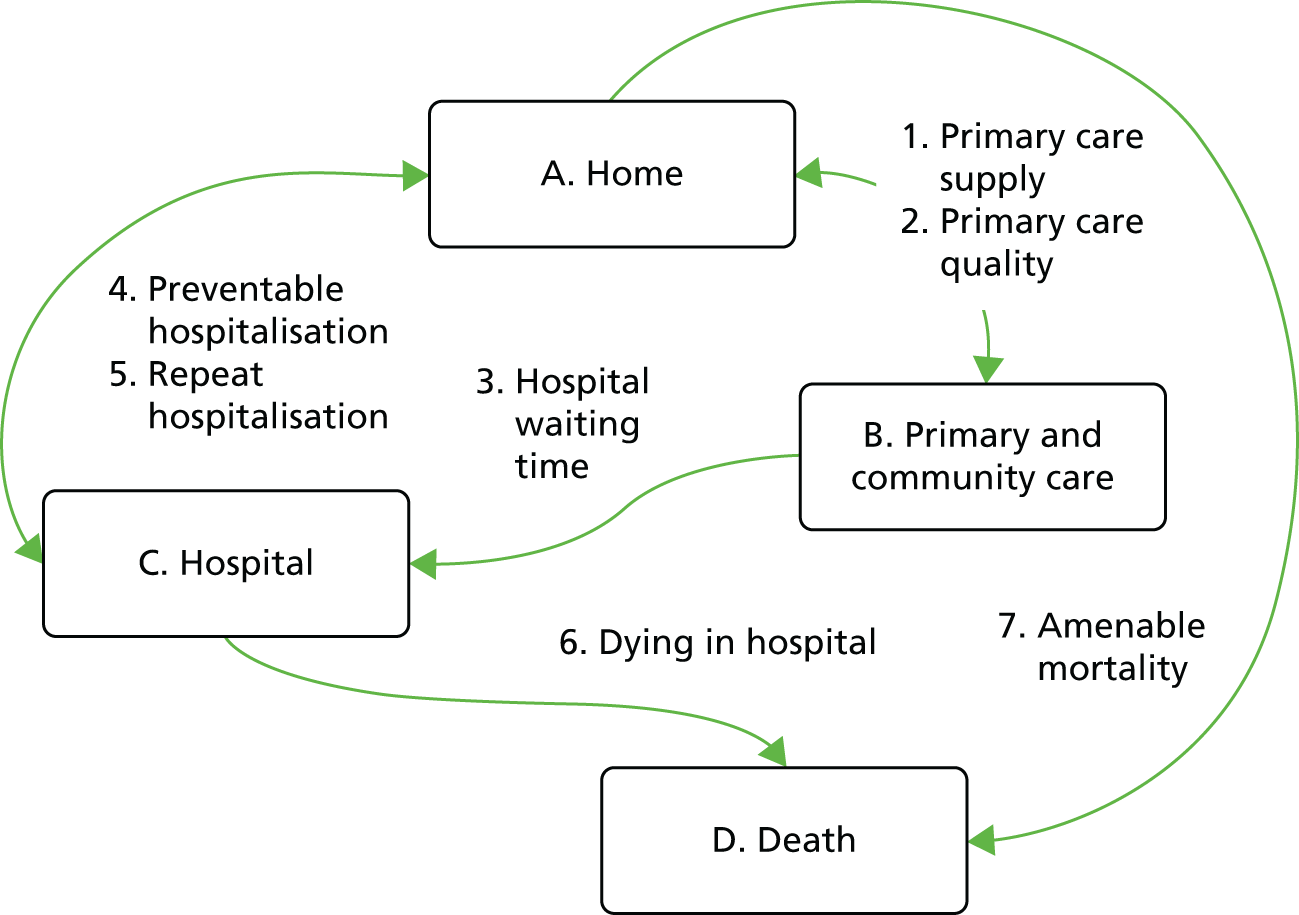
Figure 1 illustrates our framework for monitoring inequality in health-care access and outcomes at key stages of the patient pathway and shows how our eight general indicators fit into this framework.
FIGURE 1.
Conceptual framework for monitoring inequality in health-care access and outcomes at key stages of the patient pathway.
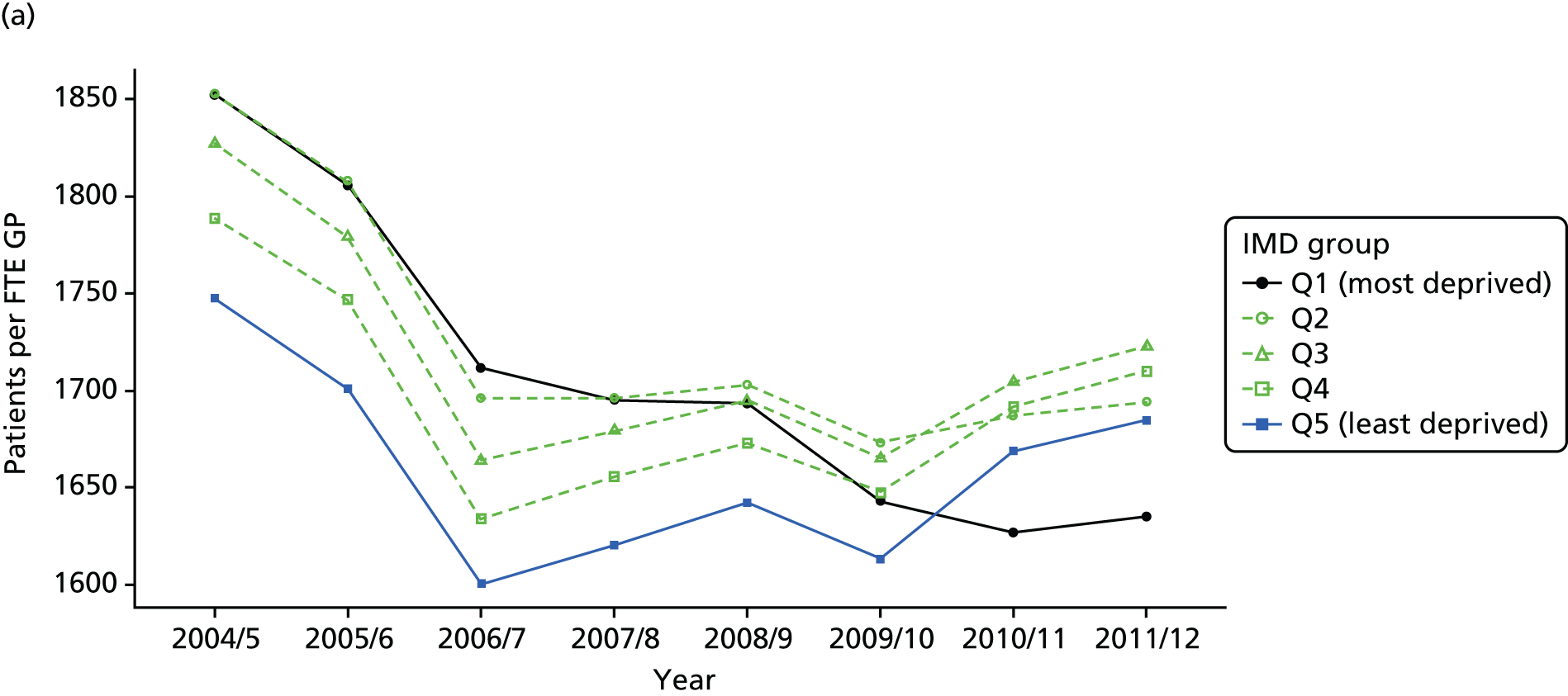
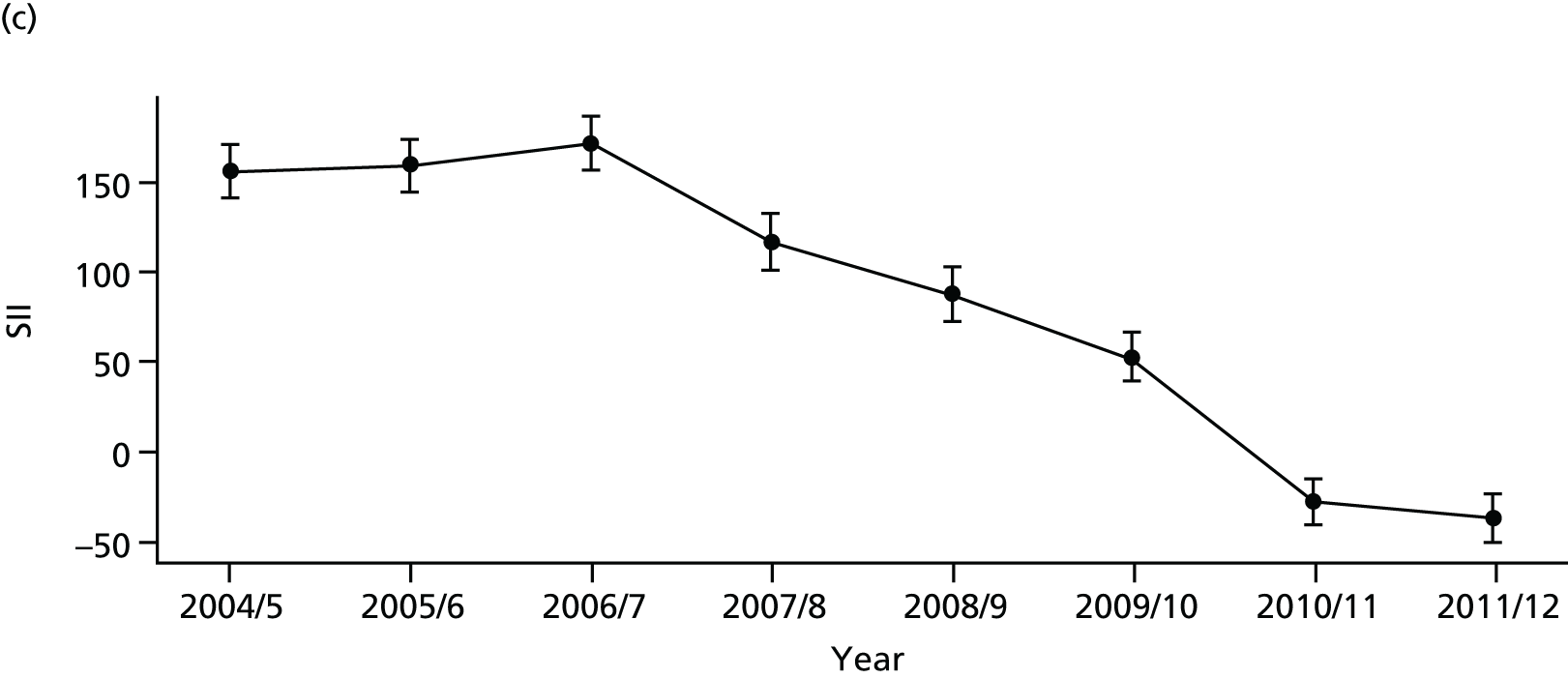
As an example, Figure 2 illustrates how we monitor national equity trends using indicator 1, primary care supply. The top panel shows a breakdown of patients per full-time equivalent (FTE) general practitioners (GPs) by deprivation quintile group, allowing for need and population change, and the bottom panels show how this translates into two standard inequality measures that look at the whole of the social gradient in health care: the SII and the relative index of inequality (RII). These measures and graphs are explained in more detail in Chapter 4.
FIGURE 2.
National monitoring of change in equity over time. (a) Indicator 1: primary care supply; (b) RII; and (c) SII. The top panel shows a breakdown of patients per FTE GPs by deprivation quintile group, allowing for need and population change, and the bottom panels show how this translates into two standard inequality measures that look at the whole of the social gradient in health care: the SII and RII. FTE, full-time equivalent; GP, general practitioner; IMD, Index of Multiple Deprivation; RII, relative index of inequality.

Finally, Figure 3 illustrates our framework for local equity monitoring against a national benchmark. This figure shows socioeconomic inequality in preventable hospitalisation within a fictional local NHS area called ‘Any Town’. The basic idea is to compare the social gradient in health care within Any Town against the social gradient in health care within England as a whole. The social gradient shows the pro-rich link between socioeconomic status and preventable hospitalisation, after allowing for exogenous risk factors influencing preventable hospitalisation that are not under the control of the NHS, in this case, age and sex. As explained above, in Concepts of equity in health care, we would ideally also want to adjust for morbidity, or, more precisely, that part of morbidity that is not under the control of the NHS, but were unable to do so because of data limitations. The relevant NHS equity objective is to reduce the social gradient in health care, both in Any Town and in England as a whole.
FIGURE 3.
Local equity monitoring against a national benchmark: preventable hospitalisation in neighbourhoods in a fictional NHS area (Any Town). Neighbourhoods are ranked by deprivation, with more deprived neighbourhoods to the right.
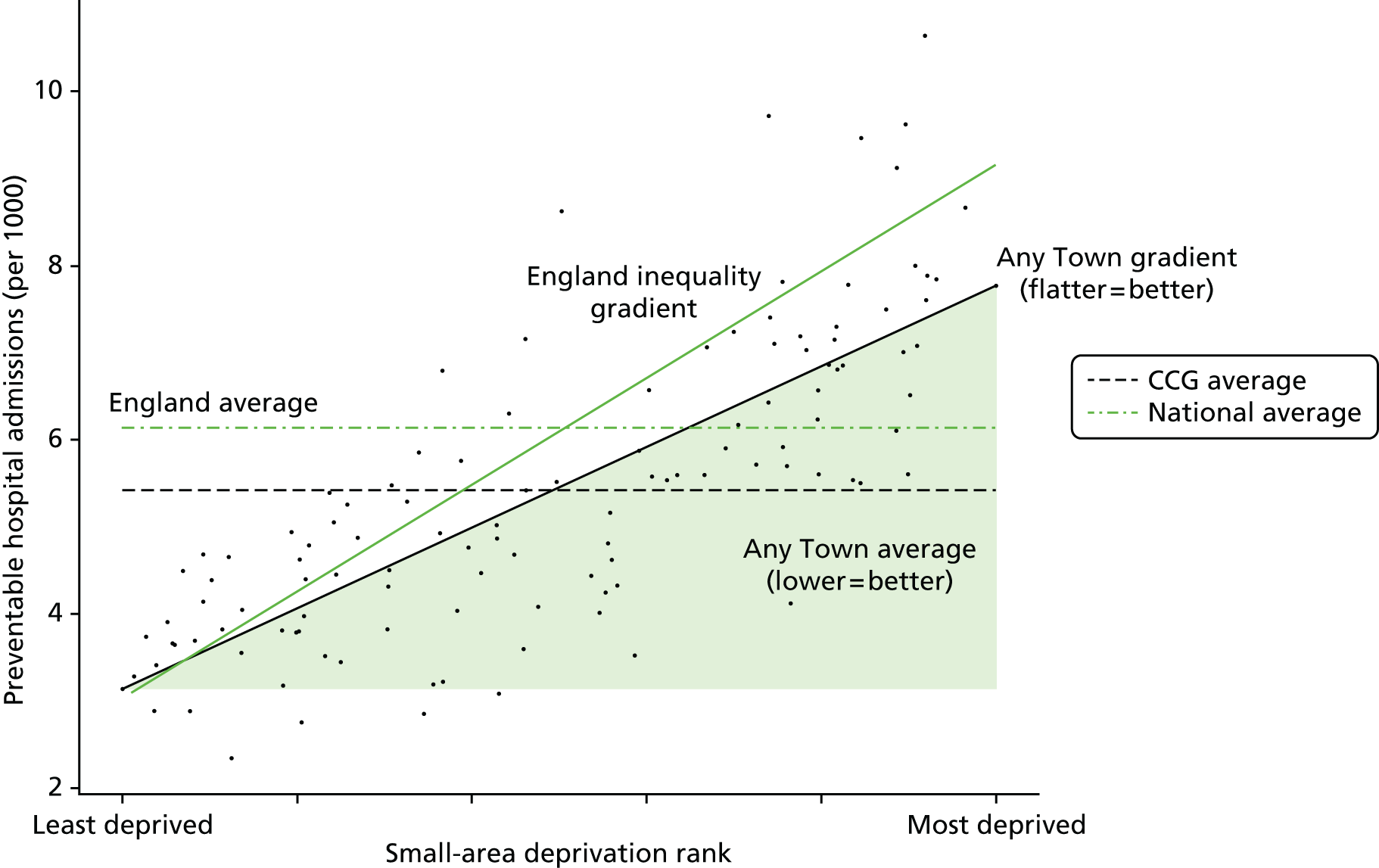
Any Town has a population of approximately 200,000 people. Each dot represents one of the 125 neighbourhoods in Any Town, each containing approximately 1500 people. Neighbourhoods are ranked by deprivation, with more deprived neighbourhoods to the right. The Any Town inequality gradient is simply a regression line fitted through these 125 dots. The England inequality gradient is a regression line fitted through all 32,482 neighbourhoods in England. In this example, Any Town is doing better than England as a whole both for the average patient (a lower average line) and in terms of reducing inequality (a flatter inequality gradient). In this example, these differences are statistically significant and unlikely to be merely because of the random play of chance. The NHS may, therefore, be able to learn lessons from Any Town about how to tackle inequality in preventable hospitalisation.
Chapter 2 Public involvement
Introduction
Public involvement was important to our study because one of the main purposes of our indicators is public reporting for democratic accountability, as well as facilitating quality improvement efforts by national and local decision-makers. We therefore wanted to select indicators of socioeconomic inequality in health care that members of the general public will consider meaningful and important. Before selecting our indicators, we therefore considered it important to ask the general public about what they view as the most unfair socioeconomic inequalities in health care. We also sought feedback from members of the public to help refine our visualisation tools for communicating the findings of our indicators and to ensure that members of the public are capable of understanding our indicators.
This chapter describes how members of the public were involved in this study. They were involved in two ways. First, through a small-scale public consultation exercise in York conducted at the beginning of the study to give us a better understanding of what kinds of socioeconomic inequality in health care are of most concern to members of the public. This involved both an online survey (with 155 responses) and a full-day citizens’ panel meeting (with 29 participants) to gather more in-depth views. Second, two members of the public, recruited via our public consultation exercise, gave feedback throughout the project through their membership of our advisory group.
The primary aim of the public consultation was to identify a list of priority areas for monitoring NHS equity performance. This was achieved by asking the public to consider different types of socioeconomic inequality in health and health care and assess which ones they thought were the most unfair. Our key finding was that the public are concerned to reduce inequality in health-care outcomes, but that their concern for reducing inequalities of access, specifically, for GP supply and hospital waiting times, is at least as strong. This finding influenced the selection of equity indicators for our subsequent analysis. At the inception of the project we had presumed that our indicators would focus on health-care utilisation and outcomes, which are the focus of much current academic literature on equity in health care. However, as a result of our public consultation exercise, as well as further development of our conceptual framework in monitoring equity at multiple stages of the patient pathway, we ensured that both GP supply and hospital waiting time were selected for inclusion in our suite of equity indicators.
A secondary aim of the public consultation was to identify two lay members of the public to join our advisory group to contribute further to the indicator selection process and provide feedback on the design of equity dashboards and other visualisation tools for monitoring equity performance.
This chapter is organised as follows. We start with consultation exercise methods, including the sampling approach, development of questionnaire and data collection. We then present the main quantitative results of the public consultation in terms of people’s responses to questions asking them to assess and rank different kinds of inequality in health and health care by degree of unfairness. The results are presented separately for our online survey and citizens’ panel. We then discuss the process of recruitment of lay members and their contribution to the advisory group and, in particular, the design of visualisation tools. Finally, we conclude by discussing the implications of public involvement for our indicator selection.
Methods of public consultation
Sampling
The survey was conducted in the York area using two modes of administration: (1) a 1-day face-to-face citizens’ panel event (n = 29), and (2) an online survey (n = 155). Participants in both forms of public consultation were recruited in the same way, through advertising and leafleting in the York area as described below. The citizens’ panel event was held in York city on Saturday, 21 September 2013. The online survey was administered between July and September 2013, using a web portal called SmartSurvey™ (SmartSurvey Ltd, Tewkesbury, UK). Citizens’ panel members were paid expenses and an honorarium for devoting a whole day of their time to this, according to National Institute for Health Research (NIHR) and INVOLVE guidance, whereas online survey participants were unpaid. The sampling strategies for both approaches are described below.
The citizens’ panel meeting was advertised in a local monthly magazine called Your Local Link in July and August 2013. The magazine is free of charge and distributed to all homes and businesses across York (35 postcode sectors), targeting all sociodemographic groups. In addition, we distributed 810 leaflets door to door to 10 of the most deprived streets in York [identified as being within the most deprived fifth of neighbourhoods in England according to the Index of Multiple Deprivation (IMD) 2010] to reach a diverse groups of participants. We also distributed flyers at two public events as part of the University of York’s Festival of Ideas which was held in June 2013. Finally, we also put out a University of York press release about the citizens’ panel event. A selection of our recruitment materials, together with the participant consent form, is presented in Appendix 6.
A total of 103 individuals made contact with the project administrator for the citizens’ panel event. The contact was made by telephone, e-mail or completion of an online registration form. Thirty places were offered after stratifying respondents based on age, sex and socioeconomic background [established using respondents’ postcode data and information from the Office for National Statistics (ONS)’s neighbourhood statistics website derived from IMD 2010 deprivation score] and then selecting participants on a ‘first-come-first-served’ basis. A total of 29 participants attended the citizens’ panel event. This resulted in a sample which was 41.3% male (n = 12) and 58.7% female (n = 17); had approximately one-quarter from each main age group (18–34 years, 35–49 years, 50–64 years and ≥ 65 years), although slightly more (around 30%) in the 50–64 years age group; and had respondents in all five deprivation quintile groups with a mean deprivation rank of around 3, which is about average for the England population (see Table 1 for more details).
The online survey was publicised on Your Local Link magazine, on door-to-door leaflets, the Centre for Health Economics website and the JISCMail mailing list for health economists. It was also advertised on social media from June 2013, particularly using the Twitter (Twitter, Inc., San Francisco, CA, USA; www.twitter.com) handles of the Centre for Health Economics and the University of York, and Facebook (Facebook, Inc., Menlo Park, CA, USA; www.facebook.com). In addition, individuals who contacted us for the citizens’ panel but were not offered a place, were also informed about the online questionnaire.
Questionnaire
The questionnaire focused on socioeconomic inequality in the supply, process and outcomes of health care. Statements about inequalities in general (non-disease-specific) health and health care were presented to all participants who were asked to rate them on a scale of 1 to 10, where 1 is not at all unfair and 10 is extremely unfair (see Appendix 6). In order to elicit views about the unfairness of different kinds of inequality, we developed a questionnaire based on the following statements about different general kinds of socioeconomic inequality in health-care access and outcome. Our selection was based on statements about inequalities that can in principle be monitored using available data, which constrained our choices considerably, but this was a necessary step as the ultimate aim was to measure and monitor inequality. We piloted these statements on a sample of administrative staff members at the University of York. Based on their feedback, we improved the presentation and clarity of the statements.
-
The richest fifth of people in England are more likely than the poorest fifth to have a healthy diet and a healthy level of physical exercise.
-
The richest fifth of people in England are served by more GPs than the poorest fifth.
-
The richest fifth of people in England are more likely than the poorest fifth to receive routine screening tests (e.g. for bowel cancer).
-
The richest fifth of people in England are more likely than the poorest fifth to see a medical specialist when they are ill.
-
The richest fifth of people in England wait less time for NHS surgery than the poorest fifth.
-
The richest fifth of people in England are less likely than the poorest fifth to die after high-risk surgery (e.g. heart or cancer surgery).
-
The richest fifth of people in England are less likely than the poorest fifth to have an emergency hospitalisation preventable by good-quality health care.
-
The richest fifth of people in England are less likely than the poorest fifth to die from conditions preventable by good-quality health care.
Respondents were then asked to indicate which of the above inequalities they saw as the most and least unfair. This rating question and a screenshot of the online questionnaire are reproduced in Appendix 6.
We did not present statements about specific clinical disease areas because it was not possible to provide members of the public with adequate clinical and epidemiological information about all the different possible disease area domains that we could select. This would require a series of clinical tutorials that would take up more than the full day of discussion. Furthermore, asking people to compare disease areas would likely change the focus of discussions to which diseases are more important, rather than on socioeconomic inequality and fairness in health and health care within each disease area.
Data collection
There were two samples: the citizens’ panel sample and the online sample. The citizens’ panel event involved presentations by facilitators to introduce the questionnaire, interactive discussions in small and large groups, and individual completion of a paper version of the questionnaire. Respondents were split into five pre-arranged groups (four groups of five and one group of four), which were mixed according to age, sex and socioeconomic background. The following people each facilitated a group: Shehzad Ali, Miqdad Asaria, Richard Cookson, Paul Toner and Aki Tsuchiya. A gift payment of £70.00 was offered to all participants of the citizens’ panel event which was accepted by all except one, who asked to donate it to charity.
The online survey was posted on SmartSurvey with the following web link: www.smart-survey.co.uk/s/NHSFairness. The survey included the same inequality statements as the citizens’ panel questionnaire and followed the same format (see Appendix 6). Our online questionnaire was active between June 2013 and September 2013. Respondents could complete the survey anonymously, or leave their name and e-mail address to receive a copy of the findings. No financial incentive was offered for taking part in the online survey because of budget limitations and technical difficulty of arranging payments.
Results of public consultation
Survey sample
In total, 29 individuals participated in the citizens’ panel event in York and 159 individuals completed the online survey. The baseline characteristics of the sample are presented in Table 1. The majority of respondents were female: 62.1% in the citizens’ panel and 66.5% in the online group. The age distribution in both groups was similar and reflects that the survey represented a diverse group of participants. Based on respondents’ postcode information, we calculated their deprivation level using the IMD 2010 data available at the small-area level. Respondents in the two groups were from all five deprivation quintile groups, with the mean deprivation quintile group rank being 3.2 and 3.3 for the citizens’ panel and online groups, respectively (i.e. the average person was in the middle of the five deprivation groups). Respondents were also asked to complete standard questions from the British Attitudes Survey about attitudes to the welfare state and income redistribution (1 = strongly agree and 5 = strongly disagree). The average score on the statement ‘The creation of the welfare state is one of Britain’s proudest achievements’ was 1.4 showing a high level of agreement (93.1% and 94.8% of respondents agree or strongly agree with this statement in the citizens’ panel and online samples, respectively). This is much higher than the findings of the British Attitude Survey results for 2014, which found that 56% of respondents agree or strongly agree with this statement. This reflects the general point that public consultation exercises about equity are more likely to recruit individuals who care about equity issues.
| Variable | Sample | |||
|---|---|---|---|---|
| Citizens’ panel (n = 29) | Online group (n = 155) | |||
| Statistic | n | Statistic | n | |
| Baseline | ||||
| Male (%) | 37.9 | 11 | 33.5 | 52 |
| Age, years (%) | ||||
| < 18 | 0.0 | 0 | 0.6 | 1 |
| 18–34 | 27.6 | 8 | 24.5 | 38 |
| 35–49 | 20.7 | 6 | 23.2 | 36 |
| 50–64 | 31.0 | 9 | 34.8 | 54 |
| ≥ 65 | 20.7 | 6 | 16.8 | 26 |
| Deprivation quintile (%) | ||||
| Quintile 1 (most deprived quintile) | 13.8 | 4 | 16.2 | 19 |
| Quintile 2 | 20.7 | 6 | 17.1 | 20 |
| Quintile 3 | 20.7 | 6 | 18.8 | 22 |
| Quintile 4 | 20.7 | 6 | 19.7 | 23 |
| Quintile 5 (least deprived quintile) | 24.1 | 7 | 28.2 | 33a |
| Social attitude statementsb (mean) (1 = strongly agree; 5 = strongly disagree) | ||||
| The creation of the welfare state is one of Britain’s proudest achievements | 1.4 | 29 | 1.4 | 154 |
| Government should redistribute income from the better off to those who are less well off | 3.0 | 29 | 2.2 | 154 |
Ranking of unfair inequalities
All participants responded to the question about the most unfair socioeconomic inequalities in health and health care. Figure 4 presents the full distribution of responses to the question about the most unfair inequality. The citizens’ panel group ranked socioeconomic inequality in waiting time for surgery as the most unfair (31%), whereas the online group ranked inequality in death from conditions preventable by good-quality health care as most unfair (33%).
FIGURE 4.
Choice of the most unfair type of inequality in the citizens’ panel and online samples.
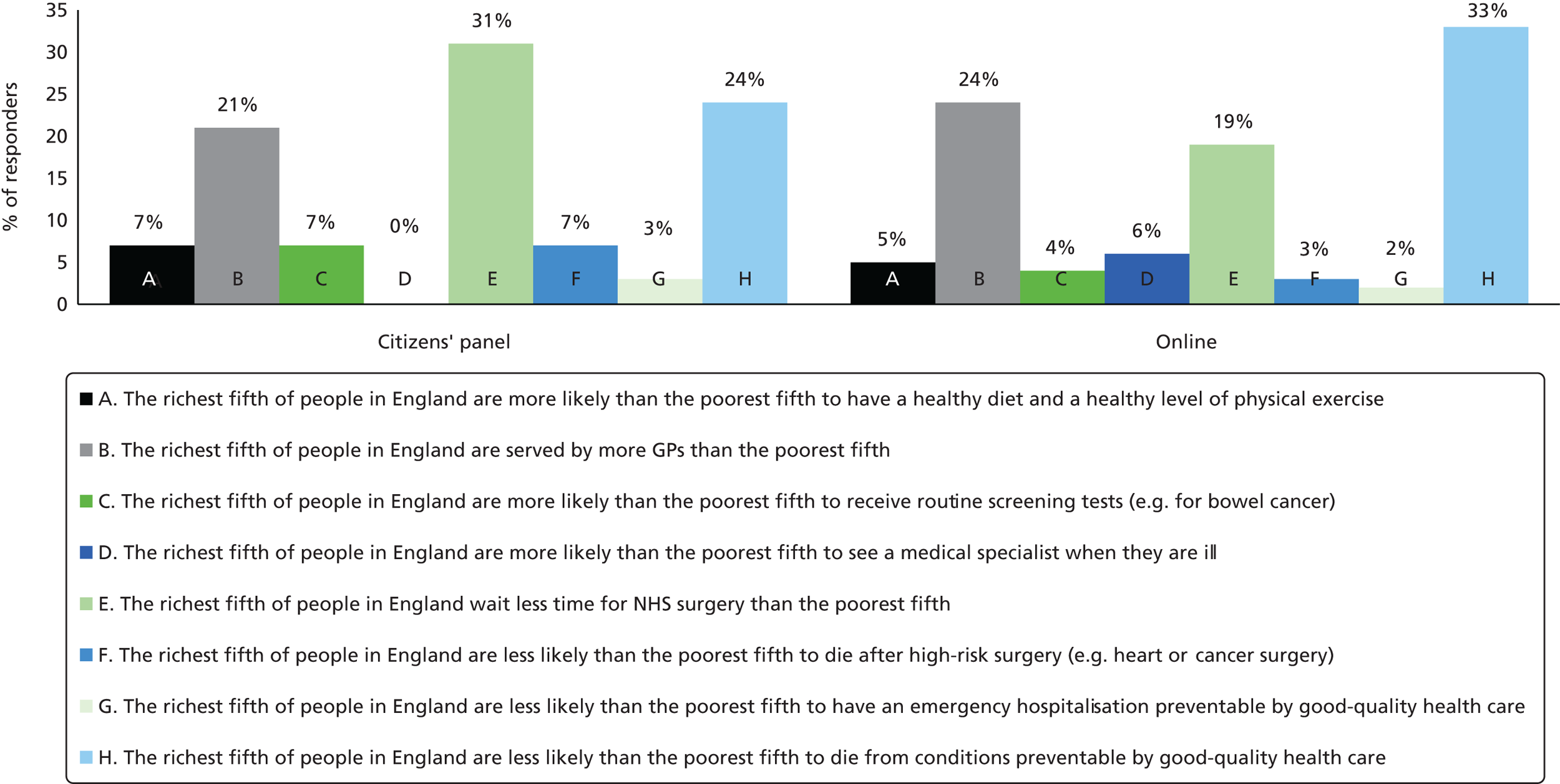
However, the following three types of inequalities were identified as the most important unfair inequalities by both citizens’ panel participants and online survey respondents:
-
The richest fifth of people in England wait less time for NHS surgery than the poorest fifth (31% of citizens’ panel participants and 19% of online respondents ranked this as the most unfair inequality).
-
The richest fifth of people in England are less likely than the poorest fifth to die from conditions preventable by good-quality health care (24% of citizens’ panel participants and 33% of online respondents ranked this as the most unfair inequality).
-
The richest fifth of people in England are served by more GPs than the poorest fifth (21% of citizens’ panel participants and 24% of online respondents ranked this as the most unfair inequality).
Rating of unfair inequalities
We also asked respondents to rate how unfair they think each type of inequality is on a scale of 1–10, where 1 is ‘not at all unfair’ and 10 is ‘extremely unfair’. All respondents in the citizens’ panel and online groups completed the rating scale. Table 2 summarises the results of the level of perceived unfairness of different types of inequality. The table shows that all forms of socioeconomic inequalities in health and health care were considered unfair by both the citizens’ panel and online groups. Based on mean scores, the citizens’ panel group rated the following inequalities as particularly unfair: waiting time for NHS surgery; supply of GPs; and routine screening tests. Similarly, based on average scores, the online group rated the following inequalities as particularly unfair: waiting time for NHS surgery; supply of GPs; and death from conditions preventable by good-quality health care.
| Statements | Sample | |||||
|---|---|---|---|---|---|---|
| Citizens’ panel | Online sample | |||||
| Mean | Median | % of responses with a score of ≥ 6 | Mean | Median | % of responses with a score of ≥ 6 | |
| A. The richest fifth of people in England are more likely than the poorest fifth to have a healthy diet and a healthy level of physical exercise | 6.69 | 7 | 62 | 6.52 | 7 | 60 |
| B. The richest fifth of people in England are served by more GPs than the poorest fifth | 8.07 | 8 | 83 | 8.67 | 10 | 91 |
| C. The richest fifth of people in England are more likely than the poorest fifth to receive routine screening tests (e.g. for bowel cancer) | 8.1 | 8 | 83 | 7.92 | 9 | 80 |
| D. The richest fifth of people in England are more likely than the poorest fifth to see a medical specialist when they are ill | 7.31 | 8 | 76 | 8.02 | 9 | 83 |
| E. The richest fifth of people in England wait less time for NHS surgery than the poorest fifth | 8.41 | 8 | 86 | 8.76 | 10 | 91 |
| F. The richest fifth of people in England are less likely than the poorest fifth to die after high-risk surgery (e.g. heart or cancer surgery) | 7.79 | 9 | 79 | 7.51 | 8 | 72 |
| G. The richest fifth of people in England are less likely than the poorest fifth to have an emergency hospitalisation preventable by good-quality health care | 7.34 | 8 | 79 | 7.99 | 9 | 82 |
| H. The richest fifth of people in England are less likely than the poorest fifth to die from conditions preventable by good-quality health care | 7.93 | 9 | 79 | 8.05 | 9 | 82 |
Role of the lay members of the advisory group
Two participants at the citizens’ panel event were invited to join our advisory group as lay members, to contribute to the research design and, in particular, the process of indicator selection and design of dashboards and other visualisation tools for monitoring changes in NHS equity performance. The selection of lay members was based on their interest in the subject of inequalities in health and health care, willingness to contribute to this project, experience of using NHS health services, ability to communicate with members of the team and availability to join meetings in York and London. Based on these criteria, one male and one female participant were invited to join the advisory group.
The lay members attended all three advisory group meetings in London, were involved in additional face-to-face discussions, and reviewing and commenting on relevant documents. More specifically, the lay members contributed to the project in the following ways:
-
They contributed to discussions on the choice of equity indicators that matter to the general public and, therefore, should be considered for monitoring equity performance.
-
They provided useful advice about dashboard design to improve presentation and interpretation.
The lay members commented on the prototype NHS equity dashboard designs, as a result of which we revised and simplified the designs to reduce ‘clutter’ on the graphical displays, and added arrows as well as traffic-light colours to help colour-blind users and people who print out in black and white. The lay members also commented on the different types of graph in the chart pack, and reassured us that our graphs were clear and informative to non-expert audiences.
Our lay members agreed in the final project meeting that the current one-page summary dashboard style presents useful information to NHS and public health experts. However, they thought that this concise format may not be appropriate for communication to the public, as it provides too much information in a small space. They advised that public reporting would require a different kind of infographic design tailored to public audiences. They suggested that the dashboard presentation would be useful to health experts once they are familiar with the dashboard design and have read the accompanying material, but proposed that clear notes accompanying the dashboard would be useful to help interpretation.
Conclusion
We conducted a small-scale public consultation exercise in York to inform the choice of priority indicators of health-care equity. The consultation was conducted through a 1-day citizens’ panel event in York and an online questionnaire, both of which aimed to gauge the strength of public concern for different types of socioeconomic inequality in health-care access and outcomes. The consultation showed that the public considered inequalities in health behaviours, such as healthy diet and healthy level of physical exercises, to be less unfair than inequalities in health-care access and outcomes. This indicated that, at least from a public perspective, the focus of NHS equity measurement should be on indicators that are amenable to changes in the way health care is organised and delivered rather than indicators of individual lifestyle behaviour; although, of course, the former may influence the latter. The consultation found that the general public perceived the following three socioeconomic inequalities in health care as particularly unfair: supply of GPs; hospital waiting time for surgery; and death due to causes preventable by good-quality health care. Our finding suggests that the public care about inequalities in both access and outcome, and that indicators of inequality in access to health care are an essential component of NHS equity monitoring for the purpose of public transparency and accountability.
The two lay members of our advisory group also provided useful feedback and advice on indicator selection and on the design of visualisation tools. As well as helping to improve our visualisation tools in various ways, one of the most helpful pieces of feedback was a negative lesson. It is clear that our one-page equity dashboard tool is appropriate for communicating to decision-makers, but it is not appropriate for public reporting. We therefore recommend further work on public reporting of our equity indicators, involving infographic design specialists and public relations experts.
Chapter 3 Indicator selection
Introduction
This chapter describes the iterative process through which we selected our eight main indicators of equity and our two disease-specific indicator domains (CHD and diabetes). We produced the following prototype equity indicators at both national and local levels: (1) primary care supply, (2) primary care quality, (3) hospital waiting time, (4) preventable hospitalisation, (5) repeat hospitalisation, (6) dying in hospital, (7) amenable mortality and (8) overall mortality. The first seven are indicators of equity in health care; the eighth is an indicator of equity in health that provides useful contextual information to place the other indicators into perspective.
The definitions of these indicators are provided elsewhere in the report:
-
non-technical overviews of each indicator, summarising what they mean and why they are worth measuring are in Chapter 5
-
short two-line indicator definitions are in Chapter 7
-
full technical indicator definitions are in Appendix 4.
We also produced prototype equity indicators at the national level for our two disease-specific domains, which are described in Appendices 1 and 2.
The indicator selection process included (1) reviewing existing indicators used by the NHS to monitor health-care quality; (2) consulting with health indicator experts about technical feasibility; (3) consulting with a diverse range of NHS and public health experts about policy relevance through one-to-one conversations and an online survey; and (4) consulting with members of the public (see Chapter 2). Indicator selection decisions were made in consultation with our advisory group, the membership of which is listed in Appendix 3.
Based on the indicator review and consultation process, we developed (1) an indicator framework around different stages of the patient pathway, (2) a long list of potential general health-care equity indicators and (3) a shortlist of potential disease-specific indicator domains, together with examples of potential equity indicators within each shortlisted domain. In consultation with our advisory group, we then selected for prototype indicator production (1) a shortlist of general equity indicators and (2) two disease-specific indicator domains (CHD and diabetes). The final set of indicators and their detailed technical specifications were subsequently selected and refined in an iterative process of data analysis and reanalysis in response to feedback from a series of presentations of emerging findings to members of our advisory group and a range of other health-care and public health experts.
All our indicators have important limitations because of data limitations. We had to do the best we could with available data that can be broken down at the neighbourhood level, and our findings must be interpreted with due caution given the data limitations. We have, as part of our research recommendations, indicated that there is a need to develop better sources of data that will enable researchers to develop improved measures of health-care access and outcome that can be broken down at the neighbourhood level or, better still, individual level. The main limitations are summarised in the paragraph below; other limitations are described in the Appendix 4.
Our measure of primary care access, GPs per patient, focuses on GPs rather than practice nurses and other primary care professionals, and also focuses on ‘inputs’ rather than outputs and outcomes from the patient perspective, for example, how long it takes to book an appointment and whether or not consultations are sufficiently long and of high quality. Data on practice nurses are now becoming available at the practice level. However, the lack of a patient perspective is less straightforward to overcome using existing data, because GP patient survey data on patient experience of access to care may be subject to sample selection bias at the practice and neighbourhood level, as explained later. Another limitation is that our measure of primary care quality focuses on the clinical process quality indicators in the Quality and Outcomes Framework (QOF), which only capture some limited aspects of primary care quality. Finally, our measures of health-care outcome were only adjusted for age and sex, not other health risk factors that increase the risk of poor outcomes in deprived neighbourhoods but may lie outside the control of health services.
The rest of this chapter contains sections on the indicator selection criteria, the indicator review and the indicator consultation. It concludes with a section describing potential quasi-experiments and additional indicators that were suggested during the indicator selection process and that may be worth considering in future work.
Indicator selection criteria
Our indicator selection criteria are listed below, together with supplementary notes on how the criteria were assessed. There are four sets of criteria: (1) general criteria for each individual indicator, (2) technical criteria for each individual indicator, (3) criteria for selecting an appropriate mix of indicators within each domain and (4) criteria for selecting the two disease-specific indicator domains.
General criteria for each individual indicator
-
Face validity to NHS and public health stakeholders: the indicator should be considered credible, meaningful and important by NHS and public health policy-makers, managers, clinicians, patients and the general public.
-
Sensitivity to health-care intervention: the indicator should potentially respond to health-care interventions, broadly defined to include actions by health-care organisations to improve the co-ordination of care between different health-care professionals and between health-care, social care and public health professionals.
-
Impact on population health: the indicator should potentially impact on population health and social inequalities in population health.
Supplementary notes
-
These criteria were assessed by the project team and advisory group based on information from our indicator review and consultation with these stakeholder groups.
-
To help satisfy the first two criteria, we sought, when appropriate, to use standard, well-validated indicators that the NHS already uses for monitoring average health-care quality. However, we did not treat conformity to current NHS indicator specifications as an independent and over-riding criterion. So, in some cases, we selected non-standard indicators, or used indicator specifications that depart slightly from current NHS technical definitions. For example, our indicator of mortality amenable to health care is based on numbers of deaths (in total, and per 1000 people) rather than potential years of life lost, because our consultees felt this was easier to explain to policy-makers, managers and the public. Our definition of hospital waiting time is based on inpatient waiting time from the point of specialist decision to treat rather than the earlier point of GP referral to a specialist, as official NHS ‘referral-to-treatment’ waiting time statistics are not available at the small-area level. And our definition of repeat hospitalisation differs from standard 30-day or 90-day all-cause emergency readmission statistics, because we wish to capture the quality of co-ordinated care and rehabilitation services over a longer time period following discharge. All departures from standard NHS indicator definitions are described and justified in Appendices 1, 2 and 4.
Technical criteria for each individual indicator
-
Data availability for national monitoring: the indicator should allow annual monitoring of social deprivation gradients over time from the early 2000s.
-
Statistical confidence for national monitoring: to be useful for monitoring national NHS performance, national indicators require sufficiently small confidence intervals to be capable of detecting a feasible change in inequality over a 2-year time period.
-
Data availability for local monitoring: the indicator should allow social deprivation gradients to be computed for each large subnational area (CCG) and back in time to the early 2000s.
-
Statistical confidence for local monitoring: to be useful for local quality improvement purposes, indicators at the CCG level require sufficiently small confidence intervals to detect at least 5 or 10 CCGs with social gradients that are better (flatter) than the national social gradient and 5 or 10 that are worse (steeper).
Supplementary notes
-
In practice, the data availability criteria restricted our attention to indicators that can be computed using health data sets providing comprehensive practice-level or small-area-level data on the entire English population going back to the early 2000s, in particular the primary care workforce census, the QOF, Hospital Episode Statistics (HES) and ONS mortality register data. Other comprehensive health data sets were considered but rejected. For example, the National GP Patient Survey from 2006/7 was rejected, as variations in practice-level response rates might lead to sample selection bias when comparing social gradients between subnational areas.
-
The statistical criteria were assessed by producing prototype indicators and examining confidence intervals around social gradients. The size of a feasible change in the national social gradient within 2 years was assessed by examining the historical speed and magnitude of change over time. Confidence intervals around social gradients depend on nuanced features of the data (including the spread of events across the gradient as well as the total number of events) and nuanced methodological choices about inequality index specification, error specification, indicator specification, risk adjustment and data pooling across years. The size and speed of historical change in the social gradient depends, in addition, on change in population denominator and adjustment variables as well as change in outcome variables.
-
We found that hospitalisation and mortality rates related to a single condition, even a common condition such as CHD, are generally too low to allow detection of statistically significant differences between local and national absolute gradient indices of inequality. Therefore, for local equity monitoring we focused on general equity indicators which have much higher rates of hospitalisation and mortality, as they provide an overall system-wide assessment of equity in the full range of NHS activity across multiple conditions.
Criteria for selecting an appropriate mix of indicators within each domain
-
Coverage of inequality in both access and outcome.
-
Coverage of inequality at all main stages of the patient pathway.
-
Coverage of inequality in multiple domains of the NHS Outcomes Framework. The NHS Outcomes Framework has five domains: (1) preventing people from dying prematurely, (2) enhancing quality of life for people with long-term conditions, (3) helping people to recover from episodes of ill health or following injury, (4) ensuring that people have a positive experience of care and (5) treating and caring for people in a safe environment and protecting them from harm.
-
Synergy between indicators: we aimed to select a coherent basket of indicators that complement one another, such that levels and changes in some indicators can potentially be used to help understand levels and changes in other indicators.
-
Relevance to quasi-experiments: other things equal, we preferred indicators that can potentially be used for quasi-experimental evaluation of the impacts of NHS interventions.
Supplementary notes
-
In assessing criterion 1, we interpreted ‘access’ broadly to include measures of structure (e.g. GP supply), process (e.g. the proportion of diagnosed patients receiving appropriate medical care) and ‘intermediate’ outcomes (e.g. blood pressure control and hospital waiting time) indicative of access. In this way, three of our seven main indicators of equity in health care can be interpreted as ‘access’ indicators (GP supply, GP quality and hospital waiting time) and four as ‘outcome’ indicators (preventable hospitalisation, repeat hospitalisation, dying in hospital and amenable mortality).
-
We assessed criterion 2 using our framework for monitoring inequality at different stages of the patient pathway (see Chapter 1).
-
In relation to criterion 3, we only managed to include indicators from the first three domains because of data availability constraints. Almost all indicators in domains 4 and 5 failed our criterion of data availability for local equity monitoring because they rely on data from sample surveys and/or administrative data only provided at the organisational rather than small-area level.
-
Criterion 4 led us to select diverse indicators that measure distinct concepts. For example, our measures of access include one ‘structure’ measure (GP supply), one ‘process’ measure (GP process quality) and one ‘intermediate outcome’ (waiting time). Our measures of outcome include measures of NHS impacts on both morbidity (preventable and repeat hospitalisation) and mortality (amenable mortality) and a measure of end-of-life care (dying in hospital). We considered indicators of inequality in early-life care outcomes, such as low birthweight, birth defects and child mortality, but did not explore these further because of concerns about small number problems for local equity monitoring and concerns that such indicators may be more sensitive to socioeconomic variation in maternal health, lifestyle and social support than socioeconomic variation in the quality of NHS care.
-
We assessed criterion 5 based on our own views about potential quasi-experiments, supplementary by information from our survey of NHS and public health experts (see below). A suitable quasi-experiment requires the existence of relevant NHS interventions in the 2000s which (1) were likely to influence socioeconomic health inequality; (2) allow the construction of a suitable control group as a result of geographical variation in delivery, such as differential timing of intervention roll-out in different geographical areas; and (3) are relevant to the design and implementation of potential future NHS interventions.
Criteria for selecting the two disease-specific indicator domains
-
Substantial disease burden and cost to the NHS: substantial disease burden and cost to the NHS are measurable although imperfect proxies for two underlying criteria: (1) domains should reflect conditions that NHS stakeholders consider important (which helps assure general criterion 1, face validity), and (2) domains should have sufficiently large patient populations to meet technical criterion 2, statistical confidence for national monitoring.
-
Data availability for national monitoring: the domain should allow the construction of an appropriate mix of indicators for annual monitoring of social deprivation gradients over time from the early 2000s (as per technical criterion 1 and the criteria for selecting an appropriate mix of indicators).
-
Availability of quasi-experiments: we wanted our indicators to form a ‘data platform’ for retrospective ‘quasi-experiments’ to provide useful evidence about the effects of past NHS interventions on health inequality.
-
Synergy between the domains: we had research capacity to examine only two condition-specific domains in addition to the general domain. So, we sought to select a synergistic pair of domains that can fruitfully be compared and contrasted.
Supplementary notes
-
The first criterion was assessed using information on burden of disease in the UK48 and NHS programme budget expenditure for 2011/12 by disease category. 49 Disorders were considered to have a ‘substantial’ burden of disease if they were in one or more of the three published ‘top 25’ burden of disease lists for the UK in 2010: (1) by years of life lost for both sexes and all ages, (2) by years of life lost for both sexes and ages 20–54 years, and (3) by years lived with disability for both sexes and all ages. Diseases were considered to have a ‘substantial’ cost if the NHS spent more than £250M treating them in 2011/12 (just over one-quarter of 1% of total NHS expenditure) according to programme budgeting subcategory data (which has to be treated with caution and which underestimates total cost as most primary care expenditure cannot be attributed). CHD (labelled ischaemic heart disease by the burden of disease study authors) was the number one cause of years of life lost for all ages and for ages 20–54 years, the number 19 cause of years lived with disability and absorbed £1890M of NHS expenditure in 2011/12. Diabetes was the number 26 cause of years of life lost for all ages and for ages 20–54 years, the number 18 cause of years lived with disability, and absorbed £1550M of NHS expenditure in 2011/12.
-
The second criterion was assessed based on whether or not a suitable mix of indicators (i.e. covering both access and outcome and all main stages of the patient pathway) could be constructed using the comprehensive health data sets listed above.
-
The third criterion was assessed based on our own views about potential quasi-experiments supplemented by information from our survey and one-to-one conversations with health-care and public health experts.
-
The fourth criterion was assessed subjectively in consultation with our advisory group. Following our review and consultation process, we produced a shortlist of five candidate disease-specific indicator domains (colorectal cancer, CHD, diabetes, severe mental illness and stroke), together with example indicators in each domain. Of these, the two disease-specific domains selected for production were CHD and diabetes. Once CHD had been selected on the grounds of being the strongest domain on all of the first three criteria, it was felt that a comparison with diabetes would add more synergy value than a comparison with any of the other shortlisted domains. This is because diabetes shares many risk factors with CHD but is growing in burden and cost of illness while CHD is declining, because well-validated primary care process quality indicators are available for both domains in the QOF, and because both domains were central to NHS efforts to tackle socioeconomic inequality in adult mortality in the late 2000s.
Indicator review process
We reviewed available indicators in order to (1) identify a full range of indicators that can potentially be used for monitoring average health-care quality in the NHS, (2) identify which of these indicators could feasibly be converted into equity indicators, based on our technical indicator selection criteria, (3) select candidate indicators based on our general indicator selection criteria and (4) select candidate disease-specific indicator domains based on our indicator domain selection criteria.
We started by reviewing all indicators currently used for monitoring average health-care quality in the NHS, as published on the Health and Social Care Information Centre (HSCIC) Indicator Portal (https://indicators.ic.nhs.uk/webview; accessed 12 July 2015). This web-based portal hosts a wide range of indicators, including all of the indicators in the NHS Outcomes Framework, the PHOF and the Adult Social Care Outcomes Framework. We then considered further indicators by (1) checking an unpublished list of indicators from an internal review by the HSCIC in 2011 and (2) seeking suggestions from advisory group members, co-applicants and colleagues. Finally, we generated proposals for new equity indicators based on our own knowledge of available health data sets in England and suggestions from consultees.
Indicator consultation process
As well as the public consultation process described in Chapter 2, the indicator consultation process included (1) one-to-one conversations with NHS and public health experts, (2) an online survey of NHS experts and (3) consultation with members of our advisory group (listed in Appendix 3). Our aim was to obtain a range of views from NHS and public health experts with appropriately diverse backgrounds and perspectives, rather than a representative national sample.
Conversations were held with a range of experts, including:
-
academic experts in health inequality, primary care, mental health, circulatory disease, cancer, epidemiology, health geography, sociology of health and health economics
-
analysts and health inequality experts at NHS England and the Department of Health, including analysts supporting the NHS Outcomes Framework
-
analysts and health inequality experts at Public Health England
-
board members of two CCGs (Vale of York and Hull)
-
public health directors in two local authorities (City of York and Hull City Council)
-
board members of two NHS hospital trusts (York and Morecombe Bay)
-
public health, health policy and performance indicator experts at leading national think tanks (The King’s Fund and Nuffield Trust).
The conversations focused on the credibility and policy importance of our proposed equity indicators, the identification of potential new indicators, the visual communication of equity indicator findings and the perceived impacts of past NHS interventions on socioeconomic inequalities in health. The questions and topics were tailored to the type and role of the respondent, rather than following a ‘one-size-fits-all’ structured interview format.
The online survey was conducted to supplement these conversations, with a range of views focusing specifically on the perceived impacts of past NHS interventions on socioeconomic inequalities in health. This specific focus was chosen to help the research team select equity indicators that NHS experts consider to be sensitive to NHS health-care delivery and that provide a platform for future ‘natural experiment’ studies of the health inequality impact of NHS interventions. Accordingly, the online survey asked two main questions:
-
In the boxes below, please list up to THREE national or local NHS interventions in the past decade or so that you think had a measurable impact on socioeconomic inequalities in health-care access or outcomes in England.
-
For each NHS intervention, what primary outcome(s) would you use to measure impact on socioeconomic health inequality?
The survey was e-mailed to 164 senior individuals from diverse organisations and clinical specialties, with an e-mail addresses identified via the personal contacts of the research team and advisory group, and web searching. Invitees could respond directly by e-mail, by filling in a Microsoft Word® form (2010, Microsoft Corporation, Redmond, WA, USA) or by filling in an online survey form via the web-based survey tool SmartSurvey (SmartSurvey Ltd, Tewkesbury, UK; www.smartsurvey.co.uk). One reminder e-mail was sent to non-responders. Only 14 response sets were received (a 8.5% response rate). This low response rate is about average for surveys of this kind, given the challenging and time-consuming nature of these open-ended questions and that we were seeking responses from busy, senior professionals. The only impact of this low response rate on our findings was that our list of potential quasi-experiments (see Potential quasi-experiments) is not exhaustive. The most important element of our consultation was the face-to-face discussions with stakeholders, as described above, which enabled us to gather more nuanced information than is possible using a survey about stakeholder views on the selection of indicators and the visual communication of equity findings.
Potential quasi-experiments and additional indicators
Potential quasi-experiments
This section lists a selection of NHS interventions implemented in the 2000s that the experts we consulted suggested may have had an impact on health inequality that could potentially be identified using quasi-experimental evaluation, based on the indicators of the kind we have developed in this project. This list helped inform the selection of our two disease-specific domains, as a number of them relate to CHD and diabetes. It may also provide researchers with useful ideas for future work using quasi-experiments to identify the effects of NHS interventions on social inequalities in health and health care.
The list includes interventions which have already been at least partially evaluated, but that one or more experts felt warrant further and more rigorous quasi-experimental evaluation. As well as NHS interventions, the list also includes some public health interventions that go beyond health-care services and/or NHS funding, but that may nevertheless impact on some of the health-care outcome indicators we measure in this project, such as preventable hospitalisation and amenable mortality. The list is as follows:
-
the Health Inequality National Support Team programme 2007–9 for improving primary care for cardiovascular disease and diabetes in disadvantaged adults
-
the Equitable Access to Primary Medical Care Programme 2008–10, which invested in opening new GP practices in under-doctored areas
-
the 2-week cancer waiting time target from GP referral to specialist consultation, introduced in 2007
-
changes in subnational (primary care trust-level) NHS expenditure during the 2000s and changes in subnational (CCG-level) NHS expenditure during the 2010s
-
the impacts on socioeconomic inequality in preventable hospitalisation and amenable mortality for CHD and diabetes of the QOF primary care pay-for-performance scheme introduced from 2004
-
changes to the QOF incentive payments in the late 2000s
-
diffusion of primary percutaneous coronary intervention following emergency admission for acute ST elevation myocardial infarction, during the 2000s
-
the national NHS Bowel Cancer Screening Programme from 2006 (this may be an example of ‘intervention-generated inequality’: this intervention is cost-effective, but may have increased health inequality because of the lower uptake in deprived groups)
-
NHS intensive smoking cessation services in England from 1999
-
cuts in particular local areas to community health-care services disproportionately used by disadvantaged groups, for example community midwifery services and out-of-hours primary care services
-
proactive hospital-based diabetes services introduced in some areas during the 2000s
-
screening and brief interventions for alcohol misuse
-
early intervention for psychosis including those identified as ‘at risk’.
Additional indicators
We list below a selection of additional equity indicators that were considered but rejected for the particular purposes of this project. We include this list to explain why some indicator ideas were not selected for inclusion in our suite of prototype equity indicators, and also to inform the deliberations of future researchers and analysts seeking to improve our equity indicators and develop new ones.
-
Multimorbidity according to patient-level inpatient hospital records: the proportion of the general population with a hospital record of three or more chronic conditions from hospital visits in the last 2 years. This indicator was rejected for the purposes of this project because of potential selection bias, as not all people with multimorbidity are admitted to hospital for inpatient treatment. However, it could nevertheless potentially be useful in future work as a contextual indicator of socioeconomic inequality in health and to improve the risk adjustment of indicators of equity in health-care outcomes, such as preventable hospitalisation and amenable mortality.
-
Multimorbidity according to practice-level primary care QOF data: the proportion of people with two or more chronic conditions based on QOF data. This was rejected because of potential under-recording in deprived patients which may vary between local areas and over time, potentially leading to bias in both time series comparisons and local equity monitoring comparisons. In sensitivity analysis, we also explored ways of using this indicator to improve the risk adjustment of indicators of equity in health-care outcomes. However, because it is only available at the practice level rather than individual level, yet is highly correlated with age, we found that adding this variable yielded unstable results and little explanatory power over risk adjustment for age and sex alone. However, at the national level this indicator could provide a useful convergent validity check on multimorbidity according to patient-level inpatient hospital records.
-
Multimorbidity according to mortality records: the proportion of people who died in the indicator year with two or more chronic conditions based on secondary mentions of causes of death. This was rejected because of lack of reliable coding of causes of death on mortality records and change over time in coding. It may be possible to improve on this by linking information from hospital records at the individual level; but again this would still suffer from the bias described above that not all individuals visit hospital.
-
Post-hospital mortality: 12-month mortality after discharge per 1000 hospital discharges. This was rejected as it yields a somewhat out-of-date indicator: either a 1-year data lag or a focus on patients admitted the year prior to the indicator year. There is also a risk of indicator revision the year after initial release, as we found that the HES–ONS mortality link data required to compute this indicator are sometimes subject to substantial data revision the following year.
-
Excess hospital stays: proportion of inpatients with excess length of stay as defined by Healthcare Resource Group (HRG) trim points. This was rejected because of concerns about time series comparability. HRG coding systems change over time, and HRG trim points only provide a relative definition of an ‘excess’ stay for a particular treatment based on the changing year-specific distribution of stays, rather than an absolute definition based on clinical judgement. Data on ‘delayed discharges’, which reflect a more accurate and more absolute definition, are currently only available at the hospital level rather than the patient or small-area level required for equity indicators.
-
Experienced access to primary care: the average of a selection of indicators of patient-reported experiences of primary care access from the National GP Patient Survey. This was rejected for our purposes, since the National GP Patient Survey only started in 2006/7 and the response rate of about 30% varies substantially between local areas (CCGs), which may hamper local equity comparisons. This indicator may be useful, however, for future national equity monitoring work.
-
Specialist doctor visits: annual probability of a first outpatient visit, adjusted for age and sex, based on outpatient HES data. This was rejected as whenever diverse forms of utilisation are grouped together it is hard to tell whether more utilisation reflects better access to care, worse quality of care or worse health. However, more specialised subindicators may be worth pursuing, in particular, percentage of first outpatient visits with immediate discharge (potentially reflecting an unnecessary referral), percentage of first outpatient visits with priority referral and percentage of first outpatient visits the patient ‘did not attend’.
-
High-need service users: rate per 100,000 general population (perhaps distinguishing adults and children) of patients with multiple unplanned admissions in the same year (say > 10). This was rejected on the basis of small numbers problems for local monitoring. However, this may be a useful indicator for national monitoring.
-
Hospital complications: annual preventable hospital complications, rate per 100,000 population adjusted for age and sex. This was rejected as there is no official list of ‘preventable’ complications across the full range of hospital activity and drawing up a list of this kind would be a major clinical research task.
-
Hospital expenditure: annual expenditure per 100,000 general population (all ages), based on the total number of outpatient visits and planned and unplanned inpatient admissions weighted by HRG prices. This was rejected as this groups together diverse forms of utilisation and so it is hard to tell whether more expenditure reflects better access to care, worse quality of care or worse health.
-
Bed-days following emergency admission: average person-based cumulative time spent in hospital during 12 months following an emergency admission in April to June (quarter 1). This was rejected as it is similar to repeat hospitalisation within the indicator year and without further refinement would yield a longer time lag. In addition, by focusing on bed-days rather than number of admissions, this indicator may tend to reflect aspects of social care supply that are outside the control of the NHS, as well as the quality-of-care co-ordination between health-care and social-care settings for which the NHS is at least partly responsible.
Chapter 4 Methods
Introduction
This section describes the data and methods underpinning the indicators defined in this study. The section has the following structure. It starts by (1) describing the data sources used and then goes on to cover (2) data linkage and aggregation to construct indicators; next, it discusses (3) the data cleaning methods used on the indicators, before discussing (4) standardisation methods used to adjust indicators for need and risk factors; finally, it describes (5) the estimation of absolute and relative inequality indices at the national level and (6) the estimation of absolute and relative inequality indices at the local level. At each stage alternative approaches that were considered and sensitivity analyses performed are discussed.
Data sources
Small-area geography
The basic small-area geographical unit provided in the data sets used was the 2001 ‘lower-layer super output area’ (LSOA). There are 32,482 of these small-area neighbourhoods in England, defined by the 2001 census to cover approximately 1500 people each (minimum 1000 and maximum 3000). LSOA boundary definitions were updated following the 2011 census, resulting in 32,844 small-area neighbourhoods. These new 2011 LSOAs form the basic building blocks of the higher-level geographies that we aggregate our results to, such as CCGs. LSOA-level indicator production and adjustment is conducted at 2001 LSOA level, and the results are then mapped onto 2011 LSOAs for production of equity measures at the national and CCG levels. The mapping between the 2001 and 2011 LSOAs is discussed in Linkage and aggregation of data.
Small-area deprivation
We measured the socioeconomic status of each 2001 LSOA neighbourhood using the IMD. This is a widely used measure that combines a wide range of data sources on multiple aspects of social deprivation. Seven indicator domains are combined into a single deprivation score for each small area. The indicator domains comprise ‘income deprivation’, ‘employment deprivation’, ‘health deprivation and disability’, ‘education, skills, and training deprivation’, ‘barriers to housing and services’, ‘living environment deprivation’, and ‘crime’. Each neighbourhood is ranked relative to one another according to its level of deprivation. Although in theory there is an element of circularity in including the ‘health deprivation and disability’ domain, in practice the exclusion of this domain makes little difference, as this domain is only one small element of the overall index and the domains are all highly correlated. We used the version of IMD published in 2010, which contains data mostly relating to the year 2007 in the middle of our analysis period. 50 We used the most informative IMD 2010 index available: overall deprivation rank for all 32,482 LSOAs in 2001. We used the same deprivation index for all years to ensure that our findings reflected real changes in health-care delivery and outcomes, rather than artificial changes in the calculation of the deprivation index or the composition of neighbourhoods. However, this does raise the issue of how accurately the deprivation of a neighbourhood in 2007 reflects its deprivation in 2001/2 and 2011/12. To assess this, we looked at cross-tabulations of change over the 7-year period between IMD 2004 (data for 2001) and IMD 2010 (data for 2007). These show that 84% of LSOAs in the most deprived fifth remained in the most deprived fifth, that 88% of neighbourhoods in the least deprived fifth remained in the least deprived fifth, and that only 14% of LSOAs changed rank by the equivalent of one quintile group or more.
Small-area population
We used mid-year population estimates from the ONS at 2001 LSOA level. These data provide population totals by age and sex for each of the 32,482 LSOAs in England for each year between 2001/2 and 2011/12. These data estimate the total resident population, including homeless people and people living in institutions such as prisons, barracks and nursing homes. All indicators requiring a general population denominator focus on this resident population, based on ONS estimates, rather than the NHS-registered population based on GP practice registers, as explained in Appendix 4.
Attribution Data Set
We used the NHS Attribution Data Set (ADS) of GP-registered populations. These data map patients from the GP practices that they are registered with to the 2001 LSOAs they live in. We used ADS data for years 2004/5 to 2011/12. We used these data to map primary care supply and quality data provided at the practice level to small-area level, as described below and in Appendix 4.
General and Personal Medical Services
Our data on primary care supply were obtained from the annual NHS General and Personal Medical Services (GMS) workforce census, taken on 30 September each year. These data report headcount and FTE-equivalent numbers of GPs at the practice level for every GP practice in England. The data split the GPs by type (allowing us to exclude trainees). However, it does not include locum GPs or details of the supply of emergency primary care services outside of normal office hours. We used GMS data for years 2004/5 to 2011/12.
Quality and Outcomes Framework
We took clinical process indicators in the UK QOF, the primary care pay-for-performance programme (introduced in 2004) and collected at the GP practice level. Although the QOF indicators capture only a limited part of clinical practice, by international standards they are, nevertheless, one of world’s most comprehensive sets of primary care quality indicators. QOF data report the number of patients achieving the various outcomes, as defined by the indicators, as well as the numbers of patients excluded from performance calculations for various reasons and so classed as exceptions. In the base-case analysis reported in Chapter 5 we use the ‘population achievement’ figure which includes ‘exception-reported’ patients in the population denominator and hence treats them as representing poor quality. However, we also conducted sensitivity analysis using the ‘reported achievement’ figure which excludes exception-reported patients. We used QOF data for the year 2004/05 and 2011/12. Data on exception-reported patients were not available in the first year 2004/5 and hence we see a blip in our ‘population achievement’ QOF figures in 2004/5 in which these exceptions are excluded from the calculation of the primary care quality denominator. Further details including the list of included QOF indicators are in Appendix 4.
Hospital Episode Statistics
We used inpatient HES data on admitted patient care (APC) to measure hospital waiting time, preventable emergency hospitalisation, repeat emergency hospitalisation and death in hospital. This data set records finished consultant episodes (FCEs), that is, the details of the patient’s period of care under the responsibility of a particular specialist. The HES data include, among other things, details regarding the patient (age, sex, 2001 LSOA of residence), as well as details about the specific hospital admission: admission date, type of hospital admission (emergency vs. elective), length of hospital stay, reason for admission [diagnosis in terms of International Classification of Diseases, Tenth Edition (ICD-10)51], any procedures undertaken during the admission, outcome of the admission and date of discharge from care of the specialist. We aggregated these HES data from the FCE level to continuous inpatient spells (CIPSs), which capture the entire hospital stay for the patient including hospital transfers: details of this aggregation are provided in Linkage and aggregation of data. HES data are collected in financial years, that is from April to April. We used HES data from 2001/2 to 2011/12 in our indicators.
Office for National Statistics mortality
We used mortality data from the ONS estimates. These data tell us the date of death, cause of death (in terms of ICD-10 code), 2001 LSOA of residence, age and sex of the deceased for every person who dies in England. We used mortality data for the financial years 2001/2 through to 2011/12.
Linkage and aggregation of data
The GMS and QOF data sets (see General and Personal Medical Services and Hospital Episode Statistics, respectively) collect data at the GP practice level while our basic geographical unit for our analysis is the 2001 LSOA. The ADS details the LSOAs in which the patients registered with each GP practice live. We use this information to determine the proportions of the practice-level variables in GMS and QOF to attribute to each of the LSOAs that the patients registered with the practice live in. Applying this attribution calculation to each GP practice and then aggregating the practice-level variables attributed from the different practices at the LSOA level gives us our measures of these primary care supply and quality indicators at the 2001 LSOA level. Practice-level populations were used only to apportion these practice-level variables to 2001 LSOAs; the denominators used in the indicators derived at the LSOA level based on these variables were then derived using ONS data for the LSOA-level population estimates to maintain comparability with the other indicators.
The HES data set (see Hospital Episode Statistics) provides data at the FCE level; this describes a patient’s period of care under one consultant. We further aggregate this to the CIPS level, which groups together the entire hospital stay of the patient, including transfers between consultants and between hospitals. The CIPs are described in Lakhani et al. 52
Patient-level data from HES, ONS mortality data and ONS mid-year population data are then split by sex and into age groups for ages 0–4, 5–15, 16–24, 25–39, 40–59, 60–74 and ≥ 75 years before being aggregated into 2001 LSOAs. These age groups were selected to minimise the number of subgroups while still capturing key life stages and points at which policy interventions are typically targeted in England.
Although 2001 LSOAs were the basic small-area unit of analysis, our target large-area geographies for indicator production, in particular CCGs, were defined in terms of 2011 LSOA boundaries. While 96.3% of 2001 LSOAs were unchanged between the 2001 and 2011 LSOA boundaries (‘one-to-one’ mappings), the other 3.7% (1192 out of all 32,482 of the 2001 LSOAs) needed to be mapped between these alternative LSOA definitions. When two or more 2001 LSOAs were merged to form a single 2011 LSOA (‘many-to-one mappings’), these multiple 2001 LSOAs were straightforwardly aggregated to form results at the 2011 LSOA level. When a 2001 LSOA mapped to more than one 2011 LSOA (‘one-to-many’ and ‘many-to-many’ mappings), it was assumed that the 2001 LSOA was split in equal proportions when attributed to the 2011 LSOA. The mappings for 2.7% of small areas (881 out of 32,482 of the 2001 LSOAs) required splitting in this way. We used this algorithm to produce a set of weights to map results at the 2001 LSOA level to 2011 LSOA level. These weights were then applied to all our indicator results at the 2001 LSOA level before being aggregated to higher geographical levels.
The IMD 2010 overall deprivation rank scores defined at the 2001 LSOA level were attributed to 2011 LSOAs, which were then ranked according to attributed score. These integer ranks were then normalised to produce a fractional rank ‘ridit score’53 between 0 (least deprived) and 1 (most deprived). The IMD deprivation ranks at larger geographical levels were produced by population-weighted aggregation of the 2011 LSOA-level IMD deprivation ranks to higher levels of geography, with normalisation to produce a fractional rank between 0 and 1 at the target geographical level. The IMD quintile and decile groups were defined as aggregations of appropriate sets of deprivation ranked 2011 LSOAs.
Data cleaning
The administrative health data we use in this study have the advantage of covering the whole population of England, but coding errors remain despite all the various cleaning procedures and data quality checks conducted by data providers. To guard against data quality issues in the source data sets, we trimmed what we considered to be extreme outliers likely to reflect measurement error from our LSOA-level results. We first trimmed any infinite values and values that were highly implausible or logically impossible given the indicator definition (see below). In the case of indicators 3–8, our data-cleaning algorithm consisted of calculating the mean and standard deviation of each of the indicators at the LSOA level for each year of data, and dropping results that fell outside six standard deviations either side of the mean (see Figure 81, Appendix 5). This resulted in the exclusion of < 0.15% of LSOAs in any given year for any given indicator, and for most indicators the percentage excluded was substantially lower than this. For example, there was no exclusion for repeat hospitalisation in any year, and the exclusion for preventable hospitalisation was around 0.01% and for amenable mortality around 0.05% (see Figure 83, Appendix 5). In the case of indicator 1 (primary care supply), we first excluded patient-per-GP figures above 10,000, which we judged are likely to reflect data error, before applying the six standard deviation trimming algorithm. This resulted in excluding around 0.14% of LSOAs each year. In the case of indicator 2 (primary care quality), we implemented a slightly heavier trim using three rather than six standard deviations, after first excluding any logically impossible indicator values below zero and above 100. The heavier trim was used because visual inspection revealed an unexplained cluster of apparent data error in between three and six standard deviations (see Figure 83, Appendix 5). This resulted in excluding just over 1% of LSOAs each year. We also checked the distribution of exclusion by deprivation vingtile group (twentieths), and this showed no clear pattern except in the case of amenable mortality in which exclusion only occurred in the two most deprived vingtile groups (see Figure 82, Appendix 5). However, the largest exclusion proportion was 0.25% in the most deprived twentieth, which we judged not to be problematic.
We also conducted sensitivity analysis using a heavier trim of three standard deviations for all indicators (see Figures 84–86, Appendix 5). This did give rise to an issue of potentially disproportionate trimming within the most deprived 5% to 10% of small areas for indicators with small-event counts at the LSOA level, that is preventable hospitalisation, repeat hospitalisation, amenable mortality and all-cause mortality (see Figure 85, Appendix 5). This may be a result of disproportionate numbers of extremely high-need patients in the most deprived areas, suggesting that a three standard deviation trim results in trimming away some accurate data as well as data errors. At the national level, this would lead to a slight underestimate of the social gradient, and at the CCG level this might lead to bias in CCGs with a disproportionately high fraction of exclusions. Hence we opted for a ‘light-trim’ policy of six standard deviations for these indicators.
Finally, we produced results on the raw untrimmed data and were reassured to find very similar numerical results, even though some of the graphical summaries were severely distorted by extreme outliers.
Adjustment for need and risk factors
We adjusted indicators for observable need or risk factors, such as age and sex, which (1) are correlated with deprivation (a factual matter) and (2) may be considered ‘fair’ or ‘legitimate’ sources of variation in the indicator for which the NHS should not be held responsible (a value judgement). For example, GP supply was adjusted for age, sex and population ill health on the basis of the value judgement that small areas with additional health-care needs should have additional GP supply. By contrast, GP quality and hospital waiting time were not adjusted for age and sex, on the basis of the value judgement that age and sex are not legitimate justifications for poor-quality or longer hospital waiting times. The standardisation of the various indicators is described in detail here.
The GP supply indicator was need-adjusted using the workload adjustment aspect of the 2007 version of the Carr-Hill formula for primary care resource allocation produced by the Formula Review Group established by NHS Employers and the BMA. 54 Full details of the implementation of the Carr-Hill formula used and the weights it contains can be found in Appendix 4. In brief, this formula provides weights for age, sex, health deprivation and transient patient populations and is used to adjust population sizes for need. We were unable to implement the transient patient population element of the adjustment, however, because of a lack of patient-level data on registration status, linked to age and sex, covering all practices in the country. The adjustment is applied by using the weights to upscale or downscale populations at LSOA level to create need-adjusted populations and then normalise these scaled populations so that they sum to the total population pre-adjustment. We also conducted robustness checks using an alternative need formula: the 2013/14 Nuffield index of general and acute hospital need which provides need-adjusted populations at practice level based on hospital utilisation. 55 We used the ADS to attribute these adjusted populations to LSOA levels and found that this alternative adjustment gave very similar results to the Carr-Hill formula. However, as explained in more detail in Chapter 8, we believe that the Carr-Hill formula underestimates additional needs for primary care supply in deprived neighbourhoods. This is because it allows only for morbidity and does fully allow for the ways in which multiple morbidity and disadvantage combine to generate additional health-care needs.
For the mortality, amenable mortality, preventable hospitalisation and repeat hospitalisation indicators we used indirect standardisation for age and sex groups at the LSOA level. We then translated these indirectly standardised rates to LSOA-level event counts. The standardisation procedure used is laid out in the following formulae:
The waiting times indicator was indirectly standardised in a similar manner at LSOA level but instead of standardising for age and sex this indicator was standardised for the specialty code of the treating consultant. This was done in order to risk-adjust waiting time for the specialty of the admission, on the basis of the value judgement that a difference in the patient’s specialty of treatment may be a legitimate justification for a longer waiting time, but not a difference in their age or sex. This implies the following further value judgements: (1) the NHS should not be held responsible for eliminating waiting time differences between specialties and (2) the NHS should not be held responsible for eliminating socioeconomic patterning in the specialty of treatment. A more sophisticated, but also more computationally burdensome, adjustment could adjust for admission-level diagnostic and procedure codes. The current procedure of indirect standardisation at LSOA level was already computationally burdensome because of the large size of the administrative health data sets employed, taking several days of high-performance computing time. So we felt that for the purposes of this project adjusting for the treating consultant’s specialty was a sufficient proxy for these CIPS-level codes and opted to leave more detailed need adjustment of this indicator for future research in this area.
In line with the current NHS Outcomes Framework indicators,56 the risk adjustment process we have used when we have access to patient-level data rely largely on indirect standardisation in favour of direct standardisation. This allowed us to reliably produce adjusted event count data at the LSOA level, adjusted for the event rates of the 14 age–sex subgroups in each LSOA. Direct standardisation, while generally preferable for calculating national-level indicators,57 and as used in the NHS PHOF,58 was found to be not sufficiently stable for use at this LSOA level of disaggregation as a result of the small numbers (often zeros) within each LSOA–age–sex band. Adjusting our indicators at the LSOA level rather than at deprivation decile level allowed us to create comparable inequality measures at national and subnational levels: a key objective of our programme of work.
There were other more sophisticated regression-based standardisations accounting for a range of variables and their correlations that we considered at individual patient event level32,57 rather than the indirect standardisation we opted for at LSOA level. These more sophisticated approaches were considered to be excessively computationally burdensome for the scale, and scope, of the indicators considered here, without delivering a commensurate gain in accuracy. So, we felt taking such approaches would limit the likelihood of our proposed indicators being operationalised.
However, perhaps the most important factor missing from our risk adjustment process was a measure of individual-level morbidity and particularly multimorbidity. So, we would suggest identifying and standardising for such variables as a key research priority going forward.
National inequality indicators
The details of the specific indicator definitions and how these indicators were constructed are provided elsewhere in this report. In this section we describe how these indicators were used to calculate inequality indices at the national level.
The primary indicator we used in our analysis is our implementation of the SII as a measure of absolute inequality; and we also used the corresponding RII. We chose this indicator as an appropriate compromise between simple indicators that are easy for users to understand but potentially misleading, such as the gap between top and bottom groups, and more sophisticated indicators that are hard for users to interpret, such as the absolute concentration index. 53,59 The slope index captures the whole social gradient, rather than selecting two arbitrary groups for comparison. It also has a reasonably simple interpretation as the modelled health-care gap between the most and least deprived neighbourhoods, allowing for the social gradient in-between. This indicator is also already used routinely in England for monitoring inequalities in health by the PHOF, and has been proposed for routine use by the NHS Outcomes Framework for monitoring national inequalities in health-care outcomes. 60
Mathematically, the absolute concentration index is the slope index multiplied by twice the variance of the socioeconomic variable, as measured on its original raw scale. 59 Thus, the main limitation of the slope index compared with the absolute concentration index is that it uses only information on the fractional rank of the deprivation variable, and does not also take account of variance in the deprivation score measured in its original raw scale. This is an important limitation when cardinal measures of socioeconomic status are available, such as income. However, the IMD is only measured on an ordinal scale in the first place, and so converting this variable into a fractional rank does not throw away any important information.
To compute the SII we start by taking the standardised indicator data at LSOA level, cleaned to ensure data quality (see Data cleaning), and for each year of data we calculated an ordinary least squares regression of LSOA-level outcome variable against LSOA-level deprivation fractional rank (measured on a 0–1 scale as described in Linkage and aggregation of data). The coefficient on deprivation fractional rank in this regression gave us the SII for the year, and the standard error on this coefficient gave us the standard error around the SII. The SII can be interpreted as the modelled difference in event count between the least deprived and most deprived LSOAs in the country, taking into account the distribution of the outcome variable across the deprivation range. For all of our indicators, a positive SII value indicates pro-rich absolute inequality in the outcome, whereas a negative SII indicates a ‘pro-poor’ absolute inequality in the outcome. This is straightforward in almost all cases, as almost all of our outcomes are defined as undesirable events. As we have defined our deprivation score to run from 0 for least deprived to 1 for most deprived, a positive linear association thereby implies that more deprived small areas have worse outcomes. The one exception is primary care quality, which is a desirable outcome. In this case, we simply invert the SII by multiplying by –1.
Our approach differs a little from some of the other commonly used definitions of the SII, in which the indicators are first aggregated to deprivation decile group level and then the slope through the decile group points is calculated. 58 We felt that given the availability of the data at the LSOA level for these indicators we were better able to capture the within-decile variation and uncertainty in our SII estimate by using LSOA-level linear regressions of outcomes against LSOA deprivation rank as opposed to national decile-level regressions.
The SII is also used to calculate a ‘real inequity gap’, based on a counterfactual situation of full equality in which all neighbourhoods do as well as the least deprived neighbourhood in terms of modelled achievement on the indicator. The real inequity gap is measured in the same units as the indicator and is calculated as 0.5 × SII × population. This is depicted by the shaded area in Figure 5, which also shows the national average and deprivation decile average values of the indicator as well as the SII slope. We did this because of feedback from our consultation process that policy-makers and members of the public find it easier to understand and relate to ‘raw’ physical units (e.g. numbers of deaths) rather than rates and proportions, as explained in Chapter 3.
FIGURE 5.
Generic national absolute inequality graph showing the SII slope, inequality gap, national and decile averages for the indicator.
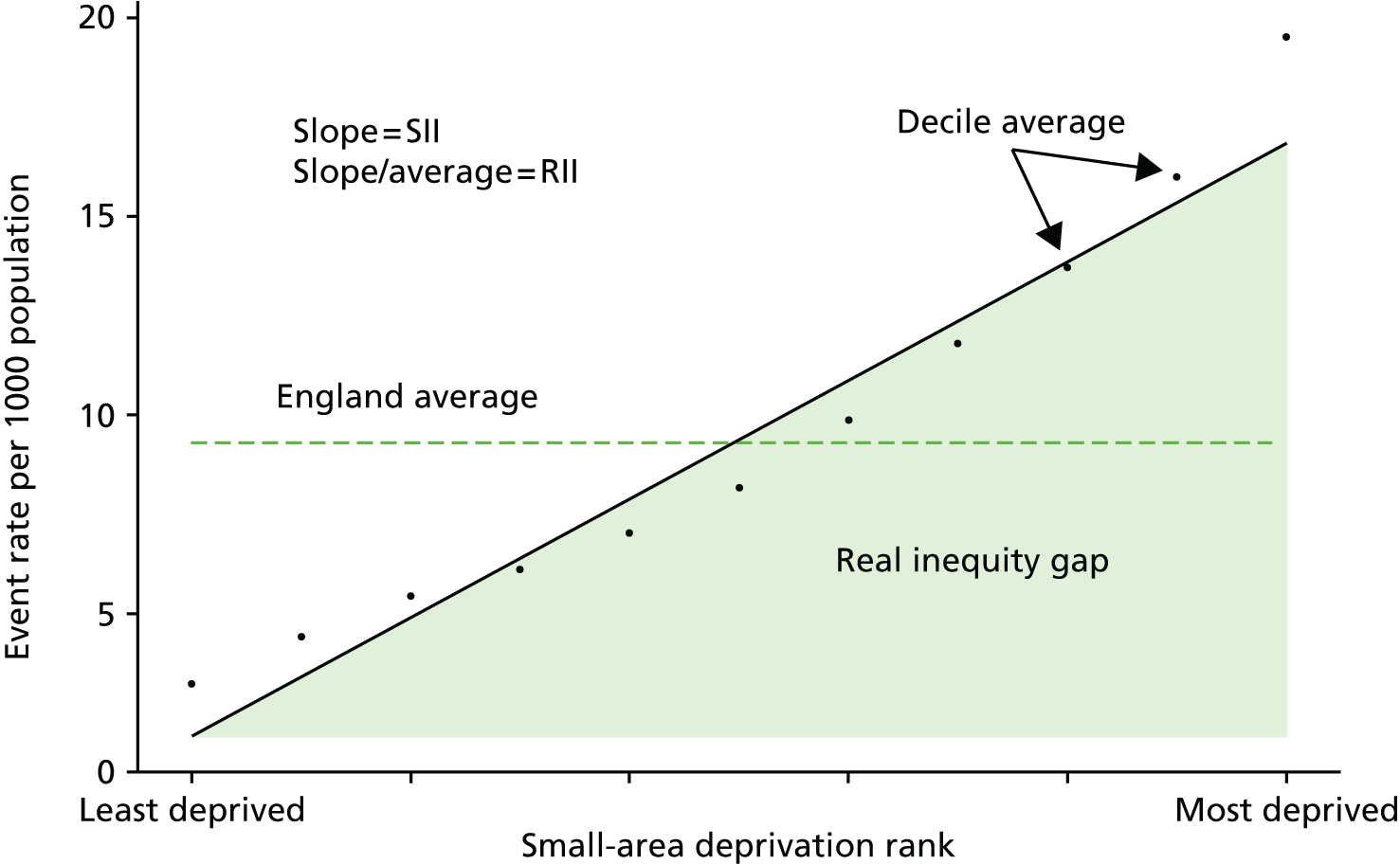
We also calculated national average levels of the outcome variables and inequality trends in these variables for display in the indicator dashboards, as the year-on-year difference between this year’s figure and last year’s figure, with colour coding to show whether or not the trend was significant. We found that a simple 1-year trend was easier for users to understand than a more complex trend involving more than 1 year; although, to guard against the risk of over-reacting to a possible 1-year ‘blip’, we advise that dashboard users also consult the in-depth graphical analysis underpinning the numbers reported in the dashboards, which show the year-on-year trend over several years.
As an example, the 2011/12 SII trend can be calculated simply as:
Alternative trend measures were also considered, including differences between multiyear moving averages, linear regressions of SII against time, and pooled time series cross-section regressions involving year dummies interacted with deprivation rank. However, the simple single-year change in SII was chosen for its simplicity and the fact that the value calculated as a trend in a particular year would be fixed and not be revised as further years of data become available.
We analogously calculated the same range of indicators on a relative scale by presenting our absolute inequality results as a proportion of the national average achievement for the indicator. As almost all of our indicators are measures of undesirable outcomes, these can be seen as relative shortfall indicators rather than relative attainment indicators. 61 A relative attainment indicator could be calculated by inverting the outcomes, for example calculating the number of people having emergency hospitalisations results in a relative shortfall indicator, while calculating the number of people not having emergency hospitalisations would result in a relative attainment indicator.
Although we fitted a linear model for our base-case results, we also tested the robustness of our conclusions to using alternative non-linear functional forms including log-linear or exponential models, Poisson and negative binomial models. These non-linear models still allow the computation of a slope index, by predicting outcomes for the most and least deprived neighbourhood and taking the gap. We were reassured to see that these alternative model specifications produced the same basic national inequality trends as the linear model, and very similar patterns at the CCG level. Measuring inequality is not solely a statistical exercise in finding the best-fitting model but is also partly a normative judgement. For example, consider the situation depicted in Figure 5 in which there is a clear non-linear ‘uptick’ in adverse outcomes within the two most deprived decile groups. This is the case, for example, for preventable hospitalisation and amenable mortality. In this case, a log-linear model would give a lower estimate of the predicted absolute gap than the linear model. It would also be less sensitive to health-care indicator improvements in the most deprived decile groups. This is because a log-linear model allows a closer fit to the non-linear ‘uptick’. In effect, it assumes that more deprived areas should have more than a linear increase in event rates. This is partly a normative judgement, implying that a non-linear ‘uptick’ in event rates in the most deprived end of the spectrum is normal and so NHS organisations should not be held to account for eliminating it. By contrast, the linear model gives greater weight to inequality at the two extremes of the distribution, and so is more sensitive to changes at the most deprived end of the spectrum. Mathematically, the ordinary least squares linear model yields a weighted average of the gradient between each point and the mean point, with greater weight given to points that lie further from the mean. Gradients towards the more extreme end of the spectrum thus receive higher weight, and hence the slope index is more sensitive to change the further one moves towards the tails of the deprivation spectrum. In practice, then, use of the linear slope index rather than a non-linear slope index embodies the value judgement that the index ought to be more sensitive to change towards the most and least deprived ends of the spectrum than change in the middle.
We chose to use the linear model for our base-case estimates of the SII as this is the simplest, easiest to understand, and most widely used form of the measure in the inequalities literature. When different kinds of non-linearity are evident in the different years of the data for the different indicators, these could each in theory be modelled using the best-fitting non-linear model for that particular instance. However, we found that the linear model provides a useful general method to measure inequality and adequately captures the inequality trends across indicators and over time in a comparable manner.
We also produced results using heteroscedasticity robust standard errors and were reassured to find that these had little effect on our estimated standard errors in both the national- and CCG-level analyses. We chose to use unadjusted standard errors, in the absence of compelling empirical evidence for heteroscedasticity at the national level or theoretical reasons for expecting heteroscedasticity within some subnational areas but not others.
We did not apply LSOA-level population weights either to the computation of the deprivation ridit score or to the linear regression in our base-case results. This again was on grounds of simplicity of communication to policy-makers, as LSOAs do not vary dramatically in population size and application of population weights made little difference to the results.
Finally, we did not allow for influential outliers at the CCG level using robust regression methods that apply an iterated reweighted least squares algorithm based on a particular weighting function. Rather, we propose that individual CCGs should visually inspect their own within-CCG small-area-level and practice-level scatterplots with a view to identifying and understanding the role of ‘unusual’ local neighbourhoods and GP practices on a case-by-case basis.
Local inequality indicators
We constructed CCG-level indicators using similar methods as we used to construct the national inequality indicators. Our absolute inequality indicator at the CCG level is based on running local-level regressions using just those LSOAs that fall within a CCG, and modelling the ‘social gradient’ relationship between the outcomes of these LSOAs and its national deprivation ranks. The deprivation rank we used was the national deprivation rank rather than recomputed local within-CCG deprivation rank. We did this in order to allow us to compare the within-CCG inequality gradient with the national inequality gradient in a straightforward manner. We labelled this indicator, the AGI, to distinguish it from variants of the SII at local level that use the local deprivation rank. We also calculated a relative version of this indicator at the CCG level, analogous to the national RII, that we called the relative gradient index (RGI). To maintain comparability with the national RII, this was computed as the AGI divided by the national mean level of the indicator. Dividing by the local mean would potentially bias comparisons against the national RII benchmark by decreasing measured local relative inequality in areas with higher-than-average mean levels of the indicator outcome (e.g. relatively deprived CCGs with above-average levels of preventable hospitalisation), and vice versa. National- and local-level results were graphically combined to compare the CCG with the national-level results as shown in Figure 6.
FIGURE 6.
Absolute inequality graph for a hypothetical CCG showing the AGI slope, inequality gap, within-CCG LSOA-level results, national and CCG average for an example indicator (e.g. preventable hospitalisation per 1000 general population).
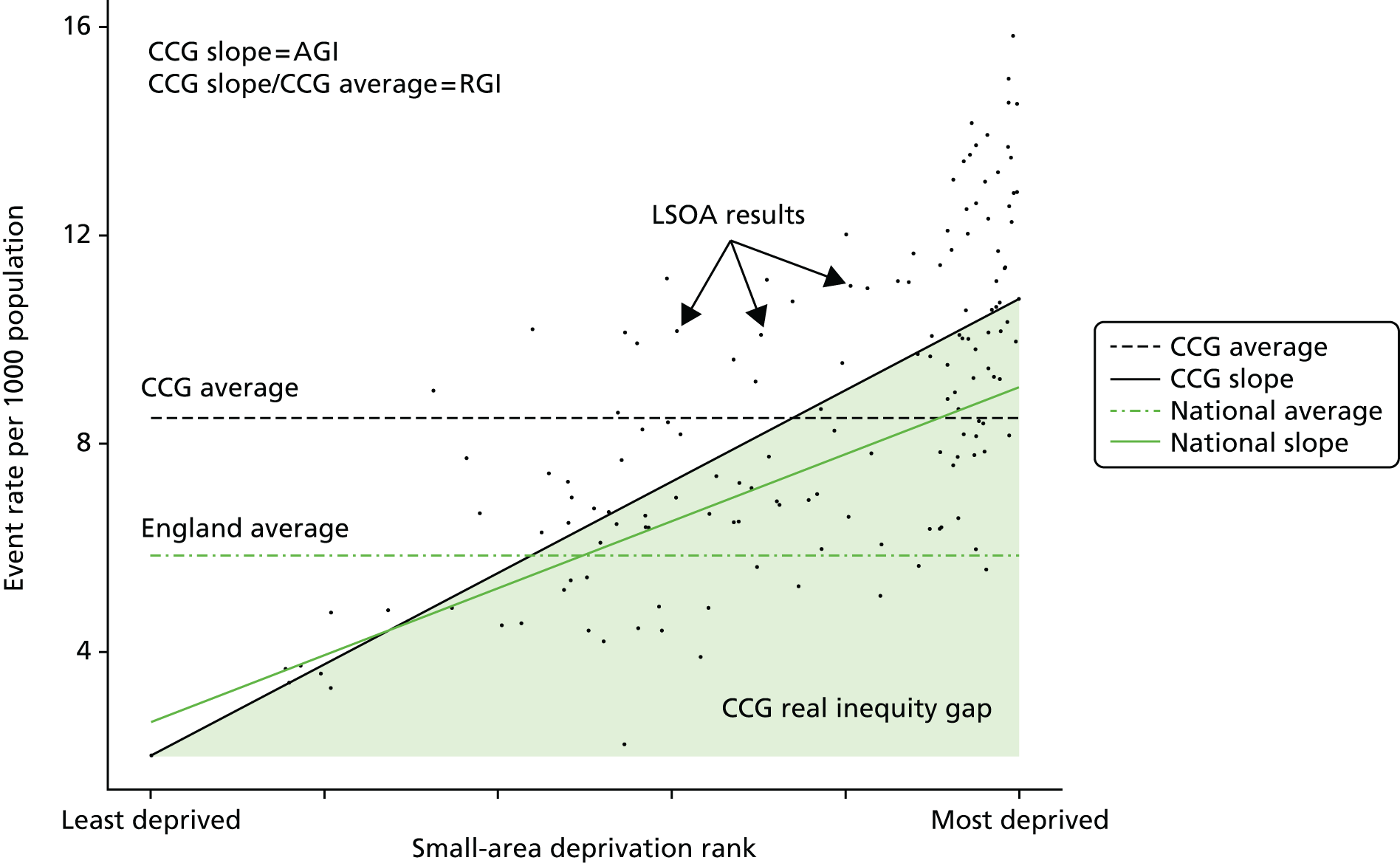
This approach differs from the PHOF approach58 to calculating within-CCG SIIs. The PHOF approach uses local deprivation ranks recalculated in CCGs, and then deprivation decile-level regressions based on these local ranks. This difference is because of the difference in purpose between health-care equity indicators and public health equity indicators. The main difference is that our health-care equity indicators aim to compare local health-care inequalities against a national benchmark, whereas the public health equity indicators focus on comparing the same local area over time. For our purpose of making comparisons against a national benchmark, using a common deprivation scale between the national- and CCG-level indicators is appropriate. A second difference is that our indicators focus on role of the NHS in reducing the link between deprivation and ill health, rather than in reducing deprivation and income inequality per se. By contrast, the PHOF indicator seeks to pick up the success of local government both in reducing the deprivation–health link and also in reducing deprivation and income inequality per se. Our more specific focus is reasonable insofar as changes in local prosperity are largely caused by factors outside NHS control; although, of course, NHS actions can have consequences for people’s wealth by protecting them against catastrophic health-care costs and keeping them economically productive. To measure the deprivation–health link specifically, we need to use the absolute national deprivation rank rather than the relative within-CCG deprivation rank. In principle, our measure will then not be sensitive to ‘gradient-preserving’ changes in local economic prosperity if this leads to precisely corresponding changes in health and health care along the national social gradient.
We also plotted the full range of CCG-level inequality results against the national inequality result on a caterpillar plot, showing data for the most recent year to help us identify areas that performed significantly better or worse than the national average in terms of inequality. An example of such a plot is shown in Figure 7.
FIGURE 7.
The CCG-level caterpillar plot comparing absolute inequality at the CCG level in terms of AGI to absolute inequality at the national level in terms of SII.
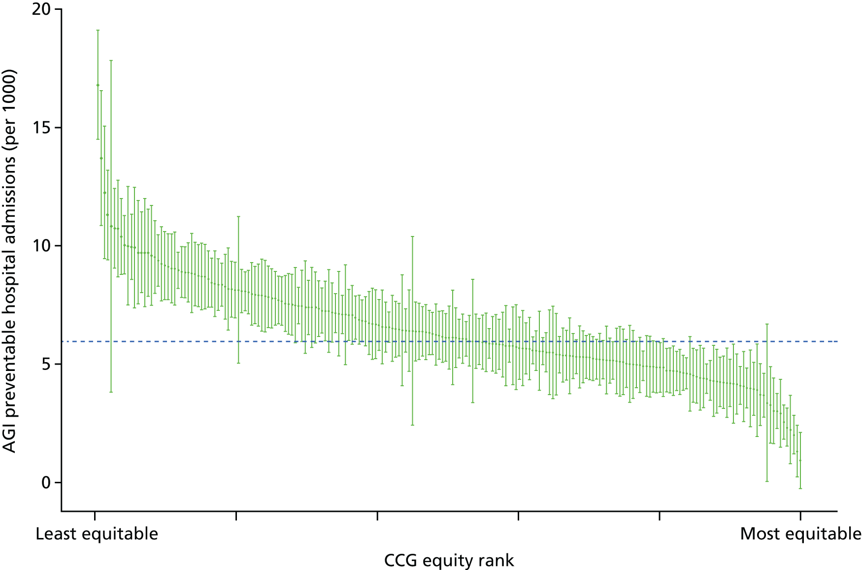
As a final analytical tool we produced plots of CCG-level average achievement and inequality achievement by deprivation to get some understanding of the contributions between-CCG and within-CCG inequality to the national inequality results. An example of such a plot is shown in the Figure 8.
FIGURE 8.
Correlations between deprivation and average and inequality performance at the CCG level. (a) Mean; and (b) AGI.
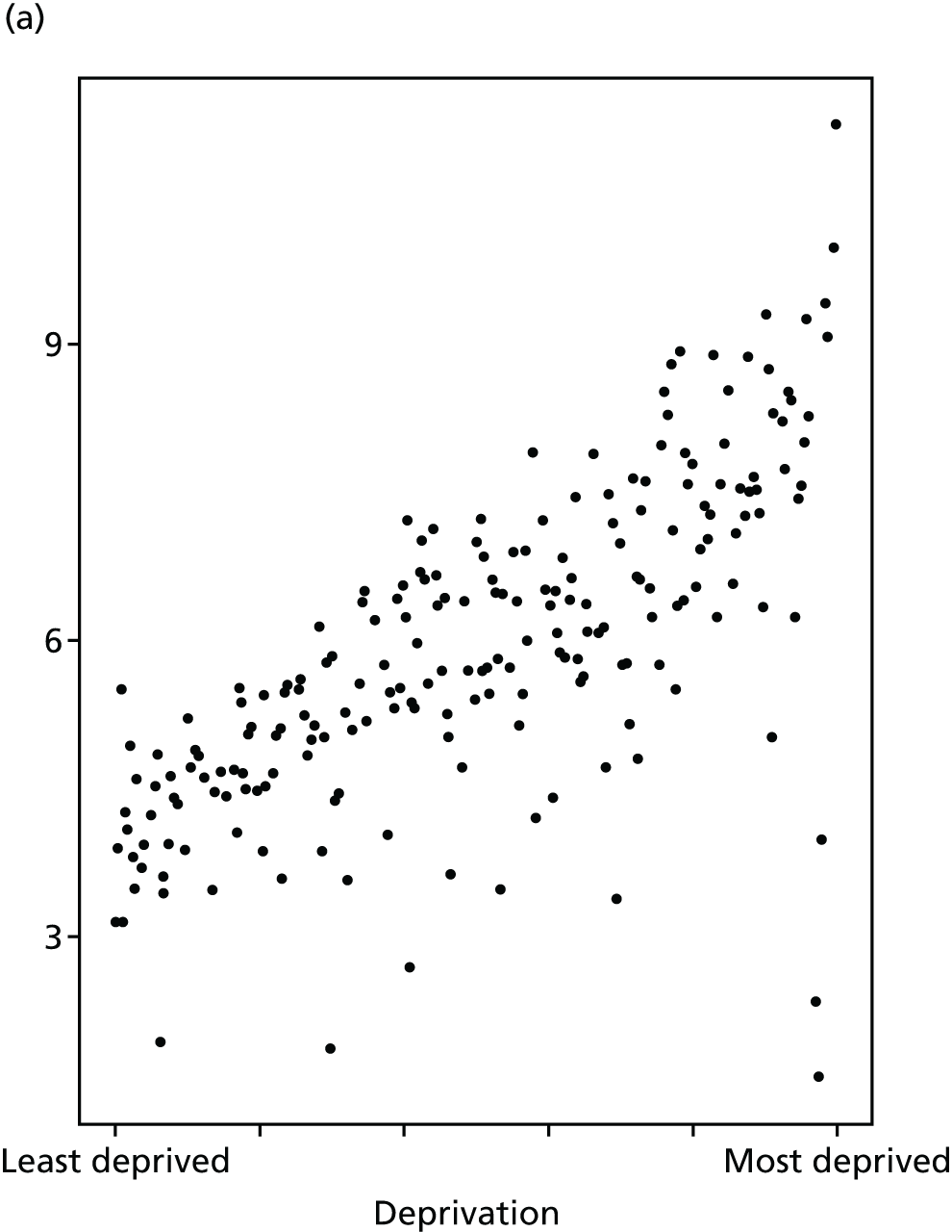
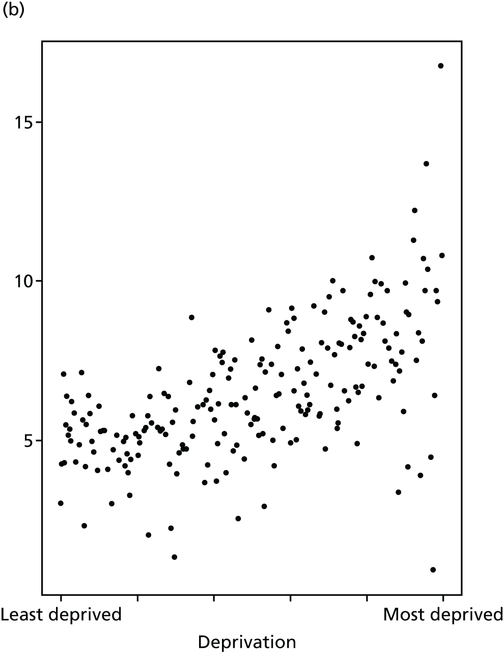
As with the national inequality indicators, we tested a range of alternative regression models to ensure the robustness of our results. We also tested using a random-effects specification of our model with CCG-level random slopes and intercepts. We found that for those indicators in which we had small event counts at the CCG level (in particular, amenable mortality and all-cause mortality), the random-effects specification had trouble converging. However, for the indicators in which the random-effects specification did converge we found that the magnitudes of inequality results were, as would be expected, shrunk towards the national average. However, the trends and rankings of CCGs in terms of inequality remained very similar to those observed with the standard linear model. Our base-case results at local level are, therefore, produced using the standard linear model as (1) this could be applied in a consistent manner across the full suite of indicators and (2) this is a simpler approach that is easier for decision-makers to understand and interpret.
Chapter 5 Results
Introduction
This chapter presents the main results at both the national and local level. Detailed results for each of our eight indicators of equity are presented one by one, in the same format, and then a final section summarises our findings on local equity monitoring for all eight indicators.
Detailed results for each indicator follow a common format. An introductory section first explains what the indicator means, why it was selected and how it was defined, with special attention to any departures from standard NHS indicator definitions. The main results are then presented graphically, using the same four types of graph. The key findings are then summarised. The four types of graph are as follows: first, national equity time trend graphs showing trends in (1) indicator levels by quintile group of deprivation, (2) the SII and (3) the RII. We present annual time trends for our full period of 2001/2 to 2011/12 when possible, although this is not possible for primary care supply and quality whose data series only start in 2004/5 (as explained in Appendix 4). We first present unadjusted time trends and then adjusted time trends, after allowing for need or risk factors. Second, a national equity gradient graph for 2011/12 showing adjusted indicator levels by decile groups of deprivation, the social gradient (the slope of which is the SII), and the area under the social gradient, representing the inequity gap (see Chapter 4). Third, a local equity performance graph for 2011/12 in the form of a caterpillar plot showing equity (AGI) by CCG in 2011/12 in rank order, with confidence intervals. Fourth, a local performance deprivation correlation graph for 2011/12 in the form of a CCG-level scatterplot of performance against deprivation at the CCG level, for both equity performance (e.g. the AGI in patients per GP) and average performance (e.g. the average level of patients per GP).
We start by presenting contextual information on population trends from 2001/2 to 2011/12 by deprivation group, age group and sex, before turning to the results for our eight equity indicators.
Population
Equity is a population-level concept, relating to unfair inequality within the relevant population of interest. To help interpret trends in equity over time, it is therefore important to understand the nature of changes in population size and sociodemographic composition over time. Our equity indicators are based on ONS mid-year estimates of population, which estimate the total resident population including homeless people and people in institutions such as nursing homes, prisons and barracks. We present contextual information on national population trends by age, sex and deprivation group in the form of two matrix plots. The first plot, Figure 9, has a fixed population range on the y-axes, to facilitate comparisons between age groups (rows). The second plot, Figure 10, has variable population ranges on the y-axes, to facilitate comparisons between deprivation groups (columns).
FIGURE 9.
Population matrix showing breakdown by deprivation group, age group and sex (y-axes fixed for comparison across age groups).
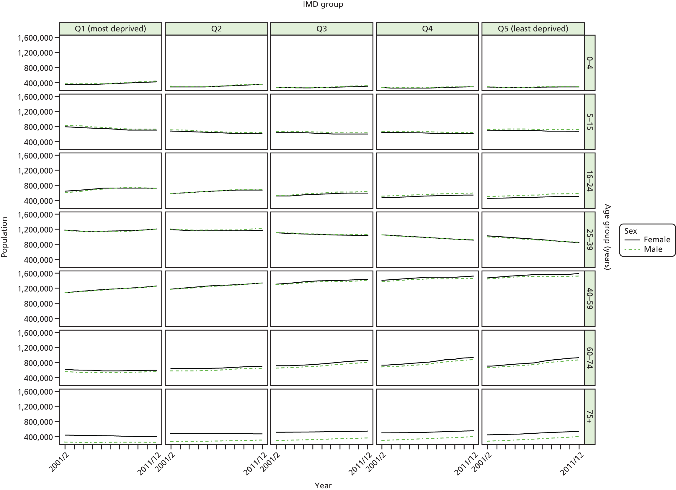
FIGURE 10.
Population matrix showing breakdown by deprivation group, age group and sex (y-axes free for comparison across deprivation groups).

The population matrix plots show that (1) more deprived areas have younger populations than more-affluent areas and (2) old age populations have been increasing over time in the most affluent areas, while population at younger ages has been increasing over time in more deprived areas.
The bulk of the population is between 25 and 74 years of age. There has been substantial growth over the period in the populations aged 40–59 years and 60–74 years for all deprivation groups. This growth has been most pronounced in the more-affluent groups where we also see a substantial decline in the numbers aged 25–39 years. Women and men follow largely the same trends within each age and deprivation group. Men tend to outnumber women up until the 16–24 years age group, after which women outnumber men, with the sex difference becoming more noticeable in older age groups.
These deprivation-related demographic variations and trends have important implications for risk and need adjustment. The risk of adverse health-care outcomes (such as hospitalisation and mortality) tends to increase with age. The impact of deprivation-related demographic variation, that is point (1) above, will therefore be to increase the risk of adverse events in affluent areas, and hence to reduce the unadjusted socioeconomic gradient in health-care outcomes. Similarly, the impact of deprivation-related demographic change, that is point (2) above, will be to increase the relative risk of adverse events in affluent areas compared with deprived areas, and hence to reduce the unadjusted socioeconomic gradient in health-care outcomes over time. Without age adjustment, therefore, socioeconomic inequality in health outcomes may appear to reduce over time in a pro-poor direction, even if the NHS did nothing to improve inequality. This would be misleading as the resulting inequality would reflect the impact of demographic change rather than the impact of the NHS. Therefore, we considered it relevant to adjust for age in our analysis. In a cross-sectional analysis, adjusting for age increases the SII and RII for health-care outcomes, as more deprived areas are younger and hence less at risk of poor outcomes. In a time series analysis, adjusting for age adds a growth trend to SII and RII over time, by removing the impact of ageing in affluent areas on reducing the social gradient over time.
Age is, of course, not the only factor that influences the risk of adverse health-care outcomes. In particular, morbidity may have larger and potentially opposing impacts, as deprived populations are more sick than affluent populations and more at risk of adverse events. Unfortunately, however, we were not able to adjust for morbidity because of lack of time-varying individual-level data on both age and morbidity, as explained in Chapter 4. The morbidity-unadjusted gradient in health-care outcomes that we observe will therefore be substantially larger than the ‘true’ morbidity-adjusted gradient. Furthermore, there is some evidence that socioeconomic inequalities in morbidity have widened during the 2000s. 62 If so, this would have the impact of appearing to increase socioeconomic inequalities in the non-morbidity-adjusted health-care outcomes that we observe.
Primary care supply
Access to primary care is a foundation stone of health-care quality, and makes a crucial contribution both to patient experience and improvement in population health outcomes. There is evidence that improved access to primary care can help to prevent illness, manage chronic conditions more effectively and reduced unnecessary utilisation of secondary care,12,63 although evidence on the impact of marginal changes in primary care supply on mortality in high-income countries is mixed. 12,64,65 We use a simple and objective measure of access to primary care: the number of patients per primary care physician. Measures of patients’ subjective experiences of primary care access are also available, based on the annual National GP Patient Survey. However, this survey goes back only to 2006/7 and has a response rate of around 30%, which varies substantially between practices, which may hamper comparisons in social gradients between subnational areas.
Previous studies in high-income countries, including the UK, have found significant geographical variations in the distribution of primary care physicians. 66–72 Data from England between 1974 and 2006 showed substantial and persistent geographical inequalities in supply of GPs relative to need between NHS administrative areas. 73–75 However, these studies focused on large areas, which made it difficult to accurately pinpoint primary care shortages in specific disadvantaged neighbourhoods.
Our indicator of primary care supply evaluates socioeconomic inequality in GP supply between small-area populations from 2004/5 to 2013/14. We use LSOA-level data, which allows us to capture changing patterns of socioeconomic inequality in much finer detail than previous studies. We define GP supply as the number of patients per FTE GP, excluding registrars and retainers, adjusted for age, sex and neighbourhood ill health using the Carr-Hill workload adjustment (see Appendix 4 for details). The numerator is the total number of people alive at mid-point in the current financial year, while the denominator is the number of FTE GPs attributed to each small area in the current indicator year. Further technical details of how this index was computed are presented in Appendix 4.
Unadjusted trends (Figure 11) show that there has been a significant divergence in GP supply between the most deprived fifth of areas and the other areas in the country from 2006/07 onwards. As 2006/07 the most deprived fifth of areas experienced a sustained trend of increasing GP supply (decreasing numbers of patients per GP), while GP supply in all the other areas decreased over time. However, we prefer the need-adjusted findings because in cross-section the unadjusted findings come up with the potentially misleading message that people living in deprived neighbourhoods have substantially more GP supply than others. This is a potentially misleading finding, because it fails to allow for the fact that deprived neighbourhoods tend to suffer more ill health than affluent neighbourhoods, and so have greater health-care needs.
FIGURE 11.
Unadjusted equity time trends in patients per GP. (a) Indicator 1: primary care supply (unadjusted); (b) SII; and (c) RII. Notes: (1) the solid black line shows the most deprived quintile and the solid blue line shows the least deprived quintile; (2) negative SII indicates pro-poor distribution, while a positive SII indicates a pro-rich distribution in absolute terms; and (3) negative RII indicates pro-poor distribution, while a positive RII indicates a pro-rich distribution in relative terms.
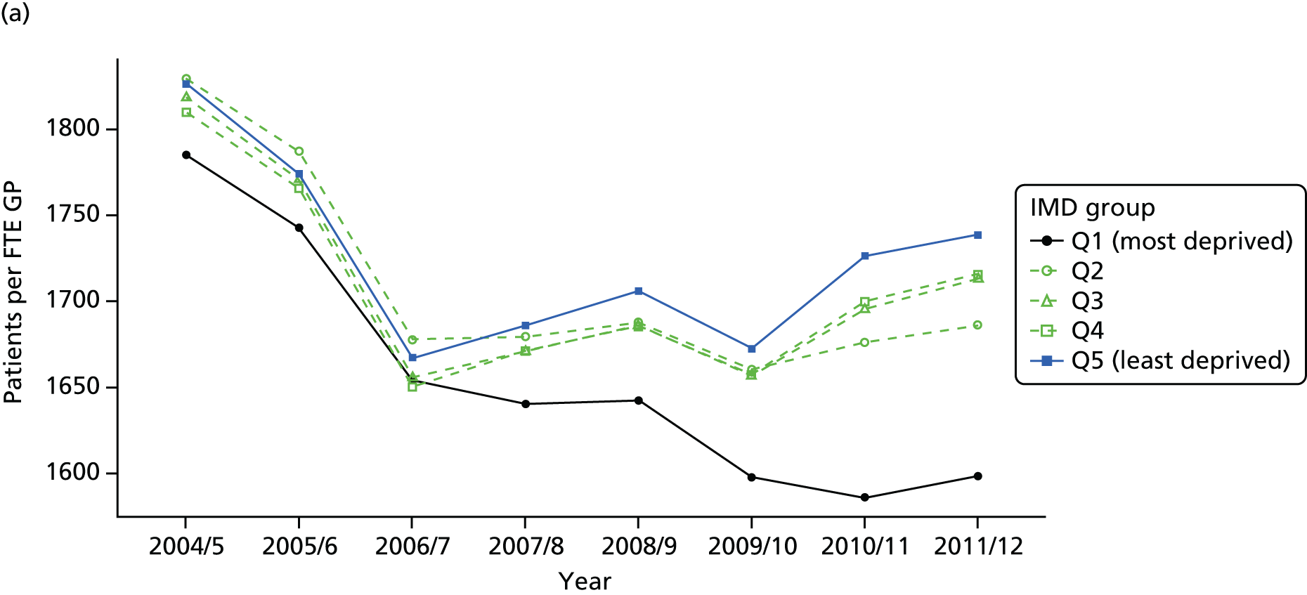
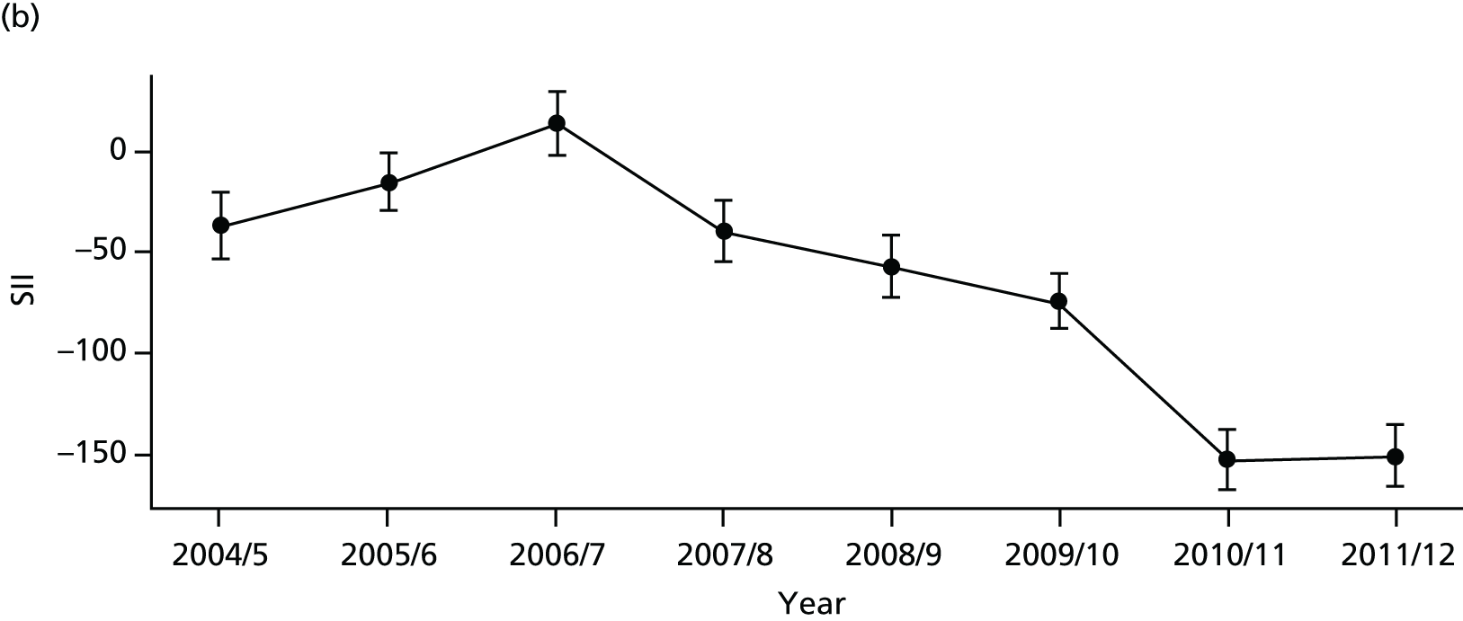

Adjusting these results for need using the Carr-Hill workload adjustment changes the levels of these lines, but we see a similar equity trend in Figure 12. We see a sustained reduction in both absolute and relative inequality, as measured by the SII and RII over the period, and by 2010/11 need-adjusted GP supply actually becomes pro-poor. This is also evident in the social gradient graph for 2011/12 shown in Figure 13, in which we see the lowest numbers of patients per GP in the most deprived areas and a negative inequity gap. The caterpillar plot in Figure 14 shows that there are substantial numbers of areas significantly more and less equal than the mean. The correlation plot in Figure 15 shows that by 2011/12 there is little evidence of a social gradient between CCGs: there is no association between mean patients per GP and deprivation at the CCG level. By contrast, there is some evidence that more deprived CCGs do better at reducing deprivation-related inequality in GP supply within their own patch; there is a clear, although weak, negative association between equity in patients per GP (AGI) and deprivation at the CCG level.
FIGURE 12.
Adjusted equity time trends in patients per GP. (a) Indicator 1: primary care supply; (b) SII; and (c) RII. Notes: (1) the solid black line shows the most deprived quintile and the solid blue line shows the least deprived quintile; (2) negative SII indicates pro-poor distribution, while a positive SII indicates a pro-rich distribution in absolute terms; and (3) negative RII indicates pro-poor distribution, while a positive RII indicates a pro-rich distribution in relative terms.
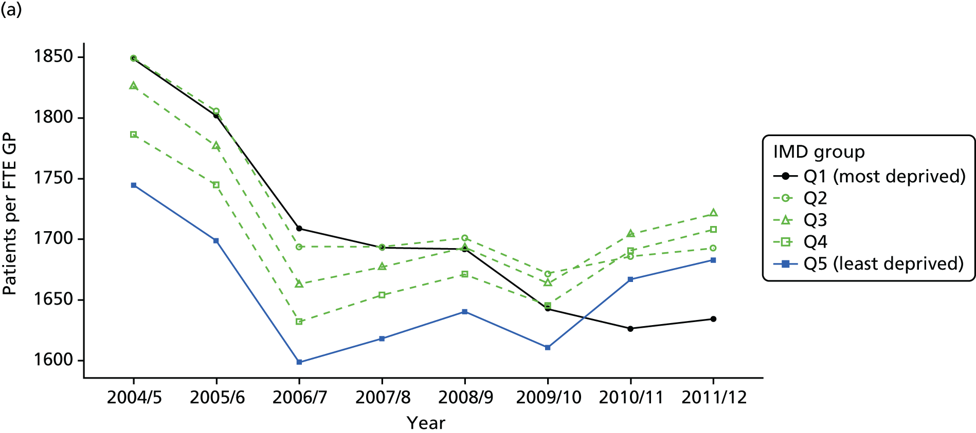


FIGURE 13.
National social gradient in patients per GP in 2011/12: adjusted. Notes: (1) dots represent decile groups, the inverted U-shape pattern indicates that neighbourhoods in the middle of the socioeconomic spectrum have less primary care physician supply than the most and least deprived neighbourhoods, after adjusting for differences in need; (2) the slope of the line is the SII. In this case, the slope is negative showing pro-poor inequality in patients per GP favouring deprived areas; and (3) the shaded area shows the inequity gap. In this case, this gap is negative indicating that bringing all neighbourhoods to the level of the least deprived would require losing some GPs in deprived neighbourhoods.
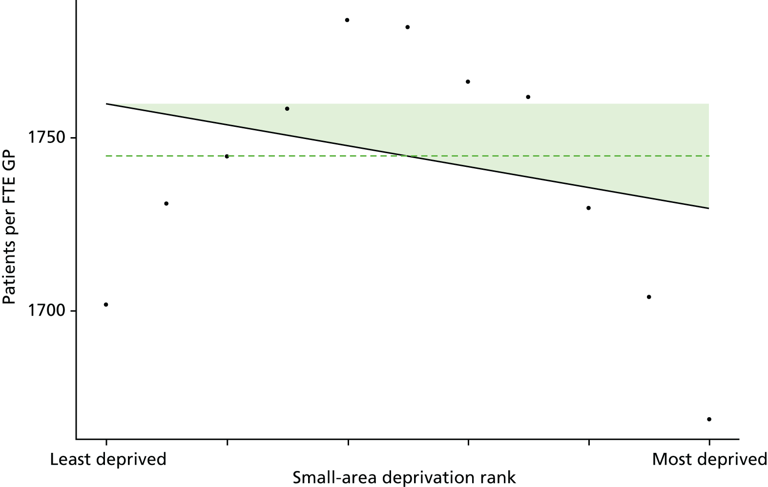
FIGURE 14.
Caterpillar plot of the AGI of inequality in patients per GP in 2011/12 at the CCG level. Notes: (1) CCGs are ranked from least equitable (left) to most equitable (right); (2) the dotted horizontal line shows the national average, CCGs to the left with confidence intervals above this line have worse than average equity performance, and vice versa; and (3) In this unusual case, there are many negative SIIs (at face value indicating pro-poor inequality) as well as positive SIIs indicating pro-rich inequality. However, as we underestimate need in deprived neighbourhoods, as explained in Chapters 4 and 6 and Appendix 4, we do not interpret negative SIIs as representing pro-poor inequality but rather as indicating no measurable pro-rich inequality.
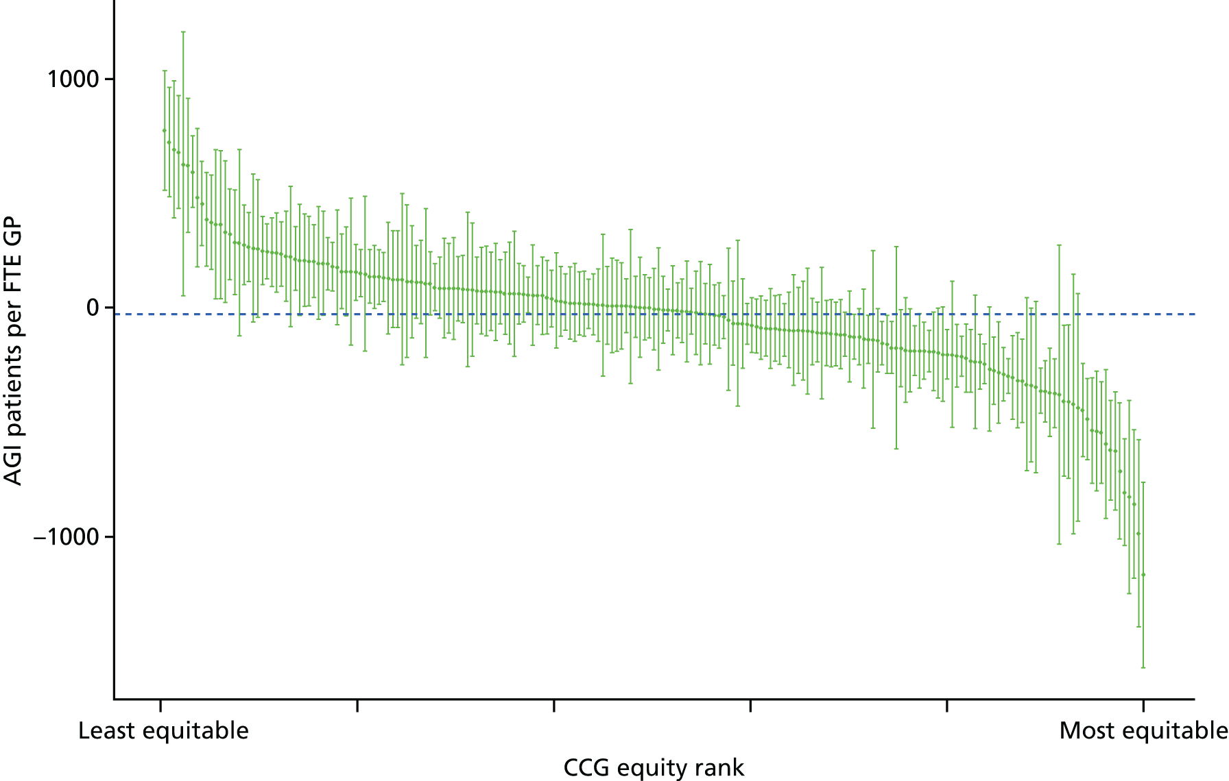
FIGURE 15.
Scatterplots of CCG performance on patients per GP in 2011/12 against deprivation, showing both mean performance and equity performance (AGI). (a) Mean; and (b) AGI.

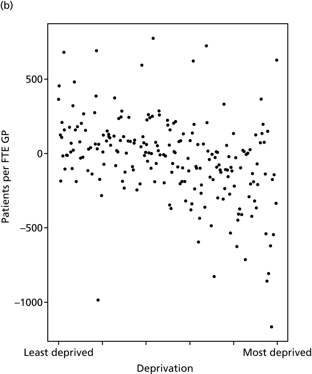
When reading these results it is important to keep in mind that GP supply is just one aspect of primary care access. Just because a patient is registered with a practice that has a relatively low number of patients per GP, this does not guarantee the patient will have relatively good access to adequately long primary care consultations at a convenient time, or that they will receive relatively high-quality care during their consultations.
Primary care quality
Primary care remains the most effective and cost-effective way of delivering accessible care in a time of rising prevalence of chronic conditions and multimorbidity. 76 This indicator focuses on clinical process indicators of the quality of primary care, based on the proportion of patients diagnosed with a particular condition receiving appropriate medical care for that condition. The quality of primary care can be measured using structures (such as the supply of GPs), processes (such as vaccination, investigation and prescribing) or outcomes (such as mortality, morbidity and patient satisfaction). 77 Combinations of these measures have been used in the literature to assess contribution of primary care in improving population health. 12 International studies have demonstrated that improving the process quality of primary care is associated with reduced emergency admissions, improved patient outcomes and reduced costs to the health-care system. 78–80 Moreover, small improvements in primary care process quality can have significant effects on population health at low cost. 81
Improving the quality of primary care has been incentivised in several countries, primarily using financial incentives. 82 In the UK, the QOF scheme was launched in 2004 to monitor and improve the quality of primary care. 83 This is one of the largest pay-for-performance programmes in the world with over £10B invested since inception. 65 The QOF programme rewards primary care practices based on their performance on a comprehensive set of indicators that measure primary care quality. In total, 146 indicators are used that cover the management of chronic disease, public health measures, quality and productivity of service, and patients’ experiences with respect to care. 84 To measure the public health impact of primary care quality, Ashworth et al. 85 developed a composite indicator using 20 QOF indicators weighted by their importance in terms of their potential for mortality reduction. 85 The resulting measure, termed the ‘Public Health Impact’ score, was proposed as a measure of primary care quality in terms of population health. We recognise that the QOF only captures part of primary care quality, and that there are valid concerns with using QOF as a measure of primary care quality. 86–88 We therefore advise that this indicator be interpreted cautiously, in the light of these limitations.
Our indicator evaluates socioeconomic inequality in primary care quality between small-area populations from 2004/5 to 2013/14. We selected 16 out of the 20 indicators proposed by Ashworth et al.,85 for which data were available throughout our period of analysis in a consistent format. We define primary care quality as weighted average of clinical process quality from 16 indicators in the QOF, with weights proportional to importance in terms of the estimated number of lives saved per 100,000 patients. 85 For each clinical indicator in QOF, the number of patients deemed appropriate for that indicator is the denominator and the number of patients for whom the indicator was met is the numerator. We use ‘population achievement’ which puts exception-reported patients back into the population denominator thereby assuming such patients represent poor quality, but as a robustness check we also analysed ‘reported achievement’ which excludes exception-reported patients from the population denominator. Further technical details of how this index was computed are presented in Appendix 4.
There are no ‘adjusted’ results to present for this indicator, because the population denominator for each indicator already defines the ‘at-risk’ patient population as patients diagnosed with the relevant condition. No further risk adjustment was performed, on the basis of the value judgement that age, sex and other patient characteristics are not legitimate reasons for failing to deliver high-quality care to the ‘at-risk’ patient population.
Primary care quality in terms of QOF steadily improved over the study period as shown in Figure 16. Both absolute and relative inequality in this measure of primary care quality steadily decreased, and was almost eliminated by 2011/12 as shown in Figure 17. The caterpillar plot in Figure 18 shows that in 2011/12 there are substantial numbers of CCGs significantly more and less equal to the national level of absolute inequality. The correlation plots in Figure 19 show that by 2011/12 there is no sign of a social gradient in this primary care quality measure between CCGs, if anything, more deprived CCGs tend to have slightly better GP supply (fewer patients per GP), and that CCG equity performance on primary care quality, as measured by QOF, is not associated with deprivation at the CCG level.
FIGURE 16.
National equity trends in primary care quality: adjustment not necessary. (a) Indicator 2, primary care quality; (b) SII; and (c) RII. Notes: (1) the solid black line shows the most deprived quintile and the solid blue line shows the least deprived quintile; (2) negative SII indicates pro-poor distribution, while a positive SII indicates a pro-rich distribution in absolute terms; (3) negative RII indicates pro-poor distribution, while a positive RII indicates a pro-rich distribution in relative terms; and (4) data on the number of exception-reported patients were not provided prior to 2005/06, which explains the blip in the trends between 2004/05 and 2005/06. This blip disappears when using ‘reported achievement’ after excluding exception-reported patients.
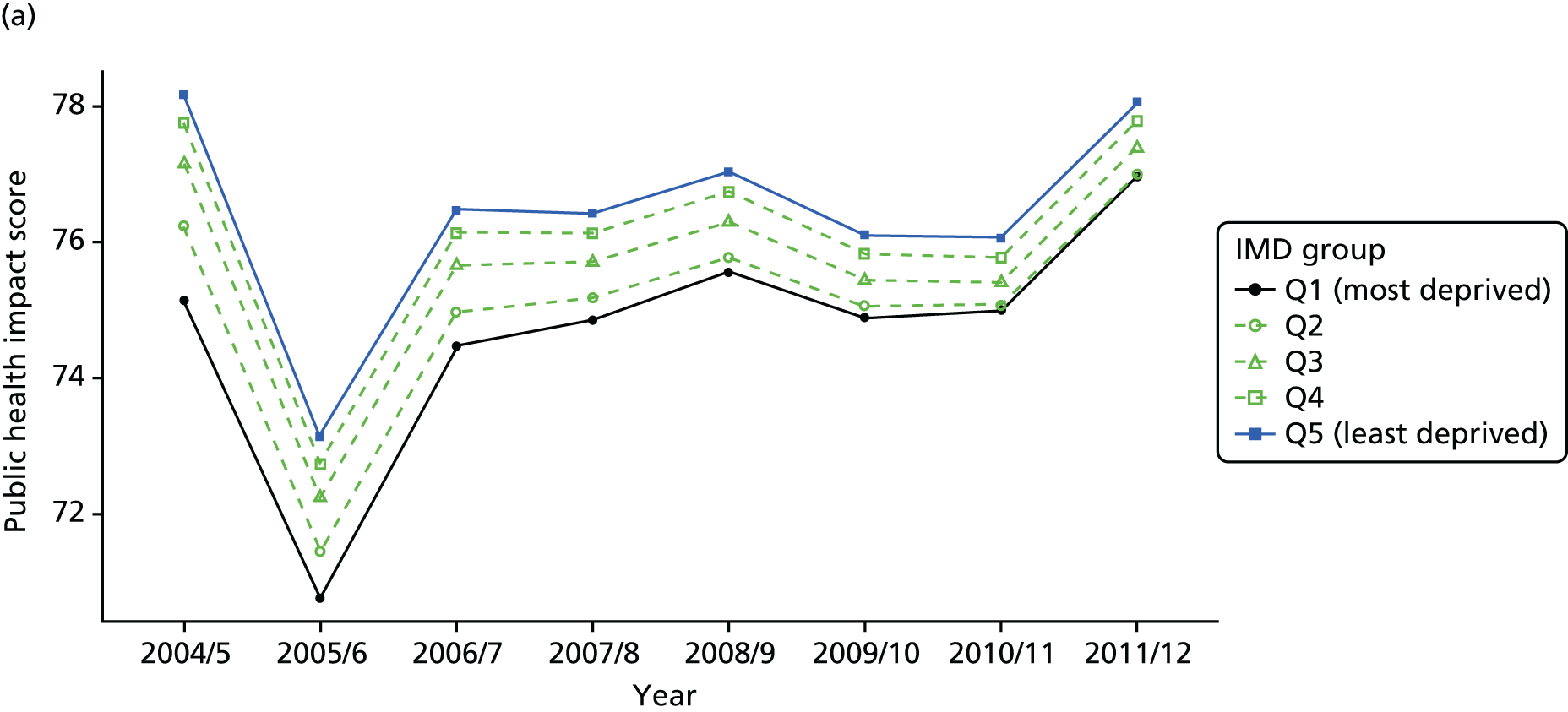
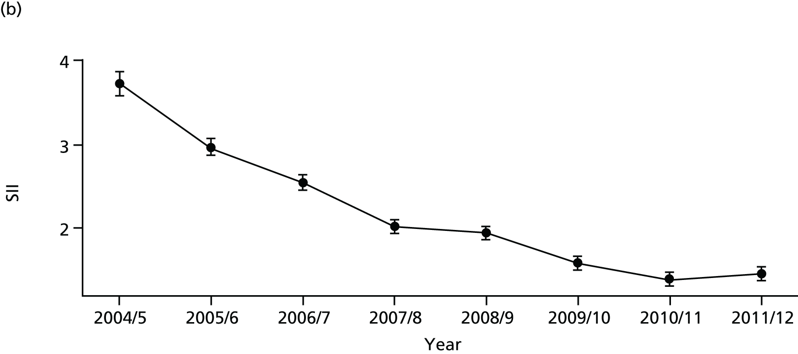

FIGURE 17.
National social gradient in primary care quality in 2011/12: adjustment not necessary. Notes: (1) dots represent decile groups; (2) the slope of the line is the SII; and (3) the shaded area shows the inequity gap.
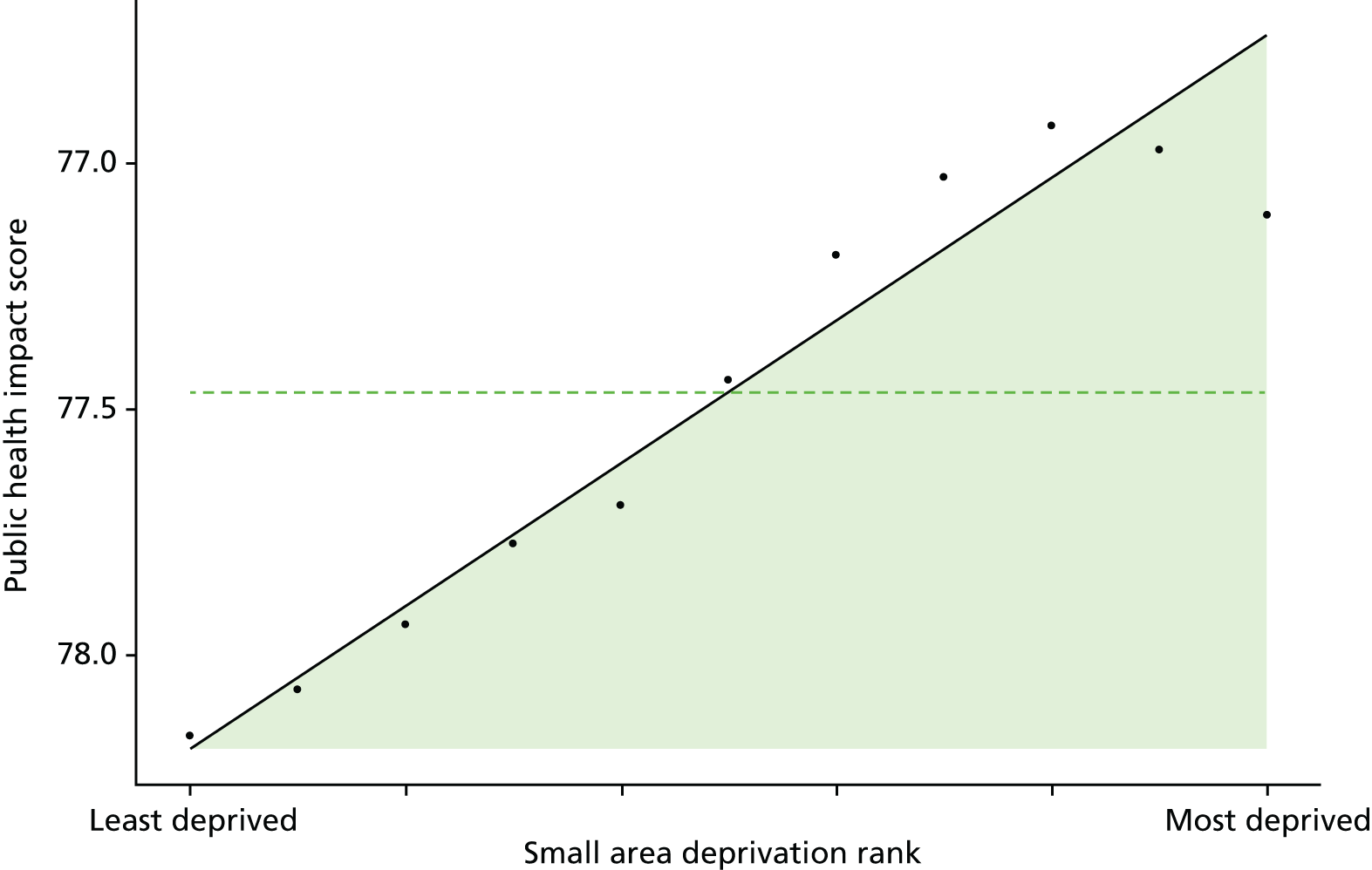
FIGURE 18.
Caterpillar plot of the AGI of inequality in primary care quality in 2011/12 at the CCG level. Notes: (1) CCGs are ranked from least equitable (left) to most equitable (right); and (2) the dotted horizontal line shows the national average. CCGs to the left with confidence intervals above this line have worse than average equity performance, and vice versa.
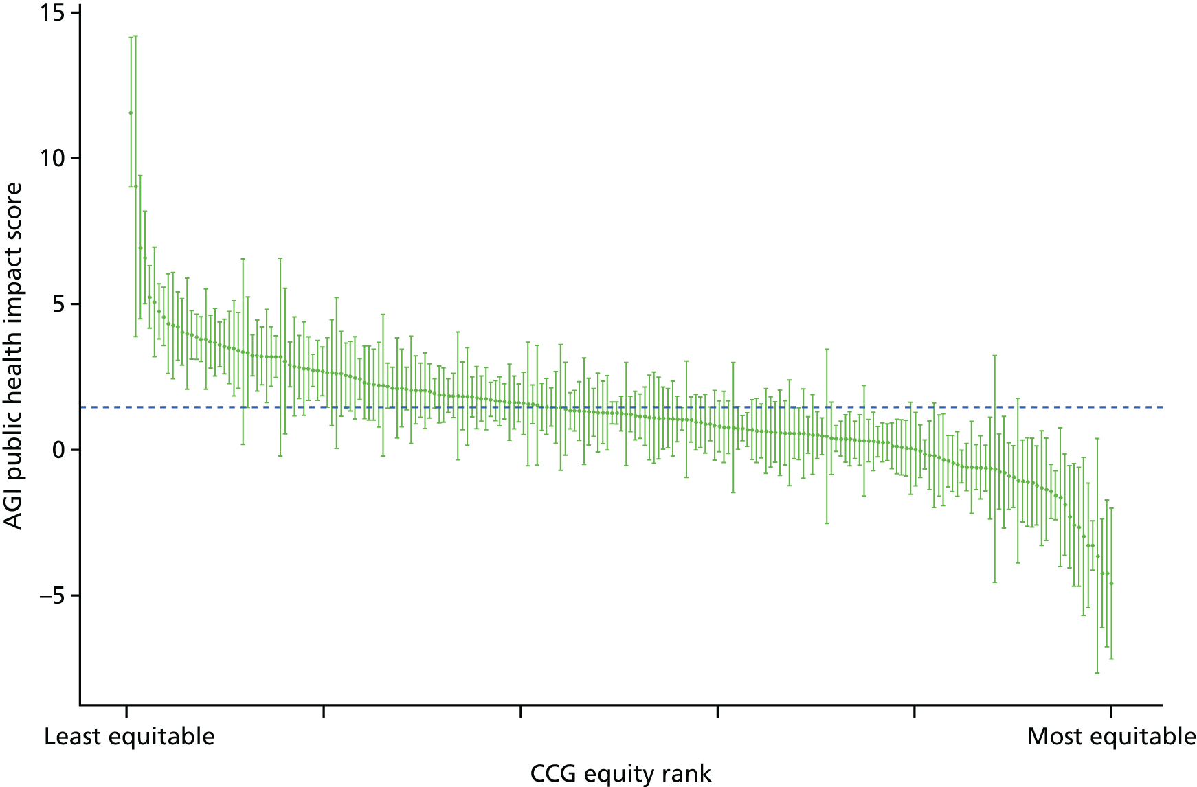
FIGURE 19.
Scatterplots of CCG performance on primary care quality in 2011/12 against deprivation, showing both mean performance and equity performance (AGI). (a) Mean; and (b) AGI.
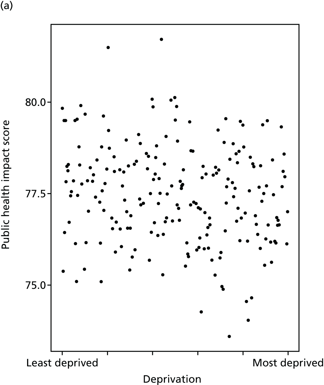
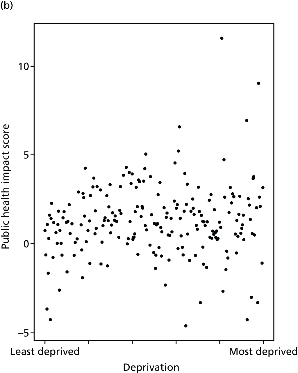
Hospital waiting time
Hospital waiting time is a major health policy issue in many countries, including the UK, and an important indicator of health system performance. 89,90 Moreover, this indicator was identified by our citizens’ panel participants as an important measure of equity in the NHS (see Chapter 3). Prolonged hospital waiting time is known to be associated with poor health outcomes, increased risk of complications, reduced quality of life and high patient dissatisfaction. For example, a systematic review of waiting time for radiotherapy found that the risk of local recurrence of cancer increased with increasing waiting time. 91 In another example, a recent English NHS study found that waiting time for hip and knee replacement surgery had a statistically significant negative impact on the health gains from surgery. 92 Similar evidence on the impact of hospital waiting time has been found for other conditions, including chronic pain,93 cataract94 and heart transplantation. 95
We measure hospital waiting time in terms of days from outpatient decision-to-treat to inpatient admission-for-treatment. This is often termed the inpatient waiting time in the literature. Another commonly used indicator is the outpatient waiting time, defined as the period between referral from a GP to the outpatient appointment with a specialist. A third and more comprehensive indicator used in the NHS since the late 2000s is the referral-to-treatment waiting time, which measures the time from referral from a GP to inpatient admission-for-treatment, including adjustment to allow for ‘clock stop’ periods of waiting attributable to patient choices (e.g. not attending an appointment) rather than NHS supply. This can be further divided into admitted and non-admitted waiting times, by distinguishing patients who are admitted for inpatient treatment from patients whose course of treatment ends at the outpatient stage without requiring inpatient admission.
However, we focus on inpatient waiting time because it is considerably quicker and easier to compute, and less subject to bias due to coding and linkage error. Computing referral-to-treatment times can be done by linking outpatient and inpatient HES at individual level across multiple years and has been done for the particular case of hip and knee replacement. 96 However, this is time-consuming in terms of both coding time and computational time, has never previously been done across all possible procedures and specialties, and would be subject to an unknown degree of coding bias and selection bias due to linkage failures. It would also be impossible, using HES data, to fully implement the complex ‘clock stop’ rules required to replicate official NHS statistics on referral-to-treatment times; and so the resulting indicator would still not precisely match official NHS statistics. The use of inpatient waiting time is also more internationally comparable, and is consistent with the definition of waiting time used in most OECD countries to measure health-system performance. 89
By all measures, average hospital waiting times have declined significantly from 2001/2 in England. 97,98 Siciliani et al. 89 report that waiting times for many procedures have more than halved, and that this can partly be attributed to the ‘targets and terror’ policy introduced from 2000 as well as increased capacity. 99,100 However, there is evidence to suggest that there remains significant socioeconomic inequalities in waiting time. For instance, Laudicella et al. 101 found that elective hip replacement patients in the poorest two socioeconomic quintiles wait about 7% longer than patients in the least deprived quintile across England. In another study, Moscelli et al. 102 found significant differences in waiting times between public hospitals in non-emergency heart revascularisation procedures in England (up to 35% difference between the most and least deprived population quintiles). These inequalities all arose within hospitals rather than across hospitals, and after allowing for differences in the number and type of diagnoses as a marker for severity.
Our indicator evaluates socioeconomic inequality in inpatient hospital waiting time between small-area populations from 2001/2 to 2013/14. We define hospital waiting time as the number of days from outpatient decision-to-treat to inpatient admission-for-treatment (i.e. the inpatient waiting time). We allow for differences in waiting times by specialty type by adjusting for the main specialty of the treating consultant. We do not additionally allow for age and sex, on the basis of the value judgement that (at least in most cases) age and sex are not a legitimate justification for making people wait longer for needed treatment. Further technical details of how this index was computed are presented in Appendix 4.
Inpatient hospital waiting time decreased substantially across all areas in the country from 2003/4 to 2008/9, after which it began to creep up again, as shown in Figures 20 and 21. Inequality appeared to be slightly pro-poor at the start of our period in 2001/2, and to become even more pro-poor up to 2003/04, after which time more affluent areas steadily started to catch up (Figures 22 and 23), with some evidence of pro-rich inequality emerging by 2011/12, as depicted in the social gradient graph in Figure 24. The caterpillar plot in Figure 25 shows that substantial numbers of CCGs are performing significantly better and worse than the national average in terms of the AGI of inequality. The correlation plots in Figure 26 show no sign of correlation between mean waiting time and inequality in mean waiting time and CCG-level deprivation.
FIGURE 20.
Matrix plot showing unadjusted trends in inpatient hospital waiting time by age, sex and deprivation (fixed axes for comparisons across age groups).
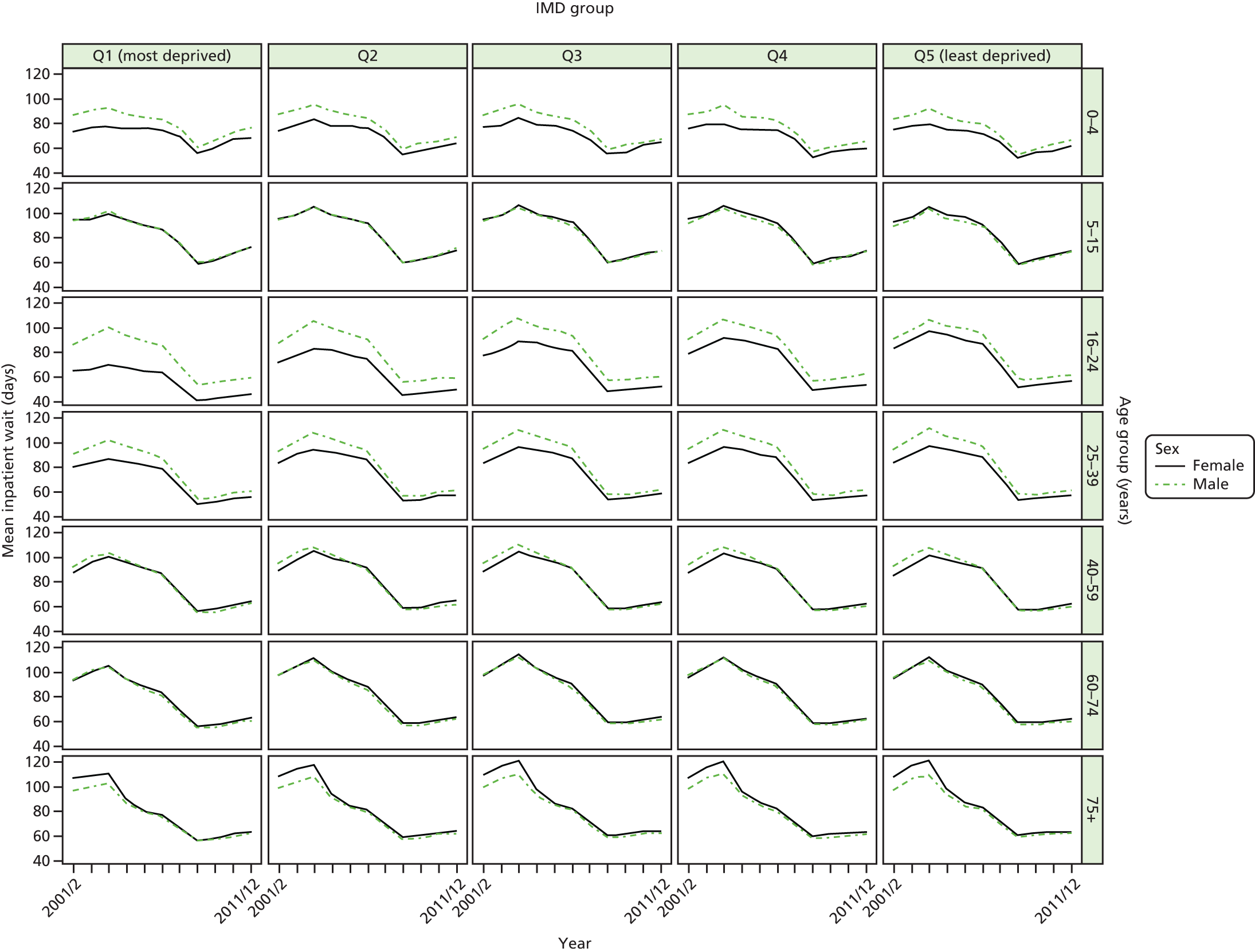
FIGURE 21.
Matrix plot showing unadjusted trends in inpatient hospital waiting time by age, sex and deprivation (free axes for comparisons across deprivation groups).
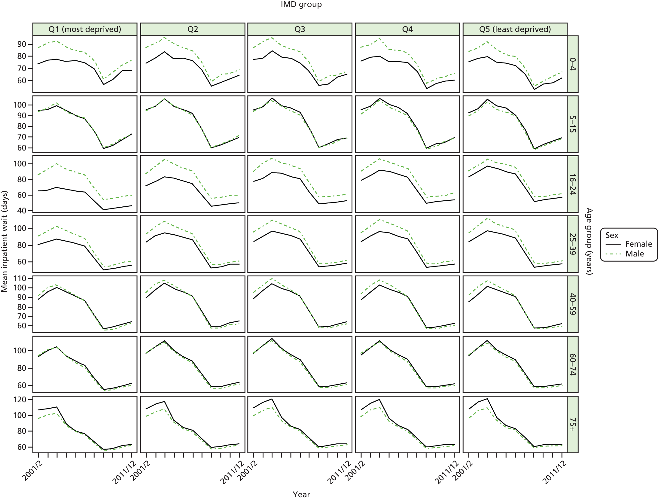
FIGURE 22.
Unadjusted national equity trends in inpatient hospital waiting time. Notes: (1) the solid black line shows the most deprived quintile and the solid blue line shows the least deprived quintile; (2) negative SII indicates pro-poor distribution, while a positive SII indicates a pro-rich distribution in absolute terms; and (3) negative RII indicates pro-poor distribution, while a positive RII indicates a pro-rich distribution in relative terms.
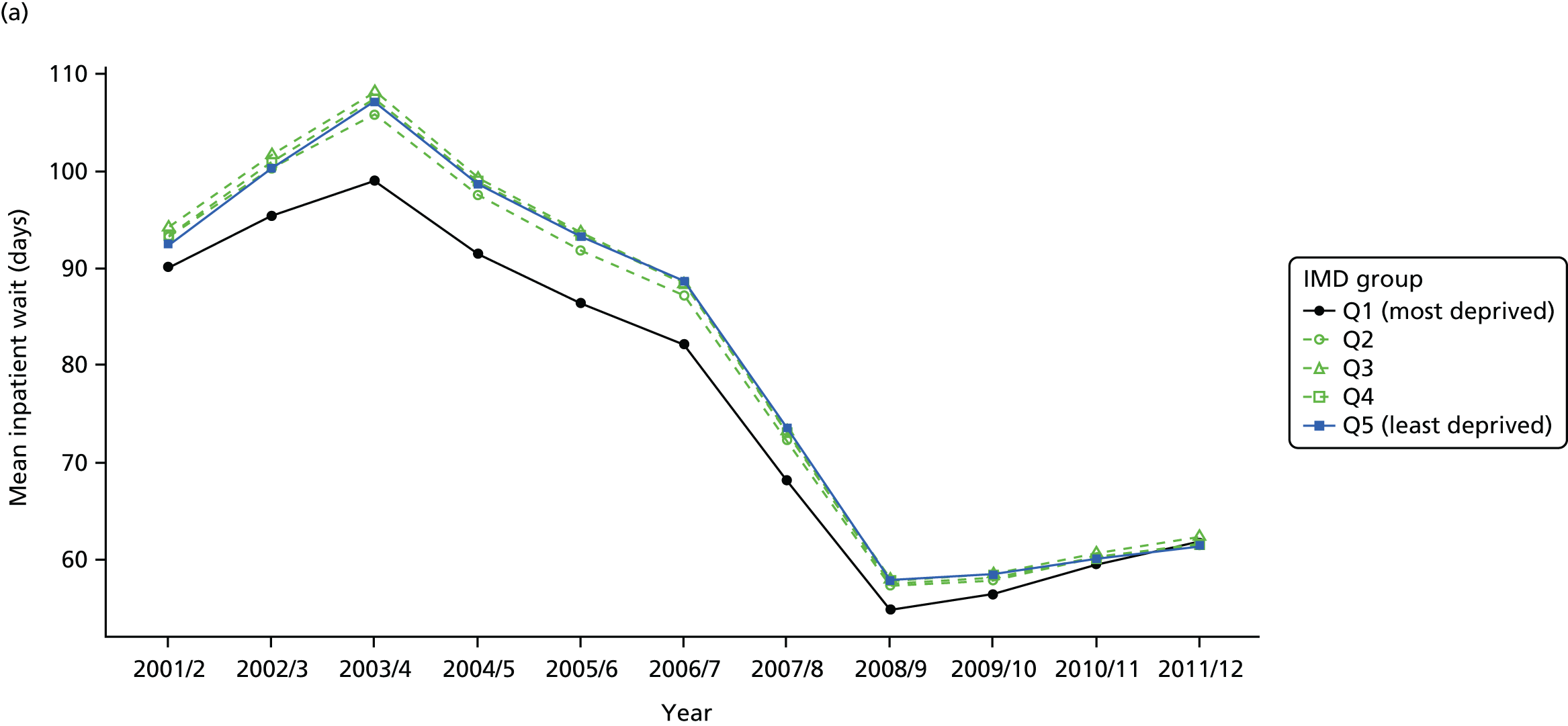


FIGURE 23.
Adjusted national equity trends in inpatient hospital waiting time. Notes: (1) the solid black line shows the most deprived quintile and the solid blue line shows the least deprived quintile; (2) negative SII indicates pro-poor distribution, while a positive SII indicates a pro-rich distribution in absolute terms; and (3) negative RII indicates pro-poor distribution, while a positive RII indicates a pro-rich distribution in relative terms.

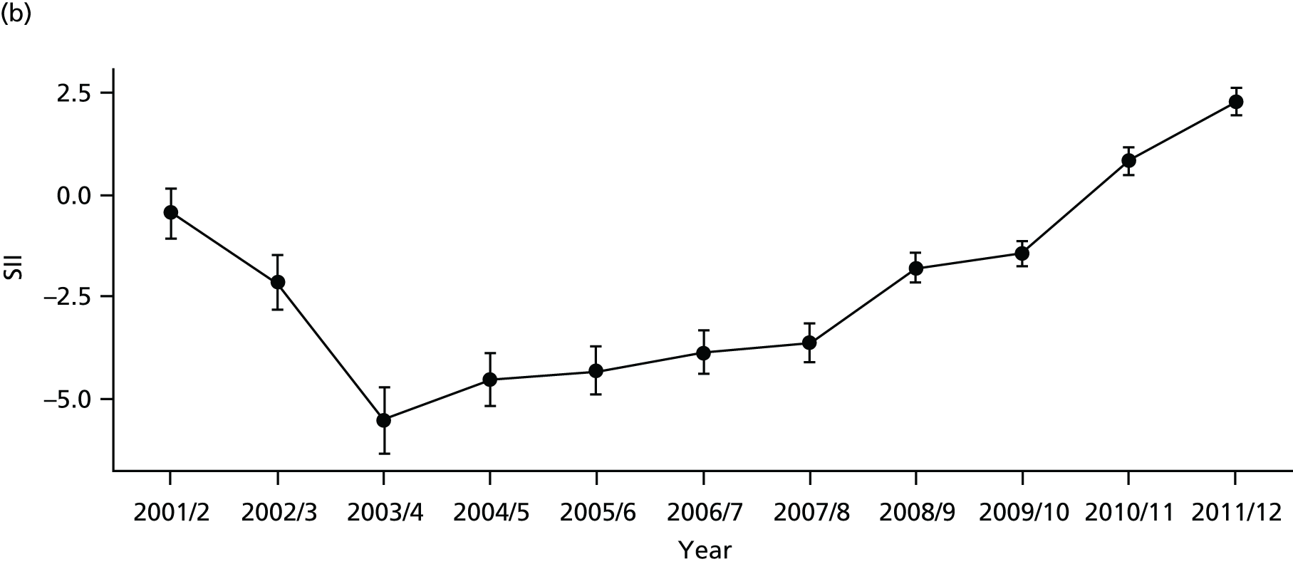

FIGURE 24.
National social gradient in inpatient hospital waiting time in 2011/12. Notes: (1) dots represent decile groups; (2) the slope of the line is the SII; and (3) the shaded area shows the inequity gap.
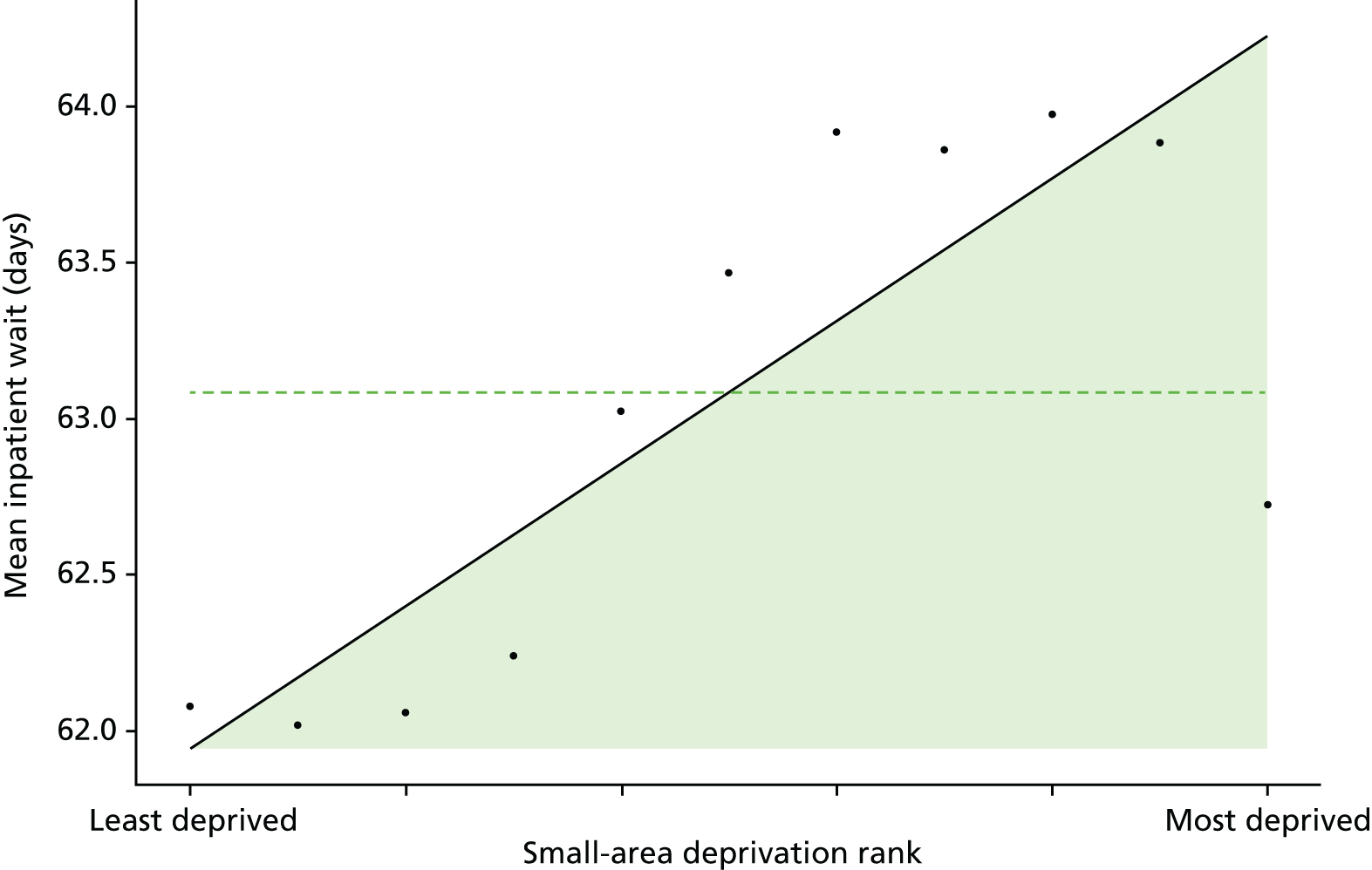
FIGURE 25.
Caterpillar plot of AGI of inequality in inpatient hospital waiting time in 2011/12 at the CCG level. Notes: (1) CCGs are ranked from least equitable (left) to most equitable (right); and (2) the dotted horizontal line shows the national average. CCGs to the left with confidence intervals above this line have worse than average equity performance, and vice versa.
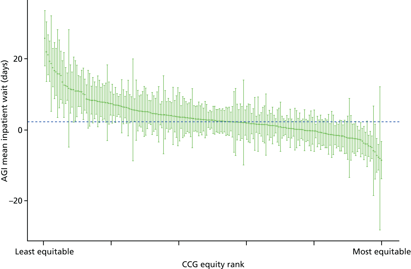
FIGURE 26.
Scatterplots of CCG performance on inpatient hospital waiting time in 2011/12 against deprivation, showing both mean performance and equity performance (AGI). (a) Mean; and (b) AGI.

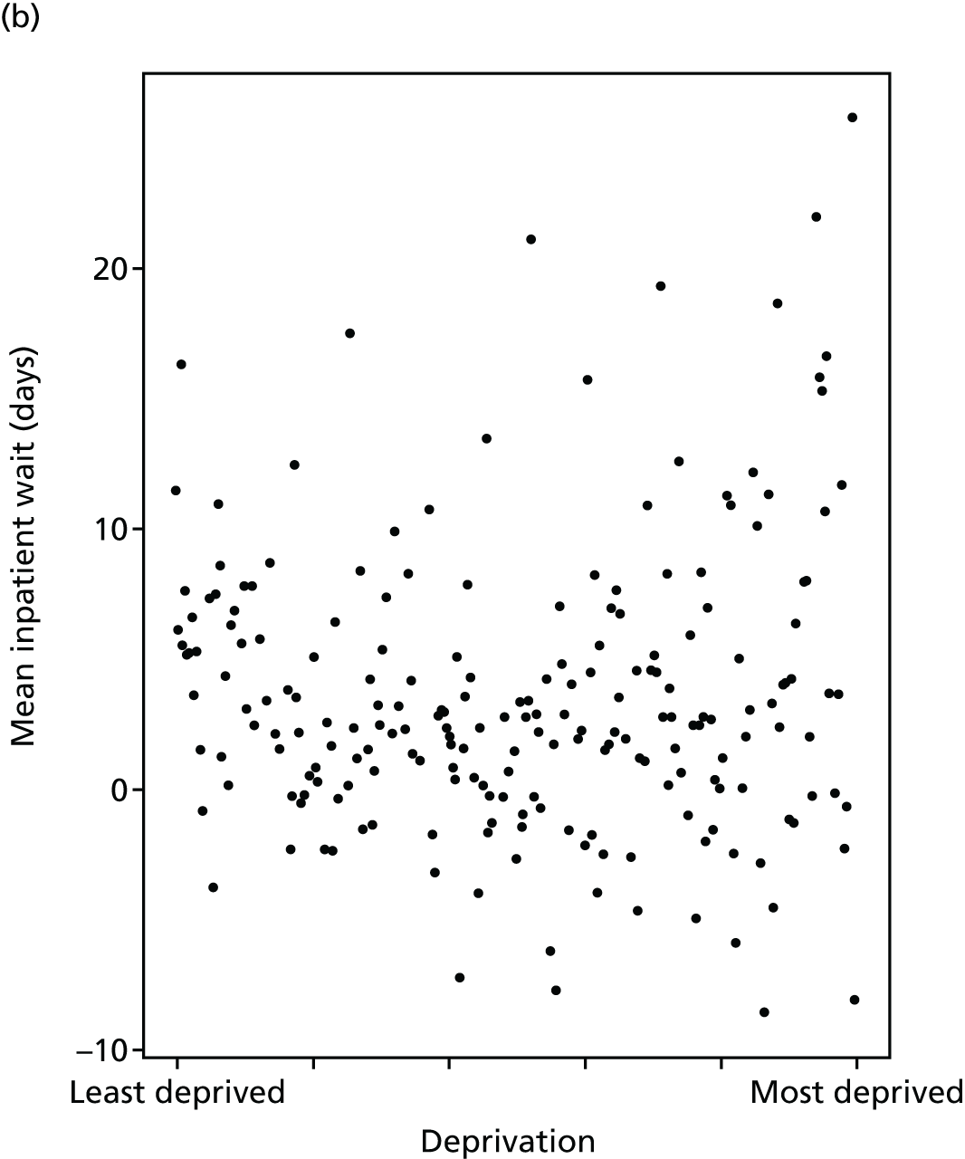
Preventable hospitalisation
Preventable hospitalisation refers to emergency hospital admissions that can be prevented by timely and effective provision of primary care. This is an important indicator of primary care access and quality that is widely used in the international literature. 103–105 In England, data from 2001 to 2013 showed that preventable hospitalisations make up one in every five hospital admissions, and have increased by 48% in the last 12 years. 106 Common causes of preventable hospitalisations include urinary tract infection/pyelonephritis, pneumonia, chronic obstructive pulmonary disease (COPD), convulsions and epilepsy, and ear, nose and throat infections. Studies suggest that preventable hospitalisation can be reduced by improving primary care supply and quality. 107 These hospital visits not only result in poor outcomes, but also result in increased cost to the health-care system. 108 For instance, a recent study concluded that better management of patients in primary care could save £1.42B in England by reducing preventable hospitalisation. 109 Similar cost estimates have been published for other countries. 110,111 Studies have also found that preventable hospitalisations are associated with the socioeconomic status of patients. 112,113
Our indicator evaluates socioeconomic inequality in preventable hospitalisation between small-area populations from 2001/2 to 2013/14. We defined preventable hospitalisation as the proportion of people with an emergency admission for a chronic ambulatory care-sensitive condition, admissions that are potentially avoidable if these chronic conditions are appropriately managed in primary care. 114 This indicator could also be described as ‘emergency hospitalisation sensitive to primary care’. We depart from the corresponding NHS Outcomes Framework definition by defining the indicator numerator as the number of people with one or more events, rather than the number of events. This is because (1) we have a separate measure of repeat hospitalisation and so want to focus this measure on the incidence of hospitalisation (the proportion of people hospitalised) rather than the intensity (how many times each individual is hospitalised); and (2) following advice from the two lay members of our advisory group, we believe that members of the public find it slightly easier to understand and relate to proportions (e.g. ‘X people per 1000’ or ‘a chance of X in 100’) than event rates. We focused on chronic rather than acute ambulatory care-sensitive conditions, as the former are likely to be more sensitive to changes in primary care supply and quality. We used the same list of chronic ambulatory care-sensitive conditions as the NHS Outcomes Framework (indicator 2.3i). Our definition of preventable hospitalisation uses all ages in both numerator and denominator, as does the NHS Outcomes Framework definition. However, the international OECD definition only includes age ≥ 15 years, that is, we include children but the OECD definition does not. We then indirectly standardised each year of data for age and sex at the LSOA level. Further technical details of the standardisation procedure are in Chapter 4, and further indicator definition details are presented in Appendix 4.
There has been a slight fall in preventable hospitalisation over the study period, although substantial inequality persisted throughout. Looking at the age–sex breakdowns in the matrix plot in Figures 27 and 28, the main exception to this trend was in children aged 5–15 years within the most deprived quintile group for whom preventable hospitalisation rose during the 2000s. The unadjusted trends in Figure 29 show improvement in inequality in terms of SII and RII. However, this is misleading because of the disproportionate ageing of the affluent population, which is associated with a higher rate of hospitalisation in this quintile group. After age adjustment, the pro-rich trend disappears for both SII and RII, as shown in Figure 30. This inequality is seen both between CCGs and within CCGs, as depicted by the correlation plots in Figure 31. Inequality lines up closely with deprivation, as shown by decile points on the scatterplot Figure 32 which all lie along the social gradient line. The caterpillar plot in Figure 33 shows there are substantial numbers of CCGs performing significantly better and worse than the national average in terms of the AGI of inequality.
FIGURE 27.
Matrix plot showing unadjusted trends in preventable hospitalisation by age, sex and deprivation (fixed axes for comparisons across age groups).
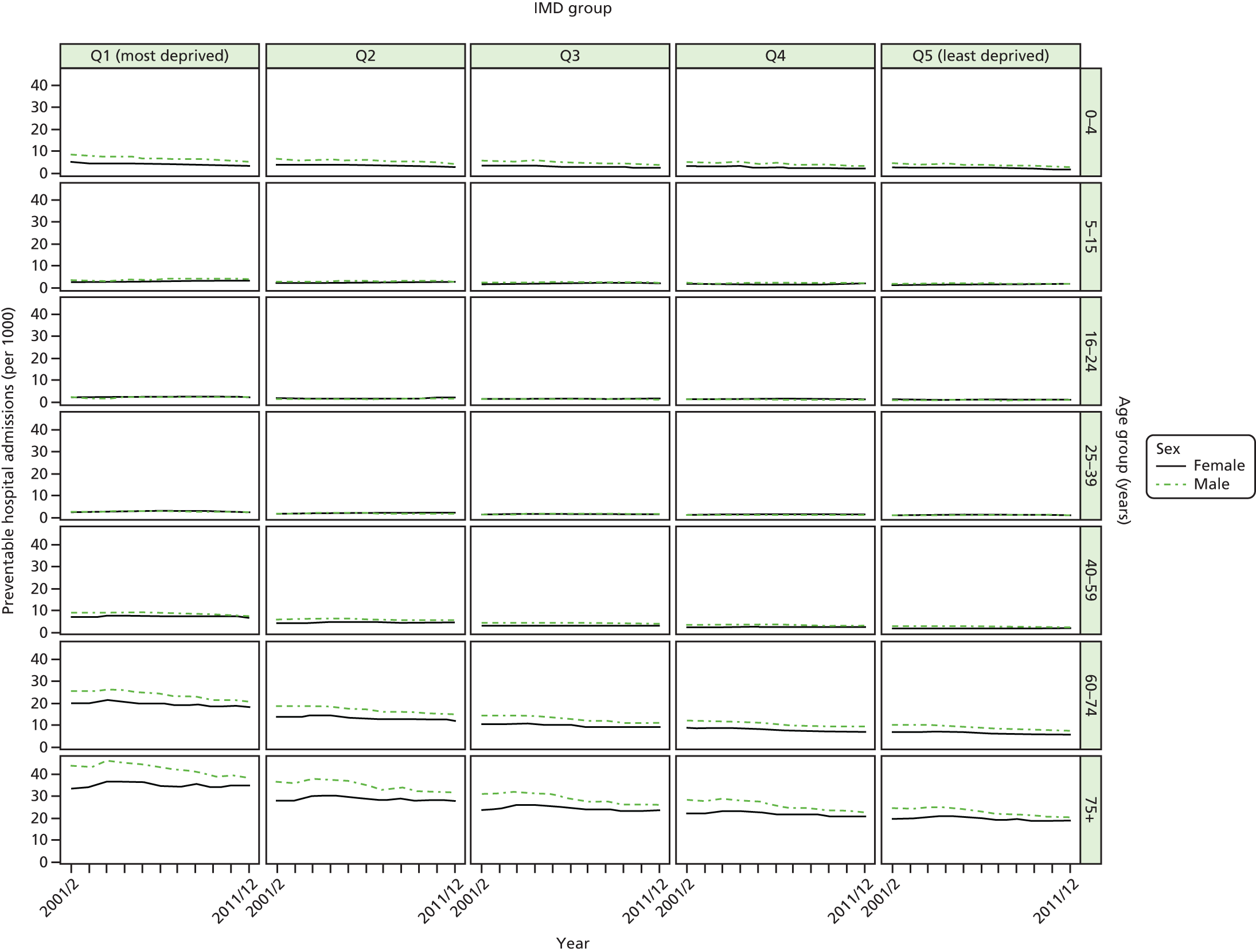
FIGURE 28.
Matrix plot showing unadjusted trends in preventable hospitalisation by age, sex and deprivation (free axes for comparisons across deprivation groups).
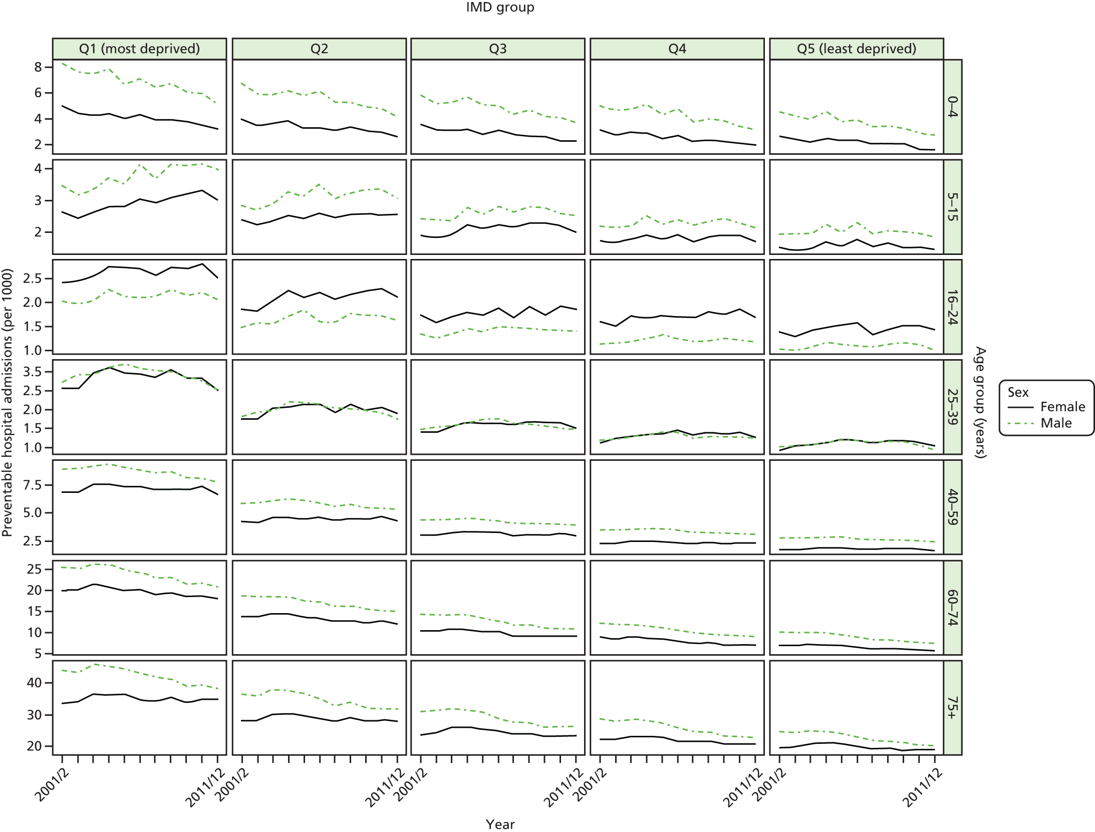
FIGURE 29.
Unadjusted national equity trends in preventable hospitalisation. Notes: (1) the solid black line shows the most deprived quintile and the solid blue line shows the least deprived quintile; (2) negative SII indicates pro-poor distribution, while a positive SII indicates a pro-rich distribution in absolute terms; and (3) negative RII indicates pro-poor distribution, while a positive RII indicates a pro-rich distribution in relative terms.
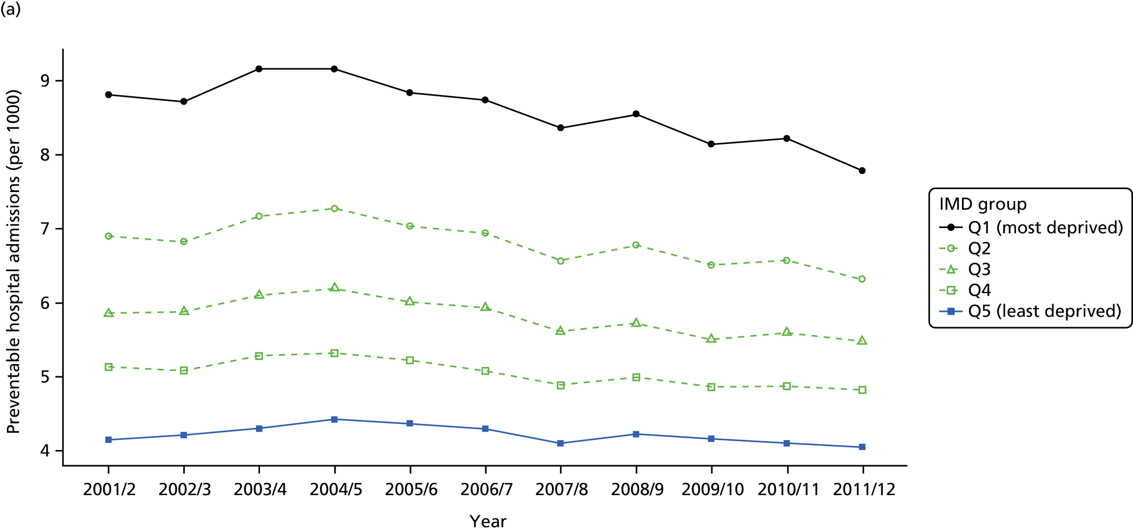
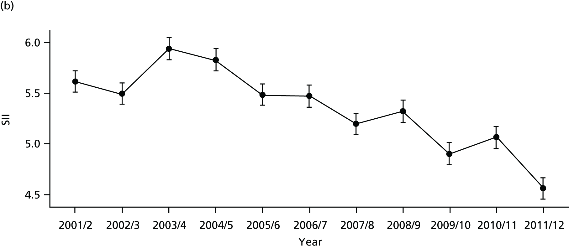
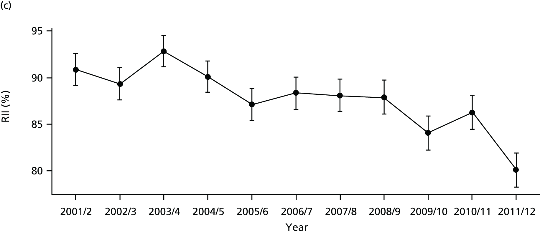
FIGURE 30.
Adjusted national equity trends in preventable hospitalisation. Notes: (1) the solid black line shows the most deprived quintile and the solid blue line shows the least deprived quintile; (2) negative SII indicates pro-poor distribution, while a positive SII indicates a pro-rich distribution in absolute terms; and (3) negative RII indicates pro-poor distribution, while a positive RII indicates a pro-rich distribution in relative terms.
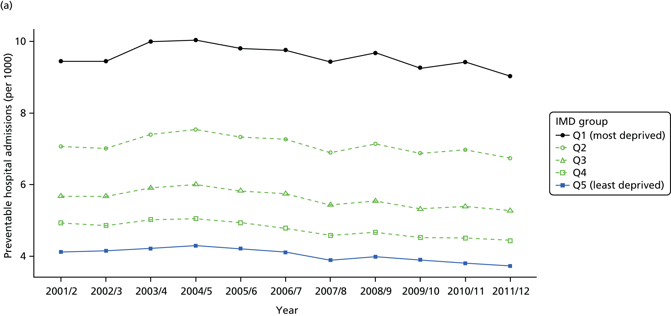
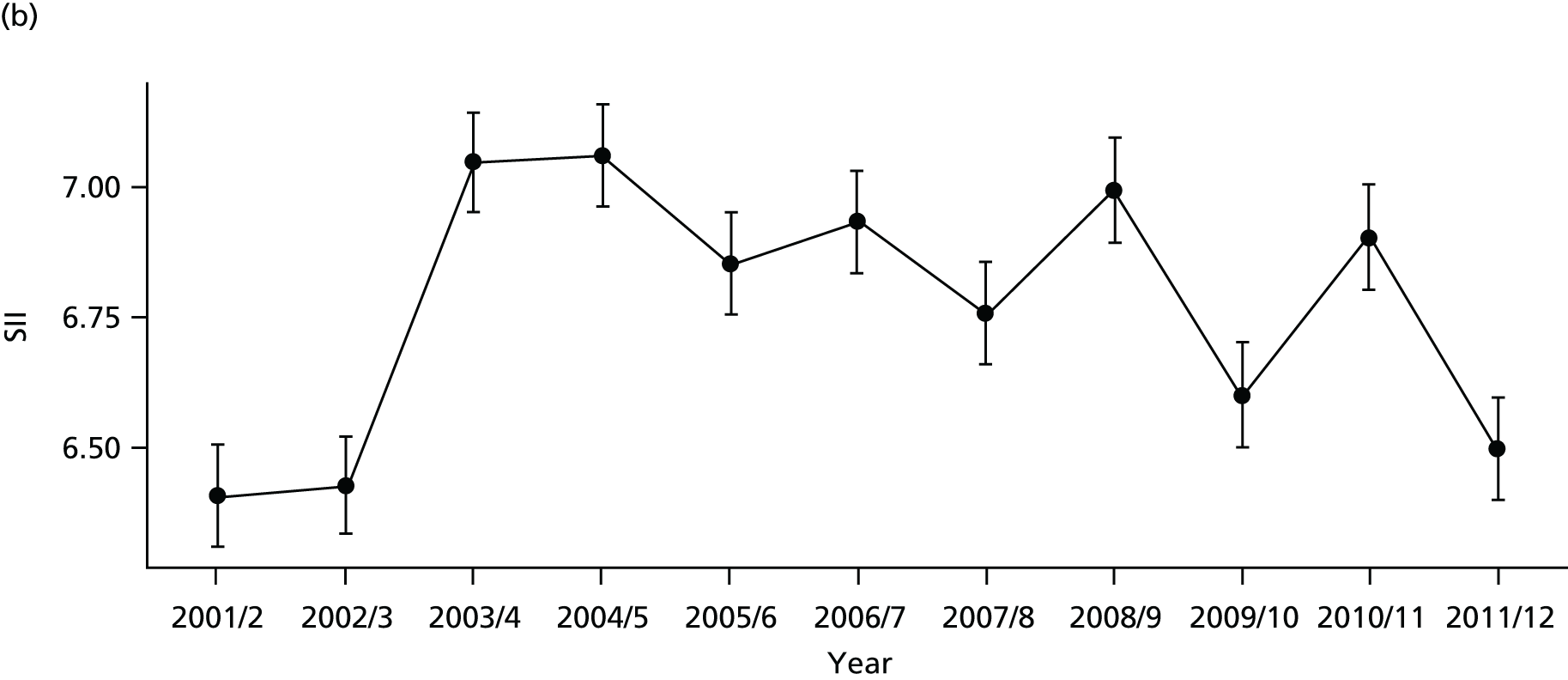

FIGURE 31.
Scatterplots of CCG performance on preventable hospitalisation in 2011/12 against deprivation, showing both mean performance and equity performance (AGI). (a) Mean; and (b) AGI.
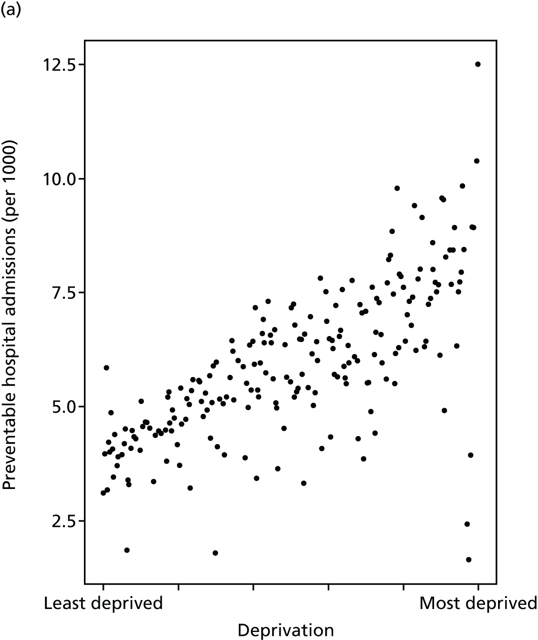
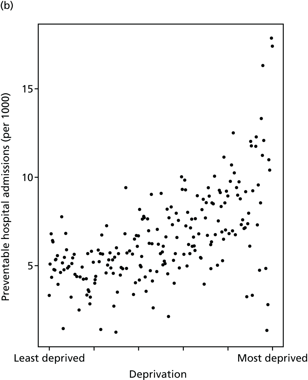
FIGURE 32.
National social gradient in preventable hospitalisation in 2011/12. Notes: (1) dots represent decile groups; (2) the slope of the line is the SII; and (3) the shaded area shows the inequity gap.
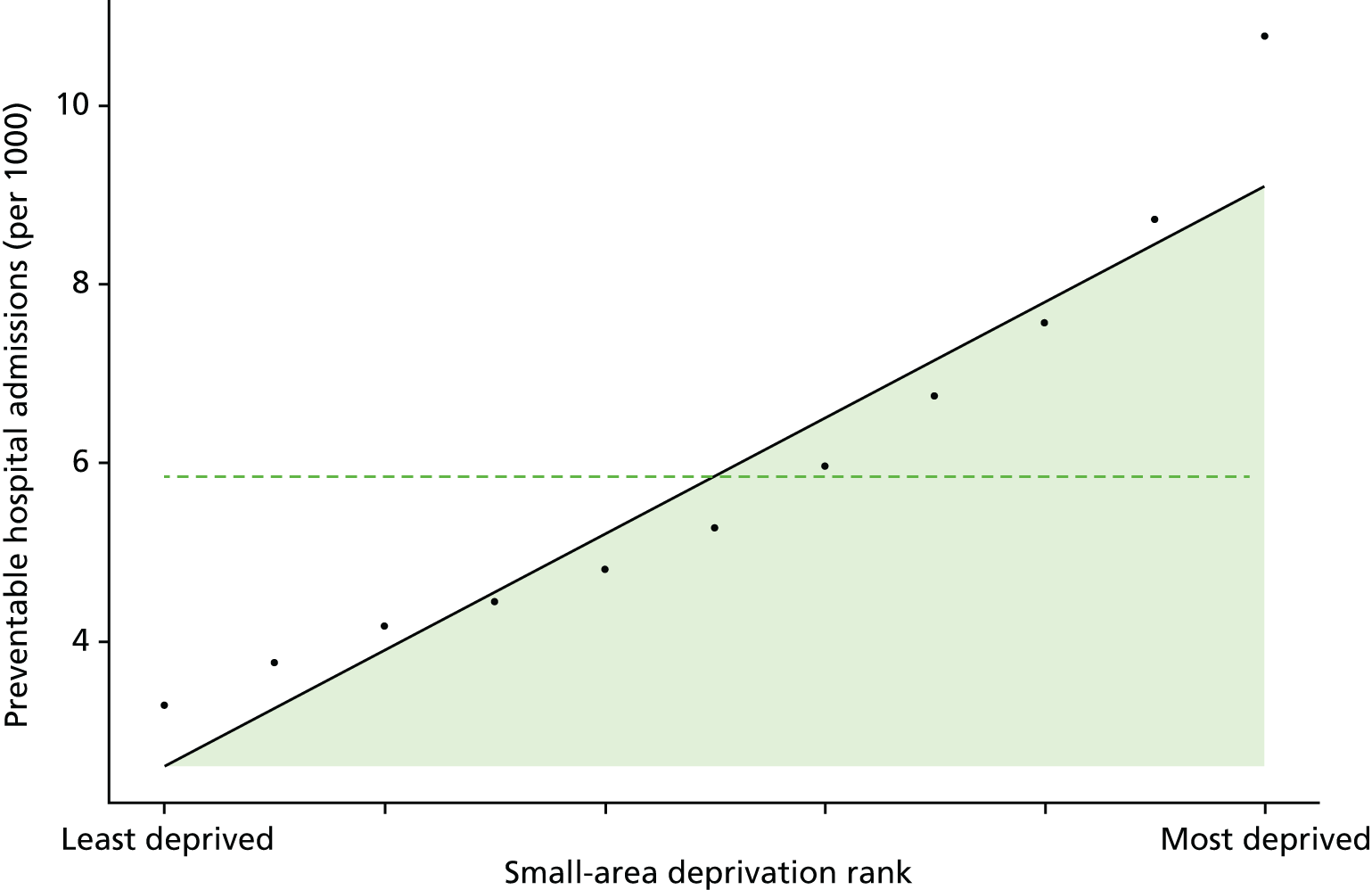
FIGURE 33.
Caterpillar plot of the AGI of inequality in preventable hospitalisation in 2011/12 at the CCG level. Notes: (1) CCGs are ranked from least equitable (left) to most equitable (right); and (2) the dotted horizontal line shows the national average. CCGs to the left with confidence intervals above this line have worse than average equity performance, and vice versa.
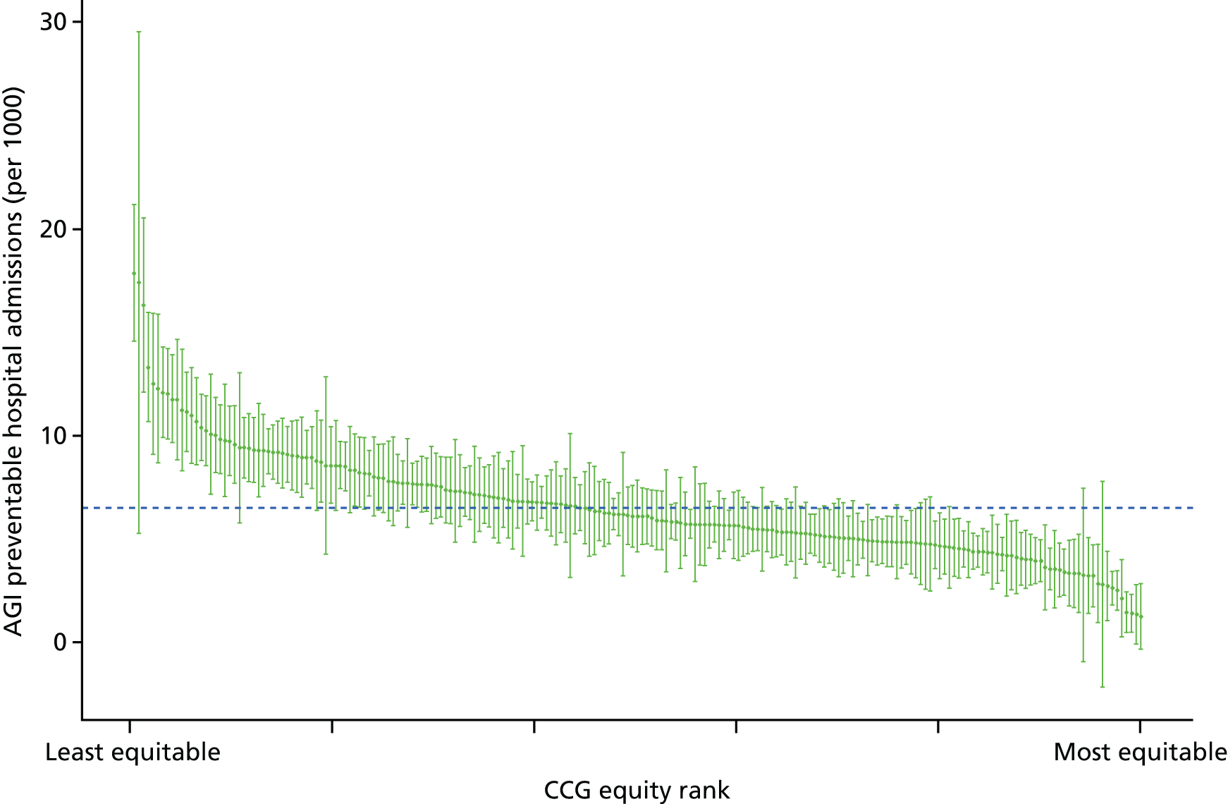
In the unadjusted trends, which do not allow for age and sex, both the SII and RII decline (get better) over time. This difference compared with the adjusted trends is because of demographic change over time: affluent neighbourhoods aged during the 2000s, while there was an increase in younger populations in deprived neighbourhoods. This demographic shift increased preventable hospitalisation in richer neighbourhoods relative to poorer neighbourhoods and hence reduced pro-rich inequality in the unadjusted trends. We think the age- and sex-adjusted trends give a more accurate picture of NHS equity performance, on the basis that the NHS should not receive credit for an apparent reduction in pro-rich inequality resulting from demographic change largely outside the control of the NHS.
A final point to note is the uptick in preventable hospitalisation in 2003/4, which was particularly strong in the two most deprived quintile groups. The cause of this is not known. However, one speculation is that this may be related to change in the supply of GP out of hours care. This uptick in preventable emergency hospitalisation happened around the time of the introduction of the new GP contract which, among other things, allowed GPs to opt out of providing ‘out-of-hours’ cover for emergency care outside normal GP practice working hours. This speculation may be worth exploring in future quasi-experimental studies.
Repeat hospitalisation
Repeat emergency hospitalisation is known as an important routine indicator of health system performance. 115–118 Repeat hospitalisation may be a result of one or a combination of several factors including (but not limited to) quality of care during previous hospitalisation (including early discharge), comprehensive discharge planning,119 primary and community care after discharge (including outpatient follow-up)120 and the patients’ own social support systems and health behaviours. Therefore, repeat hospitalisation is an important indicator of the quality-of-care co-ordination between hospital care, primary care and community care settings.
Studies suggest that greater deprivation is associated with an increased risk of emergency readmission. For instance, in a study in Greater Manchester, Lyratzopoulos et al. 121 found that deprivation was significantly and independently associated with increased risk of emergency medical readmission at 3 and 12 months after initial discharge. Other studies using specific patient groups found similar socioeconomic patterns of hospital readmissions. 122 Repeat hospitalisation not only results in poor health outcomes for patients, it also significantly increases the cost of care for the health-care system. Therefore, reducing repeat hospitalisation is one of the key indicators used to assess hospital performance and the impact of health service organisation for the average patient. 116,123
Our indicator evaluates socioeconomic inequality in repeat hospitalisation between small-area populations from 2001/2 to 2013/14. We define repeat hospitalisation as a proportion of inpatients with one or more subsequent any-cause emergency readmission in the same year. We focus on all-cause rather than cause-specific repeat hospitalisation and on within-year rather than 30-day or 90-day repeat hospitalisation for the following reasons: (1) we are interested in whole-system co-ordinated care, beyond the primary cause of hospital admission and the immediate post-hospital period; and (2) all-cause repeat hospitalisation within the indicator year provides a larger number of events for the purpose of detecting statistically significant differences between CCG-level and national-level absolute inequality gradients.
The denominator for this indicator is the total number of people with an inpatient admission from any cause in a given year. The numerator is the number of people with one or more repeat hospitalisations from any cause in the same calendar year. We used repeat hospitalisation within the indicator year rather than following patients across years because this is less time-consuming in terms of coding and computational burden. In addition, 12-month readmission would result in a less up-to-date indicator by either imposing a 1-year data lag or a focus on patients admitted the year before the indicator year. The drawback of our approach is that it may produce biased estimates of the national social gradient in 12-month readmission, although this is unlikely substantially to hamper comparisons between CCGs and over time. The advantage is that this is a simpler, less computationally expensive and timelier approach. We indirectly standardised each year of data for age and sex at the LSOA level. Further technical details of how this index was computed are presented in Appendix 4.
Rates of repeat hospitalisation have increased substantially over the study period as shown in Figures 34 and 35, coupled with an increase in both absolute and relative inequality in Figures 36 and 37. By 2011/12 there was substantial inequality in repeat hospitalisation, as depicted by the national social gradient graph in Figure 38. The unadjusted trends in Figure 36 show improvement in inequality; however, this is misleading because of disproportionate ageing of the affluent population over time. After age adjustment, the underlying worsening inequality trend becomes clear for both SII and RII, as shown in Figure 37. As discussed in more detail in Chapter 8, the increase in repeat hospitalisation and associated increase in inequality may partly be a sign of success related to increasing multimorbidity as a result of people living longer, although may also partly be a result of shorter lengths of stay in hospital, hospital payment reforms that gave hospitals financial incentives to increase emergency admissions, and, especially towards the end of the 2000s, reductions in social care supply and quality because of financial pressures on local authorities. This inequality appears to be present between CCGs as well as within CCGs, as shown in Figure 39a for 2011/12. Equity performance on repeat hospitalisation shows a slightly positive association with deprivation at the CCG level, although most of this association is driven by a handful of CCGs with unusually high and low equity performance. The caterpillar plot in Figure 40 shows there are substantial numbers of CCGs performing significantly better and worse than the national average in terms of the AGI of inequality.
FIGURE 34.
Matrix plot showing unadjusted trends in repeat hospitalisation by age, sex and deprivation (fixed axes for comparisons across age groups).

FIGURE 35.
Matrix plot showing unadjusted trends in repeat hospitalisation by age, sex and deprivation (free axes for comparisons across deprivation groups).
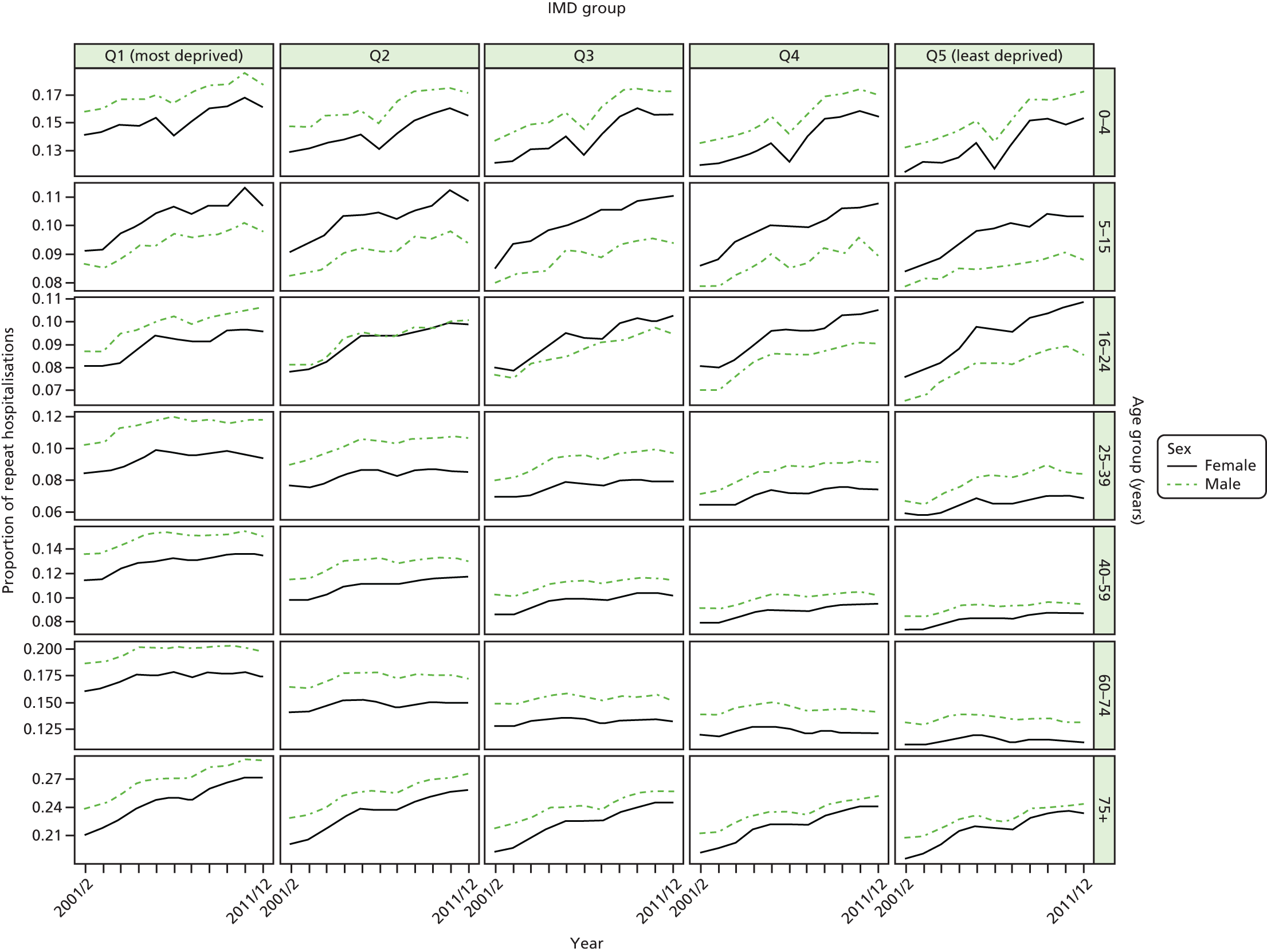
FIGURE 36.
Unadjusted national equity time trends in repeat hospitalisation. Notes: (1) the solid black line shows the most deprived quintile and the solid blue line shows the least deprived quintile; (2) negative SII indicates pro-poor distribution, while a positive SII indicates a pro-rich distribution in absolute terms; and (3) negative RII indicates pro-poor distribution, while a positive RII indicates a pro-rich distribution in relative terms.
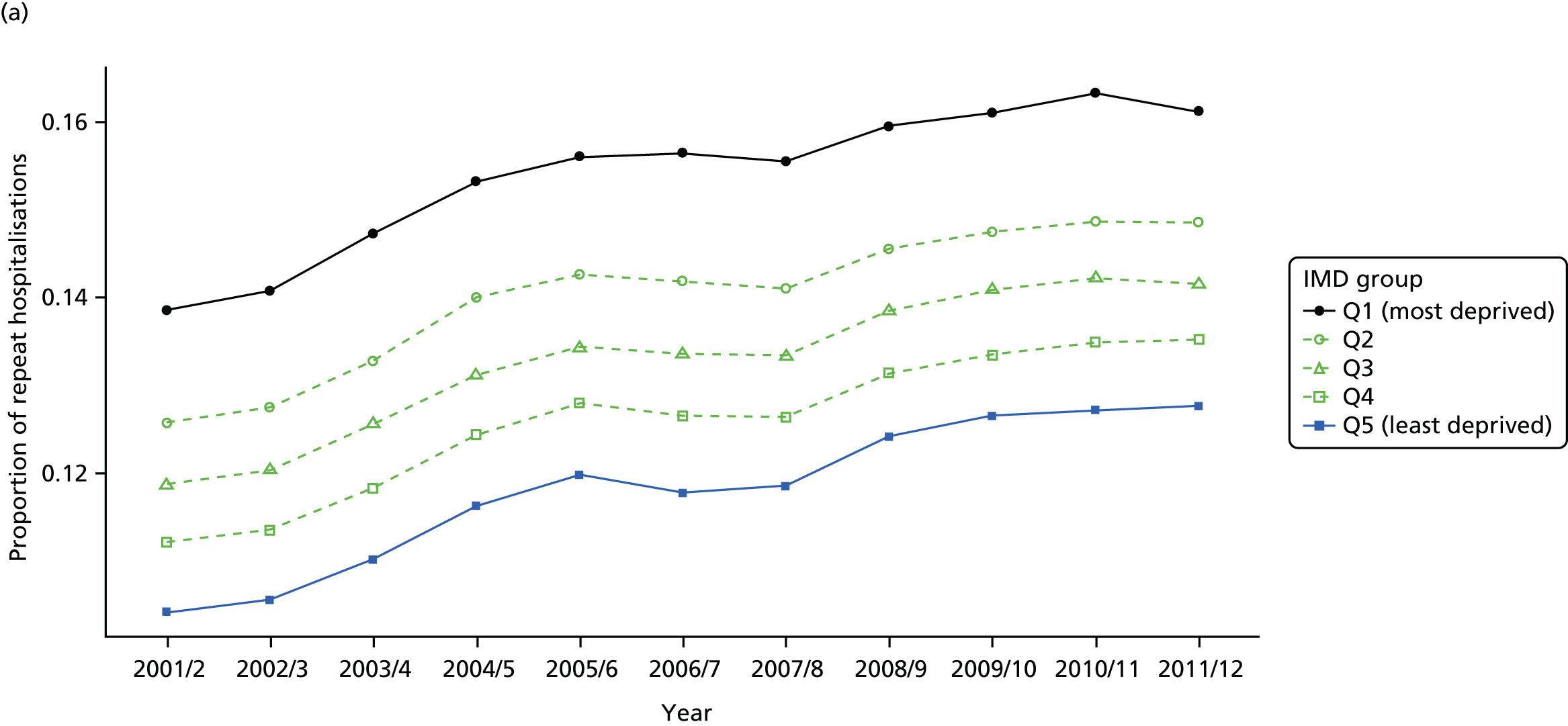
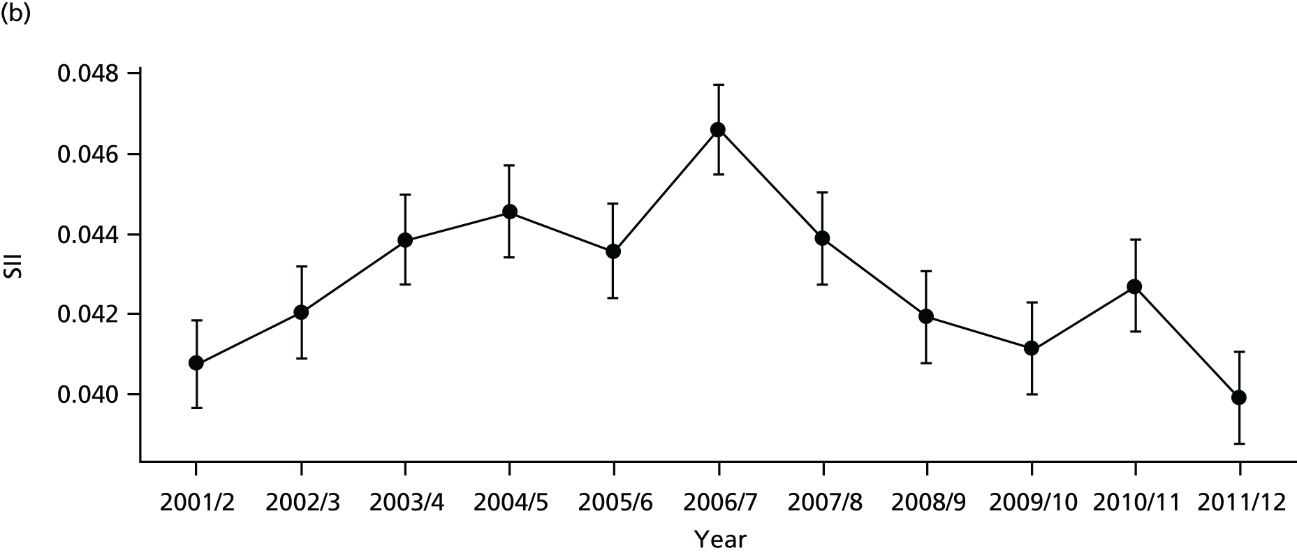
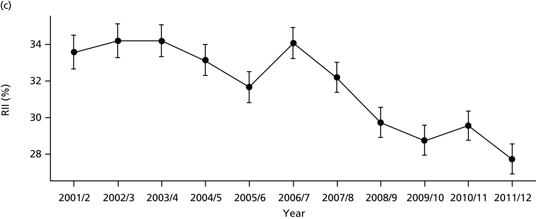
FIGURE 37.
Adjusted national equity time trends in repeat hospitalisation. Notes: (1) the solid black line shows the most deprived quintile and the solid blue line shows the least deprived quintile; (2) negative SII indicates pro-poor distribution, while a positive SII indicates a pro-rich distribution in absolute terms; and (3) negative RII indicates pro-poor distribution, while a positive RII indicates a pro-rich distribution in relative terms.
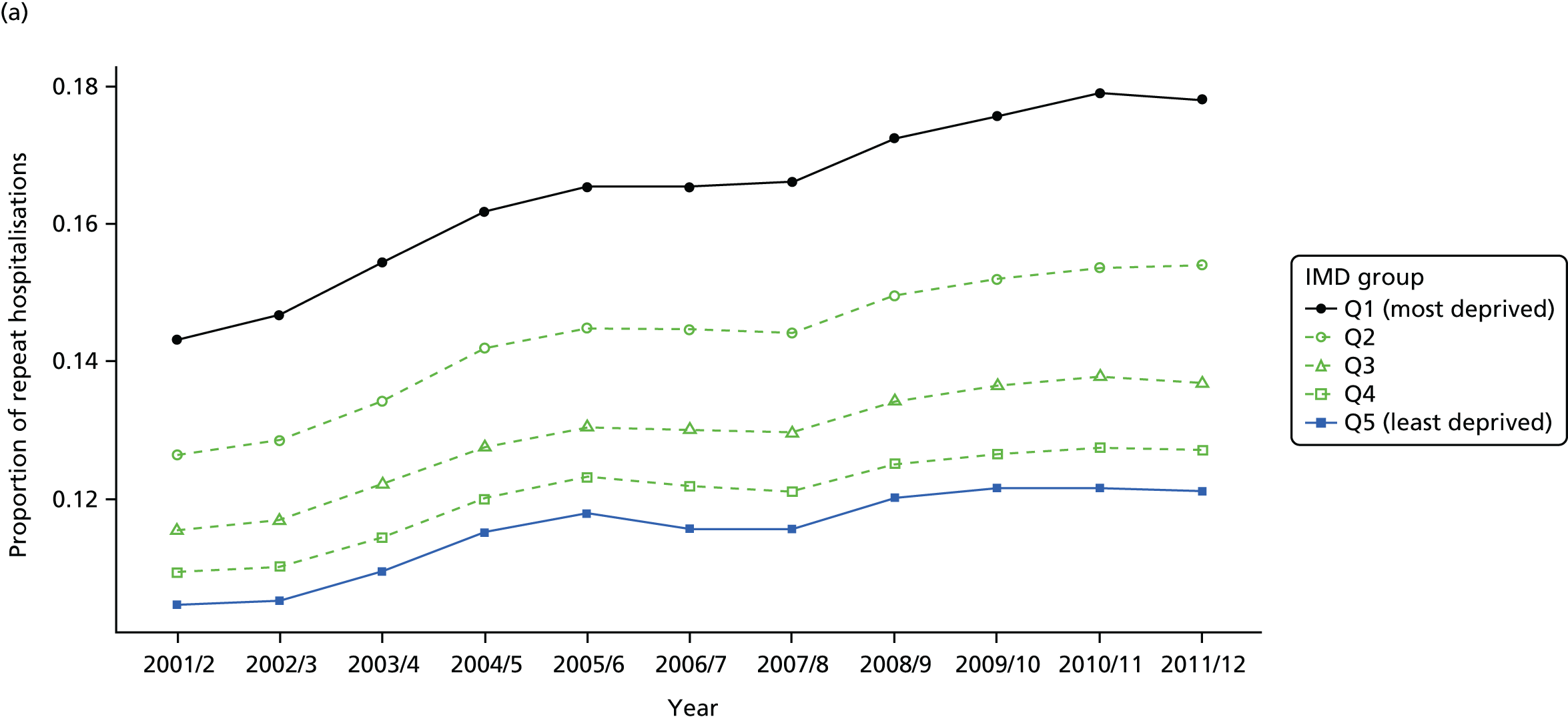
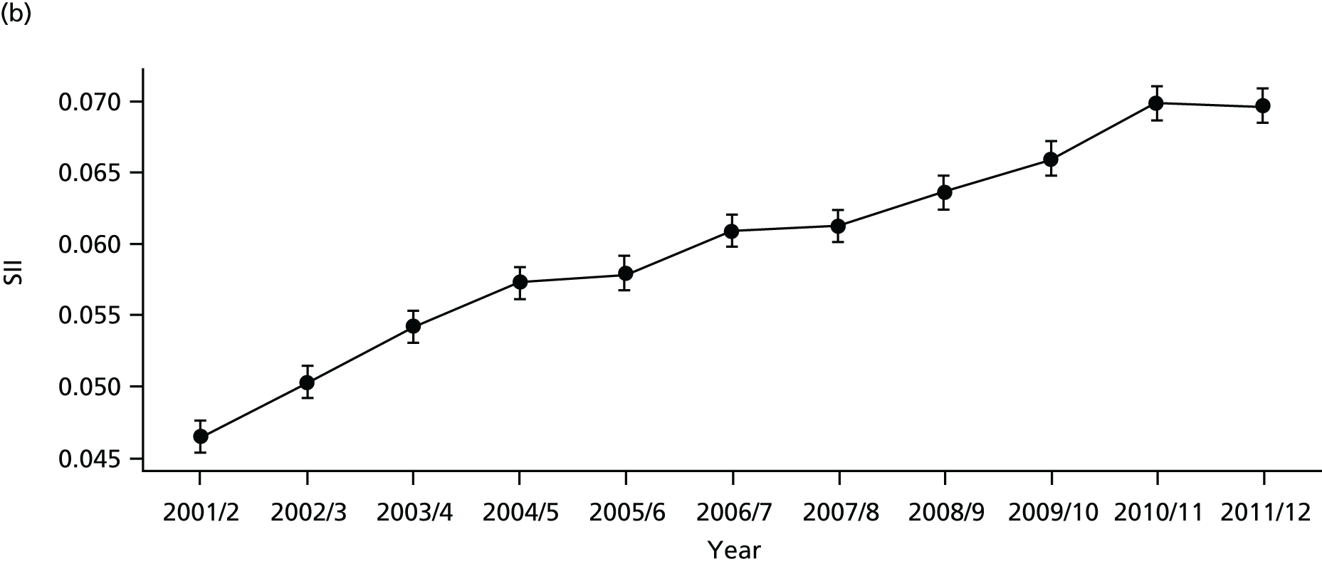
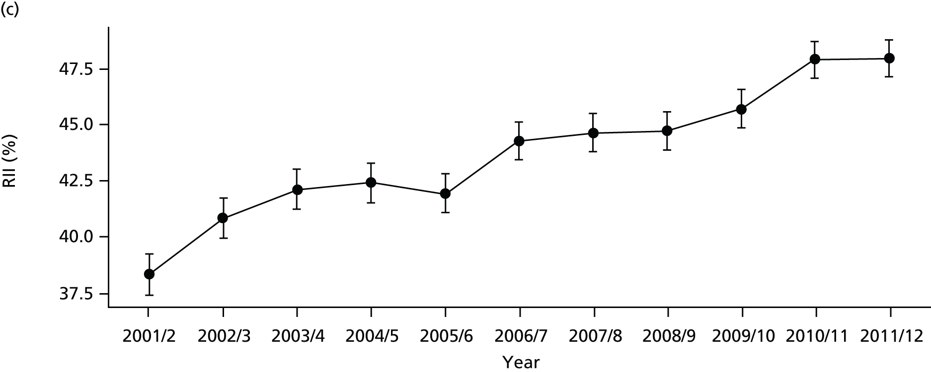
FIGURE 38.
National social gradient in repeat hospitalisation in 2011/12. Notes: (1) dots represent decile groups; (2) the slope of the line is the SII; and (3) the shaded area shows the inequity gap.
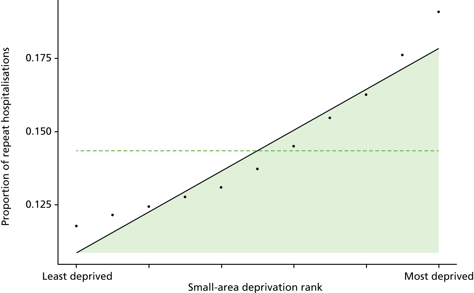
FIGURE 39.
Scatterplots of CCG performance on repeat hospitalisation in 2011/12 against deprivation, showing both mean performance and equity performance (AGI). (a) Mean; and (b) AGI.
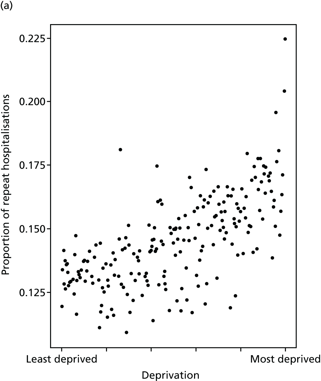
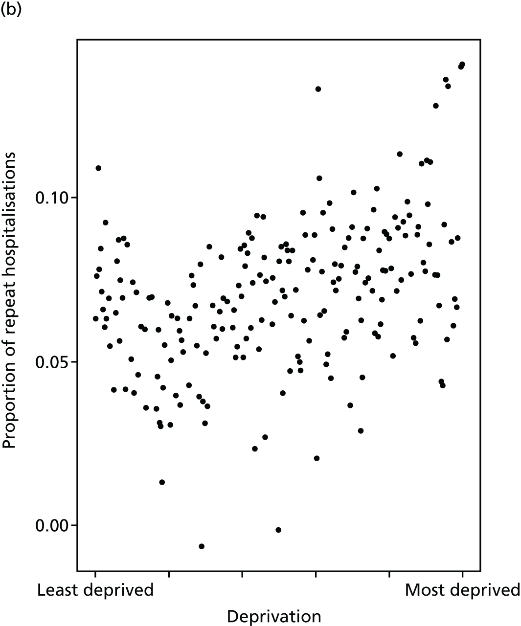
FIGURE 40.
Caterpillar plot of AGI of inequality in repeat hospitalisation in 2011/12 at the CCG level. Notes: (1) CCGs are ranked from least equitable (left) to most equitable (right); and (2) the dotted horizontal line shows the national average. CCGs to the left with confidence intervals above this line have worse than average equity performance, and vice versa.
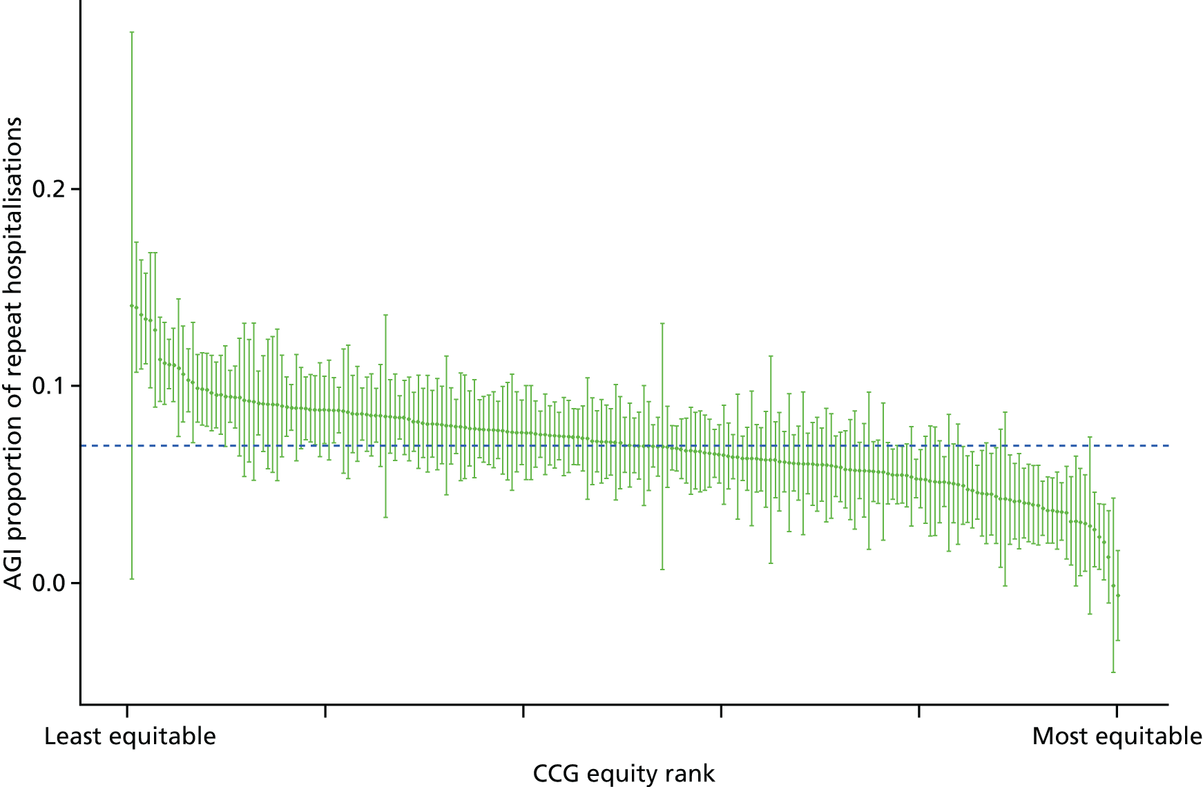
Dying in hospital
Dying in hospital is a useful indicator of the quality of end-of-life care planning. 124 It is directly related to care pathway planning and the availability of palliative care and community nursing care at home. 125,126 Moreover, socioeconomic factors including low levels of social support are associated with increased hospital deaths. 125 A recent systematic review of studies on adult preferences for place of death found that most people prefer to die at home. 127 Specifically, in England, 64% of respondents of a population survey stated that they preferred to die at home rather than in hospital. 128 However, almost half of the deaths in England occur in hospitals (47.2% in 2014/15). 129 This may be because of a combination of factors, involving health and social services and individual and social factors. Dying in hospital is also a financial concern because of high expenditure of end-of-life care in hospitals.
In keeping with our other indicators, we use a general version of this indicator that covers the full spectrum of health-care activity, rather than focusing exclusively on cancer or other specific terminal illnesses. Our indicator measures socioeconomic inequality between small-area populations in the proportion of all deaths that occur in hospital. The numerator for this indicator is the number of deaths from any cause that occurred in hospital in a given year, measured using HES data. The denominator is the total number of deaths from any cause in a given year, irrespective of the place of death, measured using ONS mortality data. The indicator was measured for years 2001/2 to 2011/12. Further technical details of how this index was computed are presented in Appendix 4.
There are no ‘adjusted’ results to present for this indicator, on the basis of the value judgement that age, sex and other patient characteristics are not legitimate reasons for differential rates of deaths in hospital.
The proportion of deaths in hospital has been falling over time in all deprivation groups as shown in Figures 41–43. However, substantial inequality between deprivation groups persists over time with those living in more deprived areas more likely to die in hospital (Figure 44). The correlation plot in Figure 45 shows that this inequality occurs between CCGs, in that more deprived CCGs have higher rates of dying in hospital. However, there is no obvious correlation between the absolute equity gradient within CCGs and deprivation at the CCG level. The caterpillar plot in Figure 46 shows that very few CCGs are statistically distinguishable from the national mean in terms of their absolute gradient in inequality.
FIGURE 41.
Matrix plot showing unadjusted trends in dying in hospital by age, sex and deprivation (fixed axes for comparisons across age groups).
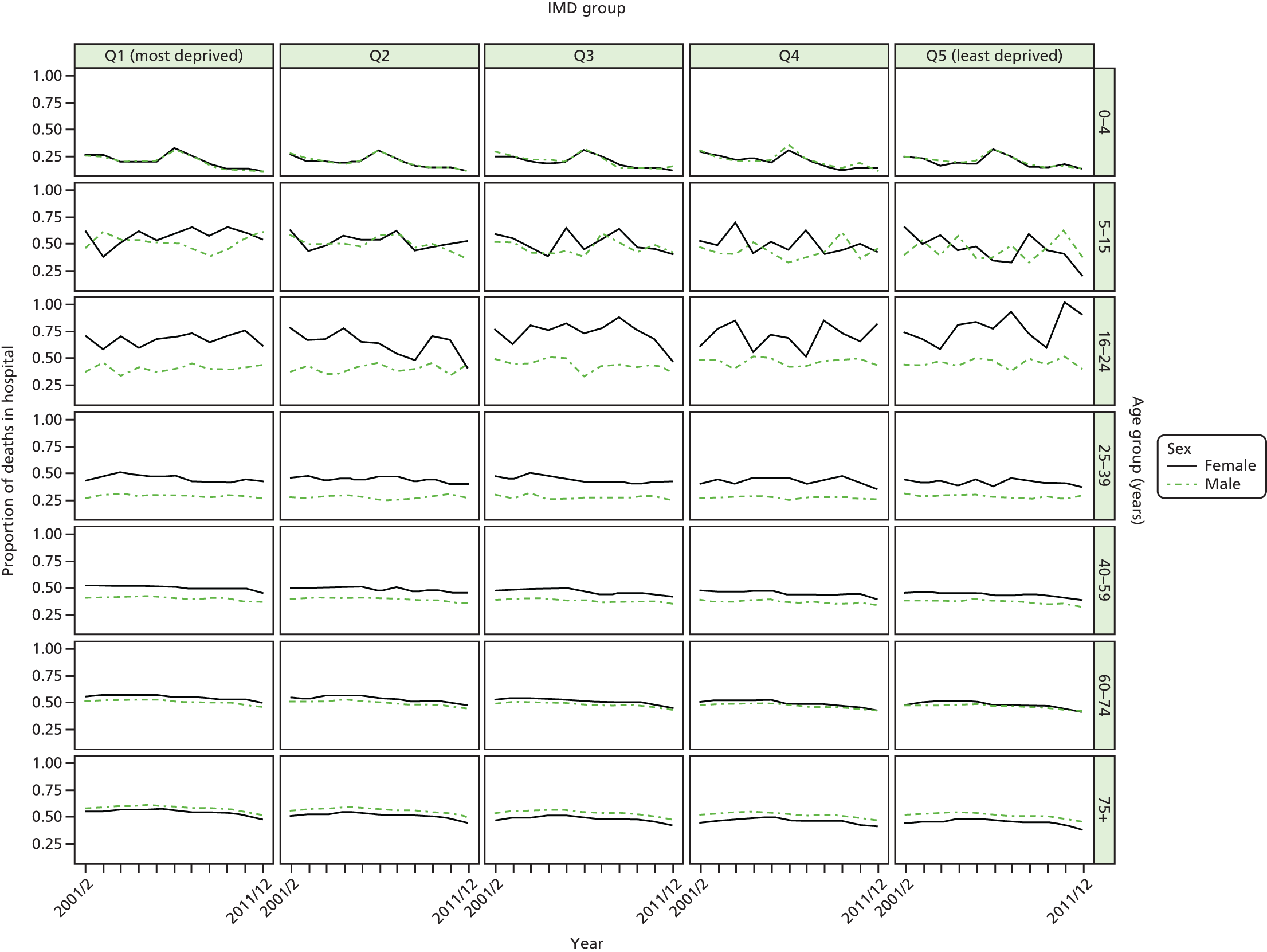
FIGURE 42.
Matrix plot showing unadjusted trends in dying in hospital by age, sex and deprivation (free axes for comparisons across deprivation groups).
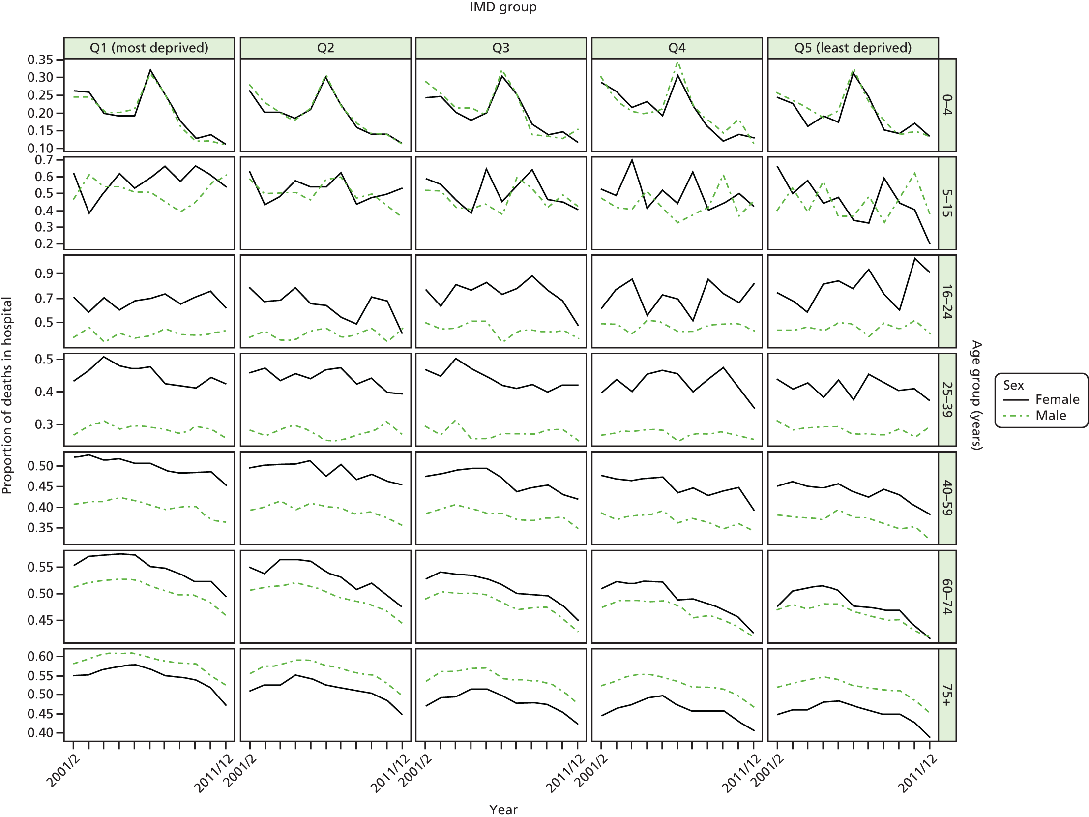
FIGURE 43.
National equity trends in dying in hospital – adjustment not necessary. Notes: (1) the solid black line shows the most deprived quintile and the solid blue line shows the least deprived quintile; (2) negative SII indicates pro-poor distribution, while a positive SII indicates a pro-rich distribution in absolute terms; and (3) negative RII indicates pro-poor distribution, while a positive RII indicates a pro-rich distribution in relative terms.
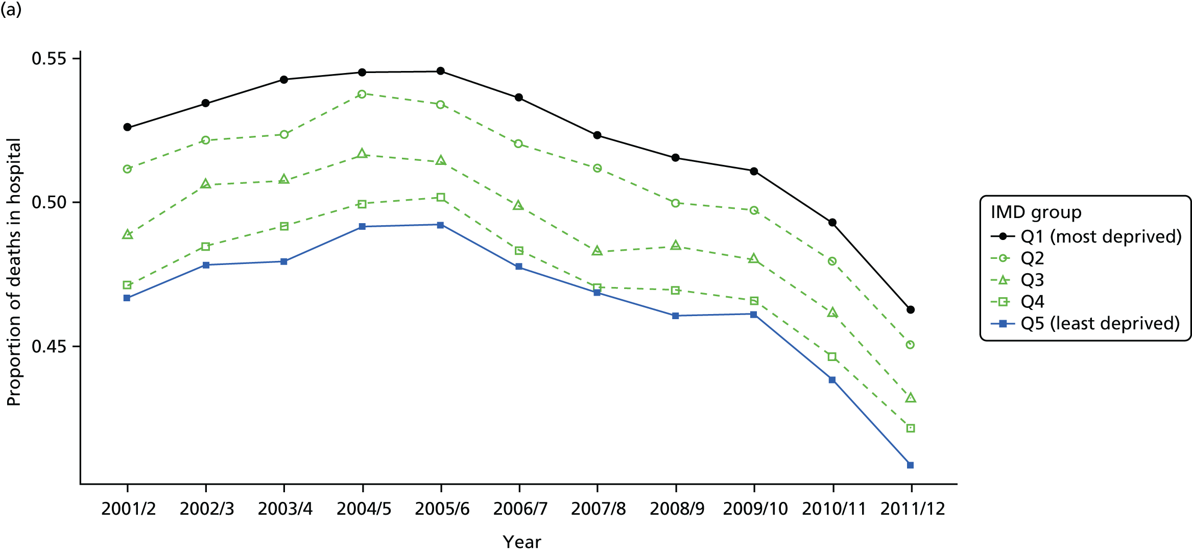
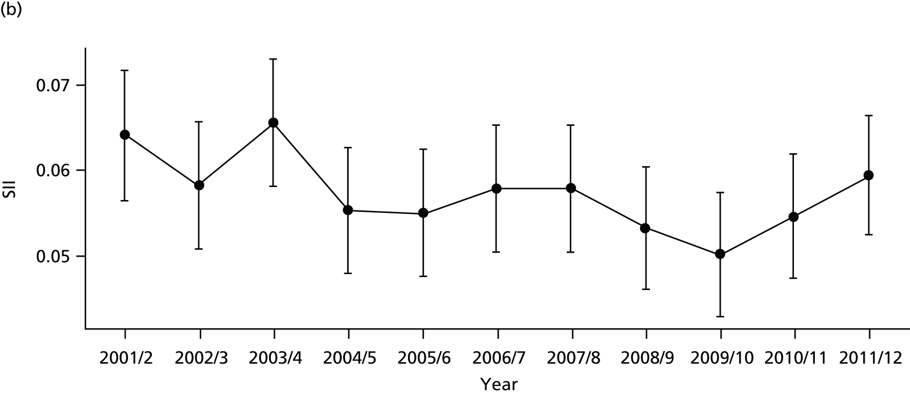
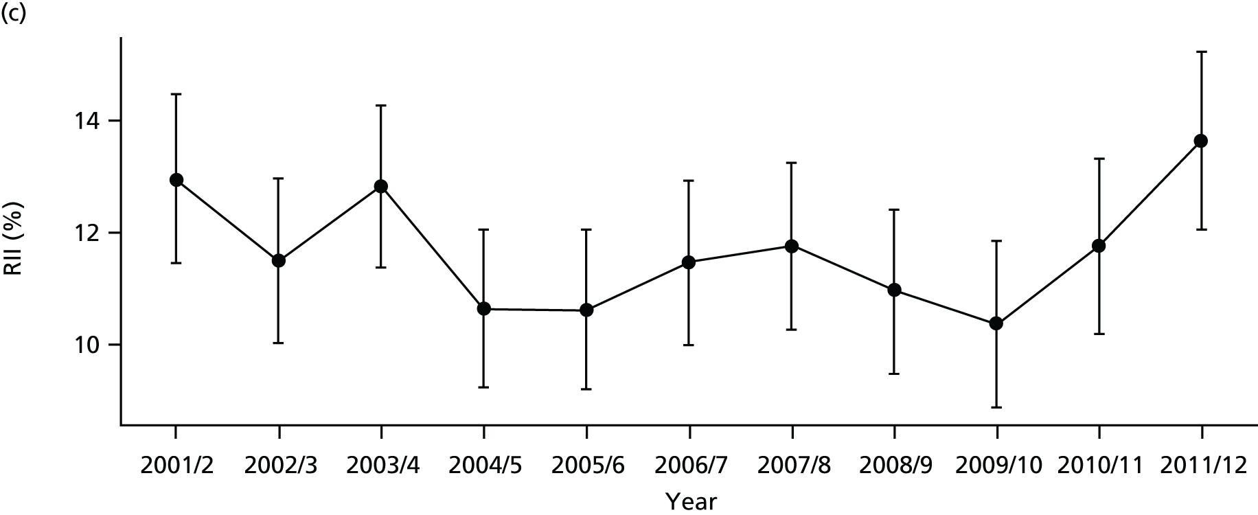
FIGURE 44.
National social gradient in dying in hospital in 2011/12. Notes: (1) dots represent decile groups; (2) the slope of the line is the SII; and (3) the shaded area shows the inequity gap.

FIGURE 45.
Scatterplots of CCG performance on dying in hospital in 2011/12 against deprivation, showing both mean performance and equity performance (AGI). (a) Mean; and (b) AGI.

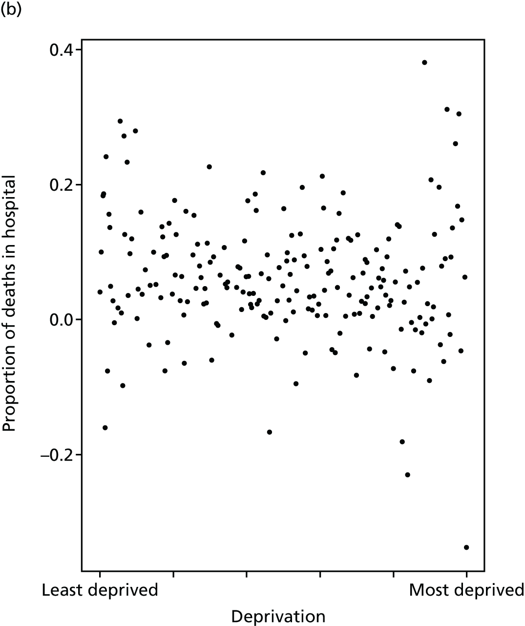
FIGURE 46.
Caterpillar plot of the AGI of inequality in dying in hospital in 2011/12 at the CCG level. Notes: (1) CCGs are ranked from least equitable (left) to most equitable (right); and (2) the dotted horizontal line shows the national average. CCGs to the left with confidence intervals above this line have worse than average equity performance, and vice versa.
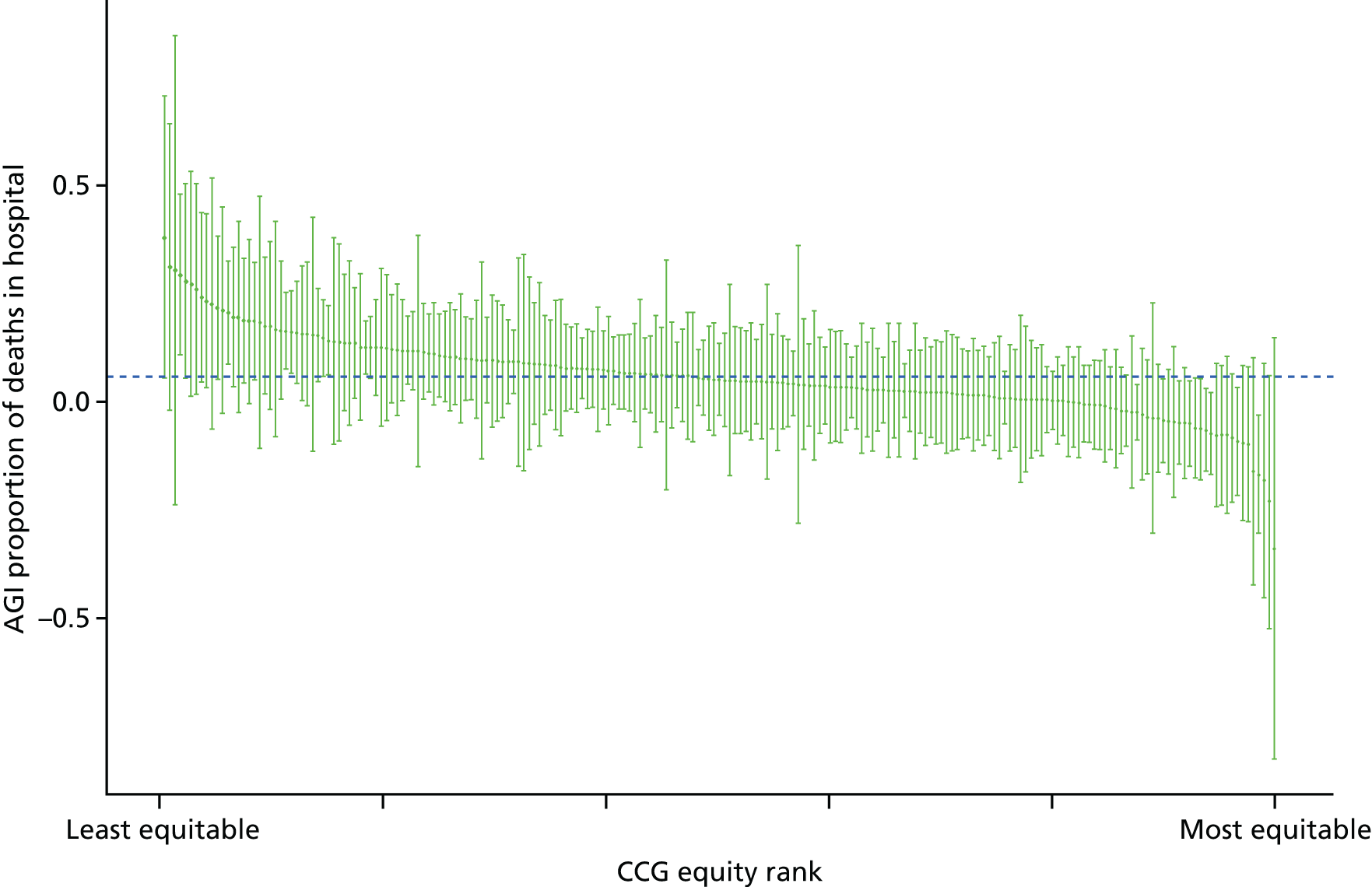
Amenable mortality
Amenable mortality is a standard indicator used internationally to monitor the performance of the health-care system as a whole, and is considered to be particularly useful for monitoring the performance of primary care and the co-ordination of care between primary and secondary services. 58,130,131 Amenable mortality refers to deaths that could be avoided by the health-care system through prevention and treatment, given medical knowledge and technology available at the time of death. 132,133 The concept was first formalised by Rutstein et al. ,134 based on treatable causes of death, and subsequently broadened to include causes preventable by health care which led to the use of the term ‘amenable mortality’. 135,136 The concept of ‘amenable mortality’ is narrower than that of ‘preventable mortality’, however, which also includes mortality preventable by public health measures outside the health-care system. 137
Amenable mortality makes up a significant proportion of total deaths, even in high-income countries. Nolte and McKee138 found that, in 2006/7, amenable mortality accounted for nearly one-quarter of all deaths among people aged < 75 years in 16 high-income countries, including the UK, where the figure was slightly above average, at 26.8%. The relationship between amenable mortality and socioeconomic status has also been investigated in several studies. 139–142 In England, socioeconomic inequality in amenable mortality increased among both men and women between 1990 and 2010; the RII for men increased from 2.21 in 1990 to 2.83 in 2010, and for women increased from 1.67 in 1990 to 2.18 in 2010. 143
This indicator measures socioeconomic inequality between small-area populations in amenable mortality. We defined amenable mortality as the proportion of people dying from causes considered amenable to health care. The numerator for this indicator is the number of deaths from causes considered amenable to health care. The denominator is the total number of deaths from any cause in a given year. We used the list of causes of death considered amenable to health care from the NHS Outcomes Framework (indicator 1.1),144 which in turn is based on a list produced by the ONS. The NHS Outcomes Framework turns the resulting mortality counts into an estimate of ‘potential years of life lost’ from premature deaths aged < 75 years. However, we have used a simple all-age mortality rate including deaths in those aged ≥ 75 years, as (1) our approach is more comprehensive (people aged > 75 years experience by far the highest rate of amenable mortality) and (2) based on advice from two lay members of our advisory group and a media expert, we believe that mortality rates are easier for the public to understand than ‘potential years of life lost’. We indirectly standardise amenable mortality for age and sex at the LSOA level. Further technical details of how this index was computed are presented in Appendix 4.
Amenable mortality has fallen in all deprivation groups over time, with some sign of an accelerated decline from 2004/5 when the primary care pay-for-performance contract was implemented (see Figures 47–50). Once adjusted for age and sex, there is a clear reduction in absolute inequality but a clear rise in relative inequality. The difference is because of the substantial declining trend in the mean over time. Relative inequality is absolute inequality divided by the mean, and so the smaller the mean, the larger the relative inequality. Inequality appears highly pronounced between CCGs (Figure 51). There is also a slight positive association between equity performance on amenable mortality and deprivation at the CCG level, although this is much weaker than the association with average levels of amenable mortality (Figure 52). The caterpillar plot in Figure 53 shows that rather few CCGs are statistically distinguishable from the national mean in terms of their absolute inequality performance on amenable mortality.
FIGURE 47.
Matrix plot showing unadjusted trends in amenable mortality by age, sex and deprivation (fixed axes for comparisons across age groups).
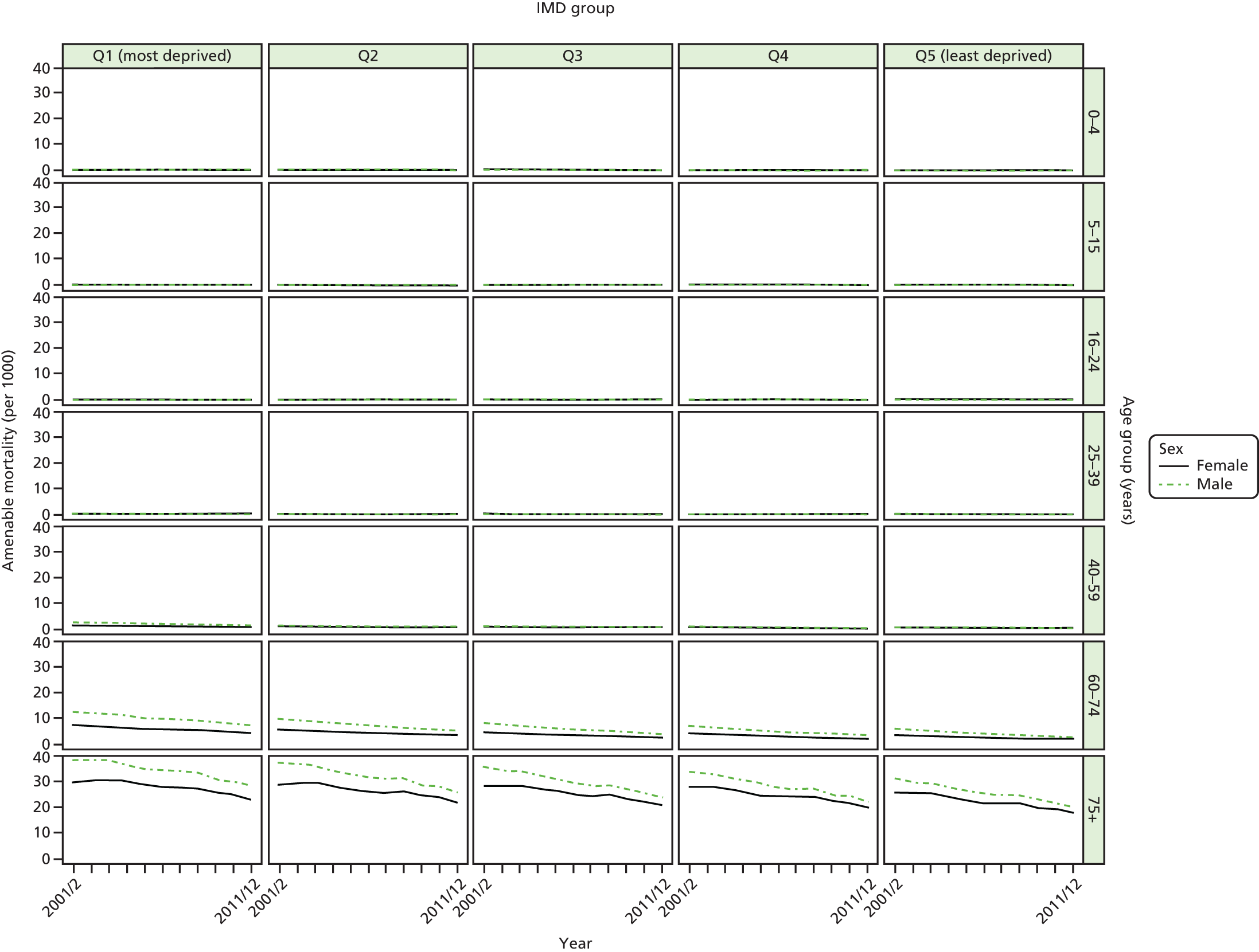
FIGURE 48.
Matrix plot showing unadjusted trends in amenable mortality by age, sex and deprivation (free axes for comparisons across deprivation groups).

FIGURE 49.
Unadjusted national equity trends in amenable mortality. Notes: (1) the solid black line shows the most deprived quintile and the solid blue line shows the least deprived quintile; (2) negative SII indicates pro-poor distribution, while a positive SII indicates a pro-rich distribution in absolute terms; and (3) negative RII indicates pro-poor distribution, while a positive RII indicates a pro-rich distribution in relative terms.
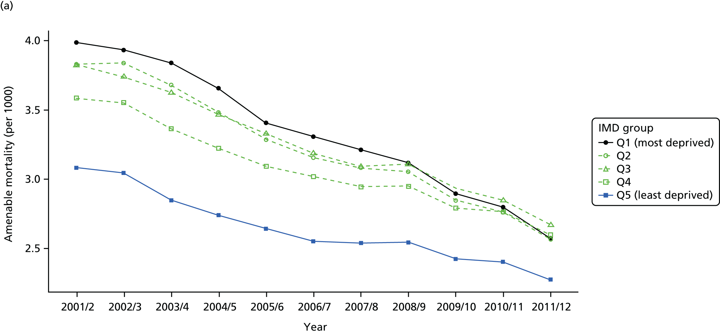


FIGURE 50.
Adjusted national equity trends for amenable mortality. Notes: (1) the solid black line shows the most deprived quintile and the solid blue line shows the least deprived quintile; (2) negative SII indicates pro-poor distribution, while a positive SII indicates a pro-rich distribution in absolute terms; and (3) negative RII indicates pro-poor distribution, while a positive RII indicates a pro-rich distribution in relative terms.
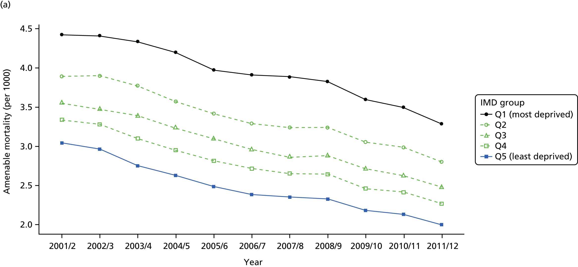
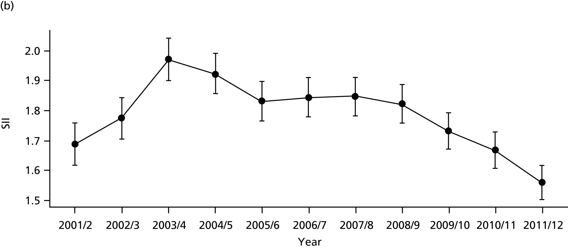
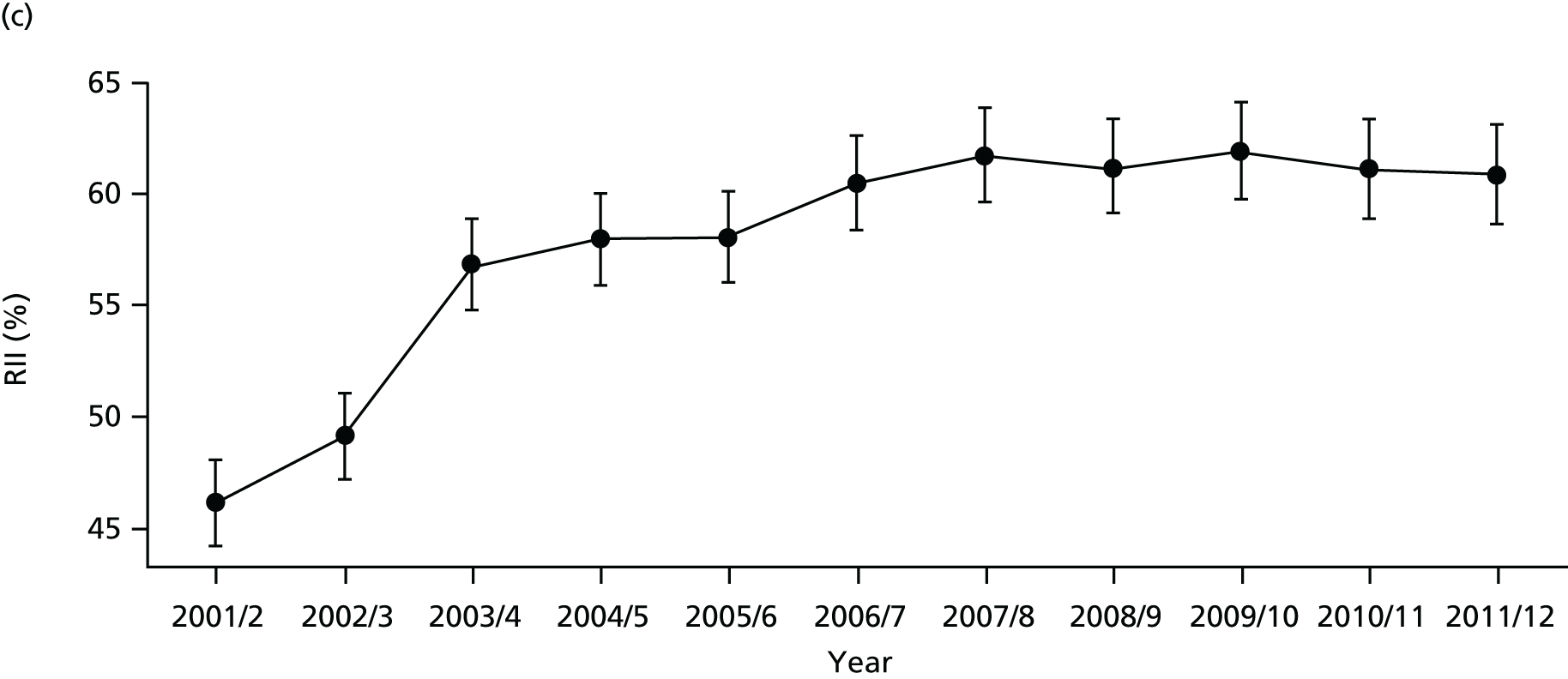
FIGURE 51.
National social gradient in amenable mortality in 2011/12. Notes: (1) dots represent decile groups; (2) the slope of the line is the SII; and (3) the shaded area shows the inequity gap.
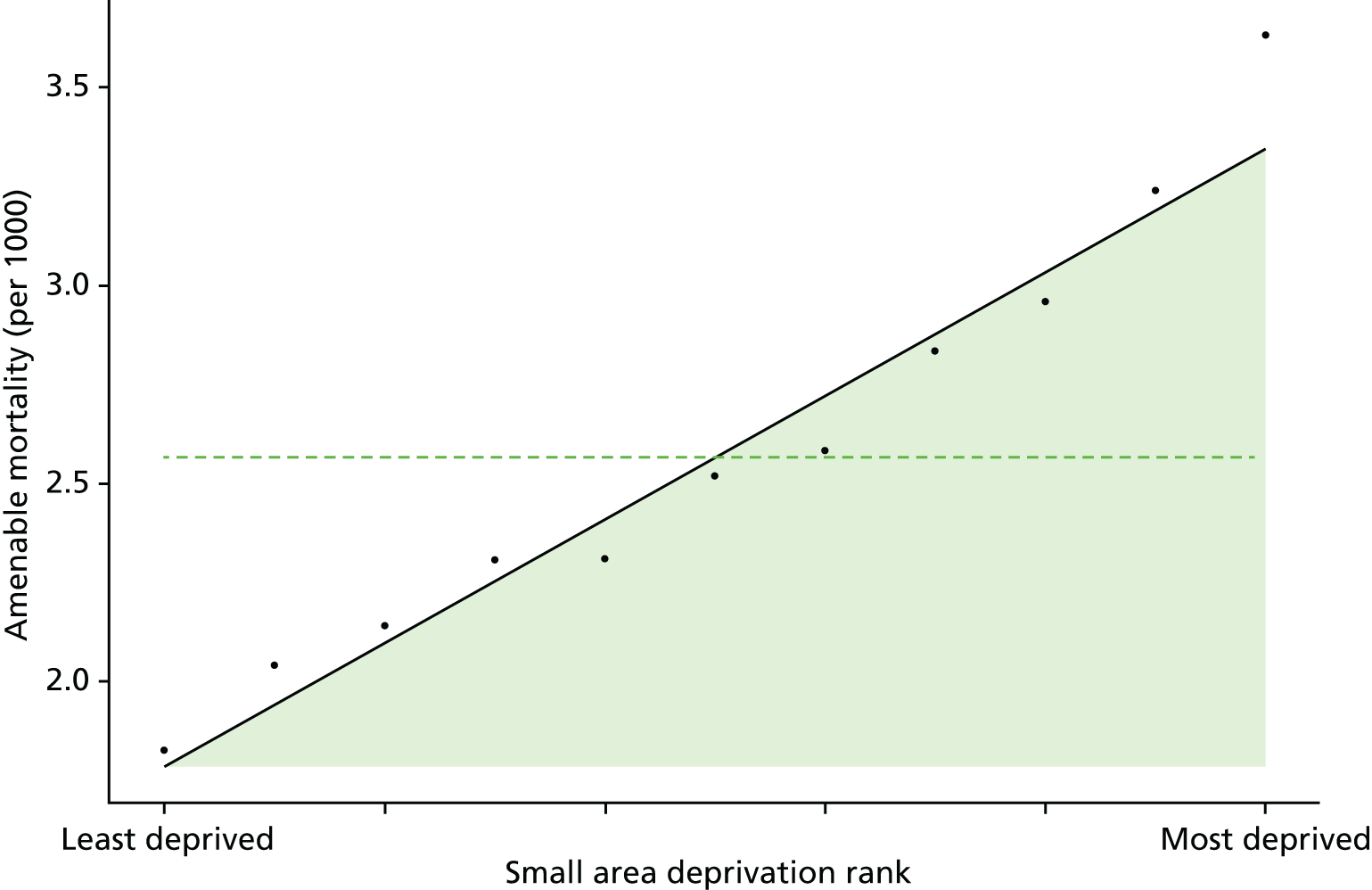
FIGURE 52.
Scatterplots of CCG performance on amenable mortality 2011/12 against deprivation, showing both mean performance and equity performance (AGI). (a) Mean; and (b) AGI.
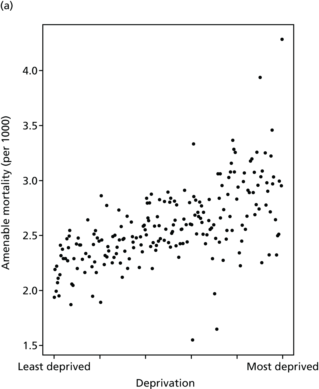
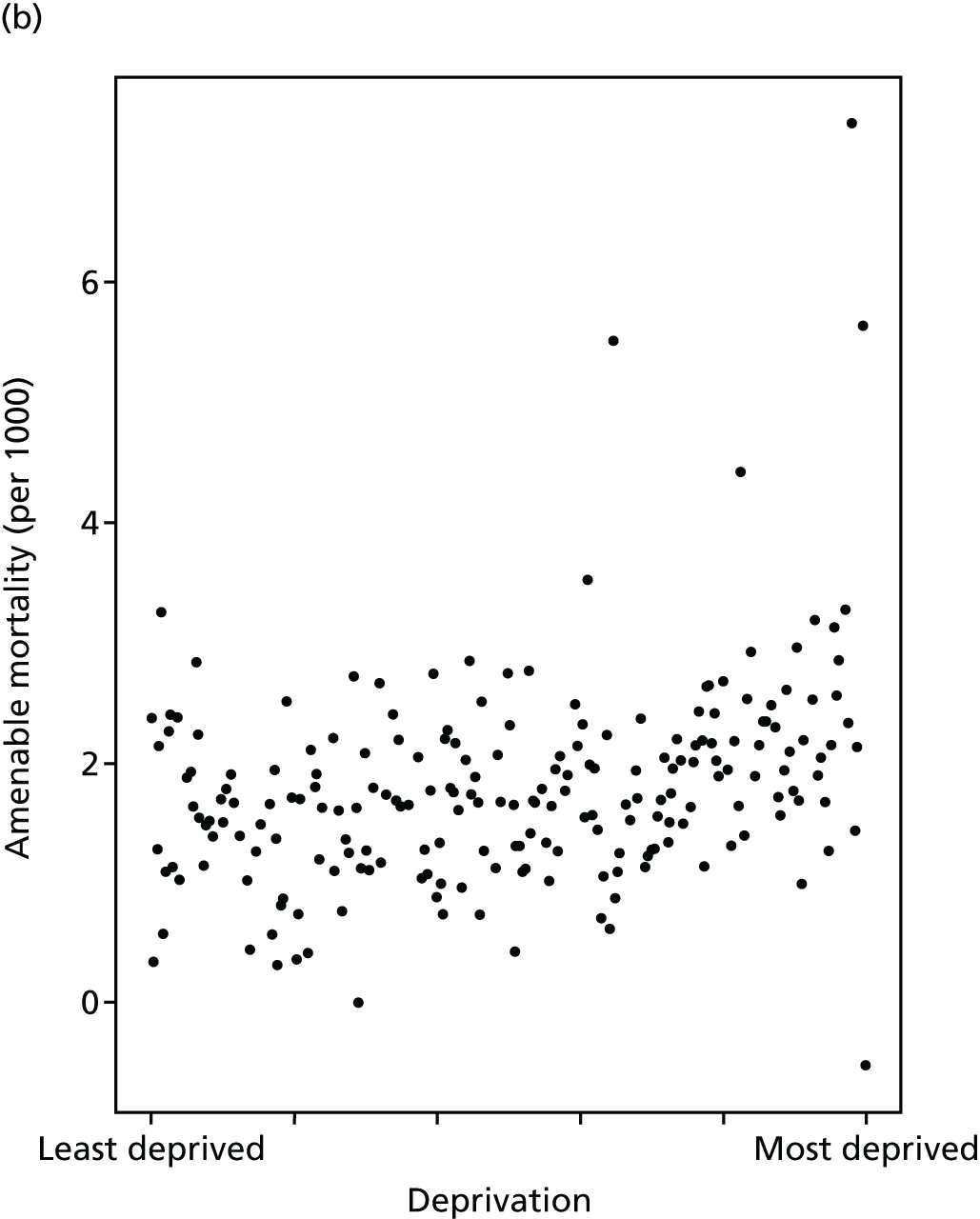
FIGURE 53.
Caterpillar plot of AGI of inequality in amenable mortality in 2011/12 at the CCG level. Notes: (1) CCGs are ranked from least equitable (left) to most equitable (right); and (2) the dotted horizontal line shows the national average. CCGs to the left with confidence intervals above this line have worse than average equity performance, and vice versa.
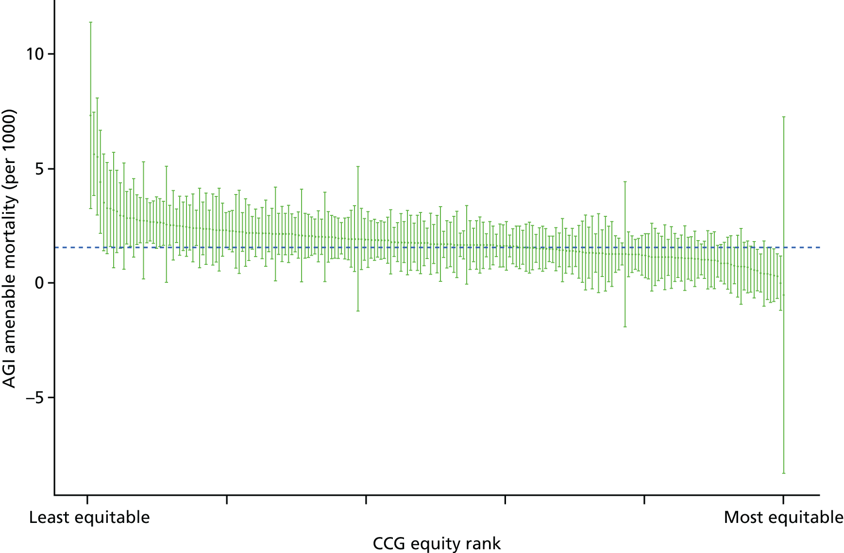
Overall mortality
Overall all-age all-cause mortality refers to the number of deaths for all ages and all causes in a given year as a proportion of the total number of people alive at the start of the year. We use all-age all-cause mortality as a contextual indicator of inequality in health, to help interpret levels and trends in our seven health-care equity indicators. Change in this indicator over time may partly reflect change in NHS delivery, but will also reflect change in the socioeconomic patterning of risk factors and health behaviours because of wider social determinants of health outside the health-care system.
In the past, some international studies have used all-cause mortality to measure and compare the performance of health-care systems. For instance, the WHO has reported all-cause mortality rates to compare health outcomes across countries. 145 However, it is by now well established that health care is only one of many social determinants of health,6 and so any credible measure of the role of health care in tackling these wider health inequalities has to focus on indicators that are more directly sensitive to health-care delivery.
In the UK, the ONS produces annual statistics for all-cause mortality by age and sex groups. 146 This provides an important indication of the overall mortality trend and provides the basis for exploring cause-specific mortality. 147 A number of studies have explored socioeconomic inequalities in all-cause mortality. Studies conducted in high-income countries, including the UK, found statistically significant evidence of higher rate of all-cause mortality in lower socioeconomic groups. 148–152 In the case of England, although population-level all-cause mortality rates have been decreasing, area-level deprivation is associated with higher rates of all-cause mortality. 153
This indicator measures the socioeconomic inequality between small-area populations in all-cause mortality rate. We define all-cause mortality as the number of deaths per 1000 people from all causes at all ages. The numerator for this indicator is the number of deaths from any cause that occurred in a given year. The denominator is the total number of people alive at the start of a given year. The indicator was measured for years 2001/2 to 2011/12. As the age and sex structure of each area can affect the mortality rate, using the crude mortality rate would be inappropriate. Hence, in line with the literature, we adjust the mortality rate by taking account of the age and sex structure of the population. Further technical details of how this index was computed are presented in Appendix 4.
The trend in overall mortality is similar to that in amenable mortality, having fallen in all deprivation groups over time as shown in Figures 54 and 55. Once adjusted for age and sex, absolute inequality in overall mortality shows a rise during the early 2000s followed by a fall from 2008 onwards (Figures 56 and 57). Relative inequality shows a similar pattern, except inequality merely flattens out from 2008 onwards: the difference between the two, as before, being the declining mean. Inequality appears to be highly prominent between areas as shown in Figure 58. The caterpillar plot in Figure 59 shows that very few CCGs are statistically distinguishable from the national mean in terms of their absolute inequality performance on overall mortality. As with amenable mortality, there is a positive association between equity and deprivation at the CCG level, although this is much weaker than the association between deprivation and average mortality as shown in Figure 60.
FIGURE 54.
Matrix plot showing unadjusted trends in overall mortality by age, sex and deprivation (fixed axes for comparisons across age groups).
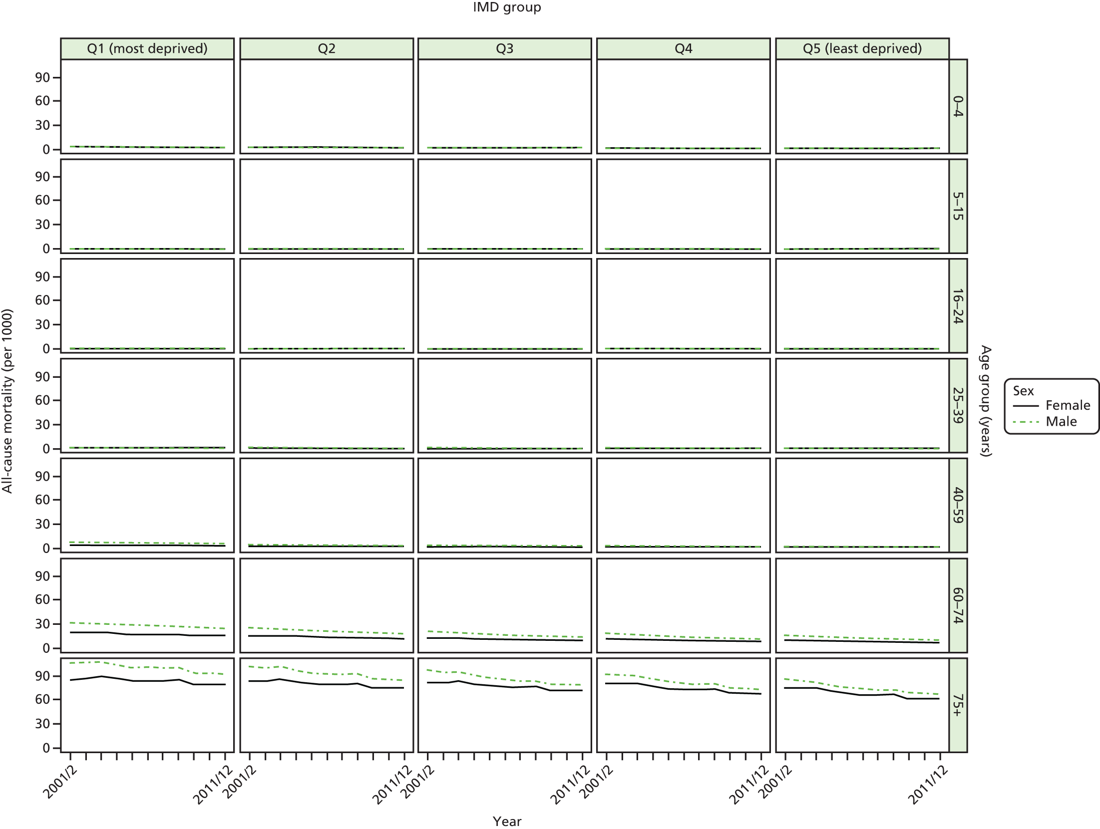
FIGURE 55.
Matrix plot showing unadjusted trends in overall mortality by age, sex and deprivation (free axes for comparisons across deprivation groups).
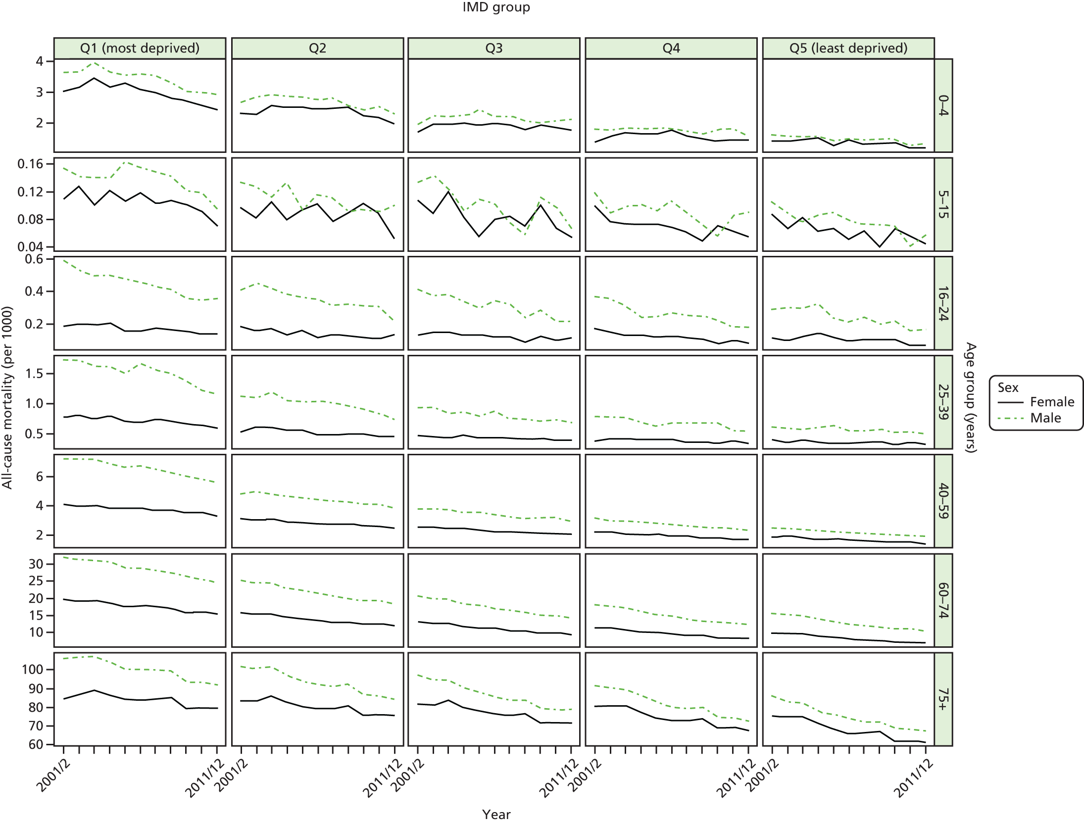
FIGURE 56.
Unadjusted national equity trends in mortality. Notes: (1) the solid black line shows the most deprived quintile and the solid blue line shows the least deprived quintile; (2) negative SII indicates pro-poor distribution, while a positive SII indicates a pro-rich distribution in absolute terms; and (3) negative RII indicates pro-poor distribution, while a positive RII indicates a pro-rich distribution in relative terms.
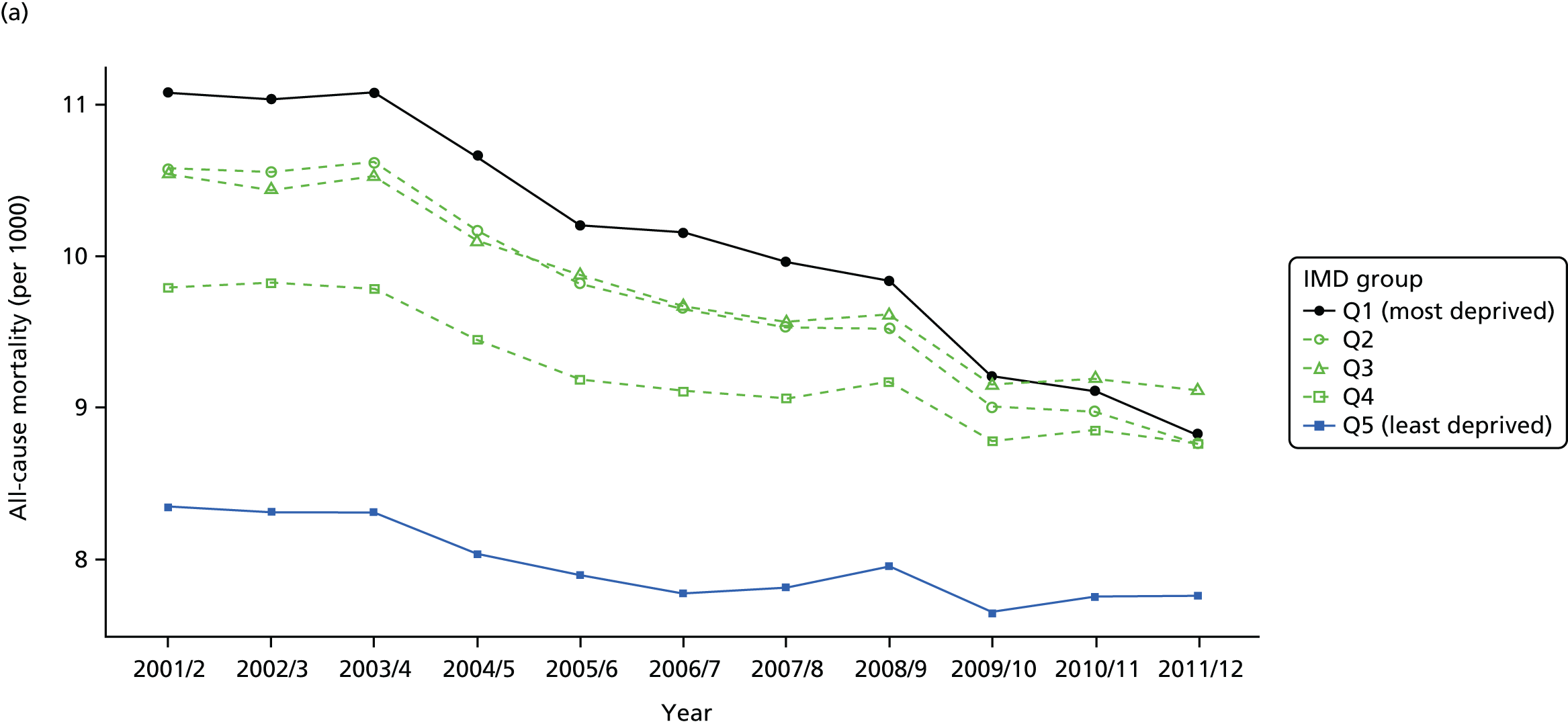
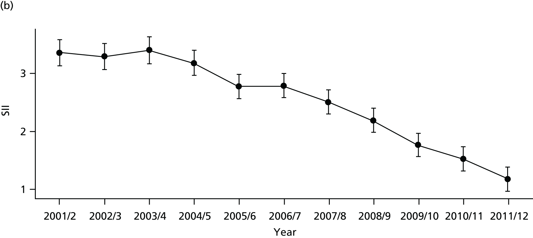

FIGURE 57.
Adjusted national equity trends in mortality. Notes: (1) the solid black line shows the most deprived quintile and the solid blue line shows the least deprived quintile; (2) negative SII indicates pro-poor distribution, while a positive SII indicates a pro-rich distribution in absolute terms; and (3) negative RII indicates pro-poor distribution, while a positive RII indicates a pro-rich distribution in relative terms.

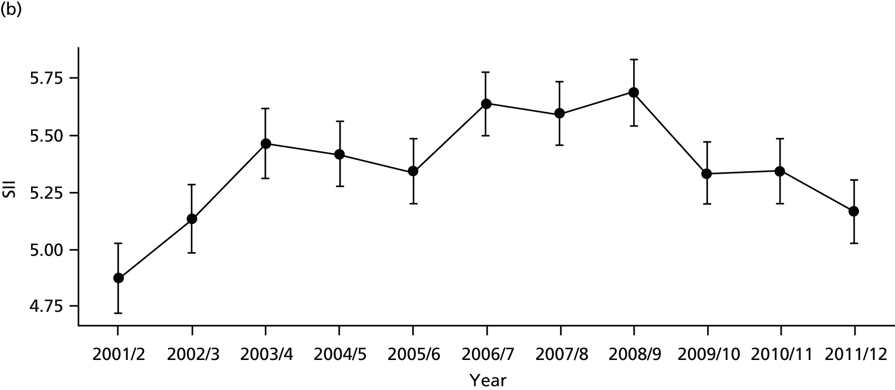
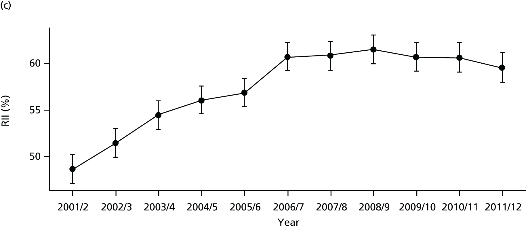
FIGURE 58.
National social gradient in mortality in 2011/12. Notes: (1) dots represent decile groups; (2) the slope of the line is the SII; and (3) the shaded area shows the inequity gap.
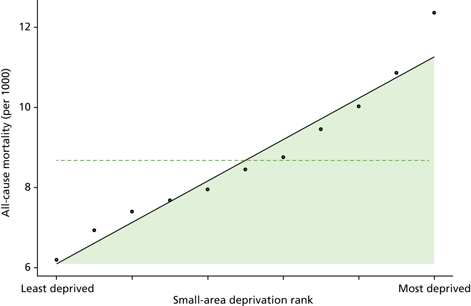
FIGURE 59.
Caterpillar plot of AGI of inequality in mortality in 2011/12 at the CCG level. Notes: (1) CCGs are ranked from least equitable (left) to most equitable (right); and (2) the dotted horizontal line shows the national average. CCGs to the left with confidence intervals above this line have worse than average equity performance, and vice versa.
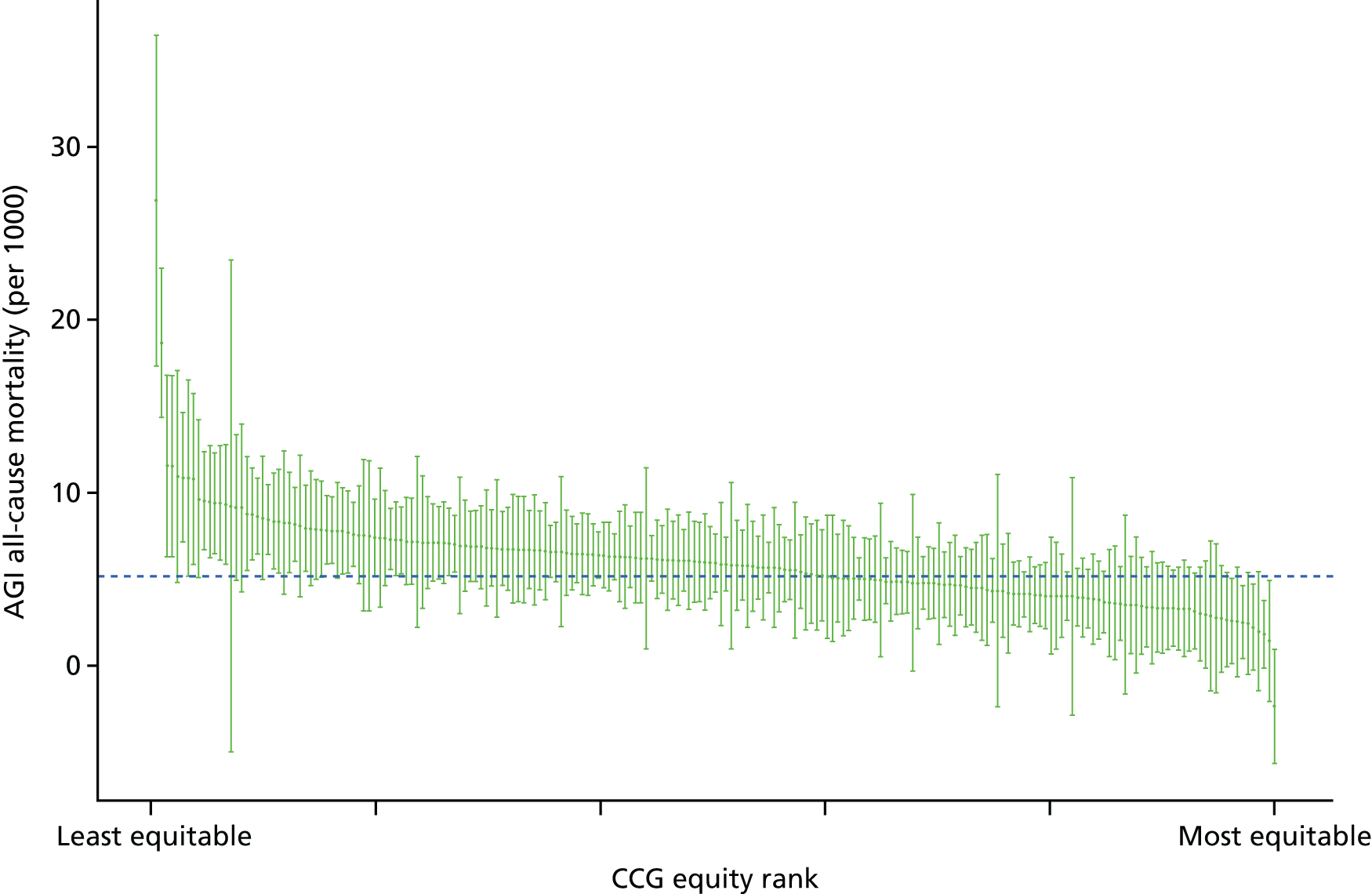
FIGURE 60.
Scatterplots of CCG performance on all-cause mortality in 2011/12 against deprivation, showing both mean performance and equity performance (AGI). (a) Mean; and (b) AGI.

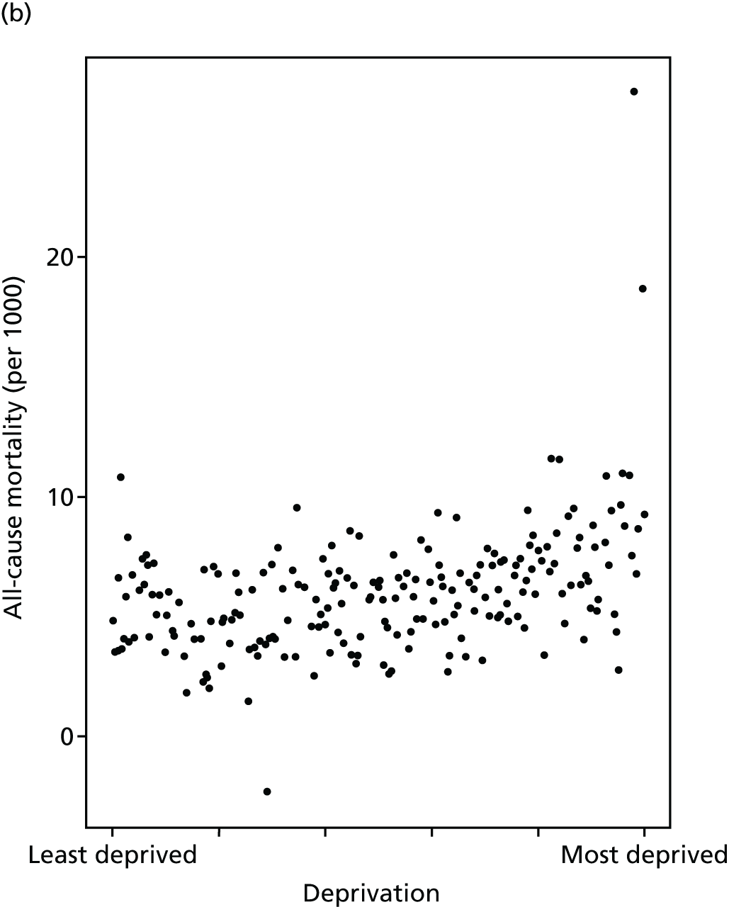
Summary of findings on local health-care equity monitoring
In 2011/12, in individual statistical comparisons at the 95% level, well over 20% of CCGs were found to perform significantly differently on equity than the national benchmark, including at least 10% better and 10% worse, using annual data for the following five general indicators: (1) primary care supply, (2) primary care quality, (3) hospital waiting time, (4) preventable hospitalisation, and (5) repeat hospitalisation (Table 3). This was not possible for the remaining three indicators. For indicator (6), dying in hospital, only 8% of CCGs were significantly different from average: 3% worse and 5% better. For indicator (7), amenable mortality, 11% were significantly different from average: 8% worse and 3% better. Finally, for indicator (8), overall mortality, 17% were significantly different from the national average, but most of these were significantly worse: only 3% were significantly better. Pooling additional years of data did not improve substantially the ability to detect significant differences.
| Indicator number | Indicator | Performance | |||||
|---|---|---|---|---|---|---|---|
| Worse | Better | Neither | |||||
| Count | % | Count | % | Count | % | ||
| 1 | Primary care supply | 39 | 18 | 41 | 19 | 131 | 62 |
| 2 | Primary care quality | 60 | 28 | 39 | 18 | 112 | 53 |
| 3 | Hospital waiting time | 38 | 18 | 21 | 10 | 152 | 72 |
| 4 | Preventable hospitalisation | 45 | 21 | 60 | 28 | 106 | 50 |
| 5 | Repeat hospitalisation | 33 | 16 | 36 | 17 | 142 | 67 |
| 6 | Dying in hospital | 7 | 3 | 10 | 5 | 194 | 92 |
| 7 | Amenable mortality | 17 | 8 | 6 | 3 | 188 | 89 |
| 8 | Overall mortality | 29 | 14 | 6 | 3 | 176 | 83 |
Note that our overall findings on the total number of CCGs differing from the national mean must be treated with appropriate caution, as we did not perform any statistical correction for multiple testing and neither did we use statistical control limits to explore the normal range of variation in the SII in order to distinguish ‘general-cause’ variation from ‘special-cause’ variation worthy of concern. 154 Rather, we simply examine whether or not each individual CCG is statistically different from the national mean at the 95% level of statistical significance. We might of course expect that up to 5% of CCGs might pass this test by chance, because of the normal ‘general-cause’ variation, although not the 20% we observe. We leave the further refinement of our statistical methods for future research, as to our knowledge an appropriate statistical formula for setting control limits for social gradients has not previously been developed.
Chapter 6 Development of equity visualisation tools
Introduction
We now turn from the data analytical ‘engine room’ of our equity indicators to the communication and knowledge translation ‘front-end’. This chapter describes how we developed visualisation tools for communicating our equity findings to decision-makers and health experts. We developed three main visualisation tools:
-
Equity dashboards: a one-page summary for decision-makers at national and local levels, including an interactive spreadsheet tool [based in Microsoft Excel® (Microsoft Corporation, Redmond, WA, USA)] that can display a dashboard for any CCG in England.
-
Equity chart packs: a standard set of slides with tables and graphs showing the underlying inequality patterns and trends in a common format for each indicator, including a portable document format (PDF) file-creating tool [based in the free statistical programming language, R (The R Foundation for Statistical Computing, Vienna, Austria)] that can create a chart pack for any CCG in England.
-
Equity custom graphs: a web-based interactive chart tool [based in free software provided by Google Charts (Google Inc., Mountain View, CA, USA)] that allows the user to draw their own customised graphs and see how equity changes over time by selecting from a wide range of variables and chart styles.
A key objective of our study was to develop visualisation tools for presenting equity findings to decision-makers and health experts in a clear, concise and informative manner. Effective communication is essential if findings are to be used in practice to inform decision-making. However, effective communication of findings about equity performance is more challenging than effective communication of findings about average performance, for two reasons. First, inequality is a more complex than the average concept, as it depends in more complex ways on the underlying distributional patterns. There are just three main ways of computing the average of a distribution (the mean, median and mode), whereas there are hundreds of different inequality indices reflecting different aspects of inequality, many of which of themselves have an infinite variety of subspecies based on one or more continuous input parameters. 155 Second, conclusions about how far inequality is ‘unfair’ or ‘equitable’ involve controversial value judgements and empirical beliefs about the causes of inequality about which reasonable people can disagree.
One key role for our equity indicators is to facilitate external NHS scrutiny, as well as to facilitate internal NHS management. In designing our visualisation tools, we therefore sought feedback from a range of intended decision-making audiences including not only NHS commissioning organisations (i.e. NHS England and CCGs) but also organisations with key NHS scrutiny and oversight roles such as Public Health England and Health and Wellbeing Boards. Our equity indicators are also intended for public reporting to enhance democratic accountability, and so we consulted the two lay members of our advisory group. Developing ‘infographics’ for public reporting requires specialised artistic and design skills beyond the skill set of our academic research team, and this was not part of the funding for the research grant. In discussions with the lay members of our advisory group, we concluded that specialised work of this kind will indeed be necessary in future to communicate equity indicator, as members of the public who are unfamiliar with using statistics and graphs may struggle to understand our dashboards and chart packs. We therefore recommend future work to develop suitable ‘infographic’ tools for public communication, which will require funding to pay for specialised media and artistic design skills.
The development of our visualisation tools has benefited from comments from many different people, including those who participated in the following presentations and meetings to national and local NHS and public health audiences:
-
presentations to our advisory group in November 2013, November 2014 and September 2015 (see membership in Appendix 3)
-
teleconference meeting with experts from the Royal College of General Practitioners on our GP supply indicators, September 2014
-
presentation to analysts at NHS England, Quarry House, Leeds, March 2015
-
presentation to analysts at Public Health England, York, June 2015
-
meeting with the chairperson of Hull CCG, April 2015
-
presentation to NHS and public health officials across the health system in York at Vale of York CCG, May 2015
-
presentation to NHS and public health officials across the health system in Hull at Hull CCG, June 2015
-
meeting with the Chief Economist, Public Health England, York City Council, July 2015
-
meetings with the health inequalities lead of the Equality and Health Inequalities Unit on various occasions in 2015, including a meeting with other senior officials from NHS England, Leeds, July 2015
-
meeting with analysts at Public Health England, Wellington House, October 2015.
We have also benefited from comments from health indicator experts from a range of disciplines, including those who participated in the following meetings:
-
seminar at the Institute for Health Policy, Management and Evaluation, University of Toronto, Toronto, ON, Canada, May 2015
-
seminar at the Canadian Institute for Health Information, Ottawa, ON, Canada, May 2015
-
seminar at the WHO Collaborating Centre for Knowledge Translation and Health Technology Assessment in Health Equity, Ottawa, ON, Canada, May 2015
-
seminar at the Centre for Health Economics and Policy Analysis, McMaster University, Hamilton, ON, Canada, May 2015
-
conference talk at the Health Services Research Network Annual Conference, Nottingham, July 2015
-
meeting with indicator experts at The King’s Fund, London, July 2015
-
conference talk at the Society for Social Medicine Annual Scientific Meeting, Dublin, September 2015
-
seminar presentation to the Partnership of Junior Health Analysts at the HSCIC, Leeds, September 2015
-
seminar presentation to City University School of Health Sciences Seminar Series, October 2015
-
conference talk at International Society for Pharmacoeconomics and Outcomes Research 18th Annual European Congress, Milan, Italy, November 2015
-
seminar presentation to the Centre for Health Economics Seminar Series, University of York, November 2015.
The rest of this chapter describes the development of our three visualisation tools in turn.
Development of equity dashboards
Our basic design strategy was to review existing dashboard tools for presenting health equity indicators in the form of a one-page summary, as used by leading health organisations in the UK and internationally, to design our own tools by adapting an existing design that the research team felt would be helpful for our particular purposes, and then progressively to revise our design in the light of feedback from members of our intended audiences. Two lessons rapidly became clear following feedback from a range of professional stakeholders. First, dashboards are more likely to be useful if they summarise all the key information on a single page. Second, equity dashboards are more useful to decision-makers if they present information about averages health-care performance alongside information about social inequality in health-care performance.
The main dashboards that we considered were the Marmot indicators for local authorities in England, the Yorkshire and Humber Public Health Observatory Health Inequalities Dashboards, the WHO Handbook on Health Equity Monitoring and the AHRQ State Quality Dashboards. Of these, the research team concluded that the style of the Marmot indicators was the most suitable for our purposes. The Yorkshire and Humber Public Health Observatory style packed a lot of information into a small space using ‘sparklines’ and other compact graphing formats. However, we felt this was too compact and complex for decision-makers as opposed to analysts. The AHRQ style was the opposite extreme in being too simple for our purposes: a large dial in the middle of the page summarising overall performance across multiple indicators. The WHO and Marmot styles lay somewhere between these two extremes. However, the WHO style did not include information about trends and levels on the same page, or any benchmarking information. By contrast, the Marmot indicators included information on both current levels and trends, on both average and equity performance, and a spine plot allowing comparisons between the local area and national or other equity benchmarks. We therefore adopted the Marmot indicator style as the basis for our dashboard.
However, we made two major modifications to the dashboard design. First, in response to feedback from decision-makers about readability, we de-cluttered the dashboard and made it easier to read. We reduced the space taken up by explanatory notes which take up the entire top half of the page in the Marmot indicators. To make more horizontal room, we created three-word summary titles for each of the indicators rather than using long descriptors. We then put the explanatory notes and longer descriptors on a separate one-page set of indicator notes to be read in conjunction with the dashboard. We also enlarged the font size to 14 points, enlarged the spine plot and allowed larger margins around each cell in the table. This was done to give particular consideration to those who struggle to read text and numbers that are displayed in small font sizes or compact graphics.
Our second major design modification was to add traffic-light background colours to indicate good and bad performance, and arrows to indicate whether or not performance is getting better (an upwards arrow) or worse (a downwards arrow). This was suggested to us by a number of decision-making audiences as being a helpful way quickly to orientate users towards the key findings. Arrows were suggested by the lay members of our advisory group, as being helpful for people who are colour blind. We also received feedback that an upward arrow will naturally be interpreted as ‘improving’ equity performance, even though it implies that inequality is reducing. We experimented with a variety of colour schemes for the traffic lights, but the feedback was that standard red, amber and green colours were easier to interpret than other colour schemes.
Using our modified Marmot indicators dashboard style, we found that up to eight or nine indicators could comfortably fit on a single page in landscape orientation. Two further important pieces of feedback from the decision-makers we consulted are as follows. First, it is important to present information about average performance alongside equity performance. For example, when presenting information about socioeconomic inequality in preventable hospitalisation within a particular CCG, it is important also to present information about the mean level of preventable hospitalisation in that CCG compared with the England mean. This information helps to put the equity findings into context. For example, good equity performance may be less impressive in a context of poor average performance; and deteriorating equity performance may be less worrying in a context of improving average performance in which all social groups are becoming better off. Furthermore, decision-makers want to know this information anyway, as in reality average performance is often more important to them than equity performance. Second, it is important to present at least one equity finding in ‘real’ units rather than rates or percentages, for example numbers of GPs, hospitalisations and deaths. Non-specialists find it easier to understand real units than rates or percentages. Furthermore, decision-makers deal in real units on an everyday basis, and so presenting findings in real units helps them to understand both the scale of the equity problem and the scale of the required policy response. We therefore developed an equity measure in real units, that we call the inequity gap, as described in Chapter 4.
We re-scaled proportions in ways that are (1) easy to read and understand but also (2) help to ensure a degree of consistency across indicators. So, for indicators with proportions larger than 0.01, we re-scaled in terms of percentages, whereas in other cases we used rates per 1000 population. We also carefully considered the orientation for printing, in thinking about how the printed version would need flipping for easy reading, and we piloted the notes pages with various audiences to ensure they were clear.
Development of equity chart packs
Feedback from the professional stakeholders we consulted emphasised the importance of clear visualisation of detailed underling patterns, alongside summary indices in the dashboard. We therefore developed a suite of four main graphs to provide in-depth information about the inequality patterns and trends underpinning our dashboards. First, a matrix graph comprising a panel of line graphs presenting basic descriptive statistics on the indicator by age, sex, deprivation group and year. Second, a scatterplot at decile group level to show the basic cross-sectional shape of the social gradient in health care. Third, a panel of line charts to show equity time trends. Fourth, a caterpillar plot to show equity performance comparisons between local areas. All four types of graphs are presented in Chapter 6, and the second, third and fourth types of graph are described in more detail in Chapter 4.
For presenting basic descriptive statistics and time trends, we followed the standard practice in the health equity literature of presenting information on socioeconomic status using five quintile groups. This is generally sufficient to capture the shape of the social gradient in health care, which is usually fairly linear, although with some important exceptions for some indicators in some years, and does not vary much within particular quintile groups. However, for showing the shape of the current social gradient we opted for decile groups, as we found that for some health-care outcomes there were non-linear patterns that only became apparent within the top and bottom quintile groups.
For the descriptive statistics, we designed a matrix plot comprised a panel of time series line charts by age and deprivation group, with separate male and female lines on the line charts. This enabled us to present all of this information on a single chart. When we presented this to analysts we received positive feedback that this is a useful way of presenting a large amount of information in a small space, and that information on age–sex breakdowns is important for decision-makers.
For the time trends, we used a panel of three line charts showing trends by deprivation quintile group on top, and then trends in two inequality indicators underneath. We experimented with various ways of distinguishing the five quintile group lines using different colours, line widths, line styles, line shades and marker shapes. In the light of feedback from decision-makers and the lay members of our advisory group, we decided (1) not to overcomplicate the graph with multiple ways of distinguishing the lines and (2) to avoid use of colour in the chart packs, partly because of the risk of political overtones, partly because people may be colour blind, and partly because some people may wish to print out the chart packs in black and white. We then arrived at a fairly simple system based on different shades of grey and marker shapes, although also a different line style for the three middle quintiles. This system focuses attention on comparing the most and least deprived quintile groups, while allowing the reader to distinguish the middle three lines on closer inspection.
For the equity performance charts, we opted for caterpillar plots rather than funnel plots. This was for two reasons. First, there is evidence that clinicians, patients and members of the public generally find caterpillar plots easier to understand. 156–158 Second, funnel plots are most useful when there is a relationship between volume (on the x-axis) and outcome (on the y-axis). It is reasonable to expect a volume–outcome relationship in the case of outcomes, such as hospital surgical mortality. However, there is no reason to expect a relationship between the size of a local area and the extent of inequality; and indeed we observed no such relationship.
When presenting the results to local decision-makers, a common theme was that they would like to see scatterplots at neighbourhood level and practice level, (1) so that they can identify which neighbourhoods and practices in their local area are performing well or badly, and (2) so they can get a clearer sense of the (substantial) variation in performance that is not driven by socioeconomic status. However, we were unable to share data of this kind because it may risk disclosing individual-level personal information in which there are counts of events at the neighbourhood level of less than five. This is something that the NHS would need to consider carefully when producing these indicators, that is how to provide local decision-makers with the information they require about individual GP practices and small-area neighbourhoods, without compromising data security. One partial solution, for example, may be to create anonymised local scatterplots by censoring counts below five and/or by adding a ‘jitter’ to the scatterplot, whereby each dot is given a small random perturbation.
Development of equity custom graphs
We reviewed the purpose-built web-based tools that various large international and national organisations have created for allowing users to draw their own custom graphs, including The World Bank DataBank, the OECD Data Lab, the WHO Equity Monitor, the US Institute for Health Metrics and Evaluation, and the Public Health England public health profiles (http://fingertips.phe.org.uk; accessed 12 July 2015). We concluded that it would not be possible to replicate these tools within our limited resources. Instead, we opted to use the freely available chart development software provided by Google Charts (https://developers.google.com/chart; accessed 12 July 2015), which is based on the ‘gap minder’ tool created by Hans Rosling for displaying inequality trends over time (www.gapminder.org; accessed 12 July 2015).
We created a prototype Google Charts tool for our two primary care indicators: primary care supply and primary care quality. We did not add information on the other indicators as the purpose of this work was proof of concept rather than to create a fully comprehensive and up-to-date tool. Our prototype tool is available at http://health-inequalities.blogspot.co.uk (accessed 12 July 2015). The indicators are provided for the years 2004/5 to 2011/12 at the level of England and the four NHS regions, although we did not publish indicators at lower levels because of risk that some of the information might be disclosive. The tool includes a battery of equity measures at both quintile and decile group levels and a range of variables including individual clinical performance indicators for different types of primary care as well as the composite score. Feedback from analysts and decision-makers who viewed our graphs created in Google Charts was uniformly positive, and people particularly liked the ability of this software to show how equity patterns changed over time.
Chapter 7 Prototype equity dashboards
This chapter shows example ‘equity dashboards’ for 2011/12. These dashboards are designed to provide decision-makers with concise summary information on all eight of our general indicators on a single page. The dashboards provide information about overall NHS performance on the indicator, as well as equity performance, and about the 1-year trend in performance since last year as well as current levels of performance.
We present example dashboards (1) for England and (2) for one anonymous local CCG called ‘Any Town CCG’ (Figures 61 and 62). In each case, we start by presenting the dashboard and indicator notes in two pages in landscape format and then present notes on how to read the dashboard.
FIGURE 61.
National NHS equity dashboard 2011/12. Figures adjusted as appropriate for age, sex and ill health. See indicator notes for details (see Figure 62).
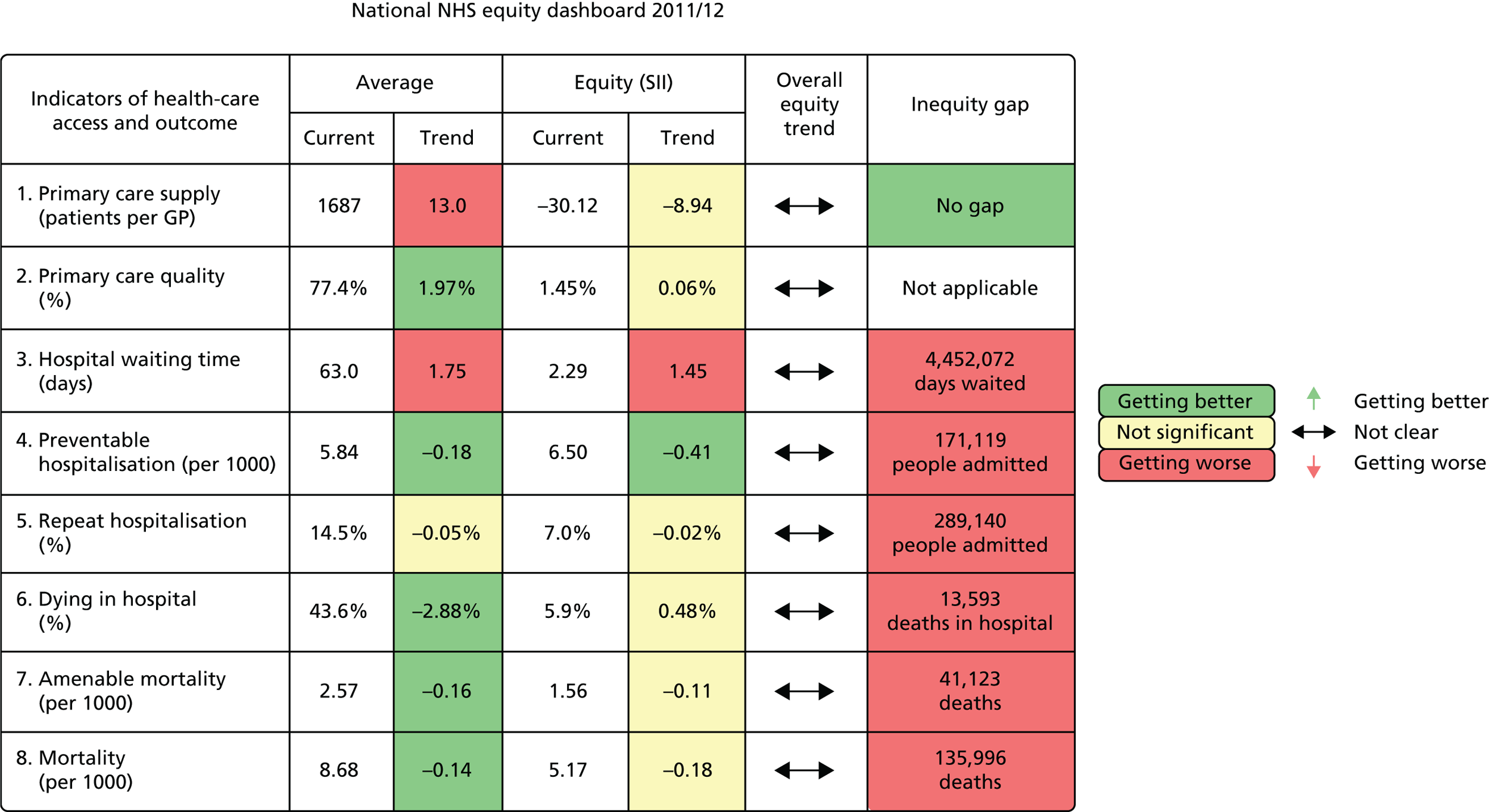
FIGURE 62.
National equity dashboard notes. a, Adjusted for age and sex each year; b, adjusted for neighbourhood ill health in 2007; and c, adjusted for treating consultant specialty each year.
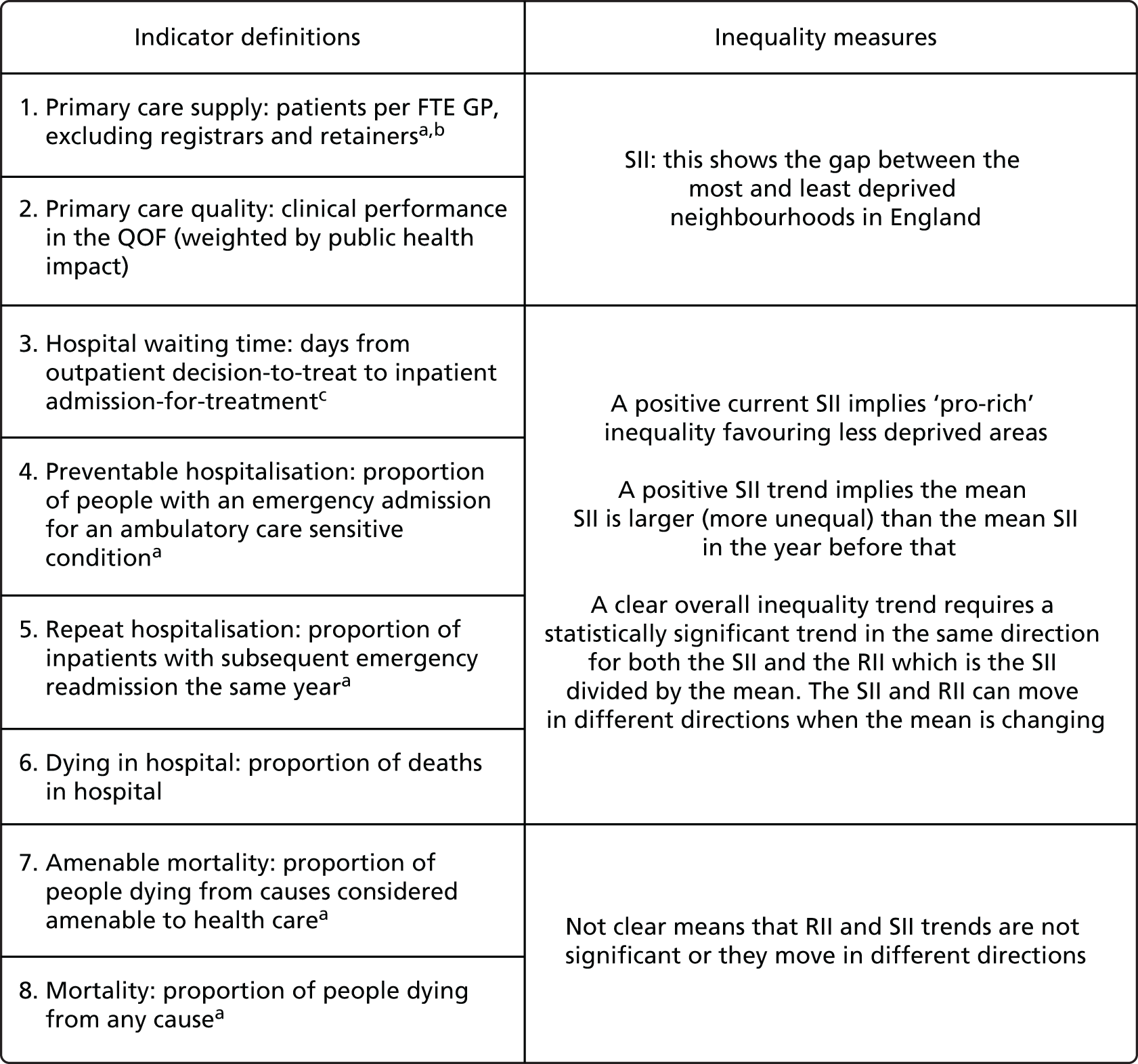
Notes on how to read the national dashboard
To understand the dashboard, it may be helpful to start by considering ‘preventable hospitalisation’, which is a classic indicator of health-care outcome. All of the other indicators of health-care outcome (indicators 4–8) can be interpreted in a similar way. The ‘Average’ columns show overall NHS performance on this indicator. The current level is 5.84 preventable hospitalisations per 1000 population and there is a downward trend since last year of –0.18. This downwards trend is coloured dark green meaning that health outcomes are getting better and that this is a statistically significant finding. The ‘Equity’ columns show equity performance on the SII. The current SII is 6.5, meaning that the most deprived neighbourhood in England has 6.5 more preventable hospitalisations than the least deprived, allowing for the gradient in between. The SII trend is –0.41, which means that the SII is lower this year than last year, that is, inequality is getting less. This box is also coloured dark green, meaning that this is a statistically significant finding. The overall equity trend arrow shows ‘not clear’, meaning that we cannot draw any clear conclusion about whether overall equity is getting better or worse. Finally, the inequity gap shows that inequality in England is associated with 171,119 preventable hospitalisations.
Now we turn to primary care supply, which is a classic indicator of health-care access. This has a similar interpretation, although there are two important differences from all the other indicators: the current SII is negative. At face value, this could be interpreted as suggesting that there is pro-poor inequality, that is deprived neighbourhoods have more GP supply relative to need than affluent neighbourhoods. However, we do not draw this conclusion because we believe that our need-adjustment underestimates need in deprived neighbourhoods, as explained in Chapter 4 and in Appendix 4. So we report the inequity gap as showing ‘no gap’ rather than a negative gap. All of the other columns can be interpreted in the same way as usual, however. So the average level of performance is 1687 patients per GP, with a significant trend in red of 13.0, showing that the number of patients per GP increased by 13.0 since last year. And the trend is –8.94 and in yellow, showing that the change in SII since last year is not statistically significant. If this change was statistically significant, we would interpret this as a beneficial reduction in pro-rich inequality, rather than a harmful increase in pro-poor inequality, because we believe that need in deprived areas is underestimated. However, assessments of need always rely on value judgements as well as empirical facts, and so we present the current negative SII so that decision-makers can draw their own conclusions based on their own value judgements about need.
Finally, we turn to primary care quality, which is different from all the other indicators in that it presents an attainment measure (more is better) rather than a shortfall measure (more is worse). This only influences the interpretation of average performance, however, as we have inverted the SII to ensure that a positive value means pro-rich inequality as with the other indicators. So, average performance is 77.4%, and the positive trend of 1.97 percentage points is coloured in dark green, an increase in quality means that overall performance is getting better, unlike all the other indicators in which an increase means overall performance is getting worse. The positive SII of 1.45 means that the most affluent neighbourhood has 1.45 percentage points more quality than the most deprived neighbourhood, allowing for the gradient in between, and the non-significant trend of 0.06 coloured yellow means that that we cannot draw any clear conclusion about the SII trend. Finally, the same applies to the overall equity trend arrow which shows that the trend is ‘not clear’.
We now turn to the example local dashboard (Figures 63 and 64).
FIGURE 63.
The CCG equity dashboard 2011/12; ‘Any Town’ CCG.
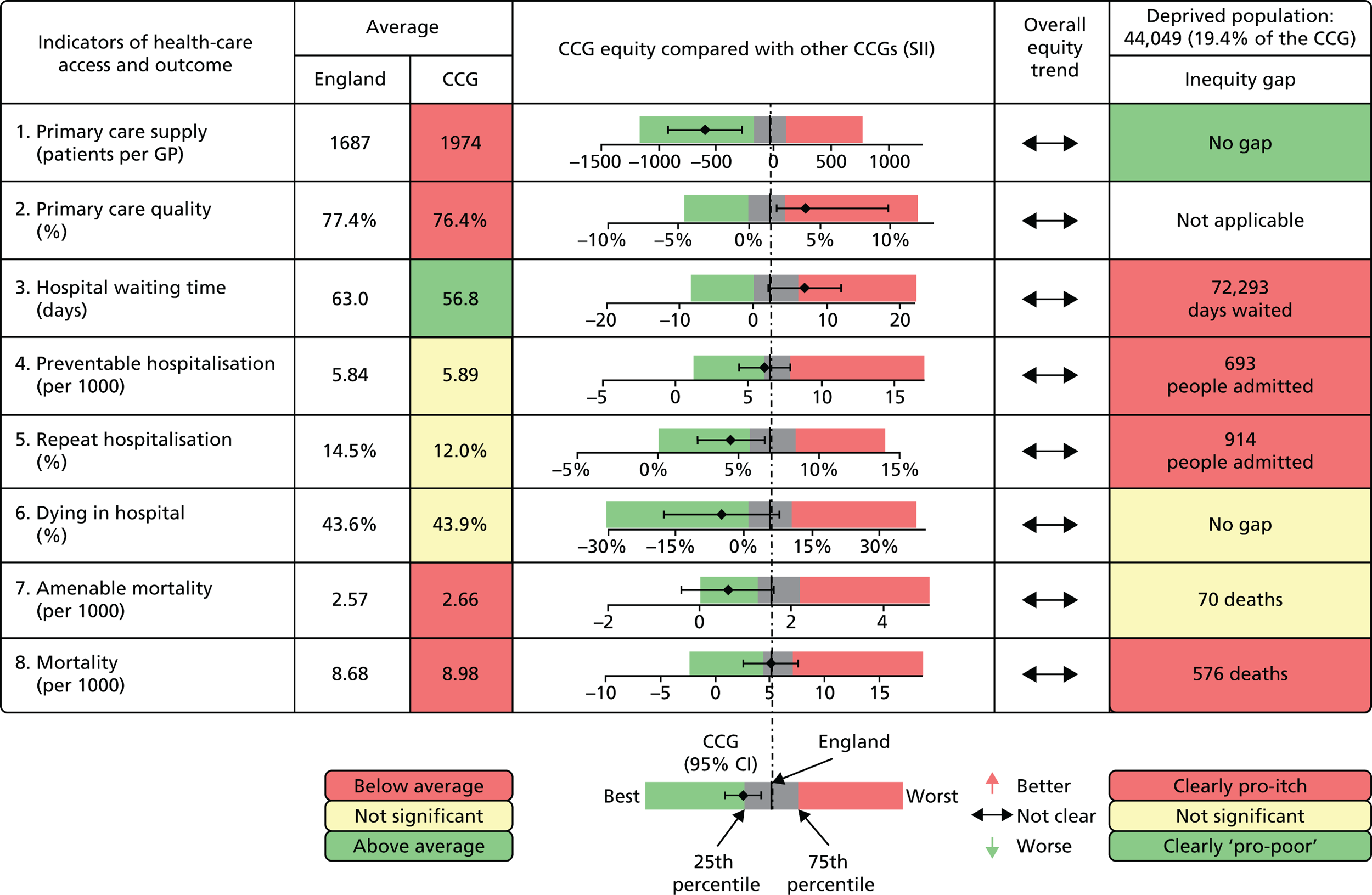
FIGURE 64.
The CCG equity dashboard 2011/12 local indicator notes. a, Adjusted for age and sex each year; b, adjusted for neighbourhood ill health in 2007; and c, adjusted for treating consultant specialty each year. CI, confidence interval.
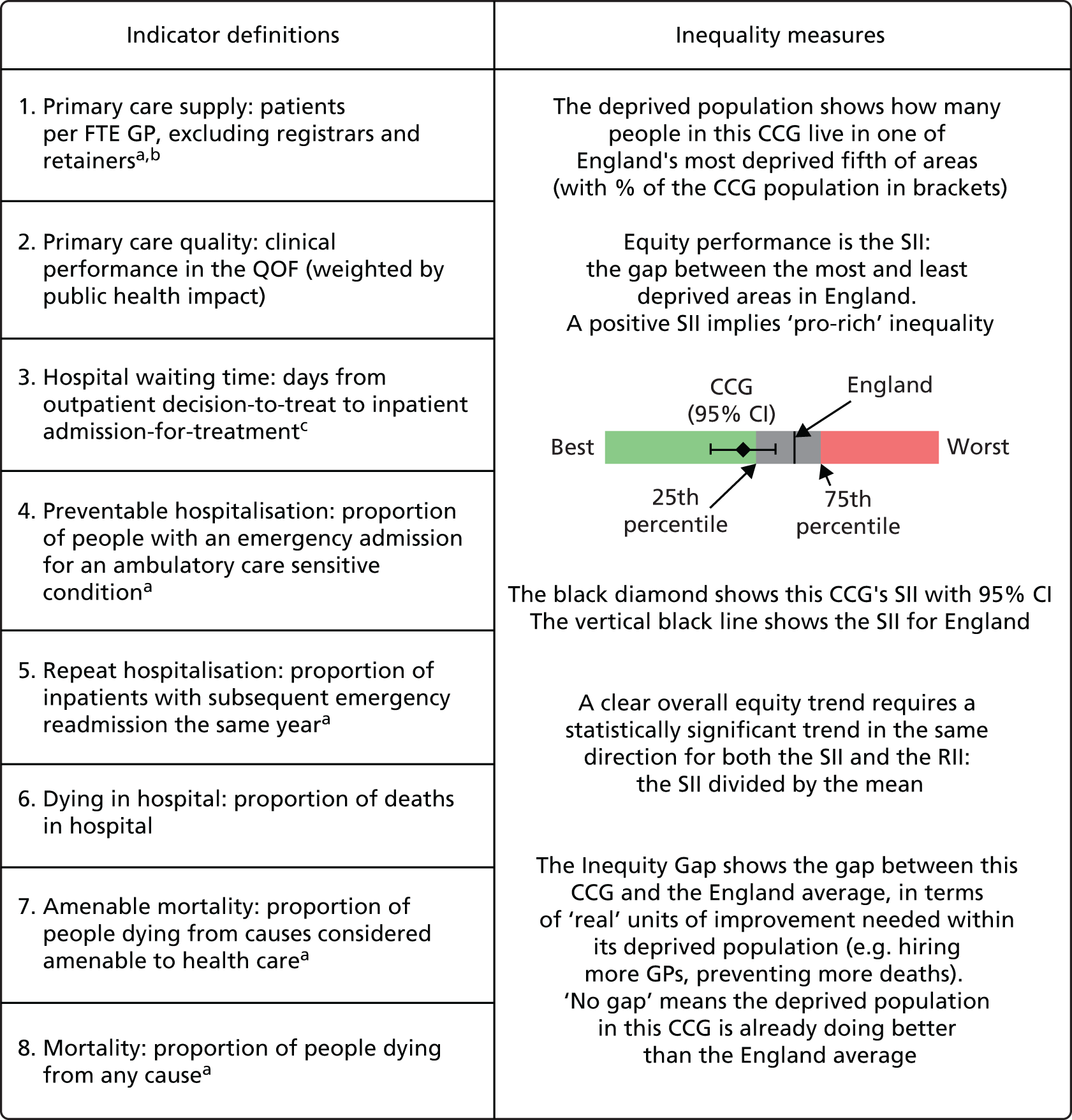
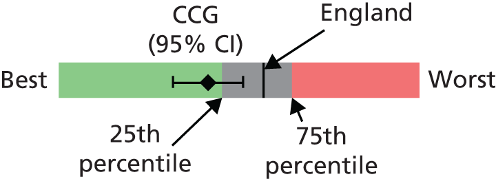
Notes on how to read the local equity dashboard
Let us start, as before, with preventable hospitalisation. The ‘Average’ column shows overall performance for the CCG and England as a whole. This CCG has 5.89 hospitalisations per 1000, which is slightly higher (worse) than the England average of 5.84. However, this is coloured yellow and so the difference is not significant. The spine plot shows that preventable hospitalisation is not significantly different from the England average; the confidence intervals overlap with the central spine representing the England average. There is no overall equity trend. Finally, the inequity gap is 693, showing that socioeconomic inequality is associated with 693 excess preventable hospitalisations in this CCG area.
Now turning to primary care supply, the ‘Average’ column shows that this CCG has significantly worse supply than the England average: 1974 patients per GP compared with an England average of 1687. The spine plot, however, shows that this CCG is doing significantly better than the England average on equity in primary care supply; the point estimate is comfortably in the light-green zone to the left, and the confidence intervals do not overlap the England average spine.
Finally, turning to primary care quality, this CCG has slightly but significantly worse primary care quality than the England average: an average of 76.4% compared with 77.4%. Furthermore, this CCG is doing significantly worse than the national average on equity in primary care quality; the point estimate is in the dark green zone to the right, and the confidence interval does not overlap the England spine.
Chapter 8 Discussion
Summary of findings
In this study, we have developed health equity indicators to help the English NHS discharge its duty to consider reducing inequalities in health-care access and outcomes. We have developed new methods for local NHS equity monitoring against a national NHS equity benchmark. We have illustrated these methods by applying them to CCGs in the year 2011/12, although they could also readily be applied to local authorities or other geographical areas comprising more than 100,000 people. We have also developed a framework for monitoring national NHS indicators of equity at all main stages of the patient pathway. This framework goes beyond the existing inequalities breakdowns in the NHS Outcomes Framework by including indicators of access as well as outcomes. By producing these indicators from 2001/2 to 2011/12, we have provided the first comprehensive assessment of health-care equity trends during a key period of sustained effort by the NHS to reduce health inequalities through primary care strengthening. Finally, and importantly, we have developed a suite of visualisation tools for communicating equity indicator findings to national and local decision-makers, including equity dashboards providing a one-page summary of both overall and equity performance on multiple indicators, and equity chart packs providing more detailed information. Clear communication is essential in this controversial area, as inequality is a complex concept and so headline statistics are even more liable than usual to be misleading when taken out of context.
Our equity indicators and visualisation tools were selected and designed in consultation with a range of expert stakeholders, including NHS and public health officials at national and local levels and health indicator experts from a variety of disciplinary backgrounds. We also consulted members of the public, because one of the main purposes of our indicators is public reporting for democratic accountability, as well as facilitating quality improvement efforts by national and local decision-makers. Members of the public were involved through a public consultation exercise in York, based on an online survey and a 1-day citizens’ panel meeting, and the two lay members of our advisory group.
The main findings are summarised below under three headings:
-
national equity findings in 2011/12
-
national trends during the 2000s
-
local equity findings in 2011/12.
National equity findings in 2011/12
Our study presents the first comprehensive national picture of inequality in health-care access and outcomes in the NHS. Our findings for 2011/12 are summarised below, and a one-page tabular summary is also provided in Chapter 7 the form of a prototype national NHS equity dashboard.
-
There was no evidence of pro-rich inequality in primary care supply. Deprived neighbourhoods had slightly more GPs relative to measured need than less deprived neighbourhoods. However, the Carr-Hill formula may underestimate need in deprived areas, so there may still be some pro-rich inequality that we are unable to measure until more accurate and up-to-date measures of need for GP supply become available.
-
There was a small amount of pro-rich inequality in primary care quality, with an estimated gap of 1.45 percentage points (95% confidence interval 1.37 to 1.53 percentage points) in population achievement of primary care quality between the most and least deprived neighbourhoods in England.
-
There was a small amount of pro-rich inequality in overall inpatient hospital waiting time, with an estimated gap of 2.29 days waiting (95% confidence interval 1.95 to 2.62 days waiting) between the most and least deprived neighbourhoods in England.
-
There was substantial pro-rich inequality in preventable emergency hospitalisation, with an estimated gap of 6.50 hospitalisations per 1000 (95% confidence interval 6.40 to 6.59 hospitalisations per 1000) between the most and least deprived neighbourhoods in England. This implies a relative inequality gap of 111% of the national average hospitalisation rate, and that deprivation was associated with an inequity gap of 171,119 excess preventable hospitalisations in England (95% confidence interval 168,574 to 173,663 hospitalisations).
-
There was substantial pro-rich inequality in repeat emergency hospitalisation, with an estimated gap of 6.97 percentage points of people hospitalised (95% confidence interval 6.85 to 7.09 percentage points of people hospitalised) between the most and least deprived neighbourhood in England. This implies a relative inequality gap of 48% of the national average hospitalisation rate, and that deprivation was associated with an inequity gap of 289,140 excess repeat hospitalisations in England (95% confidence interval 284,192 to 294,089 repeat hospitalisations).
-
There was substantial pro-rich inequality in dying in hospital, with an estimated gap of 5.95 percentage points of people dying in hospital (95% confidence interval 5.26 to 6.63 percentage points) between the most and least deprived neighbourhoods in England. This implies a relative inequality gap of 14% of the national average hospitalisation rate, and that deprivation was associated with an inequity gap of 13,593 people in England dying in hospital rather than other settings (95% confidence interval 12,023 to 15,162 people).
-
There was substantial pro-rich inequality in mortality amenable to health care, with an estimated gap of 1.56 amenable deaths per 1000 (95% confidence interval 1.50 to 1.62 amenable deaths) between the most and least deprived neighbourhoods in England. This implies a relative inequality gap of 61% of the national average amenable mortality rate, and that deprivation was associated with an inequity gap of 41,123 excess amenable deaths in England (95% confidence interval 39,624 to 42,622 amenable deaths).
-
There was substantial pro-rich inequality in overall mortality, with an estimated gap of 5.17 deaths per 1000 (95% confidence interval 5.03 to 5.31 deaths) between the most and least deprived neighbourhoods in England. This implies a relative inequality gap of 60% of the national average mortality rate, and that deprivation was associated with an inequity gap of 135,996 excess deaths in England (95% confidence interval 132,302 to 139,691 deaths).
The observed inequalities in preventable hospitalisation, repeat hospitalisation and mortality amenable to health care are large. However, as discussed in Chapter 1, this is partly because we were unable to adjust these health-care outcomes for neighbourhood-level morbidity and other risk factors outside the control of the NHS. Our figures for inequality in health-care outcomes thus overestimate the extent of pro-rich inequity for which the NHS can be held accountable. Although the NHS can be held responsible for reducing inequalities in these outcomes, it cannot be held responsible for completely eliminating them.
However, our health-care outcome figures are adjusted for age and sex. Age and sex are both observable risk factors largely outside NHS control. The social patterning of births, deaths and migration may partly be driven by NHS factors, for example if NHS actions help to reduce circulatory death rates more rapidly in more deprived populations. However, we believe that the age- and sex-adjusted figures are more useful for NHS purposes than the unadjusted figures, as changes in demographic structure are mainly driven by non-NHS factors. This point is also relevant below when we consider national trends during the 2000s. As explained below, we focus on the age- and sex-adjusted trends, in order to hold the NHS to account for changes as a result of NHS action rather than changes attributable to demographic trends outside NHS control.
National trends during the 2000s
Below we provide a brief summary of the national trends in all the age- and sex-adjusted indicators that were presented in detail in Chapter 5, including trends in both average performance and equity performance.
Average trends
During the 2000s, health-care access and outcomes improved for all socioeconomic groups on all indicators except repeat hospitalisation (as explained below). The indicator series for primary care supply and quality (indicators 1 and 2) started in 2004/5 and continued until 2011/12. Average levels of primary care supply improved from 2004/5 until 2006/7 and remained stable thereafter. Average levels of population achieved primary care quality continued rising throughout the period, although there were breaks in the data series in several years because of changes in data availability on exception reporting and indicator definitions (as explained in Chapter 5 and Appendix 4). All other indicator series started in 2001/2 and continued until 2011/12. For waiting time (indicator 3), preventable hospitalisation (indicator 4) and overall mortality (indicator 8) the improvements began after 2003/4, following slight deteriorations the previous 2 years. Waiting times fell dramatically until 2008/9, but rose slightly thereafter. Preventable hospitalisation and overall mortality continued falling to the last observed year, 2011/12, although the decline in overall mortality slowed in the 2 years after 2009/10. For dying in hospital (indicator 6), average improvements began from 2005/6 and continued throughout the period to 2011/12. For amenable mortality (indicator 7), the improvements began from 2001/2 and continued throughout the period to 2011/12. However, the pace of improvement picked up from 2003/4 onwards for the most deprived two-fifths of neighbourhoods.
In a striking exception to the general trend of improving outcomes, however, repeat hospitalisation (indicator 5) gradually increased in all socioeconomic groups from 2001/2 to the end of the period in 2011/12. This may partly reflect an increase in premature discharges from hospital, as hospitals reduced length of stay in the 2000s in response to financial incentives and waiting time targets. 159 It may also reflect hospital payment reforms that gave hospitals financial incentives to increase emergency admissions. In addition, especially towards the end of the 2000s, it may reflect reductions in social care supply and quality as a result of financial pressures on local authorities. However, it is possible that this also reflects (1) increased morbidity in patients admitted for emergency inpatient treatment, as a result of people surviving longer with multiple chronic conditions, causing an increase in post-hospital adverse events; and (2) reduced post-hospital mortality, causing an increase in the proportion of post-hospital adverse events leading to readmission rather than death. Therefore, the increase in average levels of repeat hospitalisation may partly be a consequence of success in reducing mortality, rather than a signal of failure to improve the quality of co-ordinated primary, secondary and social care after emergency hospital admission.
Equity trends
For four of the eight indicators (primary care supply and quality, preventable hospitalisation and amenable mortality), there were significant and sustained reductions in absolute socioeconomic inequalities. This began after 2003/4 for indicators 4 and 7 and was observed from the start of the series in 2004/5 for indicators 1 and 2. For primary care supply and quality, socioeconomic inequalities decreased substantially in both absolute and relative terms, and measurable inequality was virtually eliminated by 2010/11. Absolute inequality in preventable hospitalisation and amenable mortality rose from 2001/2 to 2003/4, but then gradually fell thereafter all the way to 2011/12. This was a smooth fall for amenable mortality, but there was some year-on-year volatility around the underlying trend for preventable hospitalisation. However, for both preventable hospitalisation and amenable mortality, the reduction in absolute inequality did not translate into a reduction in relative inequality as a proportion of the mean, because the mean was also falling.
The unadjusted trends in preventable hospitalisation and amenable mortality prior to adjustment for age and sex showed a larger reduction in absolute inequality, sufficiently large to translate into a reduction in relative inequality. However, as noted in Chapter 5, this difference is because of demographic change during the 2000s: affluent areas experienced population ageing, whereas deprived areas experienced an influx of younger people. We therefore prefer the age- and sex-adjusted figures, on the basis that demographic shifts are largely exogenous factors beyond the control of the NHS. However, a counterargument is that it is possible NHS activities may have had some small influence on these demographic patterns by influencing socioeconomic trends in births, deaths and migration. So we present both sets of figures, adjusted and unadjusted, so that readers can draw their own conclusions.
Hospital waiting time showed a slightly pro-poor pattern for most of the period, with a negative slope index in 2001/2 that fell even further to 2003/4 but rose thereafter and ultimately became slightly pro-rich in 2011/12. In 2003/4, at its most pro-poor point, the slope index fell to –5 days, indicating that people in the most deprived neighbourhood were waiting on average up to 5 days less than people in the least deprived neighbourhood. There was no reduction in either absolute or relative inequality in dying in hospital, despite the reduction in average levels from 2005/6 onwards. For repeat hospitalisation, both absolute and relative inequality steadily increased from 2001/2 to 2011/12. Finally, for overall mortality, there was no sustained pattern of decline in the absolute inequality gap from 2003/4, in contrast to amenable mortality. Rather, there were statistically significant one-off changes from 2005/6 to 2006/7 (an increase) and between 2008/9 and 2009/10 (a reduction). In terms of relative inequality, however, overall mortality showed a sustained increase from 2001/2 to 2006/7 which stabilised thereafter, which is a similar pattern to amenable mortality.
Local equity findings in 2011/12
In 2011/12, it was possible to detect well over 20% of CCGs performing either significantly better or significantly worse on equity than the national benchmark, including at least 10% in each category, using annual data for the following five general indicators: (1) primary care supply, (2) primary care quality, (3) hospital waiting time, (4) preventable hospitalisation and (5) repeat hospitalisation. This was not possible for the remaining three indicators. For indicator 6, dying in hospital, only 8% of CCGs were significantly different from average: 3% worse and 5% better. For indicator 7, amenable mortality, 11% were significantly different from average: 8% worse and 3% better. Finally, for indicator 8, overall mortality, 17% were significantly different from the national average, but most of these were significantly worse: only 3% were significantly better. Pooling additional years of data did not improve substantially the ability to detect significant differences.
Strengths and weaknesses of the study
Strengths
We selected our health equity indicators and visualisation tools in consultation with members of the public, NHS and public health officials, and health equity experts from a range of disciplines. We measured inequality at multiple stages of the patient pathway, including inequality in both health-care access and health-care outcomes. We constructed comprehensive indicators spanning the entire range of activities of the health-care system, as well as condition-specific indicators that only provide information about inequality in one particular disease area. We developed the first methods for local equity monitoring against a national equity benchmark, and we provided the first comprehensive assessment of national trends in socioeconomic inequality in health care and outcomes during the 2000s. We also developed a comprehensive new suite of visualisation tools for communicating health equity findings to decision-makers. Our equity indicator methods and visualisation tools are flexible, allowing different indicators to be incorporated and monitoring to be performed at different geographical levels that may be more appropriate for addressing particular aspects of variation in health-care access and outcomes. 160 Our approach is also generalisable beyond the English NHS, as it can be applied to other countries, with well-developed administrative health data sets and our methods for monitoring local equity against a national benchmark can in principle be applied to other public services. With the exception of hospital waiting time and repeat hospitalisation, we used standard, well-validated indicators that are already used for monitoring overall health-care performance in England and other high-income countries. We used data on the entire population of England, including workload and quality data on all primary care practices in England and outcomes data on all individuals in England. We structured these data in a consistent, longitudinal format that permits inequality comparisons over time and between indicators. We used inequality measures based on the entire socioeconomic gradient across all 32,482 small areas of England, rather than gaps or ratios between two arbitrarily selected parts of the distribution such as the top and bottom fifth. We examined inequality in both absolute and relative terms, because absolute and relative inequality can change in opposite directions when the mean is changing over time. 161 One of our measures, the RII, can also be compared between indicators measured on different scales to help assess the relative magnitude of different kinds of inequality.
Weaknesses
Our study does not include data on privately funded health care, which accounts for just over 15% of total health expenditure in the UK. 162 We also lack detailed national data on changing patterns of multimorbidity at the small-area level, and how multiple morbidity and disadvantage combine to generate additional health-care needs. 163 One consequence is that our study may underestimate additional needs for primary care in deprived neighbourhoods, which are likely to suffer from a greater burden of multimorbidity. 164 Another consequence is that, like all previous studies, we cannot disentangle how far observed national trends in preventable hospitalisation and amenable mortality are a result of national trends in multimorbidity outside the control of the NHS. We therefore recommend the development of small-area-level measures of multimorbidity as a research priority for the NHS, to enable more informative monitoring of health-care outcomes and more accurate targeting of health-care resources to meet health-care needs. Another limitation is that the administrative health data sets we use do not contain information on individual socioeconomic characteristics. We therefore used the IMD, a well-established method of assigning socioeconomic characteristics based on neighbourhood of residence. This method rests on the assumption that individuals conform to the socioeconomic profile of their residential neighbourhood, which is of course not always the case. However, the small areas we use are relatively small and homogeneous in size, around 1500 people each with a minimum of around 1000 and maximum of around 3000, and so our measurements are more accurate than those possible using the postcode geographies available in some other countries. In general, use of larger geographical areas tends to find shallower socioeconomic gradients in health and health care, as population average differences in income and social advantage are diluted by the use of larger and more socioeconomically heterogeneous populations. Finally, our measure of primary care quality is based on indicators drawn from the UK primary care pay-for-performance scheme, which captures only a limited part of clinical practice. 165 Under this scheme, improvements in quality were most rapid in practices with low baseline performance, and these practices were concentrated in more deprived areas. 166 It is possible that aspects of primary care quality that were not financially incentivised and monitored did not follow the same pattern, and inequalities in these may have persisted or even widened. Another limitation is the flip side of one of the strengths of our study, which is our use of general indicators that span the entire range of health-care activity and thereby paint an overall picture of NHS equity performance. A limitation of indicators of this kind, of course, is that they cover a heterogeneous range of activities and so may mask differential patterns between different specialties and disease areas. A final weakness is that we were unable to control for small-area-level variations in the supply and quality of social care. At least two of our health-care outcome indicators are likely to be sensitive to social care supply and quality outside the control of the NHS, as well as the quality of co-ordinated care for which health-care staff are partly responsible. Unfortunately, data on social care supply and quality are not currently available at the small-area level, in striking contrast to the detailed neighbourhood statistics available for health care and other public services.
Comparison with other studies
Primary care supply
Two previous national studies have examined variation in primary care supply between large administrative areas of England. Gravelle and Sutton73 found substantial and persistent between-area variation in physician supply between 1975 and 1995. Goddard et al. 74 extended this time series by adding the years 1996 to 2006 and found that variation between administrative areas increased between 1995 and 2006. Our results agree with these previous studies showing large and widening pro-rich inequalities up until 2006/7, after which we see this trend reverse with inequalities narrowing over the remainder of our study period, by the end of which we observe pro-poor inequality in need-adjusted primary care supply. Whereas the previous studies examined overall variation between large and socioeconomically diverse administrative areas, our study adds value by looking specifically at socioeconomic-related inequality between small areas. We are able accurately to attribute GP supply to small areas, based on the location of patients registered to each GP practice, and so can paint a much finer-grained picture of the socioeconomic distribution of the primary care workforce than has previously been possible.
Primary care quality
One previous national study examined trends in socioeconomic inequality in primary care process quality from the UK pay-for-performance programme. 166 This study only covers the first 3 years of our 8-year study period (2004/5 to 2006/7), but agrees with our findings of reductions in socioeconomic inequality. We find that this reduction in inequality continued but slowed down thereafter and levelled off from 2010/11 to 2011/12.
Waiting time
Most previous studies of inequality in waiting time have used disease-specific indicators focusing on particular specialties or procedures, rather than general indicators covering the whole range of hospital activity which are then adjusted for disease-specific differences in waiting times. To our knowledge, the only other previous study using a general indicator was a cross-sectional study using individual-level data on men aged ≥ 67 years from Norway in 2004/5, which found very little evidence of socioeconomic differences in waiting time after adjusting for all primary and secondary diagnoses, severity and hospital supply. 167 By contrast, previous disease-specific studies have generally found pro-rich inequality in waiting time for publicly funded inpatient hospital treatment in a range of high-income countries with universal health systems. 168,169 Previous disease-specific studies have also found a trend of reducing socioeconomic inequality in the English NHS during the 2000s, for a handful of common non-emergency hospital procedures such as hip replacement, knee replacement cataract, heart bypass and coronary angioplasty. 169,170 Our findings using a general waiting time indicator are thus diametrically opposed to previous findings using disease-specific waiting time indicators. Our indicator did adjust for differences in waiting times between specialties, although not for within-specialty differences between procedures or disease categories. The disease-specific studies are more reliable, as they focus cleanly on a fairly homogeneous procedure and some of them also include controls for waiting time prioritisation by severity (the number and type of diagnoses) and for cross-sectional differences in hospital supply (hospital fixed effects). However, the disease-specific studies are more vulnerable to selection bias because they have only examined a selected handful of specific hospital procedures which may not be representative of waiting time differentials across all areas of hospital activity. Both types of study are also subject to selection bias relating to the decision to seek privately funded care, which is partly motivated by the desire to gain a shorter waiting time than publicly funded NHS care.
Preventable hospitalisation
One previous national study examined socioeconomic inequality in preventable hospitalisation in England covering years 2001/2 to 2012/13. 171 This study found similar trends to those we observe, showing a gradual decrease in the rate of chronic ambulatory care-sensitive emergency admissions for the average patient and substantial and persistent socioeconomic inequalities in ambulatory care-sensitive emergency admissions over the period.
Repeat hospitalisation
To our knowledge, no previous study has examined socioeconomic inequality in repeat emergency hospitalisation within the same year, or time trends therein. However, many disease-specific studies of 30-day emergency readmission rates have used socioeconomic status as a control variable in regressions performed for purposes other than measuring socioeconomic inequality. These studies have consistently found substantial and significant cross-sectional associations between socioeconomic status and 30-day emergency readmission following both emergency and non-emergency hospitalisation. 172,173 The selection of an appropriate duration for this indicator illustrates a tension between capturing the quality of co-ordinated care across different primary and acute care providers over a long time period, versus pinpointing precisely at which point on the patient pathway inequality arises, that is which primary or acute service provider is responsible for generating inequality at what point in time.
Dying in hospital
Previous cross-sectional studies have found socioeconomic inequalities in dying in hospital, and interpreted this as an indicator of differences in the quality of end-of-life care. 174 To our knowledge, however, no previous study has examined trends in these socioeconomic inequalities over time.
Amenable mortality
One previous national study examined socioeconomic trends in amenable mortality175 in England from 2001/2 to 2011/12. However, this study was conducted at a large-area level (324 local authorities), which may potentially mask changing patterns of inequality within these large areas, and it excluded mortality in people aged > 75 years. This study found both average levels and absolute measures of inequality in amenable mortality to have fallen over this period. Our finer-grained analysis looking at much smaller areas (32,482 LSOAs) and including amenable mortality in those > 75 years of age confirms this basic pattern, but reveals a widening of relative inequality that was not apparent in the previous study. Furthermore, our inclusion of this older section of the population results in a higher overall rate of amenable mortality and the more detailed level of analysis we employ reveals wider socioeconomic inequalities.
Overall mortality
Numerous studies have found socioeconomic inequality in overall mortality and life expectancy in low-, middle- and high-income countries. 36,106,176 Previous studies have found reductions in absolute socioeconomic inequality in overall mortality in England in the 2000s177 and reductions in both absolute and relative inequality in life expectancy. 178 This is all in line with our findings. The reason that relative inequality in life expectancy and mortality moved in different directions during the 2000s is that the means of these two variables were moving in different directions. Mortality is a shortfall measure (more is worse) which is falling over time, whereas life expectancy is an attainment measure (more is better) which is rising over time. 179
Implications for clinicians, policy-makers and managers
The 2000s was a period of sustained large-scale expenditure growth in the English NHS,180 during which tackling health inequality was a high priority for the NHS. 38,106,181 As has been documented in previous studies, this decade saw substantial increases in overall NHS capacity and utilisation, and the average patient experienced significant improvements in health-care access, quality and outcomes. 182 Our study shows that the NHS also succeeded in achieving substantial reductions in inequality in primary care supply and quality from 2004/5 to 2011/12. By 2010/11, measured pro-rich inequity in primary care supply relative to need had been eliminated and measured pro-rich inequity in primary care quality had been nearly eliminated. Plausibly, these changes can partly be attributed to the substantial investments in primary care in the mid to late 2000s, including the pay-for-performance programme from 2004/5 and the additional funding for new GP practices in ‘under-doctored’ areas of the country in the form of the Equitable Access to Primary Medical Care programme announced in 2006. 166,183 However, these two measures are imperfect and so we cannot conclude there is no remaining important pro-rich inequality in primary care supply and quality. There may remain a degree of pro-rich inequity in primary care supply, because the Carr-Hill formula only allows for morbidity but does not examine how multiple morbidity and disadvantage combine to generate additional health-care needs. So, the Carr-Hill formula is likely to underestimate need in deprived neighbourhoods. There may also remain a degree of pro-rich inequality in primary care quality because QOF indicators do not capture all-important aspects of primary care quality.
The NHS also succeeded in making small reductions in absolute socioeconomic inequalities in health-care outcomes from 2003/4 to 2011/12. Absolute inequalities in preventable hospitalisation and amenable mortality decreased from 2003/4 to 2011/12, and the rate of increase in relative inequalities slowed from the mid-2000s, but substantial inequalities remained in 2011/12.
Although small, the observed reductions in absolute inequality in health-care outcomes during the 2000s are real and impressive for two reasons. First, there is some evidence of widening socioeconomic inequalities during the 2000s in the clustering of smoking, poor diet, physical inactivity and other unhealthy behaviours among lower socioeconomic groups. 62 This would have made it more difficult to reduce absolute inequality in both preventable hospitalisation and amenable mortality. Second, there were no comparable reductions in absolute socioeconomic inequality in non-amenable mortality during the period. This makes it plausible to attribute the reductions to the sustained improvements in health-care access and quality that occurred in the 2000s, rather than to wider trends in the social determinants of health outside the control of health-care services. It is hard to be certain about the causality, however, given that this is an observational study without a control group. Furthermore, there is uncertainty about how long it takes for improvements in health-care delivery to feed through into reductions in preventable hospitalisation and amenable mortality. It is reasonable to expect some short-term impact within a year or two,80 although the length of lag is likely to vary by disease and type of intervention; for example, reductions in mortality because of improved management of heart disease and diabetes may be more rapid than reductions as a result of earlier diagnosis and referral for suspected cancer.
It may not be surprising that the reductions in absolute inequality in health-care outcomes were small, given what is already known about the social determinants of health and the role of health care as just one input into the production of health. 7,9,10,36 Socioeconomic inequalities in health-care outcomes result not only from inequalities of access to health care, but also from socioeconomic-related differences in morbidity, patient self-care and lifestyle behaviour, home and work environments, social care and other public services that impact on health. 8
Therefore, our study provides further confirmation that reducing inequality in health-care outcomes is more complex and challenging than reducing inequality of access to health care. 184 Further reductions in socioeconomic inequalities in health-care outcomes are likely to require complex interventions to improve the co-ordination of care between specialties, between primary and acute care settings, and between health-care and social-care providers. There is a growing body of evidence about effective interventions to reduce preventable hospitalisation and amenable mortality. 171,184–187 Effective interventions may tend to reduce inequalities, if they disproportionately benefit ‘high-need service users’ in the more deprived end of the socioeconomic spectrum who are most in need of co-ordinated care. On the other hand, effective interventions may increase inequalities if they rely heavily on changing people’s self-care and lifestyle behaviour and if individuals in deprived neighbourhoods are less likely to change their behaviour. 188 Unfortunately, however, evidence about the impacts of interventions on socioeconomic health-care outcomes is limited. Therefore, further research is needed including rigorous evaluation of interventions designed to improve the co-ordination of care between primary care, secondary care and social care providers. The indicators developed in this study can be used to facilitate evaluations of this kind, and to help develop the evidence base for reducing inequalities in health-care outcomes through equity monitoring and quality improvement work at local, national and international levels.
Our local equity indicators and dashboards also have potentially important implications for managers, including health-care commissioners, the managers of hospital, primary and community health services, and also the managers of social services and other local government services with impacts on health outcomes. Managers do not yet know which areas of England are performing well or badly on tackling inequalities in health-care access and outcomes, or which areas are showing sustained signs of improvement or deterioration on equity. For example, managers in Liverpool currently do not know whether they are doing better, worse or about the same as managers in Manchester at tackling inequalities in health-care access and outcomes, or whether their equity performance relative to the national average has been improving or deteriorating in recent years. Producing our local equity indicators and dashboards on a routine basis could provide this information, and allow researchers and managers to start finding out why some areas are performing better than others on equity, and why some areas are improving and deteriorating faster than others. This information could also help managers to find out which deprived neighbourhoods within their own local areas are suffering the worst health-care outcomes and why. This is important for hospital managers, as well as commissioners, primary care and public health managers, as avoidable accident and emergency admissions are nearly two and a half times higher in the most deprived fifth of neighbourhoods than the least deprived fifth. Hospital managers have a direct interest and an important role to play in helping to reduce avoidable hospitalisation, through more proactive identification and follow-up of patients at risk of repeated emergency admission, many of whom will live in deprived neighbourhoods. Officials from NHS England and within CCGs have expressed an interest in our equity indicators, as described in the letters of support at Appendix 7, and national inequalities breakdowns are already starting to be included in the NHS Outcomes Framework. At the time of writing, however, no announcement had been made about whether or not, or when, the NHS would commence production of any local health-care equity indicators.
Chapter 9 Conclusion and research recommendations
Main conclusions
We draw together our main conclusions below in this section, before turning to technical conclusions and recommendations for further research in the next two sections. The overall research question of our study was: ‘Can changes in the socioeconomic patterning of health-care utilisation and outcomes provide useful indicators of change in NHS equity performance?’ Our overall conclusion is ‘yes’. We elaborate below, with the following more specific conclusions:
-
NHS actions can have measurable impacts on socioeconomic inequality in both health-care access and health-care outcomes.
-
Increasing the number of primary care physicians and paying them for the quality of care they provide has been associated with small impacts on reducing inequality in health-care outcomes, although the causal link between primary care inputs and health-care outcomes has not been established in this study.
-
Local NHS equity monitoring against a national NHS equity benchmark can produce useful findings both to help managers improve quality and to enhance democratic accountability.
-
Currently, the most useful indicators for local NHS equity monitoring are primary care supply, primary care quality and preventable hospitalisation.
-
National NHS monitoring of change over time in NHS equity can usefully be done using a much wider range of indicators of health-care access and outcomes, including disease-specific indicators.
-
Equity indicators are more useful to decision-makers if they are presented together on the same page, alongside average performance indicators, and accompanied by graphs showing the underlying inequality patterns.
-
Variants on our equity indicators could be used for international comparisons of equity in health care and for evaluating the impacts of interventions on equity in health care.
NHS actions can have measurable impacts on socioeconomic inequality in both health-care access and health-care outcomes
Prior to this study, there was good evidence that the introduction of universal health care, and, in particular, universal primary care, can help to reduce socioeconomic inequality in both health-care access and outcomes. 10,11 However, it was less clear whether or not further actions taken by a universal health system, such as the NHS, can have a further measurable impact on either increasing or reducing socioeconomic inequality in health-care access and outcomes. 39,189–191 Our study shows that by strengthening its primary care system in the 2000s, the NHS achieved substantial reductions in socioeconomic inequality in health-care access (in terms of primary care physician supply and quality of care provided by these physicians as measured by QOF) along with real, although modest, reductions in absolute inequality in health-care outcomes (in terms of preventable hospitalisation and amenable mortality).
Increasing the number of primary care physicians and paying them for the quality of care they provide has been associated with small impacts on reducing inequality in health-care outcomes, although the causal link between primary care inputs and health-care outcomes has not been established in this study
Along with the substantial reductions in socioeconomic inequality of access to primary care physicians between 2004 and 2011, we also found small reductions in absolute inequality in preventable hospitalisation and amenable mortality, and a slowdown in the increase in relative inequality. However, substantial socioeconomic inequalities in health-care outcomes persist, despite the investments in health care made in the 2000s. This partly reflects socioeconomic inequalities in morbidity and multimorbidity that are beyond the control of the NHS. Although we risk-adjusted our health-care outcomes for age and sex, we were unable to also adjust for morbidity because of lack of comprehensive individual-level data on age and morbidity covering all individuals in England. However, inequalities in health-care outcomes also reflect socioeconomic differences in patient and provider behaviour, informal social support, and the use of formal social care and public services. There is evidence that improved co-ordination of financing, planning and delivery between different services, for instance, between primary, secondary and community care providers, between specialties, and between health and non-health services, can help to reduce average levels of preventable hospitalisation and amenable mortality. 185,186 Although there is limited evidence about health equity impacts, and the impacts may go in either direction, it is plausible that some forms of improved care co-ordination, perhaps especially those that do not rely too heavily on patient behaviour change, may deliver larger absolute reductions in more deprived neighbourhoods with higher rates of preventable hospitalisation and mortality. Furthermore, some behaviour change interventions can have small but important effects. The NHS can influence both provider and patient behaviour in various ways, including behavioural public policies or ‘nudges’,192 such as effective ways of reminding people about appointments and encouraging them to take up preventative care; workforce training for service providers on how to deal with people who have different styles of communicating; and changes in the location and timing of service provision. 193 However, evidence about the inequality impacts of interventions is limited and further research is needed.
Local NHS equity monitoring against a national NHS equity benchmark can produce useful findings both to help managers improve quality and to enhance democratic accountability
Local equity monitoring is capable of detecting areas that are performing significantly better or worse than the national average at any geographical level containing populations greater than around 100,000 people, including CCGs, local authorities and accountable care organisations. In principle, local equity monitoring can be done using all five of the following general health-care equity indicators: (1) primary care supply, (2) primary care quality, (3) hospital waiting time, (4) preventable hospitalisation and (5) repeat hospitalisation. All of these indicators, or variants based on the same underlying data sources, could be produced annually, based on data collected during the financial year, and updated within 6 months of the end of the financial year. The following general indicators are less useful for local NHS equity monitoring purposes: (6) dying in hospital, (7) amenable mortality and (8) overall mortality. This is mainly because these indicators are less able to robustly identify local areas performing significantly better and worse than the national average, but also because they require use of ONS mortality data and so would suffer from data lags of around 15 months.
Currently, the most useful indicators for local NHS equity monitoring are primary care supply, primary care quality and preventable hospitalisation
Indicator production and communication is costly, both in terms of money and scarce analytical capacity, and so the NHS will need to set priorities for indicator production. We recommend three of our indicators as a high priority for local NHS monitoring against a national NHS benchmark: (1) primary care supply, (2) primary care quality and (4) preventable hospitalisation. We recommend all three of these indicators because (1) they all capture important, but distinct, general elements of health-care access and outcomes; (2) NHS policy-makers and managers have a reasonable understanding of what actions they can take to shift these indicators; and (3) they are all based on well-validated technical indicator definitions. Hospital waiting time and repeat hospitalisation also meet these first two criteria, and our public consultation exercise established that socioeconomic inequality in waiting time was of particular concern to members of the public. However, these indicators are less well validated than the others and so we recommend further work to validate and refine these two indicators before using them for routine monitoring purposes.
National NHS monitoring of change over time in NHS equity can usefully be done using a much wider range of indicators of health-care access and outcomes, including disease-specific indicators
National monitoring of change over time in health-care equity can be performed using all of the indicators we have developed, including the eight general indicators described in the main report and the six disease-specific indicators for CHD and diabetes described in Appendices 1 and 2. Further general and disease-specific indicators can also be constructed for national monitoring, including indicators in the NHS Outcomes Framework. However, most of these indicators cannot be used for local equity monitoring because small numbers of events at the local level mean that performance in almost all local areas is statistically indistinguishable from the national average.
Indicators of equity are more useful to decision-makers if they are presented together on the same page, alongside information about average NHS performance, and accompanied by graphs showing the underlying inequality patterns
During our extensive piloting work with NHS and public health officials at national and local levels, and the equity experts on our advisory group, we learned three main lessons about effective ways of communicating health equity indicators to decision-makers. First, that equity indicators are more useful to decision-makers, and likely to have more impact, if they can be summarised in the form of a single one-page ‘dashboard’. A dashboard approach allows comparisons between multiple indicators of health-care access and outcome at different stages of the patient pathway. Furthermore, it also focuses attention on a small number of key indicators and reduces the risk of equity information getting buried in a ‘blizzard’ of indicators. This is important, as, in reality, equity objectives will always tend to have lower priority for health-care managers than balancing the books and delivering high-quality care for the average patient. We found that up to eight equity indicators can comfortably fit on a single page or screen, but beyond that the text becomes too small for comfortable reading. Second, that equity indicators need to be accompanied by information on average NHS performance, so that decision-makers can put equity findings into context. For example, increasing inequality may be less worrying in a context of improving average performance in which all social groups are becoming better off. Third, equity indicators need to be accompanied by graphs that reveal the underlying inequality patterns and trends over time. Health equity is a complex concept and headline equity statistics presented in isolation can be misleading. So, before drawing conclusions and taking action to remedy apparent problems, decision-makers need to understand what is going on behind the headline statistics. We found that graphs using five deprivation quintile groups are generally sufficient to capture the main inequality time trends of interest, but that 10 deprivation decile groups are more useful for presenting the basic cross-sectional inequality gradient, as the gradient in adverse health-care outcomes often starts to become steeper within the most deprived tail of the social distribution.
Variants on our equity indicators could be used for international comparisons of equity in health care and for evaluating the impacts of interventions on equity in health care
Variants on all of our indicators could be produced in Scotland, Wales and Northern Ireland, which have similar health information infrastructures to England including QOF data on primary care quality. Variants on at least three of our general indicators of inequality in health-care outcomes, (1) primary care supply, (4) preventable hospitalisation and (5) repeat hospitalisation, could also be produced in other countries with comprehensive data on primary care supply and hospital activity linked to small-area-level or individual-level measures of socioeconomic status. Crude versions of our indicators could also be produced in countries with comprehensive national data on hospital activity linked to large-area deprivation measures, although these are less accurate than the small-area-level measures of deprivation available in England. Our indicators can also be used to facilitate evaluation of the equity impacts of interventions through quasi-experimental studies of both national and local interventions. Little is known about the equity impacts of interventions, and different studies use different equity metrics. Our indicators can facilitate the incorporation of equity impacts into experimental and quasi-experimental studies, and may even help to improve the comparability of equity impact findings between different studies by providing a common set of metrics for equity evaluation studies.
Technical conclusions about equity indicator production and communication
In this section, we draw technical conclusions about appropriate analytical methods for producing and communicating equity indicators. Some of our conclusions apply to equity indicator methods used in any country, although some relate to the specific kinds of data available in England, for example conclusions about how often it would be feasible to produce and report particular equity indicators given current data release cycles in England.
Visualisation: as well as producing a headline equity statistic (e.g. the slope index of inequality), we recommend visualising inequality levels and trends by producing ‘equity chart packs’ that include cross-sectional scatterplots showing the shape of the social gradient, time trend line plots showing recent change in the social gradient, matrix plots showing the breakdown of equity patterns by age and sex group, and caterpillar plots showing how equity in your area compares with equity in other areas and against the national benchmark
Equity is a complex concept that cannot be captured by any single summary statistic, such as a SII. It is therefore essential to visualise the inequality patterns to give decision-makers a clear understanding of what is going on underneath the headline findings. We have developed a suite of equity visualisation tools that we believe provide all the necessary underpinning information in a concise and easy-to-read format.
Periodicity and indicator year: we recommend updating both national and local equity indicators on an annual basis, based on the financial year
Because the socioeconomic patterning of health care does not change rapidly, there is limited value in updating equity indicators more frequently than once a year, although in principle half-yearly or even quarterly updating can be performed for national equity indicators based on hospital data, that is, (3) hospital waiting time, (4) preventable hospitalisation and (5) repeat hospitalisation. The databases for different indicators become available at different points in the year, are based on data collected at different points in the year and suffer from different data lags. However, we recommend the financial year as the most appropriate indicator year, as (1) NHS budgeting and planning mechanisms operate to the financial year and (2) using the same indicator year facilitates comparisons between indicator findings. The financial year is also the most appropriate period for indicators 1 and 2 (primary care supply and quality) as the workforce census is taken in September each year, in the middle of the financial year, and QOF data are collected at the end of March relating to the previous financial year. Indicators 3–5 can be produced for any indicator year, as the required hospital record data becomes available to NHS analysts via the Secondary Uses Service within a few months. If the indicators were to be produced by academic analysts using HES data, rather than NHS analysts using Secondary Uses Service data, they would also find the financial year convenient, as HES is released by financial year. However, indicators 6–8 require ONS mortality data, which are typically released in early November for the previous calendar year. As the data lag for these indicators is already at least 1 year, it may be sensible to base these indicators on the calendar year rather than increasing the data lag to ≥ 2 years.
Data lags: it should be possible to release updated indicators for the previous financial year in autumn or spring each year
The primary care workforce data required for indicator 1 are usually published in March and relate to the previous September, so in principle this indicator could be produced and released by the summer. However, indicators 3–5 based on hospital data for the previous financial year could not be released until the autumn. This is because there would be a few months’ delay in the hospital data for the financial year becoming available, and further delays in data access and data analysis. QOF data and ONS mortality data are generally released at the end of October; therefore, allowing a few months’ delay for data access and data analysis, the earliest that indicators 2, 6, 7 and 8 could be released is spring. This implies a data lag of 6 months from the end of the financial year for indicators 1, 3, 4 and 5; a data lag of 9–12 months from the end of the financial year for indicator 2; and a data lag of 15 months from the end of the calendar year for indicators 6, 7 and 8.
Inequality measures: we recommend using the slope index of inequality as the primary headline measure, supplemented by a battery of further measures including at least one relative measure such as the relative index of inequality and ideally both a relative shortfall measure and a relative attainment measure
Measuring inequality is essentially a matter of boiling down a many-valued distribution of observations (in this case, more than 32,000 neighbourhoods) into a single number. 194 This can be done in numerous different ways, and there is no ‘one-size-fits-all’ summary measure of inequality as different measures emphasise different aspects of a complex shape. As a primary equity measure we favour the SII because it both (1) is fairly easy to understand and (2) summarises the whole social gradient rather than arbitrarily focusing on two groups, such as the top and bottom fifth, or the bottom and middle fifth, or any other essentially arbitrary choice of two groups. The slope index can be interpreted as the estimated gap between most and least deprived neighbourhoods in England, allowing for the gradient in-between. However, this is an absolute measure and so needs to be supplemented with at least one relative measure, as absolute and relative inequality often move in different directions when the mean is changing. 195 Ideally, we also recommend presenting a further battery of inequality indices including (1) a relative attainment index as well as a relative shortfall index, and (2) a range of extreme group measures including the absolute and relative gap between the top and bottom fifths, between the bottom and middle fifths, and between the top and middle fifths. It is worth checking relative attainment as well as relative shortfall, as they can also move in different directions when the mean is changing, for instance inequality in mortality (a shortfall concept) may be falling while inequality in survival (an attainment concept) is rising. 179,196 However, for indicators based on adverse events, such as hospitalisation and mortality, it is only possible to do this when indicators are based on the proportion of people experiencing one or more events, rather than the rate of events including multiple events experienced by the same person. This is because a proportion has an upper bound and so can be inverted between shortfall (the proportion experiencing the adverse event) and attainment (the proportion not experiencing the adverse event). By contrast, an event rate has no non-arbitrary upper bound and so it is only possible to compute a shortfall measure. Finally, it is worth presenting extreme group measures because these are the simplest possible way of presenting information on equity to members of the public and can be understood clearly and fully without any prior training in statistics. The slope index cannot be fully understood without delving into the meaning of the caveat ‘allowing for the gradient in-between’, which in turn requires an understanding of linear regression modelling.
Recommendations for further research
Our recommendations for further research are:
-
to investigate potential explanations for variation in health-care equity performance between local NHS areas, so that health-care managers can learn quality improvement lessons
-
to perform experimental and quasi-experimental evaluations of the impacts of complex interventions on socioeconomic inequalities in health-care access and outcomes, including interventions to improve system-wide co-ordination between different specialties, health-care settings and public services
-
to make international health-care equity comparisons using these indicators of health-care access and outcomes
-
to develop broader measures of primary care access and quality that go beyond GP supply and the aspects of quality captured by the QOF
-
to develop better measures of small-area-level need for primary care, by investigating how multiple morbidity and disadvantage combine to generate additional health-care needs
-
to develop convincing methods for risk-adjusting small-area-level health-care outcomes for exogenous morbidity factors beyond the control of health-care services
-
to develop methods for monitoring other social dimensions of health-care inequality
-
to improve these indicator methods, for example by refining and adding indicators, decomposing national inequality into between-area and within-area components, and exploring the use of statistical process control methods, direct standardisation methods and non-linear functional forms
-
to develop sources of small-area-level data on the supply, utilisation, quality and outcomes of public and private social care and other goods and services that may influence health-care outcomes.
To investigate potential explanations for variation in health-care equity performance between local NHS areas, so that health-care managers can learn quality improvement lessons
If and when detailed and up-to-date local monitoring of health-care equity commences, there will be a valuable opportunity for quality improvement research involving in-depth investigation of the potential explanations for variations in quality performance at local levels. The aim of this research would be to understand why some areas do well and others badly in reducing social gradients in health-care access and outcomes compared with the national average, and why some areas show signs of sustained improvement while others show sustained deterioration. The findings of this quality improvement research could then be used to help develop and implement best-practice guidance that will help health care and local authority managers in local areas to deliver measurable reductions in health-care inequalities.
To perform experimental and quasi-experimental evaluations of the impacts of complex interventions on socioeconomic inequalities in health-care access and outcomes, including interventions to improve system-wide co-ordination between different specialties, health-care settings and public services
Rigorous evaluation studies using experimental or quasi-experimental designs are needed to gather robust evidence on the impacts of complex interventions on inequalities in health-care access and outcomes. 197,198 This will need to include careful analysis of contextual factors and interactions, and careful analysis of causal pathways, including investigation of the causal links between inequality in health-care access and outcomes at different points on the patient pathway. This should include evaluation of complex interventions designed to improve care for people with multiple conditions by improving co-ordination between primary, secondary and social care settings, and between specialties, as these are likely to be of particular importance in achieving further reductions in inequalities in health-care outcomes. The findings of this research will help guide NHS policy-makers in developing and implementing national and regional policies for tackling health-care inequalities.
To make international health-care equity comparisons using these indicators of health-care access and outcomes
Further research is needed to develop international comparisons and benchmarks for both national and local health-care equity improvement efforts. This can be done by producing some of our equity indicators in other high-income countries with well-developed health data sets linked to small-area deprivation, such as Scotland, Wales, Northern Ireland, Canada and the Nordic countries. International comparisons of this kind will allow a step-change in public transparency about NHS performance on health-care equity by providing a non-parochial assessment. They will also help the NHS to learn equity improvement lessons from other countries, both to find win–win interventions that simultaneously improve equity and average performance and also to identify potential trade-offs between equity objectives and other policy objectives.
To develop better measures of small-area-level need for primary care, by investigating how multiple morbidity and disadvantage combine to generate additional health-care needs
The Carr-Hill workload adjustment for primary care need fails to allow for multimorbidity and is now rather outdated, as it is based on data from the early 2000s. Research is needed to develop more up-to-date need adjustments, which take account of how multiple morbidity and disadvantage combine to generate additional health-care needs. This research would help to inform the future development of geographical resource allocation formulae as well as being useful for monitoring and evaluation purposes.
To develop convincing methods for risk-adjusting small-area-level health-care outcomes for exogenous morbidity factors beyond the control of health-care services
Further research is needed to find ways of risk-adjusting health-care outcome indicators for ill health, as well as for age and sex. For local equity monitoring, this will require individual-level data on age, sex and ill health for everyone in the country. Perhaps the most promising suggestion is to use multimorbidity from hospital records, as discussed at the end of Chapter 3. Another suggestion is to use all-cause mortality, although for local equity monitoring this would require a 3- to 5-year moving average because of the small number of deaths at the LSOA level. A final suggestion is to develop an indicator of multimorbidity using a patient-level primary care data set, such as Clinical Practice Research Datalink, and then seek to roll this out on a national basis as and when patient-level primary care data sets become available covering the whole of England. However, this is a complex area, as the NHS, can to some extent, cause changes in morbidity through preventative care. Ideally, as the aim is to adjust for ‘exogenous’ risks that are not under the control of the health-care system, one would only want to adjust for changes in morbidity risks that are not caused by health care.
To develop methods for monitoring other social dimensions of health-care inequality
Policy-makers and the public may be concerned with other kinds of social inequality in health-care access and outcomes, including inequalities by ethnicity, age, sex, geographical location and a host of other social variables – including variables with both health and social aspects such as mental health and disability. In principle, our basic small-area-level methods can readily be applied to ethnicity, which can be measured at neighbourhood level, although there are complications in particular the fact that ethnicity is not an ordered variable and so does not lend itself to the use of slope index methods.
To improve these indicator methods by refining and adding indicators, decomposing national inequality into between-area and within-area components, and exploring the use of statistical process control methods, direct standardisation methods and non-linear functional forms
Further research is needed to decompose national health-care inequality into its component parts. In principle, the national SII can be expressed as a weighted average of the between-area and within-area slopes. Decomposing the index in this way could be a useful way of disentangling the role of decisions about geographical resource allocation between different CCGs and local authorities (which influences the between-area slope) versus within-area actions by particular CCGs and local authorities. Research is also needed to find ways of analysing and communicating information on the substantial variation at small-area and practice level that is not related to small-area deprivation, and comparing this to deprivation-related inequality. This would be of particular value for indicators 1 and 2, as much of the non-deprivation-related variation is likely to be systematic, and to persist over time, and so may reflect unfair inequality of policy concern. Further research is also needed to explore ways of assessing the normal range of variation in local inequality indices, using statistical process control theory. Research is also needed to explore ways of using direct standardisation for age and sex in equity indicator production, and the pros and cons compared with our indirect standardisation approach. One advantage of direct standardisation is reduced computational burden and delay. However, a disadvantage is that this will lose granularity at local level by requiring aggregation of data to larger population sizes, such as decile groups of small areas, to improve stability. At the national level, the SII could then be estimated by using decile group-level regression and simulating confidence intervals based on the estimated standard error around each decile group point, along the lines of an approach that Public Health England are considering for their indicators of public health inequality. Further modification of decile regression with simulated confidence intervals would be required at local level; however, where fewer than 10 national decile groups may be represented in the data. Research is needed to explore the implications of non-linear functional forms for computing slope indices of inequality, including the value judgements underpinning such approaches as well as the model fit and comparative sensitivity to change in health-care access and outcomes and different parts of the socioeconomic spectrum. Finally, consideration should be given to an alternative locally relative version of the RGI. The approach taken in this report is a nationally relative RGI: the AGI divided by the national mean. An alternative locally relative approach would be RGI = AGI/(α + 0.5 × AGI), where α is the intercept in the local linear regression for computing the AGI. Unlike the nationally relative index, this index is scale invariant at local level: if local rates in all social groups double, retaining the same proportional gaps, this locally relative AGI index will not change. We are grateful to Robert Shaw, NHS England, for this helpful suggestion.
To develop sources of small-area-level data on the supply, utilisation, quality and outcomes of public and private social care and other goods and services that may influence health-care outcomes
Health-care outcomes are influenced by public, private and informal social care, and by other social determinants of health including the consumption of a wide range of market goods and public services that impact upon individual resilience and ability to recover from episodes of illness. Improvements in the social care data infrastructure will greatly facilitate research in this area, in helping to tease out the causal pathways leading to health-care outcomes and to help disentangle the role of social-care and health-care factors. As a substantial proportion of social care is privately funded and/or informally provided within the household, it will be important to develop data sources that include privately funded and informally provided care, and as a wide range of other market goods and public services also impact on health-care outcomes it will be important to develop data sources on these as well.
Acknowledgements
The authors would like to thank all our project advisory group members for helpful advice and support throughout the project: Allan Baker, Chris Bentley, Sarah Curtis, Tim Doran, Brian Ferguson, Donald Franklin, Chris Gale, Peter Goldblatt, Ann Griffin, Iona Heath, Azim Lakhani, Alan Maynard, Nick Mays, Lara McClure, Mark Petticrew, Jennie Popay, Carol Propper and Wim Troch.
We would also like to thank Ruth Helstrip for helping to organise the public consultation work that informed the indicator selection process; the members of the public who participated in our citizens’ panel meetings and online survey; James Love-Koh, Paul Toner, Aki Tsuchiya and Matthew Robson for their help in facilitating the citizens’ panel meeting; Aki Tsuchiya and Bob Fleetcroft for helpful comments on the design of the questionnaire; and Gill Forder, Ness King, Sarah Dwyer and Rita Neves De Faria for helping us pilot the questionnaire.
We would also like to thank Mark Dusheiko, Nils Gutaker, Hugh Gravelle, Rita Santos and Peter Smith for helpful advice and comments throughout the project; Tim Doran for providing publicly available QOF data in a pre-assembled format and for co-authoring one of the journal outputs; Jessica Sheringham and Helen Barratt for helpful discussions about our local equity monitoring findings; Adriana Castelli and Katja Grasic for their help with the HES data access requests and data provision; John Galloway and Mark Wilson for information technology support; Linda Baille for administrative support; Mark Petticrew and Sarah Kennedy for allowing us to use the London School of Hygiene & Tropical Medicine Public Health Faculty Meeting Room for our steering group meetings; Gill Forder for help with formatting this final report and Ruth Helstrip for proof reading this final report; Sue Pargeter from the NIHR co-ordinating centre for providing extremely helpful research management support throughout the project; Claire Jeffery and Katrina Strachan from Prepress Projects Ltd for excellent copy-editing; and to Alistair Keely and Felicity Porritt for their help in designing our public communications strategy for this research.
Finally, for helpful comments we would like to thank Sara Allin, Yukiko Asada, Ray Avery, Patel Bhavana, Karen Bloor, Annmarie Connolly, Tony Culyer, Raiser Deber, Paul Fryers, Jeremy Grimshaw, Thomas Hennell, John Hutton, Andrew Jackson, Sasha Keshavarz, Audrey Laporte, Frank Markel, Gustavo Mery, Una Mcleod, Luke Mondor, Helena Norwell, Andrew Parker, Jennifer Petkovic, Erin Pichora, Veena Raleigh, Dan Roper, Robert Shaw, Trevor Sheldon, Sunita Shier, Nancy Sikich, Nick Steele, Andrew Street, Peter Tugwell, Jeffrey Turnbull, Vivian Welch, Mike Wimmer, Walter Wodchis and Michael Wolfson; participants in our various presentations to NHS, public health and academic audiences; and anonymous referees of our articles accepted for publication in BMJ Open and the Journal of Epidemiology and Community Health. Data were provided under license from the Department of Health (GMS and ADS), the HSCIC (HES), and the ONS (mortality).
Contributions of authors
Richard Cookson (Professor, Health Economics) initiated the collaborative project, had the original idea for the study, supervised all aspects of the research, led the stakeholder liaison process, contributed to study design and interpretation of results, and led the drafting and revision of the report.
Miqdad Asaria (Research Fellow, Health Economics) accessed, extracted and assembled the data, conducted the main data analysis, contributed to study design, interpretation of results and design of the visualisation tools especially the chart packs, and contributed to drafting and revising the report.
Shehzad Ali (Research Fellow, Health Economics) contributed to the data analysis, public consultation process, study design, interpretation of results and design of the visualisation tools especially the dashboards, and contributed to drafting and revising the report.
Brian Ferguson (Professor, Public Health) contributed to the study design, interpretation of the results from a public health perspective and revision of the report.
Robert Fleetcroft (Clinical Lecturer, General Practice) contributed to the study design, interpretation of the results from a primary care perspective and revision of the report.
Maria Goddard (Professor, Health Economics) contributed to the study design, interpretation of the results from a policy perspective and revision of the report.
Peter Goldblatt (Professor, Demography) contributed to the study design, interpretation of the results from a health equity perspective and revision of the report.
Mauro Laudicella (Senior Lecturer, Health Economics) contributed to the study design, the technical indicator methods development, interpretation of the results and revision of the report.
Rosalind Raine (Professor, Applied Health Research) contributed to the study design, the interpretation of the results from an applied health research perspective and revision of the report.
All authors contributed to the design of the work and interpretation of the results, and have commented on drafts of the report and approved the final version.
Publications
Asaria M, Ali S, Doran T, Ferguson B, Fleetcroft R, Goddard M, et al. How a universal health system reduces inequalities: lessons from England. J Epidemiol Community Health 2016;70:637–43.
Asaria M, Cookson R, Fleetcroft R, Ali S. Unequal socioeconomic distribution of the primary care workforce: whole-population small area longitudinal study. BMJ Open 2016;6:e008783.
Conference presentations
-
Cookson R. A Framework for Incorporating Equity into Health Care Quality Assurance: Analysis of NHS Administrative Data from 2001/2 to 2011/12. Health Services Research Network Annual Conference, Nottingham, England, July 2015.
-
Asaria M. Economic Methods for Health Inequality Measurement. International Health Economics Association, Milan, Italy, 14 July 2015.
-
Cookson R. A Framework for Monitoring NHS Equity Trends: Small Area Analysis of Administrative Data from 2004/5 to 2011/12. Society for Social Medicine Annual Scientific Meeting, Dublin, Ireland, 2–4 September 2015.
-
Fleetcroft R. Socioeconomic Inequality in GP Supply in England 2004 to 2013. Royal College of General Practitioner’s Annual Conference, Glasgow, UK, 1 October 2015.
-
Ali S. Measuring Health Care Performance on Equity: a Framework using National Administrative Data from 2004/5 to 2011/12. International Society for Pharmacoeconomics and Outcomes Research 18 Annual European Congress, Milan, Italy, 10 November 2015.
Data sharing statement
Owing to health data confidentiality requirements, we are unable to publish counts below five at the small-area level for mortality, hospitalisation or other health data. However, we will produce ‘censored’ small-area-level data sets that conform with data security requirements, check that the data providers are happy for us to release these data sets to people who do not have a licence to use the uncensored data, and then once we have acceptable ‘censored’ data sets for this purpose will share these with researchers who ask us for these data. We will request that researchers who re-use these data sets make an appropriate acknowledgement that mentions the contribution of the core research team (Richard Cookson, Miqdad Asaria and Shehzad Ali), the University of York, NIHR funding, and the original data providers. For example, an appropriate acknowledgement might be: ‘The equity indicator data were obtained from research led by Richard Cookson, Miqdad Asaria and Shehzad Ali at the University of York. The original source data were provided under licence from the Department of Health, the Health and Social Care Information Centre, and the Office for National Statistics’.
Disclaimers
This report presents independent research funded by the National Institute for Health Research (NIHR). The views and opinions expressed by authors in this publication are those of the authors and do not necessarily reflect those of the NHS, the NIHR, NETSCC, the HS&DR programme or the Department of Health. If there are verbatim quotations included in this publication the views and opinions expressed by the interviewees are those of the interviewees and do not necessarily reflect those of the authors, those of the NHS, the NIHR, NETSCC, the HS&DR programme or the Department of Health.
References
- Fiscella K, Franks P, Gold MR, Clancy CM. Inequality in quality: addressing socioeconomic, racial, and ethnic disparities in health care. JAMA 2000;283:2579-84. http://dx.doi.org/10.1001/jama.283.19.2579.
- Wenzl M, McCuskee S, Mossialos E. Commissioning for equity in the NHS: rhetoric and practice. Br Med Bull 2015;115:5-17. http://dx.doi.org/10.1093/bmb/ldv031.
- Health and Social Care Act. London: The Stationery Office; 2012.
- NHS Five Year Forward View. London: NHS England; 2014.
- The NHS Constitution. London: DH; 2012.
- Closing the Gap in a Generation: Health Equity through Action on the Social Determinants of Health. Geneva: World Health Organization; 2008.
- Evans RG, Stoddart GL. Producing health, consuming health care. Soc Sci Med 1990;31:1347-63. http://dx.doi.org/10.1016/0277-9536(90)90074-3.
- Marmot M. Fair Society, Healthy Lives: The Marmot Review. London: Marmot Review; 2010.
- Grossman M. On the concept of health capital and the demand for health. J Polit Econ 1972;80. http://dx.doi.org/10.1086/259880.
- Frank J, Bromley C, Doi L, Estrade M, Jepson R, McAteer J, et al. Seven key investments for health equity across the life-course: Scotland versus the rest of the UK. Soc Sci Med 2015;140:136-46. http://dx.doi.org/10.1016/j.socscimed.2015.07.007.
- Sheldon T. Vigorous implementation of effective care can reduce inequalities in health. J Health Serv Res Policy 2011;16:118-20. http://dx.doi.org/10.1258/jhsrp.2010.010155.
- Starfield B, Shi L, Macinko J. Contribution of primary care to health systems and health. Milbank Q 2005;83:457-502. http://dx.doi.org/10.1111/j.1468-0009.2005.00409.x.
- NHS England . CCG Improvement and Assessment Framework 2016 17 2016. www.england.nhs.uk/commissioning/ccg-auth/ (accessed July 2016).
- NHS Choices . My NHS. Performance of CCG - Better Health; Metric Group - Health Inequalities 2016. www.nhs.uk/service-search/scorecard/results/1172?metricGroupId=605 (accessed July 2016).
- University of York . CCG Inequality Indicators 2016. www.ccg-inequalities.co.uk/ (accessed July 2016).
- Ham C, Raleigh V, Foot C, Robertson R, Alderwick H. Measuring the Performance of Local Health Systems: A Review for the Department of Health. London: The King’s Fund; 2015.
- O’Neill J, Tabish H, Welch V, Petticrew M, Pottie K, Clarke M, et al. Applying an equity lens to interventions: using PROGRESS ensures consideration of socially stratifying factors to illuminate inequities in health. J Clin Epidemiol 2014;67:56-64. http://dx.doi.org/10.1016/j.jclinepi.2013.08.005.
- Health Systems Financing: The Path to Universal Coverage. Geneva: WHO; 2010.
- Schoen C, Osborn R. The Commonwealth Fund 2010 International Health Policy Survey in Eleven Countries. London: The Commonwealth Fund, abstract no. 1156; n.d.
- Davis K, Stremikis K, Squires D, Schoen C. Mirror, Mirror on the Wall: How the Performance of the U.S. Health Care System Compares Internationally. New York, NY: The Commonwealth Fund; 2014.
- Dixon A, Le Grand J, Henderson J, Murray R, Poteliakhoff E. Is the British National Health Service equitable? The evidence on socioeconomic differences in utilization. J Health Serv Res Policy 2007;12:104-9. http://dx.doi.org/10.1258/135581907780279549.
- Goddard M, Smith P. Equity of access to health care services: theory and evidence from the UK. Soc Sci Med 2001;53:1149-62. http://dx.doi.org/10.1016/S0277-9536(00)00415-9.
- van Doorslaer E, Wagstaff A, van der Burg H, Christiansen T, De Graeve D, Duchesne I, et al. Equity in the delivery of health care in Europe and the US. J Health Econ 2000;19:553-83. http://dx.doi.org/10.1016/S0167-6296(00)00050-3.
- van Doorslaer E, Masseria C, Koolman X. OECD Health Equity Research Group . Inequalities in access to medical care by income in developed countries. CMAJ 2006;174:177-83. http://dx.doi.org/10.1503/cmaj.050584.
- Whitehead M, Hanratty B, Popay J. NHS reform: untried remedies for misdiagnosed problems?. Lancet 2010;376:1373-5. http://dx.doi.org/10.1016/S0140-6736(10)61231-7.
- de la Maisonneuve C, Martins JO. Public Spending on Health and Long-term Care: A New Set of Projections. Paris: OECD Publishing; 2013.
- Hall RE, Jones CI. The value of life and the rise in health spending. Q J Econ 2007;122:39-72. http://dx.doi.org/10.1162/qjec.122.1.39.
- Piketty T. Capital in the Twenty-First Century. Cambridge, MA: Harvard University Press; 2014.
- Bradshaw J. A taxonomy of social need. New Soc 1972;30.
- Fleurbaey M, Schokkaert E. Equity in Health and Health Care (No. CORE Discussion Paper (2011 26)) 2011. https://ideas.repec.org/p/cor/louvco/2011026.html (accessed 21 June 2016).
- Sen A. Why health equity?. Health Econ 2002;11:659-66. http://dx.doi.org/10.1002/hec.762.
- O’Donnell O, Doorslaer EV, Wagstaff A, Lindlow M. Analyzing Health Equity Using Household Survey Data. Washington, DC: World Bank Institute; 2008.
- Sen A. Health: perception versus observation. Self reported morbidity has severe limitations and can be extremely misleading. BMJ 2002;324:860-1. http://dx.doi.org/10.1136/bmj.324.7342.860.
- Bago d’Uva T, Van Doorslaer E, Lindeboom M, O’Donnell O. Does reporting heterogeneity bias the measurement of health disparities?. Health Econ 2008;17:351-75. http://dx.doi.org/10.1002/hec.1269.
- Culyer AJ, Wagstaff A. Equity and equality in health and health care. J Health Econ 1993;12:431-57. http://dx.doi.org/10.1016/0167-6296(93)90004-X.
- Marmot M, Friel S, Bell R, Houweling TA, Taylor S. Commission on Social Determinants of Health . Closing the gap in a generation: health equity through action on the social determinants of health. Lancet 2008;372:1661-9. http://dx.doi.org/10.1016/S0140-6736(08)61690-6.
- NHS England . NHS Outcomes Framework 2015–16 2015. www.gov.uk/government/publications/nhs-outcomes-framework-2015-to-2016 (accessed 30 August 2016).
- Tackling Health Inequalities: A Programme for Action. London: DH; 2003.
- Mackenbach JP. Can we reduce health inequalities? An analysis of the English strategy (1997–2010). J Epidemiol Community Health 2011;65:568-75. http://dx.doi.org/10.1136/jech.2010.128280.
- Institute of Health Equity . Marmot Indicators 2014. www.instituteofhealthequity.org/projects/marmot-indicators-2014 (accessed 12 July 2015).
- Public Health England . Public Health Outcomes Framework 2015. www.phoutcomes.info/ (accessed 12 July 2015).
- Kohn L, Corrigan J, Donaldson M. To Err is Human. Building a Safer Health System. Washington, DC: National Academies Press; 1999.
- Crossing the Quality Chasm: A New Health System for the 21st Century. Washington, DC: National Academies Press; 2001.
- Smedley BD, Stith AY, Nelson AR. Unequal Treatment: Confronting Racial and Ethnic Disparities in Health Care. Washington, DC: National Academies Press; 2002.
- Moy E, Dayton E, Clancy CM. Compiling the evidence: the National Healthcare Disparities Reports. Health Aff 2005;24:376-87. http://dx.doi.org/10.1377/hlthaff.24.2.376.
- Agency for Healthcare Research and Quality . 2014 National Healthcare Quality &Amp; Disparities Report 2014. www.ahrq.gov/research/findings/nhqrdr/nhqdr14/index.html (accessed 12 July 2015).
- Agency for Healthcare Research and Quality . State Snapshots 2015. www.ahrq.gov/research/data/state-snapshots/index.html (accessed 12 July 2015).
- Murray CJ, Richards MA, Newton JN, Fenton KA, Anderson HR, Atkinson C, et al. UK health performance: findings of the Global Burden of Disease Study 2010. Lancet 2013;381:997-1020. http://dx.doi.org/10.1016/S0140-6736(13)60355-4.
- NHS England . Programme Budgeting Aggregate PCT Expenditure for All Programmes and Subcategories for Financial Years 2003 04 to 2012 13 2013. www.networks.nhs.uk/nhs-networks/health-investment-network/news/2012-13-programme-budgeting-data-is-now-available (accessed 19 October 2015).
- McLennan D, Barnes H, Noble M, Davies J, Garratt E, Dibben C. The English Indices of Deprivation 2010. London: Department for Communities and Local Government; 2011.
- International Classification of Diseases, Tenth Edition. Geneva: WHO; 2001.
- Lakhani A, Coles J, Eayres D, Spence C, Rachet B. Creative use of existing clinical and health outcomes data to assess NHS performance in England: part 1 – performance indicators closely linked to clinical care. BMJ 2005;330:1426-31. http://dx.doi.org/10.1136/bmj.330.7505.1426.
- Mackenbach JP, Kunst AE. Measuring the magnitude of socio-economic inequalities in health: an overview of available measures illustrated with two examples from Europe. Social Sci Med 1997;44:757-71. http://dx.doi.org/10.1016/S0277-9536(96)00073-1.
- Formula Review Group . Review of the General Medical Services Global Sum Formula 2007. www.nhsemployers.org/∼/media/Employers/Documents/Primary%20care%20contracts/GMS/GMS%20Finance/Global%20Sum/frg_report_final_cd_090207.pdf (accessed 21 December 2014).
- Neuburger J, Hutchings A, Black N, van der Meulen JH. Socioeconomic differences in patient-reported outcomes after a hip or knee replacement in the English National Health Service. J Public Health (Oxf) 2013;35:115-24. http://dx.doi.org/10.1093/pubmed/fds048.
- Securing the Future GP Workforce. Delivering the Mandate on GP Expansion. London: Department of Health; 2014.
- O’Donnell O, Propper C. Equity and the distribution of UK National Health Service resources. J Health Econ 1991;10:1-19. http://dx.doi.org/10.1016/0167-6296(91)90014-E.
- Nolte E, McKee CM. In amenable mortality – deaths avoidable through health care – progress in the US lags that of three European countries. Health Aff 2012;31:2114-22. http://dx.doi.org/10.1377/hlthaff.2011.0851.
- Wagstaff A, Paci P, van Doorslaer E. On the measurement of inequalities in health. Soc Sci Med 1991;33:545-57. http://dx.doi.org/10.1016/0277-9536(91)90212-U.
- NHS Outcomes Framework Indicators for Health Inequalities Assessment. London: DH; 2015.
- Nur U, Lyratzopoulos G, Rachet B, Coleman MP. The impact of age at diagnosis on socioeconomic inequalities in adult cancer survival in England. Cancer Epidemiol 2015;39:641-9. http://dx.doi.org/10.1016/j.canep.2015.05.006.
- Buck D, Frosini F. Clustering of Unhealthy Behaviours Over Time. London: The King’s Fund; 2012.
- Gulliford MC. Availability of primary care doctors and population health in England: is there an association?. J Public Health Med 2002;24:252-4. http://dx.doi.org/10.1093/pubmed/24.4.252.
- Rasella D, Harhay MO, Pamponet ML, Aquino R, Barreto ML. Impact of primary health care on mortality from heart and cerebrovascular diseases in Brazil: a nationwide analysis of longitudinal data. BMJ 2014;349. http://dx.doi.org/10.1136/bmj.g4014.
- Kontopantelis E, Springate DA, Ashworth M, Webb RT, Buchan IE, Doran T. Investigating the relationship between quality of primary care and premature mortality in England: a spatial whole-population study. BMJ 2015;350. http://dx.doi.org/10.1136/bmj.h904.
- Matsumoto M, Inoue K, Farmer J, Inada H, Kajii E. Geographic distribution of primary care physicians in Japan and Britain. Health Place 2010;16:164-6. http://dx.doi.org/10.1016/j.healthplace.2009.07.005.
- Petterson SM, Phillips RL, Bazemore AW, Koinis GT. Unequal distribution of the U.S. primary care workforce. Am Fam Physician 2013;87.
- Hann M, Gravelle H. The maldistribution of general practitioners in England and Wales: 1974–2003. Br J Gen Pract 2004;54:894-8.
- Yardım MS, Üner S. Geographical disparities in the distribution of physicians in Turkey. TAF Preve Med Bull 2013;12:487-94. http://dx.doi.org/10.5455/pmb.1-1351692762.
- Isabel C, Paula V. Geographic distribution of physicians in Portugal. Eur J Health Econ 2010;11:383-93. http://dx.doi.org/10.1007/s10198-009-0208-8.
- Fülöp G, Kopetsch T, Hofstätter G, Schöpe P. Regional distribution effects of ‘needs planning’ for office-based physicians in Germany and Austria-methods and empirical findings. J Public Health 2008;16:447-55. http://dx.doi.org/10.1007/s10389-008-0187-8.
- Stapleton G, Schröder-Bäck P, Brand H, Townend D. Health inequalities and regional specific scarcity in primary care physicians: ethical issues and criteria. Int J Public Health 2014;59:449-55. http://dx.doi.org/10.1007/s00038-013-0497-7.
- Gravelle H, Sutton M. Inequality in the geographical distribution of general practitioners in England and Wales 1974–95. J Health Serv Res Policy 2001;6:6-13. http://dx.doi.org/10.1258/1355819011927143.
- Goddard M, Gravelle H, Hole A, Marini G. Where did all the GPs go? Increasing supply and geographical equity in England and Scotland. J Health Serv Res Policy 2010;15:28-35. http://dx.doi.org/10.1258/jhsrp.2009.009003.
- Sibbald B. Putting General Practitioners Where they are Needed: An Overview of Strategies to Correct Maldistribution. Manchester: National Primary Care Research and Development Centre, University of Manchester; 2005.
- Shi L. The impact of primary care: a focused review. Scientifica 2012;2012. http://dx.doi.org/10.6064/2012/432892.
- Campbell SM, Braspenning J, Hutchinson A, Marshall M. Research methods used in developing and applying quality indicators in primary care. Qual Saf Health Care 2002;11:358-64. http://dx.doi.org/10.1136/qhc.11.4.358.
- Dusheiko M, Doran T, Gravelle H, Fullwood C, Roland M. Does higher quality of diabetes management in family practice reduce unplanned hospital admissions?. Health Serv Res 2011;46:27-46. http://dx.doi.org/10.1111/j.1475-6773.2010.01184.x.
- Cooper JG, Claudi T, Jenum AK, Thue G, Hausken MF, Ingskog W, et al. Quality of care for patients with type 2 diabetes in primary care in Norway is improving: results of cross-sectional surveys of 33 general practices in 1995 and 2005. Diabetes Care 2009;32:81-3. http://dx.doi.org/10.2337/dc08-0605.
- Dusheiko M, Gravelle H, Martin S, Smith PC. Quality of Disease Management and Risk of Mortality in English Primary Care Practices. Health Serv Res 2015;50:1452-71. http://dx.doi.org/10.1111/1475-6773.12283.
- Walker S, Mason AR, Claxton K, Cookson R, Fenwick E, Fleetcroft R, et al. Value for money and the Quality and Outcomes Framework in primary care in the UK NHS. Br J Gen Pract 2010;60:e213-20. http://dx.doi.org/10.3399/bjgp10X501859.
- Petersen LA, Woodard LD, Urech T, Daw C, Sookanan S. Does pay-for-performance improve the quality of health care?. Ann Intern Med 2006;145:265-72. http://dx.doi.org/10.7326/0003-4819-145-4-200608150-00006.
- Roland M. Linking physicians’ pay to the quality of care – a major experiment in the United kingdom. N Engl J Med 2004;351:1448-54. http://dx.doi.org/10.1056/NEJMhpr041294.
- Campbell SM, Reeves D, Kontopantelis E, Sibbald B, Roland M. Effects of pay for performance on the quality of primary care in England. N Engl J Med 2009;361:368-78. http://dx.doi.org/10.1056/NEJMsa0807651.
- Ashworth M, Schofield P, Doran T, Cookson R, Sutton M, Seed PT, et al. The Public Health Impact score: a new measure of public health effectiveness for general practices in England. Br J Gen Pract 2013;63:e291-9. http://dx.doi.org/10.3399/bjgp13X665260.
- Downing A, Rudge G, Cheng Y, Tu YK, Keen J, Gilthorpe MS. Do the UK government’s new Quality and Outcomes Framework (QOF) scores adequately measure primary care performance? A cross-sectional survey of routine healthcare data. BMC Health Serv Res 2007;7. http://dx.doi.org/10.1186/1472-6963-7-166.
- Serumaga B, Ross-Degnan D, Avery AJ, Elliott RA, Majumdar SR, Zhang F, et al. Effect of pay for performance on the management and outcomes of hypertension in the United Kingdom: interrupted time series study. BMJ 2011;342. http://dx.doi.org/10.1136/bmj.d108.
- Subramanian DN, Hopayian K. An audit of the first year of screening for depression in patients with diabetes and ischaemic heart disease under the Quality and Outcomes Framework. Qual Prim Care 2008;16:341-4.
- Siciliani L, Moran V, Borowitz M. Measuring and comparing health care waiting times in OECD countries. Health Policy 2014;118:292-303. http://dx.doi.org/10.1016/j.healthpol.2014.08.011.
- Willcox S, Seddon M, Dunn S, Edwards RT, Pearse J, Tu JV. Measuring and reducing waiting times: a cross-national comparison of strategies. Health Aff 2007;26:1078-87. http://dx.doi.org/10.1377/hlthaff.26.4.1078.
- Chen Z, King W, Pearcey R, Kerba M, Mackillop WJ. The relationship between waiting time for radiotherapy and clinical outcomes: a systematic review of the literature. Radiother Oncol 2008;87:3-16. http://dx.doi.org/10.1016/j.radonc.2007.11.016.
- Nikolova S, Harrison M, Sutton M. The impact of waiting time on health gains from surgery: evidence from a national patient-reported outcome dataset. Health Econ 2015;25:955-68.
- Lynch ME, Campbell F, Clark AJ, Dunbar MJ, Goldstein D, Peng P, et al. A systematic review of the effect of waiting for treatment for chronic pain. Pain 2008;136:97-116. http://dx.doi.org/10.1016/j.pain.2007.06.018.
- Hodge W, Horsley T, Albiani D, Baryla J, Belliveau M, Buhrmann R, et al. The consequences of waiting for cataract surgery: a systematic review. CMAJ 2007;176:1285-90. http://dx.doi.org/10.1503/cmaj.060962.
- Khush K, Zaroff J, Nguyen J, Goldstein B. Longer waiting time increases mortality in heart transplantation: an instrumental variable analysis. J Heart Lung Transplant 2015;34. http://dx.doi.org/10.1016/j.healun.2015.01.182.
- Marques E, Noble S, Blom AW, Hollingworth W. Disclosing total waiting times for joint replacement: evidence from the English NHS using linked HES data. Health Econ 2014;23:806-20. http://dx.doi.org/10.1002/hec.2954.
- Harrison A, Appleby J. Reducing waiting times for hospital treatment: lessons from the English NHS. J Health Serv Res Policy 2009;14:168-73. http://dx.doi.org/10.1258/jhsrp.2008.008118.
- Dawson D, Gravelle H, Jacobs R, Martin S, Smith PC. The effects of expanding patient choice of provider on waiting times: evidence from a policy experiment. Health Econ 2007;16:113-28. http://dx.doi.org/10.1002/hec.1146.
- Propper C, Sutton M, Whitnall C, Windmeijer F. Did ‘targets and terror’ reduce waiting times in England for hospital care?. B E J Econ Anal Policy 2008;8. http://dx.doi.org/10.2202/1935-1682.1863.
- Propper C, Sutton M, Whitnall C, Windmeijer F. Incentives and targets in hospital care: evidence from a natural experiment. J Public Econ 2010;94:318-35. http://dx.doi.org/10.1016/j.jpubeco.2010.01.002.
- Laudicella M, Siciliani L, Cookson R. Waiting times and socioeconomic status: evidence from England. Soc Sci Med 2012;74:1331-41. http://dx.doi.org/10.1016/j.socscimed.2011.12.049.
- Moscelli G, Siciliani L, Gutacker N, Cookson R. Socioeconomic Inequality of Access to Healthcare: Does Patients’ Choice Explain the Gradient? Evidence from the English NHS. York: Centre for Health Economics; 2015.
- Ansari Z, Laditka JN, Laditka SB. Access to health care and hospitalization for ambulatory care sensitive conditions. Med Care Res Rev 2006;63:719-41. http://dx.doi.org/10.1177/1077558706293637.
- Rizza P, Bianco A, Pavia M, Angelillo IF. Preventable hospitalization and access to primary health care in an area of Southern Italy. BMC Health Serv Res 2007;7. http://dx.doi.org/10.1186/1472-6963-7-134.
- Laditka JN, Laditka SB, Probst JC. More may be better: evidence of a negative relationship between physician supply and hospitalization for ambulatory care sensitive conditions. Health Serv Res 2005;40:1148-66. http://dx.doi.org/10.1111/j.1475-6773.2005.00403.x.
- Bleich SN, Jarlenski MP, Bell CN, LaVeist TA. Health inequalities: trends, progress, and policy. Annu Rev Public Health 2012;33:7-40. http://dx.doi.org/10.1146/annurev-publhealth-031811-124658.
- Mendonça CS, Harzheim E, Duncan BB, Nunes LN, Leyh W. Trends in hospitalizations for primary care sensitive conditions following the implementation of Family Health Teams in Belo Horizonte, Brazil. Health Policy Plan 2012;27:348-55. http://dx.doi.org/10.1093/heapol/czr043.
- Ansari H, Ansari Z, Hutson JM, Southwell BR. Potentially avoidable hospitalisation for constipation in Victoria, Australia in 2010–11. BMC Gastroenterol 2014;14. http://dx.doi.org/10.1186/1471-230X-14-125.
- Tian Y, Dixon A, Gao H. Data Briefing: Emergency Hospital Admissions for Ambulatory Care-Sensitive Conditions. London: The King’s Fund; 2012.
- Joynt KE, Gawande AA, Orav EJ, Jha AK. Contribution of preventable acute care spending to total spending for high-cost Medicare patients. JAMA 2013;309:2572-8. http://dx.doi.org/10.1001/jama.2013.7103.
- Weeks WB, Ventelou B, Paraponaris A. Rates of admission for ambulatory care sensitive conditions in France in 2009–10: trends, geographic variation, costs, and an international comparison. Eur J Health Econ n.d.;17:453-70. http://dx.doi.org/10.1007/s10198-015-0692-y.
- Magán P, Alberquilla A, Otero A, Ribera JM. Hospitalizations for ambulatory care sensitive conditions and quality of primary care: their relation with socioeconomic and health care variables in the Madrid regional health service (Spain). Med Care 2011;49:17-23. http://dx.doi.org/10.1097/MLR.0b013e3181ef9d13.
- Falster MO, Jorm LR, Douglas KA, Blyth FM, Elliott RF, Leyland AH. Sociodemographic and health characteristics, rather than primary care supply, are major drivers of geographic variation in preventable hospitalizations in Australia. Med Care 2015;53:436-45. http://dx.doi.org/10.1097/MLR.0000000000000342.
- Purdy S, Griffin T, Salisbury C, Sharp D. Ambulatory care sensitive conditions: terminology and disease coding need to be more specific to aid policy makers and clinicians. Public Health 2009;123:169-73. http://dx.doi.org/10.1016/j.puhe.2008.11.001.
- Friedman B, Basu J. The rate and cost of hospital readmissions for preventable conditions. Med Care Res Rev 2004;61:225-40. http://dx.doi.org/10.1177/1077558704263799.
- Boutwell AE, Johnson MB, Rutherford P, Watson SR, Vecchioni N, Auerbach BS, et al. An early look at a four-state initiative to reduce avoidable hospital readmissions. Health Aff 2011;30:1272-80. http://dx.doi.org/10.1377/hlthaff.2011.0111.
- Halfon P, Eggli Y, Prêtre-Rohrbach I, Meylan D, Marazzi A, Burnand B. Validation of the potentially avoidable hospital readmission rate as a routine indicator of the quality of hospital care. Med Care 2006;44:972-81. http://dx.doi.org/10.1097/01.mlr.0000228002.43688.c2.
- Byrne SL, Hooke GR, Page AC. Readmission: a useful indicator of the quality of inpatient psychiatric care. J Affect Disord 2010;126:206-13. http://dx.doi.org/10.1016/j.jad.2010.02.135.
- Shepperd S, Lannin NA, Clemson LM, McCluskey A, Cameron ID, Barras SL. Discharge planning from hospital to home. Cochrane Database Syst Rev 2013;1. http://dx.doi.org/10.1002/14651858.cd000313.pub4.
- Nelson EA, Maruish ME, Axler JL. Effects of discharge planning and compliance with outpatient appointments on readmission rates. Psychiatr Serv 2014;51:885-9. http://dx.doi.org/10.1176/appi.ps.51.7.885.
- Lyratzopoulos G, Havely D, Gemmell I, Cook GA. Factors influencing emergency medical readmission risk in a UK district general hospital: a prospective study. BMC Emerg Med 2005;5. http://dx.doi.org/10.1186/1471-227X-5-1.
- Aljuburi G, Laverty AA, Green SA, Phekoo KJ, Bell D, Majeed A. Socio-economic deprivation and risk of emergency readmission and inpatient mortality in people with sickle cell disease in England: observational study. J Public Health 2013;35:510-17. http://dx.doi.org/10.1093/pubmed/fdt100.
- Evans WN, Garthwaite C, Wei H. NBER. The impact of early discharge laws on the health of newborns. J Health Econ 2008;27:843-70. http://dx.doi.org/10.1016/j.jhealeco.2007.12.003.
- Alonso-Babarro A, Astray-Mochales J, Domínguez-Berjón F, Gènova-Maleras R, Bruera E, Díaz-Mayordomo A, et al. The association between in-patient death, utilization of hospital resources and availability of palliative home care for cancer patients. Palliat Medicine 2013;27:68-75. http://dx.doi.org/10.1177/0269216312442973.
- Gomes B, Calanzani N, Koffman J, Higginson IJ. Is dying in hospital better than home in incurable cancer and what factors influence this? A population-based study. BMC Med 2015;13. http://dx.doi.org/10.1186/s12916-015-0466-5.
- Cohen J, Bilsen J, Addington-Hall J, Löfmark R, Miccinesi G, Kaasa S, et al. Population-based study of dying in hospital in six European countries. Palliat Med 2008;22:702-10. http://dx.doi.org/10.1177/0269216308092285.
- Gomes B, Calanzani N, Gysels M, Hall S, Higginson IJ. Heterogeneity and changes in preferences for dying at home: a systematic review. BMC Palliat Care 2013;12. http://dx.doi.org/10.1186/1472-684X-12-7.
- Gomes B, Higginson IJ, Calanzani N, Cohen J, Deliens L, Daveson BA, et al. Preferences for place of death if faced with advanced cancer: a population survey in England, Flanders, Germany, Italy, the Netherlands, Portugal and Spain. Ann Oncol 2012;23:2006-15. http://dx.doi.org/10.1093/annonc/mdr602.
- Recent Trends in Place of Death in England. London: Public Health England; 2015.
- Mattke S, Epstein AM, Leatherman S. The OECD Health Care Quality Indicators Project: history and background. Int J Qual Health Care 2006;18:1-4. http://dx.doi.org/10.1093/intqhc/mzl019.
- Health at a Glance 2013: OECD Indicators. Paris: OECD; 2013.
- Castelli A, Nizalova O. Avoidable Mortality: What it Means and How it is Measured. York: Centre for Health Economics; 2011.
- Kamarudeen S. Amenable mortality as an indicator of healthcare quality – a literature review. Health Stat Q 2010;47:66-80. http://dx.doi.org/10.1057/hsq.2010.16.
- Rutstein DD, Berenberg W, Chalmers TC, Child CG, Fishman AP, Perrin EB. Measuring the quality of medical care. A clinical method. N Engl J Med 1976;294:582-8. http://dx.doi.org/10.1056/NEJM197603112941104.
- Holland WW. European Community Atlas of ’Avoidable Death’. Oxford: Oxford Medical Publications; 1988.
- Simonato L, Ballard T, Bellini P, Winkelmann R. Avoidable mortality in Europe 1955–94: a plea for prevention. J Epidemiol Community Health 1998;52:624-30. http://dx.doi.org/10.1136/jech.52.10.624.
- Office for National Statistics (ONS) . Avoidable Mortality in England and Wales 2013 2015. www.ons.gov.uk/ons/dcp171778_404337.pdf (accessed 18 November 2015).
- Nolte E, McKee M. Variations in amenable mortality – trends in 16 high-income nations. Health Policy 2011;103:47-52. http://dx.doi.org/10.1016/j.healthpol.2011.08.002.
- Borrell C, Marí-Dell’Olmo M, Serral G, Martínez-Beneito M, Gotsens M. MEDEA Members. Inequalities in mortality in small areas of eleven Spanish cities (the multicenter MEDEA project). Health Place 2010;16:703-11. http://dx.doi.org/10.1016/j.healthplace.2010.03.002.
- Tobias M, Yeh LC. How much does health care contribute to health gain and to health inequality? Trends in amenable mortality in New Zealand 1981–2004. Aust N Z J Public Health 2009;33:70-8. http://dx.doi.org/10.1111/j.1753-6405.2009.00342.x.
- James PD, Wilkins R, Detsky AS, Tugwell P, Manuel DG. Avoidable mortality by neighbourhood income in Canada: 25 years after the establishment of universal health insurance. J Epidemiol Community Health 2007;61:287-96. http://dx.doi.org/10.1136/jech.2006.047092.
- Lumme S, Sund R, Leyland AH, Keskimäki I. Socioeconomic equity in amenable mortality in Finland 1992–2008. Soc Sci Med 2012;75:905-13. http://dx.doi.org/10.1016/j.socscimed.2012.04.007.
- Yates M, Dundas R, Katikireddi S, McKee CM, Pell J, Stuckler D, et al. Trends in inequalities in amenable mortality in England: 1990–2010. Eur J Public Health 2015;25.
- Square T, Lane B. NHS Outcomes Framework Indicators. Leeds: Health & Social Care Information Centre; 2013.
- Age Standardized Death Rates, 2011. Geneva: WHO; 2011.
- Deaths Registered in England and Wales, 2013. 2014.
- Lozano R, Naghavi M, Foreman K, Lim S, Shibuya K, Aboyans V, et al. Global and regional mortality from 235 causes of death for 20 age groups in 1990 and 2010: a systematic analysis for the Global Burden of Disease Study 2010. Lancet 2012;380:2095-128. http://dx.doi.org/10.1016/S0140-6736(12)61728-0.
- Mackenbach JP, Stirbu I, Roskam AJ, Schaap MM, Menvielle G, Leinsalu M, et al. European Union Working Group on Socioeconomic Inequalities in Health. Socioeconomic inequalities in health in 22 European countries. N Engl J Med 2008;358:2468-81. http://dx.doi.org/10.1056/NEJMsa0707519.
- Stringhini S, Sabia S, Shipley M, Brunner E, Nabi H, Kivimaki M, et al. Association of socioeconomic position with health behaviors and mortality. JAMA 2010;303:1159-66. http://dx.doi.org/10.1001/jama.2010.297.
- Turrell G, Mathers C. Socioeconomic inequalities in all-cause and specific-cause mortality in Australia: 1985–7 and 1995–7. Int J Epidemiol 2001;30:231-9. http://dx.doi.org/10.1093/ije/30.2.231.
- Singh GK, Siahpush M. Increasing inequalities in all-cause and cardiovascular mortality among US adults aged 25–64 years by area socioeconomic status, 1969–98. Int J Epidemiol 2002;31:600-13. http://dx.doi.org/10.1093/ije/31.3.600.
- Shishehbor MH, Litaker D, Pothier CE, Lauer MS. Association of socioeconomic status with functional capacity, heart rate recovery, and all-cause mortality. JAMA 2006;295:784-92. http://dx.doi.org/10.1001/jama.295.7.784.
- Dundas R, Walsh D, Brown D, Allik M, Ralston K, Davies C, et al. The influence of individual socioeconomic status and area deprivation on cause-specific mortality in England. Eur J Public Health 2014.
- Spiegelhalter DJ. Funnel plots for comparing institutional performance. Stat Med 2005;24:1185-202. http://dx.doi.org/10.1002/sim.1970.
- Cowell F. Measuring Inequality. Oxford: Oxford University Press; 2011.
- Allwood D, Hildon Z, Black N. Clinicians’ views of formats of performance comparisons. J Eval Clin Pract 2013;19:86-93. http://dx.doi.org/10.1111/j.1365-2753.2011.01777.x.
- Hildon Z, Allwood D, Black N. Impact of format and content of visual display of data on comprehension, choice and preference: a systematic review. Int J Qual Health Care n.d.;24.
- Hildon Z, Allwood D, Black N. Making data more meaningful: patients’ views of the format and content of quality indicators comparing health care providers. Patient Educ Couns 2012;88:298-304. http://dx.doi.org/10.1016/j.pec.2012.02.006.
- Cookson R, Laudicella M. Do the poor cost much more? The relationship between small area income deprivation and length of stay for elective hip replacement in the English NHS from 2001 to 2008. Soc Sci Med 2011;72:173-84. http://dx.doi.org/10.1016/j.socscimed.2010.11.001.
- Castelli A, Jacobs R, Goddard M, Smith PC. Health, policy and geography: insights from a multi-level modelling approach. Soc Sci Med 2013;92:61-73. http://dx.doi.org/10.1016/j.socscimed.2013.05.021.
- Asada Y. On the choice of absolute or relative inequality measures. Milbank Q 2010;88:616-22. http://dx.doi.org/10.1111/j.1468-0009.2010.00614.x.
- OECD Health Data 2014. Paris: OECD; 2014.
- Watt G. What can the NHS do to prevent and reduce health inequalities?. Br J Gen Pract 2013;63:494-5. http://dx.doi.org/10.3399/bjgp13X671803.
- McLean G, Gunn J, Wyke S, Guthrie B, Watt GC, Blane DN, et al. The influence of socioeconomic deprivation on multimorbidity at different ages: a cross-sectional study. Br J Gen Pract 2014;64:e440-7. http://dx.doi.org/10.3399/bjgp14X680545.
- Roland M, Campbell S. Successes and failures of pay for performance in the United Kingdom. N Engl J Med 2014;370:1944-9. http://dx.doi.org/10.1056/NEJMhpr1316051.
- Doran T, Fullwood C, Kontopantelis E, Reeves D. Effect of financial incentives on inequalities in the delivery of primary clinical care in England: analysis of clinical activity indicators for the quality and outcomes framework. Lancet 2008;372:728-36. http://dx.doi.org/10.1016/S0140-6736(08)61123-X.
- Kaarboe O, Carlsen F. Waiting times and socioeconomic status. Evidence from Norway. Health Econ 2014;23:93-107. http://dx.doi.org/10.1002/hec.2904.
- Siciliani L, Verzulli R. Waiting times and socioeconomic status among elderly Europeans: evidence from SHARE. Health Econ 2009;18:1295-306. http://dx.doi.org/10.1002/hec.1429.
- Moscelli G, Siciliani L, Gutacker N, Cookson R. Socioeconomic Inequality of Access to Healthcare: Does Patients’ Choice Explain the Gradient?. York: Centre for Health Economics; 2015.
- Cooper ZN, McGuire A, Jones S, Le Grand J. Equity, waiting times, and NHS reforms: retrospective study. BMJ 2009;339. http://dx.doi.org/10.1136/bmj.b3264.
- Blunt I. Focus on Preventable Admissions: Trends in Emergency Admissions for Ambulatory Care Sensitive Conditions, 2001 to 2013. London: The Health Foundation, Nuffield Trust; n.d.
- Lindenauer PK, Lagu T, Rothberg MB, Avrunin J, Pekow OPS, Wang Y, et al. Income inequality and 30 day outcomes after acute myocardial infarction, heart failure, and pneumonia: retrospective cohort study. BMJ 2013;346. http://dx.doi.org/10.1136/bmj.f521.
- Burns EM, Bottle A, Aylin P, Darzi A, Nicholls RJ, Faiz O. Variation in reoperation after colorectal surgery in England as an indicator of surgical performance: retrospective analysis of Hospital Episode Statistics. BMJ 2011;343. http://dx.doi.org/10.1136/bmj.d4836.
- Chen H, Nicolson DJ, Macleod U, Allgar V, Dalgliesh C, Johnson M. Does the use of specialist palliative care services modify the effect of socioeconomic status on place of death? A systematic review. Palliat Med 2015;30:434-45. http://dx.doi.org/10.1177/0269216315602590.
- Barr B, Bambra C, Whitehead M. The impact of NHS resource allocation policy on health inequalities in England 2001–11: longitudinal ecological study. BMJ 2014;348. http://dx.doi.org/10.1136/bmj.g3231.
- Marmot M, Allen J, Bell R, Bloomer E, Goldblatt P. Consortium for the European Review of Social Determinants of Health and the Health Divide. WHO European review of social determinants of health and the health divide. Lancet 2012;380:1011-29. http://dx.doi.org/10.1016/S0140-6736(12)61228-8.
- Bambra C. Reducing health inequalities: new data suggest that the English strategy was partially successful. J Epidemiol Community Health 2012;66. http://dx.doi.org/10.1136/jech-2011-200945.
- Buck D, Maguire D. Inequalities in Life Expectancy. Changes Over Time and Implications for Policy. London: The King’s Fund; 2015.
- Kjellsson G, Gerdtham UG, Petrie D. Lies, damned lies, and health inequality measurements: understanding the value judgments. Epidemiology 2015;26:673-80. http://dx.doi.org/10.1097/EDE.0000000000000319.
- Mays N, Tan S. Evaluating Labour’s market reforms, 2002–10. J Health Serv Res Policy 2012;17:1-6. http://dx.doi.org/10.1258/jhsrp.2011.011162.
- The NHS Plan: A Plan for Investment, A Plan for Reform. London: DH; 2000.
- Vizard P, Obolenskaya P. Labour’s Record on Health (1997–2010). London: STICERD-LSE; 2013.
- Equitable Access to Primary Medical Care services (EAPMC): Procurement at PCTs. DH; 2007.
- Purdy S. Interventions to Reduce Unplanned Hospital Admissions: A Series of Systematic Reviews 2012. www.bristol.ac.uk/media-library/sites/primaryhealthcare/migrated/documents/unplannedadmissions.pdf (accessed 21 June 2016).
- Purdy S, Huntley A. Predicting and preventing avoidable hospital admissions: a review. J R Coll Physicians Edinb 2013;43:340-4.
- Vest JR, Gamm LD, Oxford BA, Gonzalez MI, Slawson KM. Determinants of preventable readmissions in the United States: a systematic review. Implement Sci 2010;5. http://dx.doi.org/10.1186/1748-5908-5-88.
- Purdy S. Avoiding Hospital Admissions. What Does the Research Evidence Say?. London: The King’s Fund; 2010.
- Lorenc T, Petticrew M, Welch V, Tugwell P. What types of interventions generate inequalities? Evidence from systematic reviews. J Epidemiol Community Health 2013;67:190-3. http://dx.doi.org/10.1136/jech-2012-201257.
- Cookson R, Dusheiko M, Hardman G, Martin S. Competition and inequality: evidence from the English National Health Service 1991–2001. J Public Adm Res Theory 2010;20:i181-i205. http://dx.doi.org/10.1093/jopart/muq021.
- Cookson R, Laudicella M, Li Donni P, Dusheiko M. Effects of the Blair/Brown NHS reforms on socioeconomic equity in health care. J Health Serv Res Policy 2012;17:55-63. http://dx.doi.org/10.1258/jhsrp.2011.011014.
- Cookson R, Laudicella M, Li Donni P. Does hospital competition harm equity? Evidence from the English National Health Service. J Health Econ 2013;32:410-22. http://dx.doi.org/10.1016/j.jhealeco.2012.11.009.
- Oliver A. From nudging to budging: using behavioural economics to inform public sector policy. J Soc Policy 2013;42:685-700. http://dx.doi.org/10.1017/S0047279413000299.
- Michie S, van Stralen MM, West R. The behaviour change wheel: a new method for characterising and designing behaviour change interventions. Implement Sci 2011;6. http://dx.doi.org/10.1186/1748-5908-6-42.
- Atkinson AB. Inequality: What Can Be Done?. Cambridge, MA: Harvard University Press; 2015.
- Harper S, King NB, Meersman SC, Reichman ME, Breen N, Lynch J. Implicit value judgments in the measurement of health inequalities. Milbank Q 2010;88:4-29. http://dx.doi.org/10.1111/j.1468-0009.2010.00587.x.
- Wagstaff A. Commentary: value judgments in health inequality measurement. Epidemiology 2015;26:670-2. http://dx.doi.org/10.1097/EDE.0000000000000357.
- Campbell NC, Murray E, Darbyshire J, Emery J, Farmer A, Griffiths F, et al. Designing and evaluating complex interventions to improve health care. BMJ 2007;334:455-9. http://dx.doi.org/10.1136/bmj.39108.379965.BE.
- Health Inequalities. Third Report of Session. London: The Stationery Office; 2008.
- UK Prospective Diabetes Study (UKPDS) Group . Effect of intensive blood-glucose control with metformin on complications in overweight patients with type 2 diabetes (UKPDS 34). Lancet 1998;352:854-65. http://dx.doi.org/10.1016/S0140-6736(98)07037-8.
- Nwaneri C, Cooper H, Bowen-Jones D. Mortality in type 2 diabetes mellitus: magnitude of the evidence from a systematic review and meta-analysis. Br J Diabetes Vasc Dis 2013;13.
- Hippisley-Cox J, Coupland C, Pringle M. GMS Formula Review Analysis of the QRESEARCH database. Final Report to the GMS Review Group. Nottingham: QResearch; 2006.
- Doran T, Fullwood C, Reeves D, Gravelle H, Roland M. Exclusion of patients from pay-for-performance targets by English physicians. N Engl J Med 2008;359:274-84. http://dx.doi.org/10.1056/NEJMsa0800310.
- Gravelle H, Sutton M, Ma A. Doctor behaviour under a pay for performance contract: treating, cheating and case finding?. Econ J 2010;120:F129-56. http://dx.doi.org/10.1111/j.1468-0297.2009.02340.x.
- NHS Outcomes Framework 2014/15. Domain 2: Enhancing Quality of Life for People with Long-term Conditions. Leeds: HSCIC; 2014.
- International Classification of Diseases, Tenth Edition. Geneva: WHO; 2010.
Appendix 1 Prototype coronary heart disease indicators
This appendix reports on our prototype national equity indicators for CHD. We have analysed three indicators:
-
CHD1: primary care quality for CHD
-
CHD2: emergency hospitalisation for CHD
-
CHD3: mortality from CHD.
This appendix is divided into three sections: (1) indicator definitions, (2) graphical results, and (3) discussion.
Coronary heart disease indicator definitions
CHD1: primary care quality – blood pressure and cholesterol control in coronary heart disease patients
Definition
This indicator measures primary care quality for people with CHD. We use a weighted average of the following two indicators as defined in the QOF: (1) the proportion of people with CHD in whom the last blood pressure reading (measured in the preceding 12 months) was 150/90 mmHg or less; and (2) the proportion of people with CHD whose last measured cholesterol concentration (measured in the preceding 12 months) was 5 mmol/l or less. The numerator for (1) is the number of people with CHD who were within the limit for blood pressure, and for (2) is the number of people with CHD who were within the limit for cholesterol control. The denominator in both cases is the total number of people in each practice who were registered as having CHD. An importance-weighted average based on estimated mortality reduction impact (see below for details) of (1) and (2) was taken to measure performance on this indicator.
Technical details
General practitioner practices record the number of patients with CHD who are listed in their practice registers. Blood pressure and cholesterol control in CHD patients are two of the quality indicators in QOF. The denominator is the number of patients registered as having CHD, and who were not exception reported by the practice, while the numerator is the number of CHD patients for whom (1) blood pressure and (2) cholesterol control target was met. A weighted average of (1) and (2) was calculated, with weights based on the Public Health Impact score for each indicator, as calculated by Ashworth et al. ,85 based on available evidence on mortality reduction.
We use reported achievement which excludes exception-reported patients from the population denominator. We do not standardise this indicator, as factors such as the age and sex distribution in the GP practice population are not legitimate justifications for variation in GP performance on this indicator.
CHD2: emergency hospitalisation for coronary heart disease
Definition
Emergency hospitalisation for CHD is defined as the number of people per 1000 population having one or more emergency hospitalisations for CHD, adjusting for age and sex. This is an indicator of the performance of primary care and the interface between primary and secondary care.
The numerator is the number of people with CHD-related emergency hospital admissions (both finished and unfinished admission episodes, excluding transfers). This is derived from the HES APC, provided by the HSCIC.
The denominator is the total number of people alive at mid-point in the current financial year. The ONS mid-year England population estimates for the respective calendar years are used for this purpose.
Technical details
This indicator measures the rate of CHD-related emergency hospital admissions per 1000 people, adjusted for age and sex. Hospital admissions for all ages, including young children and people aged > 75 years, for all ICD-10 codes I20–I125 for ischaemic heart disease are included in this indicator. We focus on patients with one of these codes in the primary diagnosis field. Only two of these codes are included in the NHS Outcomes Framework list of ‘preventable’ emergency hospitalisations: I20 for ‘angina pectoris’ and I25 for ‘chronic ischaemic heart disease’. However, we also include codes I21, I22 and I23 which represent ‘acute myocardial infarction’, ‘subsequent myocardial infarction’ and ‘certain current complications following acute myocardial infarction’. We include these additional codes (1) for more complete coverage of CHD, (2) for greater consistency with the companion indicator of mortality for CHD, and (3) because there is at least some evidence that multidisciplinary health-care interventions can reduce emergency admissions for these broader aspects of CHD. However, to avoid confusion with the NHS Outcomes Framework list we label this as ‘emergency hospitalisation for CHD’ rather than ‘preventable hospitalisation’.
We calculate indirectly standardised emergency hospital admission rate for CHD for each small area to allow for differing age and sex structure by deprivation level. To do so, we start with individual-level HES data on CHD emergency admissions and aggregate up to small-area level. We then compute the expected hospitalisation counts for each small area by applying national age–sex hospitalisation rates to small-area-level numbers of people in each age–sex group. We then compute the adjusted rate for each small area as the product of the ratio of observed over expected count for the small area and the national rate. We then compute the adjusted count for each small area as adjusted rate times the small-area population. Finally, we aggregate up this adjusted count to quantile group level to present adjusted count per 1000 people in each quantile group.
CHD3: amenable mortality – mortality from coronary heart disease, age and sex adjusted
Definition
Amenable mortality from CHD is defined as the number of deaths from CHD per 1000 population, allowing for age and sex. The numerator is the number of people who died in the current financial year because of CHD. The denominator is the total number of people aged < 75 years alive at the mid-point in the current financial year, from ONS mid-year population estimates.
Technical details
Amenable mortality from CHD was defined according to all the ICD-10 codes I20–I25, which are listed in the ONS list of causes of death considered amenable to health care. CHD is one of the conditions that has a clear link between the number of deaths and health-care interventions. In line with the ONS specification of avoidable mortality from CHD, an age limit of 0–74 years is applied to both the numerator and denominator. This is because identification of the underlying cause of death after age 75 years becomes increasingly unreliable.
We calculate indirectly standardised amenable mortality rate from CHD for each small area to allow for differing age and sex structure by deprivation level, as described in Chapter 4. In brief, we start with individual-level ONS mortality data and aggregate up to small-area level. We then compute the expected number of deaths in each small area by applying national age–sex mortality rates to small-area-level numbers of people in each age–sex group. We then compute the adjusted rate for each small area as the product of the national rate and the ratio of observed over expected. For visualisation purposes, we then aggregate to quantile group level.
Graphical results for coronary heart disease indicators
FIGURE 65.
Equity time trend in CHD primary care quality. Notes: (1) the solid black line shows the most deprived quintile and the solid blue line shows the least deprived quintile; (2) negative SII indicates pro-poor distribution, while a positive SII indicates a pro-rich distribution in absolute terms; and (3) negative RII indicates pro-poor distribution, while a positive RII indicates a pro-rich distribution in relative terms.
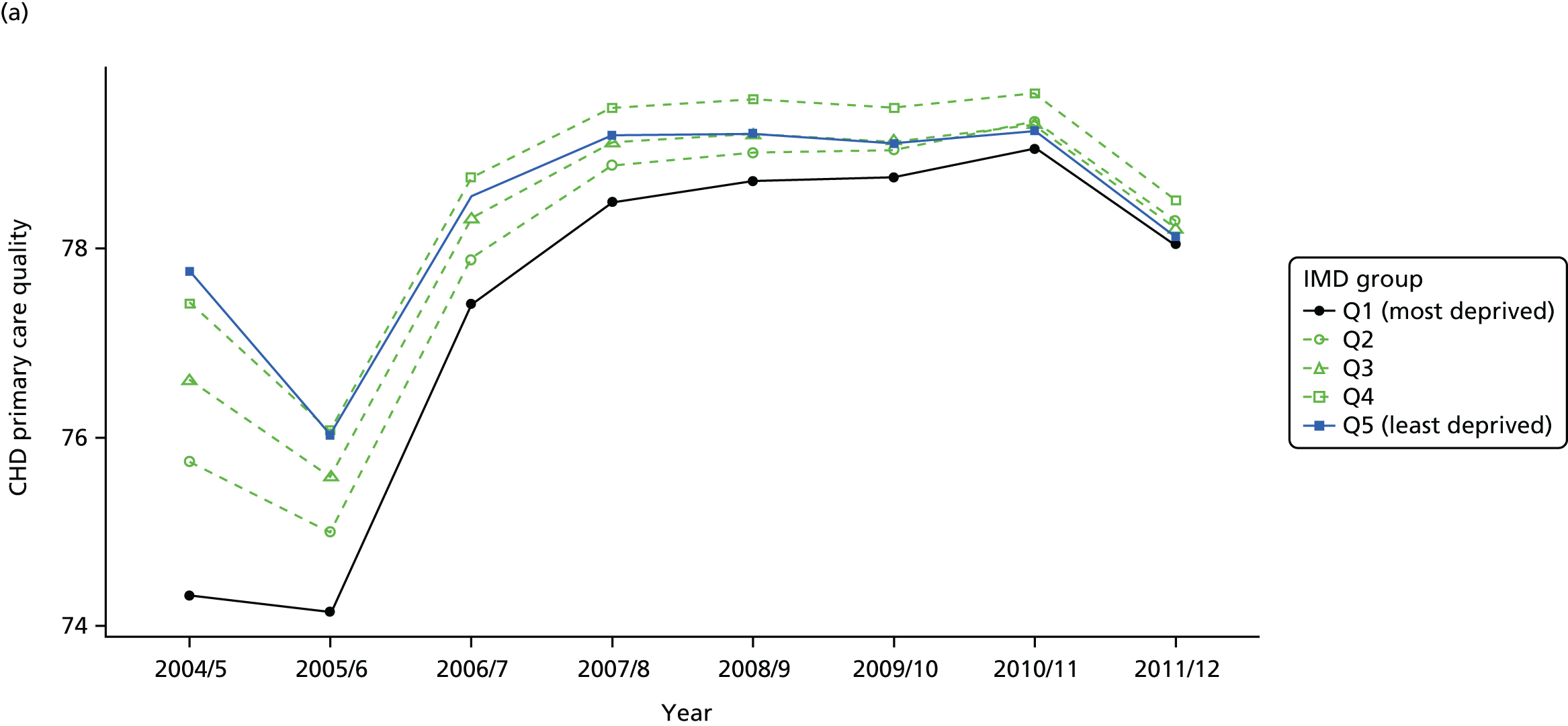
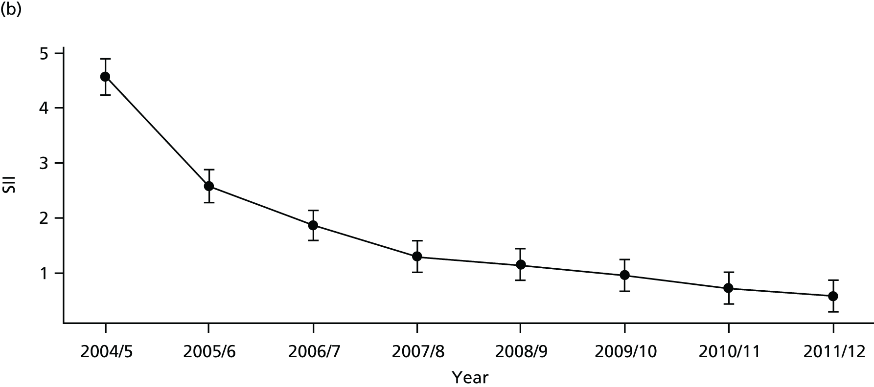
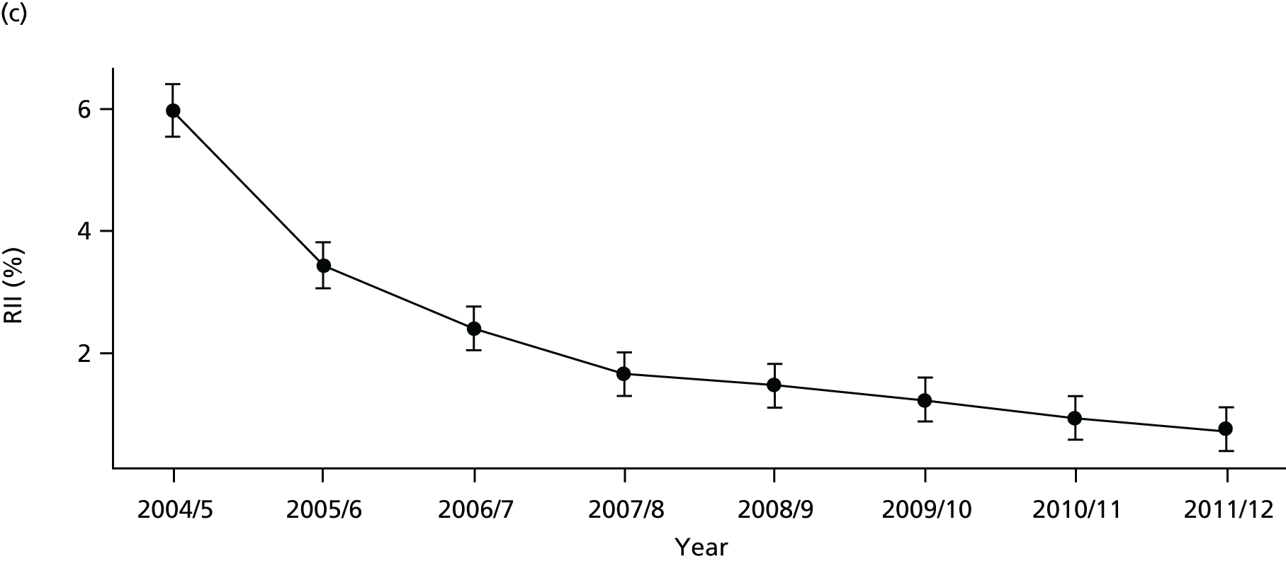
FIGURE 66.
National social gradient in CHD primary care quality in 2011/12. Notes: (1) Dots represent decile groups; (2) the slope of the line is the SII; and (3) the shaded area shows the inequity gap.

FIGURE 67.
Unadjusted equity time trend in emergency hospitalisation for CHD. Notes: (1) the solid black line shows the most deprived quintile and the solid blue line shows the least deprived quintile; (2) negative SII indicates pro-poor distribution, while a positive SII indicates a pro-rich distribution in absolute terms; and (3) negative RII indicates pro-poor distribution, while a positive RII indicates a pro-rich distribution in relative terms.

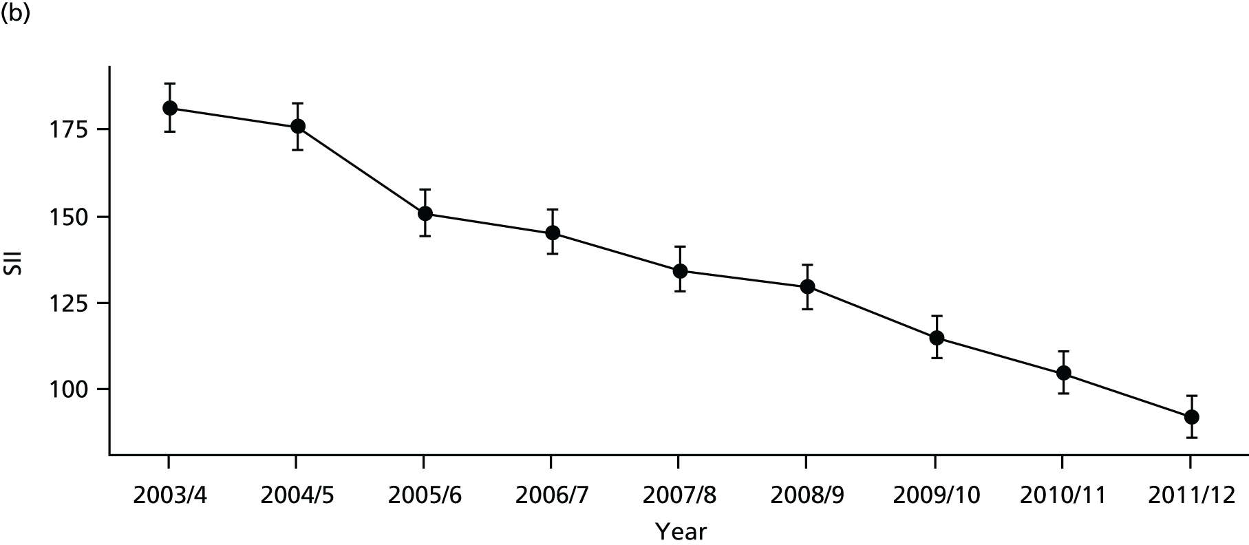
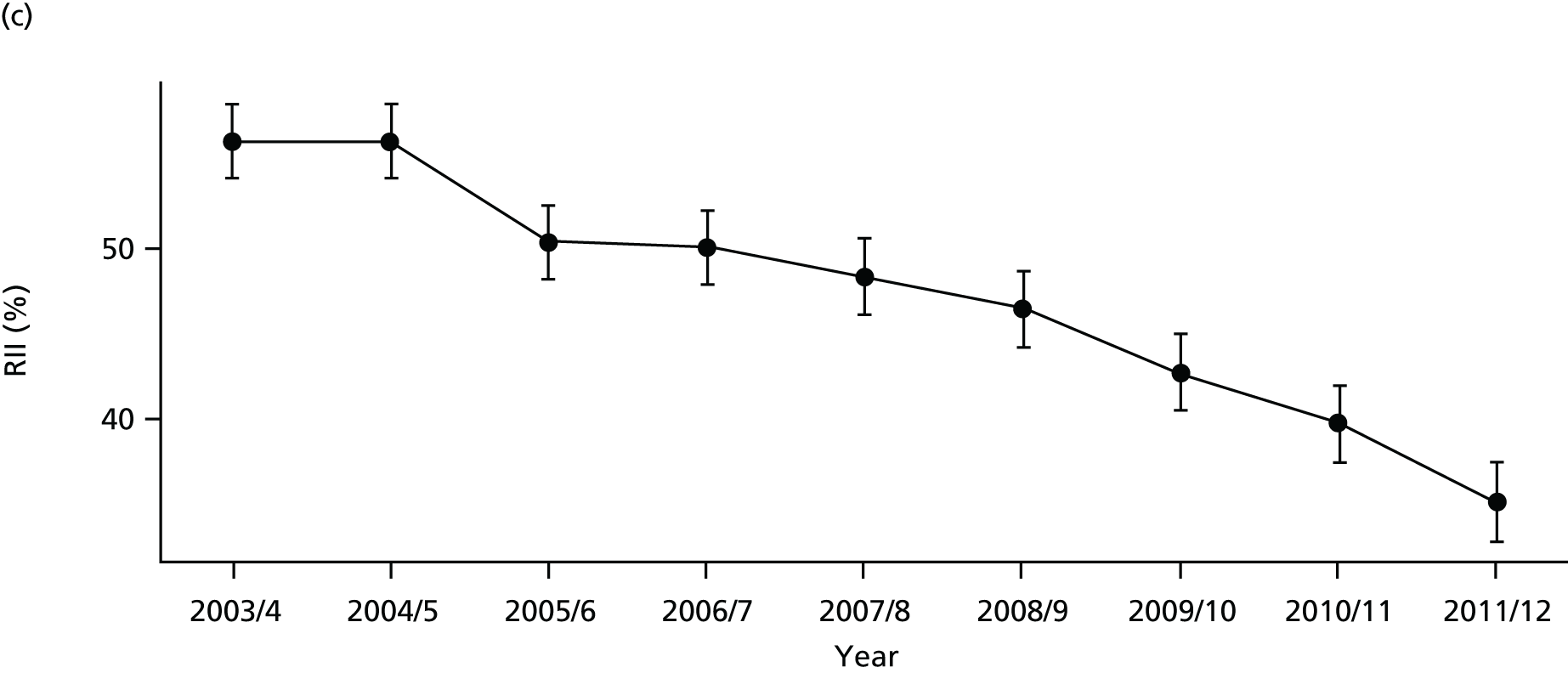
FIGURE 68.
Adjusted equity time trend in emergency hospitalisation for CHD. Notes: (1) the solid black line shows the most deprived quintile and the solid blue line shows the least deprived quintile; (2) negative SII indicates pro-poor distribution, while a positive SII indicates a pro-rich distribution in absolute terms; and (3) negative RII indicates pro-poor distribution, while a positive RII indicates a pro-rich distribution in relative terms.
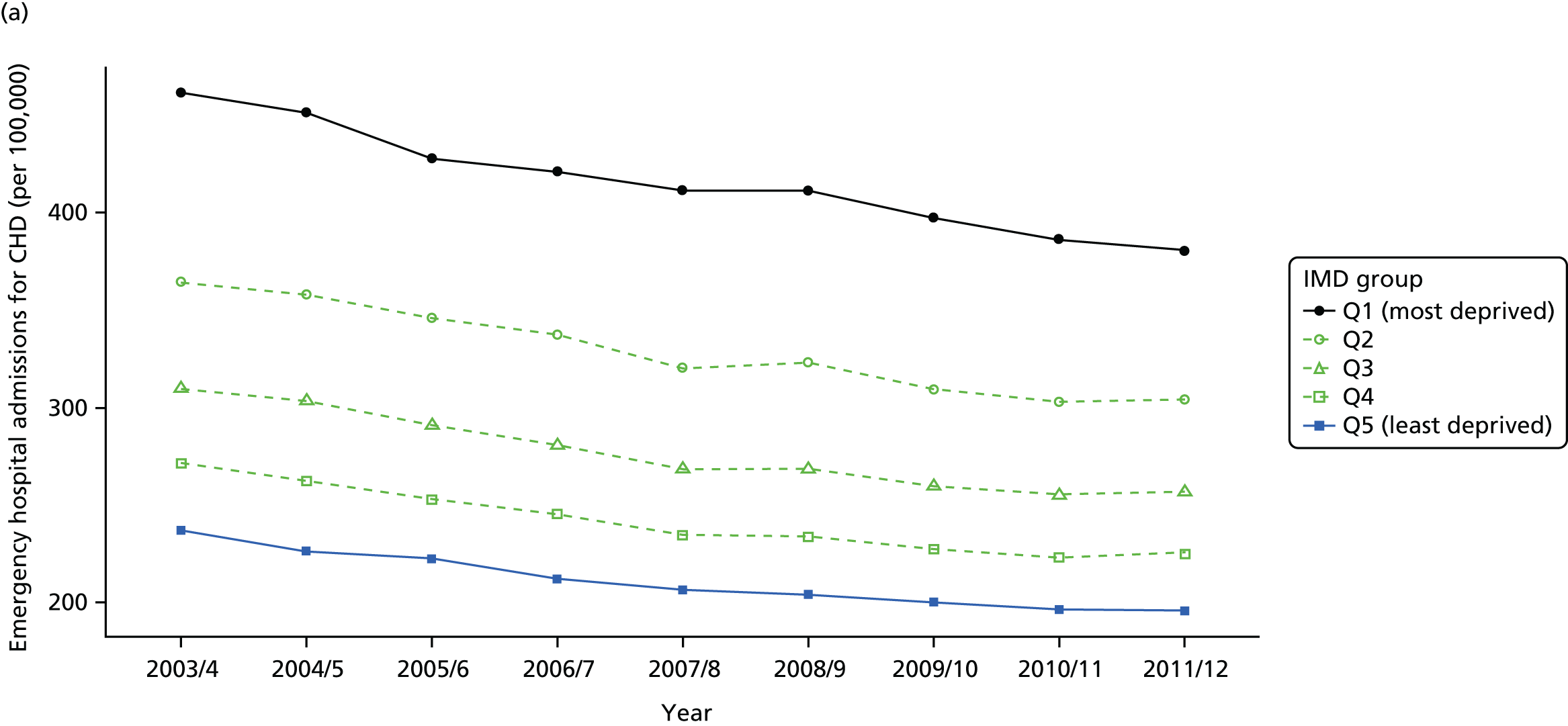
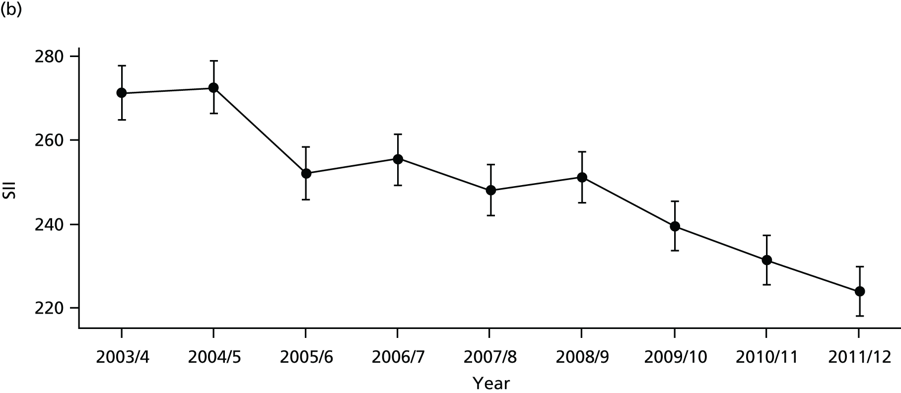
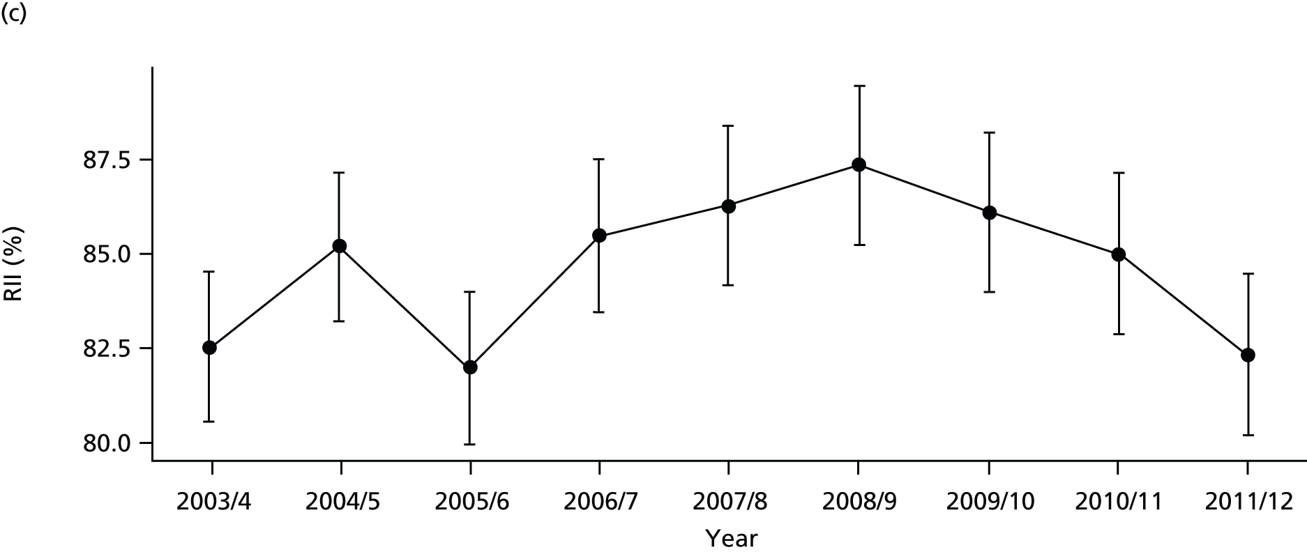
FIGURE 69.
National social gradient in emergency hospitalisation for CHD in 2011/12. Notes: (1) dots represent decile groups; (2) the slope of the line is the SII; and (3) the shaded area shows the inequity gap.
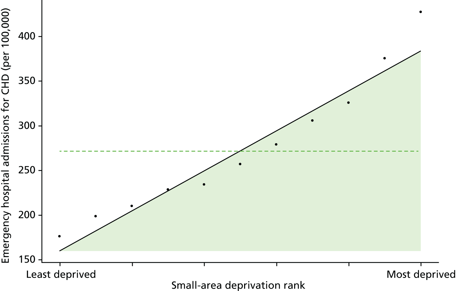
FIGURE 70.
Unadjusted equity time trend in mortality from CHD. Notes: (1) the solid black line shows the most deprived quintile and the solid blue line shows the least deprived quintile; (2) negative SII indicates pro-poor distribution, while a positive SII indicates a pro-rich distribution in absolute terms; and (3) negative RII indicates pro-poor distribution, while a positive RII indicates a pro-rich distribution in relative terms.
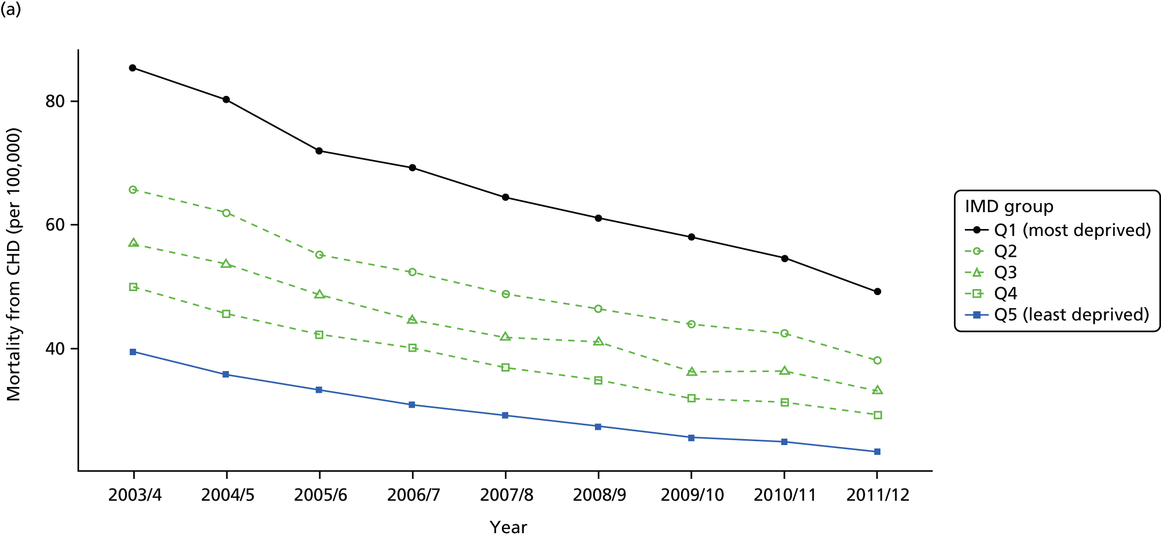
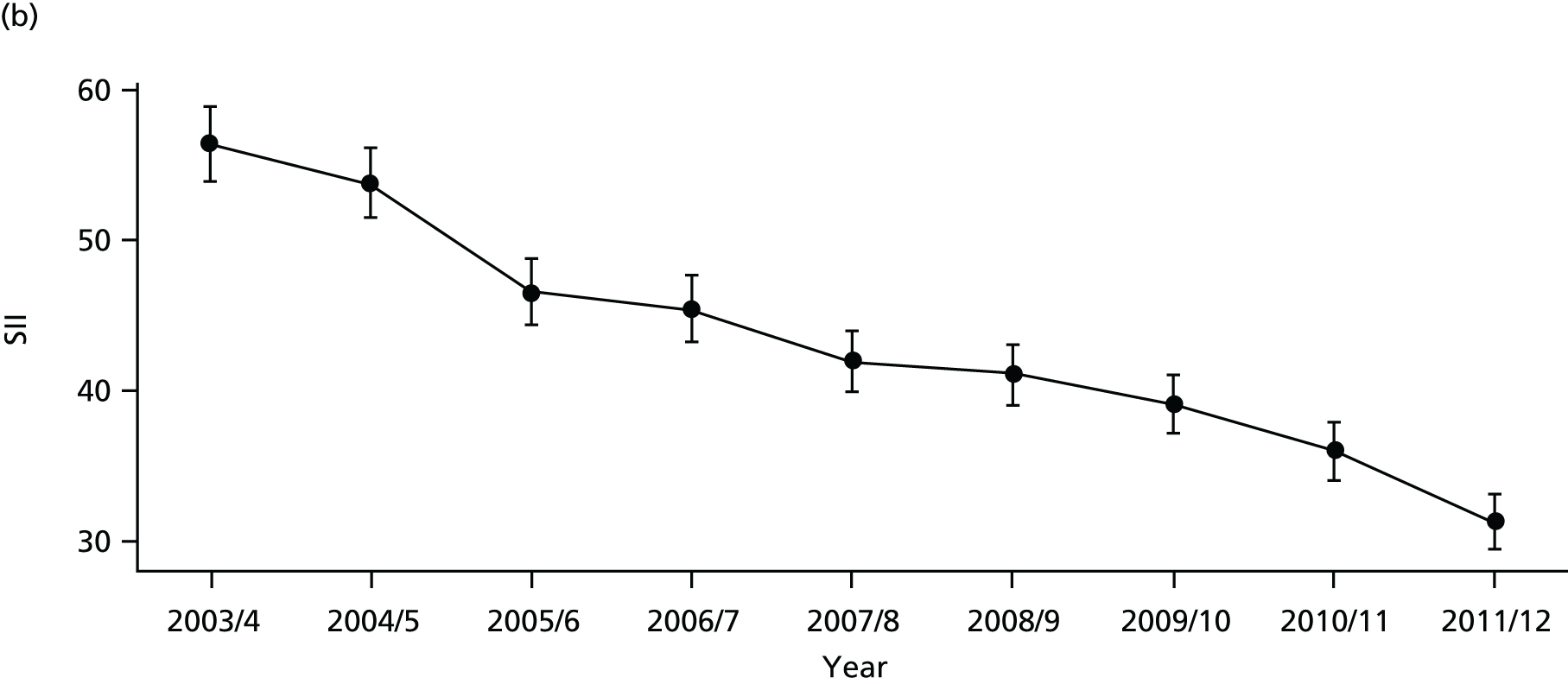
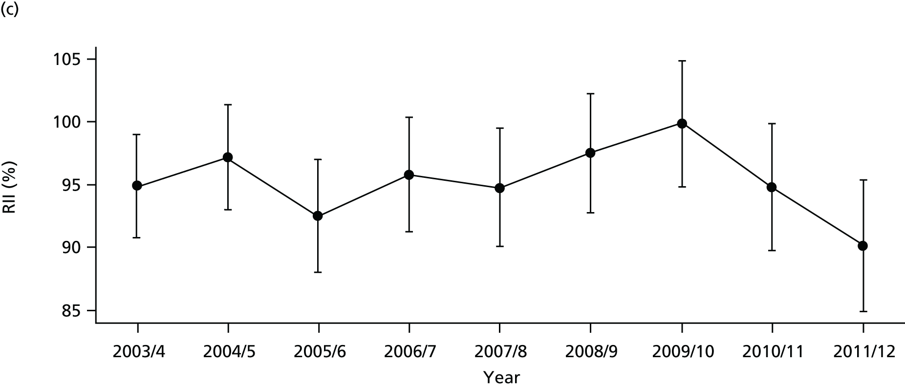
FIGURE 71.
Adjusted equity time trend in mortality from CHD. Notes: (1) the solid black line shows the most deprived quintile and the solid blue line shows the least deprived quintile; (2) negative SII indicates pro-poor distribution, while a positive SII indicates a pro-rich distribution in absolute terms; and (3) negative RII indicates pro-poor distribution, while a positive RII indicates a pro-rich distribution in relative terms.
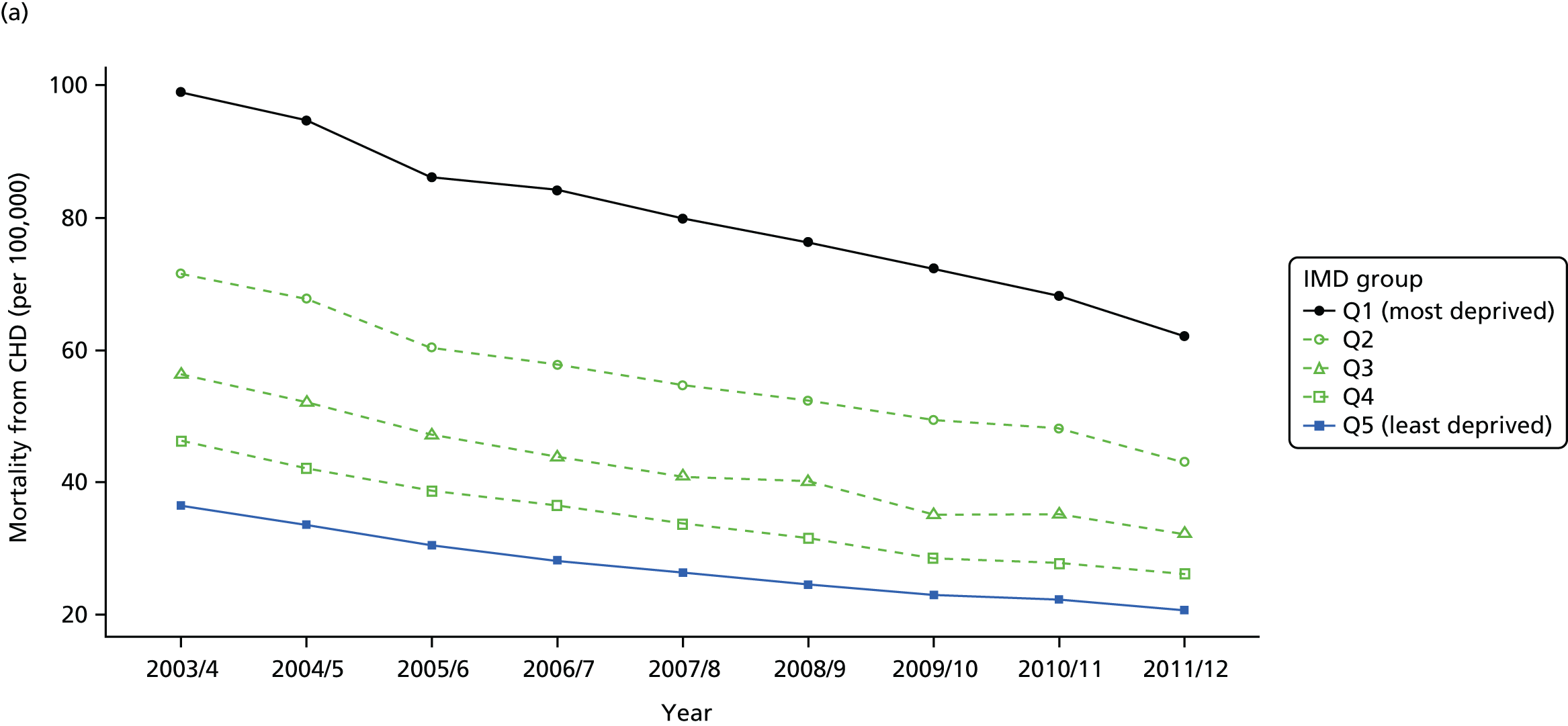
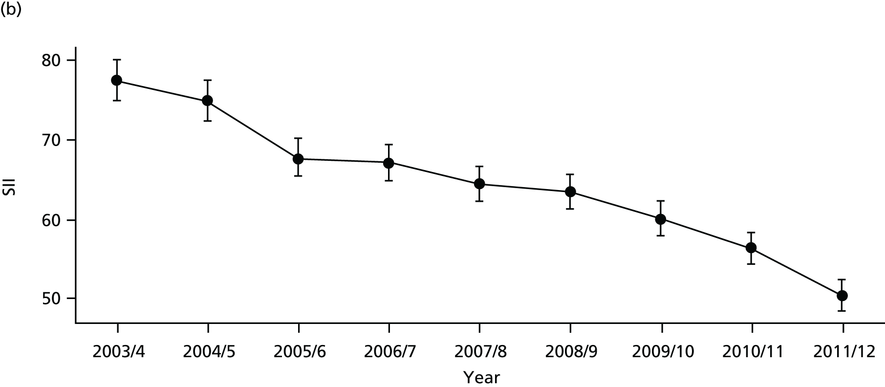
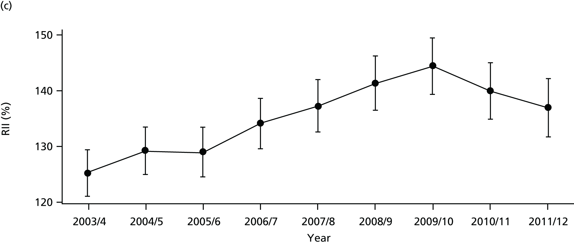
FIGURE 72.
National social gradient in mortality from CHD in 2011/12. Notes: (1) dots represent decile groups; (2) the slope of the line is the SII; and (3) the shaded area shows the inequity gap.

Discussion of coronary heart disease indicator findings
The basic pattern of our CHD findings is an improvement in average quality and a reduction in absolute inequality between 2001 and 2011. This pattern is entirely in line with our general findings for primary care quality, preventable hospitalisation and amenable mortality, although the improvements and absolute inequality reductions are even larger. However, as with the general indicators, these reductions in absolute inequality do not translate into improvements in relative inequality in the case of hospitalisation and mortality because the mean level of CHD hospitalisation and mortality is falling fast.
Appendix 2 Prototype diabetes indicators
This appendix reports on our prototype national equity indicators for diabetes mellitus. We have analysed three indicators:
-
diabetes1: primary care quality for diabetes
-
diabetes2: emergency hospitalisation for diabetes
-
diabetes: mortality from diabetes.
This appendix is divided into three sections: (1) indicator definitions, (2) graphical results, and (3) discussion.
Diabetes indicator definitions
Diabetes1: primary care quality – glycaemic control in diabetic patients
Definition
This indicator measures the proportion of people with diabetes who have achieved tight glycaemic control according to the most recently recorded set of measurements within the last 12 months. This is measured by glycated haemoglobin (HbA1c) targets for average plasma glucose (sugar) concentration over a sustained period (about 3 months). We use glycaemic control as a measure of quality of diabetes care in the primary care setting. The numerator is the number of people with diabetes who were within the limit for glycaemic control. The denominator is the total number of people in each practice who were registered as having diabetes.
Technical details
General practitioner practices record the number of patients with diabetes who are listed in their practice registers. Achieving glycaemic control in diabetic patients, as measured by HbA1c level in blood, is one of the indicators in the QOF (UK Prospective Diabetes Study 1998). 199 The denominator of the indicator is the number of patients registered as having diabetes and who were not ‘exception reported’ by the practice, and the numerator is the number of diabetes patients for whom glycaemic control target was met (as set in the QOF for a particular year, details below). Therefore, the reported achievement is the proportion of diabetic patients for whom the practice met the indicator target for glycaemic control.
The threshold level for glycaemic control has changed slightly on various occasions since the inception of QOF in 2004/5. Therefore, we use the relevant threshold for each year (Table 4).
| Indicator name in QOF | Years | HbA1c threshold (%) |
|---|---|---|
| DM6 | 2004/5; 2005/6 | ≤ 7.4 |
| DM20 | 2006/7; 2007/8; 2008/9 (replaced DM6) | ≤ 7.5 |
| DM23 | 2009/10; 2010/11 (replaced DM20) | ≤ 7 |
| DM26 | 2011/12 onward (replaced DM23) | ≤ 7.5 |
We do not standardise this indicator, as factors such as the age and sex distribution in the GP practice population are not legitimate justifications for variation in GP performance on this indicator.
The basic geographical unit of analysis was the 2001 LSOA. Primary care quality data for glycaemic control were attributed from practice level to LSOA level using the NHS ADS of GP-registered populations for the 8 years 2004/05 through 2011/12.
Diabetes2: emergency hospitalisation for diabetes
Definition
Emergency hospitalisation for diabetes is defined as the number of people per 1000 population having one or more emergency hospitalisations for diabetes complications, adjusting for age and sex. Diabetes is a condition that should not normally result in an emergency admission if appropriately managed.
The numerator is the number of people with diabetes-related emergency hospital admissions during the indicator year (both finished and unfinished admission episodes, excluding transfers). This is derived from the HES APC, provided by the HSCIC.
The denominator is the total number of people alive at the mid-point of the current financial year. The ONS mid-year England population estimates for the respective calendar years are used for this purpose.
Technical details
This indicator measures the rate of diabetes-related emergency hospital admissions per 1000 people. This is often used as an indicator of the performance of primary care and the interface between primary and secondary care. To identify diabetes-related emergency admissions, we focus on the primary diagnosis field using diabetes-related ICD-10 codes E10–E14 representing ‘type 1 diabetes mellitus’, ’type 2 diabetes mellitus’, ‘E13: other specified diabetes mellitus’, and ‘E14: unspecified diabetes mellitus. This is a broader list of codes than used by the ONS to identify ‘preventable hospitalisation’ for diabetes. We use this broader list for simplicity and for greater comparability with our indicator of diabetes-related mortality. Like the ONS, however, we use emergency hospital admissions for all ages, including young children and people over 75 years.
The more restrictive ONS list of preventable hospitalisations for chronic ambulatory care-sensitive conditions, as used in the NHS Outcomes Framework, includes admissions for one of the following reasons:
-
all complications due to poor short-term glycaemic control
-
acute hyperglycaemia (ketoacidosis and coma)
-
non-specific hyperglycaemia
-
hypoglycaemia.
The ICD-10 codes for this more restrictive list of diabetes-related admissions are presented in Table 5. This restrictive list is used in other literature, although sometimes with additions; for example, Dusheiko et al. 78 use one additional code of E162: hypoglycaemia, unspecified.
| Type of complication | ICD-10 |
|---|---|
| All diabetes complications | E100, E101, E110, E111, E120, E121, E130, E131, E140, E141, E162, E107, E108, E109, E117, E118, E119, E127, E128, E129, E137, E138, E139, E147, E148, E149 |
| Code type | Definition |
| ICD-10 codes | E10: insulin-dependent diabetes mellitus |
| E11: non-insulin-dependent diabetes mellitus | |
| E13: other specified diabetes mellitus | |
| E14: unspecified diabetes mellitus | |
| ICD-10 extension | 0: with coma |
| 1: with ketoacidosis | |
| 7: with multiple complications | |
| 8: with unspecified complications | |
| 9: without complications |
We calculate indirectly standardised emergency hospital admission rate for diabetes for each small area to allow for differing age and sex structure by deprivation level. To do so, we start with individual-level HES data on diabetes-related emergency admissions and aggregate up to small-area level. We then compute the expected hospitalisation counts for each small area by applying national age–sex hospitalisation rates to small-area-level numbers of people in each age–sex group. We then compute the adjusted rate for each small area as the product of the ratio of observed over expected count for the small area and the national rate. We then compute the adjusted count for each small area as adjusted rate times the small-area population. Finally, we aggregate up this adjusted count to quantile group level to present the adjusted count per 1000 people in each quantile group.
Diabetes3: amenable mortality from diabetes, age and sex adjusted
Definition
Amenable mortality from diabetes is defined as the number of deaths per 1000 people from diabetes, allowing for age and sex. The numerator is the number of people aged 0–74 years who died in the current financial year because of diabetes. The denominator is the number of people aged 0–74 years alive at mid-point in the current financial year.
Technical details
Amenable mortality from diabetes was defined according to the ICD-10 codes listed in the ONS list of causes of death considered amenable to health care; the ICD-10 codes are E10-E14 representing ‘type 1 diabetes mellitus’, ’type 2 diabetes mellitus’, ‘E13: other specified diabetes mellitus’, and ‘E14: unspecified diabetes mellitus.
Diabetes is on the ONS list of ‘mortality amenable to health-care’ conditions that are responsible for at least 100 deaths in a year and that have a clear link between the number of deaths and health-care interventions. We depart slightly from the ONS list, by applying a higher age limit of 74 years to numerator and denominator, rather than the ONS age limit of 49 years. The ONS apply an age limit of 49 years largely because identification of the underlying cause of death is particularly problematic for diabetes, and so identification can become unreliable after the age of 50 years. This cut-off point of 49 years is also used in other literature, for example Nolte and McKee. 58 However, we use a higher age limit for greater comparability with the age profiles used in our other diabetes indicators.
We calculate indirectly standardised amenable mortality rate from diabetes for each small area to allow for differing age and sex structure by deprivation level. To do so, we start with individual-level ONS mortality data and aggregate up to small-area level. We then compute the expected number of deaths in each small area by applying national age–sex mortality rates to small-area-level numbers of people in each age–sex group. We then compute the adjusted rate for each small area as the product of the ratio of observed over expected count for the small area and the national rate. We then compute the adjusted count for each small area as adjusted rate times the small-area population. Finally, we aggregate up this adjusted count to quantile group level to present the adjusted count per 1000 people in each quantile group.
Graphical results for diabetes indicators
FIGURE 73.
Equity time trend in diabetes primary care quality. Notes: (1) the solid black line shows the most deprived quintile and the solid blue line shows the least deprived quintile; (2) negative SII indicates pro-poor distribution, while a positive SII indicates a pro-rich distribution in absolute terms; and (3) negative RII indicates pro-poor distribution, while a positive RII indicates a pro-rich distribution in relative terms.
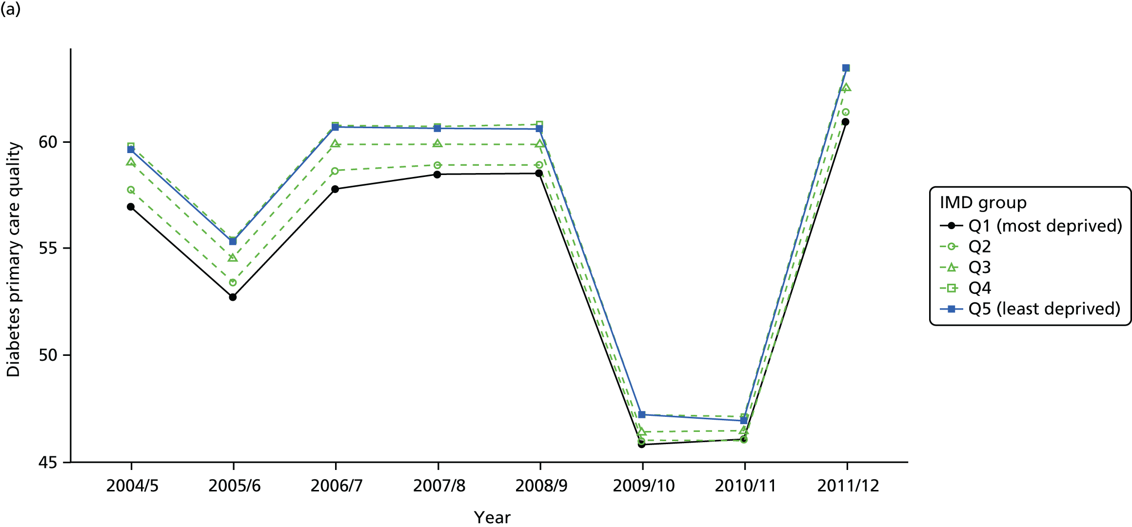
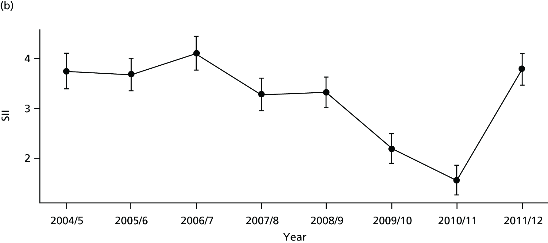
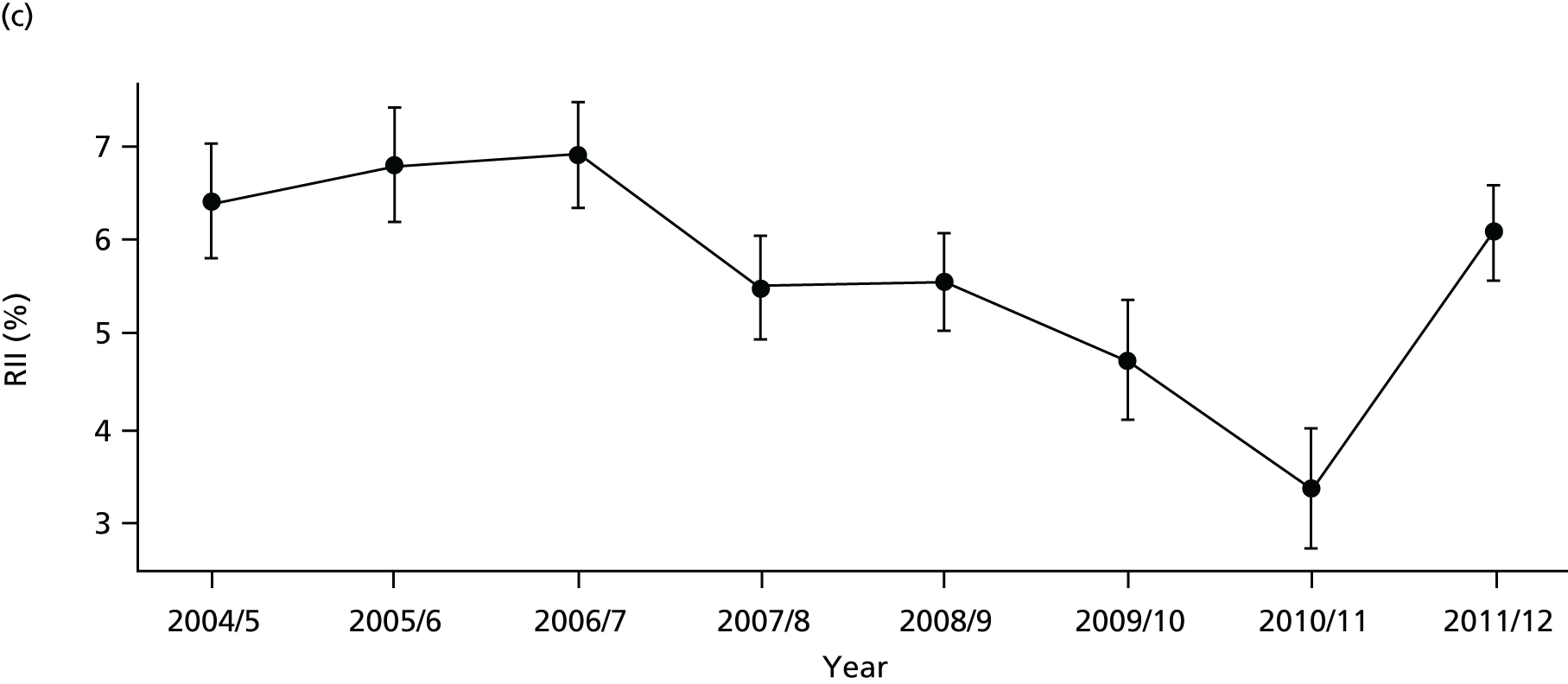
FIGURE 74.
National social gradient in diabetes primary care quality in 2011/12. Notes: (1) dots represent decile groups; (2) the slope of the line is the SII; and (3) the shaded area shows the inequity gap.
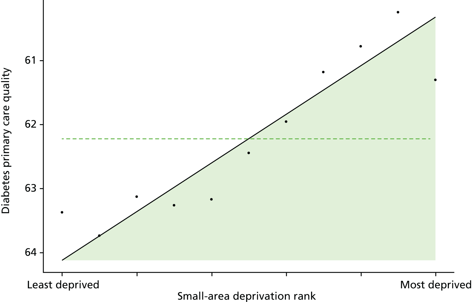
FIGURE 75.
Unadjusted equity time trend in emergency hospitalisation for diabetes. Notes: (1) the solid black line shows the most deprived quintile and the solid blue line shows the least deprived quintile; (2) negative SII indicates pro-poor distribution, while a positive SII indicates a pro-rich distribution in absolute terms; and (3) negative RII indicates pro-poor distribution, while a positive RII indicates a pro-rich distribution in relative terms.

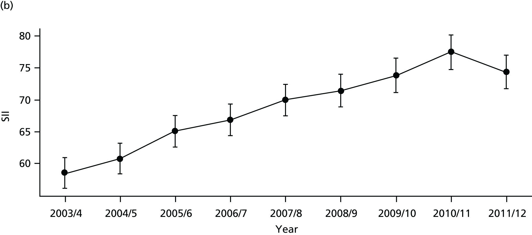

FIGURE 76.
Adjusted equity time trend in emergency hospitalisation for diabetes. Notes: (1) the solid black line shows the most deprived quintile and the solid blue line shows the least deprived quintile; (2) negative SII indicates pro-poor distribution, while a positive SII indicates a pro-rich distribution in absolute terms; and (3) negative RII indicates pro-poor distribution, while a positive RII indicates a pro-rich distribution in relative terms.
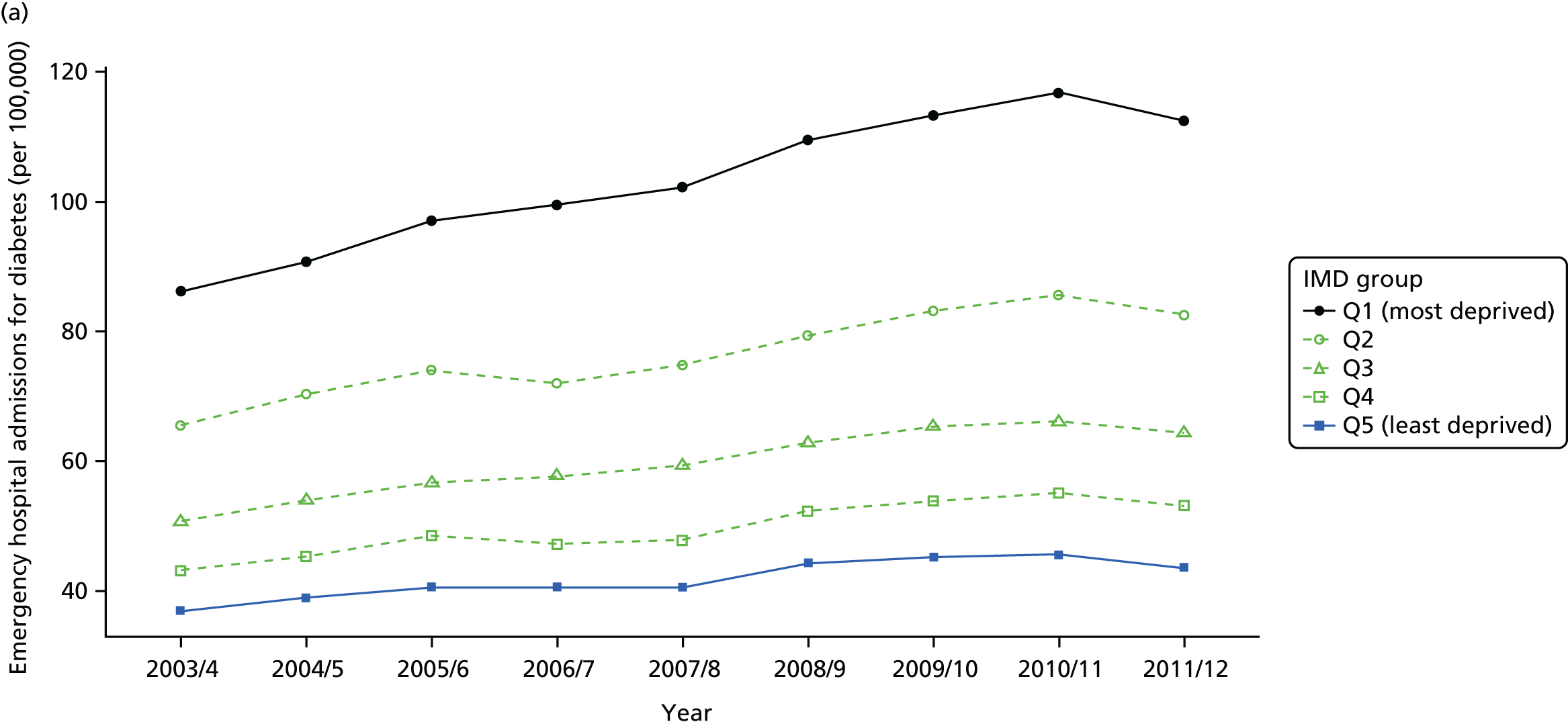
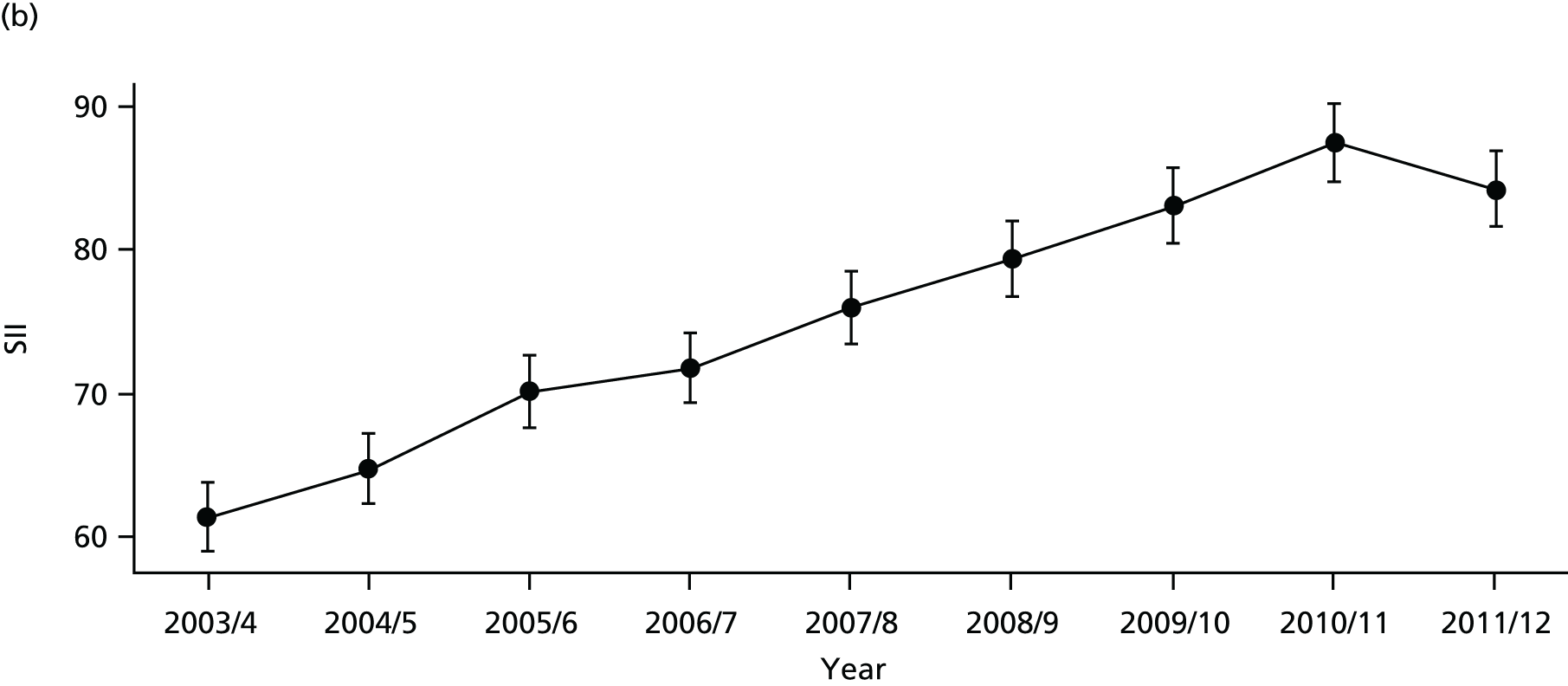
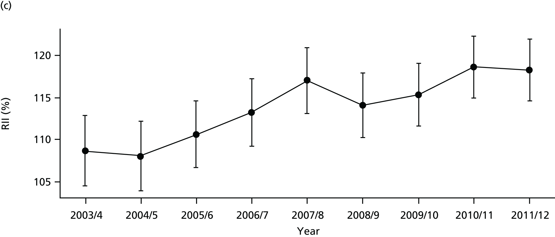
FIGURE 77.
National social gradient in emergency hospitalisation for diabetes in 2011/12. Notes: (1) dots represent decile groups; (2) the slope of the line is the SII; and (3) the shaded area shows the inequity gap.
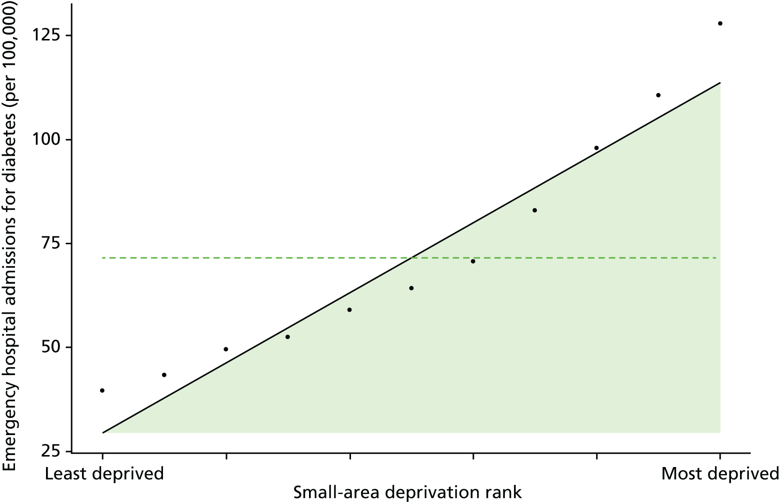
FIGURE 78.
Unadjusted equity time trend in mortality from diabetes. Notes: (1) the solid black line shows the most deprived quintile and the solid blue line shows the least deprived quintile; (2) negative SII indicates pro-poor distribution, while a positive SII indicates a pro-rich distribution in absolute terms; and (3) negative RII indicates pro-poor distribution, while a positive RII indicates a pro-rich distribution in relative terms.

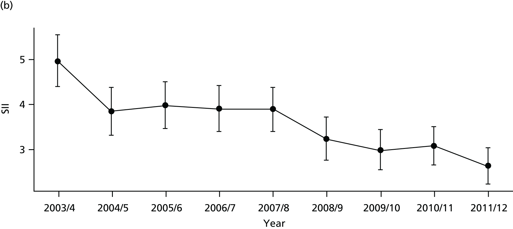
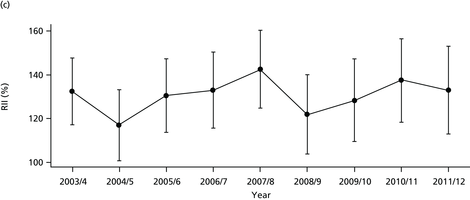
FIGURE 79.
Adjusted equity time trend in mortality from diabetes. Notes: (1) the solid black line shows the most deprived quintile and the solid blue line shows the least deprived quintile; (2) negative SII indicates pro-poor distribution, while a positive SII indicates a pro-rich distribution in absolute terms; and (3) negative RII indicates pro-poor distribution, while a positive RII indicates a pro-rich distribution in relative terms.
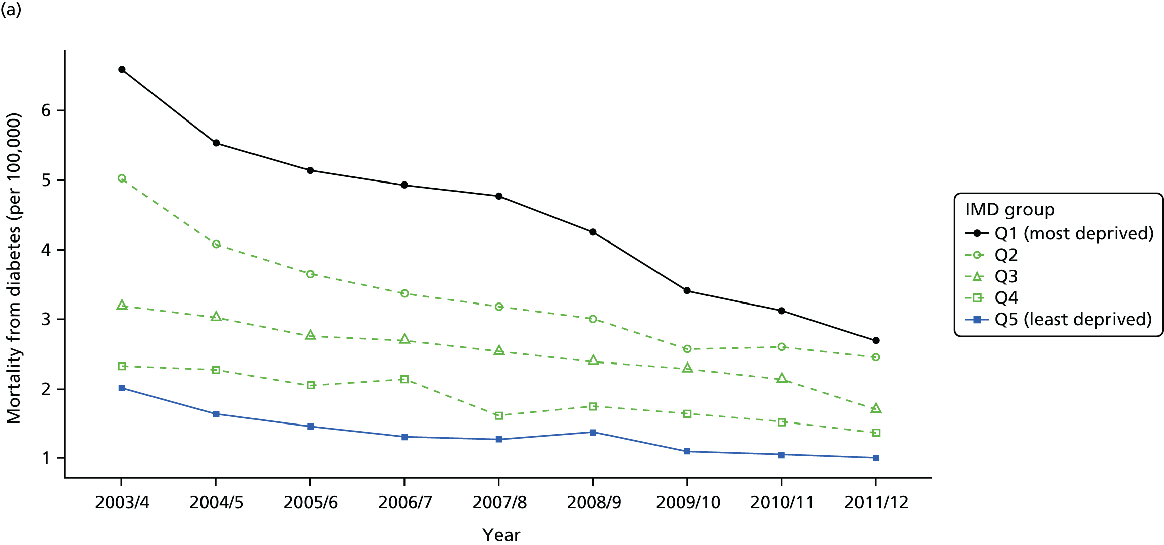

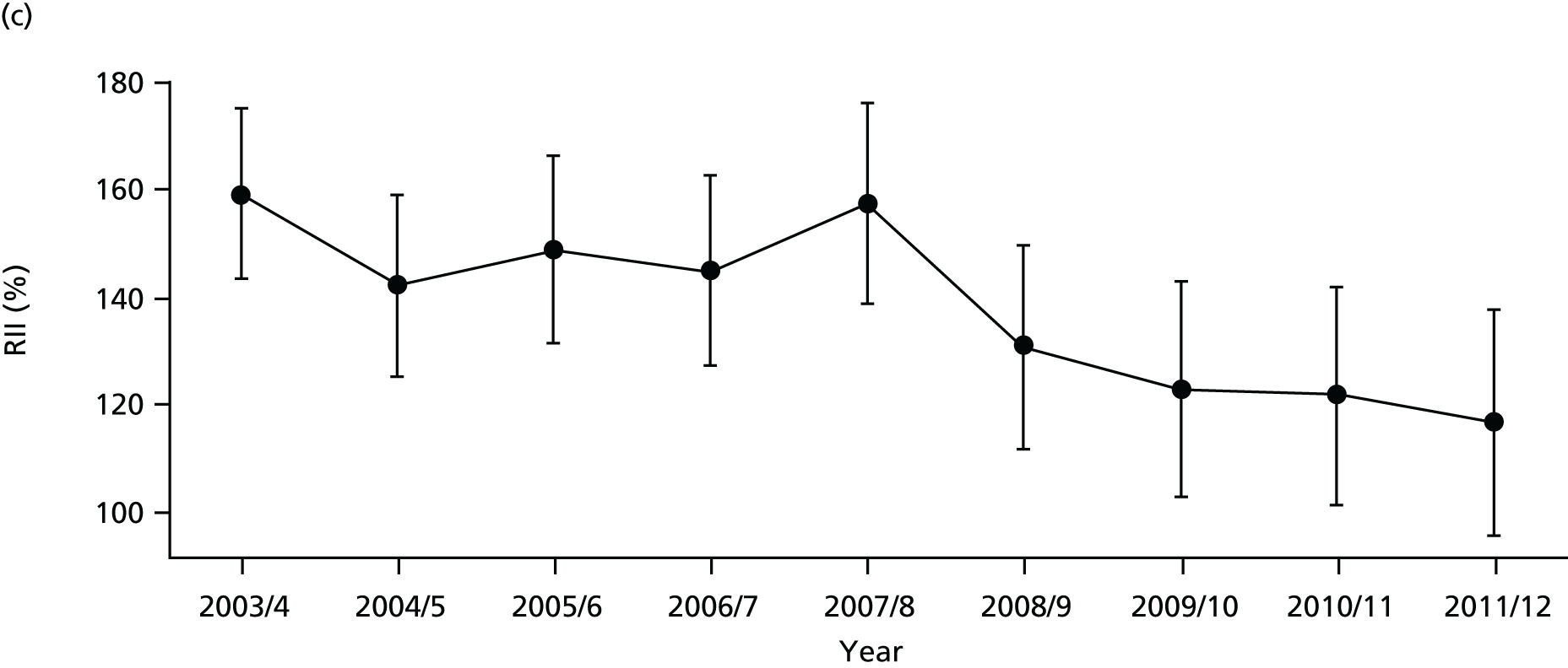
FIGURE 80.
National social gradient in mortality from diabetes in 2011/12. Notes: (1) dots represent decile groups; (2) the slope of the line is the SII; and (3) the shaded area shows the inequity gap.
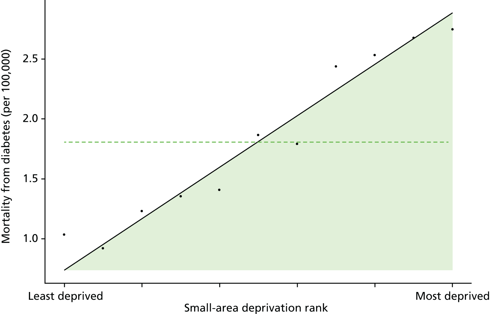
Discussion of diabetes indicator findings
It is not possible to draw clear time series conclusions from the clinical process quality indicator for diabetes, because of the repeated changes of indicator definition which manifest themselves as repeated breaks in the time series. If anything, however, both average quality and socioeconomic inequality appear not to have changed much over the period. This contrasts with the situation for CHD and general indicators of clinical process quality, which show a clear pattern of improving quality and reducing inequality.
There is a clear pattern of increasing average emergency hospitalisation for diabetes from 2001 to 2011 along with an increase in absolute inequality. This is the direct opposite of the pattern for preventable hospitalisation in general, and for emergency hospitalisation for CHD, both of which show a pattern of falling average emergency hospitalisation and falling absolute inequality. This increase in hospitalisation may be partly because of increasing prevalence of diabetes, as we adjust for age and sex but not for disease prevalence. Reported prevalence increased during the period, although this may be partly because of changes in diagnosis and reporting behaviour leading to earlier and more complete reporting of cases as opposed to a rise in the true underlying number of cases at risk of emergency hospitalisation for diabetes. In addition, clinical guidelines introduced during the 2000s recommended interventions to achieve lower target levels of HbA1c, related to lower blood sugars. These interventions are associated with increased use of insulin and higher doses of oral hypoglycaemics, which increases the risk of hypoglycaemia which may increase the risk of hypoglycaemic attack and hence an increase in emergency hospitalisation.
Finally, mortality from diabetes has fallen over the period, as has both absolute and relative inequality in mortality. This contrasts sharply with the pattern for emergency hospitalisation for diabetes, and raises an interesting puzzle for future research: why did mortality from diabetes fall at a time of increasing prevalence of diabetes? The reason may be that the mortality impact of diabetes depends on the presence of comorbid conditions, as well as the quality of diabetes management. Cardiovascular disease is the main cause of death in people with diabetes, accounting for between 52% and 80% of all deaths. 200 Declining morbidity from diabetes may therefore reflect declining CHD prevalence and mortality caused by changes in lifestyle behaviour and improved medical technology for the treatment of CHD. In essence, our hypothesis is that success in tackling CHD is reducing the mortality impact of diabetes while increasing its prevalence, because people who would otherwise have died prematurely from CHD are now living long enough to suffer from diabetes. This is purely a speculation, however, and would need testing in further research.
Appendix 3 Advisory group members

Centre for Health Economics
Developing indicators of change in NHS equity performance
Chairperson, Brian Ferguson.
Ray Avery, Equality and Health Inequalities Unit, NHS England.
Allan Baker, Head of Intelligence, London, Public Health England.
Chris Bentley, Independent Consultant, Health Inequalities National Support Team Associates.
Sarah Curtis, Professor of Geography, University of Durham.
Tim Doran, Professor of Health Policy, University of York.
Brian Ferguson, Director, Knowledge & Intelligence, Public Health England.
Steve Field, Chief Inspector of General Practice, Healthcare Quality Commission.
Donald Franklin, Senior Economist, Department of Health.
Chris Gale, Associate Professor, University of Leeds.
Peter Goldblatt, Deputy Director, University College London (UCL) Institute for Health Equity.
Anne Griffin, Health Inequalities Team Leader, Department of Health.
Iona Heath, Past President, Royal College of General Practitioners.
Ian Holmes, Head of Health System Alignment, NHS England.
Azim Lakhani, Former Head of Clinical Analysis Research and Development, Information Centre for Health and Social Care.
Alan Maynard, Former Chair of York CCG, University of York.
Nicholas Mays, Professor of Health Policy, London School of Hygiene & Tropical Medicine.
Lara McClure, Public member.
Mark Petticrew, Professor of Public Health Evaluation, London School of Hygiene & Tropical Medicine.
Jennie Popay, Professor, Liverpool.
Carol Propper, Chair in Economics, Imperial College London.
Wim Troch, Public member.
Appendix 4 Indicator definitions
Primary care supply
Definition
Primary care supply is defined as the number of patients per FTE GP, excluding registrars and retainers, adjusted for age, sex and neighbourhood ill health using the Carr-Hill workload adjustment. The numerator is the ONS estimate of the total resident population at the mid-point of the current calendar year, which includes the homeless and people living in institutions such as care homes, prisons and barracks. The denominator is the number of FTE GPs excluding registrars and retainers attributed to each small area in the current indicator year.
Technical details
Our data on primary care supply at GP-practice level were obtained from the annual NHS GMS workforce census, taken 30 September each year, midway through the financial year. In keeping with standard measures of the GP workforce, we exclude GP registrars and GP retainers from our measure.
We used these data to construct whole-population national data sets at small-area (LSOA) level by using the NHS ADS of GP-registered populations to attribute FTE GPs from GP practices to LSOAs. The attribution data set details the LSOAs in which the patients registered with the practice live. We use this information to determine the proportion of the FTE GP workforce attached to the practice to attribute to each of the LSOAs that the patients registered with the practice live in. Applying this attribution calculation to each GP practice and then aggregating the GP supply attributed from the different practices at LSOA level gives us our measure of primary care supply at LSOA level. We linked practice-level data on primary care supply for the 10 years 2004/05 through 2011/12 with corresponding LSOA-level data on population and deprivation. We used data from all 9092 general practices in the English NHS that were open for at least 1 year of the study period.
We then need-weighted the population for each small area for age, sex and IMD 2010 health and disability domain using the Carr-Hill formula workload adjustment (updated 2007 version, Table 6). This adjustment upscales populations that are expected to require more primary care and downscales populations expected to require less. 54,201 The Carr-Hill formula is used for distributing funding to GP practices. The version of the formula we use was recommended in 2007 by the Formula Review Group, established by NHS Employers and the BMA, and although never implemented in practice it remains the most authoritative and up-to-date analysis of the determinants of primary care workload in England. We do not adjust for temporary resident population, the fourth and final workload adjustment factor in the Carr-Hill formula, as the HSCIC were unable to provide us with the patient-level data necessary to make this adjustment.
| Age–sex weight | Registration status weight | IMD health and disability domain score weight | ||
|---|---|---|---|---|
| Band | Weight | Band | Weight | |
| Male, 0–4 years | 2.354 | Registered with practice for ≥ 12 months | 1.000 | The weight is calculated as: 1.054 to the power of the IMD Health Domain score associated with the patient’s postcode |
| Male, 5–14 years | 1.000 | Registered with practice in last 12 months | 1.689 | |
| Male, 15–44 years | 0.913 | |||
| Male, 45–64 years | 1.373 | |||
| Male, 65–74 years | 2.531 | |||
| Male, 75–84 years | 3.254 | |||
| Male, ≥ 85 years | 3.193 | |||
| Female, 0–4 years | 2.241 | |||
| Female, 5–14 years | 1.030 | |||
| Female, 15–44 years | 1.885 | |||
| Female, 45–64 years | 2.115 | |||
| Female, 65–74 years | 2.820 | |||
| Female, 75–84 years | 3.301 | |||
| Female, ≥ 85 years | 3.090 | |||
An alternative would have been to use GP practice registered populations as the population numerator, rather than ONS estimates of resident population. However, we did not do this for the sake of consistency with the other indicators. We have chosen to use ONS mid-year population estimates for all our indicators, because of the concern about GP practice list inflation. This occurs, for example, when people leave an area without telling their local GP, and means that GP registers tend to overestimate the total population.
We believe that the Carr-Hill formula underestimates additional need for primary care supply in deprived areas. This is because it only allows for morbidity and not also for how multiple morbidity and disadvantage combine to generate additional health-care needs.
Primary care quality
Definition
Primary care quality is a score between 0 and 100, and defined as a weighted average clinical process quality score in terms of population achievement for 16 indicators in the national QOF. Each indicator measures the percentage of the relevant patient population for whom the quality target is achieved. The weights used to combine these indicators into a primary care quality score are proportional to importance of the individual indicators in terms of the estimated mortality reduction impact associated with improvement on the indicator.
Technical details
The list of indicators is reported in Table 7. This list includes some ‘intermediate outcomes’, such as measures of blood pressure and glucose control, as well as ‘pure’ clinical process quality indicators such as the proportion of patients with CHD receiving beta blockers.
| QOF indicator | Summary description of indicator | Crude prevalence per 100,000 registered patients, mean (SD) | Annual mortality reduction, per 100,000 registered patients |
|---|---|---|---|
| DM18 | Diabetes: influenza vaccination | 4420 (1881) | 63.7 |
| CHD12 | CHD: influenza vaccination | 3448 (1487) | 61.6 |
| BP5a | Hypertension: BP ≤ 150/90 mmHg | 13 548 (5117) | 48.2 |
| CHD10a | CHD: beta-blocker treatment | 3448 (1487) | 45.9 |
| STROKE10 | Stroke/TIA: influenza vaccination | 1649 (967) | 28.1 |
| DM23a | Diabetes: HbA1c ≤ 7.0% | 4420 (1881) | 26.5 |
| COPD8 | COPD: influenza vaccination | 1626 (958) | 24.9 |
| CHD9a | CHD: aspirin or other antithrombotic therapy | 3448 (1487) | 24.8 |
| CHD8a | CHD: cholesterol ≤ 5.0 mmol/l | 3448 (1487) | 15.8 |
| STROKE12a | Stroke (non-haemorrhagic): aspirin or other antithrombotic therapy | 1080 (649) | 15.8 |
| DM12 | Diabetes: BP ≤ 145/85 mmHg | 4420 (1881) | 13.5 |
| CHD6a | CHD: BP ≤ 150/90 mmHg | 3448 (1487) | 11.3 |
| SMOKING4 | CHD, stroke/TIA, hypertension, DM, CKD, COPD, asthma, psychosis: smoking cessation advice | 3903 (2525) | 10.9 |
| DM25 | Diabetes: HbA1c ≤ 9.0% | 4420 (1881) | 7.4 |
| DM15a | Diabetes with proteinuria or microalbuminuria: ACEI or ARB therapy | 505 (513) | 3.4 |
| CHD11a | CHD (myocardial infarction): ACEI or ARB therapy | 572 (291) | 1.5 |
We measure ‘population achievement’ on each clinical indicator. The denominator is the number of patients diagnosed with the relevant condition, and the numerator is the number of patients for whom the indicator was met. This is typically lower than ‘reported achievement’, which excludes from the denominator all patients declared as ‘exceptions’ by the practice. Population achievement is a more exacting target than reported achievement, and arguably provides a more consistent standard across different practices as some practices may engage in ‘gaming’ of their exception reporting statistics in order to report higher achievement and thereby receive greater income. 202,203 However, in sensitivity analysis we also examined ‘reported achievement’.
We started with a group of 20 QOF indicators, identified by Ashworth et al. ,85 based on available evidence on mortality reduction. We then selected 16 out of the 20 indicators for which data were available throughout our period of analysis in a consistent format. Each indicator was then weighted based on importance in terms of the estimated number of lives saved per 100,000 patients. These weights were derived from Ashworth et al. ,85 who identified the highest level of evidence for risk reduction in all-cause mortality and converted risk reduction estimates into estimated mortality reduction rates per 100,000 population per annum (see Table 7 for details).
Numerators and denominators for the QOF indicators were attributed from GP practice to LSOA level in an identical manner to that used to attribute primary care supply as described above. The QOF indicators were then calculated at LSOA level and these were then combined using the weighting process described to give average performance in terms of primary care quality score at LSOA level.
We do not need to risk adjust this indicator, as it is a nationally comparable quality measure that already allows for case mix by focusing only on the patient population diagnosed with the relevant condition. We do not additionally adjust for age and sex, on the basis of the value judgement that age and sex are not legitimate justifications for poor quality care.
Hospital waiting time
Definition
Hospital waiting time is defined as the mean number of days waited from outpatient decision-to-treat to inpatient admission-for-treatment. This can be termed the ‘inpatient waiting time’, to distinguish it from the ‘outpatient waiting time’ (from GP referral to specialist visit) and the ‘referral-to-treatment’ waiting time (from GP referral to inpatient admission). We allow for differences in waiting times by specialty, by adjusting for the main specialty of the treating consultant. We do not additionally allow for age and sex, on the basis of the value judgement that in most cases age and sex are not a legitimate justification for making people wait longer for needed treatment. Unlike most indicators, this is a mean rather than a ratio and so there is no numerator or denominator.
Technical details
This indicator measures the number of days waited from outpatient referral to inpatient admission per person hospitalised during the indicator year. We exclude ‘planned’ admissions for which waiting is medically appropriate rather than being a result of research constraints, for example because of the regular chemotherapy cycle or the planned removal of an internal fixation after 3 months (see the description on this HSCIC website http://systems.hscic.gov.uk/data/nhsdmds/faqs/waiting/plannedad; accessed 12 July 2015). There is no evidence of substantial ‘gaming’ of the coding of ‘planned’ versus ‘unplanned’ admissions that could lead to bias. 100 Other than ‘planned’ admissions, all patients who had an elective hospital admission during the indicator year were included, including young children and people over 75 years, either in NHS hospitals or in private hospitals with NHS funding.
We measure hospital waiting time in terms of days from outpatient decision-to-treat to inpatient admission-for-treatment. This is often termed the inpatient waiting time in the literature. Another commonly used indicator is the outpatient waiting time, defined as the period between referral from a GP to the outpatient appointment with a specialist. A third and more comprehensive indicator used in the NHS since the late 2000s is the referral-to-treatment waiting time, which measures the time from referral from a GP to inpatient admission-for-treatment, including adjustment to allow for ‘clock stop’ periods of waiting attributable to patient choices (e.g. not attending an appointment) rather than NHS supply. This can be further divided into admitted and non-admitted waiting times, by distinguishing patients who are admitted for inpatient treatment from patients whose course of treatment ends at the outpatient stage without requiring inpatient admission.
However, we focus on inpatient waiting time because it is considerably quicker and easier to compute, and less subject to bias as a result of coding and linkage error. Computing referral-to-treatment times requires linking outpatient and inpatient HES at individual level across multiple years. However, this is time-consuming in terms of both coding time and computational time, has never previously been done across all possible procedures and specialties, and would be subject to an unknown degree of coding bias and selection bias due to linkage failures. It would also be impossible using HES data to fully implement the complex ‘clock stop’ rules required to replicate official NHS statistics on referral-to-treatment times; and so the resulting indicator would still not precisely match official NHS statistics. Use of inpatient waiting time is also more internationally comparable, and is consistent with the definition of waiting time used in most OECD countries to measure health-system performance.
We calculate hospital waiting time for all elective (non-emergency) hospital admissions for each patient within each small area. We drop all waiting times greater than 12 months and then calculate the small-area mean. The waiting times indicator is then indirectly standardised at LSOA level for specialty using the specialty code of the consultant under whose care the patient was. It is important to adjust for specialty because waiting time varies based by specialty. We do not additionally allow for age and sex, on the basis of the value judgement that (at least in most cases) age and sex are not a legitimate justification for making people wait longer for needed treatment. Our indirect standardisation procedure is described in Chapter 4. In brief, we compute the expected mean waiting time for a small area by multiplying the number of patients in the small area treated in each specialty by the national mean waiting time for that specialty, and then dividing by the total number of patients treated in the small area. The standardised waiting time ratio is then the ratio of observed divided by expected mean waiting time. The adjusted waiting time is the standardised waiting time ratio multiplied by the national mean waiting time. Finally, we aggregate up this adjusted waiting time to quantile group level to present adjusted mean waiting time per CIPS for patients who had an elective hospital admission in each quantile group.
Preventable hospitalisation
Definition
Preventable hospitalisation is defined as the number of people per 1000 population having one or more emergency hospitalisations for a chronic ambulatory care-sensitive condition, adjusting for age and sex. This indicator could also be described as ‘emergency hospitalisation sensitive to primary care’.
The numerator is the number of people with emergency hospital admissions (both finished and unfinished admission episodes, excluding transfers) for specific long-term conditions which should not normally require hospitalisation. This is derived from the HES APC, provided by the HSCIC.
The denominator is the total number of people alive at mid-point in the current financial year. The ONS mid-year England population estimates for the respective calendar years are used for this purpose.
Technical details
This indicator measures the number of people having an emergency hospital admission per 1000 of population for specific long-term conditions considered amenable to health care. This is often used as an indicator of the performance of primary care and the interface between primary and secondary care. We use the list of conditions defined in the NHS outcomes framework indicator 2.3i (Table 8). Hospital admissions for all ages, including young children and people over 75 years, are included in this indicator.
| ICD code | Descriptor |
|---|---|
| Infections | |
| B18.1 | Chronic viral hepatitis B, without delta-agent |
| B18.0 | Chronic viral hepatitis B, with delta-agent |
| Nutritional, endocrine and metabolic | |
| E10 | Insulin-dependent diabetes mellitus |
| E11 | Non-insulin-dependent diabetes mellitus |
| E12 | Malnutrition-related diabetes mellitus |
| E13 | Other specified diabetes mellitus |
| E14 | Unspecified diabetes mellitus |
| Diseases of the blood | |
| D50.1 | Sideropenic dysphagia |
| D50.8 | Other iron-deficiency anaemias |
| D50.9 | Iron-deficiency anaemia, unspecified |
| D51 | Vitamin B12-deficiency anaemia |
| D52 | Folate-deficiency anaemia |
| Mental and behavioural disorders | |
| F00 | Dementia in Alzheimer’s disease |
| F01 | Vascular dementia |
| F02 | Dementia in other diseases classified elsewhere |
| F03 | Unspecified dementia |
| Neurological disorders | |
| G40 | Epilepsy |
| G41 | Status epilepticus |
| Cardiovascular diseases | |
| I10X | Essential (primary) hypertension |
| I11.0 | Hypertensive heart disease with (congestive) heart failure |
| I11.9 | Hypertensive heart disease without (congestive) heart failure |
| I13.0 | Hypertensive heart and renal disease with (congestive) heart failure |
| I20 | Angina pectoris |
| I25 | Chronic ischaemic heart disease |
| I50 | Heart failure |
| I48X | Atrial fibrillation and flutter |
| J81X | Pulmonary oedema |
| Respiratory diseases | |
| J20 | Acute bronchitis |
| J41 | Simple and mucopurulent chronic bronchitis |
| J42X | Unspecified chronic bronchitis |
| J43 | Emphysema |
| J44 | Other chronic obstructive pulmonary disease |
| J45 | Asthma |
| J46X | Status asthmaticus |
| J47X | Bronchiectasis |
We calculate indirectly standardised emergency hospital admission rate for each small area to allow for differing age and sex structure by deprivation level. To do so, we start with individual-level HES data on emergency admissions and aggregate up to small-area level. We then compute the expected hospitalisation counts for each small area by applying national age–sex hospitalisation rates to small-area-level numbers of people in each age–sex group. We then compute the adjusted rate for each small area as the product of the ratio of observed over expected count for the small area and the national rate. We then compute the adjusted count for each small area as adjusted rate times the small-area population. Finally, we aggregate up this adjusted count to quantile group level to present adjusted count per 1000 people in each quantile group. The calculations are set out in Chapter 4.
We note that our definition of preventable hospitalisations focuses on individuals in the numerator (individuals who have had one or more hospitalisations), whereas the NHS Outcomes Framework definition focuses on events, as does the OECD definition of preventable hospitalisations. We have chosen to do this differently because (1) we have a separate measure of repeat hospitalisation and, therefore, keep the focus of this measure on the incidence of hospitalisation (the proportion of people hospitalised) rather than the intensity (the number of times each individual is hospitalised); and (2) we think that a proportion of the population or a probability (X people per 1000) is slightly easier for the public to understand than an event rate.
We also note that our definition of preventable hospitalisation uses all ages in both numerator and denominator, like the NHS Outcomes Framework definition. However, the OECD definition only includes age ≥ 15 years, that is we include children but the OECD does not.
Repeat hospitalisation
Definition
Repeat hospitalisation is defined as the proportion of people with any elective or emergency inpatient hospital admission in a given year who have one or more subsequent any-cause emergency readmission in the same year, adjusting for age and sex. This is an indicator of the quality of post hospital care, including the quality of co-ordination between primary, secondary, community care and informal social support. This is a non-standard indicator developed specifically for the purposes of this project, rather than a standard and previously validated indicator commonly used for monitoring average health-care quality.
The numerator is the number of people with one or more repeat hospitalisations from any cause in the indicator year. The denominator is the total number of people with an inpatient admission from any cause in the same year. Both numerator and denominator are derived from the HES APC, provided by the HSCIC.
Technical details
This indicator measures the proportion of people with an inpatient hospitalisation during the indicator year who had a second or subsequent emergency rehospitalisation within the same indicator year. The denominator included all patients who had a hospital admission during the indicator year, including young children and people aged > 75 years, either in NHS hospitals or in private hospitals with NHS funding. People with one or more repeat emergency hospitalisation from any-cause were included in the numerator, as long as it occurred in the same indicator year as the first hospitalisation.
We calculate indirectly standardised all-cause repeat hospitalisation proportion for each small area to allow for differing age and sex structure by deprivation level. To do so, we start with individual-level HES data on repeat hospital admissions and aggregate up to small-area level. We then compute the expected repeat hospitalisation count for each small area by applying national age and sex-specific repeat hospitalisation rate to small-area-level number of people in each age and sex category. We then compute the adjusted repeat hospitalisation rate for each small area as the product of the ratio of observed over expected repeat hospitalisation count for the small area and the national rate. We then compute the adjusted repeat hospitalisation count for each small area as adjusted rate times the small-area population. Finally, we aggregate up this adjusted count to quantile group level to present adjusted proportion of repeat hospitalisation in each quantile group. The calculations are presented in Chapter 4.
We note that we defined repeat hospitalisation within the year rather than computing 30-day or 90-day repeat hospitalisation for the following reasons: (1) we are interested in whole-system co-ordinated care, beyond the primary cause of hospital admission and the immediate post-hospital period; and (2) all-cause repeat hospitalisation within the indicator year provides a larger number of events for the purpose of detecting statistically significant differences between CCG-level and national-level absolute inequality gradients.
In addition, we used repeat hospitalisation within the indicator year rather than 12-month readmission because the latter requires following patients across years which is substantially more time-consuming in terms of coding and computational burden. In addition, 12-month readmission would result in a less up-to-date indicator by either imposing a 1-year data lag or a focus on patients admitted the year before the indicator year. The drawback of our approach is that it may produce biased estimates of the national social gradient in 12-month readmission, although this is unlikely substantially to hamper comparisons between CCGs and over time. The advantage is that this is a simpler, less computationally expensive and timelier approach.
Dying in hospital
Definition
Dying in hospital is defined as the proportion of deaths from all causes that occurred in hospital in a given year. The numerator for this indicator is the number of deaths from any cause that occurred in hospital in a given year, measured using HES data. The denominator is the total number of deaths from any cause in a given year, irrespective of the place of death, measured using ONS mortality data.
Technical details
This indicator measures the proportion of people dying in hospital. This is an indicator of the quality of end-of-life care planning and the availability of palliative care and community nursing care at home. We include deaths from all causes and all ages in both the numerator and the denominator, with the numerator including only the deaths that occurred in NHS hospitals or in private hospitals with NHS funding.
There are no adjusted results to present for this indicator, on the basis of the value judgement that age, sex and other patient characteristics are not legitimate reasons for differential rates of deaths in hospital.
Amenable mortality
Definition
Amenable mortality is defined as the number of deaths per 1000 people from causes considered amenable to health care, allowing for age and sex. The numerator is the number of people who died in the current financial year as a result of a cause of death considered amenable to health care. The denominator is the total number of people alive at mid-point in the current financial year.
Technical details
Amenable mortality was defined according to the conditions listed in the ONS Outcomes Framework (Table 9). This includes conditions that are responsible for at least 100 deaths in a year and that have a clear link between the number of deaths and health-care interventions. The classification takes account of appropriate age limits and each death is counted only once.
| Condition group and cause | ICD-10 codes | Age (years) |
|---|---|---|
| Infections | ||
| Tuberculosis | A15–A19, B90 | 0–74 |
| Selected invasive bacterial and protozoal infections | A38–A41, A46, A48.1, B50–B54, G00, G03, J02, L03 | 0–74 |
| Hepatitis C | B17.1, B18.2 | 0–74 |
| HIV/AIDS | B20–B24 | All |
| Neoplasms | ||
| Malignant neoplasm of colon and rectum | C18–C21 | 0–74 |
| Malignant melanoma of skin | C43 | 0–74 |
| Mesothelioma | C45 | 0–74 |
| Malignant neoplasm of breast | C50 | 0–74 |
| Malignant neoplasm of cervix uteri | C53 | 0–74 |
| Malignant neoplasm of bladder | C67 | 0–74 |
| Malignant neoplasm of thyroid gland | C73 | 0–74 |
| Hodgkin’s disease | C81 | 0–74 |
| Leukaemia | C91, C92.0 | 0–44 |
| Benign neoplasms | D10–D36 | 0–74 |
| Nutritional, endocrine and metabolic | ||
| Disorders of thyroid gland | E00–E07 | 0–74 |
| Diabetes mellitus | E10–E14 | 0–49 |
| Neurological disorders | ||
| Epilepsy and status epilepticus | G40–G41 | 0–74 |
| Cardiovascular diseases | ||
| Rheumatic and other valvular heart disease | I01–I09 | 0–74 |
| Hypertensive diseases | I10–I15 | 0–74 |
| Ischaemic heart disease | I20–I25 | 0–74 |
| Cerebrovascular diseases | I60–I69 | 0–74 |
| Respiratory diseases | ||
| Influenza (including swine flu) | J09–J11 | 0–74 |
| Pneumonia | J12–J18 | 0–74 |
| Asthma | J45–J46 | 0–74 |
| Digestive disorders | ||
| Gastric and duodenal ulcer | K25–K28 | 0–74 |
| Acute abdomen, appendicitis, intestinal obstruction, cholecystitis/lithiasis, pancreatitis, hernia | K35–K38, K40–K46, K80–K83, K85, K86.1–K86.9, K91.5 | 0–74 |
| Genitourinary disorders | ||
| Nephritis and nephrosis | N00–N07, N17–N19, N25–N27 | 0–74 |
| Obstructive uropathy and prostatic hyperplasia | N13, N20–N21, N35, N40, N99.1 | 0–74 |
| Maternal and infant | ||
| Complications of perinatal period | P00–P96, A33 | All |
| Congenital malformations, deformations and chromosomal anomalies | Q00–Q99 | 0–74 |
| Injuries | ||
| Misadventures to patients during surgical and medical care | Y60–Y69, Y83–Y84 | All |
We use ONS mortality data for this indicator which is based on the 2001 version of ICD-10 codes. 51 From January 2010, the ONS adopted a new version of ICD-10 codes. 205 As we use the data provided by the ONS, our data are based on the 2001 version of ICD-10 until 2010/11 and then on the 2010 version of ICD-10 for 2011/12. As this change in coding from 2011/12 may have a small effect on classification of amenable mortality in those aged > 65 years, we did not see any substantial impact of this coding change on the inequality trend in our overall amenable mortality trend from 2010/11 to 2011/12.
We calculate indirectly standardised amenable mortality rate for each small area to allow for differing age and sex structure by deprivation level. To do so, we start with individual-level ONS mortality data and aggregate up to small-area level. We then compute the expected number of deaths in each small area by applying national age–sex mortality rates to small-area-level numbers of people in each age–sex group. We then compute the adjusted rate for each small area as the product of the ratio of observed over expected count for the small area and the national rate. We then compute the adjusted count for each small area as adjusted rate times the small-area population. Finally, we aggregate up this adjusted count to quantile group level to present adjusted count per 1000 people in each quantile group. The calculations are presented in Appendix 1.
We used the list of causes of death considered amenable to health care from the NHS Outcomes Framework (indicator 1.1), which in turn is based on a list produced by the ONS. The NHS Outcomes Framework turns the resulting mortality counts into an estimate of ‘potential years of life lost’ from premature deaths aged < 75 years. The OECD also applies a cut-off point, by only including ages 0–74 years in both the numerator and population denominator. However, we have used a simple all-age mortality rate including deaths in those aged ≥ 75 years, as (1) our approach is more comprehensive (people > 75 years experience by far the highest rate of amenable mortality) and (2) based on advice from two lay members of our advisory group and a media expert, we believe that mortality rates are easier for the public to understand than ‘potential years of life lost’.
However, we recommend that in future work a cut-off point of age 74 years is applied to our indicator for both the mortality numerator and population denominator. This is because using an all-age population denominator artificially deflates the rates for some of the mortality causes, and may lead to artificial variation between areas with different proportions of elderly people over the age of 75 years.
Overall mortality
Definition
Overall all-age all-cause mortality is defined as the number of deaths for all ages and all causes in a given year as a proportion of the total number of people alive at the start of the year. The numerator for this indicator is the number of deaths from any cause that occurred in a given year. The denominator is the total number of people alive at the start of a given year.
Technical details
This indicator is expressed as the number of deaths from all causes at all ages per 1000 people alive. We use all-age all-cause mortality as a contextual indicator of inequality in health, to help interpret levels and trends in our seven health-care equity indicators. As the age and sex structure of each area can affect the mortality rate, we adjust the mortality rate by taking account of the age and sex structure of the population.
We calculate indirectly standardised all-cause all-age mortality for each small area to allow for differing age and sex structure by deprivation level. To do so, we start with individual-level ONS mortality data for all ages and aggregate up to small-area level. We then compute the expected number of deaths for each small area by applying national age and sex-specific mortality rate to small-area-level number of people in each age and sex category. We then compute the adjusted mortality rate for each small area as the product of the ratio of observed over expected mortality count for the small area and the national rate. We then compute the adjusted mortality count for each small area as adjusted rate times the small-area population. Finally, we aggregate up this adjusted count to quantile group level to present adjusted proportion of all-cause mortality per 1000 people in each quantile group. The calculations are presented in Chapter 4.
Appendix 5 Trimming analysis
FIGURE 81.
Kernel density plots by indicator, showing six standard deviation trim points in 2011/12. (a) Indicator 1: primary care supply; (b) indicator 2: primary care quality; (c) indicator 3: hospital waiting time; (d) indicator 4: preventable hospitalisation; (e) indicator 5: repeat hospitalisation; (f) indicator 6: dying in hospital; (g) indicator 7: amenable mortality; and (h) indicator 8: mortality.
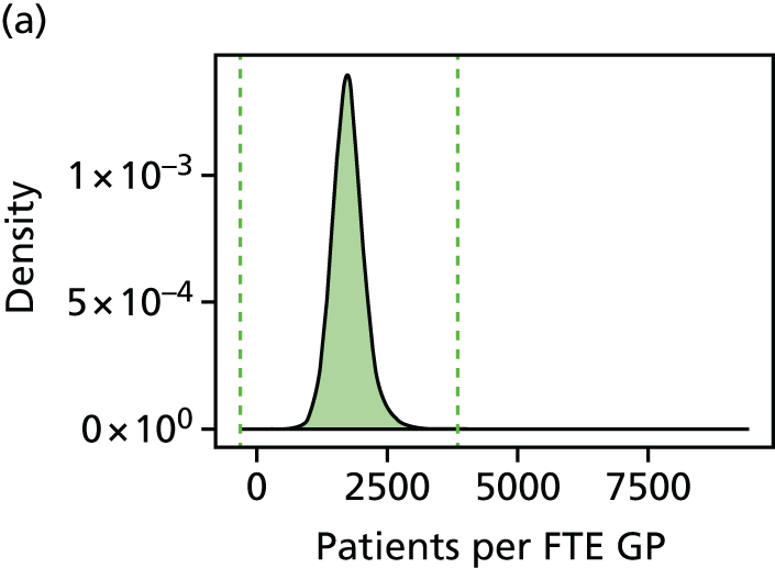
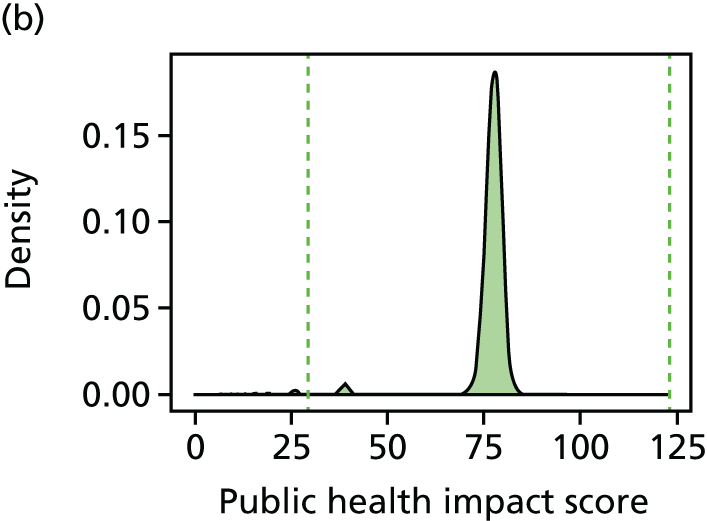
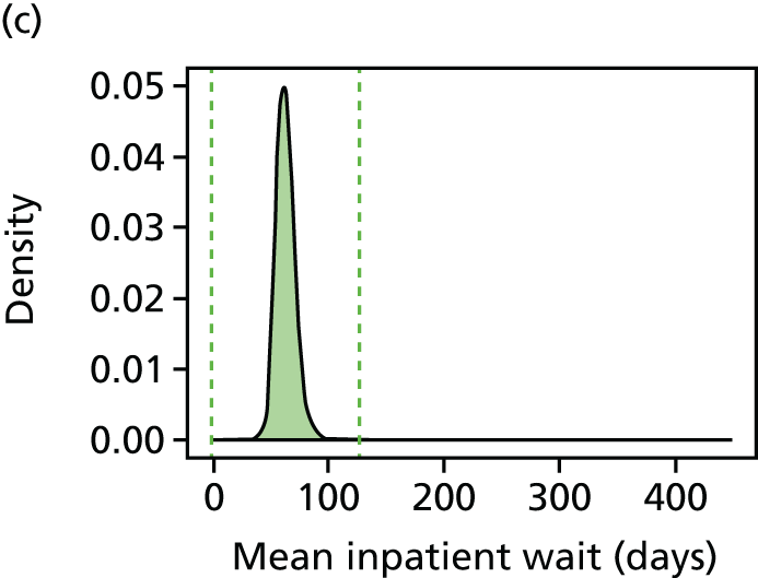
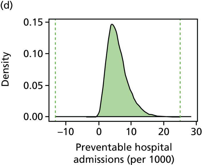
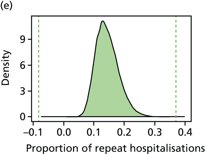
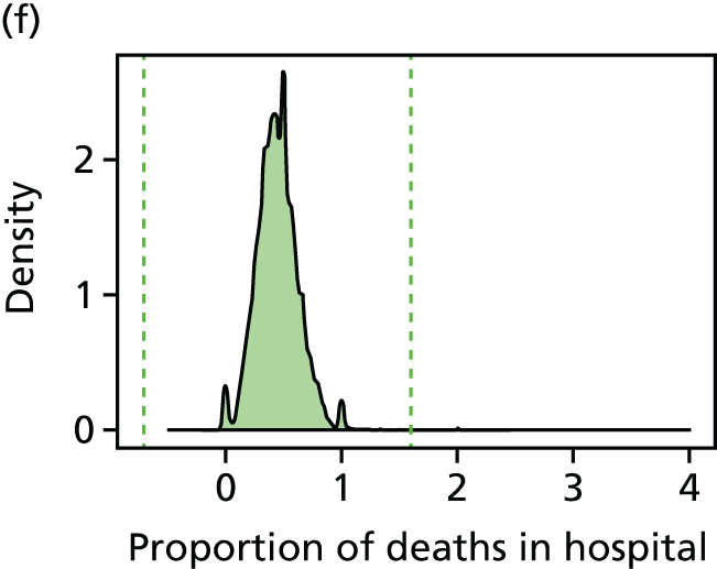
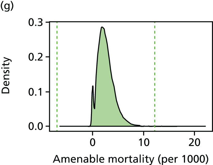
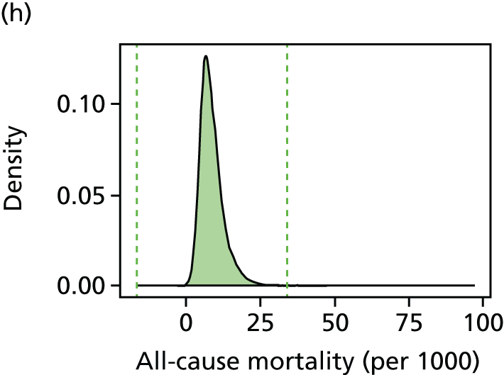
FIGURE 82.
Bar charts by indicator, showing percentage trimmed by deprivation vingtile in 2011/12 using six standard deviation trim points.
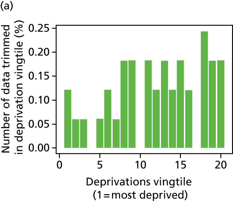
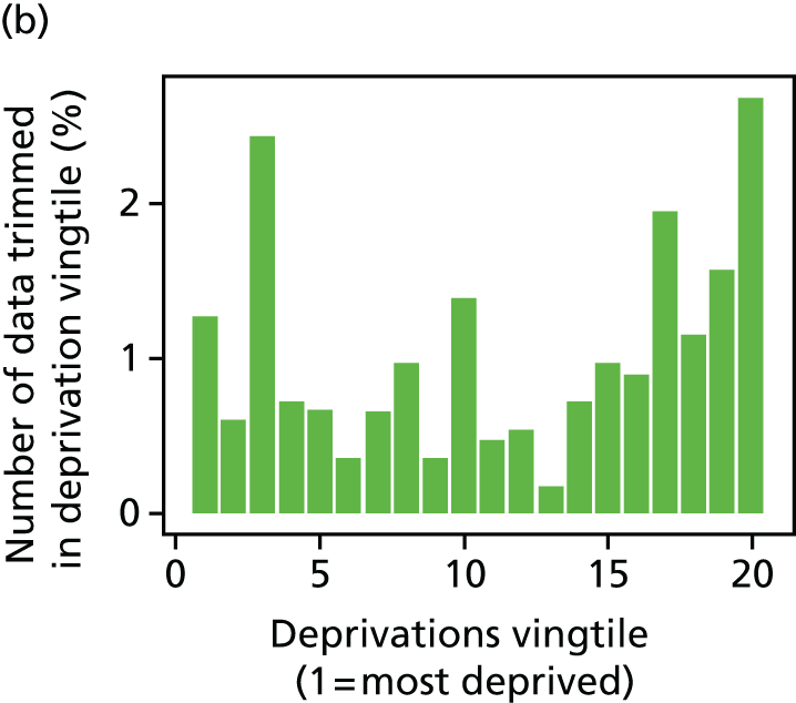
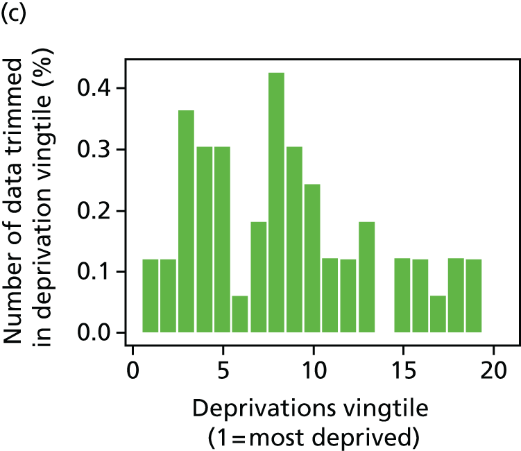
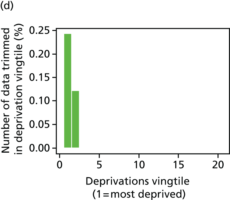
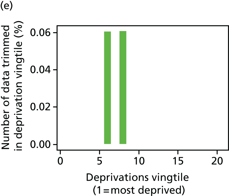
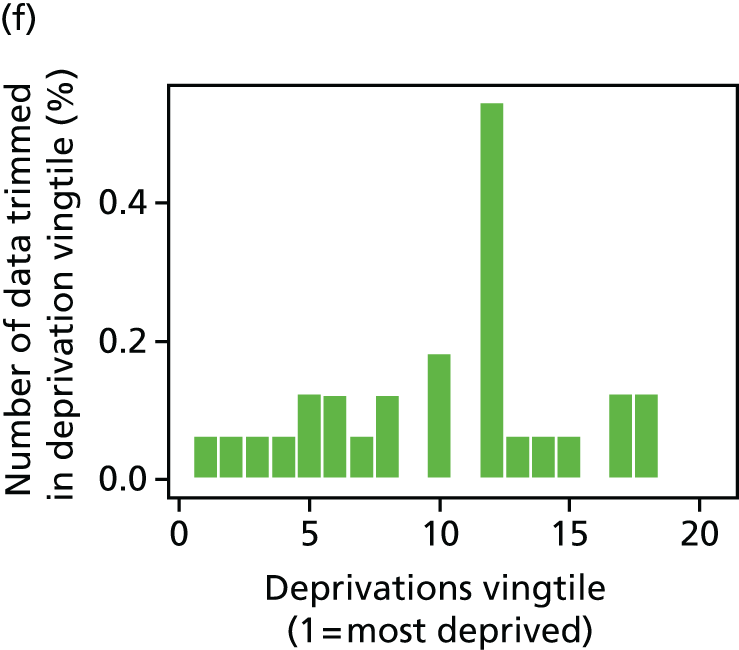
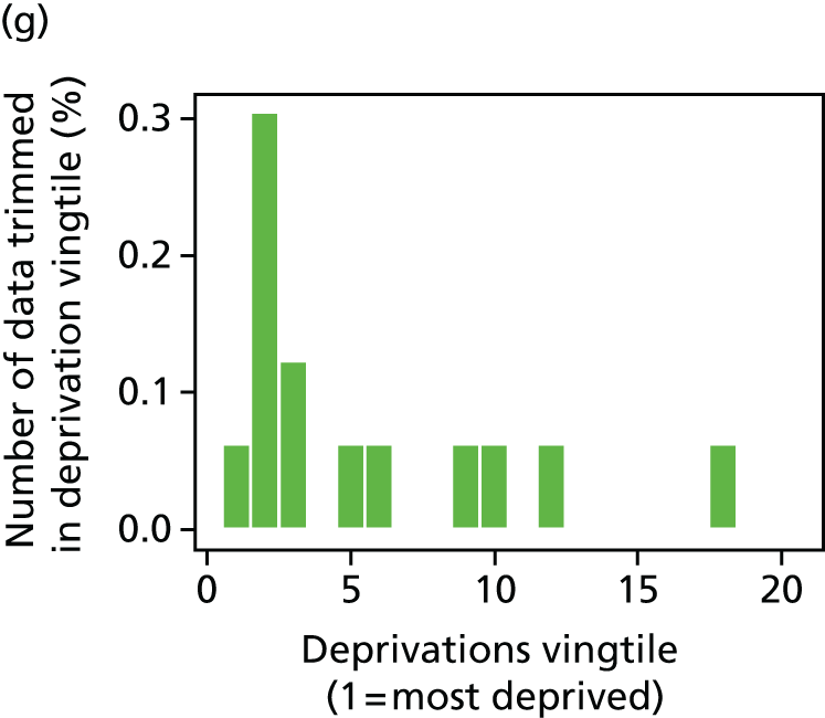
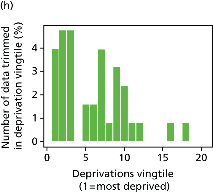
FIGURE 83.
Percentage of LSOAs trimmed by year for each indicator, using six standard deviation trim points.
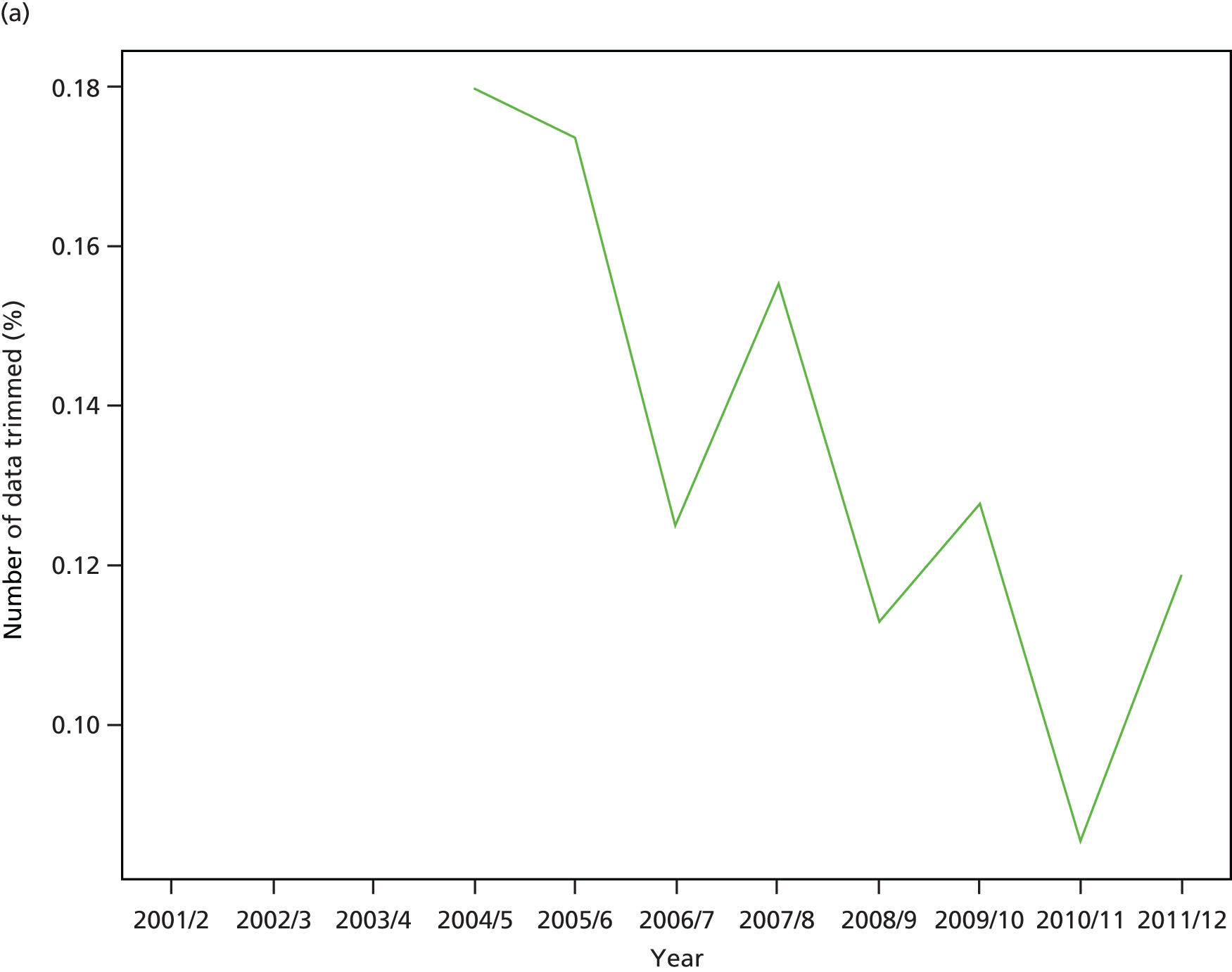
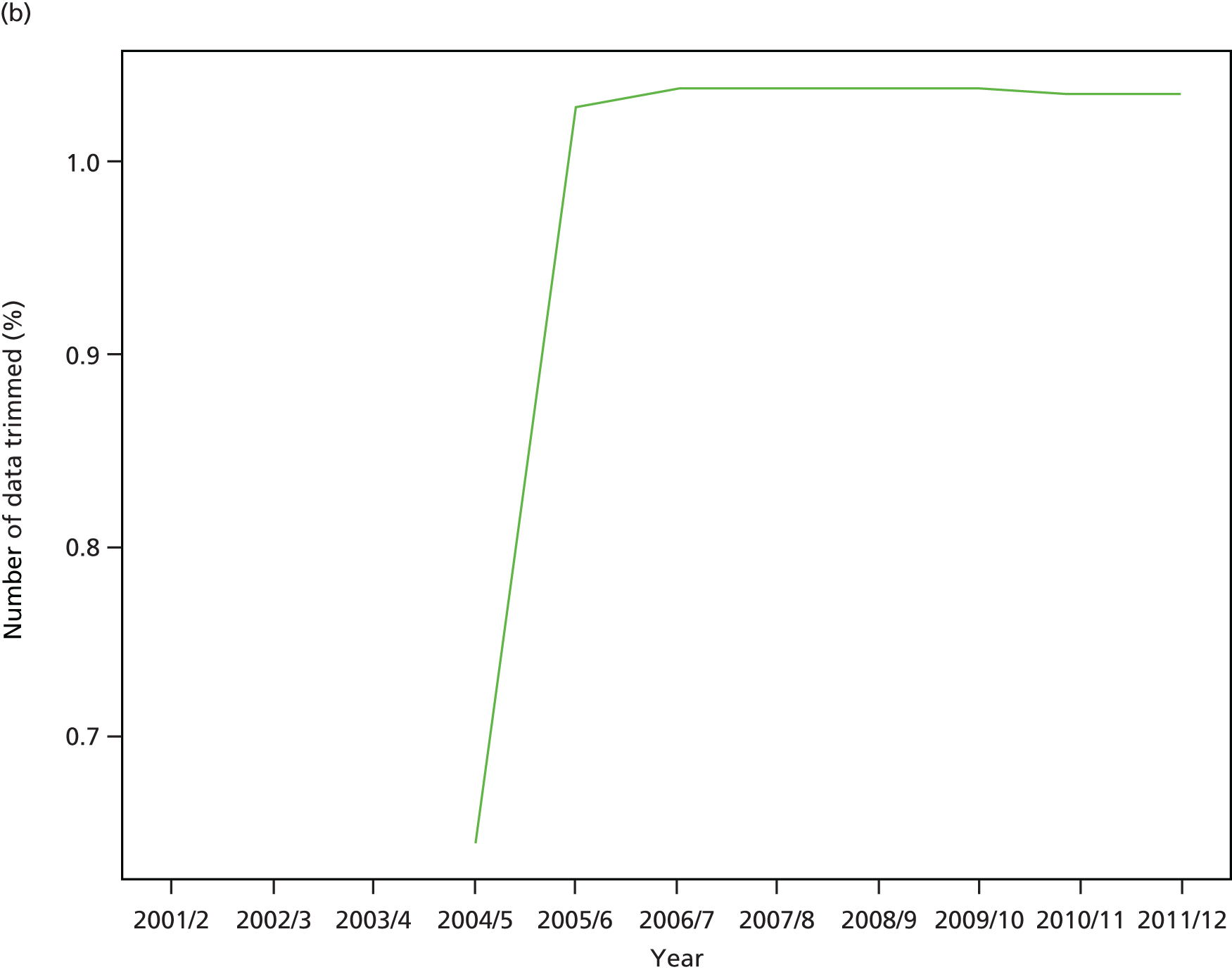

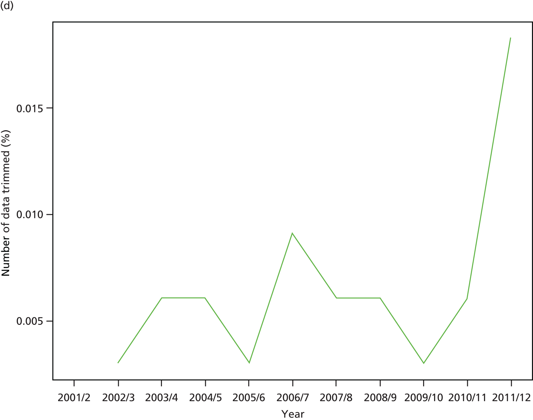

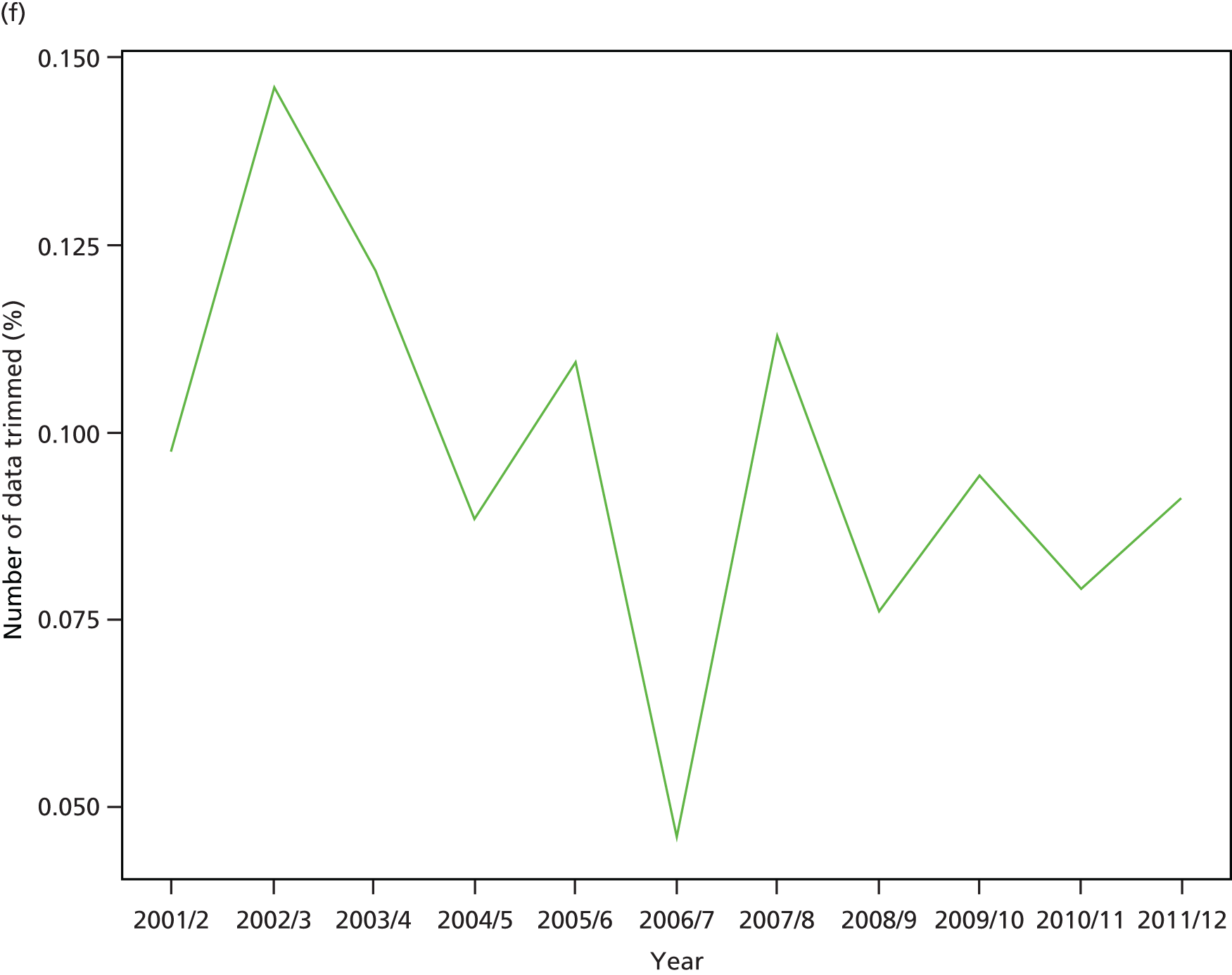
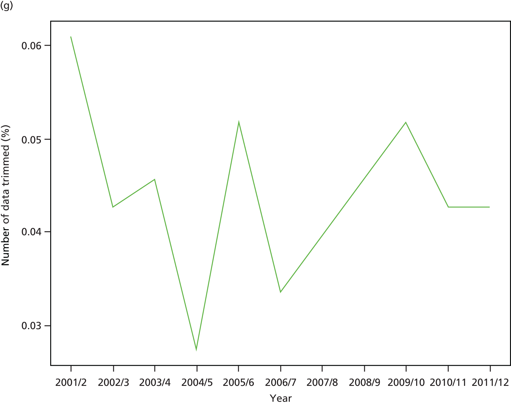

FIGURE 84.
Kernel density plots by indicator, showing three standard deviation trim points in 2011/12.


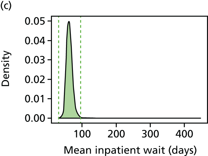
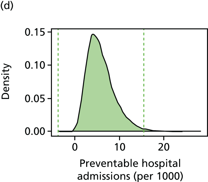
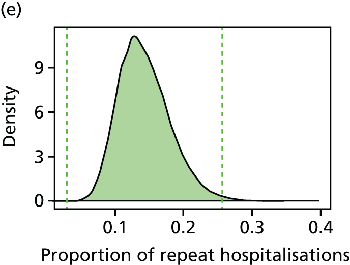

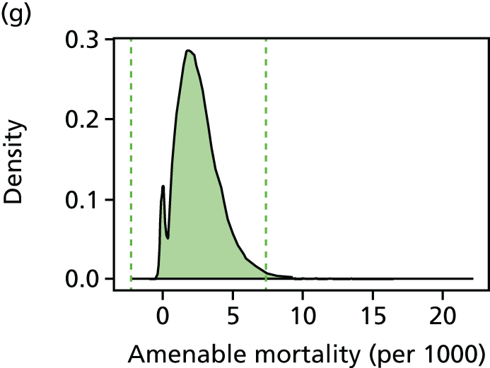

FIGURE 85.
Bar charts by indicator, showing percentage trimmed by deprivation vingtile in 2011/12 using three standard deviation trim points.
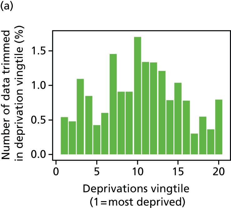
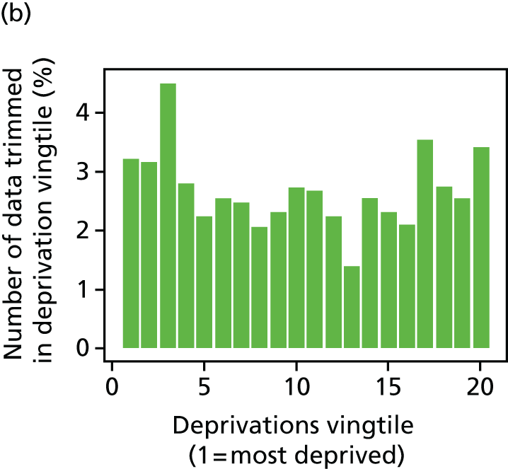
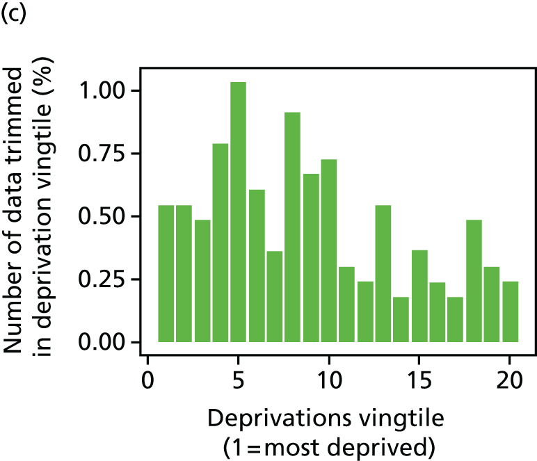


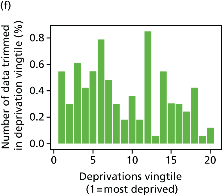

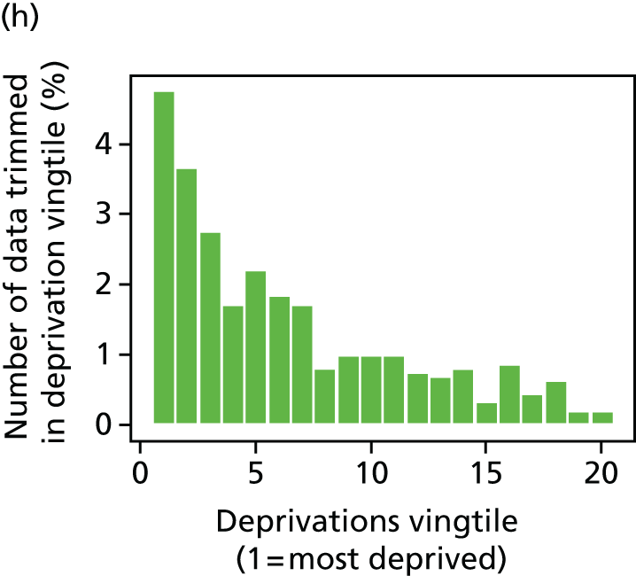
FIGURE 86.
Percentage of LSOAs trimmed by year for each indicator, using three standard deviation trim points.

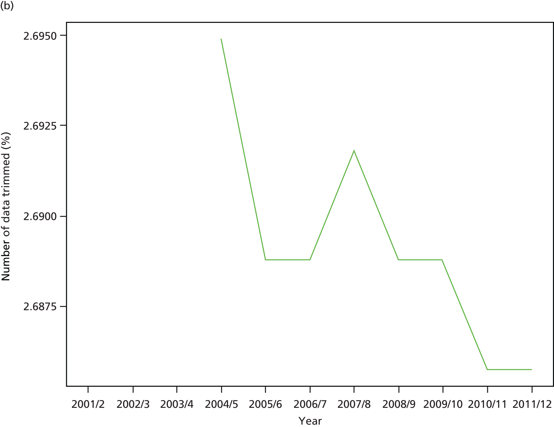
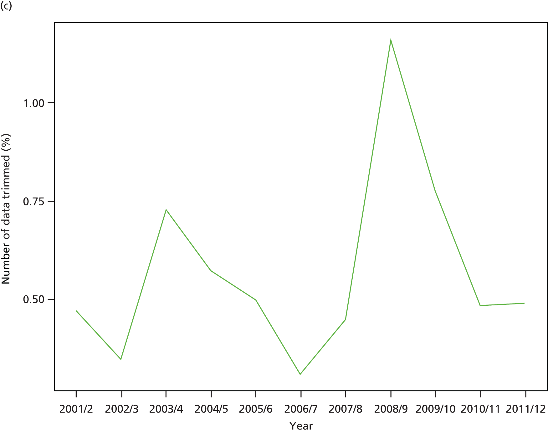

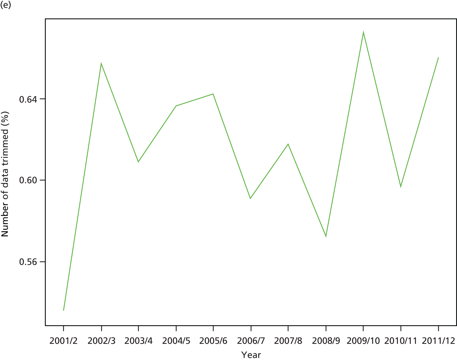
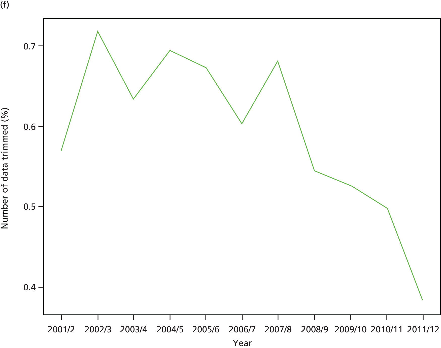
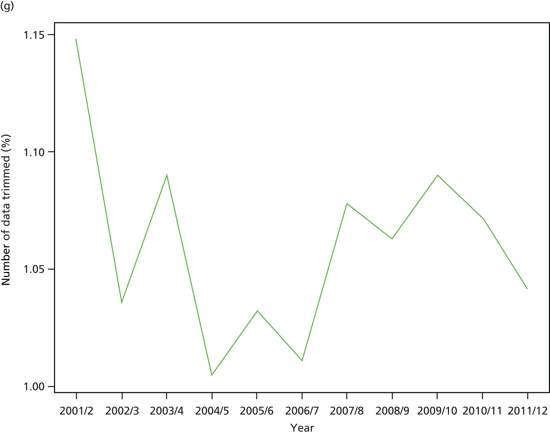
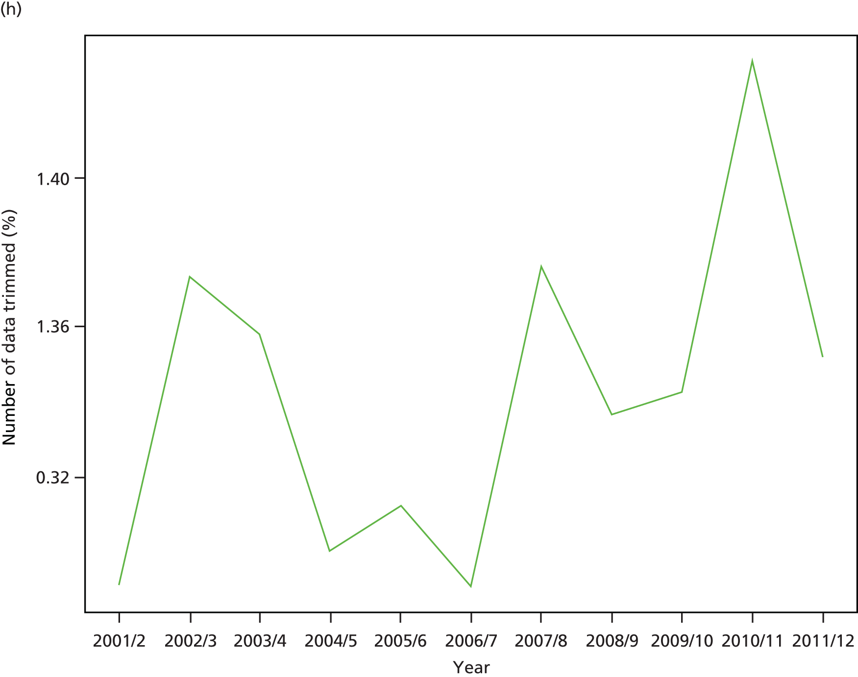
Appendix 6 Public consultation materials
Recruitment materials for the citizens’ panel exercise


Consent form for the citizens’ panel event
Rating question about the most unfair inequalities in health and health care
Screenshot from the online questionnaire

Appendix 7 Letters of support
E-mail from Health Inequalities Lead, NHS England Equality and Health Inequalities Unit
E-mail from chairperson of Hull Clinical Commissioning Group
Letter from Chief Clinical Officer, Value of York Clinical Commissioning Group
List of abbreviations
- ADS
- Attribution Data Set
- AGI
- absolute gradient index
- AHRQ
- Agency for Healthcare Research and Quality
- APC
- admitted patient care
- BMA
- British Medical Association
- CCG
- Clinical Commissioning Group
- CHD
- coronary heart disease
- CIPS
- continuous inpatient spell
- COPD
- chronic obstructive pulmonary disease
- FCE
- finished consultant episode
- FTE
- full-time equivalent
- GMS
- General and Personal Medical Services
- GP
- general practitioner
- HbA1c
- glycated haemoglobin
- HES
- Hospital Episode Statistics
- HRG
- Healthcare Resource Group
- HSCIC
- Health and Social Care Information Centre
- ICD-10
- International Classification of Diseases, Tenth Edition
- IMD
- Index of Multiple Deprivation
- LSOA
- lower-layer super output area
- NIHR
- National Institute for Health Research
- OECD
- Organisation for Economic Co-operation and Development
- ONS
- Office for National Statistics
- PHOF
- Public Health Outcomes Framework
- QOF
- Quality and Outcomes Framework
- RGI
- relative gradient index
- RII
- relative index of inequality
- SII
- slope index of inequality
- WHO
- World Health Organization