Notes
Article history
The research reported in this issue of the journal was funded by the HS&DR programme or one of its preceding programmes as project number 14/19/13. The contractual start date was in April 2015. The final report began editorial review in July 2016 and was accepted for publication in February 2017. The authors have been wholly responsible for all data collection, analysis and interpretation, and for writing up their work. The HS&DR editors and production house have tried to ensure the accuracy of the authors’ report and would like to thank the reviewers for their constructive comments on the final report document. However, they do not accept liability for damages or losses arising from material published in this report.
Declared competing interests of authors
Christina Pagel, Sonya Crowe and Martin Utley report personal fees from University College London Consultants, outside the submitted work, from royalties from the sale of the original PRAiS software in 2013. No fees were received for work in this project. Rodney Franklin reports that he is Clinical Lead of the National Congenital Heart Disease Audit (NCHDA) within the National Institute of Cardiovascular Outcomes Research. Katherine Brown reports grants from Great Ormond Street Hospital Children’s Charity (grant number V1498) and the National Institute for Health Research {for Health Services and Delivery Research programme projects 10/2002/29 [Brown KL, Wray J, Knowles RL, Crowe S, Tregay J, Ridout D, et al. Infant deaths in the UK community following successful cardiac surgery: building the evidence base for optimal surveillance, a mixed-methods study. Health Serv Deliv Res 2016;4(19); and 12/5005/06 [under way]} outside the submitted work. Katherine Brown also sits on the steering committee of the NCHDA.
Permissions
Copyright statement
© Queen’s Printer and Controller of HMSO 2017. This work was produced by Pagel et al. under the terms of a commissioning contract issued by the Secretary of State for Health. This issue may be freely reproduced for the purposes of private research and study and extracts (or indeed, the full report) may be included in professional journals provided that suitable acknowledgement is made and the reproduction is not associated with any form of advertising. Applications for commercial reproduction should be addressed to: NIHR Journals Library, National Institute for Health Research, Evaluation, Trials and Studies Coordinating Centre, Alpha House, University of Southampton Science Park, Southampton SO16 7NS, UK.
Chapter 1 Background and research objectives
Background
Why is mortality monitored and why should we try to adjust for risk?
Approximately 3500 children aged < 16 years have heart surgery each year in the UK. 1 Although overall 30-day survival is over 97%, congenital heart disease (CHD) is a spectrum of disorders, and the more serious and complex abnormalities are an important cause of childhood mortality, morbidity and disability.
Since 2000, all UK specialist centres have contributed procedure data to the National Congenital Heart Disease Audit (NCHDA), one of seven national audits within the National Institute of Cardiovascular Outcomes Research (NICOR). Life status is independently obtained from the Office for National Statistics (ONS); when no ONS tracking is available, discharge status is used instead and checked with individual units. Centre-specific mortality outcomes for individual procedure categories have been published online by NICOR since 2007. 2
Outcomes following children’s heart surgery have long been the subject of clinical, regulatory, media and public scrutiny in the UK. Complex surgical procedures on extremely small hearts are among the most technically challenging and resource intensive in the field. In the UK, past events, public inquiries and plans to reduce the number of centres performing such surgery all provide a rich source of backstories and a level of public awareness that make this specialty ripe for comment and journalism. 3–6 Mortality has, understandably, always been the dominant reported outcome and is often perceived as a straightforward measure of performance by the media and the public.
There is a reasonable expectation from the paediatric cardiac profession that, in publishing their outcomes, audit will be ‘fair’ to clinical teams. That is, the reporting of outcomes should take into account the hugely diverse set of diagnoses and comorbid conditions that patients present with, the wide range of surgical procedures performed, the differences in case mix between centres and the impact of relatively small numbers of patients on what can reliably be inferred from data. These characteristics of the specialty make risk adjustment in the presentation of outcomes analysis essential, but they also make it very difficult to achieve.
Until recently, the only risk adjustment method easily available to NICOR was to report mortality within procedure categories, thus partially accounting for variations in case mix. One example is the arterial switch operation, a definitive surgical procedure to repair the heart when the main artery and vein connections to the heart are the opposite of what they should be. The structure of such hearts can vary drastically, from a ‘simple’ isolated inversion of the great arteries to a complex physiology with several accompanying abnormalities. A child may also have additional non-cardiac problems and/or an underlying chromosomal abnormality. These sorts of issues highlight the importance of incorporating case mix into interpreting observed short-term outcomes following heart surgery in children, beyond consideration of the procedure performed. 6
Why did we develop the PRAiS risk model?
There have been several models aiming to incorporate risk assessment into outcome measures. In the early 2000s, the Risk Adjustment for Congenital Heart Surgery (RACHS-1) score was introduced. 7 This method involves gathering a panel of experts who assign patients to one of six predefined risk categories on the basis of the presence or absence of individual diagnosis and procedure codes. Cases with combinations of cardiac surgical procedures are placed in the category of the highest risk procedure. Around the same time, the Aristotle tool emerged to evaluate quality of care based on the complexity of the operation and on specific patient characteristics. 8 Also based on a review by a panel of experts, Aristotle gives a precise score for the complexity of 145 specific paediatric cardiac operations. Both RACHS-1 and Aristotle are examples of ‘consensus-based’, subjective, risk stratification tools, essentially meaning that experts have sat down and decided how a particular operation compares with others in terms of risk, which for these systems is usually considered synonymous with complexity. Although certainly valuable and useful, these methods have started to give way to recent empirical approaches, based on the emerging availability of databases incorporating the outcomes of tens of thousands of patients. The Society of Thoracic Surgeons-European Association of Cardiothoracic Surgery (STS-EACTS) score, or STAT-score, introduced in 2009, was based on data from > 75,000 paediatric cardiac surgery procedures performed between 2002 and 2007 in Europe and North America and was an important step towards monitoring mortality, as clinical teams could benchmark current outcomes against achieved outcomes in the recent past. 9
None of the above risk models is easy to use in the routine monitoring of outcomes using UK national audit data, none was calibrated on UK data and all mainly used procedure information. In our previous National Institute for Health Research (NIHR) Health Services and Delivery Research-funded project (09/2001/13), which ended in 2011, we (VT, KB, MU, CP and SC) developed a new risk model for 30-day outcome after paediatric cardiac surgery, referred to as PRAiS (Partial Risk Adjustment in Surgery). 10,11 This empirical model was developed for the purpose of routine local in-house monitoring of risk-adjusted outcomes within UK paediatric cardiac surgical units, and incorporated not only the procedure but also cardiac diagnosis, the number of functioning ventricles and age category (neonate, infant or child), as well as continuous age, continuous weight, presence of a non-Down syndrome comorbidity and whether or not surgery was performed on cardiopulmonary bypass. The model was developed using data from all paediatric cardiac surgery procedures performed in the UK between 2000 and 2010, and in validation it compared well with RACHS-1, Aristotle and the STS-EACTS score. The intention was that, by facilitating local routine monitoring, units could regularly examine their recent outcomes (with a time lag of 30 days), compared with the annual results published by NICOR, which could represent a time lag of up to 18 months.
What happened with PRAiS after the end of the first National Institute for Health Research grant?
Following the development of the PRAiS risk model, several units expressed an interest in piloting the model for the in-house routine monitoring of outcomes. In 2012, the analytical team at the University College London (UCL) Clinical Operational Research Unit (CORU) (CP, MU and SC) worked with Great Ormond Street Hospital, Evelina London Children’s Hospital and Glasgow Royal Hospital for Sick Children in a pilot study to implement the new risk model. We developed prototype software to allow units to use their own routinely collected data to produce variable life-adjusted display (VLAD) charts for 30-day mortality after children’s heart surgery after partial risk adjustment with PRAiS. 12,13 The software was codesigned with the clinical teams to be robust and easy to use and to produce output that was helpful for team discussion of outcomes. The advantage of using VLAD charts is that they show the accumulation of outcomes over time, allowing trends in outcomes (both negative and positive) to be spotted quickly and discussed.
The pilot study was successful, with the pilot units keen to continue using the software and other units also showing an interest. 14 As a result, the team at UCL CORU decided to further develop the software that implements PRAiS into a package that could be rolled out across the UK. This involved including comprehensive error checking of any entered data, further work on the software in response to feedback from pilot units, the development of user manuals and the recalibration of the PRAiS risk model on all national data from 2007 to 2010, in part to address an observed imbalance in neonatal outcomes in the original development and validation data sets. 11 The software to implement PRAiS was licenced by UCL Business in April 2013 and licences were purchased by NICOR with funding from NHS England for all English hospitals that perform children’s heart surgery and for the NICOR congenital heart audit itself. All units that contribute data to NICOR’s congenital heart audit now possess licensed copies of the PRAiS software.
In the following 6 months, all English hospitals downloaded the software to implement PRAiS, and it was also used by NICOR to include risk adjustment in the reporting of national outcomes for the first time. 1 An important part of the software licence was the inclusion of a half-day consultancy visit to units, to discuss not only the practical use of the software, but also, and more importantly in the analytical team’s view, the caveats of using risk adjustment to monitor outcomes. As the PRAiS model began to be used to monitor outcomes both locally within units and nationally as part of NICOR’s audit, data quality for information previously collected but not actively used (such as comorbidity and diagnosis codes) improved rapidly (and retrospectively, as recent data were revisited by hospitals back to 2009). In particular, the proportion of surgical episodes with a recorded comorbidity (excluding Down syndrome) doubled from 15% (2000–10 original data set) to 30% of cases. It also appeared that national outcomes between 2009 and 2012 had improved since the time period that the PRAiS risk model was calibrated on (2007–10). 1 In July 2013, at NICOR’s request, CORU analysts (CP and SC) recalibrated the risk model on the 2009–12 data set (but left the risk factors identified in the original development process unchanged) and updated the software to implement the model. 15 These changes are documented on UCL CORU’s website (www.ucl.ac.uk/operational-research/AnalysisTools/PRAiS).
PRAiS is now being used in three main ways.
-
Local quality assurance and improvement, for which it is used every month to monitor survival trends, and any up or down ticks can be discussed as a team. It is also used to audit particular population cohorts or operations types (e.g. all shunt operations or all neonates).
-
National quality assurance to ensure that no hospital has a survival rate that is potentially concerning because it is much lower than expected using PRAiS.
-
National audit annual benchmarking between hospitals and also against historic national performance (e.g. is one hospital doing markedly better and can the clinical community learn anything from those processes? Are national outcomes overall improving compared with historical data and, if so, do we understand why?).
What prompted this project to update the model?
Data completeness and quality of comorbidity information was poor in the original 2000–10 data set that was used to develop PRAiS. Although we explored different methods for incorporating information about different types of comorbidity and multiple comorbidity as part of our original project, none of the models using such methods proved to be robust. 10 Faced with the choice of excluding comorbidity entirely as a risk factor or using a very crude measure of comorbidity as a ‘yes/no’ variable, we chose the latter. This was because the definite presence of at least one non-Down syndrome comorbidity was significantly associated with mortality in multivariable analysis, because comorbidity was considered extremely important in risk adjustment by clinical collaborators (VT and KB) and because it was hoped that inclusion of the crude risk factor would drive future improvement in data quality concerning comorbidities. 10,11 In addition, other international risk adjustment systems have started to use comorbidity information as a risk factor, in recognition of its importance. 16,17
Our consultancy visits to English hospitals with the PRAiS software are now complete. Feedback on the software to implement PRAiS and the usefulness of the VLAD charts was very positive; however, a consistent concern, expressed during almost all visits, was the treatment of comorbidity within the PRAiS risk model, highlighting its importance as a risk factor. On the one hand, this justified the inclusion of comorbidity within PRAiS, but, on the other hand, it emphasised the need to revisit how comorbidity is incorporated within the model. The improvement in national audit data quality since 2009 (noted above) means that by 2015 there were enough data with better-quality comorbidity information for us to explore a more sophisticated inclusion of comorbidity within the PRAiS risk model.
We proposed to return to PRAiS model development to improve comorbidity information and to improve the risk adjustment achieved through the use of PRAiS in local and national audit.
Public understanding of mortality outcomes following children’s heart surgery
The public and media response relating to the cessation of children’s heart surgery in one unit in 2010, the brief suspension of heart surgery in another in 2013 and other recent coverage all prove the immense public interest in understanding what happens to children after heart surgery and, in particular, fears about what deaths after heart surgery mean about the care provided within units. 18–27 The UK is one of the few countries that publish mortality outcomes after children’s heart surgery, and NICOR’s results are, understandably, used by journalists, politicians and the public to make judgements about whether or not heart surgery is ‘safe’. 28 Such judgements are fraught with difficulties and are very stressful both for the families of children who have heart disease and for the clinical teams treating these children.
Although the PRAiS risk model was originally developed for the local in-house routine monitoring of outcomes, it has also been adopted by the NICOR’s congenital heart audit for reporting annual outcomes for each UK centre. 1 Using risk models for comparative audit is fairer than using raw mortality, but risk adjustment does not in and of itself make comparisons ‘fair’. 14,15 Although comparing the number of deaths seen in different units seems straightforward, risk adjustment or not, unfortunately it is not that simple (whether in congenital audit or elsewhere). 15,29,30 We have written on the difficulties of interpreting comparative mortality data using PRAiS, and the NICOR Congenital Audit has also written resources for the public on its public portal; however, these sources are not easily found without prior knowledge of their existence and are not necessarily easily digested by the non-expert. 14,15,31,32
We believed that there was a real need to, first, develop better resources for the public about how to interpret evidence on mortality following children’s heart surgery and, second, to disseminate these resources widely. We had the enthusiastic support of charities the Children’s Heart Federation (CHF) (a user group for families of children with heart disease) and Sense about Science (a charity dedicated to the public understanding of science and evidence). The second strand of our project was (originally) to develop a video animation on the interpretation of mortality outcomes for the public, with help and user input from both charities.
Aims and objectives
Aim 1: updating the PRAiS risk model for 30-day mortality following paediatric cardiac surgery
Aim 1 was to improve the PRAiS risk model for 30-day mortality following paediatric cardiac surgery by incorporating more detailed information about comorbid conditions.
The objectives to achieve aim 1 were to:
-
explore the relationship between the existing six comorbidity groupings (defined as part of the original risk model development process but not included in final model) and mortality, both in the presence and in the absence of other risk factors, and the consequent potential impact on the robustness of the PRAiS risk model (1.1)
-
decide on the suitability of existing comorbidity groups in the light of initial exploratory analysis, devise any necessary modifications and consider options for changing current groupings of specific procedure and diagnosis categories, with expert input from clinicians and data managers from multiple centres (1.2)
-
modify the existing mapping of individual comorbidity codes to broader comorbidity categories and to a single 30-day patient episode with expert clinical input (1.3)
-
explore trade-offs in reducing detail in existing risk factors (e.g. specific procedure categories) to incorporate new comorbidity categories within the PRAiS risk model while maintaining a robust calibration (1.4)
-
calibrate a new PRAiS risk model, after deciding on the final risk factors by consideration of statistical goodness of fit and clinical face validity (1.5)
-
update the software that implements PRAiS with the new parameterisation (1.6).
Aim 2: developing a public website to communicate how PRAiS is used to monitor children’s heart surgery
Aim 2 was to develop, test and disseminate online resources for families affected by CHD in children, the public and the media to facilitate the appropriate interpretation of published mortality data following paediatric cardiac surgery.
The objectives to achieve aim 2 were to:
-
confirm our understanding of the current and planned presentations of mortality outcome data by the NICOR congenital audit (2.1)
-
coproduce a web tool with patient groups and interested users that includes an explanatory website, an interactive animation and a short video to facilitate the interpretation of mortality outcomes (2.2)
-
undertake a formative mixed-methods evaluation of the web tool to strengthen the final outputs (2.3)
-
disseminate the developed material via the CHF and Sense about Science and to evaluate the usability and efficacy of the final web tool as an aid to the public understanding of outcome data; in addition, to share the material with other charities such as the British Heart Foundation and also with the NICOR Congenital Audit (2.4).
Structure of the report
The report is separated into two main sections: the development of an updated PRAiS risk model, discussed in Chapter 2, and the development of the website, discussed in Chapter 3.
In Chapter 2, we discuss the national data set used, the role of the expert panel, the development of the PRAiS 2 risk model, its final performance and its incorporation into updated PRAiS Microsoft Excel® software (2013, Microsoft Corporation, Redmond, WA, USA).
In Chapter 3, we discuss the interdisciplinary team assembled for the project, our overall strategy for building the web resource, the evolution of the resource and its launch and reception. We end by discussing the key learning from this innovative methodology and how the multidisciplinary aspects contributed to the whole.
Chapter 2 Aim 1: updating the PRAiS risk model for 30-day mortality following paediatric cardiac surgery
This part of the project aimed to improve the PRAiS risk model for 30-day mortality following paediatric cardiac surgery by incorporating more detailed information about comorbid conditions.
The starting point: the PRAiS 1 risk model
The original PRAiS 1 risk model included the following risk factors:
-
age
-
weight
-
28 specific procedure groupings
-
procedure type (bypass/non-bypass)
-
three diagnosis groups (high, medium and low risk)
-
univentricular heart (UVH) status
-
presence of a non-Down syndrome comorbidity
-
three categorical age groups (neonate, infant and child)
-
procedure performed pre 2007.
As discussed in Chapter 1 (see Aims and objectives, Aim 1: updating the PRAiS risk model for 30-day mortality following paediatric cardiac surgery), the main aim of the update for PRAiS risk model (hereafter called PRAiS 2) was to explore incorporating more comorbidity information into the risk model than the binary absence/presence of a non-Down syndrome comorbidity. Given that the raw mortality rate is low (< 3%), there is a practical upper limit to how many free parameters can be reasonably included in the model. We also intended to explore the inclusion of more diagnostic information than the three broad groupings in PRAiS 1. Thus, it was likely that a desire to include more detailed information about comorbidity and diagnosis would necessitate a trade-off in grouping together some other categorical risk factors, most probably the current 30 specific procedure groupings used within PRAiS.
With respect to the other PRAiS 1 risk factors, we initially kept treatment of age, weight, procedure type and UVH status unchanged.
We used the same process as for PRAiS 1 for excluding non-cardiac procedures, reoperations within 30 days (see Defining episodes of surgical management for analysis) and catheter procedures. 10,33
Defining episodes of surgical management for analysis
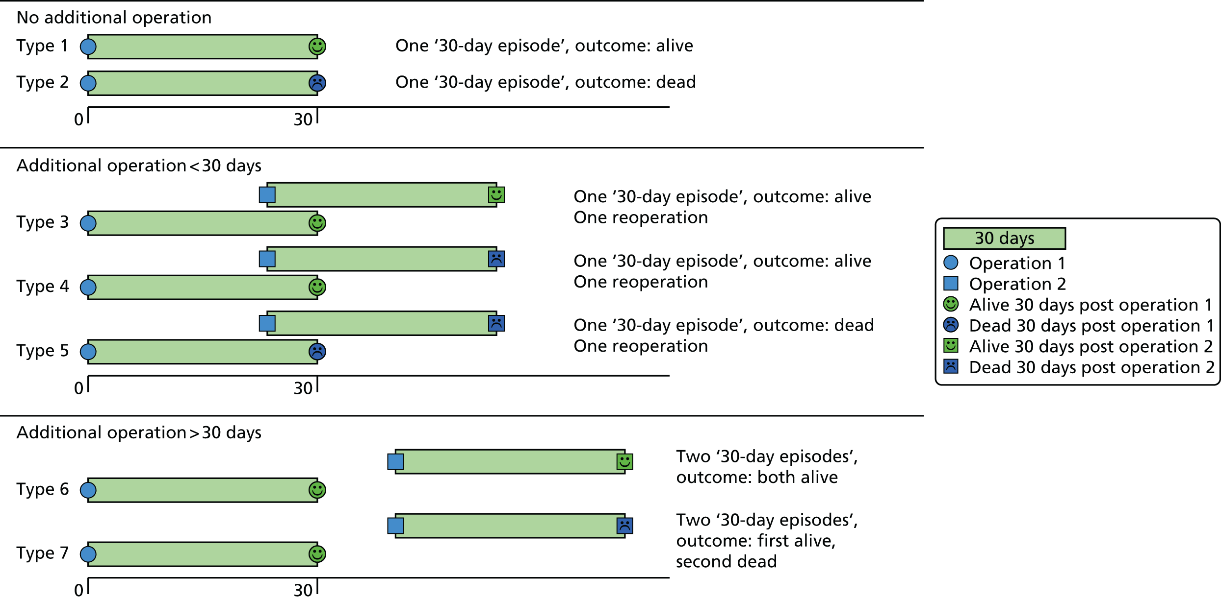
Using the same approach as for PRAiS 1, a ‘30-day episode of care’ was the unit of analysis. A 30-day episode starts with the first surgical procedure on a patient. 10 This episode is then assigned an outcome of alive or dead, according to the vital status of the patient 30 days after this first surgical procedure. Any further surgical procedures that the same patient underwent within 30 days of this first procedure were not included in model development. The next procedure recorded for the same patient > 30 days after the first surgical procedure was treated as the start of a new 30-day episode.
Examples of how the 30-day episode was allocated are shown in Figure 1.
FIGURE 1.
Illustration of how the ‘30-day episode’ was allocated: example patient histories.
Role of the expert panel
Comorbidities have a complex impact on risk of death, depending on the number of comorbidities present, the particular combinations of comorbidity, age and other covariates. It is not feasible to include all potential groupings of comorbidity information within the risk model and, as discussed above, it is unlikely that further comorbidity information can be included without some trade-offs in the detail included for procedure. The options for dealing with comorbidity and any resultant trade-offs with specific procedure should not be decided only by the analysts (CP, LR, MU and SC) but also need input from the clinical community.
The case mix of units is different not only in terms of primary cardiac diagnosis but also by pattern of comorbid conditions. It is also possible that an intensive care consultant will see the risk of comorbidity differently from a surgeon, who may see it differently from a cardiologist. In addition, each procedure can have several comorbidities entered (typically up to eight) and there may be variations in coding practice between centres. Prematurity and/or extremely low-weight babies are important comorbidities and there may be scope for inferring their presence from age and weight information in the absence of relevant comorbidity codes. Thus, it is crucial to have input from a range of centres, a range of clinical expertise, and experienced data managers who have an excellent understanding of how comorbidities are actually coded within the data. To this end, we assembled an expert advisory panel of nine people from five centres, comprising three surgeons (VT, DA and DB), two cardiologists (KE and RF), two intensivists (KB and ST) and two data management experts (TW and JS).
The role of the expert panel was to advise on the update to the model from analytical, clinical and data management perspectives. The expert panel was consulted on:
-
how more comorbidity information could be included
-
potential new groupings of specific procedures and diagnoses
-
new ways of incorporating age and weight information
-
how to incorporate a new, rare and high-risk procedure
-
options for taking into account national changes in outcome over time
-
the exclusion/inclusion of specialist centres.
The expert panel met in July 2015 and February 2016, and regular updates of model development were provided by the analytical team and clinical co-applicants KB and RF to the rest of the expert panel between meetings. Key examples of the material shared with the expert panel are in Report Supplementary Material 1.
The new data set
We used the NCHDA data set covering procedures from April 2009 to March 2014 (‘the main data set’), received in April 2015 after our successful data application on confirmation of the NIHR grant award. All data were stored on the UCL Data Safe Haven, which has been certified to the ISO27001 information security standard and conforms to the NHS Information Governance Toolkit. The data set included all cardiac procedures carried out in children in the UK and Ireland. The NCHDA uses specialised detailed codes for categorising the procedural, diagnostic and comorbid information for each child using the European Paediatric Cardiac Coding (EPCC) Short List. Each operation can have up to eight procedural codes recorded (out of a list of 679 EPCC procedure codes), six diagnostic codes (out of a list of 1292 EPCC diagnostic and diagnostic procedure codes) and up to eight comorbidity codes (out of a list of 145 comorbidity codes).
The data fields used for data cleaning and model development were:
-
pseudonymised hospital patient identification
-
pseudonymised patient NHS number
-
pseudonymised unit (hospital) identification
-
age at operation (to three decimal places)
-
sex
-
six diagnostic code fields
-
weight
-
a single comorbidity field that can contain many individual EPCC codes
-
year and month of procedure
-
procedure type
-
sternotomy sequence (used for data cleaning only)
-
six procedure code fields
-
discharge life status
-
(most recent) life status
-
age at discharge (to three decimal places)
-
age at life status (to three decimal places).
In February 2016, towards the end of the modelling process, we were offered another year of NCHDA data, from April 2014 to March 2015 (‘the 2014–15 data set’). Given that the model development was well under way, it was decided that this would be used as an external temporal validation set for the model developed on the main data set, with the final model used for roll-out to the hospitals as part of the PRAiS software being recalibrated using all data from April 2009 to March 2015 (‘the full data set’).
Data preparation and descriptive analysis in the main data set
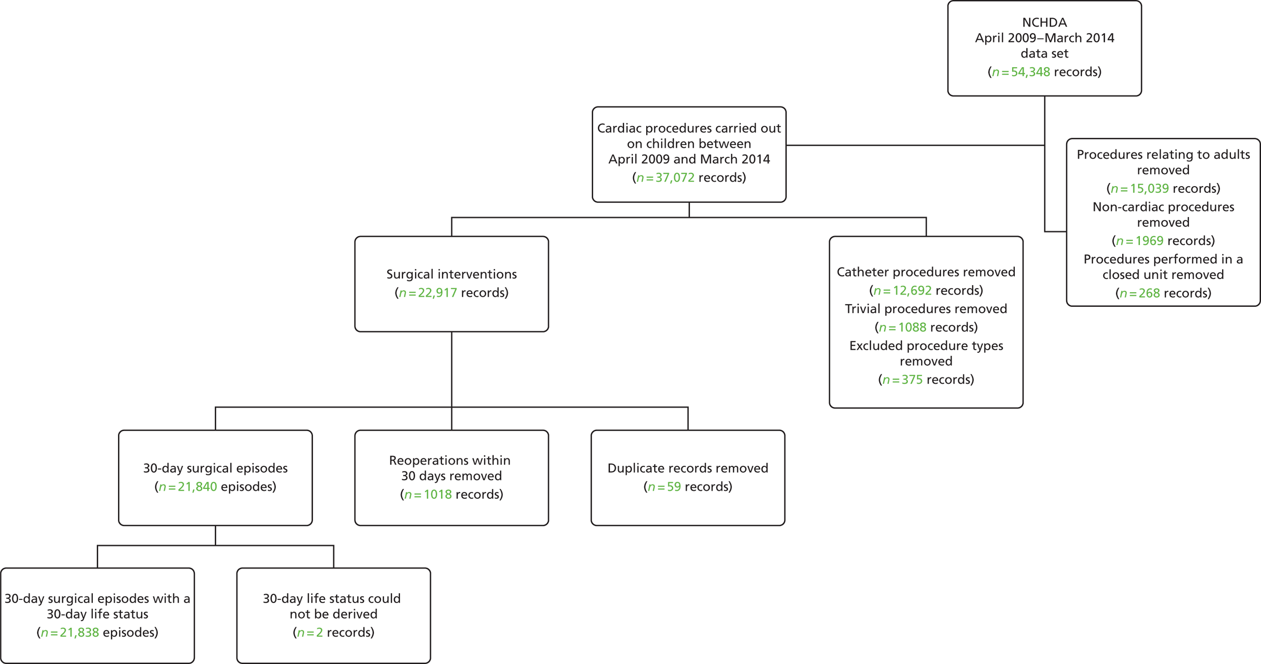
A summary of the records included and excluded from the main data set is included in Figure 2.
FIGURE 2.
Inclusions and exclusions from the main data set.
Initial removal of records outside the scope of the project
From the main data set, we initially removed all records in which the patient was > 16 years old at the time of the procedure; any procedure performed before April 2009; any non-cardiac procedures; records relating to catheter and ‘other’ type (i.e. non-surgical) procedures; and non-cardiac or trivial/minor procedures.
The PRAiS 1 risk model had also excluded ‘hybrid’-type procedures, as these were not considered surgical cardiac operations. Since then, a new hybrid procedure has evolved to treat the most serious congenital heart condition, hypoplastic left heart syndrome (HLHS). On the advice of the expert panel and the NCHDA at the first expert panel meeting, HLHS hybrid procedures were also included in our model development. All other hybrid-type procedures were excluded.
Oxford’s John Radcliffe Hospital stopped performing paediatric cardiac surgery in 2010. Following discussion with the expert panel, it was decided that procedures performed at this unit should be excluded, as they would not be indicative of future outcomes.
To construct 30-day episodes, it was essential to identify records within the data set relating to the same individual patient. To do this, we initially linked all procedure records that had the same pseudonymised NHS and/or the same pseudonymised hospital number.
We then checked for inconsistencies between records now identified as being for the same patient. We first identified all records for an apparently single patient for whom sequential ages at operation were inconsistent with procedure dates. The manual inspection of procedural, diagnostic and other demographic factors for these patient records determined whether the patients were, in fact, different, or whether a mistake had been made in the recording of date of birth or procedure dates. However, neither episode allocation nor 30-day life status was affected in those cases in which it was determined that records apparently relating to the same patient were, in fact, for different patients. For patients for whom there appeared to be an error in the date of birth or date of procedure, we used indicators such as weight and sternotomy sequence instead of the procedure date to infer the correct order and the timing of procedures for determining episode allocation.
This reduced data set contained 22,917 uncleaned procedure records, corresponding to 18,836 unique patients.
Removal of duplicate records
Some records appeared to be duplicates based on systematic comparison of pseudonymised patient NHS number or hospital number, year and month of operation, age-specific procedure, procedure type and procedure and diagnosis codes included. There is a plausible mechanism for record duplication: if an institution tries to update an individual record within NCHDA by changing either the patient’s hospital identification number or the procedure date (both of which are key fields), a second, duplicate, record will be created instead of the original record being overwritten. We used a formal protocol (see Appendix 1) to determine possible duplicates, and to determine which record of each pair to retain, based on the completeness and plausibility of the data contained in the records. Our identification of duplicates was checked with the clinical co-applicants and shared with the NCHDA. A total of 59 duplicate records in the main data set were removed from the analysis.
We then proceeded to allocate 30-day surgical episodes of care as described in Figure 1, resulting in 21,840 episodes.
Allocation of 30-day life status
The NCHDA receives independent life tracking from the ONS. However, a patient is not recorded as dead in ONS until any ongoing inquest is complete, which can lead to delays in updating the life status of a minority of children who have died. The ONS life status in the data set was the most recent life status at data extraction (2015), and if a hospital discharge life status was ‘dead’ and the ONS life status was ‘alive’, we used the hospital discharge status, consistent with current practice at NCHDA. We note that the only records likely to be affected by the ONS inquest issue would be children operated on in 2014–15 with a discharge status of alive who then died following discharge, which is unlikely to affect more than a very small number of episodes, especially as we received the 2014–15 data in March 2016, allowing almost an extra year for any inquest to be completed.
Note that ONS tracking is not available for children from overseas or for those who do not have a NHS number for any other reason. The NCHDA includes these children in its public reports and so these children must also be included in the development of the PRAiS risk model, using the same method for allocating life status.
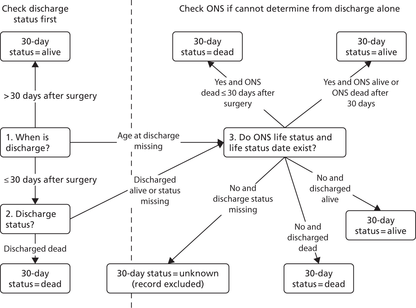
The overall algorithm we use for assigning the episode life status as shown in Figure 3 and is consistent with the method used in the NCHDA.
FIGURE 3.
Allocation of 30-day status.
In addition, subsequent records for the same patient were used to check the 30-day life status. For example, if a patient had a further operation at least 30 days after their previous procedure, they were considered alive at 30 days for the initial procedure, even if this was not supported by discharge or life status.
When the life status was not known at 30 days post procedure, the discharge status prior to 30 days was used as a proxy for 30-day life status, which is consistent with NCHDA practice and the PRAiS 1 process. This affected 3165 episodes (14% of records) in the main data set (99% of which correspond to patients from outside England and Wales for whom no ONS tracking is available and who were discharged alive before 30 days).
We were able to allocate the 30-day life status for all but two surgical episodes. These two records were excluded from the analysis (see Figure 2), leaving us with a final data set comprising 21,838 30-day surgical episodes.
Data cleaning of key variables
The NCHDA data set is widely recognised as being of extremely high quality (arguably the best of its type in the world) and the data quality has increased steadily over time; however, given the sheer size of the data set and the complexity of paediatric cardiac diagnoses and surgery, it is inevitable that there were some errors and anomalies in the data. The analytical team spent considerable amounts of time understanding the data set and, when necessary, cleaning it.
Age and weight fields
Some of the ages, weights and combinations of age/weight recorded for an episode were biologically implausible. When a weight was recorded as identically zero, it was treated as missing data. There were five patients in the main data set whose weight was determined as having been recorded in grams instead of kilograms (all children in the first month of life whose weights were recorded as > 600 kg). These weights were converted manually into kilograms.
The data set was then subdivided into the same 23 age bands that were used for the development of PRAiS 1 (narrower at younger ages), and the means and standard deviations (SDs) of the recorded weights within each band were calculated. We then calculated the weight-for-age z-scores for each episode within the data set. Episodes in the main data set, with missing weights (n = 3) or a z-score of either < –5 or > 5 (considered infeasible) (n = 23, shown in blue in Figure 4), were assigned the mean weight corresponding to their age band. The z-score thresholds were chosen after consultation with the expert panel and an independent statistician, and were chosen to ensure that patient weights outside these boundaries were definitely biologically implausible.
FIGURE 4.
Adjustments made to weight.
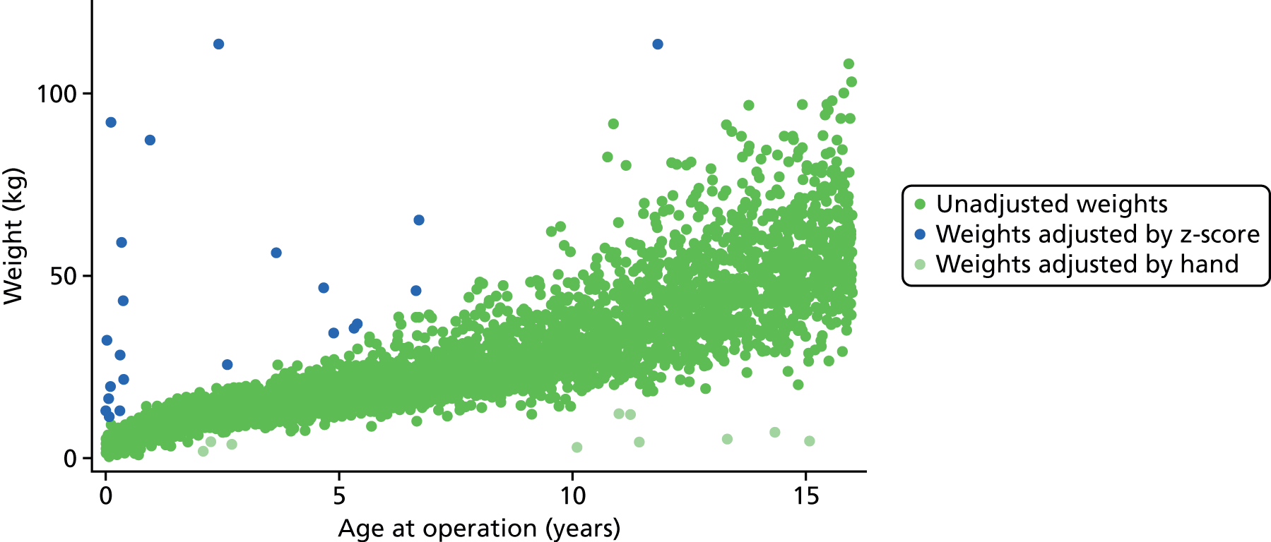
Finally, a further 10 episodes had their weight manually assigned to the mean weight for age following inspection by a clinician (KB) on the grounds of biological implausibility (all considered too low to be feasible). These episodes are shown in light green in Figure 4.
Figure 4 shows the distribution of age and weight in the main data set prior to adjustment with the identified anomalous weights highlighted.
Diagnosis fields
Our use of diagnostic information in the model development relied on us being able to identify each recorded diagnosis for an episode by its EPCC short codes. Some of the information recorded in the six possible diagnosis fields for each episode in the data set was not automatically identifiable as an official EPCC code. For fields for which this information was ambiguous, we replaced that diagnosis with ‘empty/unknown’. In other instances we were able to allocate an official EPCC code to a diagnosis unambiguously, for example when there was an anomalous numerical code format that was nonetheless identifiable (e.g. with additional spaces or dots). When multiple codes were recorded in a single diagnosis field, we split these and moved them to separate diagnosis fields in sequential order for that record. Any repeated codes were ignored. We investigated the data using additional text searches for episodes that were being allocated an ‘empty/unknown’ diagnosis, but they did not provide any further information.
Procedure fields
In general, the quality of the procedural information in the data set was very high, although there were some examples of information recorded in the procedure fields that was not automatically identifiable as an official EPCC code. When the code had an anomalous format (e.g. additional spaces or dots), we replaced the information with the official EPCC code. When multiple codes were recorded in a single procedure field, we split these into separate procedure fields in sequential order for that record. In cases when this information was ambiguous, the field was ignored. After the procedural information was cleaned, those records containing only non-cardiac procedures (using same criteria as those for PRAiS 1;10 see also Report Supplementary Material 2) were removed from the data set (n = 1991; see Initial removal of records outside the scope of the project). Any repeated codes were ignored.
Comorbidity fields
Comorbidity codes provided information on other health problems that a child had in addition to his or her primary cardiac diagnosis. We extracted all of the comorbidity codes stored in the single NCHDA data field for each episode. These were then cleaned in the same way as the diagnosis fields.
We note that, to capture all of the diagnosis and other illness information possible, we searched all diagnosis and comorbidity fields for both diagnosis and other illness EPCC codes.
Consideration of risk factors
Specific procedure information
The specific procedure algorithm was first developed by the NCHDA steering committee over 10 years ago to combine the individual EPCC codes submitted to NCHDA as part of a patient’s procedure record to define a standard procedure category (‘a specific procedure’). The algorithm defines the series of EPCC codes that may be included to identify an individual operation, and in a proportion of operations in which the definition may be more complicated it also defines the list of EPCC codes that must be excluded. The algorithm contains a hierarchy that ranks the recognisable procedures in order, with the most complex at the top (grouped first) and the least complex at the bottom (grouped last). The algorithm has been refined and improved by the NCHDA steering committee year on year to match evolving practice, such that the definitions of each operation remain tight and consistent. There are currently 49 surgical specific procedure categories.
We used the most recent specific procedure algorithm available to determine specific procedures for all surgical episodes in the main data set. By the end of the model development, this was the Specific Procedure Algorithm v5.05 from May 2016 (https://nicor4.nicor.org.uk/chd/an_paeds.nsf/vwcontent/technical%20information?opendocument). In recent years a new procedure to treat HLHS, called the HLHS hybrid approach procedure, has become increasingly common and is expected to become more widespread in the future. Although this procedure is not currently included in the specific procedure algorithm, the expert panel felt that, owing to the expected increase in its use and the high risk of the procedure, it should be included in PRAiS 2. This inclusion of HLHS hybrids was then discussed and affirmed by the NCHDA steering committee. The expert panel developed a coding addition to the specific procedure algorithm to include this procedure, taking into account how the procedure had been coded in the past and how it should be coded prospectively.
One of the main aims of the update for the PRAiS model was to balance an increase in diagnosis and comorbidity information included in the model with a reduction in the number of degrees of freedom used by procedural information. The increase in the number of specific procedures included in the specific procedure algorithm, from 41 to 49, since PRAiS 1 was developed made this problem more acute. This balance was discussed at the expert panel meeting in July 2015. The analysts (CP and LR) demonstrated how risk model performance could be maintained with some illustrative broader specific groupings offset by increased comorbidity and diagnostic information. The expert panel agreed that the analytical team would investigate different methods of grouping specific procedures into broader procedural risk groups and share the most statistically promising groupings at the next expert panel meeting.
The analytical team initially grouped specific procedures by the ages at which they occurred and the risk associated with them using classification and regression tree (CART) analysis. 34 These groups were then adjusted iteratively by the analysts (LR and CP) after consultation with the clinical expert panel and testing of the stability and performance of the resultant risk models under cross-validation, to ensure that the groups were clinically valid and that they demonstrated consistently good performance. The expert panel provided advice on procedures for which the observed mortality was not considered representative of the risk or about instances when procedures that were qualitatively different should not be combined in a single risk group.
Procedure type
In PRAiS 1, only bypass and non-bypass surgical procedures were included in the model. The relatively new HLHS hybrid approach procedure involves both surgical and catheter techniques, so it did not strictly fit into a bypass/non-bypass procedure type category. 35 How to allocate a procedure type for HLHS hybrid procedures was discussed with the expert panel.
Diagnostic information
The diagnosis allocated to episodes from the individual recorded EPCC codes was a slightly modified version of the scheme used by coauthors KB and SC in their work on longer-term infant heart surgery outcomes, which itself was adapted from the scheme originally developed by coauthors for the PRAiS 1 risk model. 36,37 The diagnosis allocation algorithm results in 29 hierarchical diagnosis groups, and full details are provided in Report Supplementary Material 2. In short, for each episode, each recorded diagnosis code is mapped uniquely to one of the 29 primary diagnosis groups, and then the highest ranked (most serious) primary diagnosis is allocated as the overall primary diagnosis group for that episode. In PRAiS 1, these primary diagnosis groups were then further allocated to one of three broad diagnosis groups used in the final model. 10
The reduction in the number of degrees of freedom used by procedure information meant that we could explore increasing the number of diagnosis risk groups used for PRAiS 2. New diagnosis risk groups were developed in a similar way to, and alongside, the broader procedure risk groups, using CART analysis to initially group diagnoses by the age at which patients with that diagnosis had procedures, and the risk associated with that diagnosis. These groups were then adjusted iteratively by the analysts after consultation with the expert panel and testing of the stability and performance under cross-validation, to ensure that the groups were clinically valid and were not unduly affected by the apparent risk shown in the data set if the expert panel did not feel that this reflected the true risk of the diagnosis. We also took into consideration when there was significant correlation between procedures and diagnosis (e.g. some procedures are only performed for a single diagnosis) and strived to develop parsimonious groupings.
Definite indication of univentricular heart allocation
An episode was determined to relate to a patient with a UVH structure if they had a diagnosis code implying a UVH or if they had a procedure that would be performed only on a patient with a UVH. A patient was thus assigned to the UVH category if they met at least one of the following criteria.
-
Had one of the following overall diagnosis groups:
-
HLHS
-
functionally UVH
-
pulmonary atresia and intact ventricular septum (IVS).
-
-
Had one of the following EPCC diagnosis codes:
-
010119 – double outlet right ventricle: with non-committed ventricular septal defect (VSD)
-
159060 – ‘failed’ Fontan-type circulation
-
010309 – atrioventricular and/or ventriculoarterial connections abnormal.
-
-
Had one of the following specific procedures:
-
Norwood procedure
-
HLHS hybrid approach procedure
-
Fontan procedure
-
bidirectional cavopulmonary shunt.
-
-
Had one of the following EPCC procedure codes:
-
121000 – Norwood-type procedure
-
123001 – Fontan-type procedure
-
123005 – total cavopulmonary connection (TCPC) using extracardiac inferior caval vein/pulmonary artery conduit with fenestration
-
123006 – TCPC with fenestrated lateral atrial tunnel.
-
123013 – Fontan procedure with atrioventricular connection
-
123027 – Fenestration of Fontan-type connection
-
123028 – Fontan-type connection without fenestration
-
123031 – takedown of Fontan-type procedure
-
123032 – Fontan procedure with direct atriopulmonary anastomosis
-
123034 – conversion of Fontan repair to TCPC
-
123037 – Fontan-type procedure revision or conversion
-
123050 – TCPC
-
123051 – TCPC with lateral atrial tunnel
-
123054 – TCPC using extracardiac inferior caval vein/pulmonary artery conduit
-
123056 – takedown of TCPC
-
123111 – bidirectional superior cavopulmonary (Glenn) anastomosis
-
123115 – hemi-Fontan procedure
-
123144 – bilateral bidirectional superior cavopulmonary (Glenn) anastomoses
-
123172 – superior caval vein to pulmonary artery anastomosis.
-
Comorbidity information
During the development of PRAiS 1, coapplicant KB devised a scheme whereby EPCC comorbidity codes were placed into one of the following groups:
-
acquired comorbidity
-
congenital non-Down syndrome comorbidity
-
prematurity
-
Down syndrome.
The binary group of ‘any indication of a non-Down syndrome comorbidity’ was included in the PRAiS 1 model. The original four groupings developed by KB formed the basis of the expert panel’s discussion on how to add more detailed comorbidity information to the PRAiS risk model. Other particular additional risk factors considered by the panel were the most common EPCC codes in the data set and those highlighted by Jacobs et al. 16,38 in the US context, not all of which had been included in the above categories.
Other categories of additional risk factor that were considered were acquired heart conditions not directly related to a patient’s primary congenital cardiac diagnosis and indicators that a patient was severely ill (e.g. shock).
Possible ways to include more comorbidity information that were discussed included:
-
a simple count of the number of non-duplicate EPCC comorbidity codes recorded
-
definite indication of different comorbidity/additional risk factor groups
-
a count of the number of instances in each of these groups
-
common combinations of types of additional risk factor.
We also explicitly considered the potential for ‘gaming’ by including risk factors. A candidate risk factor could be open to gaming if additional risk could be counted in the calculation based on factors included in the data that did not necessarily reflect an actual increase in risk. This would lead to an artificially high predicted risk, leading to a more favourable conclusion of predicted versus actual 30-day mortality and potentially allowing a poorly performing hospital to avoid investigation as a result of national audit reporting. A possible way that a candidate risk factor could be ‘gamed’ would be if several different diagnostic or comorbidity codes relating to the same condition were counted as making individual contributions to the risk for that episode, or if risk factors that are present in many patients with CHD without necessarily leading to an increased risk of 30-day mortality, such as cyanosis, were included in the model.
Age and weight
The association of both age and weight with mortality is non-linear. We investigated several methods of accounting for this non-linearity. In PRAiS 1, a continuous linear age and a categorical age band variable (neonate, infant and child) were included as risk factors in the model alongside continuous weight. 10 However, this inevitably resulted in relatively large, unrealistic changes in predicted risk at age band boundaries.
For PRAiS 2, with encouragement from the expert panel, we explored using cubic splines and fractional polynomials to model the non-linear association of age and weight with mortality. Cubic splines are piecewise third-order polynomials that pass through a set of ‘knots’. 39 Fractional polynomials are continuous functions that can contain repeated, integer, non-integer and logarithmic terms. 40
During discussion about comorbidities and additional risk factors, a low weight (< 2.5 kg) risk factor was also discussed as a possible proxy for prematurity.
Descriptive analysis of the data
Field completeness
Since PRAiS 1 was developed, the quality of the data in the NCHDA data set has improved greatly. Missing data were not a significant problem in model development. Data completeness is summarised in Table 1.
| Variable | Number (%) of missing records | Treatment |
|---|---|---|
| Age | 42 (0.11) | Removed with records relating to adults (see Figure 3) |
| Procedure codes | 45 (0.11) | Removed with non-cardiac procedures (see Figure 3) |
| Procedure type | 29 (0.07) | Removed with excluded procedure types (see Figure 3) |
| Diagnosis codes | 42 (0.11) | Included with ‘empty/unknown’ diagnosis |
| Weight | 79 (0.20) | Included and adjusted as detailed in Data cleaning of key variables, Age and weight fields |
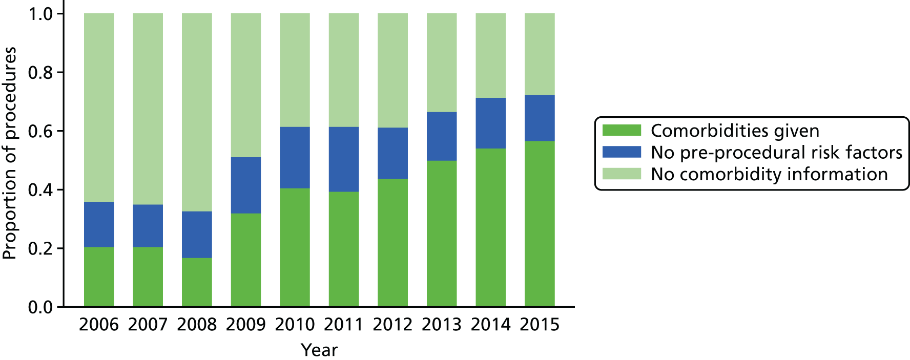
The increase in the amount of comorbidity information included in the NCHDA data is shown in Figure 5, while the proportion of procedures in the data set that have the explicit ‘no pre-procedural risk factors’ comorbidity code has stayed reasonably stable over the years.
FIGURE 5.
The completeness of the comorbidity field over time for surgical procedures.
Specific procedures
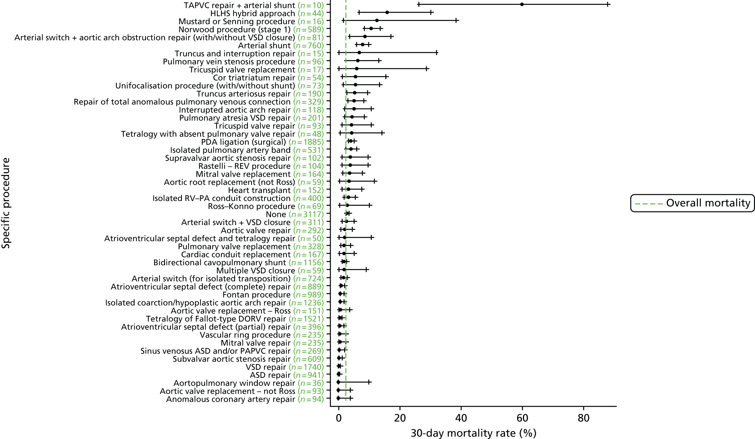
We show the mortality rate by specific procedure category in Figure 6.
FIGURE 6.
Mortality rates (95% CIs) based on 30-day status for specific procedures within the main data set (n = 21,838). The dotted green line indicates the overall average mortality rate (2.5%). ASD, atrial septal defect; CI, confidence interval; DORV, double outlet right ventricle; PAPVC, partial anomalous pulmonary venous connection; REV, Réparation à l’Etage Ventriculaire; RV–PA, right ventricle to pulmonary artery; TAPVC, total anomalous pulmonary venous connection.
Diagnosis
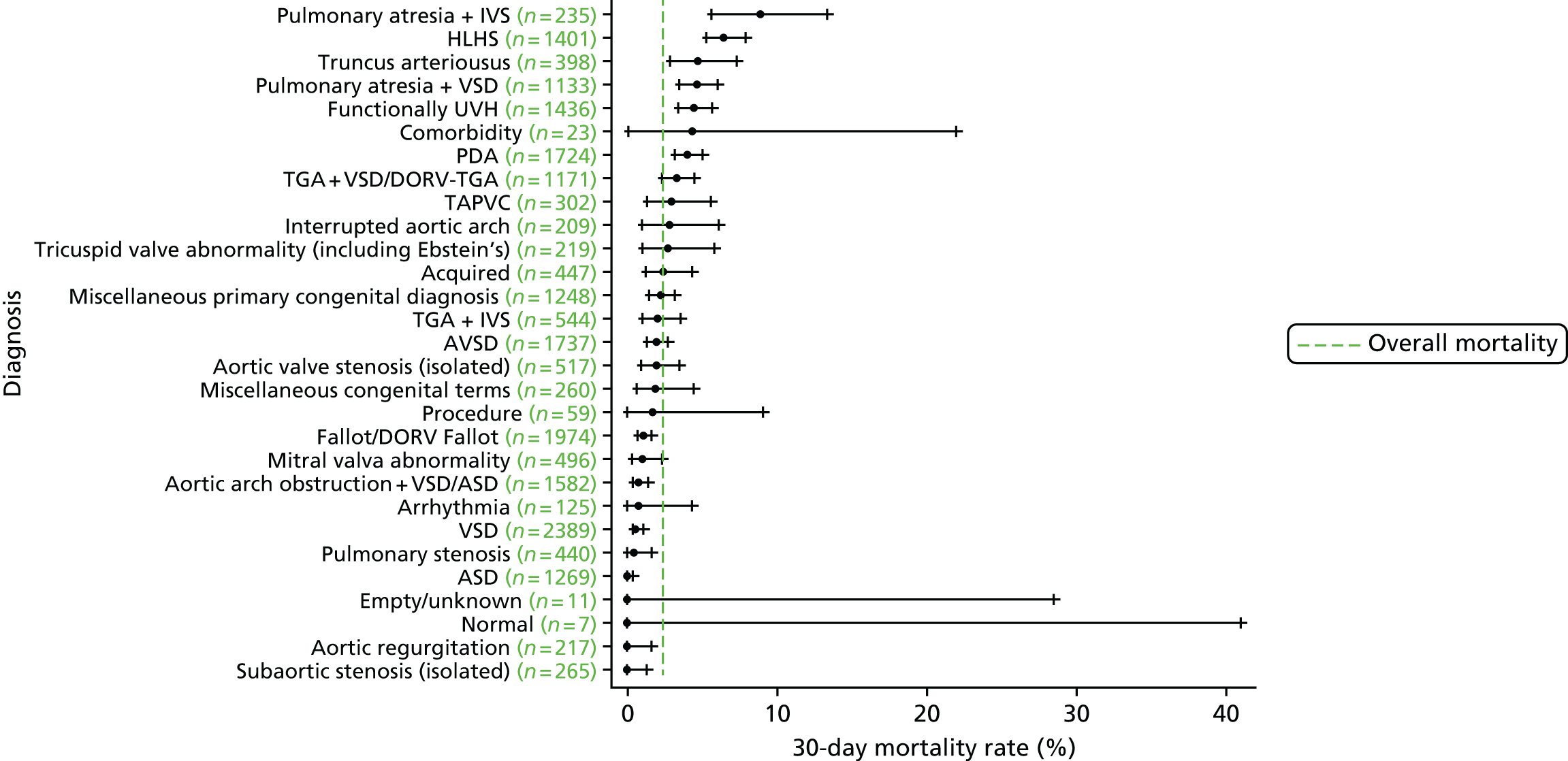
We show the mortality rate by diagnosis group in Figure 7.
FIGURE 7.
Mortality rates (95% CIs) based on 30-day status for diagnosis within the main data set (n = 21,838). The dotted green line indicates the overall average mortality rate (2.5%). ASD, atrial septal defect; AVSD, atrioventricular septal defect; CI, confidence interval; DORV, double outlet right ventricle; TAPVC, total anomalous pulmonary venous connection; TGA, transposition of the great arteries.
Age and weight
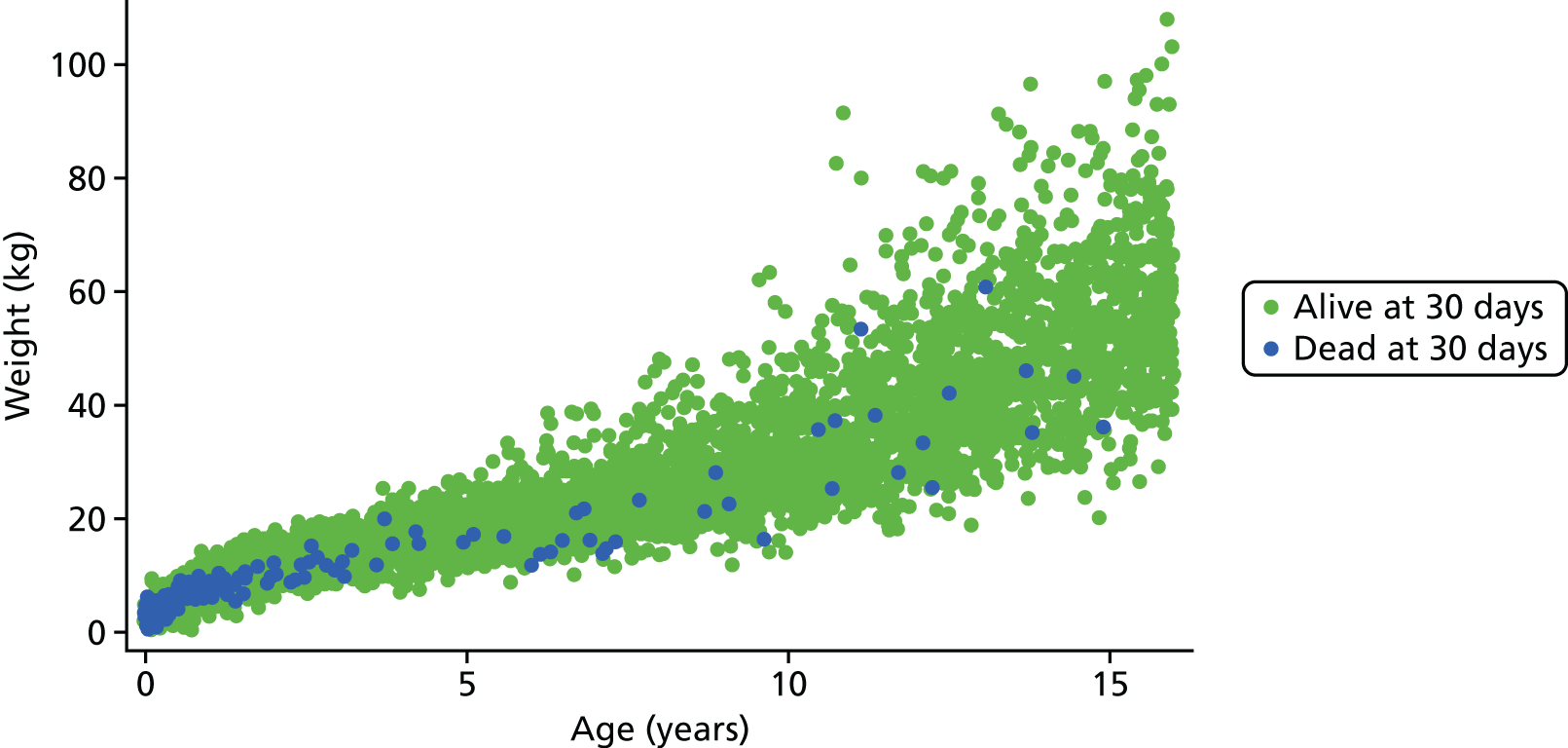
Figure 8 shows the higher incidence of death within 30-day surgical episodes for younger patients and for patients with lower weight.
FIGURE 8.
Weight vs. age scatterplot for episodes in the main data set (n = 21,838).
Procedure type and univentricular heart status
The frequency of episodes by UVH status and procedure type is given in Table 2, along with observed mortality rates.
| Risk factor | Frequency, n (%) | Mortality (%) |
|---|---|---|
| UVH status | ||
| Not UVH | 17,749 (82.9) | 1.9 |
| UVH | 3550 (17.1) | 5.0 |
| Procedure type | ||
| Bypass | 16,443 (77.0) | 2.2 |
| Non-bypass | 4819 (22.8) | 3.4 |
| Hybrid | 37 (0.2) | 15.9 |
Additional risk factors
The frequency of episodes by additional risk factor and number of additional risk factors are given in Tables 3 and 4, respectively, along with the observed mortality rate.
| Additional risk factor | Frequency, n (%) | Mortality (%) |
|---|---|---|
| Down syndrome absent | 19,635 (92.3) | 2.5 |
| Down syndrome present | 1664 (7.7) | 1.5 |
| Prematurity absent | 18,742 (87.8) | 2.3 |
| Prematurity present | 2557 (12.2) | 4.0 |
| Acquired diagnosis absent | 18,448 (86.5) | 2.4 |
| Acquired diagnosis present | 2851 (13.5) | 3.1 |
| Acquired comorbidity absent | 17,628 (82.1) | 1.7 |
| Acquired comorbidity present | 3671 (17.9) | 5.8 |
| Congenital non-Down syndrome comorbidity absent | 18,890 (88.5) | 2.3 |
| Congenital non-Down syndrome comorbidity present | 2409 (11.5) | 3.8 |
| Number of PRAiS 1 comorbidities (including Down syndrome) | Frequency, n (%) | Mortality (%) |
|---|---|---|
| 0 | 13,215 (61.5) | 1.6 |
| 1 | 4028 (19.0) | 3.0 |
| 2 | 2198 (10.4) | 3.0 |
| 3 | 1284 (6.1) | 4.0 |
| 4 | 391 (2.0) | 9.9 |
| ≥ 5 | 132 (1.0) | 13.7 |
Methods: model development and selection
Benefit of the expert panel
The clinical validity of the risk factors to be included in PRAiS 2 was discussed at length and in considerable detail by the expert panel, both during and between expert panel meetings. In particular, the clinical knowledge of the panel was combined with the evidence from the data to determine the groups of EPCC codes to be included as comorbidities and additional risk factors in the model, how specific procedures and diagnosis should be allocated to broad risk groups and how developments in treatment and outcomes should be incorporated into the updated model. This discussion continued throughout the modelling process.
The process adopted for constructing the final risk model thus consisted of the iterative use of the steps described in the rest of this section.
Multivariable logistic regression
The final set of risk factors included in the model was determined based on a combination of their ability to discriminate between high- and low-risk patients consistently over subsets of the data, their clinical face validity and their ease of use prospectively. All multivariable logistic regression analysis was conducted using the statistical software package Stata, release version 13.0 (2013; StataCorp LP, College Station, TX, USA). The regression output included the risk factor coefficients, the area under the receiving operator characteristic (AUROC) curve, Akaike information criterion (AIC) and the predicted risk for each episode. The AUROC curve measures the discriminative power of a model (i.e. its ability to distinguish between high- and low-risk episodes). 39 A model with an AUROC curve of 1 would predict every outcome perfectly, and an AUROC curve of 0.5 is no better than chance. The AIC is a measure of the goodness of fit of a model that penalises a higher number of model parameters. When comparing models, a lower AIC is preferable. 41
As discussed in Defining episodes of surgical management for analysis, the data set contained more than one episode for some patients. Our aim was to develop a risk model for use at episode rather than patient level in monitoring short-term risk-adjusted outcomes for an entire paediatric cardiac surgical programme, not just for those undergoing their first operation; hence, we treat each surgical episode as independent in running the logistic regressions.
For this reason, the logistic regression output should not be used to infer risk at a patient level, as not all observations used in the regression were independent (with respect to patients). When running our cross-validation procedure (see next section), the data split was adjusted so that each record pertaining to the same patient was in the same cross-validation fold, so that none of the models produced by the cross-validation was tested on patients who had also featured in the development of that model.
25 × fivefold cross-validation
The original PRAiS 1 model developed in 2011 was validated by splitting the data into a development set (70%) and a test set (30%). All analyses were carried out on the development set, and, after calibration within the development set, the model was validated on the test set. 10,33 This was also the original protocol for PRAiS 2. However, there are inherent problems with this method of model validation. As the data are split only once, natural variation in the episodes included in the development and test sets can lead to an imprecise estimate of predictive accuracy. It is also not an efficient method as 30% of the data are never used as part of model development. After discussion with GA from UCL Medical Statistics and our independent statistical expert, DS, we decided to use fivefold cross-validation repeated 25 times (25 × fivefold cross-validation) to develop and test the PRAiS 2 risk model. 42–44 We preferred cross-validation to bootstrapping to ensure that all of the data were used in developing and testing the model, particularly as there exist small but high-risk subpopulations that are important to include.
For a fivefold cross-validation, the process is as follows.
-
The data are randomly split into five equally sized subsets; the model is developed on four subsets (80% of the data) and tested on the subset that was excluded (20% of the data). This is repeated so that all five subsets are treated as the test set once.
-
Step 2 can be repeated on different partitions of the data to increase the reliability performance estimates. We did this 25 times (25 × fivefold cross-validation).
-
The results for the predictive accuracy are averaged over all of the cross-validations to obtain a measure of the predictive accuracy of the final model.
-
The chosen model is then calibrated on the entire data set.
The advantages of 25 × fivefold cross-validation over maintaining a single quarantined test set are as follows. 43
-
As each entry in the data is used an equal amount to test the model, there is less variability in the performance estimate.
-
The model development process and the chosen risk factors are validated and use all of the available data.
-
Repeating the fivefold partition leads to a more accurate performance estimate.
The data splits were stratified by year and unit to ensure a representative case mix and, as discussed above, all episodes for a patient were constrained to lie in the same data split.
To mimic prospective use, no adjustment of weights of this nature was made when using an episode in the test set for each cross-validation run.
Assessment of model performance for each considered model
To assess model performance we used the following measures.
In the main data set:
-
the AUROC curve and AIC of the model developed on the whole main data set.
Under cross-validation:
-
The median and range of the AUROC curve over the cross-validated test sets. We used the somersd command in Stata to calculate an overall AUROC curve for each of the 25 repeats of the cross-validation. 45 The median and full range of these 25 values were then calculated.
-
For each cross-validation fold, a calibration slope (the regression coefficient, β) and the intercept (the constant term, α) were calculated by regressing the outcome on the linear prediction in the test set for that cross-validation. If a model was perfectly calibrated, we would expect β = 1 and α = 0. If β < 1, this can be evidence of overfitting, whereas β > 1 can be evidence of underfitting. If α < 0 the model has overpredicted observed deaths, and if α > 0 the model has underpredicted observed deaths. 46 The coefficient β can also be interpreted as the ‘shrinkage factor’, with a value of much less than 1 being a possible indication of overfitting and of the possible need to apply shrinkage to the model. The calibration slope and intercept were used to test for calibration rather than the more traditional Hosmer–Lemeshow test, as the former method is now considered superior. 41 The median and range of the calibration slope and intercept across the 125 cross-validation test sets.
In the external 2014–15 test data set following final model selection:
-
the AUROC curve of the model developed on the main data set and tested on the 2014–15 data, including confidence intervals (CIs)
-
the calibration slope and intercept of the linear predictor developed on the main data set and regressed on the 2014–15 data set, including CIs.
The regression output was also used to construct charts, known as MADCAP (Mean Adjusted Deaths Compared Against Predictions) charts,47 of cumulative predicted and observed deaths against episode number, with episodes ordered by increasing predicted risk. These give a graphical means of summarising the performance of the risk model with respect to discrimination and calibration. The end points of the two lines indicate the overall numbers of deaths predicted and observed over a series of cases. The extent to which the slope of the cumulative observed deaths increases with episode number gives information about the discrimination of the model: the greater the ‘bowing’ towards the bottom right-hand corner of the MADCAP chart, the better the discrimination of the model. Any major deviations of the ‘observed’ curve from the ‘predicted’ curve provide information on where the model may work less well across the spectrum of predicted risk.
Comparison of MADCAP charts between different models was used as a way of informing decisions about the value added or lost in adopting different approaches to how specific procedures, diagnoses and comorbidities were included in the model.
Finally, we investigated any episodes that had particularly large leverage or influence39 to see whether they were genuine outliers or data errors.
Clinical considerations
Comorbidities and additional risk factors
A large part of the clinical discussion centred on how to incorporate more information on comorbidities and other additional risk factors in the model in a clinically meaningful way. A key issue was to reflect the increase in risk posed by other health problems, while balancing the need to make the new risk factors robust in use and not open to gaming in prospective use.
The expert panel felt that a simple count of comorbidities could lead to inflated predicted risk if several comorbidity codes for similar conditions were used, when the actual additional risk from the extra codes would be minimal. For this reason we decided not to include an overall count of comorbidities or a count within different categories. A yes/no indicator for each different category of additional risk meant that predicted risk would be increased if an episode contained different types of comorbidities or additional risk factors, while meaning that records with several similar additional risk factors did not have any additional predicted risk.
The additional cardiac risk factor group of codes was further split into categories of codes relating to different conditions within this group. The clinical members of the expert panel then decided which of these categories would relate to a real increase in risk for any patient in the data set (e.g. conditions that were an expected consequence of a certain diagnosis were not included). Any codes that were too general, and could therefore be applied to many patients with CHD without a real change to their risk, were also excluded. The categories of codes included in the final model were those relating to pulmonary hypertension and poor ventricular function. Any patient who had an acquired diagnosis as their primary diagnosis was excluded from this category to avoid double-counting the risk associated with these conditions.
As this aspect represents both a significant amount of work and novel research, we have included as an appendix (see Appendix 2) a more detailed, clinical account of how this comorbidity and additional risk factor allocation was carried out by the expert panel (written by coauthor KB).
Procedure types
The panel decided to include HLHS hybrid approach procedures in the same procedure type category as non-bypass procedure. As these procedures are still very rare, including them as their own category in the model is not feasible.
Specific procedure and diagnostic risk groupings
At the second expert panel meeting in February 2016, a possible set of specific procedure and diagnosis risk groups was presented to the panel. These groups had been derived by the analytical team using CART analysis based on the risk associated with a procedure/diagnosis and the age at which the episodes occurred.
The groups were discussed by the panel, and a set of possible alternatives was suggested by the panel that were considered clinically more appropriate.
Results: model development and variable selection
Age and weight
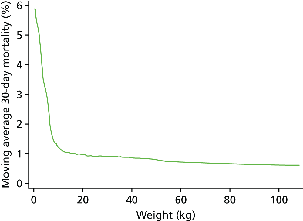
The relationships between age and weight and 30-day mortality are shown in Figures 9 and 10, respectively, which show the weighted-moving average of mortality over the range of ages and weight in the data set. These figures show that the low ages and weights have a very strong relationship with higher mortality, which drops quickly and levels off as patients in this data set get older and heavier.
FIGURE 9.
The weighted moving average 30-day mortality by age.
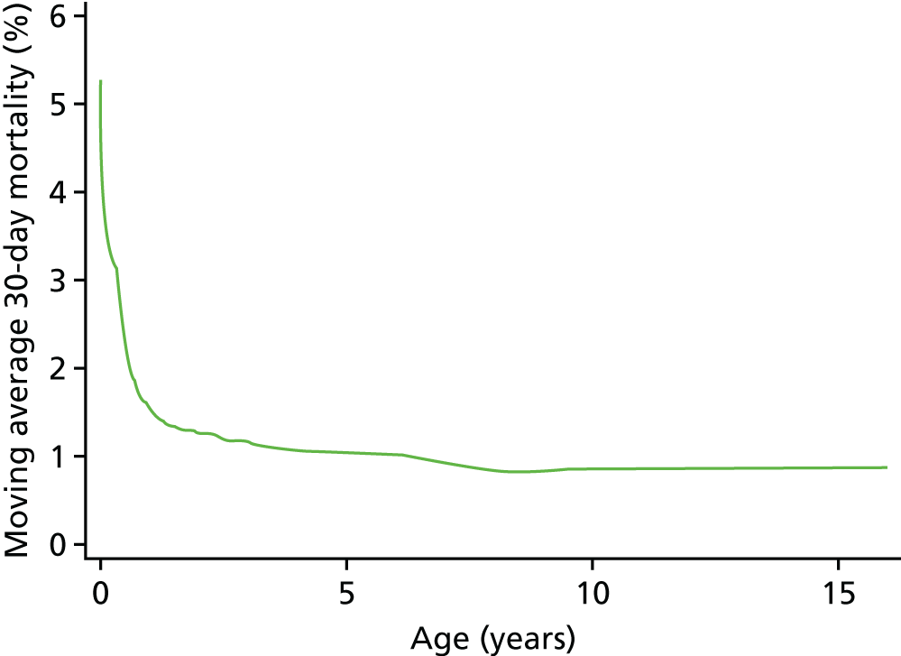
FIGURE 10.
The weighted moving average 30-day mortality by weight.
As the non-linear nature of the relationship between age and weight was now going to be accounted for more accurately, we did not include a specific low weight (< 2.5 kg) risk factor in the model.
We found that a cubic spline could not adequately model the relationship at all ages, but that fractional polynomials were able to capture the non-linear association for both age and weight.
After considering various two-dimensional fractional polynomials, with a selection of terms with powers of ±2, ±1, ±0.5, 3 and logarithms, that were the best fit in different cross-validation runs, we used ax+bx for both age and weight, as it was simple function that performed very well. Moving to these non-linear functions of age allowed us to discard the categorical age bands used in PRAiS 1.
Comorbidities and additional risk factors
Several months of iterative refinement of comorbidity and additional risk factor categorisation resulted in six final groupings for consideration, shown in Table 5. The details of how these factors are allocated are given in Report Supplementary Material 2.
| Risk factor | Frequency, n (%) | 30-day mortality (%) |
|---|---|---|
| Congenital comorbidity absent | 19,393 (88.8) | 2.3 |
| Congenital comorbidity present | 2445 (11.2) | 3.7 |
| Acquired comorbidity absent | 20,584 (94.3) | 2.2 |
| Acquired comorbidity present | 1254 (5.7) | 6.5 |
| Severity of illness indicator absent | 19,578 (89.7) | 1.9 |
| Severity of illness indicator present | 2260 (10.3) | 7.5 |
| Additional cardiac risk factor absent | 20,785 (95.2) | 2.3 |
| Additional cardiac risk factor present | 1053 (4.8) | 5.3 |
| Down syndrome absent | 19,635 (92.3) | 2.5 |
| Down syndrome present | 1664 (7.7) | 1.5 |
| Prematurity absent | 18,742 (87.8) | 2.3 |
| Prematurity present | 2557 (12.2) | 4.0 |
In almost all cross-validation runs using all six risk factors, neither prematurity nor Down syndrome was significant at the 5% level in multivariable regression.
Down syndrome had been excluded from the comorbidity risk factor in PRAiS 1 as its presence was not associated with an increased risk of mortality and a majority of Down syndrome patients have a single specific procedure. When this was discussed again by the expert panel, they believed that patients with Down syndrome did not have a risk from this procedure that was substantially different from that of non-Down syndrome patients.
Although prematurity was significantly associated with mortality in univariate regression, this association disappeared once other risk factors were included. It appeared that the better treatment of age and weight (using fractional polynomials) was adequately capturing the additional risk due to prematurity (as these patients are almost all of low weight and young).
Given these considerations, and on the advice of the analysts (LR and CP), the expert panel agreed to exclude Down syndrome and prematurity from further consideration as risk factors for PRAiS 2.
The other four comorbidity and additional risk factor groups devised by the expert panel (see Table 5) remained significantly associated with higher mortality in all cross-validation multivariable logistics regressions and were included in the final model.
Year of surgery
While exploring early versions of the PRAiS 2 risk model by calendar year from 2009 to 2014, we found a clear trend of overestimating risk in the later years, particularly after 2012. This was not unexpected, given the already observed decrease over time in mortality up to 2010. 48 Raw mortality has continued to fall (albeit not evenly), with particular reduction post 2012 (Figure 11). This trend suggested that any model calibrated on data from 2009 to 2014, without taking an epoch effect into account, would already be out of date when used prospectively by hospitals for local quality improvement and assurance and by national audit. To include year of surgery as a continuous or ordinal variable would, however, be to assume that improvement over time is inevitable, and to ignore ceiling and threshold effects. The epoch effect is likely to be caused by a combination of changes in outcomes and coding; however, the expert panel felt that there had been a real improvement in outcomes in recent years, which was reflected in an overall drop in the observed 30-day mortality rate. There was a step change in completeness of the comorbidity field in 2009, and, although there has been improvement since then, it has been more gradual. The need for accurate and currently applicable data needed to be balanced with using the most data possible to get an accurate model, and using data from 2009 onwards with an epoch effect applied from 2013 provided an appropriate compromise. We therefore decided to explore including a binary epoch variable in the model indicating whether an episode occurred pre 2013 or from 2013 onwards.
FIGURE 11.
Observed vs. predicted risk for the final model with and without the post 2012 flag.
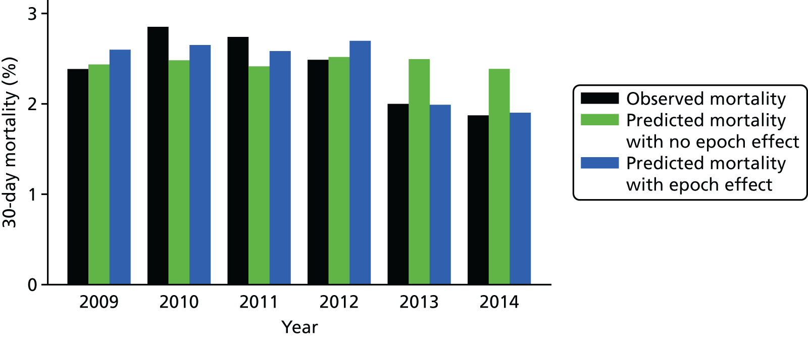
After finalising the model, we reran it in the development set with and without the epoch variable. Figure 11 shows the difference between observed and predicted deaths from each model evaluated in the main data set, for each year, weighted by the number of episodes in that year. The model that includes the epoch effect provides a better fit to the mortality over time and the binary epoch flag is highly significant (p < 0.005; AIC with the flag of 4222 vs. AIC without the flag of 4229). We discussed the inclusion of this parameter with the expert panel, asking whether or not they thought that such an epoch effect was clinically plausible, that is, was it plausible that outcomes had improved over the past few years instead of being due to natural variation. The expert panel considered that there had been a real improvement in outcomes and recommended the inclusion of the epoch flag in the final model.
Specific procedure and diagnosis risk groups
As procedure and diagnosis are intrinsically linked, the expert panel considered options for adjusting the CART-generated diagnosis and specific procedure groups together.
Following the second expert panel meeting, the team of analysts considered a shortlist of candidate models and compared their performance using MADCAP charts and consideration of individual specific procedure and broader group frequency/mortality in the national data set.
The initial risk groups presented at the meeting are shown in Tables 6 and 7.
| Specific procedure group: model A | Frequency, n (%) | 30-day mortality (%) |
|---|---|---|
| Specific procedure risk group A | 1356 (6.9) | 9.5 |
| Norwood procedure (stage 1) | 589 (2.7) | 10.7 |
| HLHS hybrid approach | 44 (0.2) | 15.9 |
| TAPVC repair + arterial shunt | 10 (0.0) | 60.0 |
| Truncus and interruption repair | 15 (0.1) | 6.7 |
| Arterial switch + aortic arch obstruction repair (with/without VSD closure) | 81 (0.4) | 8.6 |
| Arterial shunt | 760 (3.5) | 7.8 |
| Specific procedure risk group B | 3364 (15.4) | 4.2 |
| Truncus arteriosus repair | 190 (0.9) | 5.3 |
| Interrupted aortic arch repair | 118 (0.5) | 5.1 |
| Repair of total anomalous pulmonary venous connection | 329 (1.5) | 5.2 |
| Arterial switch + VSD closure | 311 (1.4) | 2.6 |
| Isolated pulmonary artery band | 531 (2.4) | 4.0 |
| PDA ligation (surgical) | 1885 (8.6) | 4.1 |
| Specific procedure risk group C | 1996 (9.1) | 1.2 |
| Arterial switch (for isolated transposition) | 724 (3.3) | 1.5 |
| Isolated coarction/hypoplastic aortic arch repair | 1236 (5.7) | 1.0 |
| Aortopulmonary window repair | 36 (0.2) | 0.0 |
| Specific procedure risk group D | 503 (2.3) | 5.0 |
| Mustard or Senning procedure | 16 (0.1) | 12.5 |
| Ross–Konno procedure | 69 (0.3) | 2.9 |
| Pulmonary vein stenosis procedure | 96 (0.4) | 6.3 |
| Pulmonary atresia VSD repair | 201 (0.9) | 4.5 |
| Tetralogy with absent pulmonary valve repair | 48 (0.2) | 4.2 |
| Unifocalisation procedure (with/without shunt) | 73 (0.3) | 5.5 |
| Specific procedure risk group E | 1672 (7.7) | 2.8 |
| Heart transplant | 152 (0.7) | 3.3 |
| Tricuspid valve replacement | 17 (0.1) | 5.9 |
| Mitral valve replacement | 164 (0.8) | 3.7 |
| Aortic valve repair | 292 (1.3) | 2.1 |
| Pulmonary valve replacement | 328 (1.5) | 1.8 |
| Aortic root replacement (not Ross) | 59 (0.3) | 3.4 |
| Cardiac conduit replacement | 167 (0.8) | 1.8 |
| Isolated RV–PA conduit construction | 400 (1.8) | 3.3 |
| Tricuspid valve repair | 93 (0.4) | 4.3 |
| Specific procedure risk group F | 2414 (11.1) | 1.7 |
| Bidirectional cavopulmonary shunt | 1156 (5.3) | 1.7 |
| Multiple VSD closure | 59 (0.3) | 1.7 |
| AVSD and tetralogy repair | 50 (0.2) | 2.0 |
| AVSD (complete) repair | 889 (4.1) | 1.0 |
| Cor triatriatum repair | 54 (0.2) | 5.6 |
| Supravalvar aortic stenosis repair | 102 (0.5) | 3.9 |
| Rastelli – REV procedure | 104 (0.5) | 3.8 |
| Specific procedure risk group G | 2253 (10.3) | 0.7 |
| Fontan procedure | 989 (4.5) | 1.0 |
| Aortic valve replacement – Ross | 151 (0.7) | 0.7 |
| Subvalvar aortic stenosis repair | 609 (2.8) | 0.3 |
| Mitral valve repair | 235 (1.1) | 0.4 |
| Sinus venosus ASD and/or PAPVC repair | 269 (1.2) | 0.4 |
| Specific procedure risk group H | 2152 (9.9) | 0.6 |
| AVSD (partial) repair | 396 (1.8) | 0.5 |
| Tetralogy of Fallot-type DORV repair | 1521 (7.0) | 0.7 |
| Vascular ring procedure | 235 (1.1) | 0.4 |
| Specific procedure risk group I | 2868 (13.1) | 0.1 |
| Anomalous coronary artery repair | 94 (0.4) | 0.0 |
| Aortic valve replacement – not Ross | 93 (0.4) | 0.0 |
| ASD repair | 941 (4.3) | 0.0 |
| VSD repair | 1740 (8.0) | 0.2 |
| No specific procedure risk group | 3117 (14.3) | 2.9 |
| None | 3117 (14.3) | 2.9 |
| Diagnosis risk groups: model A | Frequency, n (%) | 30-day mortality (%) |
|---|---|---|
| Diagnosis risk group A | 2034 (9.3) | 6.4 |
| HLHS | 1401 (6.4) | 6.5 |
| Truncus arteriousus | 398 (1.8) | 4.8 |
| Pulmonary atresia and IVS | 235 (1.1) | 8.9 |
| Diagnosis risk group B | 2569 (11.8) | 4.6 |
| Functionally UVH | 1436 (6.6) | 4.5 |
| Pulmonary atresia and VSD | 1133 (5.2) | 4.7 |
| Diagnosis risk group C | 3406 (15.6) | 3.6 |
| TGA + VSD/DORV-TGA | 1171 (5.4) | 3.3 |
| Interrupted aortic arch | 209 (1.0) | 2.9 |
| TAPVC | 302 (1.4) | 3.0 |
| PDA | 1724 (7.9) | 4.1 |
| Diagnosis risk group D | 1248 (5.7) | 2.2 |
| Miscellaneous primary congenital diagnosis | 1248 (5.7) | 2.2 |
| Diagnosis risk group E | 766 (3.5) | 2.5 |
| Tricuspid valve abnormality (including Ebstein’s) | 219 (1.0) | 2.7 |
| Acquired | 447 (2.0) | 2.5 |
| Procedure | 59 (0.3) | 1.7 |
| Comorbidity | 23 (0.1) | 4.3 |
| Normal | 7 (0.0) | 0.0 |
| Empty/unknown | 11 (0.1) | 0.0 |
| Diagnosis risk group F | 3711 (17.0) | 1.5 |
| AVSD | 1737 (8.0) | 2.0 |
| Fallot/DORV Fallot | 1974 (9.0) | 1.1 |
| Diagnosis risk group G | 1273 (5.8) | 1.6 |
| Aortic valve stenosis (isolated) | 517 (2.4) | 1.9 |
| Mitral valva abnormality | 496 (2.3) | 1.0 |
| Miscellaneous congenital terms | 260 (1.2) | 1.9 |
| Diagnosis risk group H | 2126 (9.7) | 1.1 |
| TGA + IVS | 544 (2.5) | 2.0 |
| Aortic arch obstruction + VSD/ASD | 1582 (7.2) | 0.8 |
| Diagnosis risk group I | 4705 (21.6) | 0.4 |
| Pulmonary stenosis | 440 (2.0) | 0.5 |
| Subaortic stenosis (isolated) | 265 (1.2) | 0.0 |
| Aortic regurgitation | 217 (1.0) | 0.0 |
| VSD | 2389 (10.9) | 0.7 |
| ASD | 1269 (5.8) | 0.1 |
| Arrhythmia | 125 (0.6) | 0.8 |
The final candidate models for consideration then consisted of combinations of the model shown to the expert panel (model A), plus suggested changes to some of the broader specific procedure and diagnosis groupings that the expert panel made at the meeting.
This final candidate list consisted of the following.
-
Model 1: the model presented at the meeting, which contained 10 specific procedure risk groups and nine diagnosis risk groups (the two lowest risk diagnosis groups shown at the meeting were combined) and was based on CART analysis using age at procedure and mortality of the specific procedures and diagnosis (see Tables 6 and 7).
-
Model 2: the same specific procedure risk groups as model 1, with two additional diagnosis risk groups added and the following changes to the diagnosis groups –
-
three new separate groups consisting of transposition of the great arteries (TGA) plus IVS, patent ductus arteriosus (PDA) and acquired diagnosis, respectively
-
miscellaneous primary congenital diagnosis and total anomalous pulmonary venous connection (TAPVC) moved to diagnosis risk group E.
-
-
Model 3: the same diagnosis risk groups as model 1, with six additional specific procedure risk groups added and the following changes to the diagnosis groups –
-
TAPVC repair plus arterial shunt, truncus and interruption repair and arterial switch plus aortic arch obstruction repair (with/without VSD closure) moved from specific procedure risk group A to specific procedure risk group B
-
mitral valve replacement moving from specific procedure risk group E to specific procedure risk group D
-
and the following new groups, when formed:
-
arterial shunt
-
repair of TAPVC, arterial switch plus VSD closure and isolated pulmonary artery band
-
PDA ligation (surgical)
-
bidirectional cavopulmonary shunt
-
Fontan procedure
-
atrioventricular septal defect (complete) repair.
-
-
-
Model 4: the altered specific procedure groupings from model 3 and the altered diagnosis risk groups from model 2.
-
Model 5: the same as model 3 with ‘repair of TAPVC’ moved to specific procedure risk group C.
-
Model 6: the same as model 4 with ‘repair of TAPVC’ moved to specific procedure risk group C.
The model performance of the candidate models is shown in Table 8.
| Model | Median cross-validation AUROC curve (range) | Median cross-validation calibration coefficient β (range) | Median cross-validation calibration intercept α (range) | AIC (when comparing models, lower is better) |
|---|---|---|---|---|
| Model 1 | 0.82 (0.82 to 0.83) | 0.94 (0.66 to 1.23) | –0.17 (–1.06 to 0.81) | 4250 |
| Model 2 | 0.83 (0.82 to 0.83) | 0.93 (0.66 to 1.22) | –0.17 (–1.04 to 0.78) | 4235 |
| Model 3 | 0.83 (0.82 to 0.83) | 0.93 (0.66 to 1.27) | –0.21 (–1.03 to 0.93) | 4229 |
| Model 4 | 0.83 (0.82 to 0.83) | 0.92 (0.64 to 1.25) | –0.23 (–1.08 to 0.85) | 4222 |
| Model 5 | 0.83 (0.82 to 0.83) | 0.93 (0.66 to 1.26) | –0.22 (–1.04 to 0.91) | 4233 |
| Model 6 | 0.83 (0.82 to 0.83) | 0.92 (0.64 to 1.24) | –0.22 (–1.09 to 0.84) | 4227 |
| PRAiS 1 (recalibrated on the main data set) | 0.80 (0.80 to 0.81) | 0.90 (0.63 to 1.31) | –0.29 (–1.15 to 1.06) | 4380 |
All of these models performed very well, with high median AUROC curve values, β values close to 1 and α values close to 0. The new models 1–6 outperformed PRAiS 1. The changes suggested by the expert panel for clinical reasons generally improved the model performance, with the AIC of model 1 being the highest of the candidate models (excluding PRAiS 1) and model 4 being the lowest. As the other indicators of model performance were so similar between the candidate models, we chose to progress with the model with the minimum AIC, model 4.
Once we had selected model 4, we used plots of Pregibon leverage and influence statistics against regression residuals and predicted risk to identify episodes with particularly high leverage or high influence. 49 On inspection, these episodes would be expected to have either high influence or high leverage as they involved unusual patients; for example, patients undergoing a low-risk procedure who died within 30 days had high influence, and patients who had unusual, but not unreasonable, features, such as having an older child with a weight of > 100 kg, had high leverage. We were thus satisfied that these episodes represent genuinely unusual cases and not outliers resulting from data errors, so we did not exclude them from the analysis.
The specific procedure and diagnosis risk groups that were used in the final model are detailed in Tables 9 and 10.
| Specific procedure group | Frequency, n (%) | 30-day mortality (%) |
|---|---|---|
| Specific procedure risk group 1 | 633 (2.9) | 11.1 |
| Norwood procedure (stage 1) | 589 (2.7) | 10.7 |
| HLHS hybrid approach | 44 (0.2) | 15.9 |
| Specific procedure risk group 2 | 414 (1.9) | 7.2 |
| TAPVC repair + arterial shunt | 10 (0.0) | 60.0 |
| Truncus and interruption repair | 15 (0.1) | 6.7 |
| Truncus arteriosus repair | 190 (0.9) | 5.3 |
| Interrupted aortic arch repair | 118 (0.5) | 5.1 |
| Arterial switch + aortic arch obstruction repair (with/without VSD closure) | 81 (0.4) | 8.6 |
| Specific procedure risk group 3 | 760 (3.5) | 7.8 |
| Arterial shunt | 760 (3.5) | 7.8 |
| Specific procedure risk group 4 | 1171 (5.4) | 3.9 |
| Repair of TAPVC | 329 (1.5) | 5.2 |
| Arterial switch + VSD closure | 311 (1.4) | 2.6 |
| Isolated pulmonary artery band | 531 (2.4) | 4.0 |
| Specific procedure risk group 5 | 1885 (8.6) | 4.1 |
| PDA ligation (surgical) | 1885 (8.6) | 4.1 |
| Specific procedure risk group 6 | 1996 (9.1) | 1.2 |
| Arterial switch (for isolated transposition) | 724 (3.3) | 1.5 |
| Isolated coarction/hypoplastic aortic arch repair | 1236 (5.7) | 1.0 |
| Aortopulmonary window repair | 36 (0.2) | 0.0 |
| Specific procedure risk group 7 | 667 (3.1) | 4.6 |
| Mustard or Senning procedures | 16 (0.1) | 12.5 |
| Ross–Konno procedure | 69 (0.3) | 2.9 |
| Mitral valve replacement | 164 (0.8) | 3.7 |
| Pulmonary vein stenosis procedure | 96 (0.4) | 6.3 |
| Pulmonary atresia VSD repair | 201 (0.9) | 4.5 |
| Tetralogy with absent pulmonary valve repair | 48 (0.2) | 4.2 |
| Unifocalisation procedure (with/without shunt) | 73 (0.3) | 5.5 |
| Specific procedure risk group 8 | 1508 (6.9) | 2.7 |
| Heart transplant | 152 (0.7) | 3.3 |
| Tricuspid valve replacement | 17 (0.1) | 5.9 |
| Aortic valve repair | 292 (1.3) | 2.1 |
| Pulmonary valve replacement | 328 (1.5) | 1.8 |
| Aortic root replacement (not Ross) | 59 (0.3) | 3.4 |
| Cardiac conduit replacement | 167 (0.8) | 1.8 |
| Isolated RV–PA conduit construction | 400 (1.8) | 3.3 |
| Tricuspid valve repair | 93 (0.4) | 4.3 |
| Specific procedure risk group 9 | 369 (1.7) | 3.5 |
| Multiple VSD closure | 59 (0.3) | 1.7 |
| AVSD and tetralogy repair | 50 (0.2) | 2.0 |
| Cor triatriatum repair | 54 (0.2) | 5.6 |
| Supravalvar aortic stenosis repair | 102 (0.5) | 3.9 |
| Rastelli – REV procedure | 104 (0.5) | 3.8 |
| Specific procedure risk group 10 | 1156 (5.3) | 1.7 |
| Bidirectional cavopulmonary shunt | 1156 (5.3) | 1.7 |
| Specific procedure risk group 11 | 889 (4.1) | 1.0 |
| AVSD (complete) repair | 889 (4.1) | 1.0 |
| Specific procedure risk group 12 | 989 (4.5) | 1.0 |
| Fontan procedure | 989 (4.5) | 1.0 |
| Specific procedure risk group 13 | 1264 (5.8) | 0.4 |
| Aortic valve replacement – Ross | 151 (0.7) | 0.7 |
| Subvalvar aortic stenosis repair | 609 (2.8) | 0.3 |
| Mitral valve repair | 235 (1.1) | 0.4 |
| Sinus venosus ASD and/or PAPVC repair | 269 (1.2) | 0.4 |
| Specific procedure risk group 14 | 2152 (9.9) | 0.6 |
| AVSD (partial) repair | 396 (1.8) | 0.5 |
| Tetralogy of Fallot-type DORV repair | 1521 (7.0) | 0.7 |
| Vascular ring procedure | 235 (1.1) | 0.4 |
| Specific procedure risk group 15 | 2868 (13.1) | 0.1 |
| Anomalous coronary artery repair | 94 (0.4) | 0.0 |
| Aortic valve replacement – not Ross | 93 (0.4) | 0.0 |
| ASD repair | 941 (4.3) | 0.0 |
| VSD repair | 1740 (8.0) | 0.2 |
| No specific procedure risk group | 3117 (14.3) | 2.9 |
| None | 3117 (14.3) | 2.9 |
| Diagnosis risk groups | Frequency, n (%) | 30-day mortality (%) |
|---|---|---|
| Diagnosis risk group 1 | 2034 (9.3) | 6.4 |
| HLHS | 1401 (6.4) | 6.5 |
| Truncus arteriousus | 398 (1.8) | 4.8 |
| Pulmonary atresia and IVS | 235 (1.1) | 8.9 |
| Diagnosis risk group 2 | 2569 (11.8) | 4.6 |
| Functionally UVH | 1436 (6.6) | 4.5 |
| Pulmonary atresia and VSD | 1133 (5.2) | 4.7 |
| Diagnosis risk group 3 | 1380 (6.3) | 3.3 |
| TGA + VSD/DORV-TGA | 1171 (5.4) | 3.3 |
| Interrupted aortic arch | 209 (1.0) | 2.9 |
| Diagnosis risk group 4 | 1724 (7.9) | 4.1 |
| PDA | 1724 (7.9) | 4.1 |
| Diagnosis risk group 5 | 1869 (8.6) | 2.4 |
| Miscellaneous primary congenital diagnosis | 1248 (5.7) | 2.2 |
| Tricuspid valve abnormality (including Ebstein’s) | 219 (1.0) | 2.7 |
| TAPVC | 302 (1.4) | 3.0 |
| Procedure | 59 (0.3) | 1.7 |
| Comorbidity | 23 (0.1) | 4.3 |
| Normal | 7 (0.0) | 0.0 |
| Empty/unknown | 11 (0.1) | 0.0 |
| Diagnosis risk group 6 | 447 (2.0) | 2.5 |
| Acquired | 447 (2.0) | 2.5 |
| Diagnosis risk group 7 | 3711 (17.0) | 1.5 |
| AVSD | 1737 (8.0) | 2.0 |
| Fallot/DORV Fallot | 1974 (9.0) | 1.1 |
| Diagnosis risk group 8 | 1273 (5.8) | 1.6 |
| Aortic valve stenosis (isolated) | 517 (2.4) | 1.9 |
| Mitral valva abnormality | 496 (2.3) | 1.0 |
| Miscellaneous congenital terms | 260 (1.2) | 1.9 |
| Diagnosis risk group 9 | 544 (2.5) | 2.0 |
| TGA + IVS | 544 (2.5) | 2.0 |
| Diagnosis risk group 10 | 2022 (9.3) | 0.7 |
| Aortic arch obstruction + VSD/ASD | 1582 (7.2) | 0.8 |
| Pulmonary stenosis | 440 (2.0) | 0.5 |
| Diagnosis risk group 11 | 4265 (19.5) | 0.4 |
| Subaortic stenosis (isolated) | 265 (1.2) | 0.0 |
| Aortic regurgitation | 217 (1.0) | 0.0 |
| VSD | 2389 (10.9) | 0.7 |
| ASD | 1269 (5.8) | 0.1 |
| Arrhythmia | 125 (0.6) | 0.8 |
Model performance in the main data set and final parameter selection
Final parameter selection
Once our final model parameters had been chosen, we considered whether or not we needed to apply shrinkage to our calculated model coefficients. 41 Although, as seen from Table 8, for model 4 the median shrinkage parameter β (equivalent to the calibration slope) was 0.92 (range 0.64–1.25), close to 1, we explored whether or not shrinking our coefficients improved our calibration under cross-validation. However, shrinkage did not improve the performance of the model in the cross-validation test data sets, so we did not consider it further.
Based on the analysis and considerations set out above, the final model, decided on jointly by the clinical and analytical teams, was a logistic regression model with the following variables:
-
age (included as a×age+bage)
-
weight (included as c×weight+dweight)
-
broader specific procedure groupings (15 risk groups plus a ‘no specific procedure’ group)
-
procedure type (bypass or non-bypass/hybrid)
-
broader diagnosis groupings (11 risk groups)
-
UVH attribute (indicator variable)
-
presence/absence of a recorded congenital comorbidity
-
presence/absence of a recorded acquired comorbidity
-
presence/absence of a recorded severity of illness indicator
-
presence/absence of a recorded additional cardiac risk factor
-
indicator variable for whether an episode occurred pre 2013 or from 2013 onwards.
Probability of death within 30 days following paediatric cardiac surgery =11+e−z, where:
Parameters i = 1 to 34 are tabulated in Table 11, along with their corresponding regression coefficients, Bi, and the condition that must be satisfied for Xi = 1 (Xi = 0 otherwise).
| i | Xi = 1 if condition satisfied (Xi = 0 otherwise) | B i | p-value |
|---|---|---|---|
| 1 | Diagnosis grouping 1 | 0.000 | – |
| 2 | Diagnosis grouping 2 | –0.064 | – |
| 3 | Diagnosis grouping 3 | –0.307 | – |
| 4 | Diagnosis grouping 4 | –1.667 | – |
| 5 | Diagnosis grouping 5 | –0.515 | – |
| 6 | Diagnosis grouping 6 | –0.026 | – |
| 7 | Diagnosis grouping 7 | –0.063 | – |
| 8 | Diagnosis grouping 8 | –0.709 | – |
| 9 | Diagnosis grouping 9 | –0.522 | – |
| 10 | Diagnosis grouping 10 | –1.483 | – |
| 11 | Diagnosis grouping 11 | –1.323 | – |
| 12 | Specific procedure grouping 1 | 0.000 | – |
| 13 | Specific procedure grouping 2 | 0.187 | – |
| 14 | Specific procedure grouping 3 | 0.667 | – |
| 15 | Specific procedure grouping 4 | 0.002 | – |
| 16 | Specific procedure grouping 5 | 0.386 | – |
| 17 | Specific procedure grouping 6 | –0.669 | – |
| 18 | Specific procedure grouping 7 | 1.074 | – |
| 19 | Specific procedure grouping 8 | 0.877 | – |
| 20 | Specific procedure grouping 9 | 1.238 | – |
| 21 | Specific procedure grouping 10 | –0.546 | – |
| 22 | Specific procedure grouping 11 | –0.958 | – |
| 23 | Specific procedure grouping 12 | –0.196 | – |
| 24 | Specific procedure grouping 13 | –0.293 | – |
| 25 | Specific procedure grouping 14 | –0.852 | – |
| 26 | Specific procedure grouping 15 | –1.915 | – |
| 27 | Specific procedure grouping 20 (no specific procedure) | 0.427 | – |
| 28 | Bypass procedure | 0.425 | 0.01 |
| 29 | Definite indication of UVH | 0.655 | < 0.01 |
| 30 | Additional cardiac risk factor | 0.792 | < 0.01 |
| 31 | Acquired comorbidity | 0.684 | < 0.01 |
| 32 | Congenital comorbidity | 0.409 | < 0.01 |
| 33 | Severity of illness indicator | 0.550 | < 0.01 |
| 34 | Procedures from 2013 onwards | –0.327 | < 0.01 |
Model performance in the main data set
When calibrated over the whole of the main data set, the AUROC curve for the model was 0.84 (95% CI 0.83 to 0.86).
Figure 12 shows the MADCAP chart in the main data set for the final model calibrated on the main data set. It necessarily has to be perfectly calibrated (predicted deaths = observed deaths), but discrimination is excellent and there are no major deviations in calibration across the spectrum of predicted risk.
FIGURE 12.
Cumulative deaths among the main data set plotted against episode number with episodes ordered by increasing risk as predicted using the final model calibrated on the main data set (n = 21,838).

Figures 13–21 show the performance of the final model calibrated on the main data set for key population subgroups defined by risk factor. Ideally, the model would perform well within such subgroups to provide confidence that the model will perform well prospectively for variable case mix (e.g. distribution of risk factors can differ between units).
FIGURE 13.
The MADCAP chart showing the performance of the final model for episodes relating to non-bypass (including hybrid procedure; n = 4856) and bypass procedures (n = 16,443). (a) Non-bypass; and (b) bypass.
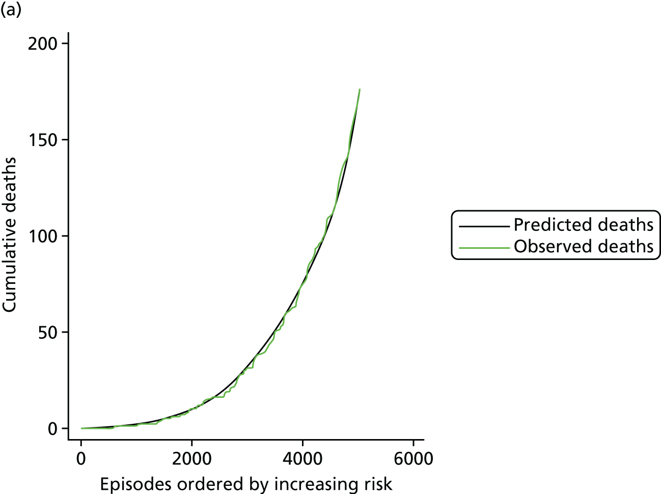
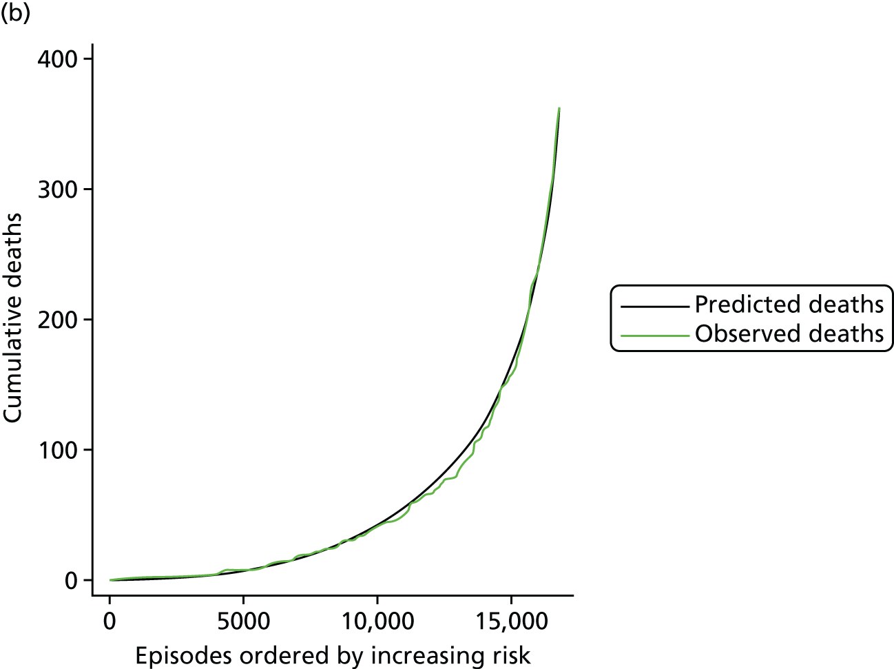
FIGURE 14.
The MADCAP chart showing the performance of the model in episodes with an indicator of UVH (n = 3737).
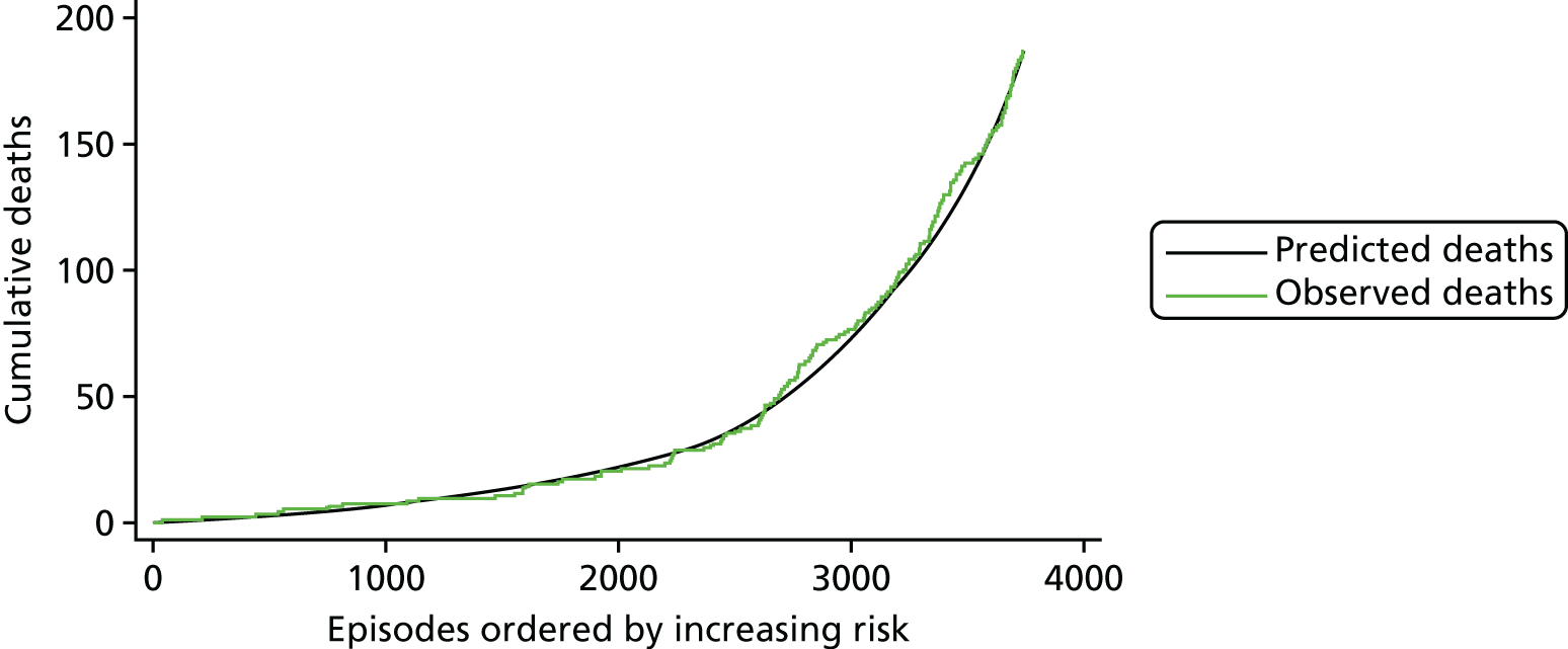
FIGURE 15.
The MADCAP chart showing the performance of the model for episodes with an additional cardiac risk factor present (n = 1053).
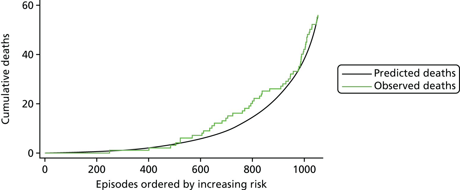
FIGURE 16.
The MADCAP chart showing the performance of the model for episodes with an acquired comorbidity present (n = 1254).
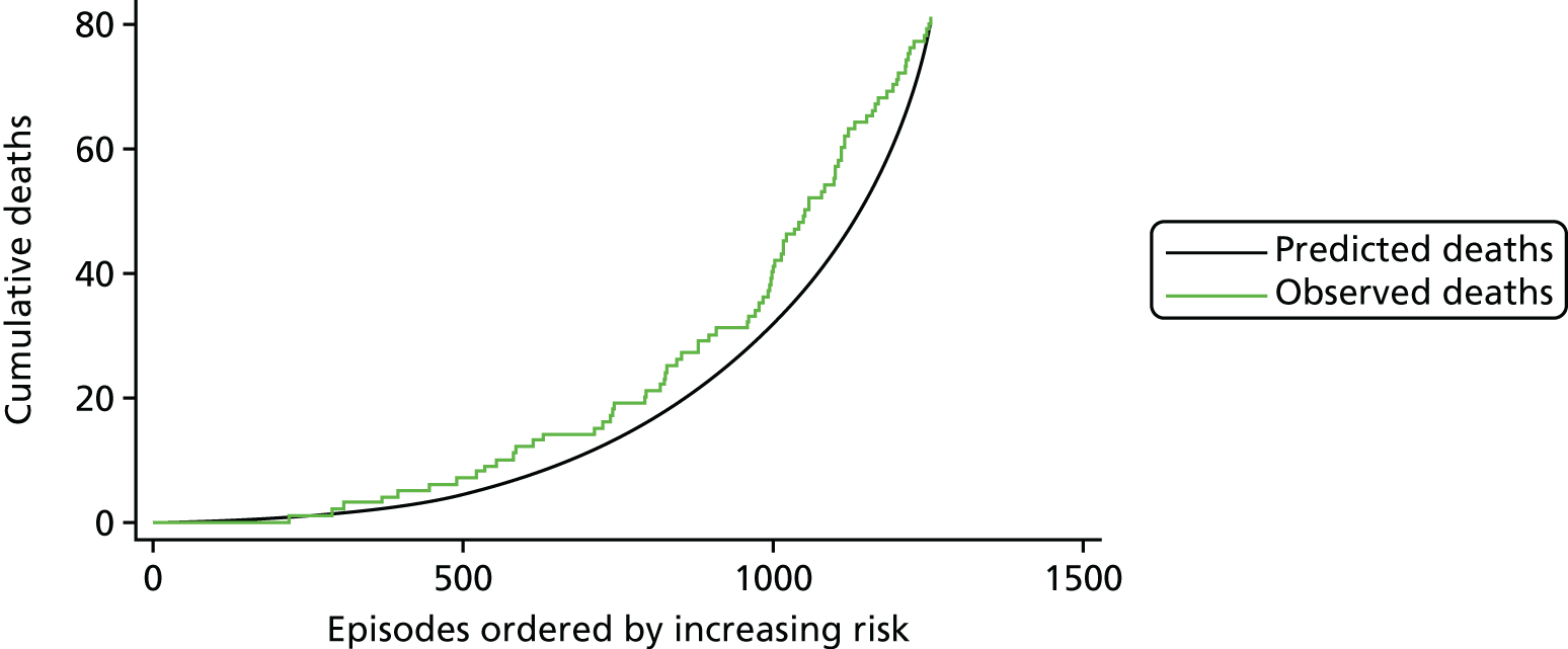
FIGURE 17.
The MADCAP chart showing the performance of the model for episodes with a congenital comorbidity present (n = 2445).
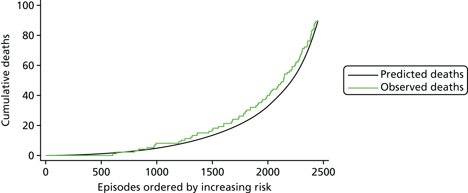
FIGURE 18.
The MADCAP chart showing the performance of the model for episodes with a severity of illness indicator present (n = 2260).

FIGURE 19.
The MADCAP chart showing the performance of the model for episodes with Down syndrome (n = 1690).
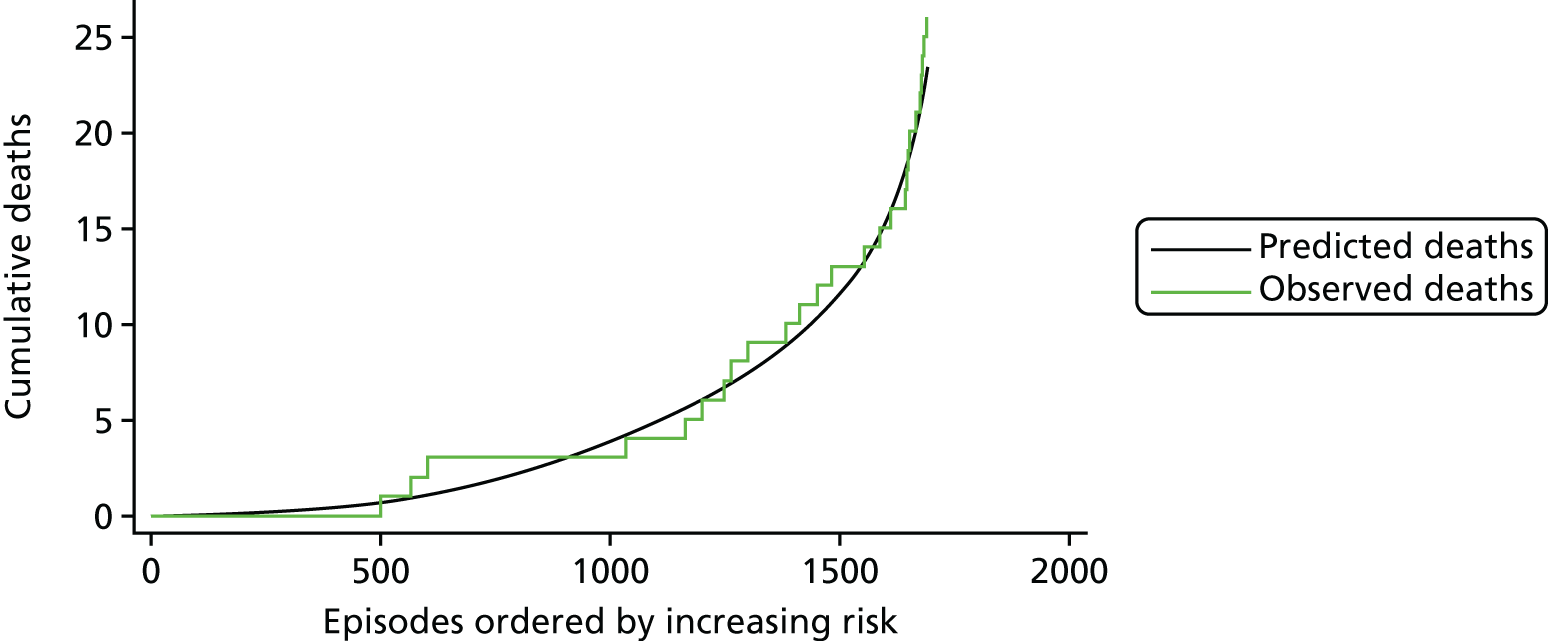
FIGURE 20.
The MADCAP chart showing the performance of the model for episodes with prematurity (n = 2664).
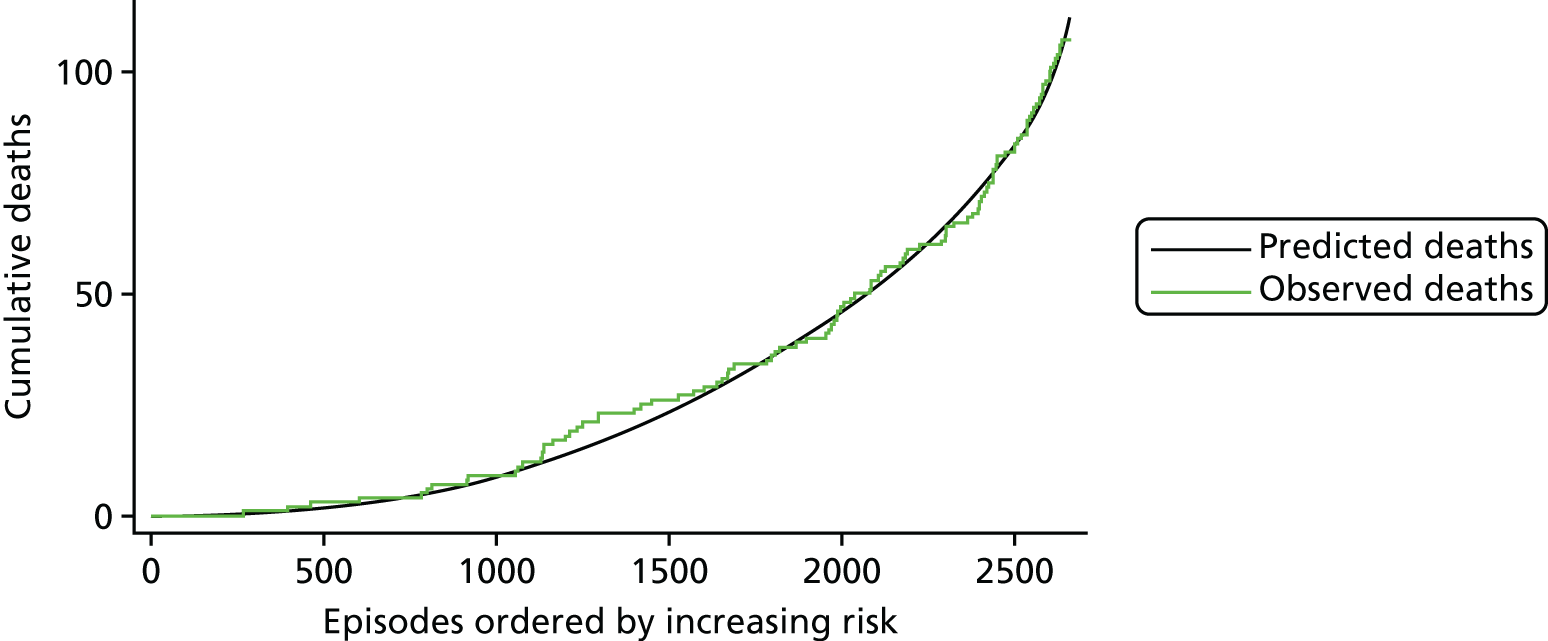
FIGURE 21.
The MADCAP chart showing the performance of the model for episodes relating to (a) neonates (< 30 days; n = 4709); (b) infants (31 days–1 year; n = 8685); and (c) children (1–16 years; n = 8444).
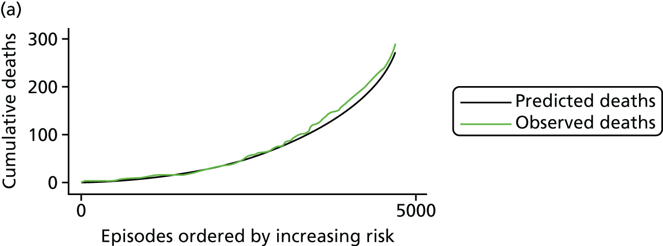

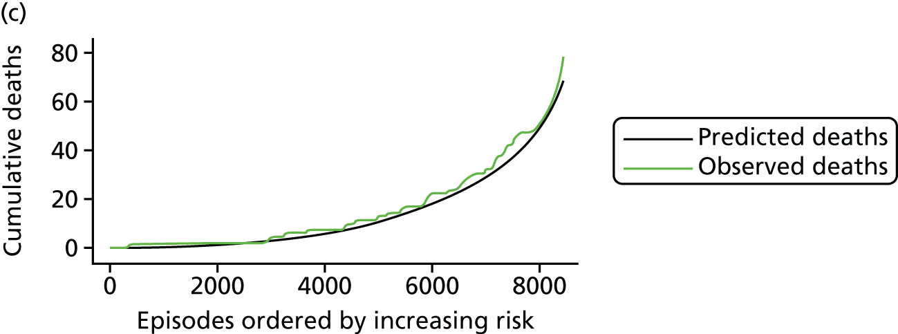
As a final check on model performance without Down syndrome, prematurity or age bands, we examined MADCAP plots within these subgroups for the final model, which did not include any of these factors as explicit risk factors. These MADCAP charts are shown in Figure 19 for Down syndrome, Figure 20 for prematurity and Figure 21 for age bands. We can see that the model performs well in both discrimination and calibration for these subgroups.
None of the MADCAP charts provided any cause for concern.
Validation of the final model
The final model was tested through both internal cross-validation and an external prospective test set using the 2014–15 data.
Performance under cross-validation
Under cross-validation, the model described in Final parameter selection had a median AUROC curve of 0.83 (total range 0.82 to 0.83), a median calibration slope of 0.92 (total range 0.64 to 1.25) and a median intercept of –0.23 (range –1.08 to 0.85) (see also Table 8). The model had good discrimination in the cross-validation test sets, there was little evidence of overfitting and, in general, it tended to slightly overpredict the risk for patients (intercept < 0).
As an example of the performance of the model under cross-validation, Figures 22–26 show the MADCAP charts for the five test sets used in the 15th repeat of the cross-validation. Figure 27 shows the MADCAP chart for these five sets of predicted risk in the each of the five test data sets combined. Although some of the test sets show some under-/overprediction, when combined to cover the whole of the main data set, there is little indication of a systematic bias.
FIGURE 22.
The MADCAP chart showing the performance of the model tested on the first fold of the 15th cross-validation repeat (n = 4367).
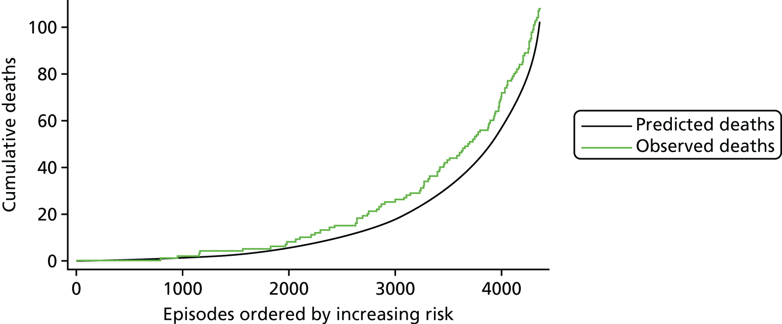
FIGURE 23.
The MADCAP chart showing the performance of the model tested on the second fold of the 15th cross-validation repeat (n = 4368).
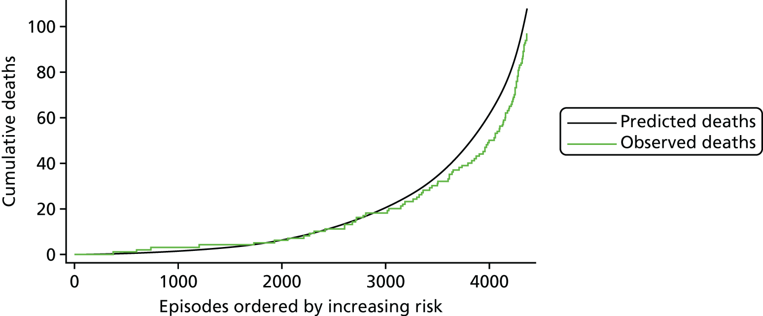
FIGURE 24.
The MADCAP chart showing the performance of the model tested on the third fold of the 15th cross-validation repeat (n = 4366).

FIGURE 25.
The MADCAP chart showing the performance of the model tested on the fourth fold of the 15th cross-validation repeat (n = 4369).

FIGURE 26.
The MADCAP chart showing the performance of the model tested on the fifth fold of the 15th cross-validation repeat (n = 4368).
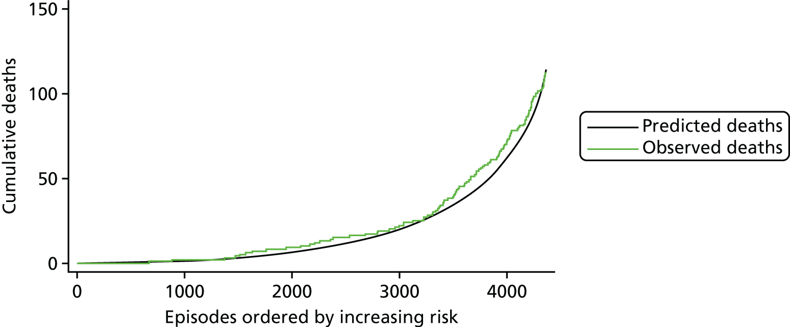
FIGURE 27.
The MADCAP chart showing the performance of the model in the five test sets used in the 15th cross-validation repeat combined (n = 21,838).
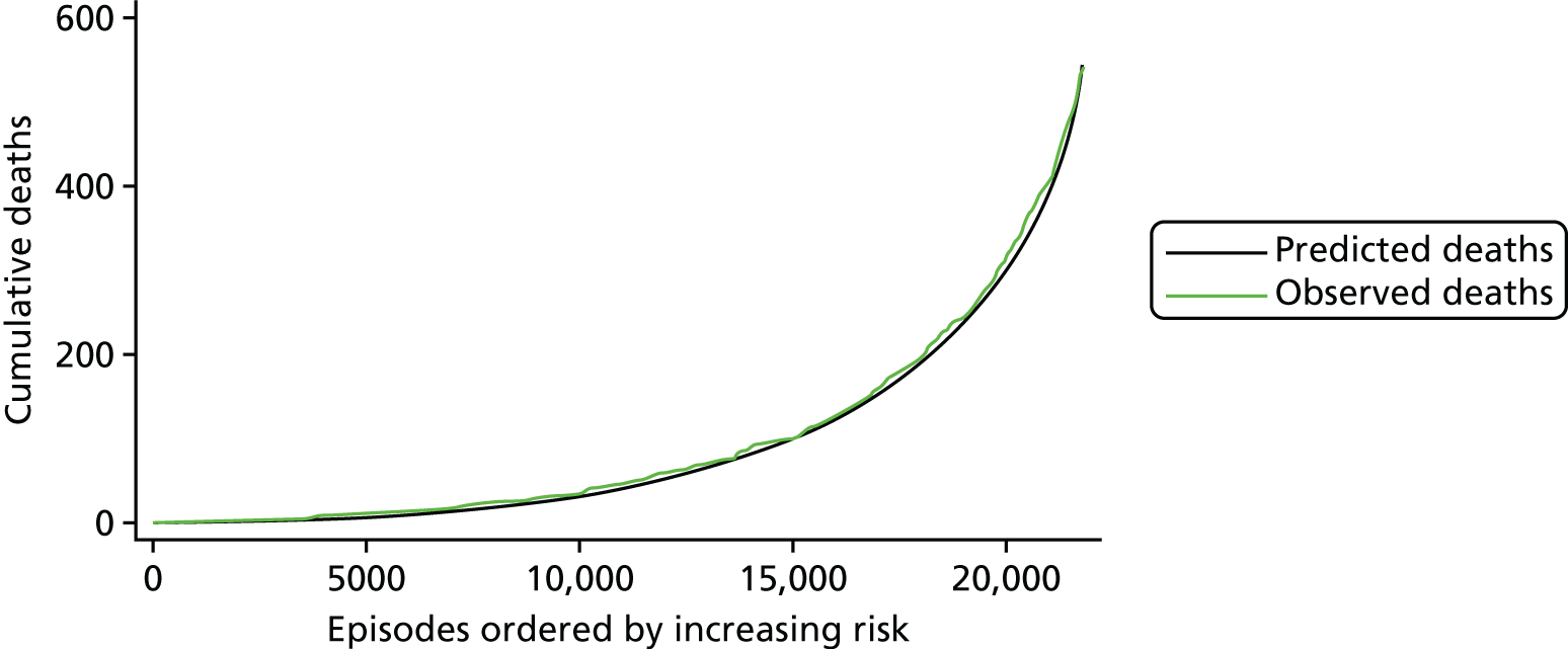
Comparison with performance of PRAiS 1
In terms of the added value of the updates to PRAiS 1, the performance of a model using the risk factors from PRAiS 1 recalibrated under cross-validation had a median AUROC curve of 0.80 (range 0.80 to 0.81), a median calibration slope of 0.90 (range 0.63 to 1.31) and an intercept of –0.29 (range –1.15 to 1.06). The performance using the updated risk factors was, therefore, markedly better (unsurprising given the AIC calculated for Table 8).
PRAiS 2 outperformed PRAiS 1 when picking out especially high-risk patients. For example, the MADCAP charts for episodes that included an acquired comorbidity for PRAiS 1 are shown in Figure 28 (compare the equivalent performance in the PRAiS 2 model shown in Figure 27). On the other hand, PRAiS 2 still performed well within the subgroup defined by having a PRAiS 1 non-Down syndrome comorbidity (shown in Figure 29).
FIGURE 28.
The MADCAP chart showing the performance of the PRAiS 1 risk model recalibrated on the main data set for the episodes with an acquired comorbidity present in the main data set (n = 1254).

FIGURE 29.
MADCAP chart showing the performance of the PRAiS 2 risk model calibrated on the main data set for the episodes with a PRAiS 1 non-Down syndrome comorbidity present in the main data set (n = 7091).
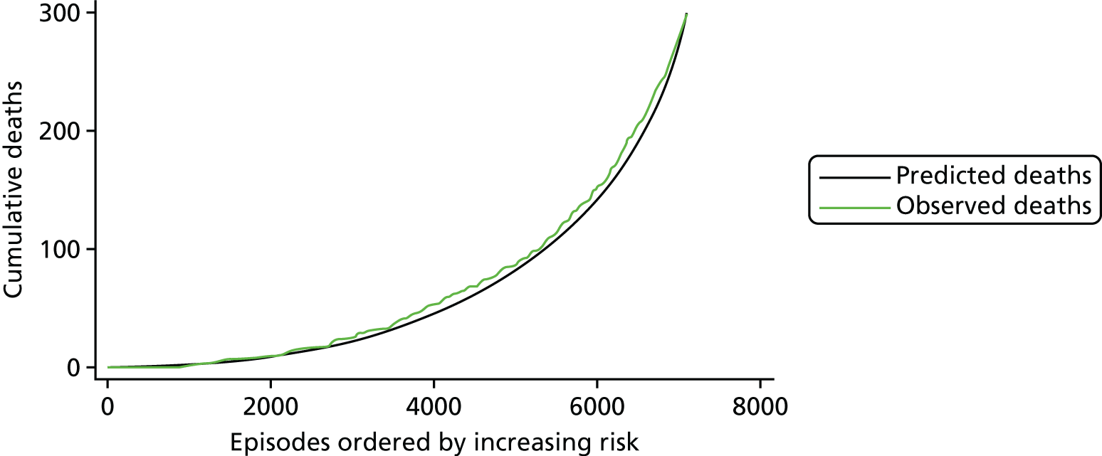
Validation in the 2014–15 data set: descriptive analysis
The 2014–15 data set contained 7278 records. The data set was cleaned in the same way as the main data set, except that no adjustments were made to outlying patients’ weights, to reflect future use. The records included and excluded by the data cleaning are detailed in Figure 30.
FIGURE 30.
Inclusions in and exclusions from the 2014–15 data set.
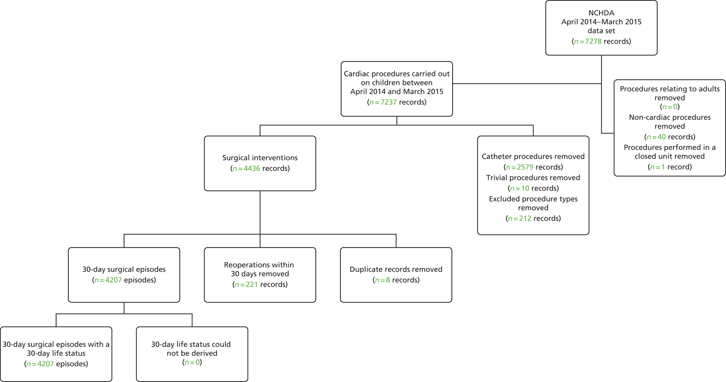
The 2014–15 data set used for testing comprised 4207 30-day surgical episodes, corresponding to 3989 unique patients. The overall 30-day mortality in the 2014–15 data set was 2.3%, compared with 2.5% in the main data set.
Figures 31–38 show a comparison between the main data set and the 2014–15 data sets in terms of the episode-level mortality rates associated with the factors included in the risk model. These show broad similarity in the univariate associations between individual factors and 30-day mortality in the two data sets. That said, there are some features worth noting:
-
The reduction in mortality for episodes with an acquired comorbidity shown in Figure 35 was coupled with an increase in the proportion of episodes with this additional risk factor from 5.7% in the main data set to 13.7% in the 2014–15 data set. This may be an early indication that the additional risk for this group is being diluted as reporting increases. This would need to be explored further in any future recalibration. The reduction in mortality for episodes with a congenital comorbidity shown in Figure 37 was not linked to as much of an increase in reporting of congenital comorbidities, and was more in line with the mortality trends of the data set as a whole.
-
The large reductions in mortality in specific procedure risk group 10, shown in Figure 31, and in diagnosis risk group 2, shown in Figure 32, were investigated by the analysts, and, although the reduction in mortality was quite large, there was no reason to think that these reductions were not genuine for these groups (whether by change in practice, chance variation or both).
-
The increase in mortality for episodes in specific procedure risk group 1 and diagnosis risk group 1 mainly relate to patients with HLHS undergoing their primary procedure. On investigation, a higher proportion of these patients underwent a hybrid procedure than underwent the traditional Norwood procedure, the latter of which generally is carried out on sicker patients and has a higher 30-day mortality rate.
FIGURE 31.
Observed mortality for specific procedure risk groups in the main data set (black with CIs, n = 21,838) and the 2014–15 data set (green, n = 4207).
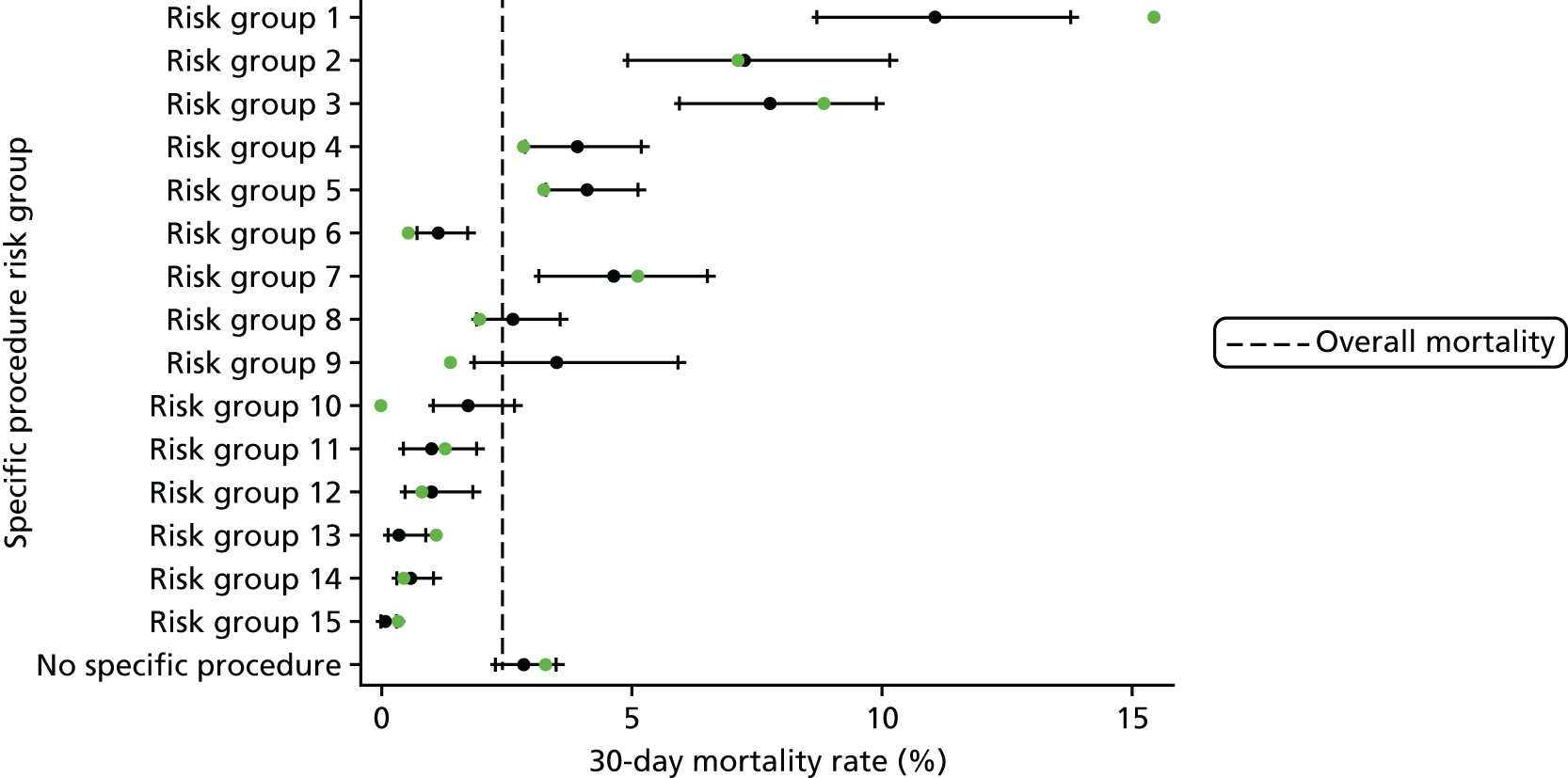
FIGURE 32.
Observed mortality for diagnosis risk groups in the main data set (black with CIs, n = 21,838) and the 2014–15 data set (green, n = 4207).

FIGURE 33.
Observed mortality for bypass and non-bypass procedure types in the main data set (black with CIs, n = 21,838) and the 2014–15 data set (green, n = 4207).
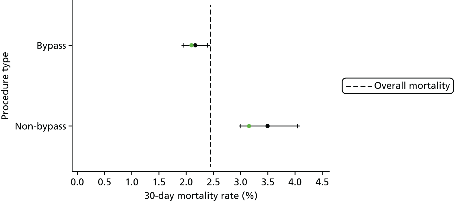
FIGURE 34.
Observed mortality for episodes with and without a UVH indicator in the main data set (black with CIs, n = 21,838) and the 2014–15 data set (green, n = 4207).
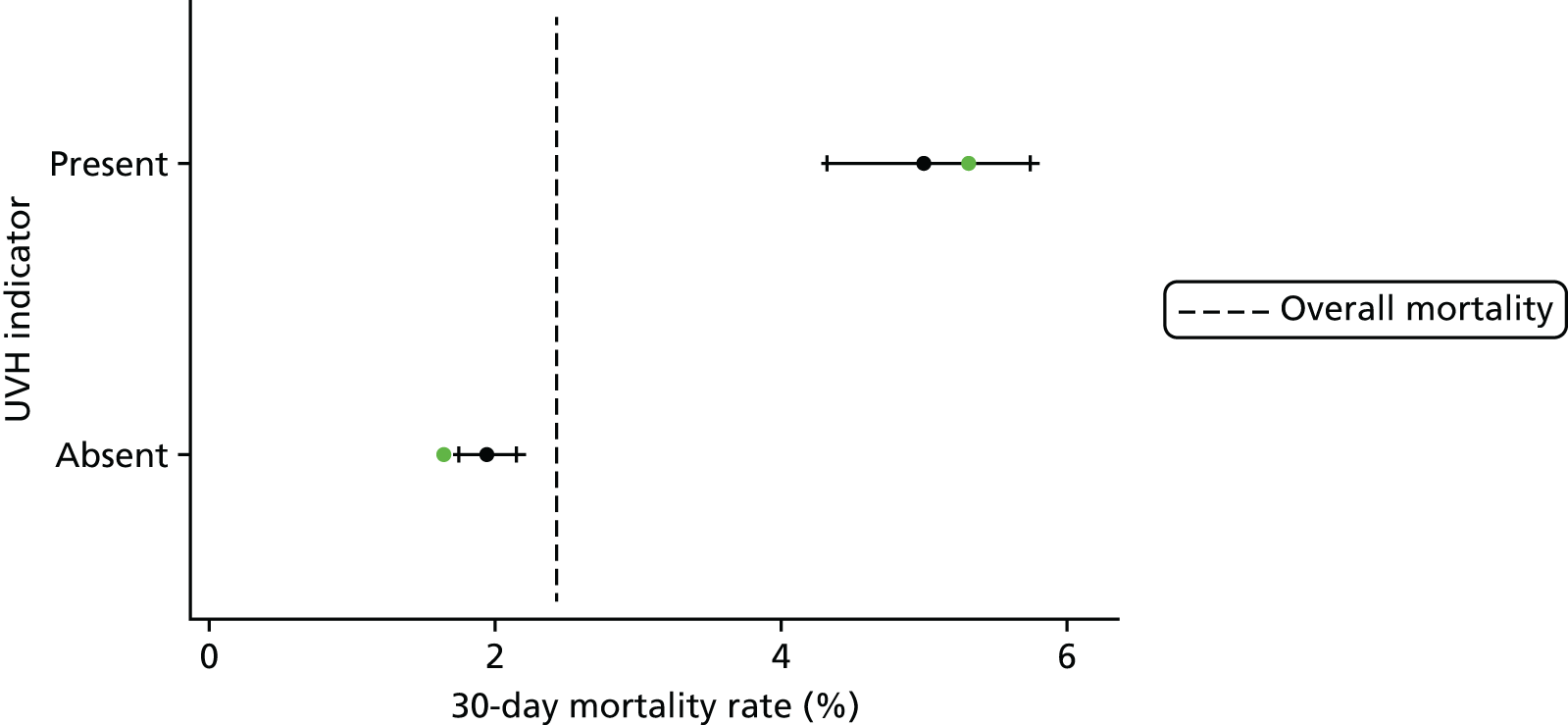
FIGURE 35.
Observed mortality for episodes with and without an acquired comorbidity in the main data set (black with CIs, n = 21,838) and the 2014–15 data set (green, n = 4207).

FIGURE 36.
Observed mortality for episodes with and without an additional cardiac risk factor in the main data set (black with CIs, n = 21,838) and the 2014–15 data set (green, n = 4207).
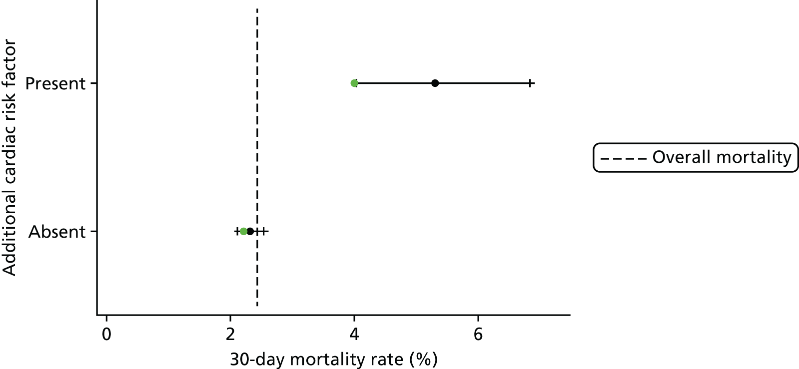
FIGURE 37.
Observed mortality for episodes with and without a congenital comorbidity in the main data set (black with CIs, n = 21,838) and the 2014–15 data set (green, n = 4207).

FIGURE 38.
Observed mortality for episodes with and without a severity of illness indicator in the main data set (black with CIs, n = 21,838) and the 2014–15 data set (green, n = 4207).
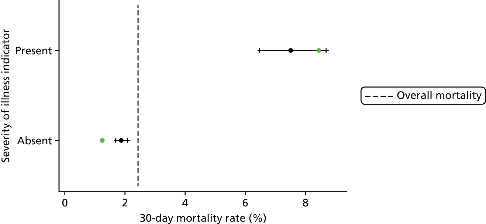
Validation in the 2014–15 data set: performance
The receiving operating characteristic curve in the 2014–15 data set is shown in Figure 39. The AUROC curve in the 2014–15 set was 0.86 (95% CI 0.82 to 0.89), compared with 0.84 (95% CI 0.83 to 0.86) in the main data set on which it was calibrated. The performance of the model described in Final parameter selection across the spectrum of predicted risk is shown in Figure 40.
FIGURE 39.
The receiving operator characteristic curve of the model calibrated in the main data set and tested on the 2014–15 data set.
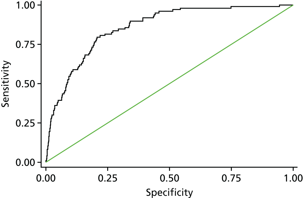
FIGURE 40.
Cumulative deaths in the 2014–15 data set plotted against episode number with episodes ordered by increasing risk, as predicted using the model set out in Table 11 (n = 4207).

The calibration slope in the 2014–15 data set was 1.01 (95% CI 0.83 to 1.18) and the intercept was 0.11 (95% CI –0.45 to 0.67). This shows that, although there was a slight (non-significant) underprediction of risk in the validation data set, the PRAiS 2 model showed excellent discrimination and no evidence of overfitting (calibration slope of 1.01). Overall, there were 97 observed deaths in the test set, compared with 89 predicted.
Use of PRAiS 2 in practice
Recalibration across all of the data
Following the successful internal and external validation of the model, the coefficients of the PRAiS 2 model were recalibrated over the whole data set from April 2009 to March 2015. Any adjustments required to recorded weights (see Age and weight) were recalculated using the whole data set.
Comparing the predicted risk using the PRAiS 2 model calibrated on April 2009–March 2014 with that calibrated on April 2014–March 2015, we can see excellent agreement (Figure 41), providing a further check that our chosen risk factors are stable across the main and the 2014–15 data sets.
FIGURE 41.
Comparison of predicted risk for the final model calibrated on the main data set and on the whole data set for episodes in the main data set (n = 21,838) and in the 2014–15 data set (n = 4207).
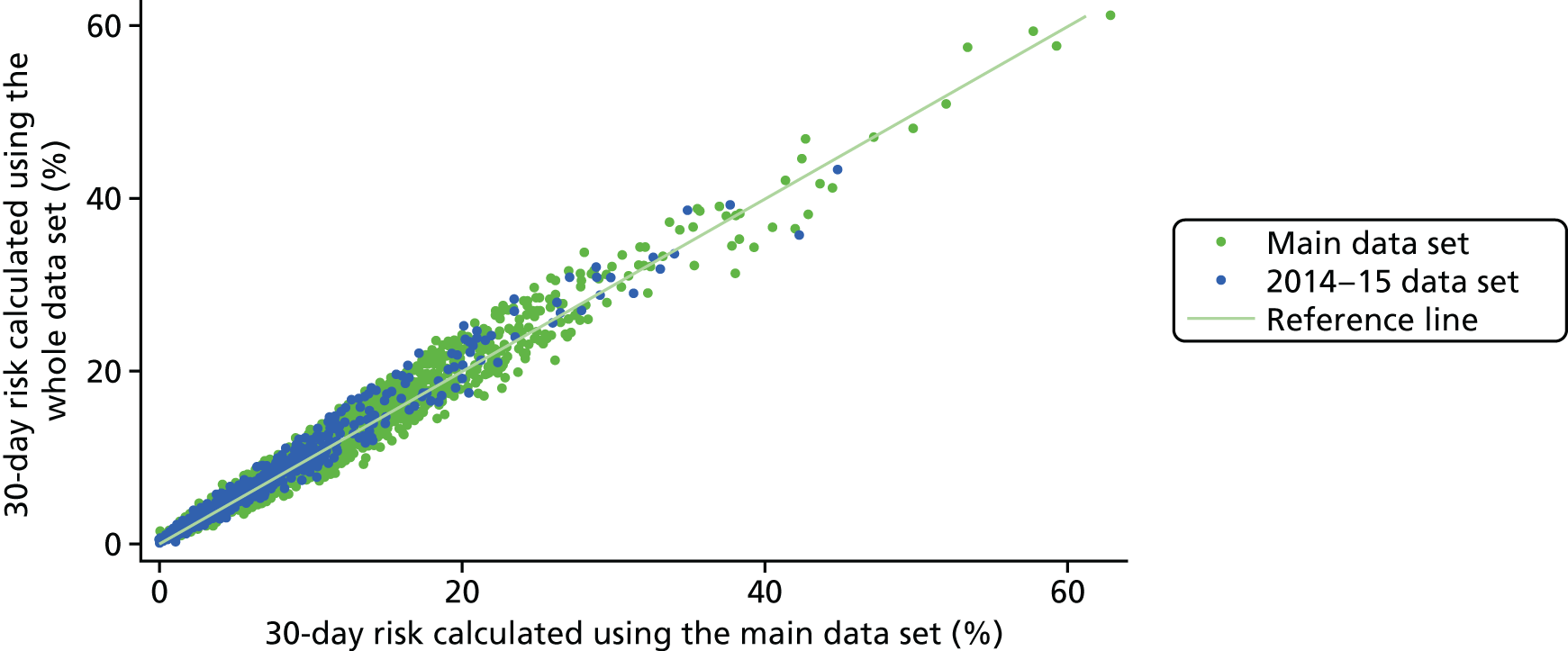
The final model is as follows:
Probability of death within 30 days following paediatric cardiac surgery =11+e−z where:
Parameters i = 1 to 34 are tabulated in Table 12 along with their corresponding regression coefficients, Bi, and the condition that must be satisfied for Xi (Xi = 0 otherwise).
| i | Xi = 1 if condition satisfied (Xi = 0 otherwise) | B i | p-value |
|---|---|---|---|
| 1 | Diagnosis grouping 1 | 0.000 | – |
| 2 | Diagnosis grouping 2 | –0.168 | – |
| 3 | Diagnosis grouping 3 | –0.330 | – |
| 4 | Diagnosis grouping 4 | –1.521 | – |
| 5 | Diagnosis grouping 5 | –0.512 | – |
| 6 | Diagnosis grouping 6 | –0.117 | – |
| 7 | Diagnosis grouping 7 | –0.054 | – |
| 8 | Diagnosis grouping 8 | –0.631 | – |
| 9 | Diagnosis grouping 9 | –0.468 | – |
| 10 | Diagnosis grouping 10 | –1.698 | – |
| 11 | Diagnosis grouping 11 | –1.241 | – |
| 12 | Specific procedure grouping 1 | 0.000 | – |
| 13 | Specific procedure grouping 2 | 0.216 | – |
| 14 | Specific procedure grouping 3 | 0.625 | – |
| 15 | Specific procedure grouping 4 | –0.090 | – |
| 16 | Specific procedure grouping 5 | 0.056 | – |
| 17 | Specific procedure grouping 6 | –0.747 | – |
| 18 | Specific procedure grouping 7 | 1.066 | – |
| 19 | Specific procedure grouping 8 | 0.788 | – |
| 20 | Specific procedure grouping 9 | 1.100 | – |
| 21 | Specific procedure grouping 10 | –0.787 | – |
| 22 | Specific procedure grouping 11 | –0.964 | – |
| 23 | Specific procedure grouping 12 | –0.202 | – |
| 24 | Specific procedure grouping 13 | –0.067 | – |
| 25 | Specific procedure grouping 14 | –0.937 | – |
| 26 | Specific procedure grouping 15 | –1.637 | – |
| 27 | Specific procedure grouping 20 (no specific procedure) | 0.428 | – |
| 28 | Bypass procedure | 0.398 | 0.01 |
| 29 | Definite indication of UVH | 0.692 | < 0.01 |
| 30 | Additional cardiac risk factor | 0.731 | < 0.01 |
| 31 | Acquired comorbidity | 0.538 | < 0.01 |
| 32 | Congenital comorbidity | 0.325 | 0.01 |
| 33 | Severity of illness indicator | 0.689 | < 0.01 |
| 34 | Procedures from 2013 onwards | –0.280 | < 0.01 |
Note that, for prospective use, the ‘post 2013’ coefficient can be absorbed into the constant term.
Example episodes
Table 13 shows the risk calculated by PRAiS 1 and PRAiS 2 for some example episodes. For the groups of examples shown, the episodes have some very similar attributes, which are treated very differently by the PRAiS 1 and PRAiS 2 risk models.
| Risk factor | Episode A | Episode B | Episode C | Episode D | Episode E | Episode F | Episode G |
|---|---|---|---|---|---|---|---|
| Age | 30 days (neonate) | 31 days (infant) | 11.0 months (infant) | 12.8 months (child) | 2 days | 2 days | 2 days |
| Weight (kg) | 4.0 | 4.0 | 9.7 | 7.7 | 2.8 | 2.8 | 2.8 |
| Specific procedure | Norwood | Norwood | Heart transplant | Heart transplant | Norwood | Norwood | Norwood |
| Diagnosis | HLHS | HLHS | Acquired diagnosis | Acquired diagnosis | HLHS | HLHS | HLHS |
| Congenital comorbidity | No | No | No | No | No | No | No |
| Acquired comorbidity | No | No | Yes | No | No | No | No |
| Severity of illness indicator | No | Yes | Yes | Yes | No | Yes | Yes |
| Additional cardiac risk factor | No | No | No | No | No | No | Yes |
| PRAiS 1 non-Down syndrome comorbidity | No | Yes | Yes | Yes | Yes | Yes | Yes |
| PRAiS 2 calculated risk (%) | 7.6 | 14.0 | 3.4 | 5.2 | 12.5 | 22.1 | 37.1 |
| PRAiS 1 calculated risk (%) | 8.8 | 8.6 | 4.2 | 3.5 | 18.2 | 18.2 | 18.2 |
Patients A and B have the same diagnosis and weight and have the same procedure performed only 1 day apart in terms of age. However, patient B has a severity of illness indicator and patient A does not have any additional risk factors. In PRAiS 1, although patient B has a non-Down syndrome comorbidity, the resulting risk is very similar to that for patient A, as patient A is a neonate and patient B is an infant, and so the increase in risk due to the non-Down syndrome comorbidity is balanced with an artefactual reduction in risk from the neonate to infant age band. The PRAiS 2 risk model captures the fact that patient B has a much higher risk of mortality within 30 days.
Patients C and D have the same procedure performed within 2 months of age, and have the same diagnosis and additional risk factors. However, patient D has a much lower weight than patient C. As is the case for patients A and B, in PRAiS 1 this increased risk is outweighed by the shift up an age band, meaning that patient C has a higher predicted risk than patient D, which is reversed in PRAiS 2.
Patients E, F and G all have the same procedure performed at the same age and have the same weight and diagnosis. They all have a PRAiS 1 non-Down syndrome comorbidity, and so are predicted the same risk by PRAiS 1. However, in PRAiS 2, the type and number of additional risk factors leads to better discrimination between these patients.
Institutional case mix and model performance
In addition to understanding the performance of the model across the spectrum of predicted risk and within key subgroups of patients, to assess the fitness for purpose of the model it is important to understand the distribution of case mix and, in particular, differences in case mix between institutions. Essentially, it is important to understand whether or not and under what circumstances differences in case mix and the differential performance of the risk model in different subgroups would combine to give an artefactual impression of better or worse risk-adjusted outcomes at one unit compared with another. We note that, throughout model development, we consulted with the expert panel about known differences in case mix between units and these discussions informed some of the decisions on which specific procedures and diagnoses to group. Such institutional differences in case mix are less important for local quality improvement as there the comparison is mostly like with like (current vs. historical outcomes for the same hospital) and when there have been changes in case mix these will be well understood by the local team.
The differences in case mix between centres, illustrated by predicted 30-day mortality risk, using the model across the model recalibrated on all of data, are shown in Figure 42. Each bar shows the distribution of predicted risk for a single institution.
FIGURE 42.
Comparison of the case mix between different institutions.
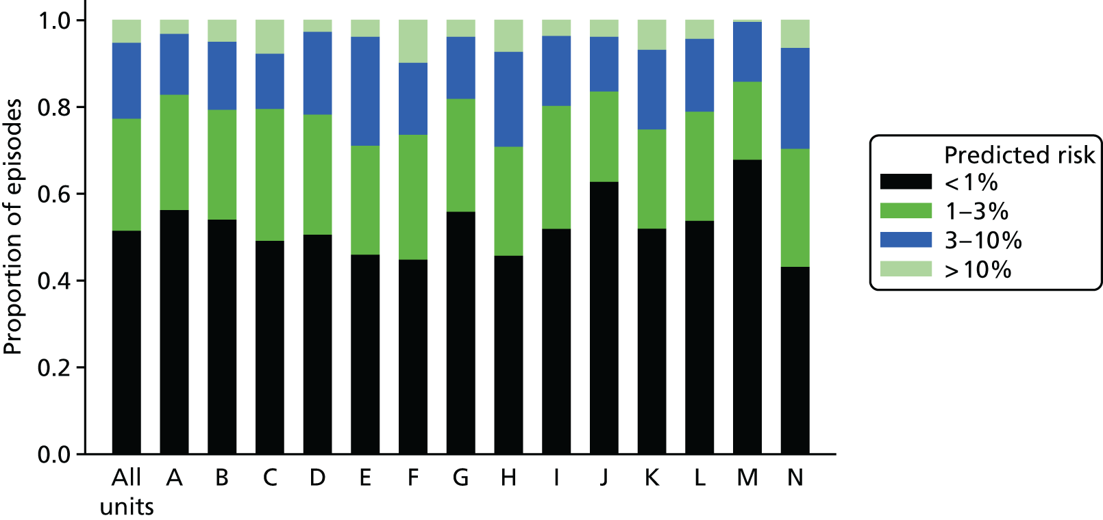
These differences in case mix were not considered problematic, given the excellent performance of PRAiS 2, but we would like to note one case-mix problem that is present within the model. For one specific procedure, the HLHS hybrid approach, we are aware that the model significantly underpredicts risk. Out of the 60 HLHS hybrid approach procedures in the whole 2009–15 data, there are 10 observed deaths, but there are only six predicted deaths based on the model recalibrated on 2009–15 data. This is because, in the UK, patients who have this procedure performed are generally sicker than patients with HLHS, who go down the traditional surgical treatment pathway, in ways that are not well captured by the NCHDA data set. The procedure is relatively rare, and so we could not use it as its own risk factor. Additionally, this procedure is predominantly performed at just one unit. The underprediction of risk for this procedure, therefore, may unfairly affect this unit in prospective national audit.
The expert panel discussed this issue and recommended including HLHS hybrid procedures within PRAiS 2 despite these issues, as they believed that the use of this procedure would increase over time and that it is a high-risk procedure that should be included in audit. It has been proposed to the NCHDA steering committee that the PRAIS 2 model for future national audit is run twice on data including and excluding hybrid HLHS procedures so that this effect can be accounted for. It is hoped that as this procedure becomes more common, PRAiS 2 could be recalibrated to better reflect the additional risk in a few years’ time.
Update to the PRAiS software
Once the risk factors had been finalised, we started work on updating the PRAiS Microsoft Excel software in May 2016. Many small details needed to be updated, but the major changes were:
-
update of the specific procedure algorithm
-
update of episode allocation to allow HLHS hybrids
-
update of diagnosis group allocation
-
introduction of broad specific procedure groupings
-
introduction of new comorbidity and additional risk factor allocations
-
update with the final risk model equation.
In addition, we added a new column for ‘NCHDA unique procedure identifier’ and information on predicted deaths at the request of some of the hospitals’ data managers.
There is a great of deal of code behind the PRAiS software and so we needed to spend a reasonable amount of time testing it to make sure that it was working as intended. It was tested independently by CP, LR, MU and SC. In particular, CP and LR used different subsets of between 1000 and 2000 actual raw records from the NCHDA data set, ran them through the PRAiS software (to generate specific procedures, capture errors, allocate 30-day episodes, allocate risk factors, calculate risks and assign deaths) and then compared the PRAiS output with that previously generated in the statistical software package Stata (which was used for model development). We required that the number of episodes, the allocation of risk factors, the number of calculated deaths and the estimates of predicted risk matched exactly between the PRAiS software and the Stata data.
We released the updated PRAiS software (PRAiS v3.0) along with updated documentation to UCL Business on 20 June 2016, and UCL Business released it to all UK and Ireland hospitals that perform heart surgery, as well as to NICOR, on 23 June 2016. It is to be noted that all of these centres and NICOR already held licences for the PRAiS software and received this update free of charge.
Thanks to close collaboration with members of the expert panel, JS and TW, a rarely used procedural code was found to cause a bug when it was entered as diagnosis. A little later, the national audit body spotted a misspelling in one of the specific procedures. We fixed these issues immediately and the latest version (3.0.2) is currently available on the UCL Business website.
We know that the national audit body and several centres are using the new software and risk model already, and, as far as we know, with no problems.
Aim 1 dissemination
Apart from the release of the updated software (see Update to the PRAiS software), we have published two academic papers in Annals of Thoracic Surgery on this work. 50,51 The first, led by KB, focuses on the clinical development of the comorbidity and additional risk factor categories, which represent important new research of international relevance (see Appendix 2). The second, led by LR and CP, describes the overall development of the updated PRAiS 2 risk model, in particular emphasising the novel collaborative work between the analysts and the expert panel, and the comparison with the US work.
CP presented on the aim 1 work at the Eighth Institute of Mathematics and its Applications Conference on Quantitative Modelling in the Management Of Health and Social Care in London in March 2016 and gave a well-received invited talk on the work (alongside aim 2) at the 12th Annual Meeting of The Multi-Societal Database Committee for Paediatric and Congenital Heart Disease in Atlanta, GA, USA, in August 2016. She further presented on the work as an invited talk at the third Summit on Transparency and Public Reporting of Pediatric and Congenital Heart Disease Outcomes in Denver, CO, USA, on 30 January 2017.
Aim 1 limitations
Although we did our best to update the risk model with care, thoughtfulness and attention to detail, some important limitations remain.
A major limitation is that for 14% of patients we had no independent life status tracking because they did not have a NHS number, and, for UK patients in 2014–15, a small number might have had an ONS status affected by an ongoing inquest. If these patients were discharged alive before 30 days, we have no way of knowing if they subsequently died before 30 days and so we will have underestimated the 30-day mortality rate in the data set. Given the mortality rate of children with ONS tracking (pre 2014–15), and the fact that around 15% of those children died after discharge but before 30 days, we estimate that there may be up to 13 or 14 children in the data set (out of over 21,000 episodes) who were misclassified as alive, meaning that we have probably underestimated mortality by around 0.05 percentage points. That said, national audit has a mandate to include these children and, thus, unless the proportion of overseas children substantially changes, PRAiS 2 should still be fit for the purpose of national quality assurance and for local quality initiatives.
Another inevitable limitation is the impact of data errors. If procedure types, diagnoses, comorbidities, age or weight were miscoded, this will have diluted the ability of the model to take account of these risk factors accurately. We searched for inconsistencies as far as we were able (e.g. implausible age/weight combinations; impossible diagnosis/procedure combinations), but there may well have been errors that could not be picked up that way. This is inevitable in any large-scale clinical data set, but we are encouraged by the fact that the quality of the NCHDA data set is generally extremely high and, unlike international voluntary databases, has a robust system of external validation of data entry.
Other limitations relate to changing case mix, practice or recording over time. The indications are that the UK case mix has been becoming more complex over time. 48 As long as the complexity is reflected in the PRAiS 2 risk factors, this is not problematic. However, we already know that some of that complexity is not well captured within PRAiS 2 (i.e. the HLHS hybrid operation). As new treatments are developed and become increasingly routine, PRAiS will need to be updated accordingly. The introduction of comorbidity as a risk factor in PRAiS 1 resulted in a doubling of the proportion of episodes with a recorded comorbidity, essentially changing the meaning of ‘comorbidity’. This was part of the reason that we recalibrated PRAiS 1 twice since its development. It is possible that the new additional risk factors in PRAiS 2 will result in similar changes to coding completeness and patterns, which would again require the recalibration of PRAiS 2 in the future to maintain its fitness for purpose.
Aim 1 conclusions
We fulfilled our aim of significantly improving the PRAiS risk model, by using more information about comorbidity and additional risk factors. During this process, we made several other improvements, including moving to non-linear treatment of age and weight, which removed the need for artefactual sudden changes in predicted risk at age boundaries, and reducing the detail in specific procedure but increasing the amount of diagnostic information. The final model parameters and coefficients are given in Recalibration across all of the data.
Overall, we reduced the number of model parameters from 38 to 36 but improved performance. The updated PRAiS 2 risk model achieved excellent performance: under 25 × 5 cross-validation it had a median AUROC curve of 0.83 (total range 0.82 to 0.83), a median calibration slope of 0.92 (total range 0.64 to 1.25) and a median intercept of –0.23 (total range –1.08 to 0.85) in its test sets, while the AUROC curve was 0.86 (95% CI 0.82 to 0.89), the calibration slope was 1.01 (95% CI 0.83 to 1.18) and the intercept was 0.11 (95% CI –0.45 to 0.67) in the 2014–15 validation set. Thus, the model demonstrated excellent discrimination and no evidence of overfitting.
The PRAiS model and software is fulfilling two purposes: national quality assurance with annual reporting and benchmarking, and local quality improvement through regular in-house monitoring. The limitations discussed in Aim 1 limitations relate mostly to the use of PRAiS for national monitoring. This is because local teams have access to the full medical notes of each patient and so they can put the PRAiS results in the context of other risk factors/information not included the model; they are consistently comparing only with their own recent results, and the local team is aware of factors, such as changing local case mix, that might affect PRAiS. Because the PRAiS software includes hospital numbers alongside detailed diagnosis and procedure groups, it also facilitates local quality improvement initiative on particular subpopulations of patients (e.g. for a certain type of procedure or diagnosis).
The close involvement of the expert panel, which represented many centres and different specialties, was novel and very successful. The iterative development of the comorbidity and risk factor groupings was essential in achieving the balance between statistical performance, clinical face validity and careful consideration of how individual codes have been and will be used by centres in practice. Similarly, the iterative refinement of new broader specific procedure and diagnosis groups resulted in groups that had good discrimination in terms of risk but also had clinical face validity. The additional value of this collaboration with the expert panel is harder to quantify but important nonetheless; the trust in the final model within the clinical community and key members (including the chairperson, RF) of the national audit steering committee came largely from our process of codevelopment.
One consequence of this is perhaps the rapid take-up of the updated software within the clinical community and by national audit (less than a week). An anecdotal reflection on this is that queries and comments about the new risk model and software have come exclusively from centres that were not represented on the expert panel. A second anecdotal reflection is that members of the expert panel felt empowered to respond to many of these queries without needing to refer back to the analysts. As a result, were we to undertake another extensive model-building exercise, we would try to involve representatives of all the UK centres even if that increased the logistical complexity.
Chapter 3 Aim 2: developing a public website to communicate how PRAiS is used to monitor children’s heart surgery
This part of the project aimed to develop, test and disseminate online resources for families affected by CHD in children, and for the public and the media, to facilitate the appropriate interpretation of published mortality data following paediatric cardiac surgery.
Team and roles
Who
This was a multidisciplinary effort with interwoven strands led by the principal investigator CP, DS (Winton Professor for the Public Understanding of Risk), TR (an experimental psychologist) and EJ of the charity Sense about Science. An explanation of how the roles fitted together is given below.
Communicating the statistics
DS and his team specialise in developing resources for the public understanding of science, with a focus on risk and probability. For this project, CP and DS drafted the initial content for the web material, working closely with MP from the Statistical Laboratory at the University of Cambridge, who was responsible for the considerable technical effort involved in building and designing the website.
Running the user codevelopment
Sense about Science is a charity that promotes the understanding and use of, and challenges the misrepresentation of, scientific evidence. EJ and JT recruited participants to the non-parent workshops, facilitated and organised all of the workshops at the Sense about Science offices, collaborated closely on the website content, and designed and ran the launch and dissemination of the website. MS from the CHF helped to recruit the parents for the parent workshops and provided feedback on the evolving website on behalf of the CHF. She also organised the CHF dissemination at the website launch.
Experimental psychology (King’s College London team)
TR specialises in using innovative methods from experimental psychology to investigate how people interpret risk and surgical outcomes when these are communicated using different graphical methods. In particular, TR has worked previously with DS on the public interpretation of funnel plots – the same form of plot used by NICOR to communicate paediatric surgery outcomes – and survival curves. 52,53 For this project, TR and his research associate EB ran two sets of three experiments alongside the website development to test specific aspects of the presentation and language. They also ran an experiment in June 2016 to evaluate the final website.
Overall strategy
We knew that the presentation of the complex ideas behind using risk adjustment for audit would not be straightforward. We also knew that DS’s expertise in communicating complex ideas about risk, and his track record of working with MP to produce useful tools and animations around interpreting risk, would be invaluable. 54–60 However, Sense about Science emphasised the importance of involving potential users as early as possible and so, with the welcome support of NIHR, we planned to coproduce the material using a series of workshops with potential users, starting from the very beginning of the project.
The output was aimed at two reasonably distinct audiences:
-
Older patients, parents and families of children who have had/will have heart surgery. This group is likely to have a more emotional involvement with published results and more likely to be focused on specific questions concerning individual hospitals.
-
Other interested users, including press officers and policy advisors for medical charities or professional bodies, members of the media, NHS England, family liaison services of paediatric hospitals, patient advocates and interested members of the public.
We thus decided to convene two sets of groups in parallel throughout the process: one comprising parents and families and one comprising other interested users. We recruited parents/carers and did not recruit children, as the large majority of children who undergo heart surgery are aged < 5 years. Family members were recruited through the CHF and other charities affiliated with the CHF. The CHF initially added a news item to its website and Facebook page (www.facebook.com), and forwarded the responses to Sense about Science. Later, CHF also passed on details of other charities that could help [e.g. Little Hearts Matter (www.lhm.org.uk) and Tiny Tickers (www.tinytickers.org)], and these charities also added news items to their Facebook pages and newsletters. For workshops 2–4, we offered parents a range of dates and times, including weekends and evenings. Parents who expressed an interest in earlier workshops but could not attend were also individually invited to attend later workshops. Parents were offered compensation for their time at the Involve rates of pay and travel expenses. 61
Sense about Science recruited the non-parent participants for the second strand of workshops. Details of each participant’s role are given in Appendix 3.
We held four workshops for each group of users in June 2015, October 2015, February 2016 and April 2016; these were organised and facilitated by Sense about Science and held at their offices in London (i.e. there were 4 × 2 focus groups in total). Each workshop lasted 1.5 hours and refreshments were provided. To ensure a fresh perspective at each time point, no workshop participant attended more than one workshop, but they were all invited to provide feedback on new versions of the website and animations via e-mail/online survey. We aimed to have about six people per group at each meeting (i.e. a total of up to 24 family members and 24 interested users).
For all workshops, participants received only minimal details about the project and were not required to prepare or read anything prior to the workshop. Each workshop began with refreshments, at which point participants were introduced to the facilitators (EJ and JT), to project team observers and to each other, before EJ gave an introduction to Sense about Science and JT gave a brief presentation on the background of the project, including the cost of poor risk communications in this area, and explained how the workshop would run. EJ and JT also asked for (and received) permission to record each meeting to facilitate the write-up of the discussion. The recordings were not shared outside the Sense about Science team. The participants were informed that the project team observers (always including at least one of CP, MP and DS) would remain silent unless there were specific questions about the technical content of the website. From the second set of workshops onwards, all material was viewed via the web pages, with each participant having access to their own laptop; participants were given approximately 15 minutes at the start of the workshop, after the introductions, to explore the material on their own with no further guidance from Sense about Science. It was made clear to parents that if at any point they did not feel comfortable to continue, they were free to leave. At the end of each workshop, the participants were asked if they wanted to be kept up to date with the project progress and to continue to provide feedback and comments via e-mail. All participants chose to stay involved. After each workshop, Sense about Science wrote a report on the discussion, including recommendations of changes, which was then shared with the rest of the aim 2 project team (CP, MP, DS, TR and EB).
Starting in late autumn 2015, once the web material was in a more advanced state, the King’s College London (KCL) psychology team began formal experiments to explore further how people understood the presented statistics and some of the key sections of the new drafted material. For this component of aim 2, we adopted a mixed-methods approach to evaluating candidate components for the website, involving experiments, think-aloud studies and qualitative research. The final component was an experimental comparison between the website and the NICOR report. 62 Our research focused on (1) comprehension and interpretation of prediction interval plots, (2) evaluation of hospital survival data when presented using prediction-interval data, and (3) user understanding of issues relating to the monitoring of paediatric cardiac surgery. This work was undertaken at KCL by TR (project coinvestigator) and EB. For the design and content of our studies, we drew on the content of the workshops run by Sense about Science (see Website development: April 2015–April 2016) (most of which EB attended as an observer), discussions with DS and CP (particularly, but not exclusively, about the mathematical and statistical concepts under investigation) and with MP (particularly in relation to data presentation via the website). These experiments provided additional input into the content and design of the website, including the animations.
Between workshops, CP and MP worked closely together to update the website content, with sharing and commentary by other team members. Content was updated in response to the Sense about Science reports from the workshops and, later, the insights arising from the psychology experiments.
Periodically, we also sent existing material to the CHF and the expert panel from aim 1 (see Chapter 2), in November 2015, February 2016 and April/May 2016, to invite feedback and to ensure that we had accurately described the role of the audit body and the process by which they monitored survival statistics for children’s heart surgery. In April/May 2016 we also sent the close-to-final version of the web material to all previous workshop participants, both for further feedback and to show how their previous participation had influenced the site. A summary of the strands of the project and how they interacted is shown in Figure 43.
FIGURE 43.
Summary of the development plan for the web material. SaS, Sense about Science.

We knew that the multidisciplinary, multi-institutional and coproduction approach to building the website would provide a challenge, as the extent and scope of the interaction of the different strands was new to all partners. To support our work in this new approach, we worked with LM, an experienced facilitator of multidimensional initiatives. She facilitated three aim 2 project team meetings in March 2015, January 2016 and June 2016, in which she took on the role of a ‘critical friend’. She asked questions, stimulated discussion and reflection and served as a sounding board for the team to air thoughts, learning and challenges from the project at key stages of its development.
We discuss each of the strands in more detail in subsequent sections. Website development: April 2015–April 2016 discusses the workshop and psychology input. The run-up to launch and the website’s reception and future dissemination is discussed in the subsequent sections (see from Feedback from previous workshop participants, expert panel, the National Institute for Cardiovascular Outcomes Research and others to Aim 2 dissemination). Finally, the last facilitated team meeting generated a lot of discussion about the learning from this project and how it could be used in the future. These discussions, the reflections from individual team members and the reflections from LM are all included in Appendices 5 and 6.
We note that we provide considerable detail in our description of the workshop feedback and how the feedback impacted on the site because we want to demonstrate how the final website was truly coproduced with workshop participants and its scope gradually considerably broadened in response to user requirements and suggestions.
Website development: April 2015–April 2016
Starting the web material development
Before planning the workshops and drafting any material at all, CP met with coapplicants RF and KB as representatives of NICOR in April 2015. This meeting confirmed understanding of NICOR’s current and planned output for its annual reports. It should be noted that, prior to the project starting, NICOR had planned a patient day in May 2015, from which we were hoping to gather some insights via RF and KB, but this event did not, in the end, take place.
The initial focus of the envisaged web material was on explaining the key graphic in the NICOR annual report, an example of which from the 2010–13 report is shown in Figure 44 alongside its accompanying table (Figure 45). 62
FIGURE 44.
Example of the key NICOR output, taken from the 2010–13 annual report (© 2014 UCL; may be reused by NHS and government organisations without permission). 62
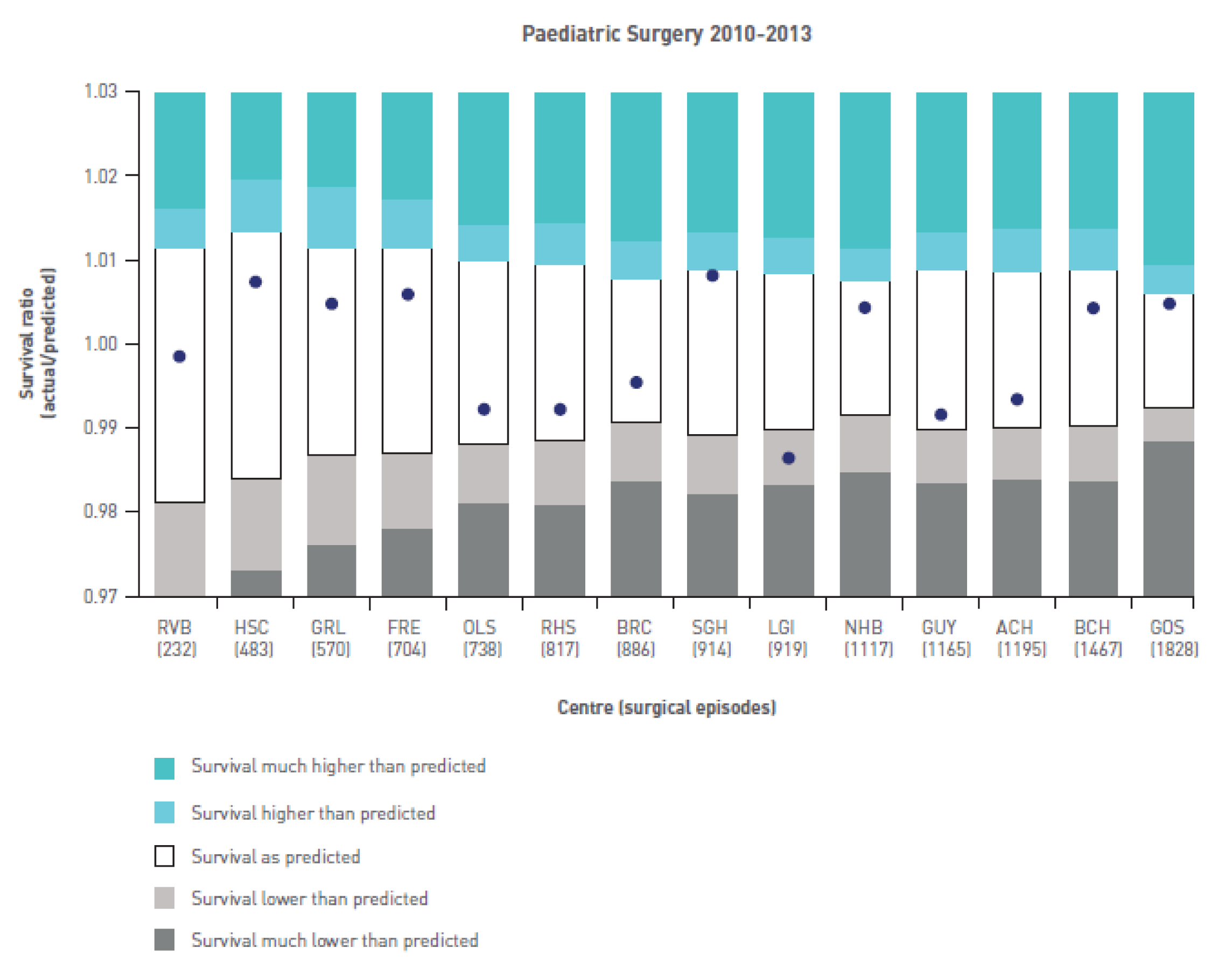
This graphic shows how each hospital’s actual survival compares with its expected survival as calculated by the PRAiS risk model (in this case PRAiS 1). In Figure 44 the vertical axis is the ratio of actual survival to predicted survival (1 representing an exact match). If this value is > 1 then survival at that hospital was better than predicted and if the value is < 1 then survival was lower than predicted. The white interval shows the 95% prediction interval for this ratio: essentially, the range within which we expect hospital outcomes to lie. The width of the range depends on the number of operations a hospital has performed.
In April 2015, Sense about Science and CP met with DS and MP to discuss the initial content of the web material and plans for the first workshops.
During this discussion, MP suggested that by rotating the chart (see Figure 44) by 90o, it could become another column on the table (see Figure 45), which would perhaps make the relationship between the table and the graphic easier to understand.
We thus decided to prepare the following in advance of the first sets of workshops:
-
introductory text
-
NICOR table of results
-
NICOR results graphic (how table translates to plot)
-
a horizontal version of the table and graphic
-
explanations of the terms used in the graphic
-
‘frequently asked questions’ (FAQs) for broader questions around monitoring children’s heart surgery.
For the FAQs, we initially came up with the following.
-
Which hospital should I go to?
-
Is hospital X safe?
-
What about my child’s operation?
-
What happens if survival for hospital X is low?
-
What does it mean if survival at hospital X is low?
-
How good/accurate are the data?
-
Limitations.
-
Difficulties of risk adjustment.
-
Benefits of risk adjustment.
After some discussion, and on the advice of Sense about Science, we decided to present each of these potential questions on paper, rather than on a website, alongside paper outputs of the NICOR graphic and table. This served two purposes. First, we could listen and respond to the order in which people asked questions and, second, it reinforced the fact that users were involved from the very beginning and encouraged workshop participants to ask for extra material and be open about suggesting changes to both the content and the navigation of the proposed website.
After this meeting, DS drafted the graphic and table explanations, while CP drafted the background and FAQ text. These initial drafts were then shared with Sense about Science, MP and TR, all of whom commented extensively and suggested important changes to the text. Both DS and CP found the perspective of experts from different backgrounds (TR and Sense about Science) extremely valuable.
Workshop round 1
The first two workshops were held on 29 June 2015 (non-parent) and 30 June 2015 (parent). Five non-parent participants and four parents, respectively, attended each workshop. CP, DS and MP attended both meetings as observers.
At each meeting we presented the NICOR table (see Figure 45) and graphic (see Figure 44), as well as the new horizontal display shown in Figure 46.
FIGURE 46.
New horizontal display of the graphic alongside the table content.
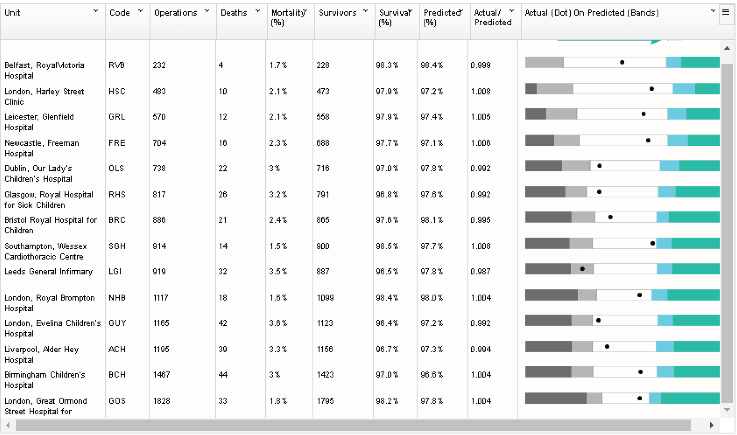
In addition, we provided paper copies of the background material and initial FAQs, with each FAQ on a separate piece of paper so that we could show the questions in any order. These drafts are provided in full in Appendix 4. The main feedback points are given below.
Ratio of actual survival to observed survival
It became apparent during both workshops that ratios are easy to misinterpret and that the language surrounding them is not necessarily common usage. For instance, not everyone knew that the symbol ‘/’ meant ‘divided by’. DS and CP spent a lot of time in the workshops explaining both what the ratios represented and why they were used instead of simply raw survival.
The ratio is preferred by NICOR because it means that every hospital has the same ‘expected value’ of 1, which gives the graph in Figure 43 a ‘centre line’ on which to look at hospital results. However, as discussion of the results progressed, CP and DS emphasised that hospitals should not be compared directly with each other using their raw survival rates and that the key feature is whether the ‘dot’ on the graph is within the predicted range (the white area). These workshops made us realise that emphasising that hospitals should only be compared with their own predictions made it confusing to then transform hospital results into a ratio whose main benefit was to allow hospitals to be compared with each other. We also realised that providing the exact predicted survival (whether on its own or as the ratio) was inconsistent with emphasising that the predicted range was the important feature.
As a result of this we decided to present results in terms of actual survival for each hospital and to show that in terms of the hospital’s predicted range of survival. We chose not to provide the exact predicted survival at all.
The National Institute of Cardiovascular Outcomes Research plot
Both DS and CP were familiar with the way in which NICOR presented the hospital outcomes (see Figure 44), and they liked the presentation. However, the value of having ‘fresh eyes’ at the workshop became immediately apparent. Some workshop participants were immediately drawn to the colour regions in Figure 44 and interpreted the graphic as a bar chart, which then gave the (incorrect) impression that the hospitals on the horizontal axis are ranked by increasing survival. After discussing with participants, we decided to change the colouring so that the white area became coloured and the outermost areas became white, as this would focus attention on the dot and its predicted range.
Horizontal versus vertical display
In both workshops, participants were unanimous in preferring the horizontal display over the vertical one, so we decided to use the former going forward.
Other plot features
Participants suggested changing the language of the legend and relating this directly to the plot areas by the use of hover-overs within a web page. For instance, instead of ‘survival as predicted’ for the central range, we changed to ‘there is no evidence that the chances of survival in the unit were different from predicted’.
Predicted survival
This created a lot of discussion; participants asked how predictions were made, by whom and when. For instance, some people interpreted ‘predicted survival’ to mean the survival that the hospital predicted for itself after knowing what its actual survival was. We had tried to avoid using detail about the risk adjustment method, but this proved to be a mistake, as different people interpreted our explanations quite differently. Parents in particular wanted to know more about how the survival was predicted. As a result of this, we realised that we would have to explain risk adjustment at the top level of the material and not just as a FAQ. We also realised that we would have to think carefully about using language such as ‘predicted’ or ‘expected’ and what connotations the language could have.
Introduction and website title
All participants said there was too much text and that it was hard to read. Both workshops also suggested that we needed to signpost people to further resources (e.g. charities and support groups for parents). Parents stressed the importance of explaining that the UK has good monitoring in place and that the overall survival rates are high. Other feedback was that we needed more background about heart surgery in the UK, which hospitals performed it and what the website was for (and what it was not for).
Participants preferred the overall title ‘understanding children’s heart surgery outcomes’.
Frequently asked questions
Again, the general feedback was the FAQs were too wordy and hard to read. Participants were divided on whether coin analogies were useful and whether the analogy was too trivial for the subject, which may then come across as insensitive. It was clear that describing the role of ‘chance’ and ‘uncertainty’ would be key challenges for the project team. Specific feedback was also given on text that used too much jargon or phrases that jarred; for instance, one participant said that sentences starting ‘it is important to remember that’ could come across as patronising and off-putting.
Workshop round 2
The second non-parent workshop was held on 6 October. Owing to difficulty recruiting parents during the working day, the second parent workshop was delayed until 10 December. The difficulty in finding several parents who could all attend at the same time prompted us to change our approach to the recruitment of parents. Instead of fixing a date and then asking the CHF to recruit parents for that date, we switched to offering parents a range of dates and times, including evenings and weekends for more flexibility. Via the CHF, we also asked other charities such as Little Hearts Matter and Heartline Families (www.heartline.org.uk) to post notices on their social media sites asking for parents who would be interested in being involved. Switching to this approach worked much better and we had few problems recruiting parents for workshops 3 and 4.
After workshop 1, we tried to address all of the feedback and started building a prototype website. By the second non-parent workshop, we had developed three draft web pages: an introduction page (Figures 47 and 48), a data page (Figure 49) and a FAQ page (see Figure 52).
FIGURE 47.
Our first attempt at the introduction page.
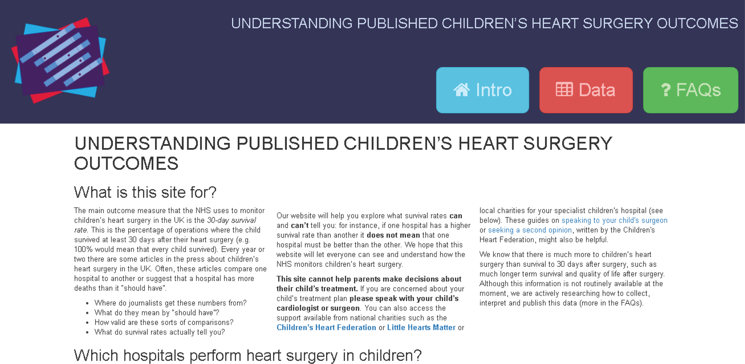
FIGURE 48.
The rest of the our first introduction page.
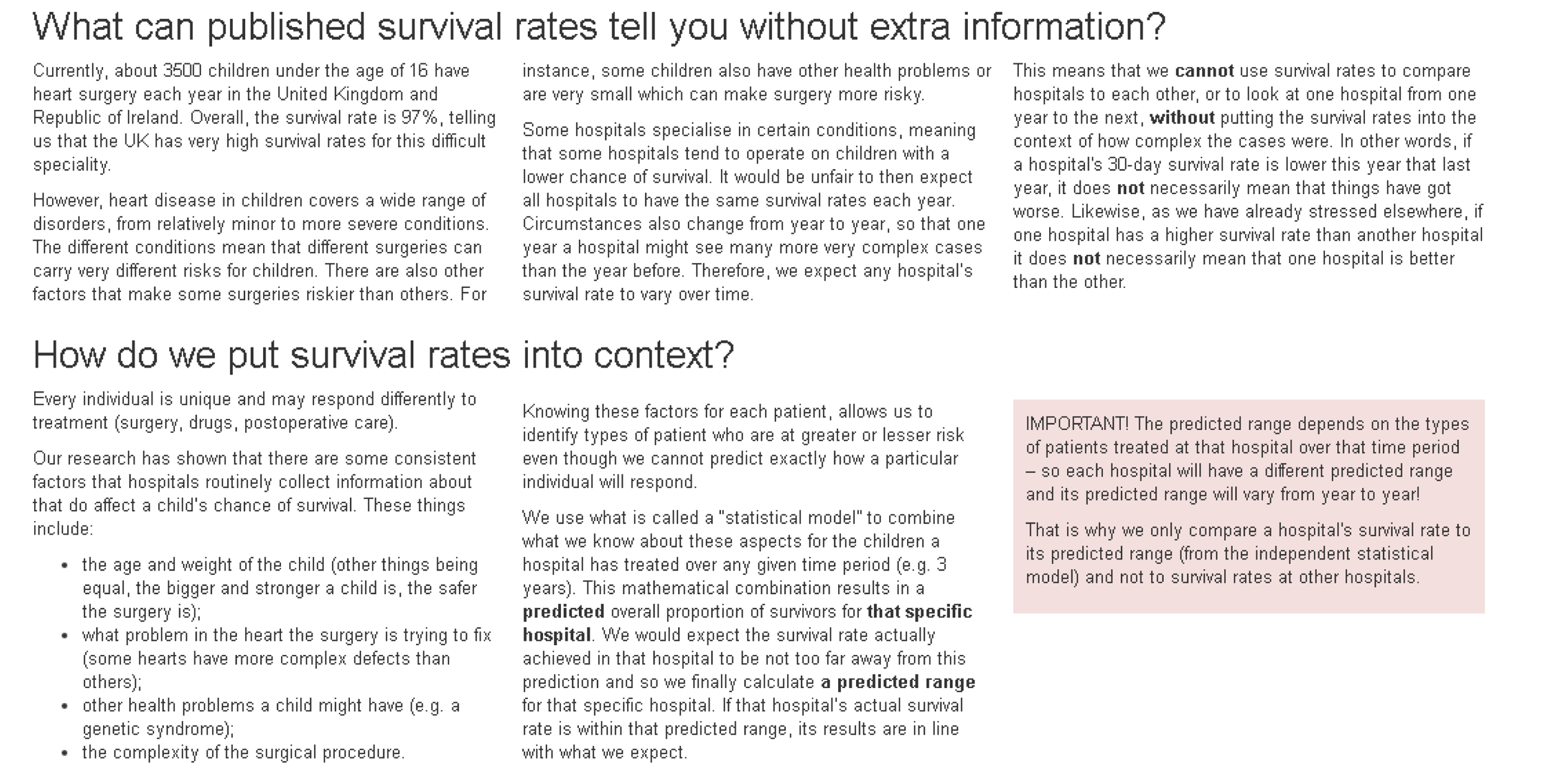
FIGURE 49.
Our first attempt at the data page.
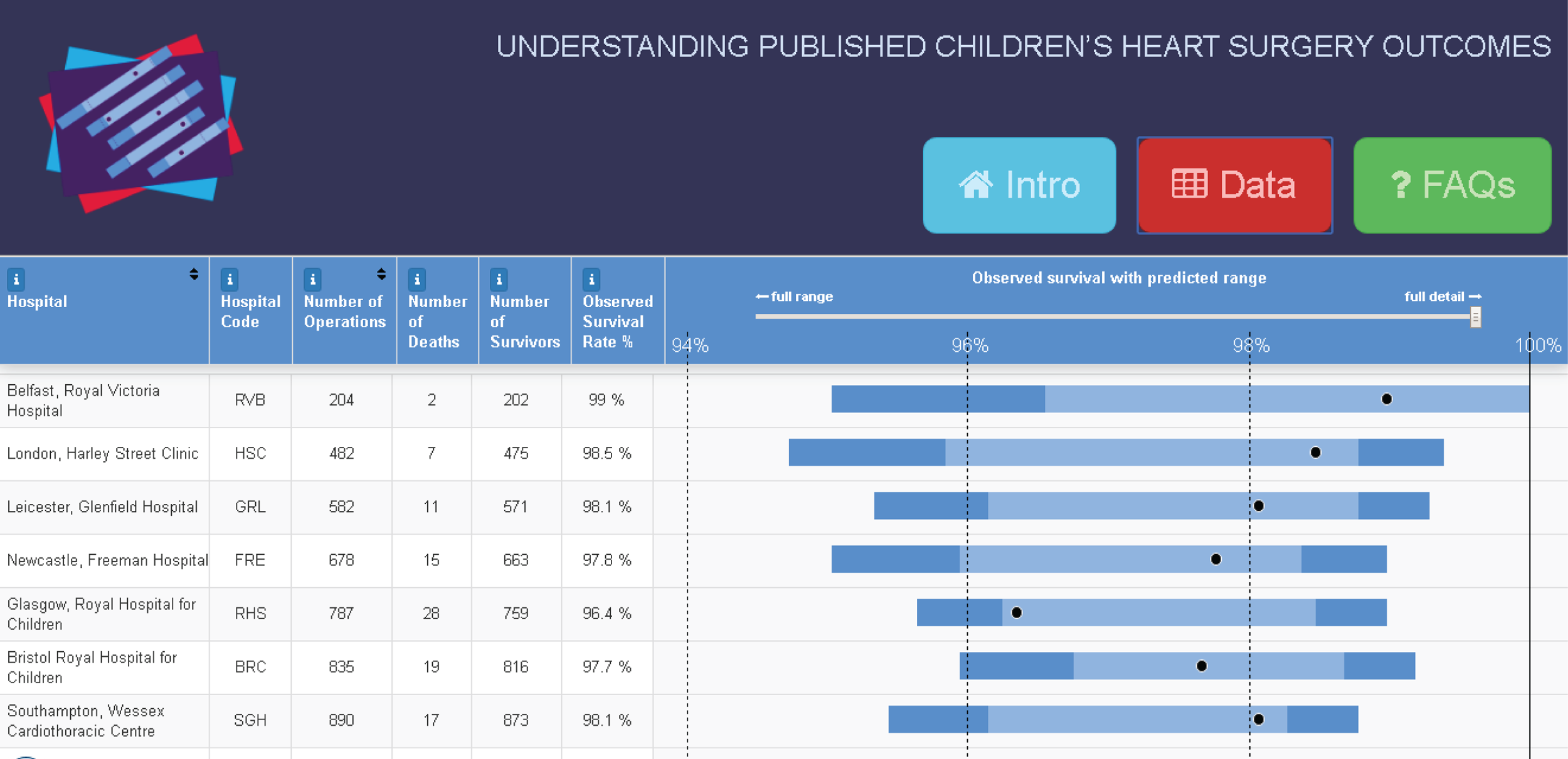
The introduction page now started with a section called ‘What is this site for?’, followed by a list of hospitals that perform heart surgery in children, alongside links to each hospital and also to any hospital-specific charities or support groups.
We also had sections describing why survival is difficult to interpret and introducing the concept of risk adjustment (see Figure 48). In these sections we tried to be clear that the risk adjustment method was objective (based on patient characteristics rather than on any judgements about that hospital’s quality). We also added content to make it explicit that hospitals should not be compared with each other using their raw survival rates.
For the data page, we moved to using:
-
a horizontal display as a final column on the data table
-
using survival rates instead of the ratio of actual to predicted survival
-
colouring the central predicted range.
We added hover-overs to the each bar along with explanations of what they meant (Figure 50). Clicking on a hospital name brought up that hospital’s results in detail, along with an interpretation of what the results meant (Figure 51). From the bottom of the page, the user could select different colour themes for the graphics, which we wanted to test on the workshop participants. It should be noted that from workshop 2 onwards the displayed data were from the 2011–14 NICOR annual report (which was published in the summer of 2015).
FIGURE 50.
Example hover-over in the data table explaining the predicted range.
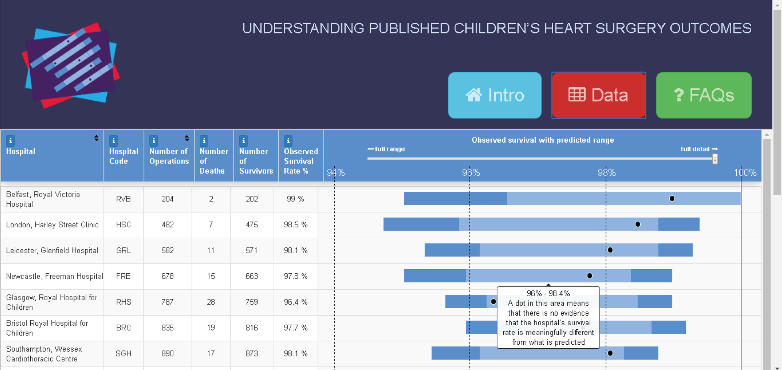
FIGURE 51.
Example of what was shown when clicking on a single hospital.
The FAQ section at this stage was simply a collation of the existing text, revised after the first set of workshops (Figure 52).
FIGURE 52.
First attempt at a FAQ page. We were clear that this page was very messy to look at but we wanted to get its content right before concentrating on the layout.

The second professional workshop
There were four participants at the second workshop, and CP, MP, EB and MU all attended from the project team.
Introduction page
Feedback about the introduction page was generally positive, and participants liked the simple design that had three obvious tabs at the top of each page. However, they all felt that the introductory text was still too lengthy. Specific comments also related to the style of the text and noted that, for instance, the first section did not in fact begin by answering the question ‘what is this site for?’ and instead provided an introduction to why the NHS monitors heart surgery.
Participants liked that there were caveats about not comparing hospitals by survival rates and suggested that these needed to be more prominent, perhaps by, for example, moving the new pink ‘important’ box further up the page. The list of hospitals was considered confusing, and participants were not sure why this was on the introduction page.
Data page
Participants liked the displays on the data page and found them to be relatively easy to interpret. They did query the colours and suggested that we try different colour combinations, avoiding red. Having viewed the data page, the participants were reassured that hospitals everywhere had high survival rates, and they suggested that this information be emphasised more prominently on the site. They also suggested that a key be displayed to help people to interpret the graphics, especially as some users may not find the hover-over features. In general, participants did not realise that they could click on an individual hospital’s name to bring up its detail.
At this stage we also introduced to participants the idea of using an animation to explain how the predicted range is calculated and how it is used to assess the actual survival rate, and CP discussed the potential ordering of information using the web page. Participants thought that such an animation would be helpful. In terms of colours, participants preferred a darker colour for the predicted range, a lighter colour on the outside (for the extended predicted range) and a white surround. In terms of table columns, participants suggested either removing the ‘hospital code’ column or merging it into the first column and adding information to the ‘survival rate’ column to explain why it was not possible to sort hospitals by survival rate (we had disabled this feature to prevent inappropriate ranking).
Most importantly, one participant commented on the fact that we had emphasised that hospitals should not be compared but then presented them in a table that invited comparison. This generated some discussion, which prompted us to consider adding a data view, whereby a hospital’s data were shown only in the context of that hospital.
Frequently asked questions
All participants commented negatively on the layout of the FAQ page and felt that the length of the text was very off-putting. One participant noted that whereas FAQs are often additional unimportant information, in this case this information was very important for further placing the data in context and understanding what they did or did not mean. Other participants agreed and suggested that we rename this section ‘further information’ or similar.
All participants felt that the language used was good and explained difficult concepts quite clearly, but that the ordering of text could be better. For several of the questions, participants suggested specific rewordings and clarifications.
The second parent workshop
Owing to the difficulty in recruiting parents, as discussed above, the second parent workshop did not take place until 10 December, almost 2 months after the non-parent workshop. Only two parents could attend on this date because a third parent was ill and it had become difficult to arrange anything in the weeks leading up to Christmas. The project team members present at this workshop were CP and EB.
Before this workshop, we incorporated much of the feedback from the second non-parent workshop. The updated introduction, data and FAQ pages are shown in Figures 53–57.
In the updated introduction page (Figure 53), we explored using expandable headings to reduce the amount of visible text. Particularly important sections were left expanded and the text was shortened and made more straightforward.
FIGURE 53.
The updated introduction page for the second parent workshop.

We created a new ‘mapped data’ page (Figure 54), designed by MP, to allow users to explore individual hospitals. The default page showed a ‘sample hospital’ that we used to explain how we presented the data graphically. For this workshop, we explored using a different colour theme.
FIGURE 54.
A new ‘mapped data’ page for the second parent workshop.
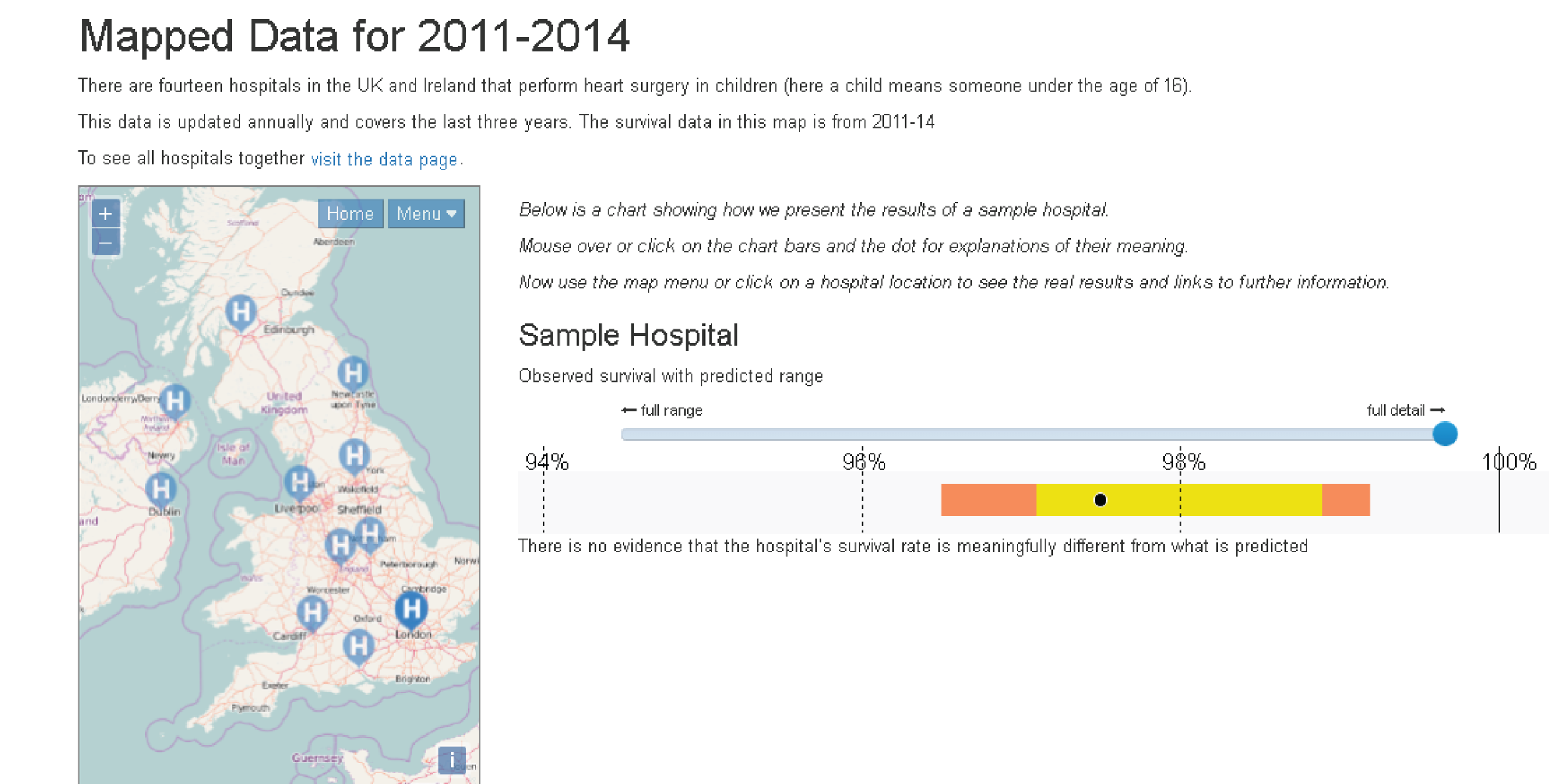
The mapped data page (Figure 55) gave the relevant raw numbers for individual hospitals (number of surgical episodes, deaths and survivors, observed survival rate and an interpretation of the survival rate in relation to its predicted range). We also provided links to the hospital’s website and any associated charity.
FIGURE 55.
The mapped data page showing the display for a specific hospital.
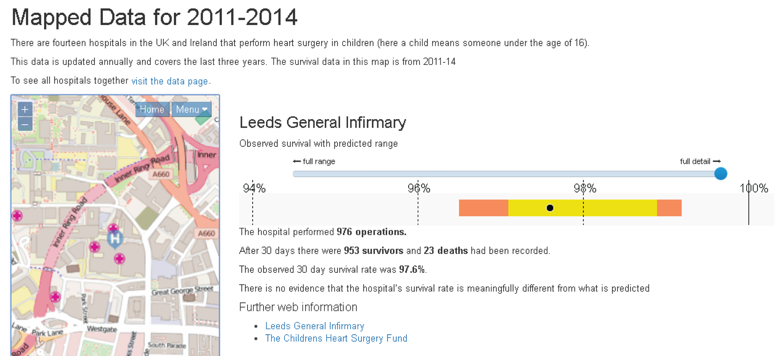
The tabled data page (Figure 56) did not have many changes, other than the use of a different colour scheme, the collation of each hospital and its code into a single column, and the addition of an information button for the observed survival rate to explain why it was not possible to order the table by survival.
FIGURE 56.
The updated table data page for the second parent workshop.
We renamed the FAQ page ‘understanding the data’ and were now exploring different options for making the layout more intuitive and less off-putting (Figure 57).
FIGURE 57.
The updated FAQ page for the second parent workshop.
Introduction page
Neither parent felt that it was immediately obvious that the headings were drop-down expandable sections. One of the participants commented that the ‘In the media’ section (which simply posed some questions readers may have about media articles) did not add anything important and was a distraction from the main content of the site.
Both participants felt that the information on the introduction page was very important but also lengthy. They wanted us to be clear about what was the absolutely essential background information needed to understand the data. Discussing with CP, we suggested adding a ‘key points’ section to the top of this page that would summarise this essential information. Parents did not like the phrase ‘statistical model’ and, after some discussion with CP and Sense about Science, we settled on the word ‘formula’ as a better description.
Both parents also said that they needed more help navigating the site, and CP suggested adding a tab called ‘Navigating this site’ as a guide.
Data page
The parents liked the mapped data page but felt that using it was not intuitive. Neither parent found the ‘sample data’ useful and explained that until they had seen the actual data (whether on the mapped or the table page), the sample data did not make much sense to them. The parents suggested that adding some of the explanation text from the sample data to the individual hospital data displays would be more helpful.
For both the mapped and the data pages, the participants said that they wanted it made much clearer which time period these data referred to. They also wanted us to add links to the individual hospital pages that would take the user to relevant FAQs.
Frequently asked questions
The parents did not particularly like the revised title of ‘Understanding the data’, saying that it was not clear what this meant, but they agreed that the title ‘FAQ’ would not encourage them to read the page.
Neither parent particularly liked the colours on this page, but they did like the idea of separating out the questions because this made them easier to browse. In terms of the language, both parents had problems with the use of the term ‘chance factors’ to explain chance variation in outcomes. The explanation of chance factors on the website, itself developed from workshop 1, was as follows:
It is impossible to predict precisely what is going to happen in an individual operation. This is partly due to the inevitable inability to predict the future with certainty – all people are physically unique and will react slightly differently to medicines, anaesthetic, surgery and no heart problem is exactly the same as another. Our inability to predict precisely is also partly because there are factors that we suspect may influence the outcome but cannot be included in the statistical method either because these factors are difficult to define or no routine data on them is collected. Together, we call these all ‘chance factors’.
One parent commented that, for parents in a heightened emotional state, the term ‘chance factors’ could come across as an excuse that would be used when things went wrong. Although she liked the explanation of the term, she felt that parents would still react negatively to the word ‘chance’. As a result of this feedback, we asked the KCL team to test alternative language to ‘chance factors’ in their experiments.
First set of psychology experiments (December 2015–January 2016)
Below we discuss each of the three experiments (1a–c) in turn. A summary of how they fed into the website development is provided at the end of this subsection.
Experiment 1a
Rationale
This experiment was designed to assess people’s understanding and evaluation of prediction interval plots, comparing the type of plot used in the NICOR report (outcomes plotted using the survival ratio; see Figure 44) with the type of plot that we were considering using for the explanatory website (outcomes plotted using percentage survival rate; see Figure 51).
Methods
Seventy-seven university students were randomly assigned to one of two conditions. The participants were shown either plots with survival data displayed as ratios (observed/expected survival), as used in the annual audit report for these data (ratio-plot condition; n = 39), or plots displaying percentage survival rates that had been designed for the explanatory website (percentage-plot condition; n = 38). Figure 58 provides an illustration of the kinds of plots that were shown to participants.
FIGURE 58.
Graphs shown to participants in study 1b: ratio-scale plot (a) and percentage-scale plot (b).

An online survey was constructed using Qualtrics software (www.qualtrics.com; 2016, Qualtrics, Provo, UT, USA). The first part of the survey comprised demographic questions. The next part presented information about survival rate data for paediatric heart surgery, which was adapted from the national audit report for these data. The main part of the survey comprised three categories of questions about these data: comprehension, interpretation and evaluation. All questions were accompanied by graphical displays of hypothetical (albeit plausible) survival rate data for 14 hospitals.
Question set 1 consisted of a graphical display of hypothetical data, about which participants were asked comprehension questions (e.g. ‘what does the light grey shaded area mean?’). Question set 2 consisted of a graphical display of a different set of hypothetical data, about which participants were asked for their interpretation [e.g. ‘please select which hospital(s) has a survival rate that is higher than predicted’]. Question set 3 consisted of graphical displays of six hypothetical data sets (with the order of the data sets randomised). The questions asked about participants’ evaluations of the hospitals whose survival-rate data were displayed in each graph. There were four questions for each hospital, with ratings on a scale of 1 (‘strongly agree’) to 7 (‘strongly disagree’):
-
I am concerned about hospital X.
-
I feel confident about hospital X.
-
I would recommend using hospital X.
-
I would discourage people from using hospital X.
The six data sets used for these questions were carefully constructed to investigate a variety of possible interpretations of the data, allowing us to explore how key features of the graphical displays (e.g. control limits and sample size) influenced participants’ evaluations.
Results
Participants in either condition selected the correct response almost all of the time for these questions (e.g. > 90% accuracy for questions about the ‘labelling’ or ‘meaning’ of regions of the prediction interval plots). However, the question about the meaning of the point denoting the survival ratio or percentage survival (‘what does the black dot mean?’) provoked many errors, with significantly lower accuracy for the ratio-scale plot (41.0%) than for the percentage-scale plot (71.1%) [χ2(1, N = 77) = 7.04; p = 0.008]. The most common answer to this question for participants in the ratio-plot condition was ‘observed survival rate’ (n = 19, 48.7%), which was incorrect. Participants expressed more doubt for this than for other comprehension questions, with three participants in the ratio-plot condition and four participants in the percentage-plot condition selecting ‘I do not know’.
Responses to the four evaluation items (concerned, confident, recommend and discourage) were combined into an overall evaluation score for each hospital within each data set (‘7’ = highly positive evaluation; ‘1’ = highly negative evaluation).
An items analysis was conducted, treating each mean evaluation for a given hospital in a given data set as a data point, with separate data points for the ratio-scale and percentage-scale plots. This allowed detailed comparison between conditions and showed that the pattern of means was very similar between conditions, with the item means correlating (r = 0.97) between the two conditions. There was, however, a small but reliable tendency for more positive evaluations in the percentage-plot condition, with the mean (SD) evaluation score being 4.95 (1.02) in the percentage-plot condition and 4.73 (1.02) in the ratio-plot condition. These means differed significantly (p < 0.001; difference, d = 0.22).
Figure 59 shows mean evaluation (y-axis) as a function of each hospital’s outcome plotted as a survival ratio (x-axis). Three regression lines are shown on each figure: Loess regression lines (solid black) fitted to the full data set; and two linear regression lines fitted separately for those hospitals with action/predicted survival ratios above 1 (solid blue line) and those with survival ratios below 1 (broken green line). Note that a survival ratio above/below 1 also corresponds to a black dot shown above/below the mid-point of the predicted range; consequently, some information about survival ratio can (in principle) be inferred from a percentage-scale plot.
FIGURE 59.
Mean valuation per hospital as a function of actual outcome observed in that hospital represented as a survival ratio. (a) R2 = 0.919 (linear relationship for all data); and (b) R2 = 0.826 (linear relationship for all data).
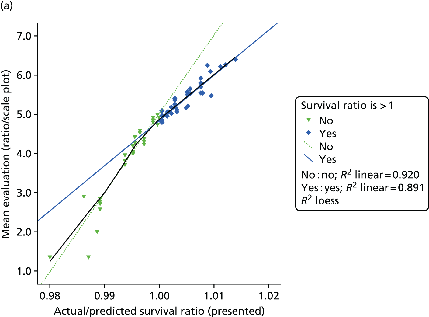
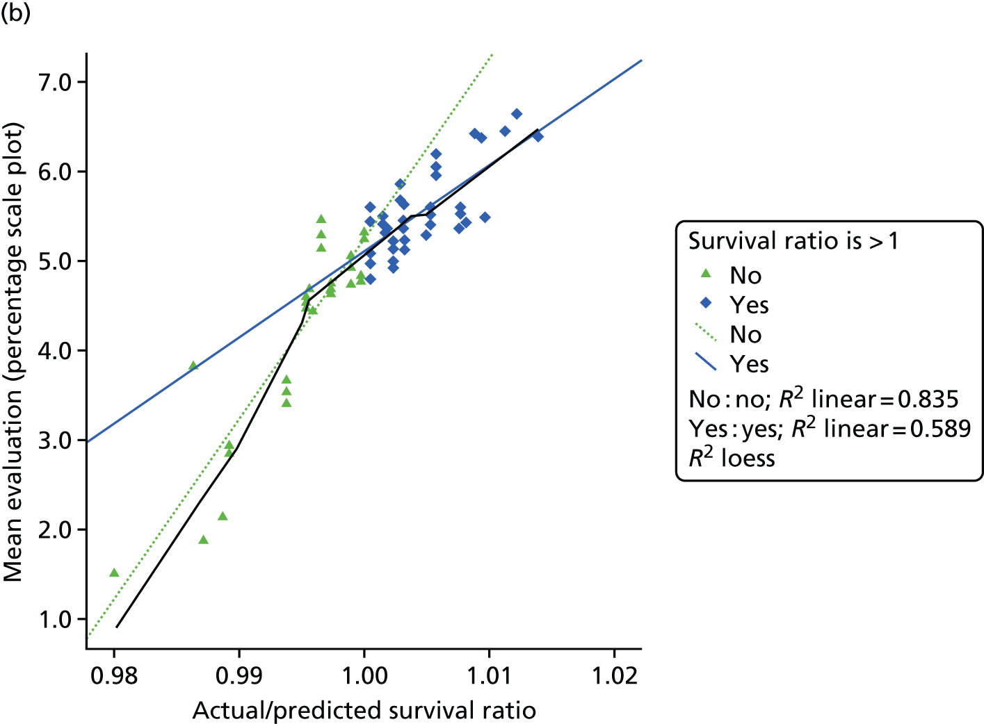
Figure 59a shows that the ratio-scale plot yields evaluations that are very closely tied to the survival ratio, but, notably, the steepness of this relationship changes at a point close to a survival ratio of 1 (with the Loess curve switching from following one linear regression line to following the other). One could regard this as a ‘penalty’ for hospitals with survival ratios below 1, or as more discriminating evaluations when the survival ratio is below 1 than when it is above 1. The mapping between hospital outcomes and evaluations follows a similar pattern for the percentage-scale plot, although evaluations are not as closely tied to the plotted outcome measure (percentage survival in this case) as was the case for the ratio-scale plot. It should be noted also that the ‘penalty for lower outcomes’ does not ‘kick in’ quite as early (see Figure 59b), with the break point being around a survival ratio of 0.995 rather than around 1.0. Seemingly, some tolerance, or ‘grace’, is shown when evaluating points that sit a little below the middle of the predicted range on the percentage-scale plot (relative to the ratio-scale plot).
This tolerance, or grace, associated with the percentage-scale plot is also implied in Figure 60. This shows evaluations from both types of plot (ratio-scale plot represented by diamond icons; percentage-scale plot represented by open triangle icons) as a function of the position of the back dot relative to the predicted range (0 = lower 97.5% limit; 0.5 = mid-point; 1.0 = upper 97.5% limit). Black dots towards the end of or outside the predicted range yield similar evaluations for both kinds of plot, while black dots around the middle or slightly below the middle of the predicted range yield more positive evaluations when presented via the percentage-scale plot.
FIGURE 60.
Mean evaluation as a function of the position of actual outcomes relative to the prediction interval (prediction interval scaled from 0 to 1; hence x < 0.0 denotes ‘survival worse than predicted’ and x > 1.0 denotes ‘survival better than predicted’).
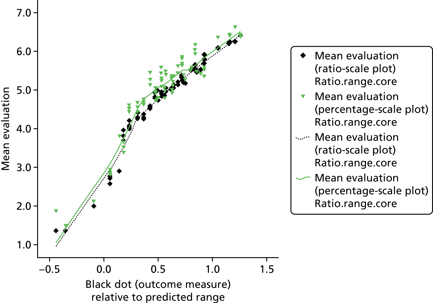
Conclusions
Overall scores or comprehension and interpretation did not differ significantly between conditions, suggesting that for many purposes there is no clear advantage to using ratio-scale plots over percentage-scale plots, or vice versa. Importantly, however, participants in the percentage-plot condition were significantly better at identifying the ‘meaning’ of the black dot that signifies each hospitals level of performance. We regard this as a strong argument for using the percentage-plot display because it suggests that even people (such as our participants) who are used to interpreting quantitative data have difficulty comprehending the ratio outcome measure.
We might characterise the evaluation data in the following way. Hospitals with ‘good’ outcomes reap a progressive ‘reward’ to their evaluations as outcome rates increase, while hospitals with ‘poor’ outcomes reap a progressive ‘punishment’ to their evaluations as outcome rates increase. However, consistent with the greater sensitivity to negative outcomes than to positive outcomes that is often reported (i.e. loss aversion, whereby ‘losses loom larger than gains’), the progressive punishment for poor outcomes seems to be greater than the progressive reward for good outcomes. 63 Importantly, on this reading of the data, the ratio-scale plot and percentage-scale plot seem to have a different reference point on the outcome scale that subjectively distinguishes ‘good’ from ‘poor’. The rate change in evaluation occurs close to the mid-point of the prediction interval (i.e. around survival ratio = 1.0) when outcomes are plotted as a survival ratio, while the point of rate change in evaluation is about one-quarter of the distance into the prediction interval (from the lower limit) when outcomes are plotted as a percentage. Thus, potentially, the ratio-scale plot could promote undue concern about hospitals whose outcomes are within the lower half of the predicted range (where there is no strong evidence that the hospital is performing poorly).
Experiment 1b
Rationale
This qualitative study was run as an auxiliary study to experiment 1a, and was designed to gauge people’s understanding of some of the key terms and concepts associated with prediction interval plots, and to better understand how they interpreted prediction interval plots.
Methods
Twenty-three participants who had participated in experiment 1a took part. Semistructured interviews were used to elicit responses for key terms (‘probability’, ‘risk’ and ‘predicted outcome’). Using a figure showing prediction intervals and survival data (appropriate to their condition assignment in experiment 1a; see Figure 58) as a prompt, participants were also asked what they would recommend on the basis of those data.
Results: interpretations of key terms
-
‘Probability’: the majority of participants used the word ‘likelihood’ in their definition. Participants also favoured the use of the term ‘chance’. Occasionally, participants went into more detail, describing probability as being influenced by certain factors that may pre-exist. Others went on to highlight a more quantifiable aspect of probability by describing it as a scientific measure of chance that is represented by a number.
-
‘Risk’: participants generally expressed risk as being similar to probability, but with a negative connotation. Some participants characterised this bad or negative outcome as something that was not intended to happen.
-
‘Predicted outcome’: most participants characterised the term ‘predicted outcome’ as the likelihood of survival, or the estimated chance of surviving to 30 days. Some participants provided more detail. One participant described the predicted outcome in terms of 2 and 3 SDs. Some participants described the process of calculating predicted outcomes by reviewing past data. One participant ventured that predicted outcomes depended on the type of heart disease a patient had. One participant expressed the opinion that having a lower predicted range (i.e. the bar in the graph in Figure 58) meant that a hospital was worse than others. One participant said that the term ‘predicted outcome’ brought to their mind an image of a group of doctors considering a hospital together and predicting what the outcomes there would be, whereas another discussed the idea of there being a machine that computed predicted outcomes.
Participants were told to imagine that an acquaintance of theirs was going to hospital for a procedure. On viewing a graph, participants were asked to provide their opinion about two hospitals, one of which was in the ‘survival much lower than predicted’ range and the other of which was in the ‘survival much higher than predicted’ range.
Almost all participants indicated that they would tell their acquaintance not to use the hospital in the ‘survival much lower than predicted’ range. Participants expressed this in terms of having less confidence in this hospital, feeling concerned about it and wanting to encourage their acquaintance to consider going to another hospital. Participants varied in their explanations for this response, either saying that this hospital’s survival rate was much lower than predicted, or saying that, overall, it had the lowest survival rate (seemingly regardless of predicted outcome). Some went on to say that this may suggest that a hospital is not up to standard and generally is not as good as the other hospitals. Some participants moderated their responses. For example, one participant reported that they understood why individuals may be concerned about this hospital, but explained that actually, when one looked at the survival rate, it was still very high. Similarly, one participant reported that the survival rate at this hospital was not that much lower than that at some of the hospitals.
All participants said that they would either feel confident recommending the other hospital (in the ‘survival much higher than predicted’ range) or actually encourage their acquaintance to use this hospital. Participants generally explained that they would encourage their friend to attend this hospital either because the hospital’s survival rate is much higher than predicted, or because in general its survival rate is higher. A few participants modified their responses. Two participants said that, although they would recommend the ‘much higher’ hospital, they would not be that concerned about the ‘much lower’ hospital because the survival ratio was still quite high.
A couple of participants expressed the idea that risk is estimated for a large number of individuals and one cannot predict one’s own individual risk. For example, one participant seemed to indicate that the value of the data in terms of decision-making or preferences was lessened, as, even if a hospital had a very high survival rate, an individual patient may not survive. Some participants felt that hospitals with a greater number of surgeries were preferable. Participants explained this by saying that this meant that the hospital was more reliable.
Conclusions
Participants’ responses revealed a range of understanding about the data shown in prediction plots. Many of their interpretations were appropriate given the data, although some participants appeared to hold misconceptions that we would want to correct. These include interpreting a lower prediction interval as meaning that a hospital has worse outcomes (whereas this indicates that it treats more difficult cases); believing that a priori higher-case volume implies better treatment; and a tendency to compare survival rates between hospitals (which is not warranted if these hospitals treat different patients).
Experiment 1c
Rationale
This mixed-methods study was run as an auxiliary study to experiment 1a, and was designed to further explore people’s understanding of prediction interval plots, and the effect of the type of plot used (survival ratio vs. percentage survival rate).
Methods
Forty-nine participants who had participated in experiment 1a took part and were assigned to the same condition (ratio-scale plot or percentage-scale plot) as those in study 1a (ratio-scale plot, n = 24; percentage-scale plot, n = 25). Paper-based questionnaires were constructed, which included background information about predicted ranges (adapted from an explanatory website under development), for participants to read and refer to, as well as a graph appropriate to their assigned condition (Figure 61). The participants answered two comprehension questions, two inference questions, one question regarding the judgement of ‘acceptable’ outcomes and a sixth question asking participants to explain their answer to the fifth. For questions 1–5, participants marked a dot on the graph to indicate their answer for hospitals for which survival rates/ratios had been omitted (e.g. ‘mark a dot for hospital F, which would indicate that the hospital’s survival rate is much higher than predicted’).
FIGURE 61.
Stimuli for experiment 1c: ratio-scale plot (a) and percentage-scale plot (b).

In keeping with experiment 1a, the responses to these (four) questions implied a good understanding of some of the key features of prediction-interval plots, with no significant differences between the two types of plot.
The majority of participants placed their threshold (for the ‘lowest acceptable survival rate’) in the survival-as-predicted area (ratio-scale plot, 65%; percentage-scale plot, 52%). This implies a more stringent standard than that applied by NICOR, which the participants had been informed of and seemingly understood (given their answers to the two preceding questions). This aligns with our interpretation of experiment 1a, whereby survival rates are regarded as ‘poor’ when they are ‘as predicted’ but are below the predicted (point-estimate) survival rate – especially for the ratio-scale plot. The mean threshold value was close to the lower bound of the survival-as-predicted range (in either condition), and the location of those thresholds did not differ significantly between conditions.
Participants’ explanations for where they placed their threshold were analysed for content. Eleven themes were identified; three of these in an explanation were each, independently, significantly associated with condition and/or the location of the participant’s threshold: (1) takes into account the number of procedures, (2) comparison with data of other hospitals and (3) emphasises the importance of being within the ‘as-predicted’ range. These associations are described below.
Some participants indicated that they compared an observed survival rate not only with the predicted ranges for the identified hospital, but also with the predicted ranges for other hospitals (n = 15). One participant with a threshold in the ‘survival much lower than predicted’ range explained their choice: ‘this is because, while it is out of the predicted range for the hospital itself, it is within the ranges for the other hospitals’. Another participant explained ‘97.5%, because it would still lie within the “survival as predicted” range but would not fall below a rate lower than “average” of the other hospitals’. Other examples of this type of explanation include ‘anything lower than the lowest range out of all the hospitals (hospital B) would to me be considered unacceptable’ and ‘this is because, while it is out of thepredicted range for the hospital itself, it is within the ranges for the other hospitals’. There was a striking difference between conditions for this type of explanation: of the 15 participants who provided an explanation of this type, significantly more (n = 12) were from the percentage-plot condition [χ2(1, N = 44) = 7.86; p = 0.005]. This suggests that percentage-scale plots may encourage interinstitutional comparisons, which – in this context – are inappropriate owing to the variation in case mix between hospitals. This could be due to a number of factors, including incidental features such as the horizontal orientation of the graph that we used. One possibility that having a better understanding of percentage survival than the survival ratio measure – which is an important difference that we identified in experiment 1a – actually encourages people to ‘do more’ with the measure. Thus, if percentages are straightforward to understand, they may facilitate comparisons based on that measure. Further research is required to determine how to discourage inappropriate comparison between hospitals – but without harming people’s understanding of the data.
In addition, emphasising the importance of being within the ‘as predicted’ survival range (theme 10) was significantly more common in the ratio-plot condition (n = 15) than in the percentage-plot condition (n = 7) [χ2(1, N = 44) = 5.37; p = 0.02]. This may partly reflect the fact that more participants in the ratio-plot condition (n = 15) placed their threshold in the ‘survival as predicted’ range than in the percentage-scale plot condition (n = 11) but it is too large an effect to be solely explained by this. Thus, in tandem with percentage-scale plots seemingly encouraging inappropriate comparisons between hospitals, ratio-scale plots may encourage the appropriate consideration of survival rates relative to the hospital’s own prediction interval.
One perhaps unsurprising finding was that threshold location was significantly associated with emphasising the importance of the ‘as predicted’ survival range, this theme being most prevalent when thresholds were within the survival-as-predicted area [χ2(2, N = 44) = 12.81; p = 0.002]. There was an association between taking the total number of procedures into account and the location of lowest acceptable threshold [χ2(2, N = 44) = 8.16; p = 0.017]. To provide an interpretation of this association, we note that none of the five participants who mentioned the number of procedures put their threshold in the survival-as-predicted range (whereas 26/39 of the other participants did so). There was also an association between comparison with data of other hospitals and the location of lowest acceptable threshold [χ2(2, N = 44) = 6.40; p = 0.041], which reflects a tendency to mark a lower threshold when explicit comparisons with other hospitals are made.
Although not associated with condition or threshold, another interesting feature of these explanations was that participants sometimes acknowledged that a hospital could fall outside the predicted range by chance (n = 10, 20.8%). Some participants acknowledged chance, but chose to discount this information [‘if a score were to be below its prediction, it could be a sign that something is wrong within the hospital’ (ignoring the possibility that a low score could be due to chance)] or explained that they would not take the risk of using such a hospital, ‘although being outside of the predicted range could be a result of chance; it seems safer to trust the hospitals who have matched their predicted survival rate’ and ‘even if it is due to chance they should aim to improve survival rate’. This represents a potentially important feature of people’s reasoning about uncertainty: they may acknowledge chance or sampling variability as a potential cause and yet be unwilling to accept this as the best explanation of the data.
Conclusion
Participants working with percentage survival rate plots were more inclined to explain their judgments on the basis of comparisons between hospitals and (accordingly) less inclined to mention comparing a hospital’s outcomes against its prediction interval. However, comparing a hospital’s percentage survival against its prediction interval (and not against other hospitals) is exactly what should be done (for the very reasons that call for risk-adjusted data and the creation of prediction intervals). Therefore, in a subsequent study we sought to test whether or not the tendency for inappropriate comparisons between institutions could be reduced.
How these studies fed into the website development
The results of the experiments 1a and 1b confirmed our decision to use percentage-scale plots instead of ratio-scale plots, but they highlighted key areas in which we needed to provide very clear messages on the website. These were:
-
Including material on not making judgements on a hospital’s performance if its survival is within the predicted range (experiments 1a and 1b), in particular in summarising evidence on individual hospital displays and in the animation ‘how we present the data’.
-
Being very clear throughout the website that comparing hospitals’ survival rates or predicted ranges was not appropriate (experiments 1b and 1c). We did this by using the key points in the ‘what/why/how’ section, and adding text to the top of the table view of the data and in the animation ‘how we present the data’.
-
Being clear that the predicted range was based on an objective statistical formula and only reflected the complexity of the cases the hospital treated (experiments 1b and 1c). We did this by using the key points in the ‘what/why/how’ section, adding text to the top of the table view of the data and emphasising this in both animations.
-
Being clear and consistent in the use of the terms ‘chance’, ‘risk’, ‘uncertainty’ and ‘probability’. We made the decision to always refer to predicted risk as ‘predicted chance of survival’; the placement of the survival dot in relation to its predicted range as ‘strong/some/no evidence that chances of survival at that hospital were different to that predicted using the formula’ and inherent uncertainty in outcome as ‘unforeseeable factors’ (note that this term was originally ‘chance factors’). We did not use the words ‘probability’ or ‘luck’ in the website.
Workshop round 3
We note that our original aim of producing an animation and some accompanying text that simply explained the published NICOR graphic had now been, of necessity, considerably expanded. Workshop participants had made it clear that the website needed a lot of background material that was carefully written and carefully presented. Because users can navigate a website in any order they like, we needed to be careful that key messages were repeated in different parts on the website and that there was sufficient detail to avoid misinterpretation of information on the data pages.
Reflecting on the feedback of workshop 2, CP and MP decided that adding a new page explaining how to navigate the website was not a good solution and that, instead, we should develop a site that was intuitive to navigate and needed as little work as possible on the part of users to work out where key information was and how to navigate between sections. MP suggested a new, much simpler homepage that gave an overview of the site content (Figure 62). By this stage, we also had a new logo, designed by CORU’s research manager Andrew Wilshere.
FIGURE 62.
The new, simpler home page developed for the third set of workshops.

The introduction content had been moved to a new page called ‘What, why, how?’, which now had a ‘Key points’ section at the top (Figure 63). These points were decided based on previous feedback from the workshops and also from expert panel members who, by this stage, had seen and commented on the site.
FIGURE 63.
The new ‘What, why, how’ page developed for the third set of workshops.
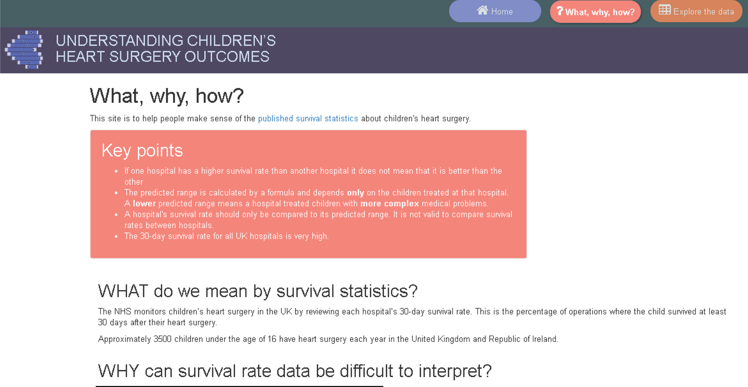
CP extensively reworked the text from the previous introduction page to make it shorter and easier to read. At the bottom of this page were explicit sections entitled ‘what this site cannot do’ and ‘what this site can do’. On the suggestion of previous workshop participants, we added direct links to charities in the ‘what this site cannot do’ section.
The mapped data page had been updated to incorporate the sample hospital information as a legend within individual hospital displays (Figure 64).
FIGURE 64.
The new individual hospital display with added legend.
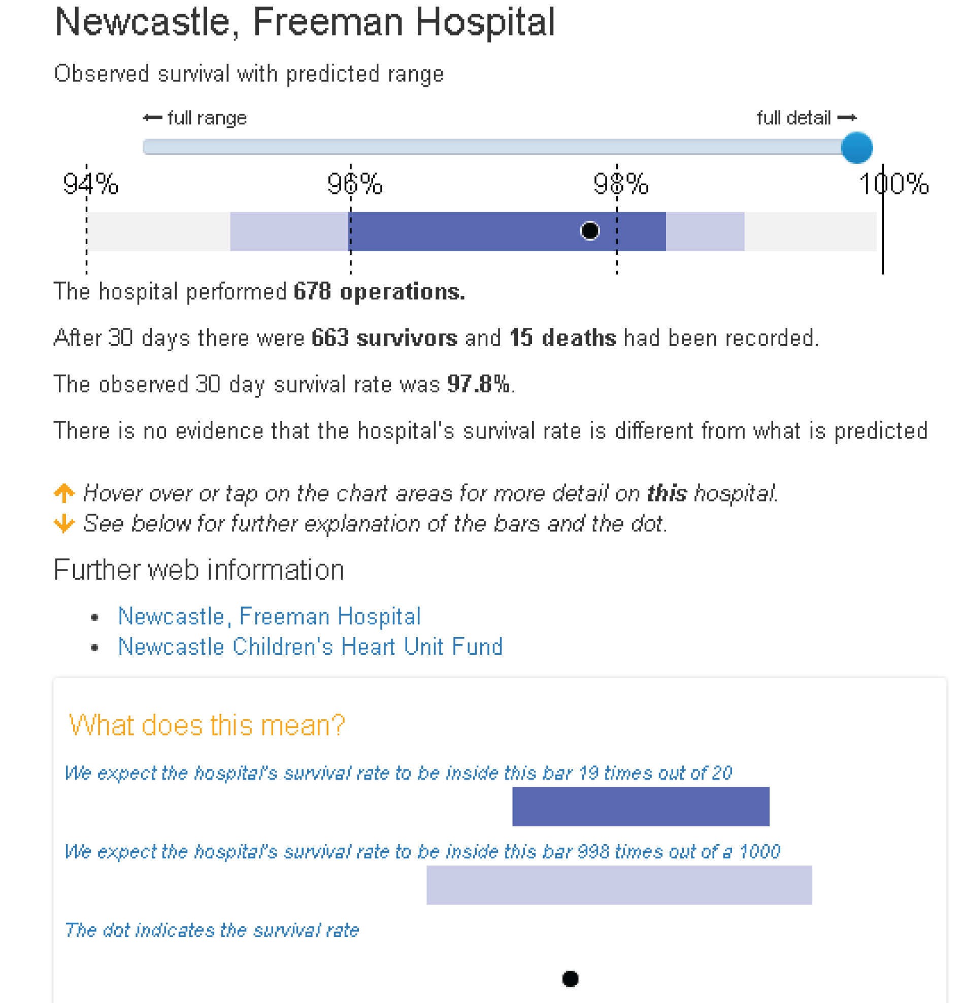
We had also finalised the colour scheme, settling on a dark blue predicted range and a light blue extended predicted range. The tabled data page now included some summary detail about the data at the top, as requested by previous participants (Figure 65). Clicking on either the hospital name or the hospital code from the data table gave the same pop-up as in Figure 64.
FIGURE 65.
The data table page updated for the third workshop.
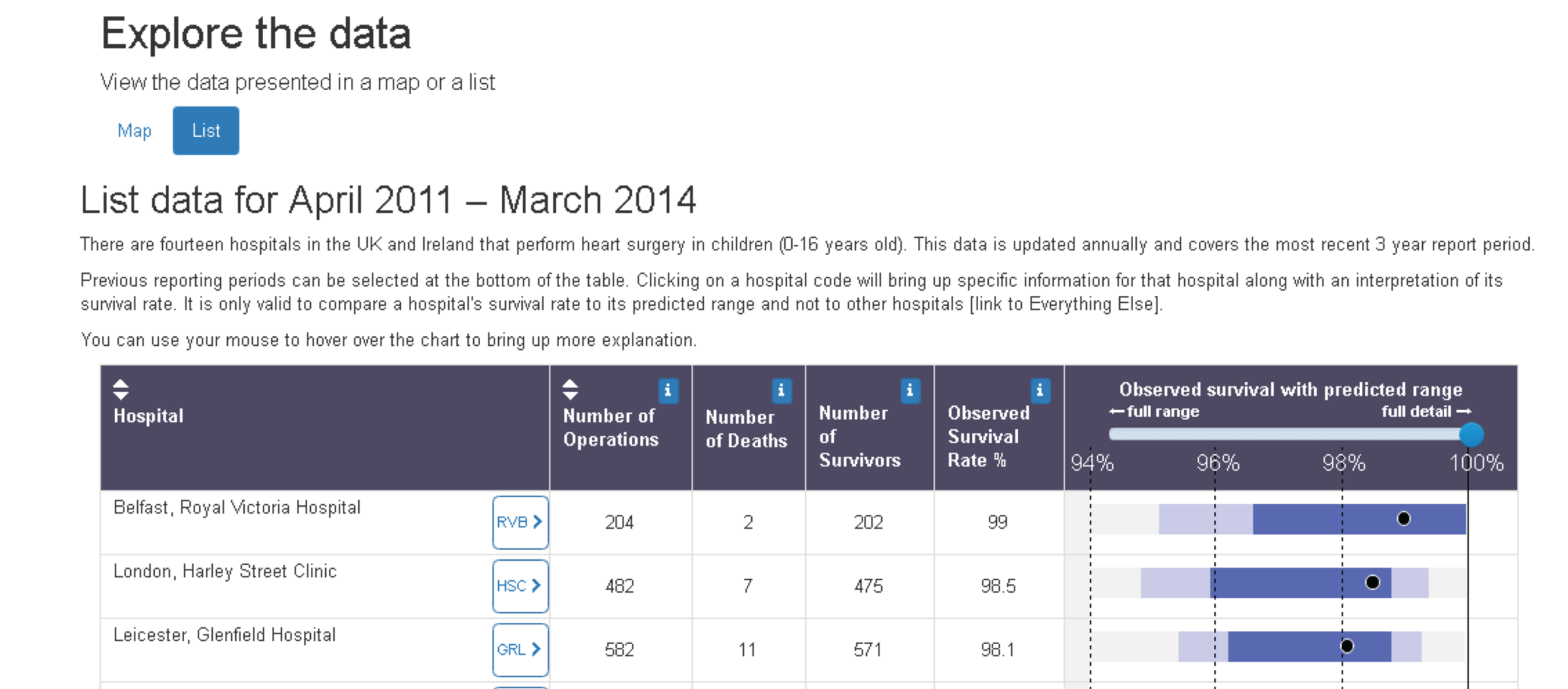
After exploring several options for the FAQs layout, we settled on the version shown in Figure 66 (after the third non-parent workshop and before the third parent workshop). We had changed the name to ‘Everything else’ and added an information icon. After discussion with Sense about Science, CP also went through the FAQs and provided a short ‘headline’ answer alongside each existing long answer (Figure 67).
FIGURE 66.
The updated FAQ section for the third workshop.

FIGURE 67.
Example FAQ showing the new ‘headline’ answer format.
Workshops
The non-parent workshop (comprising six participants) was held on 3 February 2016, while the parent workshop (comprising five participants) was held on 13 February 2016. MP and EB attended both workshops, whereas CP was able to attend the parent workshop only.
Overall, the participants were impressed with the site. All of the parents said that the website clearly explained the material, with one commenting that ‘it was really good, well put together and contained lots of information I’d never seen before’. All participants suggested that we add a FAQ to explain why only 30-day survival was monitored. One participant also pointed out that we needed to be more careful about how we used the term ‘NHS’, as there are variations in the health-care systems used in the different regions of the UK, and Ireland has a different health-care system entirely.
‘What, why, how’ page
All participants liked the key points text box, but there were some suggestions of wording changes in wording (e.g. changing ‘survival rates are very high’ to ‘30-day survival rates are very high’). The parents in particular were very pleased to see other charities signposted in the ‘What, why, how’ section and that in the FAQs there was a link to list of all UK and Ireland charities and support groups.
‘Explore the data’ page
The parent participants liked the new expanded hospital detail displays (see Figure 64) and felt that these were easy to interpret. As one parent put it, ‘blue is what’s predicted, black dot is fact’. However, they found the wording of the legend confusing, and CP and MP discussed different wording options with them. Participants suggested adding explicit labels saying ‘predicted range’ and ‘extended predicted range’ to the legend to tie in with the language used throughout the FAQs. All participants felt that it was important to include a legend in the expanded display.
When the data were in table view (now called ‘list’ view) (see Figure 65), as before some participants did not realise that they could click on a hospital’s code to bring up the expanded view. We noted that participants had different preferences for exploring the data: some preferred the map view and some preferred the list view. The parent participants suggested removing the word ‘observed’ from ‘observed survival rate’ throughout the site. All participants understood why hospitals could not be ordered by survival and all thought that this was appropriate.
‘Everything else’ section
Participants varied in their responses to the ‘Everything else’ section: some felt that it was too colourful and that they would have preferred a simpler, more text-heavy layout. However, the majority liked the design and found it easy to navigate. Parent participants said that they were immediately drawn to the ‘my family or child’ section and found this very helpful. All participants found the ‘Understanding the predicted range’ section the most difficult to understand, but they commented that the concepts were difficult, meaning that the explanations were necessarily wordy and could not easily be shortened.
Parents did not like the phrase ‘risk adjustment’, which was used in the FAQs. CP suggested replacing it with the words ‘statistical formula’ or ‘formula’, which the parents liked. Participants wanted an example of a ‘chance factor’ to make it easier to understand what this term meant. Non-parent participants suggested adding ‘about us’ and ‘how we developed this site’ sections to this web page.
Second set of psychology experiments (March 2016)
Below we discuss each of the three experiments (2a–c) in turn. A summary of how they fed into the website development is provided at the end of this subsection.
Experiment 2a
Rationale
Drawing on previous research from experimental psychology on ‘evaluability’ (i.e. what makes it easier or harder for people to evaluate the dimensions of an option), this experiment tested whether or not we could alter participants’ evaluation of survival data simply by having them evaluate one hospital at a time, thereby removing the possibility of an ‘easy’ comparison between hospitals.
Methods
Sixty-five participants were recruited from the KCL research volunteer list. An online survey was constructed using Qualtrics software, which had a similar structure to the survey in experiment 1a (demographics, audit report excerpt, comprehension questions and then evaluation questions) but with the comprehension questions divided into two sets and interpolated by the provision of additional guidance on prediction interval plots (taken from the draft version of our website). The presentation order of these two sets of three questions was counterbalanced. The stimuli for the evaluation questions were four of the six hypothetical data sets from experiment 1a – always presented with percentage survival rate as the outcome measure – with order of the data sets randomised. Participants answered two of the four evaluation questions for each hospital (I feel confident about hospital X; I would recommend using hospital X) with ratings on a scale of 1 (‘strongly disagree’) to 7 (‘strongly agree’). These responses were given individually for a given hospital (i.e. only one question on the screen at a time) but with the (sequential) presentation of these questions blocked by question (order of questions was randomised) within data set (order of hospitals within data set was randomised).
For the main manipulation in this experiment, participants were randomly assigned to one of two conditions. The participants saw plots showing data for all 14 hospitals in a data set (combined condition; n = 32) or plots showing only the data for one hospital at a time (individual condition; n = 33). Thus, when answering an evaluation question, participants in the individual condition saw only the data pertaining to the hospital identified in the current evaluation question, while participants in the combined condition saw plots similar to those in the percentage-plot condition of experiment 1a.
Results
Accuracy scores for the number of correct responses (out of three) were computed for each set and subjected to a 2 (set) by 2 (order group) analysis of variance. There was no significant effect of set or group order group; however, there was a substantial and statistically significant interaction between question set and order group [F(1,63) = 21.71; p < 0.001; η2 = 0.256]. Partial eta-squared, η2, is a standardised measure of effect size that provides an estimate of the proportion of variance in the dependent variable that is accounted for by a factor in an analysis of variance model. Elsewhere, for differences between two means, we use the standardised mean difference, d, to report effect size (in terms of the number of SDs that separate to means). Thus, performance on a given set was better after reading the guidance than before [t(63) = 2.39; p = 0.020 for set 1; and t(63) = 4.42; p < 0.001 for set 2]. In addition, participants were more accurate on whichever set they completed second (after they had read the guidance) [t(63) = 2.71; p = 0.011; and t(63) = 3.82; p = 0.001] (Figure 68).
FIGURE 68.
Mean percentage accuracy (with 95% CIs for the mean) before and after reading the guidance, shown separately for each question set.
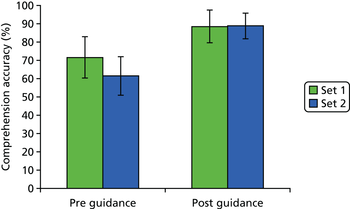
Responses to the two evaluation questions (‘feel confident’ and ‘recommend’) were averaged together to create an overall evaluation score for each hospital within each data set. These mean evaluations are summarised in Figure 69. As per experiment 1a, we used an items analysis to perform a ‘global’ comparison between the combined condition and the individual condition, which revealed that the mean evaluation score was higher in the individual condition (mean = 5.24, SD = 0.87) than in the combined condition (mean = 5.02, SD = 0.97). This difference was small (d = 0.24) but statistically significant [t(55) = 7.95; p < 0.001]. Figure 69 illustrates that the discrepancy is most prominent for hospitals with lower survival rates: a reading of these data that is confirmed by more detailed analyses of them.
FIGURE 69.
Mean evaluation as a function of whether evaluations were made with data for all hospitals showing (combined condition) or for only the hospital being evaluated (individual condition). Loess regression lines are plotted separately for each condition.
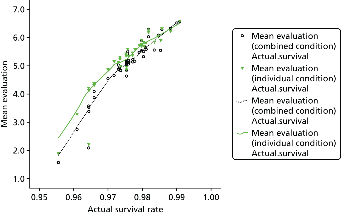
Conclusions
Presenting survival rate data with accompanying prediction intervals for one hospital at a time results in more positive evaluations (relative to presenting survival-rate data and prediction intervals for several hospitals), particularly for hospitals that have survival rates that fall towards the lower end of the distribution. Our favoured interpretation of this is that individual (separate) presentation of the data makes comparison with other hospitals difficult and forces participants to compare a hospital’s survival rate with its prediction interval. This results in more positive evaluations for hospitals that would otherwise ‘suffer’ in a comparison against other hospitals, that is, those with lower survival rates. However, perhaps these hospitals should not be evaluated positively. The rationale for using prediction intervals speaks to that question as follows. If a hospital’s survival rate is within its prediction interval, we have no evidence that the hospital’s survival rate is lower than predicted; arguably, such a hospital should not receive negative evaluations purely on the basis of its survival rate. By contrast, if a hospital’s survival rate falls below its predicted range, there is some evidence that survival rates are lower than predicted (given case mix). This is a cause for concern and would trigger an investigation of a hospital’s performance, and, therefore, a negative evaluation is not inappropriate. Further analysis suggests that participants’ judgments in the individual condition were broadly consistent with this nuanced view of how hospitals should be evaluated: the more ‘generous’ evaluation of hospitals in the individual condition is largely restricted to hospitals that have survival rates that are within their predicted range for this measure.
Experiment 2b
Rationale
Prompted by discussions among the PRAiS 2 aim 2 team about how to explain the interpretation of prediction interval plots, experiment 2b used an experimental design to evaluate two candidate terms (‘chance factors’ and ‘unforeseeable factors’) that could be used to explain the role of sampling variability.
Method
Sixty-four participants who had completed experiment 2a participated in this study. Participants were randomly allocated to either the ‘chance factors’ (n = 32) or ‘unforeseeable factors’ (n = 32) condition, and asked questions that referred to one of these terms. Participants were given a definition of chance/unforeseeable factors and asked questions regarding their satisfaction with the definition, with their responses given on a seven-point Likert scale. Finally, participants were asked if they preferred the term ‘chance factors’ or ‘unforeseeable factors’ and to explain their preference.
Results
Participants were asked for their interpretation of ‘chance factors’ or ‘unforeseeable factors’ prior to viewing the definition. Many participants (n = 23, 35.9%) gave an answer explicitly indicating that these were factors that one could not foresee, control or predict. There was a significant difference in the prevalence of this answer by condition. Participants in the unforeseeable factors condition were more likely to explicitly state in their definition that these were factors that could not be predicted, controlled or foreseen [χ2(1, N = 64) = 15.27; p < 0.001]. In response to this initial question, some participants (n = 25, 39.1%) also listed examples of chance factors, or unforeseeable factors, although it was not until the second question that they were asked to provide specific examples. Participants were more likely to give specific examples in answer to this question if they were allocated the unforeseeable factors condition [χ2(1, N = 64) = 7.94; p = 0.005]. These examples included factors already known to patients and doctors, such as age and weight. Some participants went on to include factors that could not be controlled for (excessive bleeding, pneumonia or infection after surgery, response to anaesthetic and the availability of rooms and equipment). Some participants (n = 28, 43.8%) gave examples of factors that were the responsibility of the hospital and surgeons (if the surgeons were to make a mistake, if the team was tired and if one hospital was generally better than another). The presence of this type of example was not associated with condition.
For the third question, participants were given the following statement and asked if they could explain in their own words why this was the case: ‘We are not able to predict the future with certainty, or in other words, we are not able to predict precisely what will happen in a future operation’. Many participants (n = 28, 43.8%) responded to this statement by emphasising the individuality of the patient (e.g. people react in different ways to drugs). Some participants (n = 7, 10.9%) focused on the complexity and difficulty of surgical procedures (e.g. operations are very complex and things can go wrong). Some participants (n = 5, 7.8%) also described this statement as being necessary, as a way to manage patients’ expectations of survival in surgery and provide some form of liability protection. These types of answers did not vary significantly by condition.
Participants were then shown a definition of ‘chance factors’ or ‘unforeseeable factors’. Participants reported high levels of satisfaction with this definition (via 1–7 responses to four statements), which did not differ according to condition.
Finally, participants were informed of the alternative term for ‘chance factors’ or ‘unforeseeable factors’ and were asked which of these terms they preferred. The majority preferred the term unforeseeable factors (n = 40, 62.5%) to chance factors (n = 14, 21.9%), with seven (10.9%) having no preference and three (4.7%) not providing a response. There was a significant association with the condition participants were assigned to, whereby participants were more likely to show preference for the term ‘chance factors’ when they were allocated to the chance factors condition [χ2(2, N = 61) = 21.68, p < 0.001]. In fact, no participant in the unforeseeable factors condition displayed a preference for the term ‘chance factors’.
When participants were asked to explain their preference, many (n = 20, 31.3%) focused on how comprehensible the terms were. Some participants (n = 11, 17.5%) discussed the specificity of the terms (e.g. describing the definition of chance as being muddied with certain definitions related to chance). Most participants who mentioned this reason in their answer preferred ‘unforeseeable factors’ (n = 9/11, 81.8%) to ‘chance factors’. Some participants (n = 11, 17.5%) also felt that ‘chance factors’ had negative connotations of gambling and lotteries. As expected, most participants who gave this answer preferred the term ‘unforeseeable factors’ (n = 10/11, 90.9%). Some participants (n = 8, 12.7%) considered the impact that the terms would have on the patients (e.g. they could make a patient feel insecure). In their answers, some participants (n = 10, 15.9%) discussed the everydayness of the term; some saw this as good, while others saw it as detrimental. There was no significant association with the preference for a term and any of the reasons for preference given.
Conclusions
This study suggests that ‘unforeseeable factors’ is an acceptable synonym for ‘chance factors’, which can be used when communicating the role of sampling variability to lay audiences. In addition, there may be contexts in which the former term is preferable (e.g. when it may be particularly important to avoid connotations of luck or gambling).
Experiment 2c
Rationale
This experiment examined candidate forms of language that we were considering for the animation ‘how is the predicted range calculated’, examining the terms ‘possible futures’ and ‘possible outcomes’ in relation to model predictions that allow for uncertainty.
Methods
Forty-three participants who had completed experiments 2a and 2b participated in this study. Participants were randomly allocated to one of two conditions, ‘possible futures’ (n = 21) or ‘possible outcomes’ (n = 22), whereby questions and stimuli texts included one of these two terms. Participants were given a text to read that was taken from the planned animation script. Participants were also given a copy of an example table and graph to facilitate their understanding of the text. The text was altered for each condition so that it included the term ‘possible futures’ or ‘possible outcomes’ (Box 1). The questions focused on participants’ interpretation of these two terms. Participants were also asked to summarise the text once they had read it.
The section of the script given to participants (both alternatives shown underlined here but not in the study):
Let’s suppose that the hospital does exactly 100 heart operations in the year. We calculate the chances of survival for each child after their operation using a statistical formula. We cannot predict exactly what will happen to these children, and sadly it is very unlikely that they will ALL survive. A plausible ‘possible outcome/future’ is that two don’t survive, giving a 98% survival rate. Given the chances that have been calculated for all these patients, another ‘plausible outcome/future’ for these 100 children is that three don’t survive, giving 97% overall survival. When we take into account all the chances calculated by the formula, it turns out that in 19 out of 20 possible outcomes/futures, the overall survival rate for the hospital lies in the blue interval – we call this the predicted range. In 998 out of 1000 possible outcomes/futures, we expect it to lie in this wider interval. We call this the extended predicted range. When a hospital does a few operations, chance factors have a bigger influence on the overall survival rate, and so it has a wider predicted range than a hospital that does many operations. The predicted range depends on the children treated by a hospital that year. Different hospitals will always have different predicted ranges since they treat different children.
If one hospital has a lower predicted range than another, it is only because it treated children with more complex medical problems over that period. In this example, there is no reason to believe that either hospital has higher chances of survival than the other.
Results
The majority of participants (n = 27, 62.8%) understood ‘possible future’ or ‘possible outcome’ to mean a future eventuality or what may happen, and gave examples of this, such as a possible outcome being that two children do not survive. Approximately half of participants (n = 21, 48.8%) made their answer specific to the context of surgery, while other participants kept their answers more vague. The answers to this question did not differ significantly between future and outcome conditions.
When participants were asked what types of possible future were being discussed, many (n = 29, 67.4%) said that the types of possible future/outcome were life and death, or survival and non-survival. There was a significant association between presence of this type of answer and condition, whereby participants in the outcomes condition were more likely to give this answer [χ2(1, N = 43) = 11.30, p = 0.001].
Participants were asked to give an example of a different possible outcome/future from the one in the statement ‘a plausible “possible outcome/future” is that 2 don’t survive giving a 98% survival rate’. The majority of participants (n = 32, 74.4%) responded by providing an alternative (and usually correct) numerical expression, such as 4 out of 100 children do not survive, giving a 96% survival rate. Some participants (n = 10, 23.3%) chose instead to simply provide a different wording of the given statement.
The subsequent questions asked participants what they understood by the phrases ‘in 19 out of 20 possible outcomes/futures’ and ‘in 998 out of 1000 possible outcomes/futures’. For ‘in 19 out of 20 possible outcomes/futures’, many participants felt that this statement meant in 19 out of 20 patients (n = 7, 16.3%), in 19 out of 20 operations (n = 4, 9.3%) or in 19 out of 20 hospitals (n = 3, 7.0%), none of which was the correct interpretation. Some participants understood it to mean something different; for example, one participant gave the response ‘given a set of hypotheticals, this is the interval we are given’ and ‘in 998 out of 1000 hypothetical situations it is going to be in the light blue’. One participant interpreted the statement to mean that there is ‘one chance in 20 that statistics are not accurate, due to either human or statistical mistake. It goes wrong, or is different to what is predicted’. Many participants (n = 13, 13.2%) expressed in their answer the notion of uncertainty. For example, participants included in their answers ideas about chance and future possibilities. Participants’ answers were more likely to include the idea of uncertainty if they had been allocated the ‘possible futures’ condition [χ2(1, N = 43) = 5.88; p = 0.015].
For the ‘998 out of 1000 possible outcomes/futures’ statement, participants generally assumed the same meaning as, and provided similar answers to, the first question. Some participants (n = 11, 25.6%) even specified in their answer that they were giving the same response or that they wanted to repeat what they had previously said. Once again, many participants (n = 19, 44.2%) expressed the idea of uncertainty, and, once again, some participants (n = 6, 14.0%) gave their answer in the form of either ‘in 998 out of 1000 patients’ or ‘998 out of 1000 operations’. Many participants (n = 19, 44.2%) discussed in their answers the idea that this statement referred to a widened or extended range, or that it was sampled from a larger number of people. Some participants (n = 5, 11.6%) described this statement as somehow being better or more reliable than the previous one (‘19 out of 20 possible outcomes/futures’). For this question, the only type of answer that showed a significant association with condition was an answer referring to this statement as showing a widened, or extended, range, whereby participants were more likely to give an answer of this kind if they were allocated to the futures condition [χ2(1, N = 43) = 5.23; p = 0.022].
Finally, participants were asked for the most important or key pieces of information that they took away from the script. Many participants (n = 26, 60.5%) expressed the idea that there was a degree of uncertainty that would be implicit in the survival rates and that we can make only a threshold prediction (e.g. ‘hospitals are unable to give definitive answer as to the outcome of surgery’). Many participants (n = 8, 18.6%) also specifically mentioned chance or unforeseeable factors (e.g. ‘when predicting survival outcomes, there is a threshold that has to do with factors that are unforeseen or beyond our control’). Some participants (n = 6, 14.0%) specifically explained that there is a degree of confidence that one can have in a prediction (e.g. ‘there are various statistical methods to predict with more or less confidence’). Participants often identified the number of cases and the severity of cases as factors that influence the predicted range. One participant also correctly identified that if there are ‘more procedures when there is a smaller range. More sure of outcomes’.
Some participants (n = 15, 34.9%) discussed making comparisons between hospitals. Of those who did, only five (33.3%) discussed that hospitals should be compared and chosen between. The other 10 participants (66.7%) felt that hospitals should not be compared (e.g. ‘[you] can’t compare the survival rates of different hospitals’). Some participants’ (n = 6, 13.6%) answers also recognised that there are differing degrees of confidence in the prediction that are made. There were no significant associations between the type of answer given to the final question and the condition.
Conclusions
Explanations associated with uncertainty were more common with the term ‘possible futures’ than they were for ‘possible outcomes’. This speaks in favour of the term ‘possible futures’ because we would wish people to realise that predictions are uncertain. A positive finding was that when asked to summarise the text, many participants were able to articulate key features of the text. Furthermore, among participants who discussed comparing hospitals, the majority were explicit that this should not be done. The study highlights areas for improvement: very few participants could explain accurately what the denominator signifies in a statement such as ‘in 19 out of 20 possible outcomes/futures’.
How these experiments fed into the website development
The results of the experiment 2a prompted us to default to the individual hospital view on ‘Explore the data’. This was done specifically to discourage the comparison of hospitals. We discussed as a team whether or not to remove the table view entirely, but decided to keep it for two reasons: first, this was the closest match we had to the NCHDA report presentation (see Figures 44 and 45), and, second, we wanted to be transparent and were worried that not making this view available could lead users to think that we were hiding data. However, in the light of the results of experiment 2a (and of experiment 1), we added text to the top of the table data page emphasising that hospitals should not be compared on survival rate. We also emphasised the individual hospital condition in both of the animations.
As discussed previously, the results of experiment 2b directly informed our choice of the term ‘unforeseeable factors’ for use on the final website.
The results of experiment 2c prompted us to use ‘possible futures’ throughout the animation ‘How is the predicted range calculated’. We also realised it was crucial to take the time to explain what ‘possible futures’ meant and build up to the simulation of 20 possible futures in the animation. CP and MP spent a considerable amount of time with the animation company Qudos Animations [(now known as Spiel Creative) London, UK; www.spielcreative.com] working to try to prevent misunderstanding of this key point.
Workshop round 4
Developing animations
The feedback from the third set of workshops was, in general, very positive; by this time the basic content, look and navigation had been finalised, albeit with a few tweaks still to be done. The project team now shifted to concentrating on animation content. Three main themes had arisen from the workshops that we believed were key:
-
an explanation of how the PRAiS formula is used to calculate the predicted range and how its width is determined by pre-setting the probability of a hospital‘s surviving rate falling outside the range (in this case 5%, as the central range is a 95% prediction interval)
-
key points about hospital survival data (comparing raw survival rates between hospitals is not appropriate; different hospitals have different predicted ranges; hospitals that do fewer operations have wider predicted ranges)
-
an easy guide to how to interpret the data as we were presenting them.
DS and MP wrote the first drafts of the two animation scripts. The first animation covered:
-
why you would not expect hospitals to all have the same survival rate
-
why it does not make sense to compare raw survival rates
-
that you can only compare a hospital’s survival with its own predicted range of survival
-
the PRAiS risk model factors and how they are used to calculate the predicted chance of survival for each child a hospital treated
-
how these individual chances are combined to calculate a predicted and an extended predicted range of survival
-
explanation of different widths and different relative widths of the predicted range in different hospitals.
The second animation covered:
-
explanation of how we show the data
-
what it means if the survival dot is in the extended predicted range or outside the extended the predicted range
-
what happens if a hospital’s survival rate is below its predicted range
-
a guide to further sections of the website.
By this point, the website was already much larger in scope than we had expected and looking considerably more ‘polished’ that we had first intended. MP suggested that we contract external help for designing the animations, especially for iconography. In particular, MP pointed out that in animation 1, we would need to have graphics to represent children undergoing heart surgery and that some would need to represent children dying after surgery. Finding a way to do this that was easy to follow and visually intuitive, but nonetheless sensitive to the subject matter, was not a trivial task.
After obtaining agreement from NIHR, CP approached Qudos Animations. From the middle of March to the end of May 2016, CP and MP worked closely with the company to refine the script and storyboard for the proposed animations. This involved a new way of working for Qudos Animations, as we insisted that users were given the opportunity to feedback on imagery, script and storyboard, which meant building more time into the process and ensuring that Qudos Animations was prepared to change the storyboard and imagery quite late into the process. We were also fortunate that a professional actor, Leighton Pugh, who had a wealth of experience recording commercial audio books, offered his voiceover services free of charge to the project.
The final set of workshops thus focused very much on the animation storyboards that had been developed over the previous 6 weeks. We combined a rough draft voiceover of the existing script by Leighton Pugh with a Microsoft PowerPoint® (2013, Microsoft Corporation, Redmond, WA, USA) slide show of each animation storyboard to give workshop participants a flavour of the content and feel of the animations. We also provided print-outs of the storyboard to facilitate a more detailed discussion. Storyboards from animation 1 are shown in Figures 70 and 71.
FIGURE 70.
Example storyboard from animation 1 shown in the fourth set of workshops, frames 1–6.
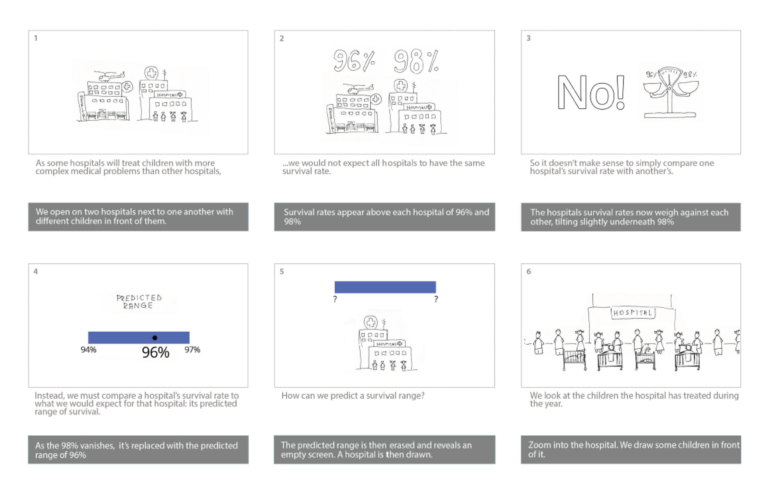
FIGURE 71.
Example storyboard from animation 1, frames 7–12.
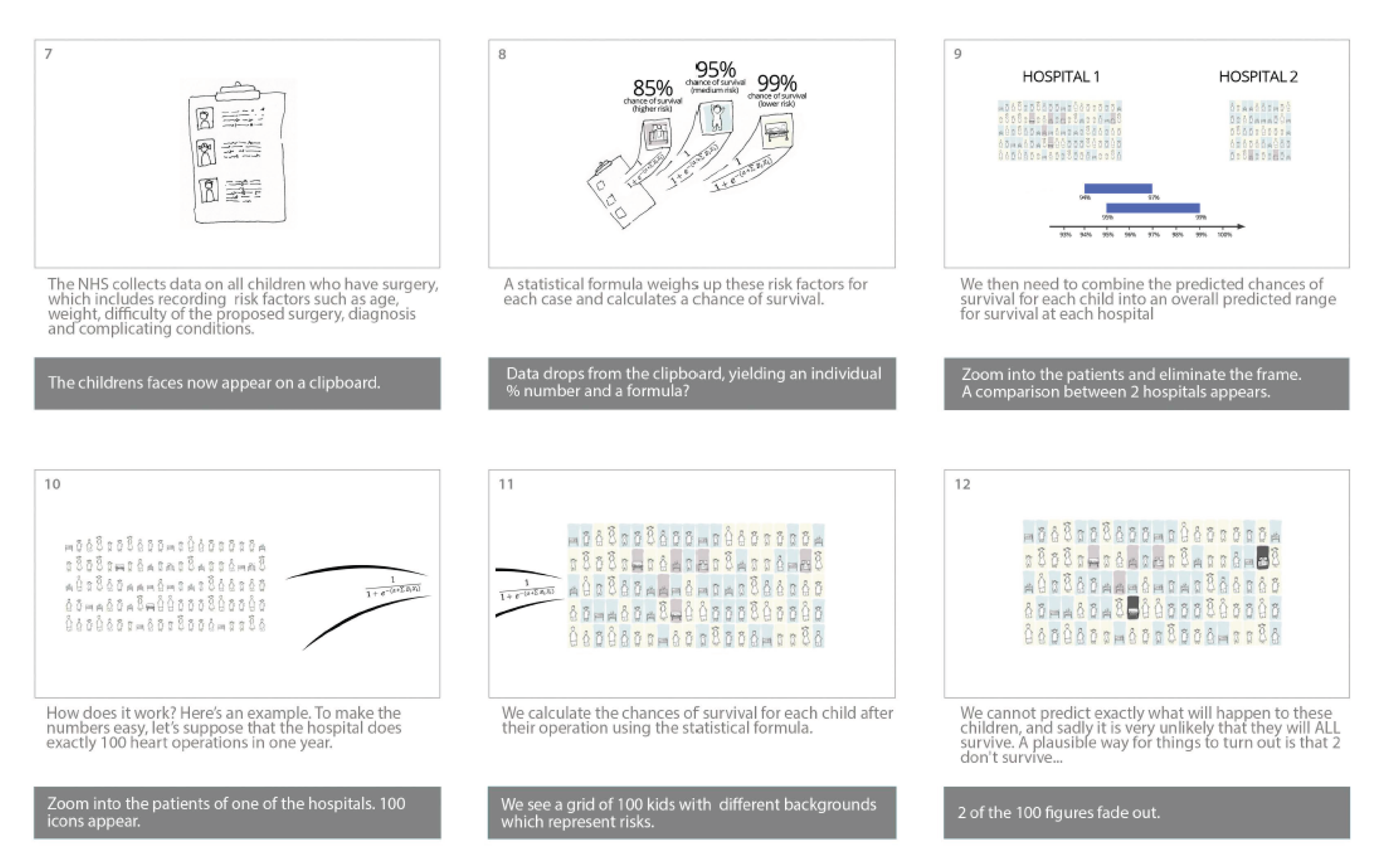
We started animation 1 (frames 1–4; see Figure 70) with what had become the key message for the website: that because different hospitals treat different children, they would not be expected to have the same survival rate; that it would, thus, not make sense to compare survival rates directly; and that instead a hospital’s survival rate should be compared with its predicted range only. In frame 6 (see Figure 70), we see the draft icons for children of different ages who have been treated by a hospital. Frames 7–8 (see Figure 71) show the move from data to a predicted chance of survival for each child treated and the introduction of three simple colours to show different levels of risk.
The key section explaining how the predicted range is calculated then starts in frame 10 (see Figure 71), in which we consider a hypothetical hospital that treated exactly 100 children. The core idea, designed by DS, CP and MP, was to show ‘possible futures’ for those 100 children: out of 100 children, each with their own predicted chance of survival, some would probably not survive. The animation would take the viewer through 20 possible futures, showing that each future could have both different children and a different number of children surviving, resulting in 20 possible overall survival rates for that hospital. In our example simulation, 19 out of 20 of the possible overall survival rates would lie inside the predicted range. This sequence involves difficult mathematical concepts that are of a standard typically found in the last year of Advanced level at secondary school or in the first year of an undergraduate degree, but they lie at the heart of outcomes monitoring across the NHS (and beyond). DS and CP were keen to try to explain this using the animation as far as possible; certainly we believed that showing it through a simulation was more likely to be successful than describing it in plain text on the website. In frame 12 (see Figure 71), we had an example of how a death of a child was represented (in this case two darker ‘child’ icons out of the 100). We knew that this was a key aspect to get right and asked participants for feedback on this specifically.
The website itself had evolved since the February workshops, taking into account the feedback arising from these. This related mainly to wording changes, but we also changed the layout of the ‘map’ tab on the ‘explore the data’ page to make it easier for users to select hospitals (Figure 72).
FIGURE 72.
The map data page for the fourth workshop.

Workshops
The non-parent workshop (comprising seven participants) was held on 13 April 2016 and the parent workshop (comprising four participants) was held on the 14 April 2016. MP, CP and EB attended both workshops, while DS attended the non-parent workshop only.
Website feedback
All participants were very positive about the website and found it easy to navigate. Parents in particular commented that the text was easy to read and ‘nicely categorised’. A new observation was that the website looked professional and serious, which participants found reassuring. The sense of quality was reinforced by use of the institutional logos and the funding statement at the footer of each page, the links to charities and support groups and the clear statements about what the website could and could not do. These aspects had not been considered previously by the project team, but once they had been pointed out it was clear that they were an important contributor to the overall look and feel of the website.
Many participants commented that it looked as if the brief descriptions of each page on the home page (Figure 73) should have corresponding hyperlinks, and it was initially confusing that they did not. Detailed feedback was also provided, such as increasing the size of the logo, making all boxes on the home page the same size and making the header a uniform background colour.
FIGURE 73.
The version of the home page used for the fourth set of workshops.
With regard to ‘Explore the data’, participants said that this page was very easy to navigate and understand, and they liked that it was ‘straightforward’ and ‘to the point’. Regarding the table (now list) view, parents said that we needed to add links to the relevant FAQ if a hospital’s survival rate was outside its predicted range. No participant wanted to be able to sort by raw survival rate. Non-parent participants suggested having some of the key points from ‘What/why/how’ repeated on the ‘Explore the data’ tab. All participants liked the updated legend in the hospital detail section but asked if this could be made hospital specific to match the width of the predicted range and extended range for that hospital’s data.
Non-parent participants felt that there was too much information on the ‘Everything else’ tab (i.e. the FAQs), but parents liked this section and found it useful. The project team decided not to change the content of this section. As part of the changes since February, the phrase ‘chance factors’ had been replaced with ‘unforeseeable factors’. All participants much preferred this revised phrase. Non-parent participants emphasised the need for consistency between the language used in the animations and the language used on the website.
Animations
Most participants found the first animation, which explained the predicted range, confusing and difficult to understand. Many suggested that it was not necessary to understand this content in order to explore the data, and that it should be made clear that this was ‘second level’ information for those who were particularly interested in finding out more. All participants made clear that the pace of the animation needed to be slower. All participants reacted strongly to the use of darker rectangles to indicate a death in the simulation of possible futures (frame 12 in Figure 71). After we discussed options with participants in each workshop, it was agreed that a child icon that faded to a white rectangle was the most sensitive graphic to portray a death. Parent participants in particular reacted quite strongly to the animation of possible futures. This was an important learning point for CP and MP and it confirmed the absolute importance of getting feedback from users, regardless of the cost in terms of time delay and reworking of material.
All participants found the second animation, which explained the presentation of the data, much easier to understand. Parents in particular found it helpful for understanding the data and felt that it should be strongly signposted to users while they are exploring the data. In a lengthy, extremely valuable discussion with the parent participants, they suggested moving key sections from animation 1 (explaining the predicted range) to animation 2 (explaining the data display) and then layering the placement of the animations of the site. During this discussion, we agreed to move frames 1–4 from animation 1 (see Figure 70) to the animation explaining the data. We also agreed to keep the predicted range explanations in this animation very simple, concentrating on the interpretation when the hospital’s survival rate was in the predicted range, in the extended predicted range or outside either range. This animation would then be added to the ‘Explore the data’ tab. The other animation (now called ‘Calculating the predicted range’) would concentrate only on explaining how the statistical formula is used to calculate the width of the predicted range. This had the advantage of allowing us to use a single example hospital throughout the key parts of the animation. This animation would be placed in the ‘Everything else’ section as additional information for those who wanted to explore further.
Feedback from previous workshop participants, expert panel, the National Institute for Cardiovascular Outcomes Research and others
In early May, following the final workshops and the psychology experiments in March, we had a close-to-final version of the website and two draft animations (loaded onto the website). The final voice recordings for the animation scripts were recorded at the end of April after they were rewritten in response to the April workshops.
We sent this version of the website to members of the expert panel for aim 1, to all previous workshop participants, to the CHF, to LM (our critical friend) and to the parent representative on the NCHDA steering committee, Bob Ward. We included the last two individuals so that we could get an entirely fresh perspective on the content.
The response to the website was overwhelmingly positive and also contained many helpful suggestions. These included changes to the key points to improve wording and ordering, changes to clarify the scope of the website (UK and Ireland results), changes to clarify the audit process when a hospital’s survival rate is below its predicted range and a new FAQ addressing what happens if a hospital’s survival rate is above its predicted range. We were also encouraged to include all available report data on the website (by this stage the NCHDA report for 2012–15 had been published and so there were three sets of report data available: 2010–13, 2011–14 and 2012–15). In terms of the animations, feedback indicated when we needed to slow the pace further and when further small embellishments would aid understanding (e.g. making key parts of the images ‘bounce’ to emphasise the text).
Finalising the website (May 2016)
Finalising the animations
After the final set of workshops, Qudos Animations worked with MP and CP to finalise the animations. Particularly for the animation ‘How is the predicted range calculated?’, this involved MP generating simulations of possible futures for the examples used in the animation. CP and MP worked together to make sure that the age and predicted risk distribution of the children was consistent with the national data set and provided Qudos Animations with the exact content of the simulations to be used in the animation.
Once Qudos Animations had provided the final versions of the animations, we explored how best to provide a transcript. Guided by MP’s expertise, the team decided that providing optional closed captions within the videos would be the best solution. Unfortunately, not all browsers support closed captions in videos directly, and we needed help from a JavaScript (Code School, Orlando, FL, USA; www.javascript.com) library to smooth over these cracks and provide as consistent an interface as possible. We eventually selected the open-source video.js player (Brightcove Inc., Boston, MA, USA), which is well supported and often used for this purpose. 64
Finalising the content
With the content and look of the website finalised, CP, EJ and JT independently checked the content of every page, concentrating in particular on the content of the questions and answers on the ‘Everything else’ page. CP updated the language in several of the answers to match the final language used in the animations and in the ‘What/why/how’ tab, and checked all of the hyperlinks in the website. It was at this stage that we added in the internal links between pages, in particular to the two animations and from the data to particularly relevant questions in the ‘Everything else’ section.
The team discussed whether or not to add a comment or forum section to the website, as had originally been suggested in the protocol. However, MP pointed out that any such section would need to be actively moderated and we did not have resource left after the project ended to enable us to commit to this. We thus agreed on adding a ‘Contact us’ section, which listed three e-mail addresses, each for a different kind of query: general queries about the website (e-mail address for Sense about Science), queries about the risk model (e-mail address for CP) and reports of technical problems (e-mail address for MP). We also directed users to the national audit body website for any questions about either individual hospital data or the national audit process.
CP also wrote the ‘About us’ and ‘How we developed this site’ sections for the ‘Everything else’ page, and the team provided their photos for the ‘About us’ section. The CHF preferred not to have a photograph but to be referenced only as an organisation.
Learning from the workshops showed that the key points at the top of the ‘What/why/how’ section were extremely valuable and should be made as attractive and accessible as possible. We wanted to adopt the same style as had been used in the two site animations, so CP and MP chose representative images from the Qudos animations. MP then extracted the artwork from the After Effects animation sources, kindly provided by Qudos, to generate the images used in the key points section of ‘What/why/how’ (Figure 74).
FIGURE 74.
Final set of ‘key points’ at the top of the ‘What/why/how’ web page.
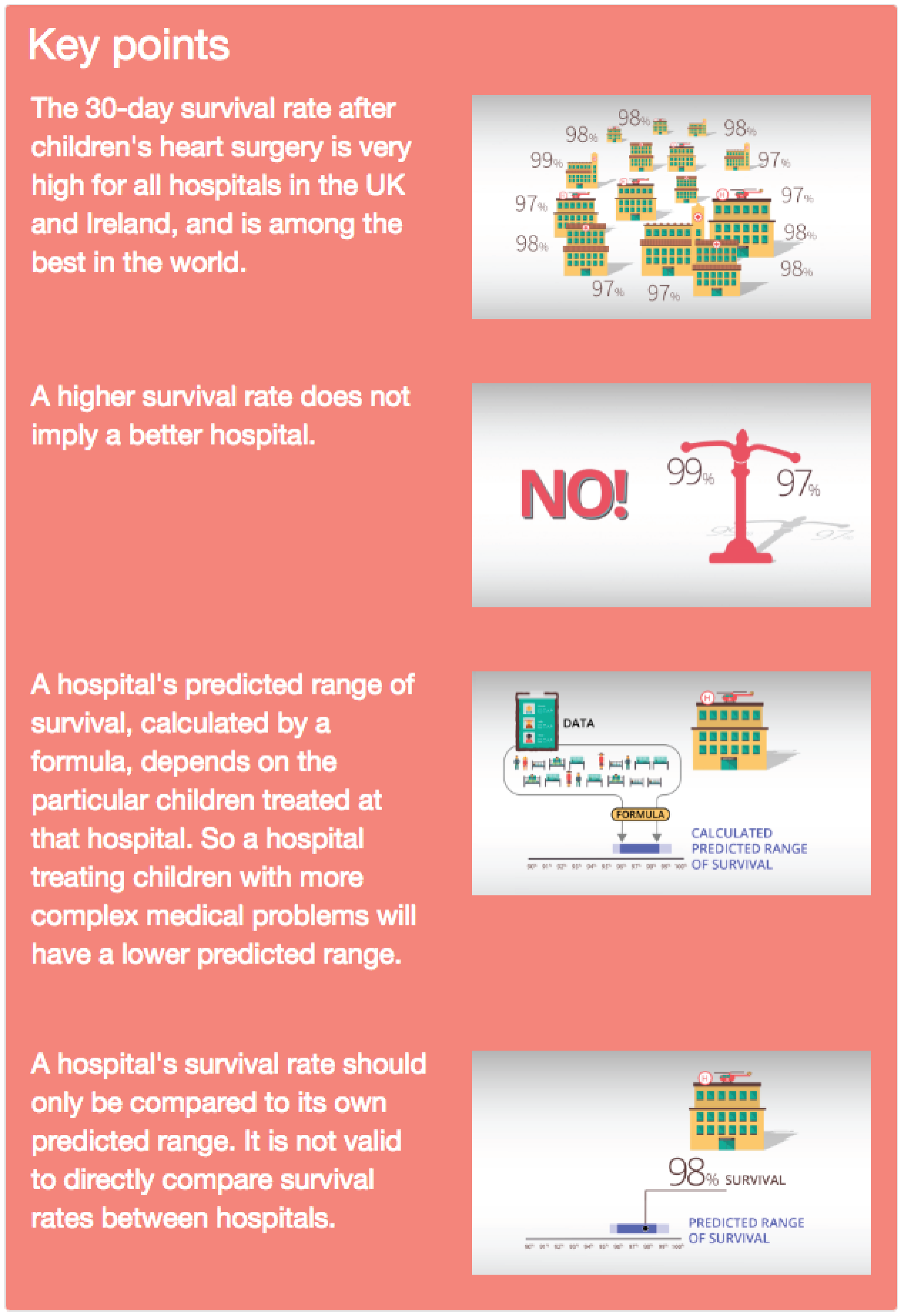
Final check of the national audit data with the National Institute of Cardiovascular Outcomes Research
The NICOR NCHDA annual reports provide the overall number of operations (surgical episodes) and the actual survival rate to one decimal place. Using this information, we calculated the numbers of survivors and deaths for each hospital, but these were subject to potential rounding errors. RF and CP worked with the national audit data lead to double check that the numbers provided in the ‘Explore the data’ sections were accurate. We also agreed that NCHDA would share the data for future reports with CP once the annual report was public. This would ensure that the website was kept up to date with the latest report in close to real time. It should be noted that the site has been designed by MP to ensure that updating it once a year with the latest report data is relatively easy.
Mobile phone and tablet compatibility
MP adopted Twitter’s (Twitter, Inc., San Francisco, CA, USA) Bootstrap Cascading Style Sheets (CSS) library (http://getbootstrap.com) early in the project’s development, as it is well tested and very capable. It adopts a ’mobile-first’ approach, meaning that when a page is being designed it is easiest to first mark up the HTML (HyperText Markup Language) for mobile phones, and adjust the code for wider (e.g. desktop) screens later.
In the workshops, we used a mix of laptops and tablets, which had the great advantage of enabling us to identify formatting issues early in the process. With hindsight, MP believes that we could have usefully used the ’mobile-first’ strategy to design content as well as layout. That would have forced us to adopt a layered approach to content at an earlier stage and would have highlighted the importance of microcopy (small bits of crucial text).
Moving to final domain and ensuring browser compatibility
CP purchased the final domain name of ‘childrensheartsurgery.info’ in the spring of 2016 (the site content is hosted on a University of Cambridge server). At the start of the project we were unsure in what final environment this site would reside, so we could make very few assumptions about web server capabilities: only that the server would need to be capable of serving static files. MP thus opted to develop the site as a single-page application in ClojureScript (https://clojurescript.org) instead of Facebook’s (Facebook, Inc., Menlo Park, CA, USA) React JavaScript library using the tonsky/rum wrapper (GitHub, San Francisco, CA, USA; https://github.com/tonsky/rum). MP used Figwheel (GitHub) to provide immediate run-time loading of changes as they were edited. This approach is inherently simple and allowed MP to make changes quickly as the site evolved and avoid feeling trapped by early architectural decisions.
However, this did mean that MP had to do some extra work when moving to production to ensure that the browser’s ‘back’ button would work properly and that we were using easy-to-type, search engine-compatible, clean URLs (Uniform Resource Locators). This was perhaps the trickiest part of the development effort, as HTML5 browser history support is not easy to understand. Clean URLs also meant that if we wanted to move from a single-page application to a server-hosted application in the future, it would be possible to do so without any user bookmarks being affected.
Internet Explorer (Microsoft Corporation, Redmond, WA, USA) was late in supporting the HTML5 features we have come to depend on. We have not attempted to support Internet Explorer 8 and Internet Explorer 9, which are in any case slowly falling out of use, with Internet Explorer 11 the final release of Internet Explorer (replaced by Microsoft Edge). During production tests, MP added advice to the home page for Internet Explorer 8 and Internet Explorer 9 users to help them to gain access to the site. It should be noted that in cases when institutions have not yet upgraded their machines to later versions of Internet Explorer, other browsers such as Google Chrome (Google, Inc., Mountain View, CA, USA; www.google.com/chrome/) or Mozilla Firefox (www.mozilla.org/en-GB/firefox/new/) must be used.
Experimental psychology evaluation of the final website
Rationale
Building on the studies of First set of psychology experiments (December 2015–January 2016) and Second set of experiments run in March 2016, which evaluated individual elements of the website, this study provided a ‘summary evaluation’ of the final website that had been developed by the aim 2 team. The objective of the study was to determine whether or not the website provided ‘added value’ to the NCHDA report of the national audit data. Thus, we conducted a small-scale randomised controlled trial comparing people’s ability to answer questions about the audit data and their interpretation when they used the NICOR report (only), the website (only) or both the report and the website (together).
Methods
Participants
Thirty-five participants were recruited from the KCL research volunteer list and via recruitment posters placed around one of the university’s campuses (Guy’s). Almost all of the participants were female, and most (61.1%) were in the 16–24 years age bracket and had a higher education qualification such as a degree (63.9%). None had participated in a previous study from this project.
Materials and design
The participants completed an online questionnaire that comprised questions about the national audit data for paediatric heart surgery, including on the comprehension and interpretation of the PRAiS model. Several of the questions were similar to those used in our earlier studies (series 1 and 2). The study had an independent group design, whereby participants were randomly allocated to one of three conditions, which differed according to the information source available to participants when they were answering the questions. Participants in the report condition were given the most recent NCHDA report. Participants in the web-tool condition were given access to the explanatory website. Participants in the combined condition had access to both the NCHDA report and the website. Eleven questions tested comprehension of prediction interval plots; the language of these questions differed by condition so that the format (e.g. colours shown on figures) matched the report or the website as appropriate to condition. Subsequent questions tested other aspects of understanding: the monitoring of survival rates (one question), the concept of unforeseeable factors (three questions), the predicted range (five questions) and the interpretation/consequences of a hospital having a survival rate outside its predicted range (six questions). Participants were also asked what parts of the report and/or web tool they found most useful, how they would use these resources, and which parts of the report/web tool they had looked at.
Procedure
The participants completed the online survey at a computer in an individual testing room, with a second screen (linked to the same computer) that they could use to view the report and/or the website (as per their condition). After providing consent, participants were given access to the report, the website or both and asked to familiarise themselves with the information; they were informed that they would still have access to this when they were answering questions about it. When they felt that they had explored this information sufficiently, they began the survey. Before starting the survey, participants in the combined condition chose whether their questions matched the information format of the website or that of the report, although, as described above, this affected the format of only a minority of the questions. Participants typically took 40–45 minutes overall, although there was some variation around this average.
Results
Questions that had a single correct answer were scored as correct (1 point) or incorrect (0 points). Other questions were scored according to a mark scheme that reflected the quality of answers, assigning ‘marks out of N’ according to the number of valid points included in the answer, which were then scaled on a 0–1 scale to give all questions similar weight. These were then combined (by addition) into three summary scores for each participant: comprehension (out of 11), understanding (out of 15) and an overall score (out of 26).
Table 14 summarises the accuracy of answers by condition, for individual questions and for the three summary scores. Mean comprehension accuracy was significantly greater for participants who had access to the website (mean 90.5%, SD 16.1%) than for those who were given access the report only (mean 78.8%, SD 13.0%), t(33) = 2.17; p = 0.037; 95% CI mean difference 0.8% to 22.7%; d = 0.77 (large effect). The mean understanding score was significantly higher among participants who had access to the website (mean 53.8%, SD 17.7%) than among those who were given access the report only [mean 31.8%, SD 17.2%; t(33) = 3.52; p = 0.001; 95% CI mean difference 9.3% to 34.7%; d = 1.25 (large effect)]. The mean overall survey score was significantly higher among participants who had access to the website (mean 69.3%, SD 13.7%) than among those who were given access the report only [mean 51.7%, SD 11.3%; t(33) = 3.83; p = 0.001; 95% CI mean difference 8.3% to 27.0%; d = 1.36 (large effect)].
| Topic, question [type]a | Condition (%) | ||
|---|---|---|---|
| Report (n = 12) | Web tool (n = 12) | Combined (n = 11)b | |
| Plot comprehension (‘meaning’ of plots) | |||
| c.1 What does the dark blue dot mean [mcq_0.1] | 33 | 83 | 73 |
| What would it mean if the dark blue dot was in the . . .c | |||
| c.2 Dark grey area? [mcq_0.1] | 75 | 75 | 100 |
| c.3 Light/bright blue area? [mcq_0.1] | 75 | 100 | 100 |
| c.4 White area? [mcq_0.1] | 100 | 92 | 100 |
| c.5 Light grey area? [mcq_0.1] | 67 | 92 | 100 |
| c.6 In the darker blue/green area? [mcq_0.1] | 92 | 100 | 100 |
| Where would the dot be if there was . . . | |||
| c.7 No evidence of difference [mcq_0.1] | 100 | 92 | 100 |
| c.8 Strong evidence higher [mcq_0.1] | 67 | 83 | 82 |
| c.9 Some evidence higher [mcq_0.1] | 100 | 77 | 91 |
| c.10 Some evidence lower [mcq_0.1] | 100 | 77 | 91 |
| c.11 Strong evidence lower [mcq_0.1] | 58 | 75 | 100 |
| Overall comprehension accuracy | |||
| Mean (SD) | 79 (13) | 87 (20) | 94 (9) |
| Median | 82 | 91 | 100 |
| Understanding (of monitoring, etc.) | |||
| u.1 How the NHS monitors survival rates [free_0.6] | 31 | 50 | 52 |
| u.2 What unforeseeable/chance factors means [free_0.3] | 33 | 53 | 52 |
| u.3 Example of unforeseeable/chance factor [free_0.2] | 71 | 88 | 77 |
| u.4 Effect of unforeseeable factors greater when fewer operations performed [mcq_0.1] | 50 | 25 | 45 |
| p.1 Explain predicted range [free_0.5] | 35 | 32 | 40 |
| p.2 What information is used to calculate predicted range [free_0.4] | 19 | 31 | 34 |
| p.3 Why predicted range differs between hospitals [free_0.2] | 38 | 38 | 45 |
| p.4 Effect of N procedures upon prediction interval width [mcq_0.1] | 41 | 58 | 64 |
| p.4a Explains previous answer [free_0.1] | 25 | 42 | 45 |
| o.1 Why might a hospital fall out of range [mcq_0.5] | 42 | 53 | 49 |
| o.2 Effect of N hospitals on chance that a survival rate is outside prediction interval by chance [mcq_0.1] | 58 | 75 | 82 |
| o.3 What happens if survival rate is outside predicted range [free_0.3] | 11 | 53 | 55 |
| o.4 What happens if survival rate is outside extended prediction range [free_0.3] | 6 | 47 | 45 |
| o.5 How often is survival rate outside predicted range by chance? [free_0.1] | 8 | 75 | 82 |
| o.6 How often is survival rate outside predicted range by chance? [free_0.1] | 8 | 67 | 64 |
| Overall understanding score | |||
| Mean (SD) | 32 (17) | 52 (17) | 55 (19) |
| Median | 31 | 54 | 59 |
| Overall survey score | |||
| Mean (SD) | 52 (11) | 67 (16) | 72 (10) |
| Median | 52 | 67 | 71 |
An inspection of Table 14 indicates that the differences between the conditions are greater for some types of question than for others. Notably, for the comprehension questions, determining the ‘meaning’ of the black dot (i.e. identifying the outcome measure) was much harder from the report (alone) than from the explanatory website (question c.1s). This is consistent with what we found in experiment 1a. The other large differences were for questions about hospitals with survival rates outside the predicted range, in particular the actions that the audit body takes when this occurs (questions o.3 and o.4) and how often this occurs by chance when a hospital is operating as predicted (questions o.5 and o.6).
Conclusions
The results of this study suggest that the explanatory website does improve people’s understanding of the complex survival data generated by the PRAiS model and reported in the NCHDA report. It is worth noting the areas in which the website seems to be particularly helpful. First, comprehension for the outcome measure used to evaluate performance is substantially better for the website than for the report, which – when taken together with other questions – results in better overall comprehension for the plots when people have access to the website than when they have access to the report alone. Second, the website seems to provide people with clearer information about the audit process triggered when a hospital’s survival rate falls outside its predicted range than can be found in the NICOR report. Third, the website also provides information about how often the survival rate will fall outside the predicted range by chance, information that participants found very hard to glean from the report. These second and third strengths of the website may be particularly important for ameliorating ‘alarmist’ reactions to the data, because the site seems to help people to appreciate that not all unexpected differences are meaningful, and that there is a process in place through which the health service follows up on the data when there is potential cause for concern.
The embedded nature of the experiments meant that we were forced to trade off between maximising statistical power and having results available in sufficient time to inform the next stage of website development. If time-constraints had permitted, we would have wished to exceed 50 participants per cell in order to exceed 70% power to detect a mean difference of d = 0.5 with a between-subjects comparison (which we would regard as an ‘important’ size of difference to detect).
Importantly (and acknowledging that we would have wanted a larger study for firm conclusions in this regard), although there were several types of question for which accuracy in the report condition was similar to that for the website or combined conditions, there were no questions for which access to the website led to substantially lower accuracy. In addition, we had wondered if having a website with different data formats from those of the NCHDA report might cause confusion that would not arise when using only one of these information sources. However (and, again, a caveat regarding sample size), we found no evidence of this, suggesting that the website has value both as a standalone tool and as a tool to be used in conjunction with the NCHDA report. Finally, although the website improves people’s understanding of these data, we can see from Table 14 that it does not lead to a complete understanding. Therefore, it might be valuable to explore whether or not the website has further value when used as a teaching tool, for instance through training members of cardiac teams or family support groups to use it to guide members of the public towards a better understanding of these data.
Website launch
The website was launched at 00:01 on 21 June 2016 (http://childrensheartsurgery.info/).
Launch strategy
Sense about Science (EJ/JT) led the website launch strategy and implementation. The audiences identified for user testing were a reflection of the target audience for launch:
-
parents of children with heart conditions
-
professionals:
-
health professional (including surgeons, family liaison staff at hospitals, cardiac nurses)
-
NHS commissioners
-
policy professionals (e.g. at learned and professional societies)
-
communications professionals, journalists, science writers
-
opinion leaders (e.g. celebrity GPs)
-
medical charities
-
organisations interested in good risk communication
-
-
members of the public interested in how the NHS monitors heart surgery.
Professionals who make decisions, write reports and answer journalists’ queries about these data constituted a key audience through which future miscommunication could be reduced. One way of reaching the policy and health-care professional audience, at the same time as reaching a public audience, was through national press outlets. The second way to reach them was via their membership bodies and academic publications.
Professional and parent dissemination to established networks
We made use of the project team’s established networks (e.g. NICOR, children’s heart units, CHF networks, Sense about Science’s established network of medical charities, learned and professional societies, and opinion leaders on good communication of statistics).
Developing and harnessing new networks
The user testing workshops helped us to build relationships with important stakeholder organisations that had established professional or patient networks. We provided them with early views of the website, suggested tweets, requested inclusion in blogs and newsletters and provided images for online articles.
We provided a tailored approach to different media outlets. To the broadcast media we offered a case study. Two mothers from the user testing workshop volunteered to speak to journalists. For The Guardian science blog we offered an article65 that shared the researchers’ (CP/DS) experience and discussed the importance of listening to parents and the broader reasons why making statistics accessible as well as available matters for accountability. We also reached out to civil society organisations in advance.
For the general press release there was a joint release from Sense about Science and the University of Cambridge. It was sent to broadcast (TV and radio) and print media, in addition to lifestyle press and science weeklies, and included supportive quotations from the President of the Society of Cardiothoracic Surgeons, the patient representative on the NHCDA steering committee, and a mother of a child with a heart condition.
Summary of coverage received, interest and dissemination
Media response to the launch was very good considering the limited space available as a result of coverage of the lead-up to the UK’s European Union referendum (which was held on 23 June 2016). This problem would have been even worse had the launch taken place after the referendum. Coverage of the launch is summarised as follows.
-
Press coverage (dissemination to professional, parents and interested public):
-
Science weeklies (dissemination to research community and clinicians):
-
Medical charity dissemination (parents of children with heart conditions):
-
Civil society organisations (interested members of the public and parents of children with heart conditions):
-
A parent participant wrote a blog on Mumsnet. 70
-
-
Medical charity membership organisation (to reach medical charities to encourage others to take on our approach of involving audience early):
-
Sense about Science wrote about a blog for the Association of Medical Research Charities about why it was important to involve patients and families, and to involve them early, in the website’s creation. 71
-
-
Funders/academic institutions/statistical organisations (to reach researchers with tips for public engagement and how to communicate risk well):
-
Learned and professional societies (to reach surgeons with a useful tool to improve their understanding and to signpost to patients/colleagues):
-
The Royal College of Surgeons of Edinburgh added a news item to their website. 76
-
Royal College of Surgeons included information on the project in their newsletter to members and fellows.
-
Social media
All of the above organisations shared the website link on social media, as did the charities Little Hearts Matter and Heartline.
In addition, we received very supportive tweets and retweets by opinion leaders active in improving risk communication, including Simon Singh (who has 71,000 followers on Twitter) and Dr Phil Hammond (who has approximately 44,300 followers on Twitter and is a doctor, journalist, broadcaster, campaigner and comedian).
Post launch
We track usage of the site using Google Analytics (Google, Inc., Mountain View, CA, USA). 77 After an initial surge in hits in the first week after launch, the website received an average of about 70 visits per day in July, 67% of which were from first users, and a bounce rate of 37%, which is considered very good. 78 Most visitors (70%) have been from the UK, but the site has also received international interest, particularly from the USA and Australia. Although most views have been via desktop, > 30% of people viewing the site have been using smartphones or tablets (as of December 2016), confirming the importance of designing the site with usage from non-desktop platforms in mind.
As of December 2016, and not including the substantial activity after its launch (over 5000 visitors between mid-June and August), the website has been receiving 400–600 visitors a month (3 months’ data: September–December 2016), with 67% new visitors, a bounce rate of 35%, and 54% of visitors from the UK. The proportion of new visitors has been steady, with 20% of new visitors spending > 3 minutes and 12% of visitors spending > 10 minutes on the site. If the family of every child undergoing heart surgery each year looked at the website, we would expect approximately 375 new visitors per month (there are approximately 4500 surgical episodes a year in the UK). Obviously we do not know if all of our UK site visitors are such families, but our new UK visitor rate of around 145–220 per month suggests that at least some are finding and viewing the website.
Importantly, in addition to the endorsement and promotion listed in Summary of coverage received, interest and dissemination, we have made progress in achieving long-term visibility through key endorsements and permanent links.
In particular, NICOR have discussed the website and now link to it from the NICOR NCHDA congenital page. 32 NICOR also said that they would include the website as a resource in press releases about future annual reports, which will provide an important signpost to journalists seeking to understand the results.
The NICOR congenital steering committee (NCHDA) also sent an e-mail to each hospital that carries out heart surgery on children to suggest that they add a link to the website on their web pages. Almost all of the charity and user groups listed on the website were enthusiastic and agreed to include permanent links to the website (at least five charities have already done so). 79 Another important source is NHS Choices, which has added the link to its pages on CHD. 80
Details of the website, as a trusted independent resource, were included in the letter sent to parents of children treated at Bristol Royal Infirmary, in advance of the Care Quality Commission inquiry report at the end of June 2016. We also shared the website with the Health Quality Improvement Partnership, which provided positive feedback and in turn shared the website with Professor Sir Bruce Keogh, NHS England’s medical director. 81–83
Aim 2 dissemination
As well as the dissemination associated with the launch (see Website launch), we have written an academic paper describing the process of building the website and key lessons learned for a general clinical audience (led by CP). This paper has been published in Annals of Thoracic Surgery. 84 A manuscript currently under review at the Journal of Behavioral Decision Making reports the three studies that formally compared different graph formats (experiments 1a, 1c and 2a in this report).
In addition, TR gave a talk on this work to the members of the Royal Statistical Society at Durham University in May 2016; CP gave a talk offering her perspective to the Health Services Research UK Conference in Nottingham in July 2016; and MU presented the website to British Congenital Heart Association meeting in Nottingham in November 2016, at which he received extremely positive feedback. CP gave an invited talk on the work (alongside aim 1) at The 12th Annual Meeting of The Multi-Societal Database Committee for Pediatric and Congenital Heart Disease in Atlanta, GA, USA, in August 2016 and gave a similar invited talk at the Third Summit on Transparency and Public Reporting of Pediatric and Congenital Heart Disease Outcomes in Denver Colorado on 30 January 2017. In general, there has been a great interest in the USA about the website and about developing similar resources there.
Sense about Science has written a blog for the Medical Research Council offering advice to other academics on public engagement, based on this project, and it will prepare a case study for NIHR offering advice and learning for other NIHR research projects. 71
There may also be international venues, such as the Seventh World Congress of Pediatric Cardiology and Surgery in Barcelona in July 2017, where RF will talking about transparency at a pre-congress session on outcomes.
Learning and the future
Over the course of the project, the scope of the website expanded considerably. Initially, we set out to develop material to explain a single NICOR graph, but, as we engaged with users, they helped us to develop our key messages about high survival, inappropriate comparisons and the objective nature of the statistical formula. By listening and responding to their needs, we iteratively prioritised these messages while simultaneously seeking to simplify our presenting of data.
As highlighted in The Lancet editorial and by the Royal College of Surgeons of Edinburgh, we hope that this process of early, frequent and genuine engagement with users will become a template for how published NHS outcomes can be shared with patients, the media and the general public. 68,76
Key learning points
In our final facilitated meeting in June 2016, we distilled some key learning points for different groups of stakeholders. Our thoughts are summarised in the following sections.
Academics
A key lesson was that building a website such as this is harder than it may seem. It requires considerable resources, including money, people and time, particularly when building something to a high level of production quality. Even though we had generous funding from NIHR, we had not allotted sufficient time. Mainly this was because we had underestimated how much effort and time the website development would take, often concentrated in short periods, particularly as a result of the many iterations of input from the workshops. Another consequence of the constrained time scale was that time for the psychology experiments had to be fitted into the time between workshops and, thus, tended to be more reactive than we would have liked. Ideally, one would allow more time for development and testing than we had been able to. This aspect of the process nonetheless provided valuable insights, but having more time for reflection between workshops could have led to other important psychology experiments.
However, despite the challenges, the team felt that the effort was worthwhile, as the high quality of the website seemed to make users feel that they were being taken seriously and that the information presented was genuinely transparent.
In terms of generalisability, the analytical team members (DS and CP) felt that it would be important for those communicating clinical or statistical information to understand it and have confidence in its accuracy. This confidence needs to underlie any communication, so that, for instance, CP would not be the right person to lead a project communicating results in a clinical area with which she was unfamiliar (e.g. outcomes in elderly care).
Another learning point has been finding the balance between expressing a difficult concept as simply as possible without compromising the quality of the information being provided. It was extremely helpful to receive user input on the language we were using, but, on the other hand, there were times when we could not simplify the information without risking misinterpretation. DS and CP noted that many parents in the workshops said that although the FAQs were long, this was necessary and the information was clear to read and understand. Certainly, both the workshops and the different disciplines of the academics involved highlighted how blind you can be to the jargon in your own field.
For difficult topics such as survival outcomes, the parent workshops were particularly humbling and also vital in clarifying the emotional aspect of the data. Academics must be guided by the target audience as to what is appropriate and sensitive display of information; for us, this was particularly key in the imagery used in the animation illustrating the calculation of the predicted range.
To summarise, there is no substitute for genuine coproduction.
The academics found it extremely helpful to have an external partner, Sense about Science, guiding the stakeholder involvement and providing an outside perspective. There is no doubt that the vast experience of Sense about Science in communication contributed a great deal to the website’s success.
In terms of technical web development, when there is a cycle of iterative feedback, as in this coproduction process, responsiveness and speed in changing the web material is important. A sensible ‘to-do’ list is required, as is an appropriate technical strategy for reworking the website as various features change. That necessitates a style of working that is not the norm in website development, and the use of functional approaches that allow this.
Funders
All of the academics agreed that they would not have asked for the level of support that NIHR provided upfront, on the assumption that it would not be forthcoming. If NIHR had not encouraged us to think more boldly, this project would not have happened. A lesson for all funders is that projects that could benefit from this sort of stakeholder involvement should be encouraged to put in costed and realistic plans for this work, recognising that it may take considerable time and effort. Furthermore, explicit guidance on how to cost these aspects would be very helpful (perhaps with case studies or indicative costs). Many academics applying will be new to this sort of engagement and would welcome concrete examples.
The whole team felt that this project went beyond ‘public engagement’ and was a true research endeavour in coproduction. We felt that funders, in their guidance, could usefully distinguish between public engagement that is ‘telling people about the science you do’ and engagement that works with people to ensure that they have access to science that is relevant to their lives (in our case, giving parents access to clinical survival data that could affect their children).
In addition, individual team member reflections on the project and what they have taken from it are provided in Appendix 5. Appendix 6 details the observations of our ‘critical friend’, LM, who facilitated the three group meetings.
Capturing impacts going forward
Although this project is over, the website will be updated annually with the latest national audit report data. In terms of utilisation, we (MP/CP/Sense about Science) will monitor for:
-
an uptick in traffic after the publication of a NCHDA report
-
an uptick in traffic after the publication of news stories about children’s heart surgery in the UK and Ireland
-
an increase in the number of permanent links to the website.
More hard-to-measure impacts that we hope to see over the coming years are a change in the language used about survival after children’s heart surgery (e.g. in the NCHDA report and/or in media stories), extending perhaps to the reporting of other published hospital outcomes.
Another hard-to-measure but interesting potential impact would be to track other efforts utilising the approach, ideas, presentation and/or layout that we used for the website. For instance, the approach may be used to communicate information about other clinical procedures. Sense about Science has offered to keep track of examples of such potential diffuse impacts.
Aim 2 limitations
A major limitation, identified with hindsight, was lack of time. With more time, we could have performed more extensive psychology experiments to further inform the language and layout choices. We also would have had more time to incorporate the feedback from previous workshop participants.
As the website grew in scope, we often had to make design decisions based on expediency and simplicity. With more time and specific web design expertise, we could perhaps have made some of the navigation and signposting more slick, for instance on the ‘Everything else’ page.
Even with the extensive user input, the website remains reasonably wordy, and we did not have the time or resources to test it on a more general audience who might not have been as engaged and informed as our parent participants. As the project ended essentially with the launch of the website, we do not have resources to follow up its use and impact in detail or to make major updates to its design. We do remain committed to keeping the data up to date to reflect the annual release of NCHDA audit reports.
Another limitation, which the principal investigator takes full responsibility for, is that we approached building the website with enthusiasm but not necessarily with a detailed academic understanding of previous research on such public communication (although we did call on the considerable expertise of DS). That said, we also believe that this is a strength of the work; as the part of the team responsible for the PRAiS model, we were in the best position to understand its nuances and its interpretation. A major learning point of this study is that a multidisciplinary team such as ours can work together, out of many of our respective comfort zones, and undertake genuine coproduction with users to produce a valuable new resource.
Aim 2 conclusions
We set out to develop material to explain a single graph to help explain the survival output generated by the national audit body. As we engaged with users, it became clear that much more than this was needed, and so users helped us to develop messages about high survival rates, statistical methods and avoiding inappropriate comparisons. We produced an extensive website that provides an interactive exploration of the data, two explanatory animations and a wealth of background information and further signposting.
The multidisciplinary, multisector nature of the team was crucial: each team member’s perspective fed into and enhanced the whole. The early and continuous user engagement was vital, with each workshop improving and shaping the website. The content and look of the website was genuinely coproduced with workshop participants. The psychology experiments provided important insights into the language used and, by pinpointing common misconceptions or psychological responses to the data display, where we needed to emphasise, explain and be explicit about caveats.
Building this website took considerable resources, including funding, people and time. It was extremely helpful to have an external partner, Sense about Science, guide the stakeholder involvement and act as a neutral facilitator at the workshops. For the technical web development, responsiveness and speed in changing the web material was important, requiring a technical strategy for reworking the website outside the norm for website development. For difficult topics such as survival outcomes, the parent workshops70 in particular were humbling and vital for the team to understand the emotional aspect of the data for parents and inform development of sensitive communication. We hope that our narrative description of the website development, explaining in detail who did what and why, will encourage other academics unused to public communication to undertake this sort of work, and that it has provided some insight into how such a multidisciplinary project can work.
The website (http://childrensheartsurgery.info/) was launched on 23 June 2016. It was very well received and was very quickly endorsed by major stakeholders (charities, clinical specialists, national audit, NHS Choices, Royal Colleges and leading medical journals). We hope that the website be useful for parents and other users in the coming years.
Chapter 4 Overall summary
We set out with two aims:
-
aim 1 – to improve the PRAiS risk model for 30-day mortality following paediatric cardiac surgery by incorporating more detailed information about comorbid conditions
-
aim 2 – to develop, test and disseminate online resources for families affected by CHD in children, the public and the media to facilitate appropriate interpretation of published mortality data following paediatric cardiac surgery.
We have summarised the work carried out to achieve each aim in Chapters 2 and 3. In this chapter, therefore, we reflect on whether or not we were successful in generating the knowledge output that we set out to produce.
Planned knowledge output
We said that outputs would include:
-
an updated PRAiS risk model for 30-day mortality following paediatric cardiac surgery (aim 1)
-
updated software to implement new risk model (aim 1)
-
new algorithms for characterising comorbidities associated with a patient record (aim 1)
-
online material for the public/family members/media (aim 2)
-
new learning on how formal experiments and coproduction with users can be integrated to improve public engagement efforts (aim 2).
As discussed in Chapter 2, we successfully achieved outputs 1–3, and the updated risk model software is already in national use. As discussed in Chapter 3, we coproduced a website with users that launched in June 2016 (output 4). The website was very well received and has been endorsed by many key stakeholders. Through our three facilitated group meetings, particularly the final one in June 2016, we reflected on learning from the project and distilled key messages for other academics and funders (output 5). We thus believe that we have successfully achieved all of the planned knowledge outputs.
Generalisability of the work and future directions
Generalisable learning
The key generalisable aspects from aim 1 are:
-
Close collaborative working between clinical experts and analysts improves both the performance and the acceptability of risk adjustment methods. The latter in particular is crucial for translating research into practice.
-
Comorbidity and diagnosis information are increasingly recognised as important determinants of risk. Our careful and thorough approach to categorising these features for complex paediatric patients provides a template for other clinical specialties. In particular, although we have considered the paediatric cardiac population, many of the considerations around defining comorbidity will be directly relevant to other paediatric specialties.
-
As 30-day survival continues to improve, focus is shifting onto other outcomes for children with CHD, such as complications after surgery and longer-term survival. Comorbidity and diagnosis will be important modifiers for these outcomes and the categorisations developed for this project will be directly transferable to consideration of these other outcomes.
The key generalisable aspects for aim 2 are:
-
the coproduction workshop methodology used to build the website
-
the learning from independent psychology experiments that fed into the key messages of the web material
-
the need to build in sufficient time to respond and reflect at each iteration
-
the language we developed to describe sophisticated mathematical concepts around prediction, uncertainty and risk.
Given that the current trend is towards greater transparency and the increased publication of outcomes across many more clinical specialties, this project’s learning could be very important to others in the coming years. Indeed, in the short time the website has been live, we have been approached by other organisations (one surgical, one intensive care) for advice on how they can learn from and replicate our experience.
Future recommendations
This project focused on a single surgical outcome – mortality – and on building both a better statistical model with which to monitor surgical mortality in children with heart disease and a website to try to ensure that the way in which surgical mortality is monitored in this specialty is transparent for both families and the public. As discussed previously, survival rates for children with CHD have increased dramatically (30-day survival is now > 97.5%), but CHD remains a lifelong condition requiring lifelong engagement with clinical services managed by various health-care providers. Patients often need a complex combination of medicines, hospital visits and treatments, leading to high levels of health-care utilisation. 85–89 CHD services are expensive and high profile and have an enormous impact on patients’ lives, but there is currently no cohesive strategy to measure outcomes across settings and providers. Thus, 30-day survival in children after cardiac intervention is no longer an adequate proxy on its own for quality in CHD services. 85,90–92
National reviews have identified areas of CHD services in which improvements could be made but for which there is no adequate system for objectively defining, measuring, acting on and reporting on these areas. 6,92 Examples are reducing post-discharge deaths (3.2% for infants); addressing barriers to accessing care in the community; reducing complications following surgery; reducing loss to follow-up after hospital discharge, particularly when moving from paediatric to adult services; and improving reporting of outcomes for adult patients. 36,41,42,93–97 The 2015 NHS England review of CHD services called for better reporting of quality using a broader range of outcomes relevant to a range of stakeholders, including parent and adult patient groups. 92
The facets of quality given above are merely examples, and different stakeholders will have different perspectives on the importance of different possible quality criteria. Even given a set of criteria that has broad support, identifying or developing appropriate metrics for monitoring it is far from straightforward. In order to prevent gaming, irrelevance, anger or measurement overload, metrics would need to be carefully developed with their purpose and audience in mind.
At the same time, how the metrics relate to quality criteria, how they are used and what they mean needs to be communicated to patients, the media, policy-makers and the public in a transparent, accessible and informative way. 91,98–102 The website we developed in aim 2 addresses some of these reporting and communication challenges, but there is little doubt that it could be improved, and any future attempts should incorporate more extensive post-launch follow-up and evaluation.
Thus, we see that the major future recommendations for research are addressing the following questions:
-
What are the important facets of quality in CHD services and how do perspectives on these differ between stakeholder groups?
-
Can identified quality criteria be measured routinely and meaningfully, and what are the sets of metrics that can be used for national quality assurance, local quality improvement and transparent reporting to patients, commissioners and the public?
-
Does codeveloping metrics with a broad stakeholder group significantly change the type of metrics developed and improve their acceptability within the CHD community?
-
What visual representations of quality measures are effective in facilitating decision-making regarding CHD services and what are the implications for other contexts?
-
What are the most useful data representations and communication tools for sharing outcomes with patients and the public?
-
What facilitates the routine use of monitoring software tools (such as the PRAiS tool) in practice, and what are the implications for national roll-out?
-
How can we better evaluate how successful we are at communicating quality to patients, the media and the public?
-
Can and should public reporting of quality in NHS services be multiplatform (e.g. website, paper, applications)?
-
Can we create a commonality of quality reporting across different subspecialties in the NHS?
Acknowledgements
Contributions of authors
Christina Pagel (Reader, Operational Research) led the study and was closely involved with both aims.
Libby Rogers (Research Associate, Operational Research) conducted the analysis for aim 1.
Katherine Brown (Consultant, Paediatric Cardiac Intensive Care) led the research to develop comorbidity groups, advised on the diagnosis groups and was a member of the expert panel and a clinical member of the aim 2 project team.
Gareth Ambler (Senior Lecturer, Medical Statistics) advised on the statistical methods used for the PRAiS 2 risk model development.
David Anderson (Surgeon, Paediatric Cardiology) was a member of the expert panel, advising on the risk factors used for PRAiS 2 model development.
David Barron (Surgeon, Paediatric Cardiology) was a member of the expert panel, advising on the risk factors used for PRAiS 2 model development.
Emily Blackshaw (Research Associate, Psychology) ran the psychology experiments used for aim 2.
Sonya Crowe (Senior Research Associate, Operational Research) was a member of the expert panel, advising on the risk factors used for PRAiS 2 model development, tested the final PRAiS software and was an analytical advisor for the aim 2 project team.
Kate English (Consultant Cardiologist, Cardiology) was a member of the expert panel, advising on the risk factors used for PRAiS 2 model development.
Rodney Franklin (Consultant Cardiologist, Cardiology) was a member of the expert panel, advising on the risk factors used for PRAiS 2 model development, and worked with Katherine Brown to develop on the comorbidity groups. He also advised both aims as chairperson of the NCHDA steering committee.
Emily Jesper (Sense about Science) led Sense about Science’s contribution, organising and facilitating the workshops, and planning and running the website launch.
Laura Meagher (independent consultant), was the ‘critical friend’ for aim 2 and facilitated the three aim 2 team meetings.
Mike Pearson (Web Designer and Producer of Mathematical Educational Resources) built the website for aim 2.
Tim Rakow (Reader, Psychology) led the psychology input into the aim 2 website development.
Marta Salamonowicz (CHF) recruited parents for the parents workshops for aim 2 and was a member of the aim 2 project team.
David Spiegelhalter (Professor, Public Understanding of Risk) contributed to the website development, in particular the language around the communication of risk, and worked closely with Mike Pearson, Christina Pagel and Sense about Science throughout.
John Stickley (Data Lead, Paediatric Cardiac Surgery) was a member of the expert panel, advising on the risk factors used for PRAiS 2 model development.
Joanne Thomas (Sense about Science) worked with Emily Jesper to organise and facilitate the workshops and in planning the website launch.
Shane Tibby (Consultant, Paediatric Intensive Care) was a member of the expert panel, advising on the risk factors used for PRAiS 2 model development.
Victor Tsang (Surgeon, Paediatric Cardiology) was a member of the expert panel, advising on the risk factors used for PRAiS 2 model development.
Martin Utley (Professor, Operational Research) was a member of the expert panel, advising on the risk factors used for PRAiS 2 model development, tested the final PRAiS software and was an analytical advisor for the aim 2 project team.
Thomas Witter (Data Lead, Paediatric Cardiac Surgery) was a member of the expert panel, advising on the risk factors used for PRAiS 2 model development.
Publications
Rogers L, Brown KL, Franklin RC, Ambler G, Anderson D, Barron DJ, et al. Improving risk adjustment for mortality after paediatric cardiac surgery: the UK PRAiS 2 model [published online ahead of print 15 March 2017]. Ann Thorac Surg 2017.
Brown KL, Rogers L, Barron DJ, Tsang V, Anderson D, Tibby S, et al. Incorporating comorbidity within risk adjustment for UK paediatric cardiac surgery [published online ahead of print 15 March 2017]. Ann Thorac Surg 2017.
Pagel C, Jesper E, Thomas J, Blackshaw E, Rakow T, Pearson M, Spiegelhalter D. Understanding children’s heart surgery data: a cross-disciplinary approach to codevelop a website [published online ahead of print 15 March 2017]. Ann Thorac Surg 2017.
Data sharing statement
The data used for aim 1 (risk model development) were received on formal application from the NCHDA with data sharing agreements in place. This data agreement does not allow us to share the data with anyone else. Anyone wanting to use the same data set would need to apply to the NCHDA directly (nicor-generalenquiries@bartshealth.nhs.uk).
Disclaimers
This report presents independent research funded by the National Institute for Health Research (NIHR). The views and opinions expressed by authors in this publication are those of the authors and do not necessarily reflect those of the NHS, the NIHR, NETSCC, the HS&DR programme or the Department of Health. If there are verbatim quotations included in this publication the views and opinions expressed by the interviewees are those of the interviewees and do not necessarily reflect those of the authors, those of the NHS, the NIHR, NETSCC, the HS&DR programme or the Department of Health.
References
- Cunningham D, Franklin R, Bridgewater B, Deanfield JE. NICOR Investigation of Mortality from Paediatric Cardiac Surgery in England 2009–12 2013. www.england.nhs.uk/2013/04/12/reports-chs-leeds/ (accessed 20 April 2013).
- NICOR . NICOR, Specific Procedures National Data 2013. http://nicor4.nicor.org.uk/CHD/an_paeds.nsf/WBenchmarksYears?openview&RestrictToCategory=2012&start=1&count=500 (accessed 18 March 2014).
- Aylin P, Alves B, Best N, Cook A, Elliott P, Evans SJ, et al. Comparison of UK paediatric cardiac surgical performance by analysis of routinely collected data 1984–96: was Bristol an outlier?. Lancet 2001;358:181-7. https://doi.org/10.1016/S0140-6736(01)05404-6.
- Moore A, Agnew T, Cole A. Bristol Royal Infirmary – the aftermath: six pages of analysis. Health Serv J 2001;111:11-7.
- Murphy JF. The Bristol Royal Infirmary Inquiry 18th July 2001. Ir Med J 2001;94.
- NHS . Safe and Sustainable: Children’s Congenital Cardiac Services 2011. www.specialisedservices.nhs.uk/safe_sustainable/childrens-congenital-cardiac-services (accessed 3 January 2013).
- Jenkins KJ, Gauvreau K, Newburger JW, Spray TL, Moller JH, Iezzoni LI. Consensus-based method for risk adjustment for surgery for congenital heart disease. J Thorac Cardiovasc Surg 2002;123:110-18. https://doi.org/10.1067/mtc.2002.119064.
- Lacour-Gayet F, Clarke D, Jacobs J, Gaynor W, Hamilton L, Jacobs M, et al. The Aristotle score for congenital heart surgery. Semin Thorac Cardiovasc Surg Pediatr Card Surg Annu 2004;7:185-91. https://doi.org/10.1053/j.pcsu.2004.02.011.
- O’Brien SM, Clarke DR, Jacobs JP, Jacobs ML, Lacour-Gayet FG, Pizarro C, et al. An empirically based tool for analyzing mortality associated with congenital heart surgery. J Thorac Cardiovasc Surg 2009;138:1139-53. https://doi.org/10.1016/j.jtcvs.2009.03.071.
- Pagel C, Brown KL, Crowe S, Utley M, Cunningham D, Tsang V. A mortality risk model to adjust for case mix in UK paediatric cardiac surgery. Health Serv Deliv Res 2013;1.
- Crowe S, Brown KL, Pagel C, Muthialu N, Cunningham D, Gibbs J, et al. Development of a diagnosis- and procedure-based risk model for 30-day outcome after pediatric cardiac surgery. J Thorac Cardiovasc Surg 2013;145:1270-8. http://dx.doi.org/10.1016/j.jtcvs.2012.06.023.
- Lovegrove J, Valencia O, Treasure T, Sherlaw-Johnson C, Gallivan S. Monitoring the results of cardiac surgery by variable life-adjusted display. Lancet 1997;350:1128-30. https://doi.org/10.1016/S0140-6736(97)06507-0.
- VLADs for Dummies. Milton, QLD: Wiley Publishing Australia Pty Ltd; 2008.
- Pagel C, Utley M, Crowe S, Witter T, Anderson D, Samson R, et al. Real time monitoring of risk-adjusted paediatric cardiac surgery outcomes using variable life-adjusted display: implementation in three UK centres. Heart Br Card Soc 2013;99:1445-50. https://doi.org/10.1136/heartjnl-2013-303671.
- Pagel C, Brown K, Utley M, Crowe S. The benefits and rises of risk-adjustment in paediatric cardiac surgery. Heart 2014;100:528-9. http://dx.doi.org/10.1136/heartjnl-2013-304848.
- Jacobs JP, O’Brien SM, Pasquali SK, Gaynor JW, Mayer JE, Karamlou T, et al. The Society of Thoracic Surgeons Congenital Heart Surgery Database Mortality Risk Model: Part 2 – Clinical Application. Ann Thorac Surg 2015;100:1063-70.
- O’Brien SM, Jacobs JP, Pasquali SK, Gaynor JW, Karamlou T, Welke KF, et al. The Society of Thoracic Surgeons Congenital Heart Surgery Database Mortality Risk Model: Part 1 – Statistical Methodology. Ann Thorac Surg 2015;100:1054-62. https://doi.org/10.1016/j.athoracsur.2015.07.014.
- Hughes J. Unit ‘should end child heart ops’. BBC 2010. www.bbc.co.uk/news/health-11546509 (accessed 20 March 2014).
- Surgery halted after child deaths. BBC 2010. http://news.bbc.co.uk/1/hi/england/oxfordshire/8548568.stm (accessed 20 March 2014).
- Smith R. Babies died after junior surgeon left to cope on his own. Telegraph.co.Uk 2010. www.telegraph.co.uk/health/healthnews/7914517/Babies-died-after-junior-surgeon-left-to-cope-on-his-own.html (accessed 20 March 2014).
- Press Association . John Radcliffe Hospital ‘must not resume heart surgery’. Independent 2010. www.independent.co.uk/life-style/health-and-families/health-news/john-radcliffe-hospital-must-not-resume-heart-surgery-2038570.html (accessed 20 March 2014).
- Topping A. Leeds General Infirmary halts heart surgery on children. The Guardian 2013. www.theguardian.com/society/2013/mar/29/leeds-general-infirmary-halts-heart-operations-children (accessed 20 March 2014).
- Boseley S. Leeds General Infirmary to resume children’s heart surgery. The Guardian 2013. www.theguardian.com/society/2013/apr/08/leeds-general-childrens-heart-surgery (accessed 20 March 2014).
- BBC . Children’s heart surgery unit ‘safe’. BBC 2014. www.bbc.co.uk/news/uk-england-leeds-26551617 (accessed 20 March 2014).
- Barrow M, Sellman M. MPs condemn NHS chief over Leeds child heart unit suspension. The Times 2013. www.thetimes.co.uk/tto/news/uk/article3726399.ece (accessed 20 March 2014).
- ITV . Heart surgery unit set to re-open. ITV News 2013. www.itv.com/news/calendar/2013-04-05/heart-surgery-unit-set-to-re-open/ (accessed 20 March 2014).
- Perry K. Bristol Children’s Hospital ‘still in denial’ about deaths, say parents. Telegraph.co.Uk 2014. www.telegraph.co.uk/health/children_shealth/10642511/Bristol-Childrens-Hospital-still-in-denial-about-deaths-say-parents.html (accessed 20 March 2014).
- Cooper C. England’s chief doctor would send his children for heart surgery at Bristol Royal Hospital – even though he has just ordered a review into deaths there. Independent 2014. www.independent.co.uk/life-style/health-and-families/health-news/englands-chief-doctor-would-send-his-children-for-heart-surgery-at-bristol-royal-hospital--even-though-he-has-just-ordered-a-review-into-deaths-there-9139300.html (accessed 20 March 2014).
- Spiegelhalter D. Are you 45% more likely to die in a UK hospital rather than a US hospital?. BMJ 2013;347. http://dx.doi.org/10.1136/bmj.f5775.
- Spiegelhalter D. Statistics behind the headlines. Have there been 13,000 needless deaths at 14 NHS trusts?. BMJ 2013;347. http://dx.doi.org/10.1136/bmj.f4893.
- UCL CORU . PRAiS: Excel Software to Implement PRAiS Risk Model Using Routine Audit Data 2013. https://xip.uclb.com/i/software/clinical_data_modelling/PRAiS.html (accessed 8 July 2017).
- NCHDA . Central Cardiac Audit Database: Paediatric Analysis Home Page 2011. https://nicor4.nicor.org.uk/CHD/an–paeds.nsf/vwContent/home?Opendocument (accessed 29 January 2011).
- Crowe S, Brown KL, Pagel C, Muthialu N, Cunningham D, Gibbs J, et al. Development of a diagnosis and procedure based risk model for 30-day outcome following paediatric cardiac surgery. J Thorac Cardiovasc Surg 2013;145:1270-8. https://doi.org/10.1016/j.jtcvs.2012.06.023.
- Hastie T, Tibshirani R, Friedman J. The Elements of Statistical Learning: Data Mining, Inference, and Prediction. New York, NY: Springer; 2009.
- National Institute for Health and Care Excellence . Hybrid Procedure for Interim Management of Hypoplastic Left Heart Syndrome In Neonates 2007. www.nice.org.uk/guidance/ipg246 (accessed 11 July 2016).
- Brown KL, Wray J, Knowles RL, Crowe S, Tregay J, Ridout D, et al. Infant deaths in the UK community following successful cardiac surgery: building the evidence base for optimal surveillance, a mixed-methods study. Health Serv Deliv Res 2016;4.
- Brown KL, Crowe S, Pagel C, Bull C, Muthialu N, Gibbs J, et al. Use of diagnostic information submitted to the United Kingdom Central Cardiac Audit Database: development of categorisation and allocation algorithms. Cardiol Young 2013;23:491-8. https://doi.org/10.1017/S1047951112001369.
- Jacobs JP, O’Brien SM, Pasquali SK, Kim S, Gaynor JW, Tchervenkov CI, et al. The importance of patient-specific preoperative factors: an analysis of the Society of Thoracic Surgeons congenital heart surgery database. Ann Thorac Surg 2014;98:1653-9.
- Harrell FE. Regression Modeling Strategies: With Applications to Linear Models, Logistic Regression, and Survival Analysis. Springer; 2001.
- Royston P, Altman DG. Regression using fractional polynomials of continuous covariates: parsimonious parametric modelling. J R Stat Soc Ser C Appl Stat 1994;43:429-67. https://doi.org/10.2307/2986270.
- Steyerberg E. Clinical Prediction Models: A Practical Approach to Development, Validation and Updating. New York, NY: Springer; 2008.
- Park MH, Shim HS, Kim WH, Kim H-J, Kim DJ, Lee S-H, et al. Clinical risk scoring models for prediction of acute kidney injury after living donor liver transplantation: a retrospective observational study. PLOS ONE 2015;10. https://doi.org/10.1371/journal.pone.0136230.
- Steyerberg EW, Harrell FE, Borsboom GJ, Eijkemans MJ, Vergouwe Y, Habbema JD. Internal validation of predictive models: efficiency of some procedures for logistic regression analysis. J Clin Epidemiol 2001;54:774-81. https://doi.org/10.1016/S0895-4356(01)00341-9.
- Cao Y, Rosner BA, Ma J, Tamimi RM, Chan AT, Fuchs CS, et al. Assessing individual risk for high-risk colorectal adenoma at first-time screening colonoscopy. Int J Cancer 2015;137:1719-28. http://dx.doi.org/10.1002/ijc.29533.
- Newson R. Confidence intervals for rank statistics: Somers’ D and extensions. Stata J 2006;6:309-34.
- Cox DR. Two further applications of a model for binary regression. Biometrika 1958;45:562-5. https://doi.org/10.1093/biomet/45.3-4.562.
- Gallivan S, Utley M, Pagano D, Treasure T. MADCAP: a graphical method for assessing risk scoring systems. Eur J Cardiothorac Surg 2006;29:431-3. https://doi.org/10.1016/j.ejcts.2005.12.057.
- Brown KL, Crowe S, Franklin R, McLean A, Cunningham D, Barron D, et al. Trends in 30-day mortality rate and case mix for paediatric cardiac surgery in the UK between 2000 and 2010. Open Heart 2015;2. http://dx.doi.org/10.1136/openhrt-2014-000157.
- Chatterjee S, Hadi AS. Influential observations, high leverage points, and outliers in linear regression. Stat Sci 1986;1:379-93. https://doi.org/10.1214/ss/1177013622.
- Rogers L, Brown KL, Franklin RC, Ambler G, Anderson D, Barron DJ, et al. Improving risk adjustment for mortality after pediatric cardiac surgery: the UK PRAiS2 model. Ann Thorac Surg 2017;104:211-19. https://doi.org/10.1016/j.athoracsur.2016.12.014.
- Brown KL, Rogers L, Barron DJ, Tsang V, Anderson D, Tibby S, et al. Incorporating comorbidity within risk adjustment for UK pediatric cardiac surgery. Ann Thorac Surg 2017;104:220-6. https://doi.org/10.1016/j.athoracsur.2016.12.013.
- Rakow T, Wright RJ, Spiegelhalter DJ, Bull C. The pros and cons of funnel plots as an aid to risk communication and patient decision making. Br J Psychol 2015;106:327-48. https://doi.org/10.1111/bjop.12081.
- Rakow T, Wright RJ, Bull C, Spiegelhalter DJ. Simple and multistate survival curves: can people learn to use them?. Med Decis Making 2012;32:792-804. http://dx.doi.org/10.1177/0272989X12451057.
- Understanding Uncertainty. Understanding Uncertainty n.d. http://understandinguncertainty.org/ (accessed 31 March 2014).
- Understanding Uncertainty . Risk Display n.d. http://understandinguncertainty.org/files/animations/RiskDisplay1/RiskDisplay.html (accessed 31 March 2014).
- Understanding Uncertainty . Micromorts n.d. http://understandinguncertainty.org/files/animations/Micromorts/Micromorts.html (accessed 31 March 2014).
- Understanding Uncertainty . Screening Tests n.d. http://understandinguncertainty.org/files/animations/BayesTheorem1/BayesTheorem.html (accessed 31 March 2017).
- Cambridge University . Cambridge Ideas – Professor Risk 2009. www.youtube.com/watch?v=a1PtQ67urG4 (accessed 31 March 2014).
- Joint British Societies for the Prevention of Cardiovascular Disease . JBS3 Risk Calculator n.d. www.jbs3risk.com/index.htm (accessed 31 March 2014).
- Understanding Uncertainty. Big Bang Diabetes Movie 2011. www.youtube.com/watch?v=NJ-KvsUvSXM (accessed 31 March 2014).
- Involve . Payment – What Rates Should Be Offered for Involvement in Research? 2017. www.invo.org.uk/posttypefaq/payment-what-rates-should-be-offered-for-involvement-in-research (accessed 8 July 2017).
- NICOR . NCHDA Report 2010–2013 n.d. https://nicor4.nicor.org.uk/CHD/an_paeds.nsf/9791867eff401e0d8025716f004bb8f2/5983f27e0b3ff3b080257d5d005cec4a/$FILE/NCHDA%20Report%202014%20v5.pdf (accessed 10 July 2016).
- Kahneman D, Tversky A. Prospect theory: an analysis of decision under risk. Econometrica 1979;47:263-91. https://doi.org/10.2307/1914185.
- Videojs . Videojs Documentation n.d. http://docs.videojs.com/ (accessed 14 July 2016).
- Pagel C, Spiegelhalter D. Making NHS data public is not the same as making it accessible – we can and should do better. The Guardian 2016. www.theguardian.com/science/sifting-the-evidence/2016/jun/21/making-nhs-data-public-is-not-the-same-as-making-it-accessible-we-can-and-should-do-better (accessed 11 July 2016).
- EurekAlert! Parent-led tool opens up NHS children’s heart surgery data to families n.d. www.eurekalert.org/pub_releases/2016-06/uoc-pto061616.php (accessed 11 July 2016).
- Limb M. Children’s heart surgery website aims to end confusion over survival rates. BMJ 2016;353. http://dx.doi.org/10.1136/bmj.i3539.
- Editorial. Communicating risk about children’s heart surgery well. Lancet 2016;387. https://doi.org/10.1016/S0140-6736(16)30888-1.
- CHF . Understanding Children’s Heart Surgery Outcomes 2016. www.chfed.org.uk/understanding-childrens-heart-surgery-outcomes/ (accessed 26 August 2016).
- Smith A. Guest post: ‘I hope we’ve helped others preparing for their child’s heart surgery’. Mumsnet 2016. www.mumsnet.com/Talk/guest_posts/2699023-Guest-post-I-hope-weve-helped-others-preparing-for-their-childs-heart-surgery (accessed 4 August 2016).
- Association of Medical Research Charities . Involving Parents and Patients in Public Engagement – ‘A Humbling and Invaluable Experience’ 2016. www.amrc.org.uk/blog/involving-parents-and-patients-in-public-engagement-a-humbling-and-invaluable-experience (accessed 11 July 2016).
- Discovering I Knew Nothing – A Mathematician’s Insights on Building a Website to Help People Interpret Children’s Heart Surgery Data n.d. www.nihr.ac.uk/newsroom/blog/insights-on-building-a-website-to-help-people-interpret-childrens-heart-surgery-data.htm (accessed 11 July 2016).
- Royal Statistical Society . New Online Tool Makes Heart Surgery Data More Accessible n.d. www.statslife.org.uk/news/2919-new-online-tool-makes-heart-surgery-data-more-accessible (accessed 11 July 2016).
- King’s College London . Parent-Led Tool Opens Up NHS Children’s Heart Surgery Data to Families n.d. www.kcl.ac.uk/ioppn/news/records/2016/June/Parent-led-tool-opens-up-NHS-childrens-heart-surgery-data-to-families-.aspx (accessed 11 July 2016).
- Understanding Uncertainty . Exploring the Language of Chance in a Sensitive Context 2016. https://understandinguncertainty.org/exploring-language-chance-sensitive-context (accessed 26 August 2016).
- The Royal College of Surgeons of Edinburgh . Understanding Children’s Heart Surgery Outcomes n.d. www.rcsed.ac.uk/news-public-affairs/news/2016/june/understanding-children-s-heart-surgery-outcomes (accessed 11 July 2016).
- Google Analytics Solutions . Mobile, Premium and Free Website Analytics n.d. www.google.co.uk/analytics/ (accessed 14 July 2016).
- The Rocket Blog . Good, Bad, Ugly, and Average Bounce Rates n.d. www.gorocketfuel.com/the-rocket-blog/whats-the-average-bounce-rate-in-google-analytics/ (accessed 14 July 2016).
- Understanding Children’s Heart Surgery Outcomes . Charities and Support Groups for Families of Children With Heart Problems n.d. www.childrensheartsurgery.info/faq/3/2 (accessed 14 July 2016).
- NHS Choices . Congenital Heart Disease n.d. www.nhs.uk/conditions/Congenital-heart-disease/Pages/Introduction.aspx (accessed 11 July 2016).
- University Hospitals Bristol NHS Foundation Trust . Letter to Parents and Carers n.d. www.uhbristol.nhs.uk/media/2614605/letter_to_parents_and_carers___june_2016.pdf (accessed 14 July 2016).
- Care Quality Commission . CQC Publishes Review of Children’s Cardiac Case Notes at Bristol Royal Hospital for Children n.d. www.cqc.org.uk/content/cqc-publishes-review-children%E2%80%99s-cardiac-case-notes-bristol-royal-hospital-children (accessed 14 July 2016).
- HQIP . Healthcare Quality Improvement Partnership n.d. www.hqip.org.uk/ (accessed 14 July 2016).
- Pagel C, Jesper E, Thomas J, Blackshaw E, Rakow T, Pearson M, et al. Understanding children’s heart surgery data: a cross-disciplinary approach to codevelop a website. Ann Thorac Surg 2017;104:342-52. https://doi.org/10.1016/j.athoracsur.2016.11.080.
- Gurvitz M, Burns KM, Brindis R, Broberg CS, Daniels CJ, Fuller SM, et al. Emerging research directions in adult congenital heart disease: a report from an NHLBI/ACHA working group. J Am Coll Cardiol 2016;67:1956-64. http://dx.doi.org/10.1016/j.jacc.2016.01.062.
- Billett J, Majeed A, Gatzoulis M, Cowie M. Trends in hospital admissions, in-hospital case fatality and population mortality from congenital heart disease in England, 1994 to 2004. Heart 2008;94:342-8. https://doi.org/10.1136/hrt.2006.113787.
- Razzaghi H, Oster M, Reefhuis J. Long-term outcomes in children with congenital heart disease: National Health Interview Survey. J Pediatr 2015;166:119-24. http://dx.doi.org/10.1016/j.jpeds.2014.09.006.
- Mackie AS, Pilote L, Ionescu-Ittu R, Rahme E, Marelli AJ. Health care resource utilization in adults with congenital heart disease. Am J Cardiol 2007;99:839-43. https://doi.org/10.1016/j.amjcard.2006.10.054.
- Billett J, Cowie MR, Gatzoulis MA, Vonder Muhll IF, Majeed A. Comorbidity, healthcare utilisation and process of care measures in patients with congenital heart disease in the UK: cross-sectional, population-based study with case-control analysis. Heart Br Card Soc 2008;94:1194-9. https://doi.org/10.1136/hrt.2007.122671.
- Gale CP, Weston C, Denaxas S, Cunningham D, de Belder MA, Gray HH, et al. Engaging with the clinical data transparency initiative: a view from the National Institute for Cardiovascular Outcomes Research (NICOR). Heart Br Card Soc 2012;98:1040-3. https://doi.org/10.1136/heartjnl-2012-302469.
- Westaby S, De Silva R, Petrou M, Bond S, Taggart D. Surgeon-specific mortality data disguise wider failings in delivery of safe surgical services. Eur J Cardiothorac Surg 2015;47:341-5. http://dx.doi.org/10.1093/ejcts/ezu380.
- NHS England . New Congenital Heart Disease Review – Objective 5 2015. www.england.nhs.uk/wp-content/uploads/2015/03/item9-objct-5-phs-1-rep.pdf (accessed 9 September 2016).
- Crowe S, Ridout D, Knowles R, Tregay J, Wray J, Barron D, et al. Death and emergency readmission of infants discharged after interventions for congenital heart disease: a national study of 7643 infants to inform service improvement. J Am Heart Assoc 2016;5. https://doi.org/10.1161/JAHA.116.003369.
- Stoica S, Carpenter E, Campbell D, Mitchell M, da Cruz E, Ivy D, et al. Morbidity of the arterial switch operation. Ann Thorac Surg 2012;93:1977-83. http://dx.doi.org/10.1016/j.athoracsur.2011.11.061.
- Ellison S, Lamb J, Haines A, O’Dell S, Thomas G, Sethi S, et al. A guide for identification and continuing care of adult congenital heart disease patients in primary care. Int J Cardiol 2013;163:260-5. http://dx.doi.org/10.1016/j.ijcard.2011.06.020.
- Goossens E, Bovijn L, Gewillig M, Budts W, Moons P. Predictors of care gaps in adolescents with complex chronic condition transitioning to adulthood. Pediatrics 2016;137. http://dx.doi.org/10.1542/peds.2015-2413.
- Mylotte D, Pilote L, Ionescu-Ittu R, Abrahamowicz M, Khairy P, Therrien J, et al. Specialized adult congenital heart disease care: the impact of policy on mortality. Circulation 2014;129:1804-12. http://dx.doi.org/10.1161/CIRCULATIONAHA.113.005817.
- Jahangiri M, Bilkhu R, Borger M, Falk V, Helleman I, Leigh B, et al. The value of surgeon-specific outcome data: results of a questionnaire. Eur J Cardiothorac Surg 2016;50:196-200. http://dx.doi.org/10.1093/ejcts/ezw153.
- McCrum ML, Joynt KE, Orav EJ, Gawande AA, Jha AK. Mortality for publicly reported conditions and overall hospital mortality rates. JAMA Intern Med 2013;173:1351-7. http://dx.doi.org/10.1001/jamainternmed.2013.7049.
- Jha A, Pronovost P. Toward a safer health care system: the critical need to improve measurement. JAMA 2016;315:1831-2. http://dx.doi.org/10.1001/jama.2016.3448.
- Moffatt-Bruce SD, Nguyen MC, Fann JI, Westaby S. Our new reality of public reporting: shame rather than blame?. Ann Thorac Surg 2016;101:1255-61. http://dx.doi.org/10.1016/j.athoracsur.2016.02.029.
- Smith R. All changed, changed utterly. British medicine will be transformed by the Bristol case. BMJ 1998;316:1917-18. https://doi.org/10.1136/bmj.316.7149.1917.
- Wellesley D, Boyd P, Dolk H, Pattenden S. An aetiological classification of birth defects for epidemiological research. J Med Genet 2005;42:54-7. https://doi.org/10.1136/jmg.2004.023309.
- Brown KL, Ridout DA, Hoskote A, Verhulst L, Ricci M, Bull C. Delayed diagnosis of congenital heart disease worsens preoperative condition and outcome of surgery in neonates. Heart 2006;92:1298-302. https://doi.org/10.1136/hrt.2005.078097.
- Ohye RG, Sleeper LA, Mahony L, Newburger JW, Pearson GD, Lu M, et al. Comparison of shunt types in the Norwood procedure for single-ventricle lesions. N Engl J Med 2010;362:1980-92. http://dx.doi.org/10.1056/NEJMoa0912461.
- Wilder TJ, McCrindle BW, Phillips AB, Blackstone EH, Rajeswaran J, Williams WG, et al. Survival and right ventricular performance for matched children after stage-1 Norwood: Modified Blalock-Taussig shunt versus right-ventricle-to-pulmonary-artery conduit. J Thorac Cardiovasc Surg 2015;150:1440-52e8.
- Bizzarro M, Gross I, Barbosa FT. Inhaled nitric oxide for the postoperative management of pulmonary hypertension in infants and children with congenital heart disease. Cochrane Database Syst Rev 2014;7. https://doi.org/10.1002/14651858.cd005055.pub3.
- Geva T, Martins JD, Wald RM. Atrial septal defects. Lancet 2014;383:1921-32. http://dx.doi.org/10.1016/S0140-6736(13)62145-5.
- Frigiola A, Hughes M, Turner M, Taylor A, Marek J, Giardini A, et al. Physiological and phenotypic characteristics of late survivors of tetralogy of fallot repair who are free from pulmonary valve replacement. Circulation 2013;128:1861-8. http://dx.doi.org/10.1161/CIRCULATIONAHA.113.001600.
- Villafañe J, Lantin-Hermoso MR, Bhatt AB, Tweddell JS, Geva T, Nathan M, et al. D-transposition of the great arteries: the current era of the arterial switch operation. J Am Coll Cardiol 2014;64:498-511. http://dx.doi.org/10.1016/j.jacc.2014.06.1150.
Appendix 1 Identification of duplicate records in the National Congenital Heart Disease Audit data set
Figure 75 shows the protocol that was used to decide which record from a set that relates to the same patient and occurred on the same day was allocated as a primary, reoperation or duplicate procedure. Neither reoperations nor duplicates were included in the data set used to develop the model.
FIGURE 75.
The process of comparing records which relate to the same patient that occurred on the same day to allocate as a primary, reoperation or duplicate procedure. a, It is common practice in some units to record previous operations’ procedure codes in subsequent procedures’ diagnosis fields.
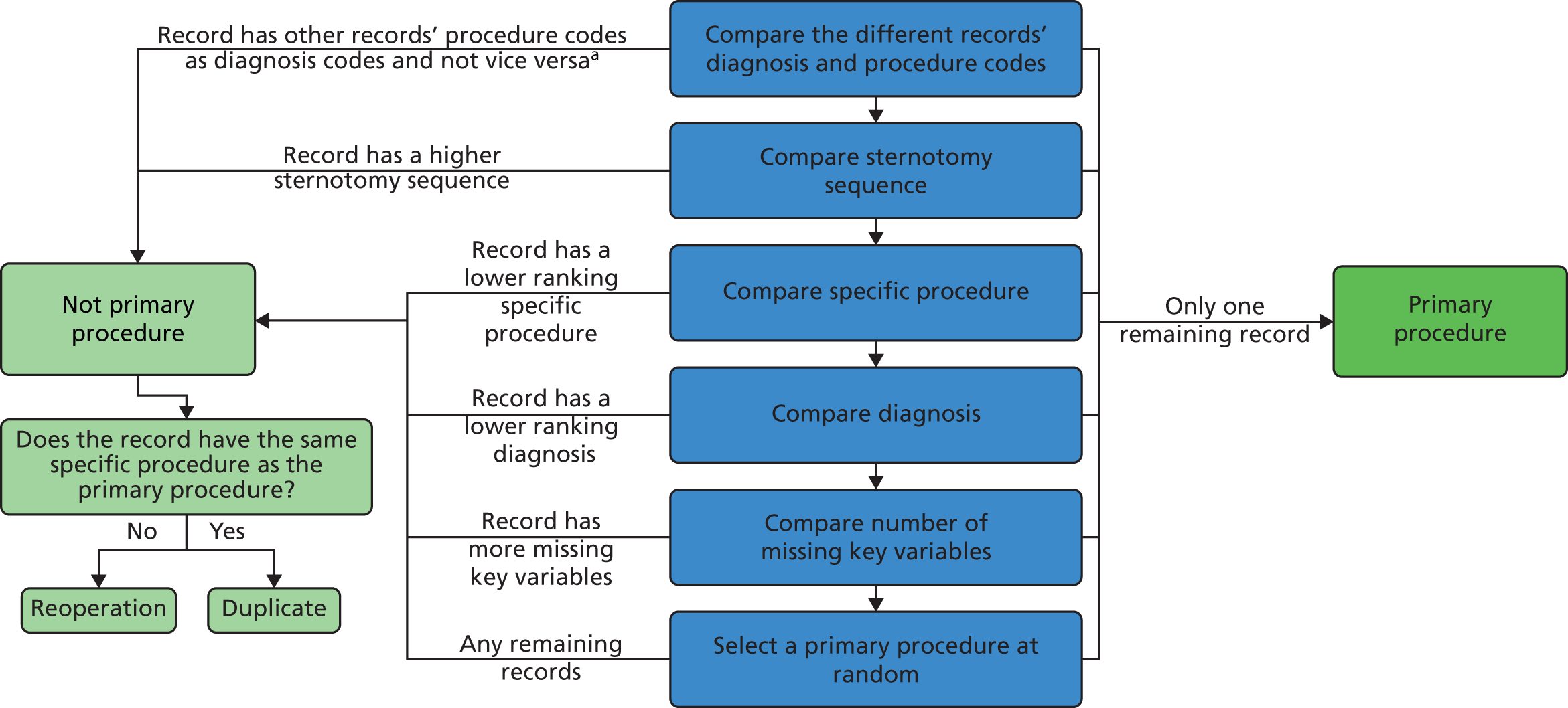
Appendix 2 Detailed discussion of how the comorbidity and additional risk factor groups were derived
This appendix is based on Brown et al. 51 This is an open access article under the Creative Commons Attribution (CC BY 4.0) license (https://creativecommons.org/licenses/by/4.0/), which permits others to distribute, remix, adapt and build on this work, provided the original work is properly cited. The text below includes minor additions and formatting changes to the original text.
Working with comorbidity codes
The expert panel held two face-to-face meetings over the course of 1 year, and took part in iterative online discussion between these meetings, with the following aims:
-
To explore options for modified groupings of comorbidity codes building on the previous categories formed during the development of PRAiS 1, which were Down syndrome, non-Down syndrome congenital comorbidity (all genetic syndromes, clinical constellations of features that constitute a recognised syndrome, and congenital structural defects of organs other than the heart), acquired comorbidity (preoperative comorbidities acquired as a result of heart disease or its treatments, such as renal failure or necrotising enterocolitis) and prematurity (birth at a gestational age of < 37 weeks); and also considering further non-procedural risk factors that have been identified as potentially important within other registry-based studies. 16,17,33,103,104
-
To identify and exclude comorbidity codes represented in the NCHDA data set that may be difficult to define consistently or where existing definitions are not available or applicable.
-
To identify and exclude comorbidity codes that were included in PRAiS 1 but very rarely arise within the data set or for other reasons are considered not clinically relevant.
The expert panel qualitatively reviewed the EPCC codes included within the NCHDA database. The 581 EPCC codes within the procedural, foetal and diagnostic qualifier groups were excluded from further review at an early stage as these were not relevant to the objectives. The remaining 776 EPCC codes within eight broad groups were subjected to further more detailed qualitative review, including round table discussions in the group’s face-to-face meetings. Of these codes there were 86 EPCC comorbidity codes and a further 52 EPCC diagnosis codes so a total of 138 codes that were previously included within PRAiS 1 as evidence of the risk factor of comorbidity. The expert advisory panel considered charts displaying the frequency and outcomes, based on 30-day surgical episodes, across the range of EPCC codes. The expert panel considered relevant literature in particular recent publications regarding the Society of Thoracic Surgeons Congenital Heart Surgery data set and current STAT Score Risk Model. 16,17
Results
Non-procedural risk factor groups
Based on consensus, and in consideration of the grouping options, relevant EPCC codes and review of relevant literature, the expert panel suggested categories of:10,16
Down syndrome, congenital comorbidities excluding Down syndrome, acquired comorbidities, prematurity and conditions indicating increased severity of illness in surgical candidates. The conditions included within the category of increased severity of illness incorporated pre-operative mechanical ventilation, which was included as an acquired comorbidity in PRAiS 1 as the expert panel considered that severity of illness group was a better fit; and other measures of illness severity that feature in the updated version of the STS STAT score, such as pre-operative mechanical circulatory support. 16 These clinical groups of pre-operative risk factors contain conditions that are separated based on distinct aetiologies, and as such have the potential to enable discrimination of risk across the diverse case mix of paediatric cardiac surgery. Figure 76 shows the EPCC categories where the individual conditions in each category originate; for example, most conditions in congenital non-Down syndrome comorbidity are ‘Diagnostic comorbidities: hereditary, neonatal and non-cardiac codes’ and most conditions in acquired comorbidity are from ‘Diagnostic codes for Preoperative risk factors’ and ‘Diagnostic codes for lung and thoracic disease’.
FIGURE 76.
How categories of EPCC codes map to the new comorbidity and additional risk factor categories.

The panel noted evidence that additional or acquired cardiac specific conditions, in particular elevated pulmonary vascular resistance and impaired ventricular function, may place surgical candidates at increased risk, and therefore it proposed the formation of a further category of additional cardiac risk factors. 105–107 As is shown in Figure 76, conditions within the category ‘Diagnostic codes for acquired and post-procedural abnormalities or disorders’ (acquired cardiac conditions) were predominant in this group. 37 Codes were put forward for inclusion as additional cardiac risk factors only when they were considered to have an unambiguously negative impact in any surgical candidate regardless of the primary cardiac diagnosis (e.g. cardiomyopathy, supra-systemic pulmonary artery pressure), and codes were ruled out when it was considered that, clinically, the impact of the condition under consideration might be variable from one patient to another and might even be the primary indication for surgery (e.g. pulmonary regurgitation) or when a code highly specific to a given primary diagnosis that was already a factor in the risk model (intramural coronary in transposition). 108–110
Both PRAiS 1 and PRAiS 2 include the risk factors of primary diagnosis and univentricular status, and hence the expert panel elected not to consider prior cardiac surgery as a risk factor given its overlap with these features.
A total of 23 codes included in PRAiS 1 were dropped on the basis that they were non-clinically relevant or were extremely rare (e.g. pes carinatum, abdominal aortic aneurysm). The code for gastero-oesophageal reflux, which was included in PRAiS 1, was dropped because it was considered to be too challenging to define consistently.
The number of individual EPCC codes (some of which denote the same condition with slight variations depicted by different individual codes) within each risk factor group was as follows: Down syndrome (one relevant EPCC code), congenital comorbidities excluding Down syndrome (51 relevant EPCC codes), acquired comorbidities (37 relevant EPCC codes), prematurity (three relevant EPCC codes) and conditions indicating increased severity of illness (nine relevant EPCC codes) and additional cardiac risk factors (40 relevant EPCC codes). The expert panel felt that a simple count of comorbidities could lead to inflated predicted risk if several comorbidity codes for similar conditions were used, when the actual additional risk from the extra codes would be minimal. For this reason it was decided not to include an overall count of comorbidities or a count within different categories. A yes/no indicator for each different category of additional risk meant that predicted risk would be increased if a surgical procedure episode contained different types of comorbidities or additional risk factors, while meaning that records with several similar additional risk factors from the same group did not have any additional predicted risk.
Risk factor frequencies and outomes
The frequency with which the selected risk factors were found within the study data set is shown in Table 15 alongside the mortality rate for surgical episodes with the stated risk factor, whether or not other risk factors were also present. The unadjusted odds ratios indicated that the univariate risk of post-operative death was significantly higher for congenital and acquired comorbidity, severity of illness indicator, additional cardiac risk factors and prematurity. Conversely, univariate risk of post-operative death was signficantly lower in surgical episodes where Down syndrome was recorded. When multivariable risk of post-operative mortality was considered, based on PRAiS 2 (adjusted for specific procedure, primary cardiac diagnosis, univentricular status, weight, age, congenital and acquired comorbidity, severity of illness indicator and additional cardiac risk factors), there was no longer evidence for increased risk of post-operative death with prematurity, but the other four factors remained statistically significant.
| Risk factor | Number of (% of all) patients with this risk factor | Mortality (%) | Odds ratio (95% CI) unadjusted | Odds ratio (95% CI) adjusted (PRAiS 2a) |
|---|---|---|---|---|
| Congenital comorbidity | 2445 (11.2) | 3.7 | 1.61 (1.28 to 2.03) | 1.52 (1.18 to 1.95) |
| Acquired comorbidity | 1254 (5.7) | 6.5 | 3.03 (2.38 to 3.87) | 1.99 (1.52 to 2.61) |
| Severity of illness indicator | 2260 (10.3) | 7.5 | 4.23 (3.51 to 5.11) | 1.75 (1.40 to 2.18) |
| Additional cardiac risk factors | 1053 (4.8) | 5.3 | 2.36 (1.78 to 3.14) | 2.20 (1.61 to 3.03) |
| Prematuritya | 2664 (12.2) | 4.0 | 1.82 (1.46 to 2.25) | 0.87 (0.62 to 1.20) |
| Down syndromea | 1690 (7.7) | 1.5 | 0.60 (0.40 to 0.89) | 1.17 (0.72 to 1.91) |
The broad underpinning definitions for the significant risk factors of congenital comorbidity, acquired comorbidity, severity of illness indicator, additional cardiac risk factors, including the time lines for their identification, are presented in Table 16. These individual risk factors are identified by the presence of specific EPCC codes in the NCHDA data set that were clinically judged as meeting the specified definition, the most common of which are listed in Table 16. The full list of individual EPCC codes selected for inclusion within these additional risk factor groups is presented in Report Supplementary Material 2.
| Additional patient risk factor | Definition of risk factor | Time line criteria for relating the risk factor to paediatric cardiac surgery | The most prevalent EPCC codes within each risk factor group |
|---|---|---|---|
| Congenital comorbidity, excluding Down syndrome | A patient condition present at birth that is additional to and separate from the congenital heart abnormality. This includes individual single abnormalities and recognised constellations of abnormality referred to as ‘syndromes’ | Although present at birth, these conditions are not always diagnosed immediately. This risk factor applies at any cardiac surgery performed throughout the child’s life | 14.01.01 Chromosomal anomaly 14.02.00 Syndrome-association potentially with cardiac involvement 14.01.21 22q11 microdeletion |
| Acquired comorbidity | An acquired condition that arises during life, which may be either temporary or permanent. This includes conditions incorporating secondary organ damage caused by CHD and, rarely, other acquired conditions that are unrelated to CHD | This risk factor applies when the condition is diagnosed during the admission to hospital that immediately precedes the cardiac surgery | 14.03.05 Psychomotor developmental delay 10.15.05 Necrotising enterocolitis 10.20.09 Preprocedural septicaemia |
| Severity of illness indicator | These are events, supports or conditions that indicate that the patient became severely unwell, usually when the causation related to CHD | For cardiac arrest and extracorporeal life support: these apply when present in the child during the admission to hospital that immediately precedes the cardiac surgery For mechanical ventilation, metabolic acidosis and shock: these apply when present as the child enters the operating room for cardiac surgery |
10.20.14 Preprocedural mechanical ventilator support 10.20.02 Preprocedural shock 10.20.05 Preprocedural acidosis |
| Additional cardiac risk factors | These are conditions related to the heart that may arise in conjunction with a congenital heart defect and have the potential to make undergoing cardiac surgery more complex or higher risk. Specifically, these conditions incorporate abnormalities of the myocardium and of the pulmonary vasculature | This risk factor applies when the condition is diagnosed as present in the child during the admission to hospital that immediately precedes the cardiac surgery | 10.20.16 Preprocedural pulmonary hypertension 10.13.01 Pulmonary arterial hypertension 10.10.25 Dilated cardiomyopathy |
As expected, additional risk factors arose in various combinations within individual surgical episodes, and the proportion of surgical episodes in the data set across the range of possible combinations is shown in Table 17. There were 16,093 (73.7%) surgical episodes with no additional risk factors of any kind, and only 10 surgical episodes (> 0.1%) with all four risk factors present. The most common risk factor as a single condition was congenital comorbidity in 1881 (8.6%), followed by severity of illness indicator in 1538 (7.0%), additional cardiac risk factors in 656 (3%) and, last, acquired comorbidity in 575 (2.6%) episodes. The most common combination of two risk factor groups was acquired comorbidity and severity of illness indicator, in 274 (1.3%) episodes.
| No additional cardiac risk, n (%) | Additional cardiac risk present, n (%) | |||
|---|---|---|---|---|
| No congenital comorbidity | Congenital comorbidity present | No congenital comorbidity | Congenital comorbidity present | |
| No acquired comorbidity | ||||
| No severity of illness indicator | 16,093 (73.7) | 1881 (8.6) | 656 (3.0) | 91 (0.4) |
| Severity of illness indicator present | 1538 (7.0) | 161 (0.7) | 143 (0.7) | 21 (0.1) |
| Acquired comorbidity present | ||||
| No severity of illness indicator | 575 (2.6) | 213 (1.0) | 51 (0.2) | 18 (0.1) |
| Severity of illness indicator present | 274 (1.3) | 50 (0.2) | 63 (0.3) | 10 (0.0) |
Within the study data set, the proportion of surgical episodes in the neonatal age group was 21.6%, in infancy was 39.8% and in childhood was 38.7%; and the proportion of surgical episodes involving a functionally UVH was 17.1% versus 82.9% involving a biventricular heart (Table 18). Notable differences across the age groups were the greatly increased proportion of surgical episodes with a severity of illness risk factor pre-operatively in the first year of life versus the much lower proportion in older children. Furthermore, congenital comorbidity was more commonly noted with increasing age, most likely because certain conditions may take time to identify, and congenital comorbidity was more common in biventricular children than in patients with functionally UVHs, probably reflecting the distribution of particular specific known combinations of cardiac and non-cardiac congenital defects.
| Risk factor | Number (%) of neonates with risk factor | Number (%) of infants with risk factor | Number (%) of children with risk factor | Number (%) of univentricular patients with risk factor | Number (%) of biventricular patients with risk factor |
|---|---|---|---|---|---|
| Congenital comorbidity | 387 (8.2) | 1005 (11.6) | 1053 (12.5) | 310 (8.3) | 2135 (11.8) |
| Acquired comorbidity | 298 (6.3) | 491 (5.7) | 465 (5.5) | 214 (5.7) | 1040 (5.7) |
| Severity of illness indicator | 1102 (23.4) | 996 (11.5) | 162 (1.9) | 325 (8.7) | 1935 (10.7) |
| Additional cardiac risk factors | 197 (4.2) | 590 (6.8) | 266 (3.2) | 126 (3.4) | 927 (5.1) |
| Total | 4709 | 8685 | 8444 | 3737 | 18,101 |
Appendix 3 Participant description of the non-parent website workshops recruited by Sense about Science
First workshop (29 June 2015)
The participants at the non-parent workshop were:
-
a member of the public
-
a statistics expert and science writer
-
a policy officer from the Royal College of Surgeons of Edinburgh
-
a media relations manager for The Lancet
-
a project co-ordinator from the Royal College of Paediatrics and Child Health.
Second workshop (6 October 2015)
The participants at the non-parent workshop were:
-
an editor of NHS Choices and Behind the Headlines
-
a policy officer from the Royal College of Surgeons
-
a media and campaigns officer from the Royal College of Paediatrics & Child Health
-
a member of the Voice of Young Science and PhD (Doctor of Philosophy) student.
Third workshop (3 February 2016)
The participants at the non-parent workshop were:
-
the head of the good practice team at the Government Statistical Service
-
a retired GP and freelance writer
-
a member of the public
-
a public affairs manager at the Royal College of Surgeons of Edinburgh
-
a policy manager from the British Heart Foundation
-
a communications officer from NHS England.
Fourth workshop (13 April)
The participants at the non-parent workshop were:
-
a media relations manager from the Royal College of Surgeons
-
a senior press officer from the Medical Research Council
-
a marketing officer from the Science Council
-
a digital content editor from the British Heart Foundation
-
a member of the public
-
a data analyst from The King’s Fund
-
a representative from the Voice of Young Science.
Appendix 4 Material for first set of workshops in June 2015
Appendix 5 What each team member has taken from the project
In this appendix, each team member contributes their own reflections on this multidisciplinary project and what aspects they will take forward into their career in the future.
Christina Pagel
This has been a truly transformative project for me. The website has become much more and took a lot more work than I originally envisaged. Each team member’s contribution was crucial and I learned so much from listening to other people’s perspectives. I am particularly proud of the fact that I believe that every workshop participant could look at the website today and spot at least three things that their participation directly influenced. I am hoping to continue this sort of communication endeavour in my future work, particularly where it relates to measuring quality.
In particular I will take these learning points with me into my next projects:
-
People have a right to NHS information presented in a clear and balanced way, and they value having access to this.
-
The website would have not have been fit for purpose without the early and continuous involvement of parents and other users.
-
There is a huge amount of effort involved in accessibly presenting abstract and difficult concepts.
-
People will interpret things in ways you had no idea were possible – but in retrospect were entirely obvious. Repeating these checks over and over with fresh eyes is priceless.
-
Never think you know how much detail people ‘need to know’.
Finally, I would like to thank NIHR for encouraging me to be more ambitious in this part of the project and to push me to go far outside my comfort zone.
David Spiegelhalter
This has been a humbling and invaluable experience. I thought I knew something about communicating statistics, but sitting listening to enthusiastic users struggling to understand concepts made me realise my inadequacy. For example, we spent months trying to choose a term to describe the unavoidable unpredictability of the number of survivors in a group of children experiencing surgery: standard technical terms such as ‘random variation’ are clearly unacceptable in this context. We finally arrived at the phrase ‘unforeseeable factors’, and after appropriate testing this has been adopted.
If we want to genuinely communicate statistical evidence, I am now utterly convinced that users have to be involved from the very start. And there are so many other areas that could benefit from this approach, which might help dislodge the obsession with simplistic league tables.
I have recently received generous philanthropic funding to open a Winton Centre for Risk and Evidence Communication in the University of Cambridge. The centre aims to collaborate on accessible and balanced communication of quantitative evidence to the public, professionals, policy-makers and the media. The children’s heart surgery project provides a perfect exemplar of the appropriate methodology for working with others to produce high-quality web material, and the centre will be using it as a template for future projects.
Mike Pearson
I learnt that involving users right from the start – even when you still have nothing to show but paper – is incredibly liberating. It allows you to try ideas out before change becomes expensive. Within a large team, discussion of different options can become difficult. We all have different experiences of technology and have developed different likes and dislikes, and so it is liberating to listen to users and allow them to guide the decisions.
I learnt that layered explanations of difficult concepts are important, and that we can use small screens to help design this layering.
I learnt that functional reactive programming works well and is a joy to code.
I learnt that the workflow for timeline based animation (with Qudos) is different to the workflow for creating interactive animations, and takes different skills.
Sense about Science (Emily Jesper and Joanne Thomas)
We gained experience of preparing a parent to appear on national radio. Although we have extensive experience of supporting scientists to speak to journalists, we had less experience supporting patients or parents. We reached out to one of the heart units with experience of supporting parents for media appearances to understand the best practice in this area from other communications professionals. The parent involved found the experience to be positive and this has given us confidence to involve parents and patients in our media plans in future.
Having a parent featured on national radio was valuable in sharing with a wider audience that there is an appetite for better resources to explain the statistics and how the NHS monitors heart surgery, from parents and patients.
We would share with others who facilitate user testing workshops to brief researchers well in advance on the value of listening, and the importance of resisting the temptation to answer workshop participants’ questions too soon. This ensures that all of the difficulties participants have in understanding the information/language are captured.
For us, we will repeat the approach of providing information on paper at the first stage of a website’s development, so that it is easier for participants to put the information into a hierarchy themselves, or for the observers to decide on the hierarchy of information based on the type of questions participants ask and the order they ask them.
It was fantastic to feel that researchers involved in the project were so responsive to the user feedback and careful to consider how to sensitively communicate and not afraid to ask participants about issues they were stuck on. In addition, it was valuable to see researchers experience first hand that there will always be communication pitfalls that can never be predicted; which shows why the importance of involving the audience early cannot be underestimated.
Children’s Heart Federation
The participation of the CHF within this body of research was vital to ensure that the voice of the parent caring for a child with CHD – and thereby the child’s voice too – would be part of the conversation.
Three key considerations were learnt from arranging parental focus groups:
-
time of group discussions
-
venue choice
-
mode of communication.
As families with a heart child have multiple commitments with attending hospital appointments, special educational needs support at schools and everyday family events for the heart child as well as their siblings, it was important to tailor the meeting times of the workshops to those outside of the standard 9 a.m.–5 p.m. office schedule, so that parental views and recommendations about the website could be heard and acted on.
Many families could not make the trip to London, and some expressed an interest in this research and asked whether their views could be considered via web-based questionnaire or electronic communication. They were sent the website for feedback in May 2016 during its final stages of development.
As each of the three key themes above was addressed successfully during the study, it may be possible to translate these considerations into future studies when the voice of families with children with CHD may be called on again to be at the heart of this vital dialogue.
Tim Rakow
I have been involved in a number of interdisciplinary collaborations, and this has arguably been the most successful to date. Key to that success has been the willingness of participants to engage with the ideas and methods of disciplines other than their own. There were several key lessons for me as a researcher. First, it worked well to use qualitative work (in this case the workshops) to inform the hypotheses and design of the experiments; using qualitative work to generate hypotheses and then experiments to test those hypotheses helped to ensure that the research examined questions that were important to the project while also providing some answers in which we could have confidence. I would like to use this approach more in the future. Second, Emily Blackshaw designed and ran some studies that used a ‘think-aloud’ approach: participants provided an answer to a structured question and then explained that answer (orally, or in writing). These explanations provided some of the most interesting data for the project, and this is an approach I would like to use more in future. Third, our first study was (arguably, and with some benefit of hindsight) ‘overengineered’: we were conservative with some of our design choices, ensuring that our stimulus set was large and our measurement was very detailed. My view is that this is a good way to start a new project, as long as one can recruit participants who are willing to take part in a long and quite demanding study (which was the case for us), because one can evaluate/review one’s methods alongside answering a research question. Thus, we could make principled research design decisions for subsequent studies (e.g. to streamline the data collection while still ensuring reliable measurement) because we had learned a great deal about our methodological toolbox for this research project in the first study. Finally, wearing my educator hat, a key lesson was seeing just how much benefit was gained by an iterative approach to developing the website and animations that demanded considerable attention to detail and embraced ‘high-end production values’. This took considerable time, effort and resources – but I feel that having an experienced web-designer and employing professional animators has enhanced the content of the website in a way that will make it more accessible to its target audiences. I would welcome opportunities to mimic this approach to develop resources for my teaching.
Kate Brown and Rodney Franklin
This project truly represents a great example of interdisciplinary work, where we achieved something that is greater than the sum of its individual parts.
We note the importance of the back story to this project: from the Bristol Inquiry in the mid-1990s, the evolution of the NCHDA validated database, the context in which we have operated for the last 15 years where stakeholders have been increasingly hungry for the project deliverables, to the development of PRAiS in 2011 and its subsequent nationwide use in 2012–15 for near real-time quality assurance of 30 day outcomes, with constructive feedback from clinicians and other stakeholders.
Therefore, the starting point for the project was that we had:
-
high-quality, inclusive and validated national audit data
-
risk adjustment methodology that had buy-in from various stakeholders
-
a widely expressed need for the product.
To make an equally successful website in another clinical context, one would ideally have these three things in place. This may not always be possible. However with national audit in the UK and large registries developing elsewhere, this is likely to become more feasible over the coming years.
From the clinical and national audit standpoint (which is what KB/RF represent), we offered our own views but we have also attempted to represent the perspectives of other clinicians and participants in the audit during the project. With respect to the final version of the website, we are feeding back on their behalf when stating that the website is excellent. Finally, we can and will share the website with clinicians, hospitals and other stakeholders that are linked with NCHDA committees, which represent all centres in the UK, as well as professional societies and colleagues from Europe and North America.
Sonya Crowe
Comparing the final website with the early thinking is striking: I am not sure any of the team would have imagined just how much things would evolve over the course of the project! It has been a privilege to see the benefits of genuine user engagement, and the extent to which that influenced the final product has surprised many of us. Christina and the core team’s commitment to listening and responding to user feedback has been admirable, as has their openness to working across disciplines. Both the process and output will justifiably be seen as exemplars for others to emulate. The project has already directly informed my plans for engagement and dissemination in related work and, more fundamentally, prompted me to reflect on my priorities and responsibilities as an academic.
Martin Utley
At the opening meeting, a graphical representation of data that I and several others had put considerable time and effort into was shown to be opaque to the point of being useless. From that moment on, it was clear to me that genuine and effective engagement with the key groups of people that will seek out or be confronted by these data was essential. Sitting in on one of the focus groups, I was impressed by the methods being used to capture the interpretations, views and preferences of people presented with data. However, what impressed me most was the rapidity and openness with which Christina and David accepted the challenges to the precepts and assumptions of the academic world view that came their way. It is these attributes that I will strive to exhibit in future work.
Appendix 6 Insights from the ‘critical friend’ perspective (written by Laura Meagher)
As a ‘critical friend’, my role was to assist the project leader and team members in: clarifying their aims as a team; designing effective meetings; checking that the team was on course; capturing successes, impacts/impact indicators and also ‘lessons learned’ from the process. This meant acting as a sounding board and as a facilitator for what was in effect ‘formative evaluation’ of an ambitious project process.
Integration
It was clear at the start of the project that the individuals were all willing to be pulled together and that they all believed in the overall project purpose, as well as their individual aims. However, the project could easily have failed to cohere – as so many well-intentioned projects with this degree of complexity have done. It could have stayed a set of disparate actions, each propelled by an experienced individual according to his or her interests or ’comfort zone’.
Instead, as seen in observation throughout and particularly in the discussions of the final meeting (24 June 2016), the project did succeed in its goal of integration across perspectives and types of expertise; it was an effective interdisciplinary effort. The ‘interweaving’ across disciplines was done by the project principal investigator, who not only co-ordinated both components of the overall PRAiS grant, but within this project ensured that ‘strands’ of statistical and clinical knowledge, stakeholder input, psychology research and expertise in public communication, as well as technical website development expertise, all fed into other strands as well as into the overall product of the project. By the final meeting of the team, it was clear that individuals had come to a greater appreciation of what others in the team had contributed; there was a sense of shared achievement.
Genuineness of stakeholder engagement
An unusual feature of this project was the extent to which stakeholder input was not only sought but also then actually used. Particularly through the agency of Sense about Science, effective stakeholder workshops were conducted. What distinguishes this project from the many that cite numbers of workshops as ticks in boxes was the genuine attention then paid to stakeholder input from each workshop. The evolution of the website, its content, language and portrayals, went through several iterations, each drawing on and responding to another workshop’s input. Although this project’s narrative of course drew on an extensive ‘back story’ of expertise and (NICOR) data, nonetheless the stakeholder input began early in this project and lasted throughout, so that this could be seen as a case of genuine coproduction.
The principal investigator and team members continued to seek user input until very late in the project, still being willing to recast what they had already done in light of stakeholder insights. They did so even though this made more work for them and generated time pressures as the end of the project drew near. Again, many other projects would have called a halt to stakeholder input earlier so as to fine-tune what had already been done; this project went the extra mile by proactively seeking and then responding to stakeholder input until nearly the end of the project.
In addition, of course, the inclusion of two clinicians (with nuanced understanding of the science and of NICOR) in the project team ensured the inclusion of that perspective, as well as networks for future dissemination.
This project’s evolution could serve as a case study or exemplar for other such efforts seeking to involve stakeholders and their perspectives in a genuine way, to feed into the project per se. During the final meeting, the team emphasised that the project utilised engagement of stakeholders in its actual research; it was important to them that this be differentiated from the more common ‘end-of-pipe’ dissemination of research results in laypersons’ language.
Delivery of professional, scientifically grounded, useful product – and early indicators of impact/influence
The website is the manifestation of combined efforts, the product of the grant. The project’s final meeting emphasised the professionalism of the content and its presentation. The website is indeed well grounded scientifically, given the expertise of the principal investigator and her colleagues. Several academics have prepared proposals for further work along these lines and a new risk and evidence communication centre at the University of Cambridge is planned ‘based exactly on this approach, with an ethos of balanced reporting of benefits and harms – with user engagement starting right from the very beginning absolutely an integral part’ (DS). The principal investigator’s Harkness Fellowship will enable her to deepen awareness of this work in the USA over the upcoming year.
By responding so proactively to stakeholder and clinical input, as well as psychological research, the project team ensured that the design, language and content were as accessible and helpful as possible. Early indications from NCHDA, other professional groups, charities and individuals suggest strongly that the website is and will be viewed as useful. For example, links to the website are already being shared (e.g. it is being e-mailed on behalf of NCHDA to specialist hospitals, and a link exists on the NCHDA website) and other links are envisaged (e.g. in the upcoming NCHDA report). Plans are in place to introduce various networks to the website (e.g. through talks at targeted conferences).
The website will continue to be hosted by the University of Cambridge; updates can thus be made as to (links to) new NCHDA reports, etc., and usage can be tracked. Over time, team members will forward key links or references to the report to Sense about Science; this will help to track unfolding influences and impacts of the website.
Leadership
As noted above, the project began as an impressive set of individuals, all willing but a bit unsure as to how the complex project would work in practice. The principal investigator led the project to a successful conclusion, interweaving the various strands of expertise and input, and bringing out synergies. She acted as a lynchpin, both intellectually (working with colleagues to translate important concepts into accessible language while still being true to the science) and practically (ensuring that the timing of each strand’s feeding into another strand was as effectively as possible).
The principal investigator has a distinctive leadership style: rather than autocratically dictating to each strand/team member, she worked carefully to bring everyone along. For example, she convened the group several times to reflect on progress, ensuring awareness of each other’s efforts and underscoring the necessity for all components of the project to succeed. She also sent round positive, constructive ‘update’ e-mails to the team members. Behind the scenes, she was responsive; as one team member commented, she replied immediately to any e-mail. She established a good tone throughout, and even for the critical friend it was a pleasure to work with this team.
The principal investigator’s facilitative leadership helped to engender mutual respect across the group and transformed a set of individuals into a cohesive whole that generated a robust product out of complexity. Team members repeatedly praised her leadership at project meetings, particularly at the final meeting, when she was commended for bringing this complicated project to conclusion at such a high standard, based on genuine inclusion of stakeholder input.
Lessons learned
The team generated a number of lessons learned, captured in notes of its final meeting in particular. There was a sense that others striving for this sort of engagement might benefit from these lessons.
Three ‘critical friend’ observations on a whole-project level might be of some interest. First, it was effective to hold periodic (but not too frequent) meetings of the team, so that all members were ‘on the same page’ even as they worked on different components of the project. This allowed trust to be built across disciplines. Furthermore, joint engagement in ‘reflection’ (as to how the project was proceeding towards goals while it was changing based on various types of input) acted as ongoing ‘formative evaluation’ so that the project stayed on track even as it evolved.
Second – and this is reiterating a major message from the team’s comments – this sort of effort is hard work; it takes time and resources. Even the generous amount of time allowed for this project could have been longer; the inclusion of so many iterations of focus group input meant that much of the psychological research, and especially the website design work, was compressed into the final stage of the project. Nonetheless, NIHR is to be commended for being unusually sensitive to the effort required to do this right.
Third, the composition of the team and, especially, the capability and leadership style of the principal investigator matter immensely. In this case, the committed, facilitative style of the principal investigator elicited the best from the admirably diverse expertise and perspectives of the team members.
Role of the funder
Project team members were grateful for, impressed by and even surprised by the level of investment NIHR made in this project. Indeed, it was NIHR’s insistence on this level of support that allowed the principal investigator to pull together such a strong team and the team to create a product even more extensive and professional than had been envisaged at the start.
At its final meeting, the team members reflected on their pride in both the product (website) and the process through which it was achieved. They expressed the hope that NIHR would feel proud of having supported both and that indeed NIHR might wish to use the project as a case study, with its narrative of interdisciplinary working and genuine utilisation of stakeholder input as the product evolved (engagement that could be seen as ‘coproduction’ or ‘experience-based co-design’). The project’s general structure, approach to development and care with content and language are seen as transferable. In a time of audit agendas, overall push for transparency, and so on, this project is seen as ‘a fantastic resource as to how it can be done’ (MU).
Furthermore, several individuals (including this critical friend, who has evaluated multiple research projects) suggested that NIHR would be well placed to share this story with other research funders, so that they too might be encouraged to invest in the time, people and resources necessary for this sort of process and the impacts that it can have.
List of abbreviations
- AIC
- Akaike information criterion
- AUROC
- area under the receiving operator characteristic
- CART
- classification and regression tree
- CHD
- congenital heart disease
- CHF
- Children’s Heart Federation
- CI
- confidence interval
- CORU
- Clinical Operational Research Unit
- EPCC
- European Paediatric Cardiac Coding
- FAQ
- frequently asked question
- HLHS
- hypoplastic left heart syndrome
- HTML
- HyperText Markup Language
- IVS
- intact ventricular septum
- KCL
- King’s College London
- MADCAP
- Mean Adjusted Deaths Compared Against Predictions
- NCHDA
- National Congenital Heart Disease Audit
- NICOR
- National Institute of Cardiovascular Outcomes Research
- NIHR
- National Institute for Health Research
- ONS
- Office for National Statistics
- PDA
- patent ductus arteriosus
- PRAiS
- Partial Risk Adjustment in Surgery
- RACHS-1
- Risk Adjustment for Congenital Heart Surgery
- SD
- standard deviation
- STS-EACTS
- Society of Thoracic Surgeons-European Association of Cardiothoracic Surgery
- TAPVC
- total anomalous pulmonary venous connection
- TCPC
- total cavopulmonary connection
- TGA
- transposition of the great arteries
- UCL
- University College London
- URL
- Uniform Resource Locator
- UVH
- univentricular heart
- VLAD
- variable life-adjusted display
- VSD
- ventricular septal defect
